JKW
Sentient Space Chimp
Concept: “You were once a test subject, a creature born and bred to be prodded, poked, and experimented upon. That all changed when they shot you into space---rather, YOU changed. Now, YOU do the poking and prodding. Now, YOU speak the big words. You're your own monkey now, and you'll do anything to keep it that way.”
Content: A class for the player who likes making a monkey of themselves–and a ruin of the world around them.
Writing: A mix of informative and flavorful description as well as class mechanics to emphasize the fundamental premise of the class.
Art/Design: White on black text in a three-column layout with an illustration of a chimpanzee in a space suit in the center.
Usability: Font choices are easily readable with high contrast and consistent presentation of bold text for labels and emphasized statements/phrases. Organization of text (stat-related info on the left; background table on the right) eases navigation to desired details.
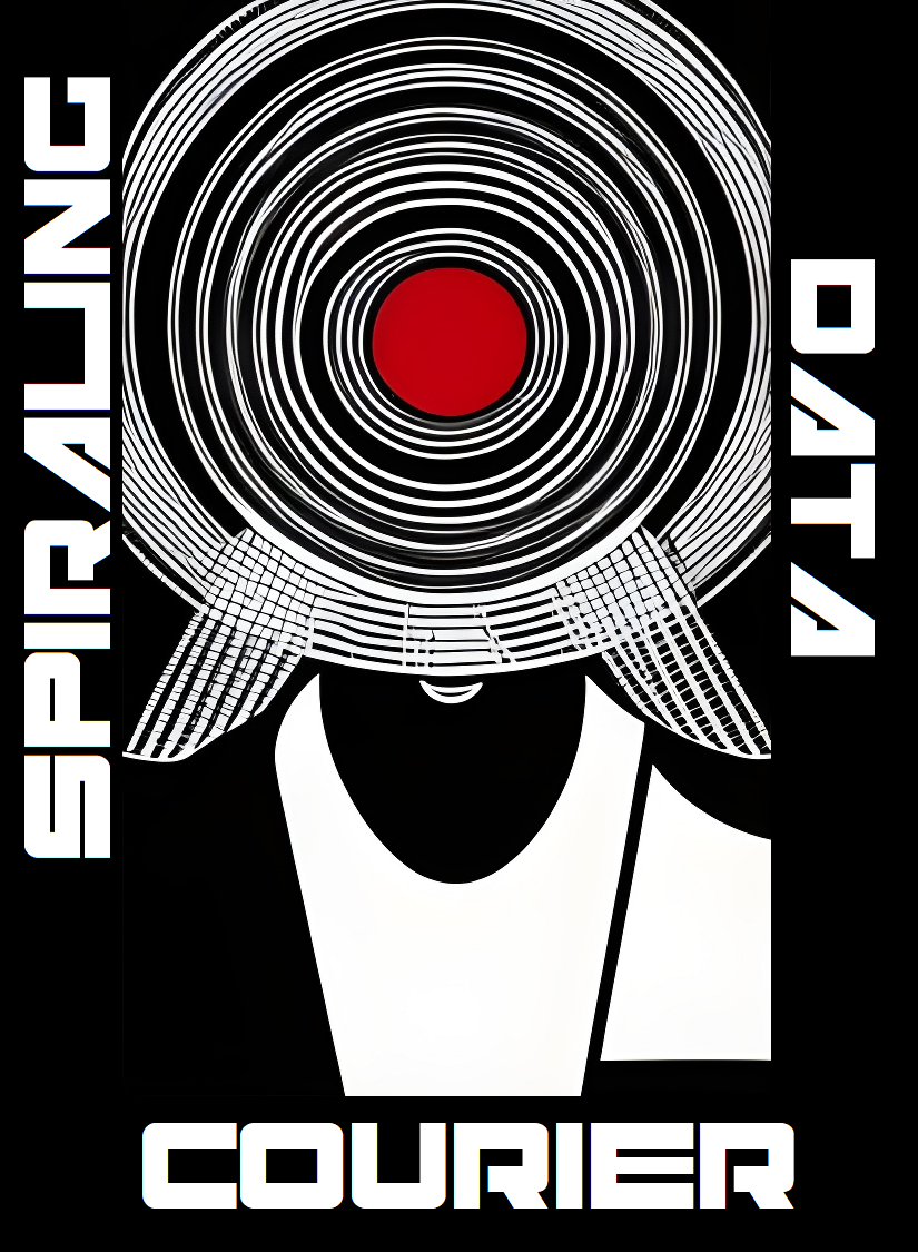
Spiraling Data Courier
Concept: “You’re losing your grip. You carry ghosts in your head, chatty artifacts of all that precious data you’ve shepherded from one client to another over the years. You really should find a new line of work, but fuck that. The biz don’t stop, and neither do you.”
Content: A class for the info jockey who dreams of room service, club sandwich, cold Mexican beer, and more–at least until it’s time to free up more space for data storage.
Writing: Brief descriptions of class features that pay homage to Johnny Mnemonic with a Cy-based flair.
Art/Design: Two sets of circles are the focal points for a two-page spread that includes class details and mechanics on the left and a stylized portrait illustration of a courier on the right.
Usability: Contrast is mostly strong, although a few fields may be difficult for some to read. Class is provided as a PNG, so text is not embedded (no searching or copying/pasting is available).
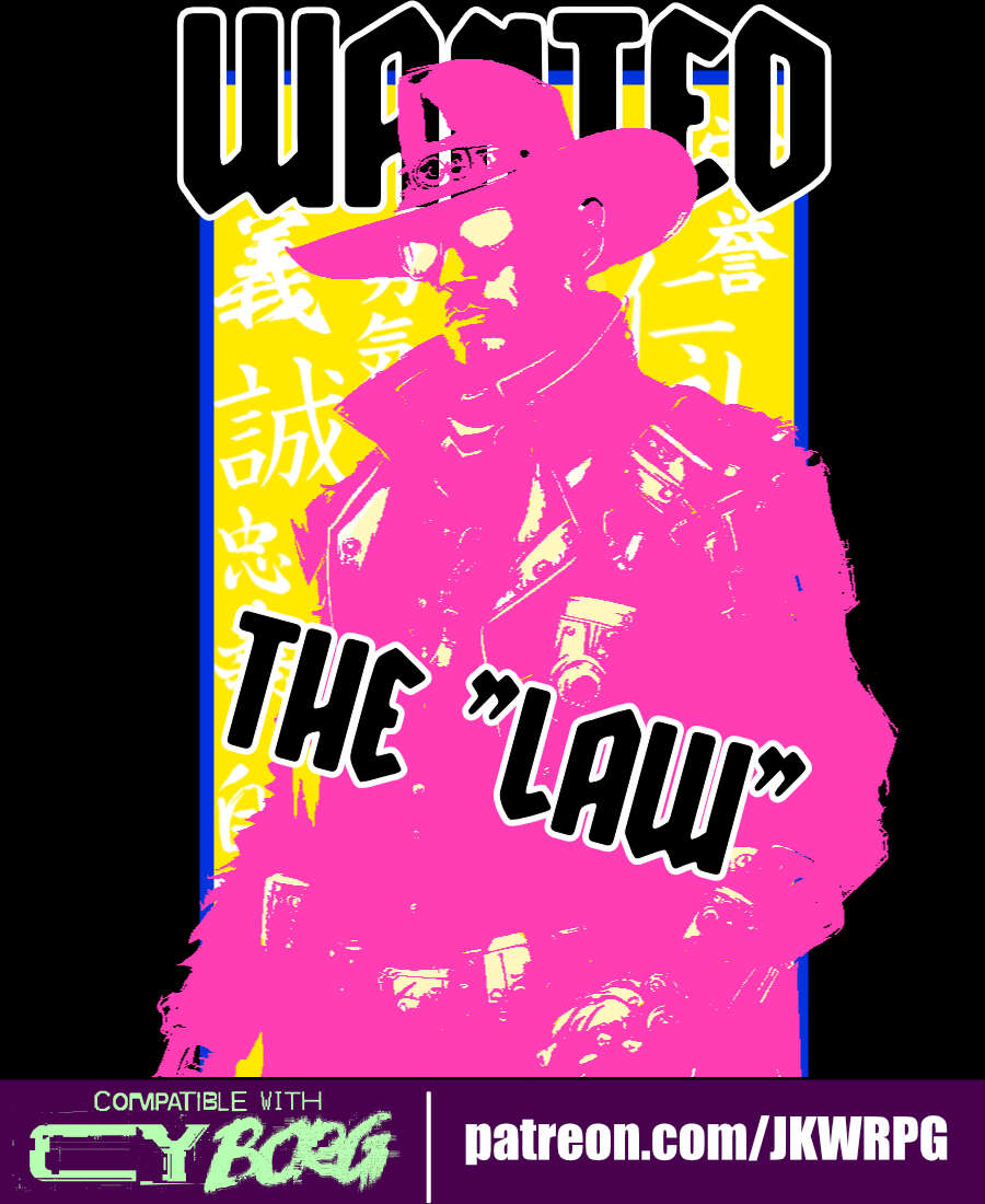
The Law
Concept: “Street samurais, rejoice! Grab your gun and sword, dust off your copy of the Hagakure (or your favorite philosophy book of choice), and start cleaning up the mean streets of CY!”
Content: A class for the chrome cowpoke whose grit is cybernetically augmented. (Note: despite the name, this does not appear to be a character class that would break Rule #00.)
Writing: Each line exudes character and flavor to highlight classic cyberpunk themes.
Art/Design: Three-column overall layout of white-on-black with a bright pink illustration of a “law” character in the middle flanked by character mechanics on the left and a Bushido personal code to follow on the right.
Usability: Text is high-contrast and in a readable font that makes use of bolded text for labels and emphasized phrase elements.
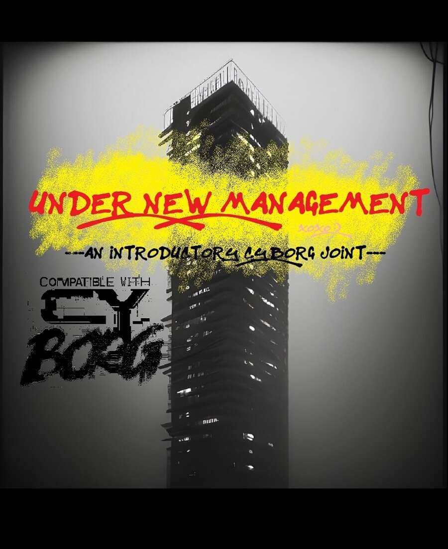
Under New Management
Concept: “UNDER NEW MANAGEMENT is an introductory three-part CY_BORG adventure inspired by classic movies like Running Man and Judge Dredd (2012), wherein the player characters must ascend a crumbling apartment tower and take out its self-appointed gang-goon leader, Jinghai Soan. It's nonstop action and weirdness that's perfect for introducing new players into the setting and system!”
Content: A scenario for PCs to get intimately familiar with life in a high-rise habitat on lockdown in order to bring down the crime lord at its apex.
Writing: Tons of details about apartment residents, the building’s aesthetic, recent rumors, NPC stats, a map, and more.
Art/Design: White-on-black monospace text with red and yellow graffiti/handwritten headings and embellishments. Occasional borders help indicate the extent of a particular sidebar or table. Black-and-white map and portrait of Jinghai Soan are included.
Usability: Text is provided mostly in one- and two-column formats with occasional exceptions. While text contrast makes for easy reading, the text is not embedded, so no searching or copying/pasting is available.
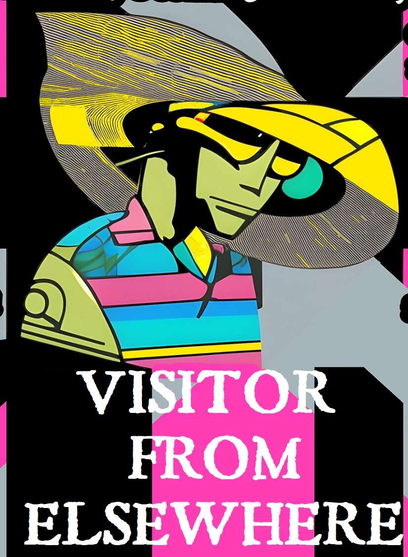
Visitor from Elsewhere
Concept: “You hail from a world unknown to humanity, far beyond the outer bounds of the Terran solar system. All data projections point to planet Earth as the site of some great future calamity, one that will resonate throughout the entire universe—but what could it be, and why here? You’ve been stranded on Earth (what’s left of it, anyway) for a few months now, and so far, only one thing’s been made abundantly clear: this place is a shithole, and nobody’s coming to rescue you.”
Content: A class for the stranger in a strange land with no way to leave it.
Writing: Class details mix levity and bizarre sci-fi tropes for a unique class experience in a cyberpunk milieu.
Art/Design: Black-edged white text on black, pink, and gray with some green text accents. Class features are arranged around a central illustration of a visitor over a background pattern of criss-crossing X shapes.
Usability: Visually, this is a busy spread, which may make reading/scanning difficult for some, augmented by the lack of embedded text (so no searching or copying/pasting). Bold text for important info and labels consistently helps distinguish individual list items and content sections.
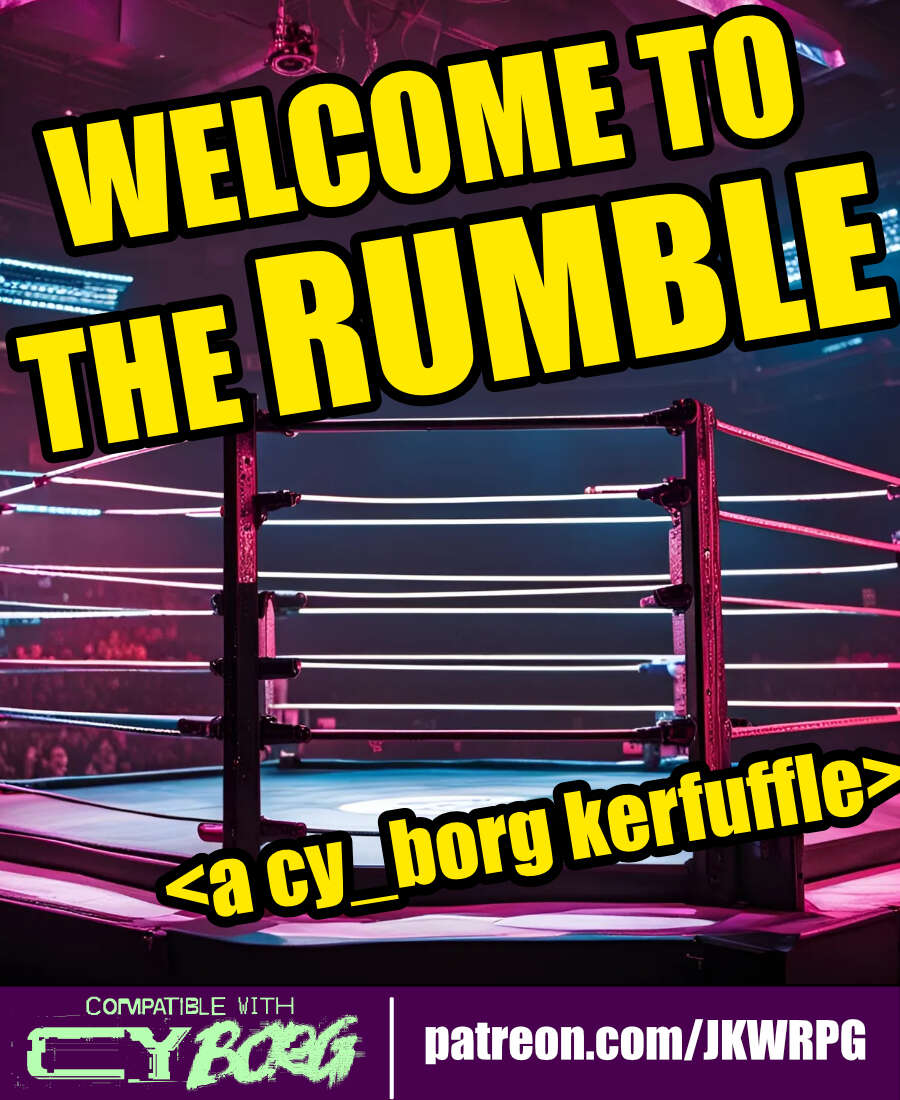
WELCOME TO THE RUMBLE
Concept: “Tonight, we are going to witness the most anticipated match in the history of professional wrestling---for the CY Wrestling Federation Championship Belt! Are you ready? Wrestling fans, ARE YOU READY?! For the thousands in attendance, and the millions watching from around the world, from the capital city of CY...ladies and gentleman...LLLLEEEET'S GET RRRREAADY TO RRRRRRUUUUMMMMBBBBBLLLLLEEEEE!”
Content: An opportunity for punks to up their side-hustle game by making some bank as a wrestling champion–assuming they win, of course.
Writing: Primarily informative details about the mechanics of the encounter, accented by some headings to reflect the tenor of the wrestling scene.
Art/Design: Wide three-column layout of content with a bloody wrestling mat map in the center of the document. White text on black with yellow headings, while a bit of pink highlights the mat image and the license info.
Usability: High-contrast text and easily readable fonts facilitate reading and navigation. Skewed text may occasionally pose issues for screen readers.
Previous page
Page 2 of 2