PWYW
Pay What You Want
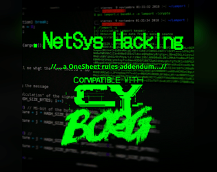
.NetSys Hacking
Concept: “H@ck the Pl@net! Use this streamlined system to hack network, or try to, as your fellow Punks take care of business in meat space. Included are rules to break into and hack systems one node at a time, activate commands in those nodes when accessed, and deal with any ICE or black ICE launched against you in addition to any other virtual denizens or invaders. Also, slot d12 new .Apps into your 'deck designed for use in virtual spaces.”
Content: A set of rules for netrunner-specific hacking procedures, along with brief stats for security/ICE NPC entities and a set of apps to kick that hacking into high gear. Full-color and black-and-white versions of the supplement are included.
Writing: Concise explanations of the hacking workflow and apps, complemented by flavorful names/labels for elements of both.
Art/Design: Full-color version resembles a green terminal UI aesthetic, with color-coded NPC info based on severity of threat and a yellow list of netrunner apps. A sample network diagram/map is included. Black-and-white version provides a clean alternative (although yellow alert symbols appear in both versions).
Usability: Text in both versions is visually identifiable and distinguishable, thanks to color and bolding/underlining to indicate certain kinds of content. Hacking workflow includes code-like line reference numbers and consistent indentation for subordinate/clarification details.
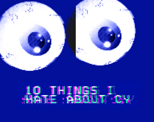
10 Things I Hate About CY
Concept: “10 urban legends whispered on the streets of CY and in the dark corners of the NET. The fact is usually worse than the fiction.”
Content: A collection of urban legends about mysterious individuals, locations, and events that might intrigue or terrify a group of punks.
Writing: Ominous tales framed as though potentially spoken by CY residents, allowing for easy slot-in ambience and plot hook/seed for GMs.
Art/Design: White, pink, and yellow text on dark blue with occasional purple circuit-board background designs and a large pair of eyeballs near the bottom of one page. Presented as three pages of single-column text.
Usability: Font choices and colors make for easy visual readability and identification of distinct content purposes (e.g., pink text for headings/labels, yellow for important details, names, and locations).
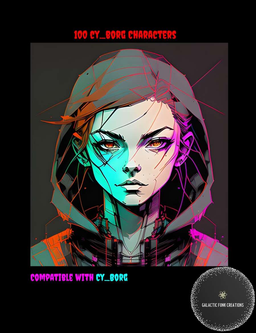
100 CY_BORG Characters
Concept: “Let me guess, your players are at prepping a heist and in the process take a turn you didn’t expect leading them to want to talk to someone that's not a part of their current goal. Sure you could improve something on the fly but why not let this list of 100 Cy_Borg Characters and their goals take some of the work of running the game off your shoulders?”
Content: A list of one hundred NPCs, each provided with a name and a one-sentence description of them.
Writing: Sentences are terse but hint at potential plot hooks for a table of punks to explore.
Art/Design: A cover page has an illustrated portrait of a young person in a hood. Otherwise, the list consists of single-column list entries in white on a black background (and a black-on-white version is also provided).
Usability: High-contrast text in a visually readable font, aided by consistent numbering and spacing throughout, makes for easy perusing and navigating to desired information.
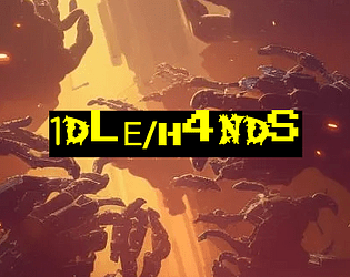
1DLE/H4NDS
Concept: “There's been a hushed-up incident at the Naiman Cybernetics factory in Bigmosse. The corpos are sweating and they need it cleaned up- fast and off-the-books. Head in and clean house, but stay on your guard: this is just the tip of the iceberg.”
Content: A clearance mission at a cybernetics facility where the situation has gotten dangerously out of hand. Content provided in three versions: a “classic look” black-on-yellow scheme, a “nite mode” black-on-gray scheme, and a “squeaky clean” black-on-white scheme that uses standard fonts.
Writing: Detailed breakdowns of locations, NPCs/enemies, potential events that might unfold (including an alternate plot hook), and an optional set of bonus goals for the PCs to achieve.
Art/Design: Each version makes use of a single-column text layout, simplified location maps, and illustrations of enemy cyborgs.
Usability: Very easily readable and navigable, with consistent use of distinct headings/labels to indicate different sections and kinds of content and important elements.
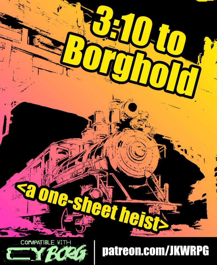
3:10 to Borghold
Concept: “It's time to rob a train---CY_BORG style! Do your research, plan your approach, and extract a high-value target from a prison transport before you're overwhelmed by security forces. Get in, get out, get paid!”
Content: A job to take care of (kill or extract) a target on a prison train.
Writing: Lots of helpful and flavorful details throughout from preparation to execution to tips on how different approaches/plans might play out.
Art/Design: Three-column landscape spread with an illustration of a train in the top center and white-on-black text with yellow headings all around.
Usability: Consistent organization and presentation of text (headings, bolded details, etc.) to make navigation and identification of desired details easy.

6 Prétirés Marginaux | [FR]
Concept: "Six Punks Anti-Corpo avec les poches vides.
Six ratés enragés et drogués
Six sacs à viandes qui tombent sous les balles et le feu numérique."
Content: A set of six character sheets with the characters already generated/rolled-up, with information in French. Also available is an experimental weapon, the "Gravitational Beam Emitter," that has high risk but very high reward for use.
Writing: Focused description and clear articulation of relevant rules/mechanics for each character class represented on one of the included sheets.
Art/design: The default Cy_Borg character sheets are used, with added text in French in high-contrast monospace fonts. The Gravitational Beam Emitter has info in a full-color black-and-white on purple spread showing someone firing the weapon (.jpg) and a text-only version (.pdf).
Usability: While visually each character sheet is readable and, thanks to the sheet layout, recognizable for use in particular ways, the included PDFs do not have embedded text. As a result, the contents are not searchable or selectable. (The PDF for the Gravitational Beam Emitter has embedded text.)
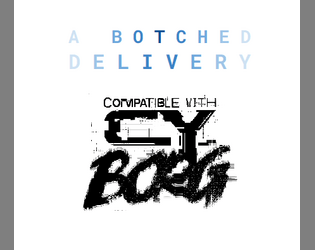
A Botched Delivery
Concept: “This scenario was written to tie two separate groups of PCs together into one central narrative. One group of PCs are fleeing from the Reaper Repo scenario (included in the CY_BORG Asset Pack) while another group of PCs are waiting in a getaway car.”
Content: An intricate means of integrating multiple PC parties into the same story, making skillful use of the Full Auto supplement for support (required for this adventure’s vehicular component).
Writing: Focused direction for how to set up & run the encounter components (including individual NPCs) is valuable for the GM unsure of how to handle everything. Tons of ambience provided in descriptions of the scenario location.
Art/Design: Simple three-column layout across three pages, with a map illustration and room descriptions across p. 2.
Usability: Content is pretty easily navigable thanks to simplicity of layout, with some accent color and bolding choices to help distinguish section headers and important details.

A Garden of New Hope
Concept: “A Garden of New Hope is a fruitful and harvest rich module for Cy_Borg that dives into the twisted heart of The Sanctum, a seemingly blissful haven masking a sinister root cause. Bathe in mind-altering nanotoxins, overcome ruthless Keepers and Wardens, and uncover the fate of a mysterious visitor from G0. Made for those who relish moral dilemmas, accepting suicide missions from dangerously unhinged clients, and taking a nice stroll through a beautiful garden.”
Content: A job to retrieve a client’s son from a cult–or possibly something far worse–from a seemingly tranquil location.
Writing: Tons of detail about the situation, relevant NPCs, and organizations, as well as GM-oriented suggestions/advice about how to bring the mission to life.
Art/Design: ~20 pages of distinct single-page layouts with some consistent elements (heading placement, font choices, etc.) and a number of NPC illustrations. Multiple maps of the target location are also included, with room-based descriptions as well as security details.
Usability: Visually, the layout elements allow for easy identification and perusal of desired content. However, text is not embedded so searching or selecting text is not possible.
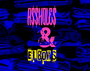
A$$hole$ and Elbows
Concept: “A low-level, mid-tier manager type from Aegis Conglomerated—using the screen name Mr. Greensleeves—needs an Aegis BioTech prototype implant recovered. This rare tech was “mistakenly” put down the recycle chute and ended up in a Mosscroft junkyard, Big Dumpers. As reward for recovering the implant and saving his job Mr. G promises to provide a backdoor into Aegis Financial for potential debt reduction. It’s simple: get to Big Dumpers, search for the implant, get the fuck out, and return it to Mr. G. What could possibly go wrong?“
Content: A simple search and rescue operation–but the PCs aren’t the only ones performing it.
Writing: Tons of character packed into the junkyard location (with a dozen areas of interest) and NPC details.
Art/Design: Trifold pamphlet layout that includes a map of Big Dumpers and relevant specifics on the inner panels, while job and NPC information appears on the outer panels. Color scheme is a mix of black-on-white and white-on-blue/yellow-on-blue.
Usability: Organization is easily recognizable, with headers and important information consistently distinguished from body text by font choice, size, color, and inline bolding.
Abandoned Algae Farmer
Concept: “You were a cog in the massive machine that feeds the city of Cy. Now, for one reason or another, you had to abandon your algae farm. All you have is the clothes on your back, a couple pieces of gear, and whatever the fuck you found out in the emerald muck of the vast algae fields.”
Content: A class for the “rural” outsider who’s ready to make a mockery of the hero’s journey.
Writing: Really engaging, flavorful text pervades the entire document; mechanics information is distinguished by underlined phrases amidst the descriptive core content.
Art/Design: A lo-fi image of an algae farmer, surrounded by imposing stalks of their crop, supports bright green, yellow, and white text content.
Usability: A variety of visual markers–boxes, clearly labeled list items, color choices–very effectively organize the presentation of class information across a two-page spread.
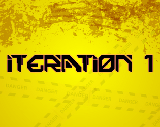
Advanced Armor Iteration 1
Concept: “Gear up with a few new pieces of cyber-enhanced equipment, including some references to popular games and media.”
Content: A set of armor, weaponry, and related tech to add to the marketplace in a game of Cy_Borg.
Writing: Equipment details are offered concisely and in a straightforward fashion, allowing item names to fill in potential flavor/character (whether they’re references to media or not).
Art/Design: Black text on yellow, with a faint caution tape illustration background and a similar pattern around the edges of the page.
Usability: Text is high contrast and easily readable, with a consistent organization for each item to allow quick grasp of and reference for item details as needed, including bolded damage/armor stats and a legend at the bottom of the page for some shared attributes.

After Market Parts
Concept: "After Market Parts are a series of mechs on A4, made for Kill ENGN and Cy_Borg. There will be more coming, keep an eye on this, follow along."
Content: A set of (currently) four unique mech enemies with which to populate hazardous regions of Cy.
Writing: Mostly quite concise in terms of providing stats for each mech, some have creative rules/abilities--and, in one case, a loot table--that can help a GM provide a memorable experience for their players.
Art/design: While each color scheme is a bit different, the files all have a consistent layout of a central illustration of the mech with boxes of stats & rule text, in a high-contrast color to the background, positioned on either side of the illustration.
Usability: Each set of abilities and explanations thereof is easy to identify and make use of.
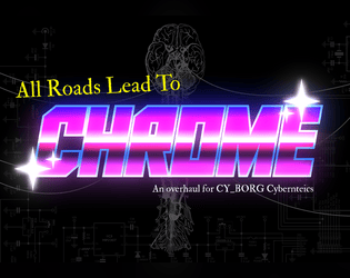
All Roads Lead to Chrome
Concept: “Being a mercenary isn't easy work. Between the gunfights, dealing with shady corps, and fending off crazed psycho's, you are bound to get hurt. Sure, you can train to get better at handling these types of situations, and maybe you can shill out some creds for a new gun or two. But eventually, no matter what path you take, if you really wanna hit the big leagues…”
Content: A set of rules to flesh out cyberware and cy_rage, along with several new drugs and a job to snag some cargo from a tech-obsessed cult.
Writing: Accessible and concise rules, with lots of detail and explanation provided for the assorted cybertech and the job.
Art/Design: A mix of white-on-dark (for the cybertech rules & drugs) and black-on-white (for the job). Occasional images complement page text, with a brain-shaped map provided (and keyed0 for the job. Bright colors and bold text highlight important information and serve as headers. A print-friendly black-on-white version of the cybertech rules is also included.
Usability: Readable fonts, visually recognizable organization of page contents thanks to spacing/grouping and section borders. Consistent application of particular color choices and bolding to help with navigating and locating desired information.
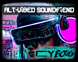
Alt-Vibed Soundfiend
Concept: “The pumping beats of the last Post-Grunge Blitz-Rave still course through your veins.”
Content: A class for the circuit-bending audiophile who’s long wanted to use their love of sick riffs and beats to obliterate the enemy.
Writing: Brief glimpses into a fully-formed lingo for the class detonate idea-bombs about how to live, and not just use, the vividly described mechanics provided here.
Art/Design: Filtered neon cityscapes and a close-up of a soundfiend on the prowl stand out as strongly as the bold, distinct headings for each set of class details/features.
Usability: General organization is quite navigable, although some font choices can make reading tricky; similarly, HP & Glitch calculation details blend into the background image.

Anarchy Is What Corporations Make of It
Concept: "Corporations are the main antagonists of any Cyberpunk Dystopia. But they're not exactly behaving like they should be in that fictional climate. Instead, Gamemasters rely on old tropes to portray corporations as state-like institutions, with the only difference being that they're profit-driven.
This 15-page zine presents Corporations in a new light, based on political theories from International Relations & Geopolitics. It seeks to highlight the much shadier side of corporate rule: the fact that, in a world without governments, corporations would rather nuke each other into the ground if it meant the bottom line was a bit greener.
It also describes how it affects the lives of regular individuals, all while introducing 4 new mechanics in order to enhance play smoothly. Make your cyberpunk stories deeper without adding unnecessary complexity.
Make your corporations dynamic, ever-changing and profit-driven the way it was always intended. Remember: Corporations are the New Gods because they own you and everything you do or desire."
Content: Part treatise, part suggested mechanics and ideas for GMing a cyberpunk-focused TTRPG.
Writing: A concerted effort to situate the political, social, and economic ramifications of corporatist systems/structures in an accessible way for GMs and players who may struggle with what "cyberpunk" as a genre attempts to attend to.
Art/design: Colorful two-page spreads with distinct aesthetics and points of focus, often with complementary illustrations centered in a spread or along its margins.
Usability: Font choices and sized vary, although highlighted embellishment is consistent throughout. Busy and low-contrast background pattern images can make some pages incredibly difficult to read/parse.
Loading next page...
Page 1 of 5
Next page