JKW
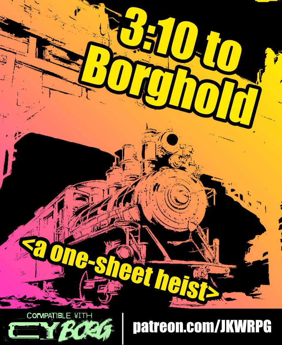
3:10 to Borghold
Concept: “It's time to rob a train---CY_BORG style! Do your research, plan your approach, and extract a high-value target from a prison transport before you're overwhelmed by security forces. Get in, get out, get paid!”
Content: A job to take care of (kill or extract) a target on a prison train.
Writing: Lots of helpful and flavorful details throughout from preparation to execution to tips on how different approaches/plans might play out.
Art/Design: Three-column landscape spread with an illustration of a train in the top center and white-on-black text with yellow headings all around.
Usability: Consistent organization and presentation of text (headings, bolded details, etc.) to make navigation and identification of desired details easy.
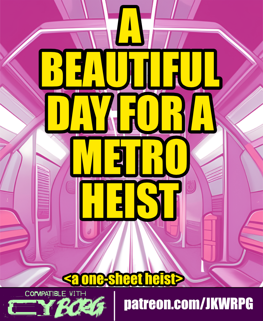
A Beautiful Day for a Metro Heist
Concept: “The heist begins as the PCs are traveling on the metro. First, the train blows past their stop. Then, the door locks engage. Finally, the train starts going fast. REALLY FAST. CYSG puts out a localized RCD blast: ‘To all aboard, the train has been hijacked… ...stop the train, get a reward… ...you have approximately...twenty minutes before the train derails…’”
Content: A gig to put a halt to a train-jacking.
Writing: Concise descriptions with bursts of flavor to flesh out train car events, inhabitants, and potential outcomes.
Art/Design: White on black with pink and yellow accents. Wide spread of content across quartered sections, with a diagonal map of a train car cutting across them. Illustrations of a train car interior and an NPC portrait accompany the text.
Usability: High contrast text/ground. Initial read-through may be somewhat confusing, as supplement “begins” on lower left and then moves up and to the right across multiple separated sections of diagonally oriented content. A player handout of train car map/layout is included.
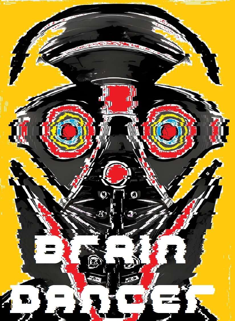
Brain Dancer
Concept: “Chiphead. Holobob. Eyerot. People talk a lot of shit. Let them. You know something they don’t: the whole world’s a stage, and you’re a motherfucking star. All you gotta do is keep dancing, and let the brain-tape roll.”
Content: A class for the talent, the face, the influencer, the fame addict.
Writing: Intriguing class features that evoke a mix of excitement and outright horror that feels completely appropriate for the streets of Cy.
Art/Design: Two-page spread with a portrait illustration of a brain dancer on the left with class features in creatively organized tables on the right.
Usability: For the most part, each section of content is visually distinct from the others, which makes for easy navigation on the page. However, the file is provided as a PNG, so text is not embedded (no searching or copying/pasting available).
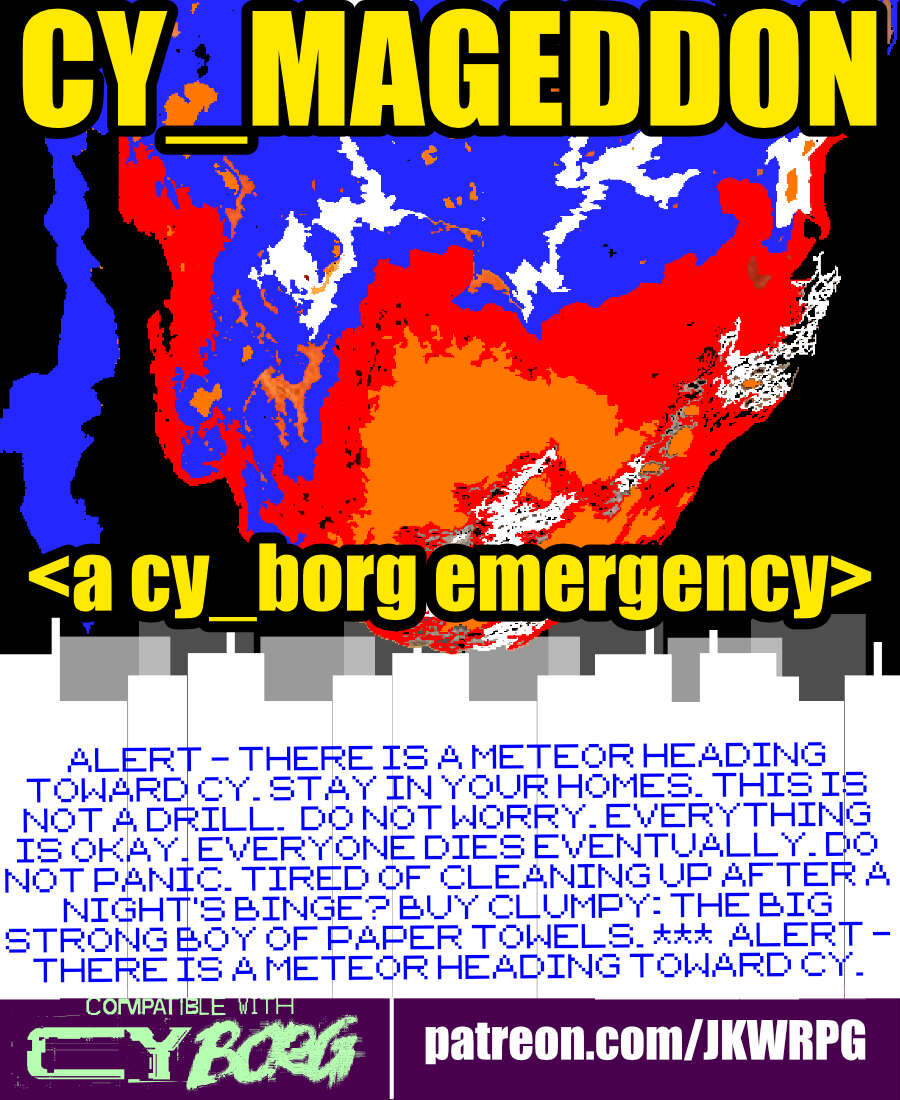
CY_MAGEDDON
Concept: “ALERT - THERE IS A METEOR HEADING TOWARD CY. STAY IN YOUR HOMES. THIS IS NOT A DRILL. DO NOT WORRY. EVERYTHING IS OKAY. EVERYONE DIES EVENTUALLY. DO NOT PANIC. TIRED OF CLEANING UP AFTER A NIGHT'S BINGE? BUY CLUMPY: THE BIG STRONG BOY OF PAPER TOWELS. *** ALERT - THERE IS A METEOR HEADING TOWARD CY. STAY IN YOUR HOMES. THIS IS NOT A DRILL. DO NOT WORRY. EVERYTHING IS OKAY. EVERYONE DIES EVENTUALLY. DO NOT PANIC. TIRED OF CLEANING UP AFTER A NIGHT'S BINGE? BUY CLUMPY: THE BIG STRONG BOY OF PAPER TOWELS.“
Content: A job to fly into outer space and destroy an incoming meteor that seems (intentionally) chock full of Bayhem.
Writing: Lots of informative details provided to help guide a GM through assorted possibilities/contingencies, tinged with sardonic in-game descriptions meant for players.
Art/Design: Three-column (one-sided) trifold arrangement with white and yellow text on black. A blue and orange illustration of a meteor hurtling toward CY occupies the top central area of the page.
Usability: High-contrast text, readable fonts, and consistent use of spacing and text ornamentation (for headings, important terms/concepts, etc.) all contribute to an easy time perusing and navigating the document.
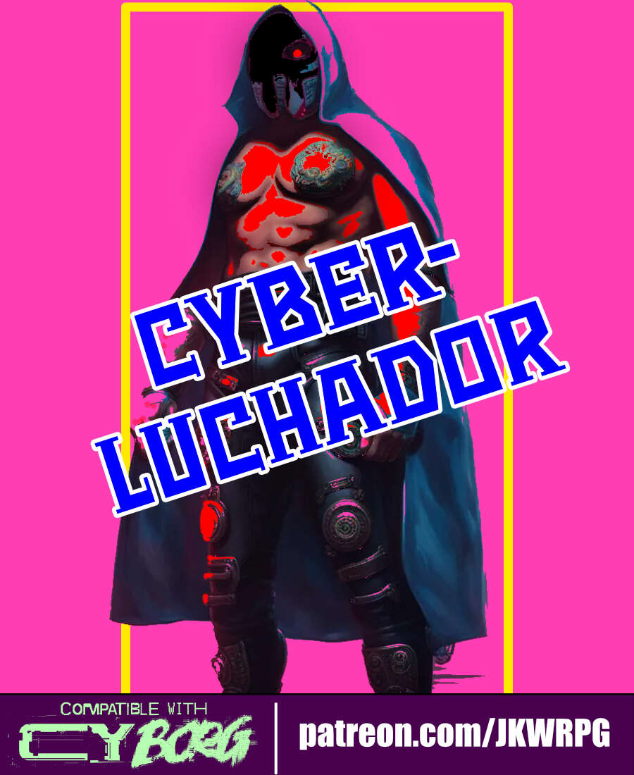
Cyber-Luchador
Concept: “Take to the skies as an unarmed specialist and wrestling phenom! Use your fists and your repertoire of deadly special moves to bring your foes to their knees.”
Content: A class for the punk who lives to bring kayfabe to every battle.
Writing: Mostly informative text complemented by thematic description so as to focus the reader’s attention on embodying the luchador character.
Art/Design: Three-panel spread with an illustration of a cyber-luchador in the center and text on either side. Mostly white on pink fore/ground.
Usability: Different sections of content are organized and positioned distinctly from one another to help with navigation and identification of desired details. Font size and use of bolding strengthens visual readability of text.
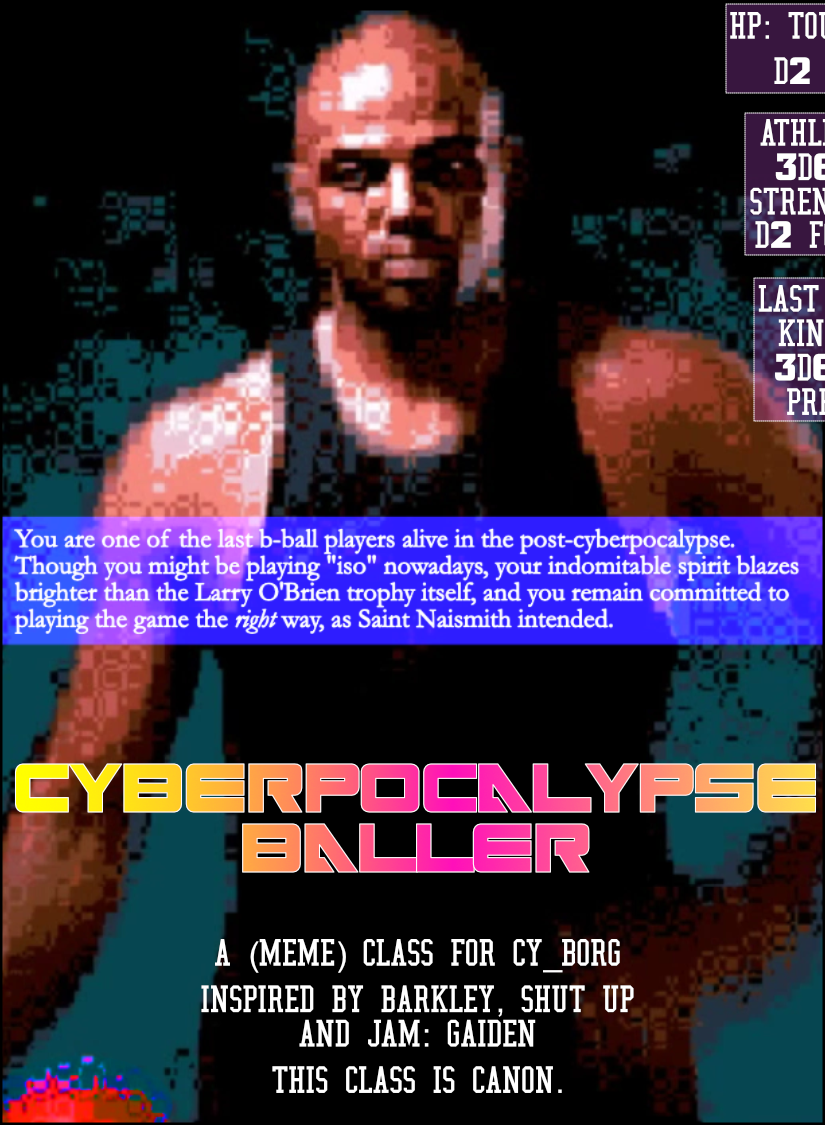
Cyberpocalypse Baller
Concept: “You are one of the last b-ball players alive in the post-cyberpocalypse. Though you might be playing "iso" nowadays, your indomitable spirit blazes brighter than the Larry O'Brien trophy itself, and you remain committed to playing the game the right way, as Saint Naismith intended.”
Content: A self-described “meme” class, for the player who understands ball is life.
Writing: Terse class feature labels and mechanics to keep the focus on core basketball elements.
Art/Design: Two-page spread with a pixelated image of Charles Barkley on the left and a cluttered ‘game plan’ arrangement of text boxes on the right, over a diagram of a basketball half-court. Text is mostly white on black/maroon and white on blue.
Usability: Visually, most text is high-contrast, with large bolded numbers to help distinguish each content item. However, text is not embedded, so no searching/selecting is possible. Also, one of the class ‘background’ tables is numbered in a potentially confusing manner for the reader scanning left-to-right and top-to-bottom.
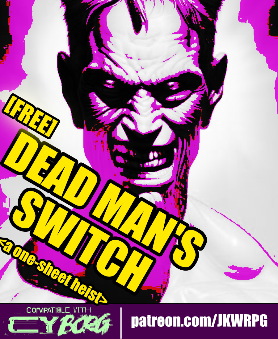
Dead Man's Switch
Concept: “Emily Radfield, a ripperdoc based in westside Laketon, received a postmortem message from her friend, Sarna---a dead man's switch. Emily hires the PCs to infiltrate a cyber-scav chop shop and recover Sarna's remains. She also wants the PCs to ‘kill as many of those scum-sucking assholes as humanly possible.’”
Content: A gig to infiltrate and retrieve a body from a scavenger stronghold.
Writing: Plenty of details to outline what the deal is, who’s involved and why, and what a GM can spring on the PCs as they seek out their target.
Art/Design: Ultra-wide four-column layout, with three columns of text on the left and a map of the chop shop on the right. Black-on-white color scheme complemented by color highlights in and around the map.
Usability: Each section of content is consistently presented, with distinct whitespace and border use to indicate particular kinds of content. Bold and italics help to emphasize key elements GMs may want to attend to.
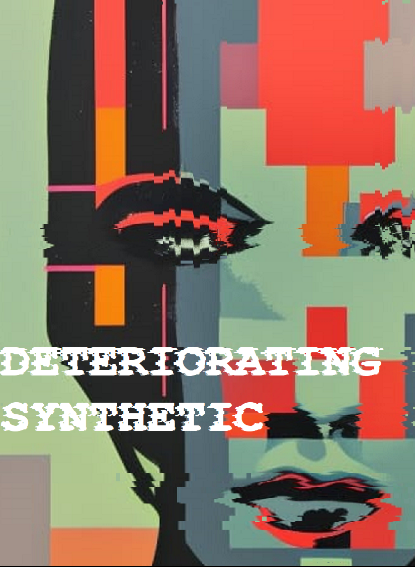
Deteriorating Synthetic
Concept: “Your time’s almost up. Like all life, you’re destined to die. The light that burns twice as bright burns half as long, and you have burned so very, very brightly. But if you are gonna burn out, you may as well take the city with you.”
Content: A class for the player whose fleeting time is an inspiration to be punk as fuck.
Writing: Incredibly brief class features and descriptions that call on recognizable archetypes from cyberpunk media to suggest character possibilities.
Art/Design: Two-page spread with class details to the left, enmeshed amidst a skyline background image, and a pixelated glitch art portrait illustration of a synthetic to the right.
Usability: Some text is very easy to identify and read, while others are a bit trickier due to contrast issues. Because class is provided as a PNG, text is not embedded (so no searching or copying/pasting is available).
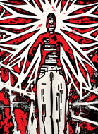
Fallen Hill Angel
Concept: “You once had it made. A life in the Hills, free from the burdens of capitalism. But something happened. You were cast out, thrown from Heaven’s Gates. Welcome to hell.”
Content: A class for anyone who had it all but now feels less than zero.
Writing: Vivid background tables and features serve as vignettes around which a tragic character can easily cohere.
Art/Design: An abstract illustration of an angel fills the left side of a two-page spread, while class details are arranged around a pattern near the center of the spread.
Usability: Distinct sections are recognizable and readable, with identifiable headings/labels. However, class is provided as a PNG so text is not selectable (no searching, copying/pasting, or screen reader functionality available)
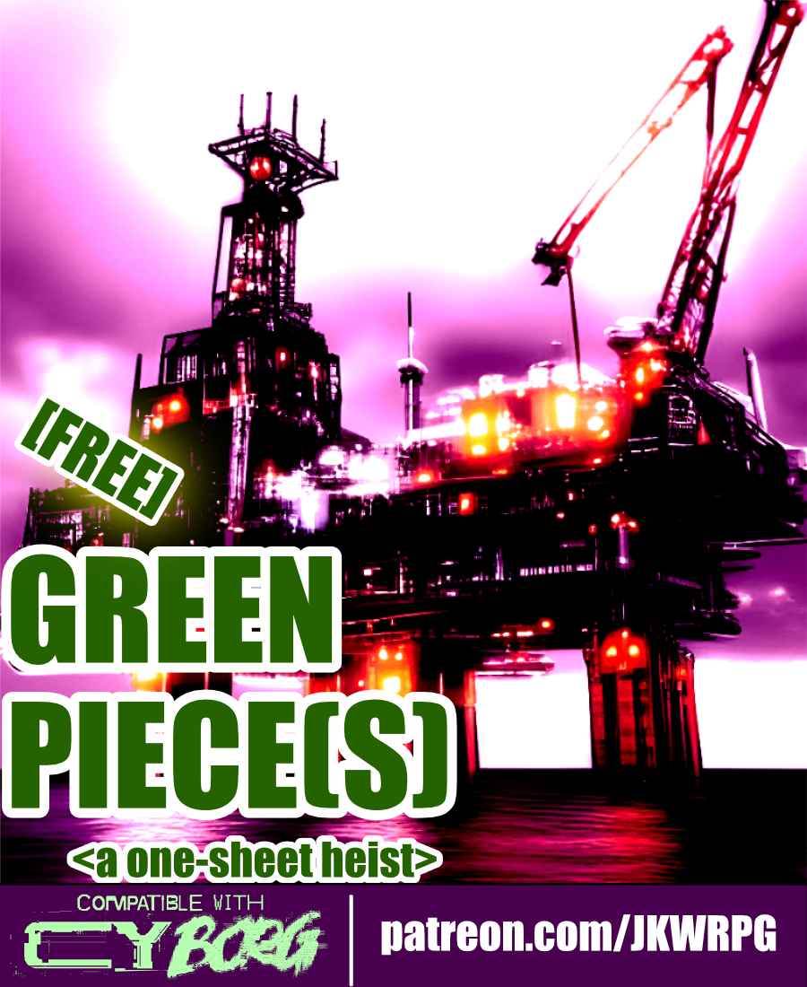
Green Piece(s)
Concept: “Radia Embtell, a junior executive officer of Cynergy Water & Power Co., has been given the onerous task of liberating an offshore oil rig from a group of eco-terrorists calling themselves “the Bitter Suns.” The Bitter Suns’ list of demands consists of but a single item: the immediate ceasing of planetary resource exploitation. “A fantasy, of course. Utter nonsense…” Radia has no idea what the Bitter Suns are planning with the oil rig—and she doesn’t care, either. She hires the PCs to retake the oil rig, “using whatever means necessary. If you can’t do the job, don’t bother coming back—I’ll kill you myself.” Though Radia isn’t one to explain herself to a group of scum-sucking street punks, she’ll let slip during negotiations that Cynergy Water & Power Co. is unwilling to mobilize its corporate military against the Bitter Suns. She will not elaborate on why, however.”
Content: A job to repossess an oil rig occupied by eco-terrorists.
Writing: Mission and NPC details, including intelligent enemy tactics and motives, are seeded with hooks and in-roads to provide players and GMs with unique experiences.
Art/Design: Wide landscape layout with four major content columns (three text columns, one overhead map illustration of the mission site). Black-on-white for most of the document, including a portrait of a key NPC; map is provided on a dark background in the main document, with a color-inverted version provided as a separate player handout image.
Usability: Consistently recognizable headings, borders, horizontal rules, and whitespace distinguish separate content sections, while bold and italicized text calls attention to important terms and information.
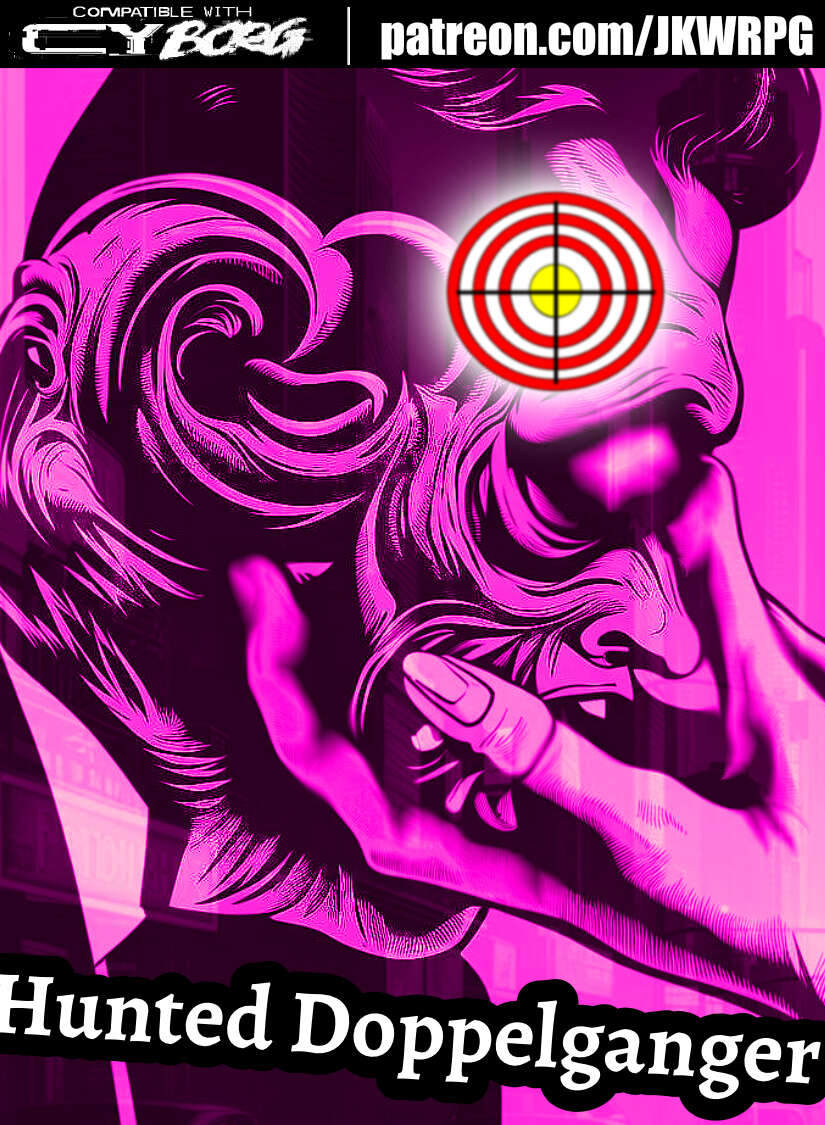
Hunted Doppelganger
Concept: ”You've worn many faces over the years: children, men, women, statesman, thieves, killers, cheats, transients and honest people alike---anyone unlucky enough to have seen you for what you truly are. A monster. A wolf in sheep's clothing. You don't know where you came from, or why you thirst for warm blood. All you know is the animal instinct. Survive or die. Hunt or be hunted. Every day is a choice. So, what's it going to be?”
Content: A class for the ultimate poseur–the one who aims to be a different person for each situation/clusterfuck.
Writing: Straightforward mechanics and abilities complemented by terse descriptors that reflect the doppelganger’s superficial disguises and underlying nature.
Art/Design: Landscape spread with (on the left side) a right-side-facing portrait of a doppelganger altering their face, with text blocks below and to the right of the image. White on black text bubble backgrounds with a pink/purple tint to the overall background.
Usability: Class file is available as JPG and PDF. High contrast text with visually readable fonts, but only the third-party license text is searchable in the PDF version.
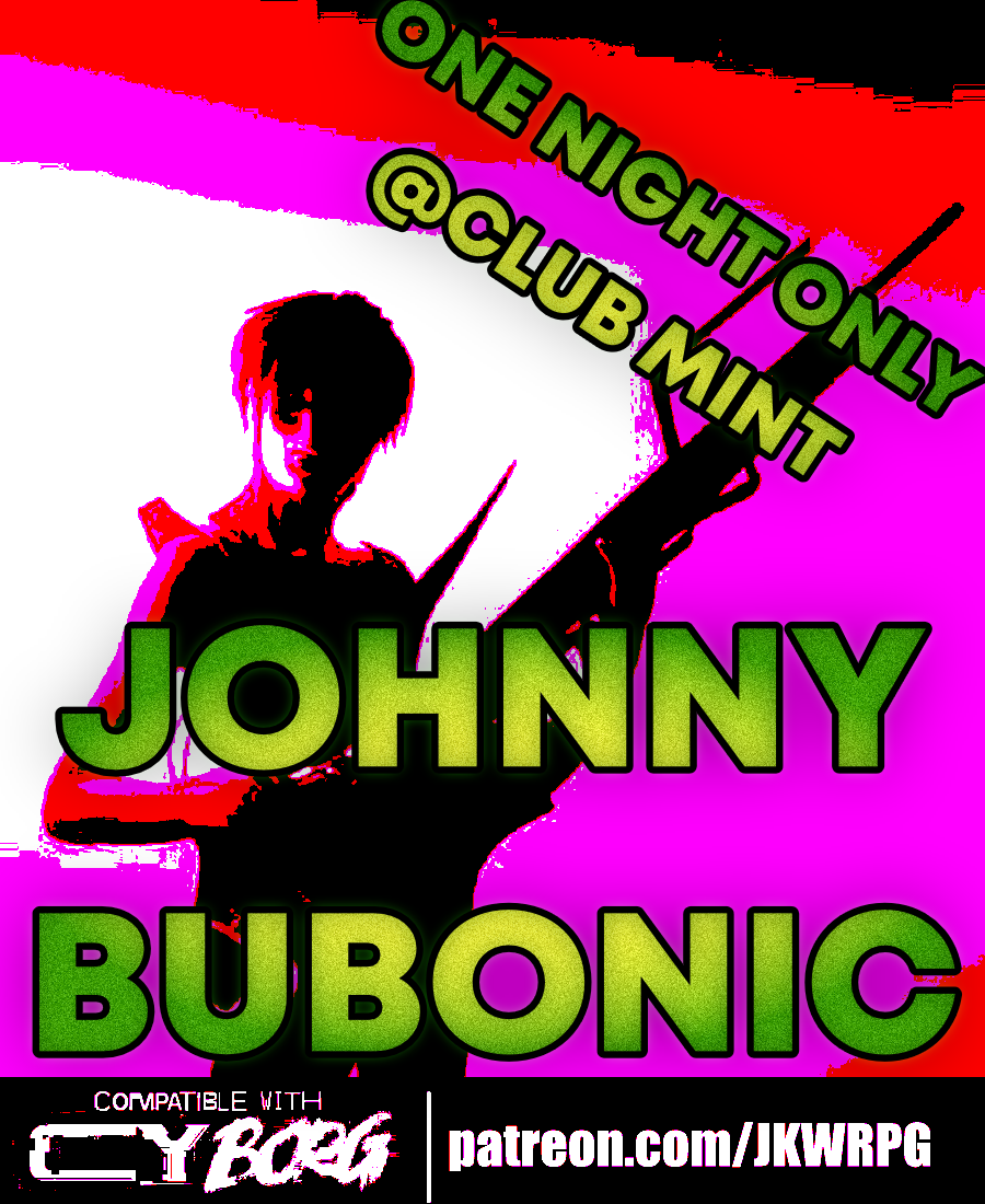
Johnny Bubonic
Concept: “Gort Phaserbekker, former front man for the mega-hit deathcore-noize band ACCESSORY TO INSANITY, has a special request for the PCs: kidnap the guy who replaced him. ACCESSORY TO INSANITY is playing a show at the “highly exclusive” Club Mint tomorrow night. Phaserbekker can get the PCs some tickets—aside from that, they’re on their own. He doesn’t give a shit how the job gets done: his only stipulation is that the target is returned alive.”
Content: A revenge mission to kidnap a musician who’s made his predecessor a has-been.
Writing: Packed full of details about goings-on at the club to provide a table with multiple sessions of fun while pursuing their target.
Art/Design: Wide two-page spread with a map of the club on the right, an illustration of a musician at the bottom, and several columns of text regarding the mission, the location, random events, NPC stats, and more.
Usability: Text is easily scannable and readable, with consistent presentation to ensure identification of desired info.
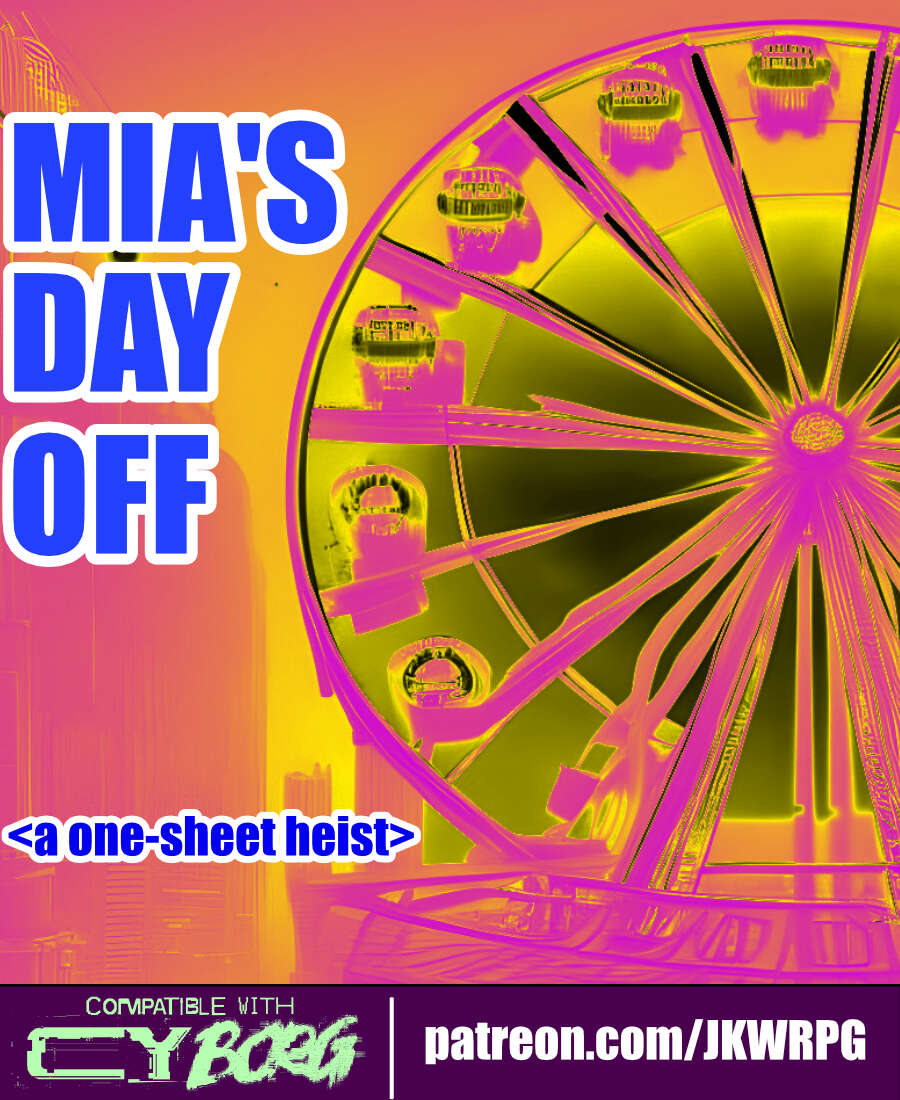
Mia's Day Off
Concept: “Masato Dvorak, a Virid Vipers crime lord, needs someone to take Mia Dvorak—his wife—out for the day. He instructs the PCs to bring Mia to the Kaytell Makers Proudly Presents: Fun!™ corpo-amusement park; their job is to keep Mia safe—and, perhaps more importantly, entertained—during their visit. Mia has had a few of these “outings” in the past, and she’s yet to have a caretaker survive. Word around the campfire is that her last one, Antwan, ended up ‘thrown off a building into a glass motherfuckin’ house. Since then, he’s kind of developed a speech impediment…’”
Content: The PCs get hired to babysit a crime lord’s daughter, and fun ensues.
Writing: Concise, informative details about the mission, NPCs, and relevant events to complicate matters.
Art/Design: Four columns of content across a wide one-page layout, with a map of the amusement park on the far right. An illustration of Mia and of roller skaters complements mission text. A player handout of the amusement park map is also included.
Usability: Consistent presentation–headings/labels, whitespace, and borders–makes it easy to identify and distinguish sections of content and important details (NPCs, stats, etc.).
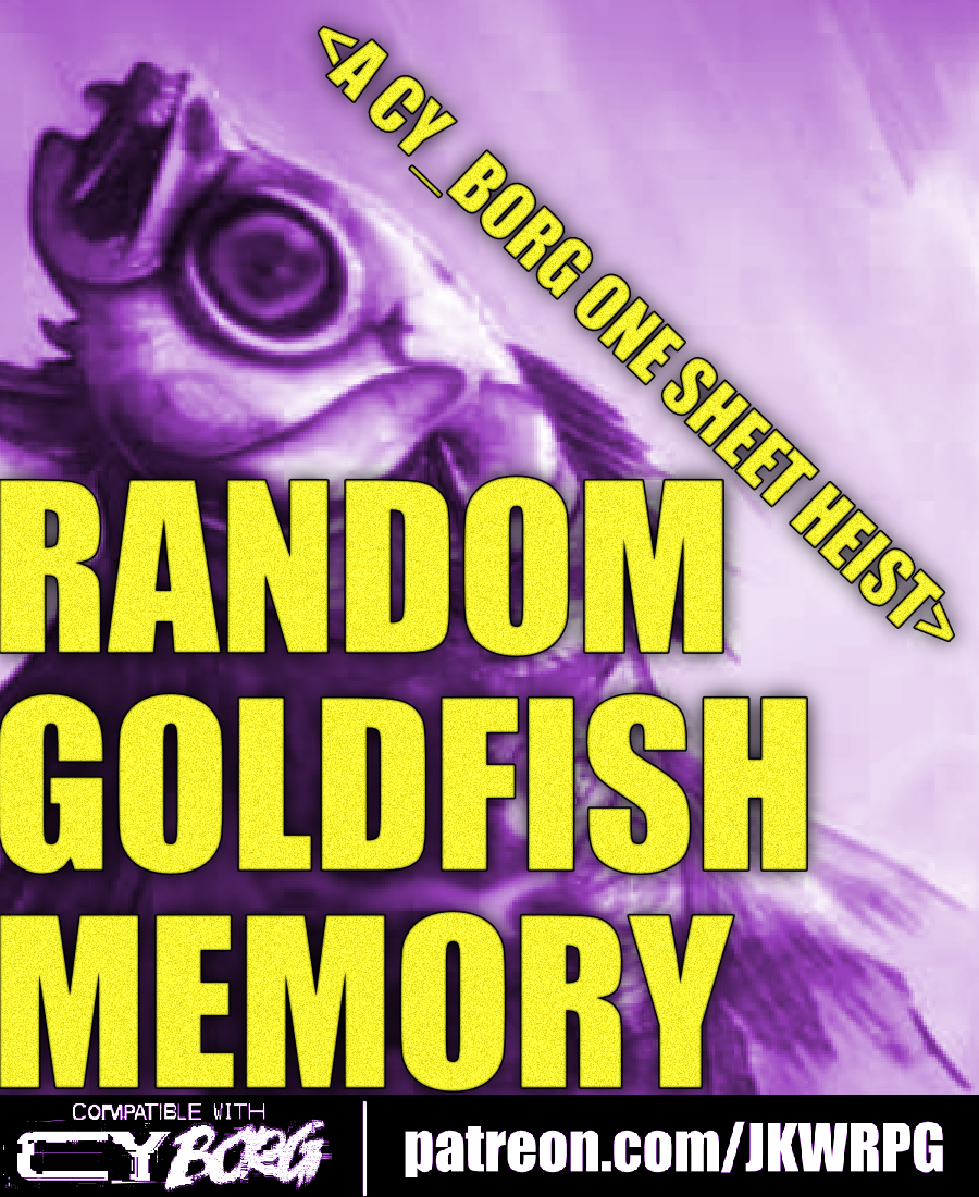
Random Goldfish Memory
Concept: “Cosmia Kowasaki, an AST Endless Seas researcher, had something stolen from her team: a data-fish with a heap of corporate secrets tucked away in its little chip-brain.”
Content: A recovery job that involves fishing for secrets at an upscale villa.
Writing: Brief but vivid details are included to cover essential dimensions of job locations, NPCs, secrets, and key events as the mission unfolds.
Art/Design: A two-page spread with mission specifics in two columns on the left and an overhead map of the site and additional information, with an illustration of the data-fish, beneath it on the right.
Usability: Text layout is readable and easily navigable, and headings/labels are consistently presented to further improve identifying and locating desired info.
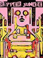
Ripper Junkie
Concept: “You’re a self-surgery maniac, but more than that, you’re an artist. Your body is a canvas, and you gladly suffer for your work. Get rippin’.”
Content: A class for the self-improvement enthusiast who’s never quite satisfied with their work.
Writing: Brief but characterful class traits and mechanics.
Art/Design: Two-page spread with black/yellow/pink-scheme. Two tables are provided on the left side and an abstract illustration of a ripper junkie on the right, with brief class details laid over it at various points on the page.
Usability: Class features are in mostly easy-to-recognize sections, although a few might get initially overlooked where they blend in a bit to the right-page image. Some text is quite small, and since class is provided as a PNG, text is not selectable (so no searching, copying/pasting, or screen reader compatibility).
Loading next page...
Page 1 of 2
Next page