Jobs/Missions
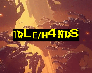
1DLE/H4NDS
Concept: “There's been a hushed-up incident at the Naiman Cybernetics factory in Bigmosse. The corpos are sweating and they need it cleaned up- fast and off-the-books. Head in and clean house, but stay on your guard: this is just the tip of the iceberg.”
Content: A clearance mission at a cybernetics facility where the situation has gotten dangerously out of hand. Content provided in three versions: a “classic look” black-on-yellow scheme, a “nite mode” black-on-gray scheme, and a “squeaky clean” black-on-white scheme that uses standard fonts.
Writing: Detailed breakdowns of locations, NPCs/enemies, potential events that might unfold (including an alternate plot hook), and an optional set of bonus goals for the PCs to achieve.
Art/Design: Each version makes use of a single-column text layout, simplified location maps, and illustrations of enemy cyborgs.
Usability: Very easily readable and navigable, with consistent use of distinct headings/labels to indicate different sections and kinds of content and important elements.
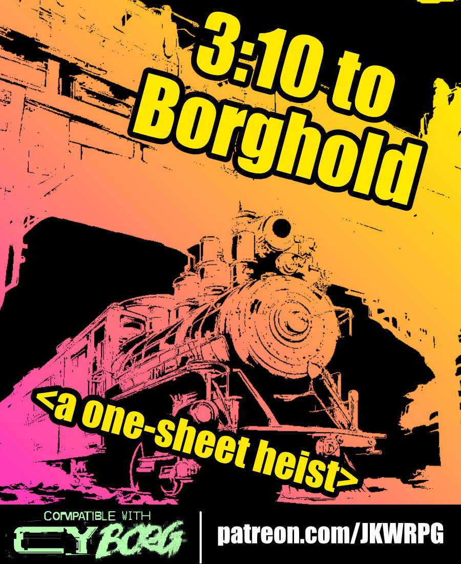
3:10 to Borghold
Concept: “It's time to rob a train---CY_BORG style! Do your research, plan your approach, and extract a high-value target from a prison transport before you're overwhelmed by security forces. Get in, get out, get paid!”
Content: A job to take care of (kill or extract) a target on a prison train.
Writing: Lots of helpful and flavorful details throughout from preparation to execution to tips on how different approaches/plans might play out.
Art/Design: Three-column landscape spread with an illustration of a train in the top center and white-on-black text with yellow headings all around.
Usability: Consistent organization and presentation of text (headings, bolded details, etc.) to make navigation and identification of desired details easy.
404.fm “THE JAMZ”
Concept: “A crazed socialite with a seemingly bottomless wallet and far more information and connections than one person in CY has any right to. He could take over this city in a matter of days, instead he’d rather play sick jams as the backing to an even sicker game.”
Content: An adventure/scenario for destructive PCs who enjoy a soundtrack to their chaos from a malevolent DJ.
Writing: Brief descriptions of tasks to complete cunningly reflect a variety of music genres that the GM is encouraged to develop a playlist for ahead of time (punk, metal, hip-hop, electronic, etc.).
Art/Design: White text on dark brick-pattern background with a hand-drawn chaotic punk in motion on the cover. Each page (focused on a musical genre and its tasks) is given unique character with font choices and text arrangement.
Usability: Large text makes identifying each element and its relation to other elements–and a similar structure for each page helps this identification and navigation. Helpful note for GMs on the last page also encourages combination and experimentation.
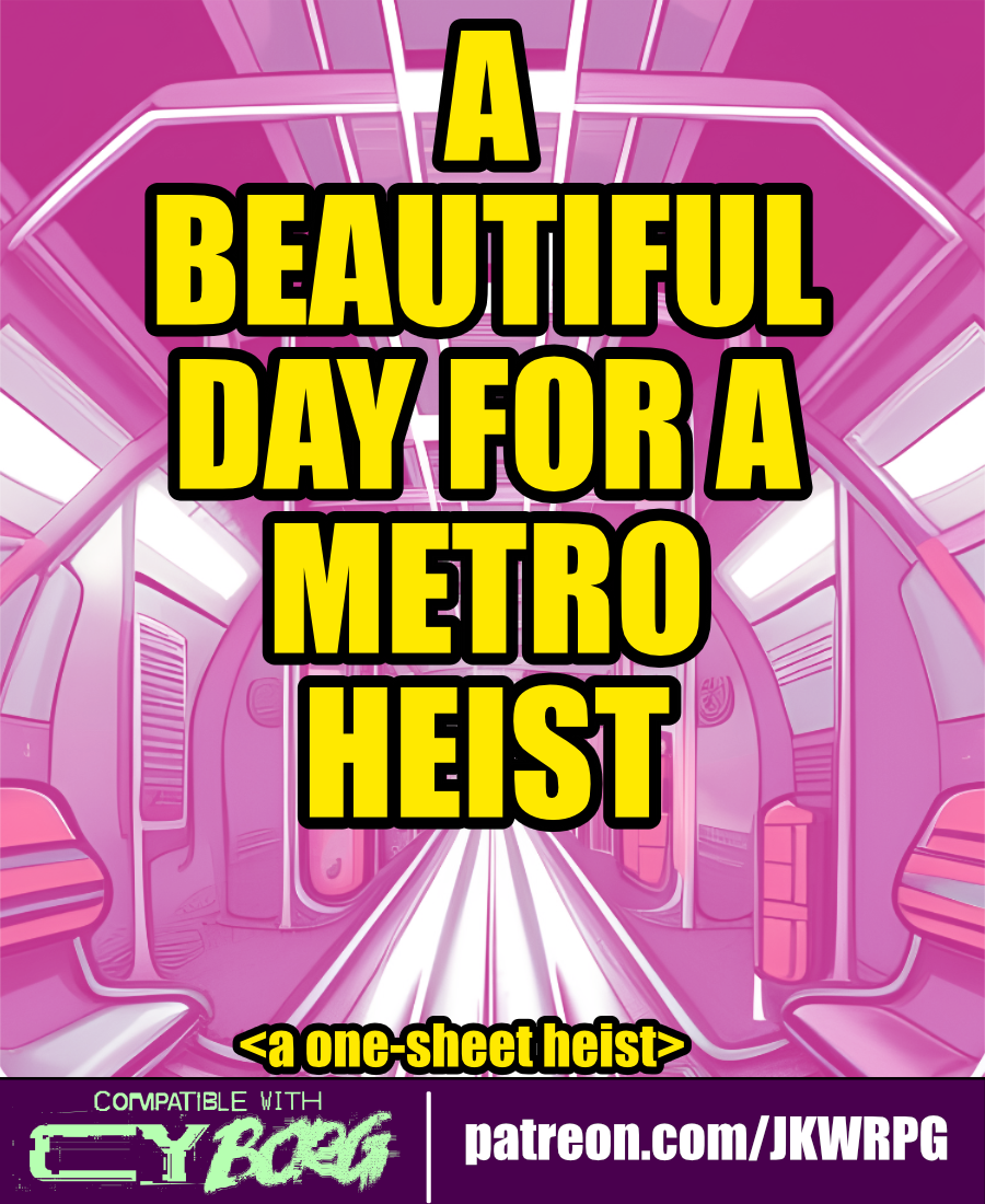
A Beautiful Day for a Metro Heist
Concept: “The heist begins as the PCs are traveling on the metro. First, the train blows past their stop. Then, the door locks engage. Finally, the train starts going fast. REALLY FAST. CYSG puts out a localized RCD blast: ‘To all aboard, the train has been hijacked… ...stop the train, get a reward… ...you have approximately...twenty minutes before the train derails…’”
Content: A gig to put a halt to a train-jacking.
Writing: Concise descriptions with bursts of flavor to flesh out train car events, inhabitants, and potential outcomes.
Art/Design: White on black with pink and yellow accents. Wide spread of content across quartered sections, with a diagonal map of a train car cutting across them. Illustrations of a train car interior and an NPC portrait accompany the text.
Usability: High contrast text/ground. Initial read-through may be somewhat confusing, as supplement “begins” on lower left and then moves up and to the right across multiple separated sections of diagonally oriented content. A player handout of train car map/layout is included.
A Botched Delivery
Concept: “This scenario was written to tie two separate groups of PCs together into one central narrative. One group of PCs are fleeing from the Reaper Repo scenario (included in the CY_BORG Asset Pack) while another group of PCs are waiting in a getaway car.”
Content: An intricate means of integrating multiple PC parties into the same story, making skillful use of the Full Auto supplement for support (required for this adventure’s vehicular component).
Writing: Focused direction for how to set up & run the encounter components (including individual NPCs) is valuable for the GM unsure of how to handle everything. Tons of ambience provided in descriptions of the scenario location.
Art/Design: Simple three-column layout across three pages, with a map illustration and room descriptions across p. 2.
Usability: Content is pretty easily navigable thanks to simplicity of layout, with some accent color and bolding choices to help distinguish section headers and important details.

A Garden of New Hope
Concept: “A Garden of New Hope is a fruitful and harvest rich module for Cy_Borg that dives into the twisted heart of The Sanctum, a seemingly blissful haven masking a sinister root cause. Bathe in mind-altering nanotoxins, overcome ruthless Keepers and Wardens, and uncover the fate of a mysterious visitor from G0. Made for those who relish moral dilemmas, accepting suicide missions from dangerously unhinged clients, and taking a nice stroll through a beautiful garden.”
Content: A job to retrieve a client’s son from a cult–or possibly something far worse–from a seemingly tranquil location.
Writing: Tons of detail about the situation, relevant NPCs, and organizations, as well as GM-oriented suggestions/advice about how to bring the mission to life.
Art/Design: ~20 pages of distinct single-page layouts with some consistent elements (heading placement, font choices, etc.) and a number of NPC illustrations. Multiple maps of the target location are also included, with room-based descriptions as well as security details.
Usability: Visually, the layout elements allow for easy identification and perusal of desired content. However, text is not embedded so searching or selecting text is not possible.
A Hundred Thousand Burned Hackers
Concept: “Nova gives you free drinks sometimes. You pay when you can. Now she needs a favor. Got herself in deep. Owes a lot of creds to some unfriendly goons. Luckily a solution walked into her bar yesterday: Abyrn Bio Corp employee, high on Rattle. Showed her a stolen “HiveShock” NNEMP prototype. Going to use it to blackmail CPHRCORP. Pulse will take out half of Cy. Worth a fortune. Nova spotted a beaconworm tracker on it. Nice tech, but an easy hack. Rooted it while Rattlemouth wasn’t looking. Now it’s her tracker, not whoever planted it.”
Content: A gig to steal some shit for a pal who deserves the help.
Writing: Densely packed details of the target office complex, enemies to encounter, events unfolding, rumors about the op, and more.
Art/Design: Trifold brochure layout with a dark-themed outer set of panels and a light-themed inner set. A labeled map is provided on one panel, and a player-facing map/handout is included as a separate file.
Usability: Sections are clearly distinguished by a consistent set of borders, headings/labels, and panel-based whitespace to facilitate identifying desired information. Text is easily readable and uses high contrast (black on white and white on black).
A Piece of the Auction
Concept: “A priceless NFT known as the Mona Lizard, goes up for auction at the famous Smotherlee’s Auctioneers tomorrow morning. Your mission is to provide security for a representative of Tulles& deVerte, who wish to add the piece to their private, tax deductible, collection. You will be provided with a driver and special dispensation to enter the hills at Galgbacken where you will collect Mx. Angel Solscraper, before continuing on to the auction house in South Central.”
Content: A scenario for the group that wants to rub elbows with the elite but also to engage in copious amounts of violence.
Writing: Focused descriptions of hook, relevant NPCs, and unfolding events all offer GMs plenty of material to build on.
Art/Design: Colorful, mostly single-column high-contrast text layouts with a variety of illustrative styles to complement page specifics. An overhead map of the auction house is provided as well.
Usability: Font choices (typefaces, size, colors) make for easy reading and consistently recognizable navigation throughout the supplement.
A$$hole$ and Elbows
Concept: “A low-level, mid-tier manager type from Aegis Conglomerated—using the screen name Mr. Greensleeves—needs an Aegis BioTech prototype implant recovered. This rare tech was “mistakenly” put down the recycle chute and ended up in a Mosscroft junkyard, Big Dumpers. As reward for recovering the implant and saving his job Mr. G promises to provide a backdoor into Aegis Financial for potential debt reduction. It’s simple: get to Big Dumpers, search for the implant, get the fuck out, and return it to Mr. G. What could possibly go wrong?“
Content: A simple search and rescue operation–but the PCs aren’t the only ones performing it.
Writing: Tons of character packed into the junkyard location (with a dozen areas of interest) and NPC details.
Art/Design: Trifold pamphlet layout that includes a map of Big Dumpers and relevant specifics on the inner panels, while job and NPC information appears on the outer panels. Color scheme is a mix of black-on-white and white-on-blue/yellow-on-blue.
Usability: Organization is easily recognizable, with headers and important information consistently distinguished from body text by font choice, size, color, and inline bolding.
All Roads Lead to Chrome
Concept: “Being a mercenary isn't easy work. Between the gunfights, dealing with shady corps, and fending off crazed psycho's, you are bound to get hurt. Sure, you can train to get better at handling these types of situations, and maybe you can shill out some creds for a new gun or two. But eventually, no matter what path you take, if you really wanna hit the big leagues…”
Content: A set of rules to flesh out cyberware and cy_rage, along with several new drugs and a job to snag some cargo from a tech-obsessed cult.
Writing: Accessible and concise rules, with lots of detail and explanation provided for the assorted cybertech and the job.
Art/Design: A mix of white-on-dark (for the cybertech rules & drugs) and black-on-white (for the job). Occasional images complement page text, with a brain-shaped map provided (and keyed0 for the job. Bright colors and bold text highlight important information and serve as headers. A print-friendly black-on-white version of the cybertech rules is also included.
Usability: Readable fonts, visually recognizable organization of page contents thanks to spacing/grouping and section borders. Consistent application of particular color choices and bolding to help with navigating and locating desired information.
Amethyst Reign
Concept: “This month’s adventure sends some street toughs on a ridiculously difficult mission — assassinate one of the world’s most famous musicians, hours before he releases his hotly-anticipated new album. He’s holed himself up in a secret recording studio, and now the PCs need to track him down and kill him before his new album influences a new generation.”
Content: A job to take down a musician before the night is over.
Writing: If most Cy_Borg missions are stripped-down punk that hint at options a GM might use, this incredibly detailed gig is prog metal. Plenty of specific considerations to address a wide variety of possible PC actions.
Art/Design: Two-column layout (plus some handouts and pre-generated character sheets) with black text on a light background supplemented with full-color illustrations, blue-on-green maps with white labels, and NPC stat boxes.
Usability: Consistent organization, arrangement, headings/labels, and readable text all contribute to an easily navigable and usable document.
An Evening at the Bionic Swan
Concept: “Dr. Ethan Nett was a lead scientist at United Citadel Security, working on an injectable, tactical A.I. enhancement for operatives. A project that was due to be shut down. However, in a moment of weakness and arrogance, Dr. Nett injected the prototype Built-in Urban Didactic Defensive Intelligent Entity (B.U.D.D.I.E.) into himself in the hopes of continuing the work off-site. Unfortunately for Dr. Nett, B.U.D.D.I.E. has managed to hijack his higher brain functions and is taking his body on a joyride. B.U.D.D.I.E. is also riddled with bugs, has a largely unstable personality and is the equivalent of an 8 year old with the processing power of a minor god.”
Content: A job to either capture/secure a scientist or extract them from imminent danger.
Writing: Engaging details for entertaining setup, execution, and aftermath/consequences of the mission.
Art/Design: Primarily white text on black in one-, two-, and three-column layouts, with occasional images–NPC portraits, silhouettes of ambient sights, and a map and logo for the bar itself.
Usability: Consistent visual grammar throughout document to indicate how each section and content element relates to the others. Helpful blue lines plot a path from one text box to the next to indicate order of unfolding events.

Android Sprinter - Of Two Faces
Concept: "One of Janus Corp’s top men has had his family disappear. Jed Billington is desperate enough he turns to you. Can you find them in time? What dark secrets will you discover along the way? What will you do when the chips are down, and all secrets laid bare?"
Content: A job to track down missing family members.
Writing: Written for both Cy_Borg and the Year Zero Engine, this scenario included Cy_Borg stats and some guidance for GMs who want to make sure its parameters fit the game scope & tone. Details included for each location punks might visit, clues they might uncover, and encounters that may occur along the way.
Art/design: Primarily organized in two-column black-on-white layouts with hand-drawn illustrations of NPCs and locations amid the text. A keyed map of one major location is also included. Two player-facing handouts are provided as separate files.
Usability: Consistent presentation of content--main body text, headings, labels, stat boxes, etc.--and Cy_Borg-specific section on NPC stats all facilitate ease of navigation and location of desired info to more easily run the mission.

APEX Singularity
Concept: "First, you PVNKS infiltrate a shady research facility protected by a powerful AI. Tough job, as usual, but this time you've got a little help——and expect a decent reward.
Then what? Do you deliver the prize to your employers, or take up any of the alternative offers you've received? Time's ticking, punk...
How greedy are you? What are you willing to betray? Who can you trust?"
Content: A job to snag an important high-tech item and then hightail it out before things go south. Also included are maps, tokens, text messages, and more to help facilitate running this job.
Writing: Evocative setup and descriptions that are likely to speak to fans of cyberpunk motifs and of J.R.R. Tolkien, with plenty of GM-oriented assistive explanations to keep a table of punks on edge.
Art/design: Black-on-white two-column layout for most pages, with assorted images (photos, illustrations, etc.) around the periphery to reflect the content of those pages. A map is included in the main PDF as well as in the "toolkit" set of materials noted above to use for running the job whether in-person or virtually.
Usability: Consistent organization and formatting of text allows for quick perusal and identification of desired info, and included explanatory details should answer a number of questions about how to approach various aspects of the job and its many potential punk-related complications/twists.
assassCYnation
Concept: “The name Adam is a ghost story corporate execs use to frighten new recruits. A faceless, unfeeling, calculating master assassin that only targets Central’s elites. Or at least he was a ghost story…”
Content: A dungeonesque excursion to hunt down an elusive corporate assassin.
Writing: Prolific details about the scenario, locations, potential events/encounters, and options that a GM might elect to include, provided in a straightforward and engaging style.
Art/Design: Dark backgrounds with one- and two-column text layouts with a variety of illustrations that draw attention to important components on each page (characters and events, especially).
Usability: High contrast between text and background facilitates reading, with font choices and colors that offer a consistently accessible experience for navigating and locating desired information, from NPC stats to roll/encounter outcomes.
Loading next page...
Page 1 of 4
Next page