Trigger Happy Jam
A Hundred Thousand Burned Hackers
Concept: “Nova gives you free drinks sometimes. You pay when you can. Now she needs a favor. Got herself in deep. Owes a lot of creds to some unfriendly goons. Luckily a solution walked into her bar yesterday: Abyrn Bio Corp employee, high on Rattle. Showed her a stolen “HiveShock” NNEMP prototype. Going to use it to blackmail CPHRCORP. Pulse will take out half of Cy. Worth a fortune. Nova spotted a beaconworm tracker on it. Nice tech, but an easy hack. Rooted it while Rattlemouth wasn’t looking. Now it’s her tracker, not whoever planted it.”
Content: A gig to steal some shit for a pal who deserves the help.
Writing: Densely packed details of the target office complex, enemies to encounter, events unfolding, rumors about the op, and more.
Art/Design: Trifold brochure layout with a dark-themed outer set of panels and a light-themed inner set. A labeled map is provided on one panel, and a player-facing map/handout is included as a separate file.
Usability: Sections are clearly distinguished by a consistent set of borders, headings/labels, and panel-based whitespace to facilitate identifying desired information. Text is easily readable and uses high contrast (black on white and white on black).
A Piece of the Auction
Concept: “A priceless NFT known as the Mona Lizard, goes up for auction at the famous Smotherlee’s Auctioneers tomorrow morning. Your mission is to provide security for a representative of Tulles& deVerte, who wish to add the piece to their private, tax deductible, collection. You will be provided with a driver and special dispensation to enter the hills at Galgbacken where you will collect Mx. Angel Solscraper, before continuing on to the auction house in South Central.”
Content: A scenario for the group that wants to rub elbows with the elite but also to engage in copious amounts of violence.
Writing: Focused descriptions of hook, relevant NPCs, and unfolding events all offer GMs plenty of material to build on.
Art/Design: Colorful, mostly single-column high-contrast text layouts with a variety of illustrative styles to complement page specifics. An overhead map of the auction house is provided as well.
Usability: Font choices (typefaces, size, colors) make for easy reading and consistently recognizable navigation throughout the supplement.
A$$hole$ and Elbows
Concept: “A low-level, mid-tier manager type from Aegis Conglomerated—using the screen name Mr. Greensleeves—needs an Aegis BioTech prototype implant recovered. This rare tech was “mistakenly” put down the recycle chute and ended up in a Mosscroft junkyard, Big Dumpers. As reward for recovering the implant and saving his job Mr. G promises to provide a backdoor into Aegis Financial for potential debt reduction. It’s simple: get to Big Dumpers, search for the implant, get the fuck out, and return it to Mr. G. What could possibly go wrong?“
Content: A simple search and rescue operation–but the PCs aren’t the only ones performing it.
Writing: Tons of character packed into the junkyard location (with a dozen areas of interest) and NPC details.
Art/Design: Trifold pamphlet layout that includes a map of Big Dumpers and relevant specifics on the inner panels, while job and NPC information appears on the outer panels. Color scheme is a mix of black-on-white and white-on-blue/yellow-on-blue.
Usability: Organization is easily recognizable, with headers and important information consistently distinguished from body text by font choice, size, color, and inline bolding.
An Evening at the Bionic Swan
Concept: “Dr. Ethan Nett was a lead scientist at United Citadel Security, working on an injectable, tactical A.I. enhancement for operatives. A project that was due to be shut down. However, in a moment of weakness and arrogance, Dr. Nett injected the prototype Built-in Urban Didactic Defensive Intelligent Entity (B.U.D.D.I.E.) into himself in the hopes of continuing the work off-site. Unfortunately for Dr. Nett, B.U.D.D.I.E. has managed to hijack his higher brain functions and is taking his body on a joyride. B.U.D.D.I.E. is also riddled with bugs, has a largely unstable personality and is the equivalent of an 8 year old with the processing power of a minor god.”
Content: A job to either capture/secure a scientist or extract them from imminent danger.
Writing: Engaging details for entertaining setup, execution, and aftermath/consequences of the mission.
Art/Design: Primarily white text on black in one-, two-, and three-column layouts, with occasional images–NPC portraits, silhouettes of ambient sights, and a map and logo for the bar itself.
Usability: Consistent visual grammar throughout document to indicate how each section and content element relates to the others. Helpful blue lines plot a path from one text box to the next to indicate order of unfolding events.
assassCYnation
Concept: “The name Adam is a ghost story corporate execs use to frighten new recruits. A faceless, unfeeling, calculating master assassin that only targets Central’s elites. Or at least he was a ghost story…”
Content: A dungeonesque excursion to hunt down an elusive corporate assassin.
Writing: Prolific details about the scenario, locations, potential events/encounters, and options that a GM might elect to include, provided in a straightforward and engaging style.
Art/Design: Dark backgrounds with one- and two-column text layouts with a variety of illustrations that draw attention to important components on each page (characters and events, especially).
Usability: High contrast between text and background facilitates reading, with font choices and colors that offer a consistently accessible experience for navigating and locating desired information, from NPC stats to roll/encounter outcomes.
Babysitting
Concept: “An easy job ! Just sit around and babysit some corpo doctor and this box. Easy money?”
Content: A gig to retrieve, guard, and escort a person and their cargo to a designated safehouse.
Writing: Prolific details to flesh out the mission and the various groups with interests in its success–or failure.
Art/Design: Trifold brochure format provides initial parameters on the inner panels and later-stage conflicts on the outer panels. Predominantly white/yellow text on black, with NPC stats in black on brightly colored boxes, with portraits and street scenes complementing text. An additional page is provided with a safehouse location map and player-facing ‘breaking news’ info.
Usability: Color-coded text references draw attention to different NPC interactions, and consistent use of content section color and shape makes for easy identification of desired info.
BR0KEN_HEARTS//BR0KEN_JAWS
Concept: "’Some desperate Alliansen admin put out a plea to rescue her AI program. Not sure why she doesn't just use company muscle to get it back, but she's promisin' the reward of "anything within her abilities," so here we are. Hope ya brought your earplugs though, cuz the goons that stole it are LOUD.’”
Content: A mission to recover an AI stolen by musicians.
Writing: Concise bursts of info to guide a GM toward notable encounters and fitting atmosphere.
Art/Design: Red and blue on black, with an aesthetic that mixes graffiti/tagging with software terminals, arranged in mostly one- and two-column layouts. A map of target location is provided in pink.
Usability: Consistent presentation of content elements throughout the document, making visual identification of headings etc. very easy. However, text is not embedded so no searching or selecting is possible.
Cur(s)e of the Candy Cult (Club TITS Unlimited)
Concept: “New Location Pad Entry. A Strip Club Dungeon inhabited by a strange Candy Cult for TRIGGER WARNING Jam compatible with Cy Borg.”
Content: A mission to liberate a cultist from their organization’s lair. A pair of player-facing handouts (including a map) is also included.
- Writing: Terse and disturbing details that emphasize the insidious nature of the candy cult.
Art/Design: Two-column layout with black, pink, and white elements. Job details and NPC stats provided on the left, complemented by illustrations of candy, cultists, and–to the right–two levels of Club TITS Unlimited.
Usability: Text is mostly high-contrast and easy to discern purpose for, allowing for easy perusal and use. Only some text is embedded, which can complicate searching or selecting text.
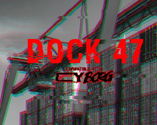
Dock 47
Concept: “You are hired by one of the most prominent gangs in CY. Your target is their former high ranking officer, Marco D’Elysio. Marco, after ratting out on his own organization, was promised immunity. The police, as usual, didn’t give a shit about their promise and left him out in the cold. He is now trying to escape in a cargo ship. But there are some complications - the engine is busted and the captain is missing. Dock 47, where the ship is sitting, is closed and full of bodyguards, those who are still loyal to Marco.”
Content: An opportunity to assassinate a rat on a docked vessel.
Writing: Several lists/tables relating to the gig/location are provided, as is a set of optional challenges for the punks to complete. Each of these entries offers a very brief but characterful dimension to the job.
Art/Design: Wide spread with text on the left and labeled maps of the ship and dock on the right. Almost entirely black-on-white except for the adventure title.
Usability: Font choices are easily readable and each section is consistently organized to quickly identify and navigate to desired info. Unfortunately, text is not embedded, so searching/selecting is not possible.
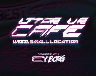
LTTPR VR CAFÉ
Concept: ”The VR Café is owned by Lotta and Perr, a hardworking couple that, strapped for cash, went to Örken, who agreed to relieve them of their debt. In return he now runs an underground operation stealing children’s imagination to create CREATIVITY_JOURNEY--v4 a drug sold under the counter.”
Content: A seedy VR cafe that’s so much sketchier than it appears–and only maybe will the punks be ready for the trouble that awaits.
Writing: Lots of flavorful sensory descriptions of the goings-on in each room of the cafe that helps immerse players into the situation.
Art/Design: Left third of the page is an overview of the locale and potential reasons for being there, while the remaining space on the page has a map with labels and room-specific information.
Usability: High-contrast text and bolded labels and distinct headings make reading and navigation easy, supported by lines to map areas (with a particularly ingenious staircase-shaped line connecting the upstairs office to its details).
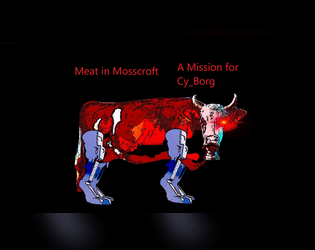
Meat in Mosscroft
Concept: “There are rumors of a warehouse owned by Gene Industrial in Mosscroft containing actual real steaks. These Bromaha steaks are supposedly in a huge walk in freezer, and they should get collected before word gets out. The street gang is offering 2d10 x 1K credits for the steaks. If they accept, Nimo will provide a small piece of paper with the address of the warehouse.”
Content: A beef break-in with the bonus of beaucoup bucks.
Writing: Deadpan descriptions lay out the absurdity of the situation, which should help a GM create a unique and memorable experience for their table.
Art/Design: Landscape-oriented pages with bright colored text on black background accompanied by relevant images of NPCs, corporate logos, and a simple map of the target facility.
Usability: Almost every block of text is a different color and font or text size than the others and positioned differently on each page, but each font is easily readable and all text is embedded for quick searching/selecting.
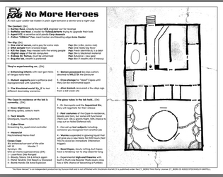
No More Heroes
Concept: “A UCS super soldier lab hidden in plain sight between a dentist and a night club.”
Content: A set of tables to generate jobs for infiltrating a lab and a map of said lab.
Writing: Vivid, unsettling bursts of description in tables (for contacts, job parameters, potential enemies, etc.) hint at possible ways for a GM to implement roll results into a unique mission.
Art/Design: Two-page black-on-white spread with tables on the left and a hand-drawn map of the facility on the right.
Usability: Text content laid out in easily navigable columns with consistent text and border formatting to identify each table’s elements and important names/phrases.
Oberon's DivaStation
Concept: “A small nightclub with a proprietor you must gain the trust of, then kill. Life here is brutal and pointless. Roll the dice, Drink, and Imbibe.”
Content: A gig to kill a club owner.
Writing: Text is mostly atmospheric, including music playing at the club, a drink menu, a drink effects table, a loot table, and a small handful of NPC stats.
Art/Design: Busy pages with lots of bright colors on gray backgrounds, with text and background illustrations, that all together reflect the tone of the mission and feel like a visual representation of the nightclub environment. A labeled map of the club is also provided.
Usability: Variety in font choices, colors, sizes, and positioning (such as over a busy background image/pattern) can drastically affect the reading experience. Text is not embedded, so searching/selecting is not possible.
Organ Heist
Concept: “Race against time to grab the coveted cyber-liver, the only thing guaranteed to filter out 99.99% of microplastics!”
Content: A job to nab a high-tech liver from a health care company.
Writing: Focused, terse descriptions focus on mechanics and unfolding events/actions, allowing a GM to inject their preferred atmosphere into the gig.
Art/Design: Trifold layout provides mission parameters/outcome and NPC details on the outer panels and map with room-specific info on the inner panels. Mostly black-on-white color scheme with full-color graphics on title panel and parameters panel.
Usability: Clearly labeled sections of content easily distinguished from others thanks to font choices and border/shading visual decorations, with text info in close proximity to relevant map location.
Penny Slots for Cy_b0rg
Concept: “An arcade location for Cy_b0rg with two jobs.”
Content: A murder-for-hire job and a cred heist in a run-down arcade.
Writing: Concise descriptions of the location and two jobs’ specifics, along with brief NPC stats and complications for each mission.
Art/Design: Black text on a white background, with simple whitespace use to distinguish sections of content. A colorful overhead map of the arcade is provided.
Usability: Text is easily readable and navigable, and different kinds of content (e.g., d6 lists/tables and NPC stats) are quickly identifiable.
Loading next page...
Page 1 of 2
Next page