Duncan Hall

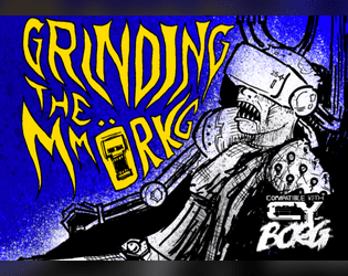
Grinding the MMORKG
Concept: “Want to use Mork Borg modules as a virtual reality simulation in your Cy_Borg game? Or to give your Mork Borg players a taste of Cy? This five-node mystery adventure path introduces the Dying Lands as an MMO game/simulation in Cy and can be approached from either game as a starting point!”
Content: The content centers on an ingenious scenario that blends Cy_Borg and Mork Borg (whether you’re starting in either game!), detailed locations and maps for each, an “emaciated sim-farmer” class that works well for the scenario, a small set of optional rules that the MMORKG facilitates, random encounters, and several pieces of equipment to consider buying.
Writing: A mix of thematic narration, straightforward rules explanations, and direction for PCs to respond to–all of which is presented succinctly and consistently throughout the supplement.
Art/Design: Distinct layouts for each section (major adventure locations, PC class, etc.) that provide individual character about its subject matter, with a bright accent color to help underscore section distinction and scope.
Usability: Despite the variety of page layouts/aesthetics, text is consistently readable and identifiable as different kinds of content (headings, labels, NPC stats, etc.).

Magenta Pages of Cy_
Concept: “A collection of one-page, one-shot gigs for your favorite sci-fi RPG, with Cy_Borg compatible stat blocks.”
Content: Several adventures, each on its own two-page spread. Two have been previously published individually: “No More Heroes” and “The Trouble with Ta1l-Yp-0.”
Writing: Each adventure provides a focus on description and ambience, supported with brief mechanics (NPCs, random encounters, etc.) for GM use.
Art/Design: Some adventures are provided with a map on the right-side page, while one has a hand-drawn illustration of a key NPC in its habitat. The left side of each adventure is black-on-white text arranged in one and two columns of distinct content sections.
Usability: Fonts are readable, with visually evident features for headings, labels, and body text (which might differ between each spread but is consistent for a given adventure). Borders and white space help separate distinct text blocks.

No More Heroes
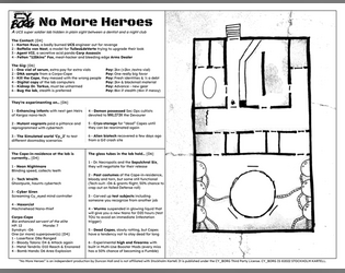
Concept: “A UCS super soldier lab hidden in plain sight between a dentist and a night club.”
Content: A set of tables to generate jobs for infiltrating a lab and a map of said lab.
Writing: Vivid, unsettling bursts of description in tables (for contacts, job parameters, potential enemies, etc.) hint at possible ways for a GM to implement roll results into a unique mission.
Art/Design: Two-page black-on-white spread with tables on the left and a hand-drawn map of the facility on the right.
Usability: Text content laid out in easily navigable columns with consistent text and border formatting to identify each table’s elements and important names/phrases.

Trouble with TA1L-YP-0
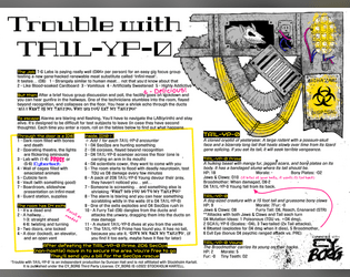
Concept: “It's a real easy gig... Just taste test T-G Labs new Infini-meat and participate in a quick focus group! You'll soon be on your way with a fistful of kreds. Where's the meat come from you ask? I'm afraid we can't share that proprietary information.”
Content: A mission to survive a marketing research meeting.
Writing: Brief bursts of flavor and mechanics (including an intriguing set of maze/escape tables) directed to both GM and player.
Art/Design: Landscape-oriented black-on-white spread (with yellow, pink, and blue highlights) includes a hand-drawn illustration of a cryptid in the top right corner, and two main columns of text content (the left of which has two columns of tables within it).
Usability: Consistent presentation of content, with visually identifiable headings, labels, and marginal notes. Layout makes referring to specific info easy, especially stats for NPCs appearing in maze room encounters.
Page 1 of 1