Gear/Items
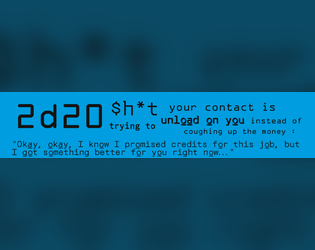
2d20 $h*t Your Contract Is Trying to Unload on You Instead of Coughing up the Money
Concept: “Your guy is trying to unload their garbage on you, maybe they want to get rid of it, maybe they are trying to scam you, maybe they genuinely don't have the money, maybe it was their plan all along…”
Content: A table of goods–some junk, some potentially valuable–that a GM might use to sprinkle in some randomness into a punk’s payday.
Writing: Tons of flavor crammed into brief descriptions of a variety of items.
Art/Design: Two versions: black-on-white and black-on-blue, each provided in primarily two-column text layout.
Usability: Both versions provide visual contrast between fore and ground, with readable font choices and consistent use of headings and list item numbering.

6 Prétirés Marginaux | [FR]
Concept: "Six Punks Anti-Corpo avec les poches vides.
Six ratés enragés et drogués
Six sacs à viandes qui tombent sous les balles et le feu numérique."
Content: A set of six character sheets with the characters already generated/rolled-up, with information in French. Also available is an experimental weapon, the "Gravitational Beam Emitter," that has high risk but very high reward for use.
Writing: Focused description and clear articulation of relevant rules/mechanics for each character class represented on one of the included sheets.
Art/design: The default Cy_Borg character sheets are used, with added text in French in high-contrast monospace fonts. The Gravitational Beam Emitter has info in a full-color black-and-white on purple spread showing someone firing the weapon (.jpg) and a text-only version (.pdf).
Usability: While visually each character sheet is readable and, thanks to the sheet layout, recognizable for use in particular ways, the included PDFs do not have embedded text. As a result, the contents are not searchable or selectable. (The PDF for the Gravitational Beam Emitter has embedded text.)
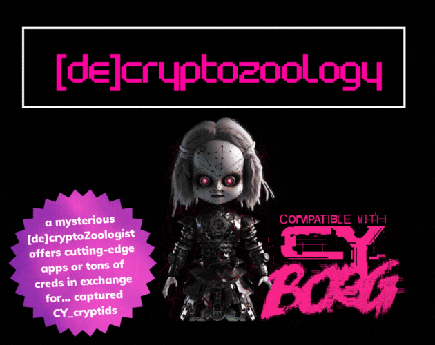
[DE]CRYPTOZOOLOGY
Concept: “In the shadowy depths of neon-lit Cy_, where man, creature, and machine meld into one, enigmatic |0r3N_C0@lM@N3|, a [de]cryptoZoologist, obsesses about cryptids. Offering bountiful creds or cutting-edge apps as rewards, she lures runners into capturing these elusive beings, her true intentions shrouded in mystery.”
Content: A collection of useful cryptid-related information and inspiration: a NPC and their laboratory, several NPCs, and a set of apps.
Writing: Descriptive overviews for entries along with mechanics that reflect the character of each.
Art/Design: Trifold pamphlet layout with pink and white on black, with each panel presented mostly as a single column of text and glitch-aesthetic illustrations.
Usability: Layout and text contrast provides easy reading and browsing for desired info.

ADDITIONAL_CYBERTECH
Concept: “10 additional Cybertechs for CY_BORG.”
Content: A set of cybertech options for further bodily customization.
Writing: Cybertech names and features are imaginative, suggesting creative opportunities for timely uses.
Art/Design: Two-column spread, with table of cybertech options on the left and a black-and-white illustration of an individual with significant cybernetic modifications. A black-on-white print-friendly version is also included.
Usability: Table contents are cleanly organized, with color/bold highlights for table row numbers and costs for each cybertech.
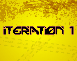
Advanced Armor Iteration 1
Concept: “Gear up with a few new pieces of cyber-enhanced equipment, including some references to popular games and media.”
Content: A set of armor, weaponry, and related tech to add to the marketplace in a game of Cy_Borg.
Writing: Equipment details are offered concisely and in a straightforward fashion, allowing item names to fill in potential flavor/character (whether they’re references to media or not).
Art/Design: Black text on yellow, with a faint caution tape illustration background and a similar pattern around the edges of the page.
Usability: Text is high contrast and easily readable, with a consistent organization for each item to allow quick grasp of and reference for item details as needed, including bolded damage/armor stats and a legend at the bottom of the page for some shared attributes.
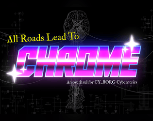
All Roads Lead to Chrome
Concept: “Being a mercenary isn't easy work. Between the gunfights, dealing with shady corps, and fending off crazed psycho's, you are bound to get hurt. Sure, you can train to get better at handling these types of situations, and maybe you can shill out some creds for a new gun or two. But eventually, no matter what path you take, if you really wanna hit the big leagues…”
Content: A set of rules to flesh out cyberware and cy_rage, along with several new drugs and a job to snag some cargo from a tech-obsessed cult.
Writing: Accessible and concise rules, with lots of detail and explanation provided for the assorted cybertech and the job.
Art/Design: A mix of white-on-dark (for the cybertech rules & drugs) and black-on-white (for the job). Occasional images complement page text, with a brain-shaped map provided (and keyed0 for the job. Bright colors and bold text highlight important information and serve as headers. A print-friendly black-on-white version of the cybertech rules is also included.
Usability: Readable fonts, visually recognizable organization of page contents thanks to spacing/grouping and section borders. Consistent application of particular color choices and bolding to help with navigating and locating desired information.
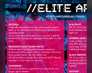
App's 4 Elite
Concept: “A bunch of custom APP's for CyBorg, to make hacking and hackers more fun.”
Content: A set of apps for the discerning hacker, whether they work with or against the PCs.
Writing: Imaginative descriptions and mechanicals effects that feel quintessentially cyberpunk.
Art/Design: Two-column layout of white text on translucent pink over a dark blue patterned background.
Usability: Clearly distinguishable app entries provide easy navigation, and text/background contrast provides accessible readability.
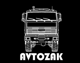
Avtozak
Concept: “Avtozak is a Cy_Borg expansion about riots.”
Content: A set of riot-related NPCs, weapons, and a table of riot causes.
Writing: Terse, frank descriptions and stats/mechanics for included content.
Art/Design: Illustrations of riot vehicles and participants (cops and protesters) with highlight colors are positioned alongside relevant high-contrast text.
Usability: Font choices are readable, with headings/labels and background colors for distinct sections that assist navigation and perusal.
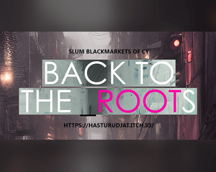
Back to the Roots
Concept: “A custom collection for Cy_Borg ttrpg, that includes:
- 13 new weapons, 6 new drugs, 4 new items - made in the slums of CY.
- 11 new street-made cyber-tech and 9 new APP's
- Short descriptions of 5 new slum Gangs
- A simple and short Adventure/Mission.”
Content: Tons of material to flesh out a game, from equipment to drugs to gang NPCs/enemies, with a scenario in the slums to take down a sadistic AI (and a map for the location).
Writing: Concise, direct descriptions and explanations of mechanics for a huge number of entries for various categories.
Art/Design: Mostly two-column page layouts (each with its own color scheme/aesthetic) with content on a translucent background pane over detailed, high-tech images. Map of floorplan includes effective icons indicating room features.
Usability: Text is easily readable with distinct heading/label decoration present in each page’s layout aesthetic.
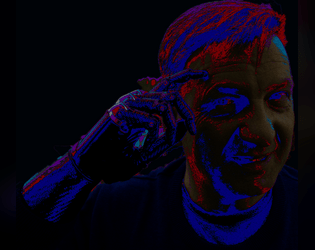
Blackhand's Blackmarket
Concept: "Listen choombatta, I just finished trekking to this MegaCity from beyond the pond. Either you buy this gear or you scram! I'm tired of punks trying to haggle - these are the prices, these are the wares, do not *%$! with me!"
A lone grey-haired man with a black van stands in front of you. All he's carrying is a revolver and a black cybernetic hand. Somehow, you catch the feeling that he knows more about Cy than you ever will…
And he's selling Cybertech & Drugs! New mechanics are associated with them, giving you the EDGE you need to topple your enemies - but, as all addictions and drugs and hubris, it comes with severe costs/drawbacks. Are you willing to take the hit and chrome up? The dark future awaits…”
Content: A set of six drugs and six pieces of cybertech for punks to use or misuse on the streets of CY.
Writing: An intriguing mix of mechanical effects (some more complex or complicated than others) and their very colorful names.
Art/Design: Yellow and pink text (one color on each page) over a dark background illustration.
Usability: Text is mostly visually contrasted enough to be readable, although some background elements may momentarily slow reading or browsing. Text is not embedded so no searching/selecting is possible.
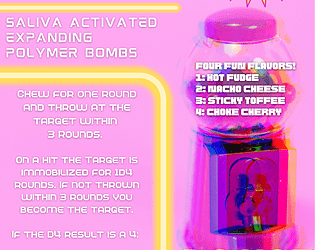
Bombles Chewable Grenades
Concept: “Yum! Delicious Bombles Chewable Grenades, a piece of equipment compatible with CY_BORG RPG. (DO NOT SWALLOW)”
Content: A fun and tasty way to weaponize one’s food.
Writing: Concise, direct explanation of bombles and how they operate mechanically.
Art/Design: White-on-pink (and yellow highlights) advertisement aesthetic with an image of a gumball machine on the right side of the page.
Usability: Info is easy to navigate and recognize particular content details, from bumble flavors to mechanical effects to credit cost. Supplement is provided as an image file, so text is not searchable or selectable.
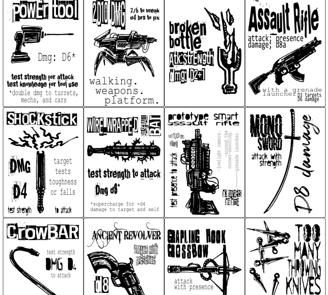
Cy_Borg Printable Weapons
Concept: “Printer Friendly weapons based on weapons and rules of CY_Borg.”
Content: Eighteen weapon tokens/cards to be printed out for use in a game of Cy_Borg.
Writing: Very brief rules/mechanics for each weapon to facilitate their use.
Art/Design: Black-and-white aesthetic with a grid of tokens/cards to be printed and cut for individual use. An image of each weapon is provided, along with relevant text (name of weapon and its mechanics) surrounding the image in different font faces/styles.
Usability: Some fonts are much easier to read than others due to text size, contrast, character ornateness, etc. Because files are PNGs, text is not searchable/selectable.

CY_OPS issue one
9 contributors
Concept: “CY_OPS is a 66 page A6 player-facing CY_BORG zine presented as an in-universe punk zine. No mechanics, no stats, just a chaotic little zine full of worldbuilding, quest hooks, items and a bunch of other cyberpunk stuff for your players to use in your CY_BORG games.”
Content: NPCs full of personality quirks, unique equipment ideas, and scenario/adventure ideas casually scattered across hectically organized spreads mixing hi- and lo-fi design and tech aesthetics. "Activity" pages offer even more direct involvement with the document.
Writing: Infectiously fun, engaging ideas presented as in-universe media, from QR codes to other CY_BORG material to instruction manual pages to chat transcripts and more. “Worldbuilding” feels like an understatement.
Art/Design: Two-page spreads stand mostly independent of one another, with some common fonts and illustration styles that draw attention to a wide range of character, occupation, and gear-related concepts that open up even more possibilities for immersing a party in CY.
Usability: Different spread layouts may not assist with consistency, but text is mostly high-contrast and readable (some pages’ white on pink might be difficult for some readers, as is text perpendicular to main orientation). Sheer amount of content is likely to keep readers interested and closely perusing each page.
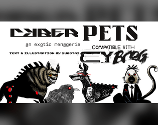
Cyber_Pets
Concept: “_EMPORIUM.ltd can not -and will not- be prosecuted or held responsible for damages, accidents, manglings, ablations, amputations, mutilations, rippings, crushings, decapitations or general acts of violence perpetrated by its proprietary software or hardware. (see UGC p.314, 34-95, all responsibility surrendered.)”
Content: A set of ten purchasable cyber-pet options (six “protection” and four “exhibition” options) and several mods to further enhance a given pet.
Writing: Categorical and pet-specific descriptions smoothly blend in-universe sales pitches and mechanical effects to entice an animal companion-seeking connoisseur.
Art/Design: Black text on white in mostly one- and two-column layouts, complemented by black-and-white illustrations of multiple pets sporting red highlights.
Usability: Sections and distinct kinds of content are consistently presented throughout, with visually readable text content. That said, some text is searchable/selectable but some is not, which might complicate some readers’ experience.
CYTOBER 2023
- Concept: “A compilation of items, rules, enemies, and more for CY_BORG based on the Exeunt Press #MÖRKTOBER 2023 prompts. Originally posted on @krasiph.bsky.social and compiled here for ease of use. Some entries have been modified to include extra information such as prices and item types.”
- Content: Thirty-one spooktacular entries reflecting the year’s Mőrktober prompts, from weapons/apps/gear to NPCs to powers, food, and environmental phenomena.
- Writing: 1-2 brief paragraphs of potent content (descriptive and informative/mechanical) for each entry to frame it within the prompt’s overarching theme.
- Art/Design: Mostly black-on-white (some white-on-black) with green highlights with a range of item heading fonts and accented background splatter effects.
- Usability: Consistent content elements–heading, item number, description–facilitate browsing, even as arrangement of list items deviates at times from left->right, top->bottom orientation. Plain text version is also provided for potentially easier perusal.
Loading next page...
Page 1 of 3
Next page