subotai

2d20 $h*t Your Contract Is Trying to Unload on You Instead of Coughing up the Money
Concept: “Your guy is trying to unload their garbage on you, maybe they want to get rid of it, maybe they are trying to scam you, maybe they genuinely don't have the money, maybe it was their plan all along…”
Content: A table of goods–some junk, some potentially valuable–that a GM might use to sprinkle in some randomness into a punk’s payday.
Writing: Tons of flavor crammed into brief descriptions of a variety of items.
Art/Design: Two versions: black-on-white and black-on-blue, each provided in primarily two-column text layout.
Usability: Both versions provide visual contrast between fore and ground, with readable font choices and consistent use of headings and list item numbering.

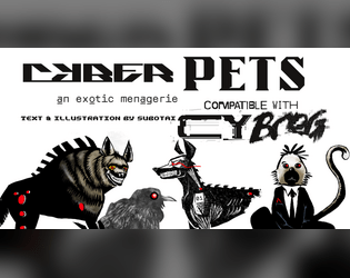
Cyber_Pets
Concept: “_EMPORIUM.ltd can not -and will not- be prosecuted or held responsible for damages, accidents, manglings, ablations, amputations, mutilations, rippings, crushings, decapitations or general acts of violence perpetrated by its proprietary software or hardware. (see UGC p.314, 34-95, all responsibility surrendered.)”
Content: A set of ten purchasable cyber-pet options (six “protection” and four “exhibition” options) and several mods to further enhance a given pet.
Writing: Categorical and pet-specific descriptions smoothly blend in-universe sales pitches and mechanical effects to entice an animal companion-seeking connoisseur.
Art/Design: Black text on white in mostly one- and two-column layouts, complemented by black-and-white illustrations of multiple pets sporting red highlights.
Usability: Sections and distinct kinds of content are consistently presented throughout, with visually readable text content. That said, some text is searchable/selectable but some is not, which might complicate some readers’ experience.

D69 Cyberpunk Gigs You Previously Had…
Concept: “Some of them sound like bullshit or don't make sense, but hey, everybody gotta eat, right ? Anyway, you're fired.”
Content: A table to flesh out the scope of a job/career a punk has previously held.
Writing: Terse but potent descriptions of various jobs, some far less appealing or lucrative than others but all quite apt for CY.
Art/Design: Two versions provided: one black-on-white and one white/green-on-dark green, both using a three-column layout for the table entries.
Usability: Headings, list item numbering, and sub-table organization are all visually evident and consistent, making for easy navigation and identification of desired details.

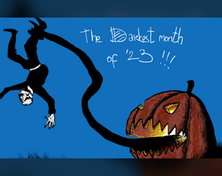
The Darkest Month of 2023
Concept: “Compilation of my Mörktober entries, all 31 of them, some monsters, some gear, some adventures, some NPC and some bits of lore, mostly Mörk borg, but also some CY_borg. All 31 are PNG format.”
Content: A few Cy_Borg rules and NPC entries to make CY all the spookier: “Haunted,” “Purple Stargazers,” and “God Damn Rain.”
Writing: Concise description and mechanics to focus a player’s (and a GM’s) attention on not only how each entry can affect the game but also how it can affect the character(s) who have to deal with it.
Art/Design: Each landscape-oriented entry contains an illustration of its subject and text taking up the remainder of the page. Lots of color choices that cement each entry in the Cy_Borg cyberpunk milieu.
Usability: Much of the text in each entry is high-contrast, and blocks of content are arranged to indicate distinction from one another as well as conceptual connection (e.g., list items). However, each entry is an image and so text is not searchable or selectable.

Things being yelled in the streets of CY
Concept: "The streets of CY_ are busy, crowded, chaotic, and most of all noisy. Things are being yelled, slogans, advertisings, chants, ramblings, or other kind of threats. Easily generate 4d10 slogans and 1d10 ways they are being yelled in the streets of the worst city on earth."
Content: A table of shouted comments and another for the source of those comments.
Writing: Flavorful combinations of ominous and inane, well-suited for random proclamations on the streets of Cy.
Art/design: One- and two-column text layout, provided in black-on-white and vivid black, yellow, and white-on-green (with pink accents).
Usability: The tables are organized for ease of use, with visually recognizable and consistent headings and list numbering, with a distinct font used for each table.

Vat-Grown Runaway
Concept: “You are an artificially designed human being, grown in a lab, who ends up finding themselves roaming in the alleyways of CY, lost and confused.”
Content: A class for the not-quite-a-person who’s trying to figure out what they are and why.
Writing: Brief and vivid character details for background and motivation complemented with terse mechanical effects/features.
Art/Design: An illustration of a runaway on the right side of a landscape-oriented spread, with white text on black (with yellow and pink highlights & headings).
Usability: Distinct typefaces and groupings of text allow for quick navigation between different content areas.
Page 1 of 1