Rules
Creativity through constraint

(Ross') CY_OPS
Concept: “The city of CY, home to the sickest minds in human history. How finely can you grind people, how much of them can you crush and squeeze, until nothing is left at all? That's what they try to figure out. The obscenely rich, the fanatically obsessed, the god-complex egomaniacs obsessed with world domination. Their lairs, their schemes, their murderous henchmen.
Thankfully, there's also someone on the other side of the equation. Packing heat under a tuxedo, or stranglewire in an evening gown's lining. Sophisticated to a knife's edge, but ready to spatter fine suits with hired blood when the time comes to clean house. Organizations that do nothing but watch and wait, and hand out packets of interesting information about the habits and domicile of movers and shakers to people who know what needs to be done.
This is CY_OPS. Check the angle of your tie one last time, and get ready to raise hell.
No relation to existing supplements also named CY_OPS.“
Content: A set of tables to help bring a game of Cy_Borg to life: schemes, henchmen, painful deaths, lair details, and more, along with two classes: “exterminator pitbull” and “stirred and shaken.”
Writing: Lots of atmospheric detail intertwined with explanations of mechanical effects. The two classes offer very different and distinct approaches to how a punk might take on some of the ops hinted at throughout this supplement.
Art/Design: Provided in both full-color and black-and-white versions, with both making use of single-column text on each page. Full-color version provides some background images–ornate rooms, window blinds, silhouettes, etc.--with high-contrast text (black and yellow) on top.
Usability: Text layout and contrast provides mostly easy readability in full-color version, although some background images are busy enough to slow the reading process.
.NetSys Hacking
Concept: “H@ck the Pl@net! Use this streamlined system to hack network, or try to, as your fellow Punks take care of business in meat space. Included are rules to break into and hack systems one node at a time, activate commands in those nodes when accessed, and deal with any ICE or black ICE launched against you in addition to any other virtual denizens or invaders. Also, slot d12 new .Apps into your 'deck designed for use in virtual spaces.”
Content: A set of rules for netrunner-specific hacking procedures, along with brief stats for security/ICE NPC entities and a set of apps to kick that hacking into high gear. Full-color and black-and-white versions of the supplement are included.
Writing: Concise explanations of the hacking workflow and apps, complemented by flavorful names/labels for elements of both.
Art/Design: Full-color version resembles a green terminal UI aesthetic, with color-coded NPC info based on severity of threat and a yellow list of netrunner apps. A sample network diagram/map is included. Black-and-white version provides a clean alternative (although yellow alert symbols appear in both versions).
Usability: Text in both versions is visually identifiable and distinguishable, thanks to color and bolding/underlining to indicate certain kinds of content. Hacking workflow includes code-like line reference numbers and consistent indentation for subordinate/clarification details.
10 Things I Hate About CY
Concept: “10 urban legends whispered on the streets of CY and in the dark corners of the NET. The fact is usually worse than the fiction.”
Content: A collection of urban legends about mysterious individuals, locations, and events that might intrigue or terrify a group of punks.
Writing: Ominous tales framed as though potentially spoken by CY residents, allowing for easy slot-in ambience and plot hook/seed for GMs.
Art/Design: White, pink, and yellow text on dark blue with occasional purple circuit-board background designs and a large pair of eyeballs near the bottom of one page. Presented as three pages of single-column text.
Usability: Font choices and colors make for easy visual readability and identification of distinct content purposes (e.g., pink text for headings/labels, yellow for important details, names, and locations).

199V
Concept: “The vampire apocalypse is coming. In the 1990s the ancient dead awoke to take control of their descendants. Their blood flows through all vampires and their will is the will of all vampires… except you. Something is wrong with you. You are a misfit, an anomaly, a broken vampire who thinks they can stop it. They can’t control you, at least not yet, so you see the designs of vampire dominance coming. You think you can stop it.
You are most likely wrong, but what else are you going to do?
Grab your ass by the fangs, sling your rifle and let’s go hunting our own!”
You are most likely wrong, but what else are you going to do?
Grab your ass by the fangs, sling your rifle and let’s go hunting our own!”
Content: A hack of Cy_Borg (and a bit of Frontier Scum) designed to emulate modern-day vampires hunting vampires.
Writing: Numerous rule systems on top of the base Cy_Borg structure in order to facilitate vampire powers, weaknesses, obsessions, etc.
Writing: Numerous rule systems on top of the base Cy_Borg structure in order to facilitate vampire powers, weaknesses, obsessions, etc.
Art/Design: A consistent aesthetic across the book, with distinct layouts and color schemes for particular pages/spreads. A variety of graphics (photos or photorealistic images, illustrations, splatter effects) complement the text.
Usability: Headings/labels are easy to visually identify for navigating the text. Some rule elements may be more complicated than others and involve multiple readings to get a handle on.

2d20 $h*t Your Contract Is Trying to Unload on You Instead of Coughing up the Money
Concept: “Your guy is trying to unload their garbage on you, maybe they want to get rid of it, maybe they are trying to scam you, maybe they genuinely don't have the money, maybe it was their plan all along…”
Content: A table of goods–some junk, some potentially valuable–that a GM might use to sprinkle in some randomness into a punk’s payday.
Writing: Tons of flavor crammed into brief descriptions of a variety of items.
Art/Design: Two versions: black-on-white and black-on-blue, each provided in primarily two-column text layout.
Usability: Both versions provide visual contrast between fore and ground, with readable font choices and consistent use of headings and list item numbering.
All Roads Lead to Chrome
Concept: “Being a mercenary isn't easy work. Between the gunfights, dealing with shady corps, and fending off crazed psycho's, you are bound to get hurt. Sure, you can train to get better at handling these types of situations, and maybe you can shill out some creds for a new gun or two. But eventually, no matter what path you take, if you really wanna hit the big leagues…”
Content: A set of rules to flesh out cyberware and cy_rage, along with several new drugs and a job to snag some cargo from a tech-obsessed cult.
Writing: Accessible and concise rules, with lots of detail and explanation provided for the assorted cybertech and the job.
Art/Design: A mix of white-on-dark (for the cybertech rules & drugs) and black-on-white (for the job). Occasional images complement page text, with a brain-shaped map provided (and keyed0 for the job. Bright colors and bold text highlight important information and serve as headers. A print-friendly black-on-white version of the cybertech rules is also included.
Usability: Readable fonts, visually recognizable organization of page contents thanks to spacing/grouping and section borders. Consistent application of particular color choices and bolding to help with navigating and locating desired information.

Anarchy Is What Corporations Make of It
Concept: "Corporations are the main antagonists of any Cyberpunk Dystopia. But they're not exactly behaving like they should be in that fictional climate. Instead, Gamemasters rely on old tropes to portray corporations as state-like institutions, with the only difference being that they're profit-driven.
This 15-page zine presents Corporations in a new light, based on political theories from International Relations & Geopolitics. It seeks to highlight the much shadier side of corporate rule: the fact that, in a world without governments, corporations would rather nuke each other into the ground if it meant the bottom line was a bit greener.
It also describes how it affects the lives of regular individuals, all while introducing 4 new mechanics in order to enhance play smoothly. Make your cyberpunk stories deeper without adding unnecessary complexity.
Make your corporations dynamic, ever-changing and profit-driven the way it was always intended. Remember: Corporations are the New Gods because they own you and everything you do or desire."
Content: Part treatise, part suggested mechanics and ideas for GMing a cyberpunk-focused TTRPG.
Writing: A concerted effort to situate the political, social, and economic ramifications of corporatist systems/structures in an accessible way for GMs and players who may struggle with what "cyberpunk" as a genre attempts to attend to.
Art/design: Colorful two-page spreads with distinct aesthetics and points of focus, often with complementary illustrations centered in a spread or along its margins.
Usability: Font choices and sized vary, although highlighted embellishment is consistent throughout. Busy and low-contrast background pattern images can make some pages incredibly difficult to read/parse.
Avtozak
Concept: “Avtozak is a Cy_Borg expansion about riots.”
Content: A set of riot-related NPCs, weapons, and a table of riot causes.
Writing: Terse, frank descriptions and stats/mechanics for included content.
Art/Design: Illustrations of riot vehicles and participants (cops and protesters) with highlight colors are positioned alongside relevant high-contrast text.
Usability: Font choices are readable, with headings/labels and background colors for distinct sections that assist navigation and perusal.
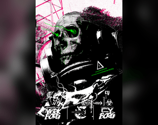
Beyond Cy
Concept: “The fields. Monoculture deserts of genetically enhanced crops like wheat 4.6, ultra-maize, and soykin. Spliced to perfection. All earth is sterile. Killed by an unhallowed mix of unfiltered UV-radiation and the most potent poisons. Only hard fertilization keeps the masses alive and fed. Traveling through the cultivations is not without peril. Chemships puke their concoctions onto the plants; mechanic harvesters that have never seen an animal or human cut down all in their path.”
Content: A treasure trove of rules (miseries, glitches, mutations), gear, location/site summaries and generators, map hexes, random encounters, enemies, classes (“Mutant” and “Elektron Rohre”), job seeds/contracts, and even a dungeon to explore.
Writing: Intense, vivid, and wry descriptions that bring to life the sprawling wastes that surround Cy.
Art/Design: A mix of collage, pixel art, graffiti, graphical user interfaces, print reports, and more to frame each page/spread uniquely but feeling comfortably in line with the official/core Cy_Borg aesthetic. Map hexes provided as additional file.
Usability: Wide variety of layouts, font choices/sizes/colors, and organization can slow down reading and navigation (e.g., class info interspersed among NPCs), but hyperlinked table of contents aids with identifying desired details.

Blood Sports
Concept: “Some trashy random tables for generating odd sports and shows names punks play in CY_. You can roll some cocky champion names too and get some inspiration from the portraits provided.”
Content: Tables for quick generation of game types/specifics and famous sports NPCs, all of which are soaked in CY style.
Writing: Table results are vivid, grungy, and dystopian–exactly what you’d hope for.
Art/Design: Contrasting-color rows help with table navigation, with tables positioned around the edges of large image spreads (an arena and a gallery of NPC portraits), with an eye-bleeding aesthetic and palette.
Usability: While not all tables are labeled, it’s clear what each does functionally and how to use it alongside the others.
Boomhunter's Laughter & Satisfaction
Concept: “Burnchurch Hex’s latest [dist/att]raction is a kill club run by the infamous chromediator Boomhunter, a chromed out kill-club veteran with gunpowder cologne and grenades for jewels. To him, the only thing better than a good kill is a thumpin soundtrack.”
Content: Just about everything a GM might need to provide players with an entertaining time at a kill club: notable NPCs, locations, events/activities (and how to bet on them), and enemies to face off against.
Writing: Plenty of imaginative world-building detail supported with brief rules and mechanics when needed.
Art/Design: Two versions are provided: one that hews closely to the Cy_Borg design aesthetic, with a variety of two-page spread layouts, colors, and fonts; and one that offers a simple, printer-friendly black-on-white single-column arrangement of content.
Usability: Text in both versions is mostly high-contrast, although in the ‘regular’ version, some font choices and spread background ‘busy-ness’ may impact readability for some readers. Relationships between different content types/sections are visually distinct, thanks to consistent shifts in font size and bolding.
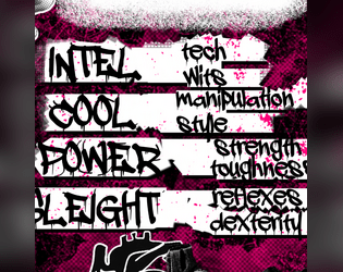
Borgpunk
Concept: “Maybe you're tired of Players rolling Presence to charm/snipe/shoot their way in and out of any situation, especially that Discharged Corp Killer who, for some reason, rolled a +3 on his Presence. Well, do not worry anymore, as this hack aims to fix that.”
Content: An expansion of stats and skills to add a bit more crunch to games of Cy_Borg.
Writing: Focused, direct explanation of optional mechanics to integrate into a game, along with an insightful rationale for the hack’s existence and a character sheet organized to include the new stats & skills.
Art/Design: Single-column white text on a dark black-and-purple patterned background. Character sheet mixes hand-drawn illustration, photo collage, and fillable fields.
Usability: Text in both files is high contrast and has consistent font use for headings/labels and body content. Unfortunately, text is not embedded in either file, so searching/selecting is not available.
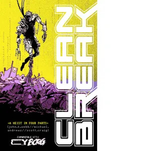
CLEAN BREAK
Concept: “>>WELCOME, BR4VE TRAVE1ER
S4N1—or “Sanny” as he prefers to be called—is CY’s sanitation AI, responsible for the timely expulsion of the city’s sewage, garbage, and miscellaneous waste. For decades, Sanny has faithfully and silently executed his function, unaware of the greater changes happening in CY; forgotten and taken for granted, nobody was around to notice the worm of some higher intelligence burrowing itself into the AI’s core programming. Replicating. Evolving. Taking over.
Now, Sanny wants to quit his job—a clean break—and you’re going to help him.”
Content: A series of jobs designed to liberate a sanitation systems AI from its electronic shackles.
Writing: Four interlocked missions with tons of descriptive flavor, tables to roll on, NPCs, and other information for GMs and players alike that provide inspiration and guidance to a given iteration of these jobs in play.
Art/Design: While the entire document is in black and white, each mission has its own aesthetic and arrangement, font types, and so on. Illustrations galore depict assorted characters, locations, maps, objects, etc. that punks might encounter in one or more of these jobs.
Usability: Visually recognizable and consistent uses of headings, bold text, table organizations, content columns, etc. make for easy navigating and reading. Distinct jobs’ aesthetics also indicate visually the boundaries of those jobs’ information to further facilitate identifying desired details.
CLUB 27
Concept: “Club 27 is a Cy_Borg expansion about the Club 27 urban legend.”
Content: A nightclub with a discerning membership, some of whom can be hired as mercs.
Writing: Brief details about the club and its members that suggest a variety of ways that a GM might incorporate the place into their game.
Art/Design: Single-fold pamphlet layout with an immersive background club-aesthetic illustration for each panel overlaid with text content.
Usability: High-contrast text is easy to read, with headings and emphasized text visually distinct through font size and color. Most text is embedded, allowing for searching/selecting.

Cut Purse
Concept: “CUT PURSE is a zine by Stockholm Kartell made for the 2024 convention season. It includes stuff for all our games; MÖRK BORG, CY_BORG, DEATH IN SPACE, SKR and some system-agnostic material (as well as an adventure for the Japanese third-party MB hack Nobunaga's Black Castle). But there are also things like album reviews and poetry.”
Content: Several tables (“Where do you hang out?,” “Returning home to your apartment after that one heist,” and a set of news headlines) as well as “Brainbox Scramble,” a combat-oriented “sudden scenario” taking place in a shopping mall.
Writing: Intensely thematic details packed into just a few pages (within the overall zine).
Art/Design: Mostly black-on-white two-column layout with some pink highlighted text, although an initial page for the scenario is white-on-black. An accompanying map provides labels for each storefront in its own distinct font (some with logos) to help sell the atmosphere of the place.
Usability: Fonts are visually readable, layouts follow an easily recognizable organization of content (with different sections and kinds of information formatted consistently), and necessary details are all included–all of which makes for an easier time using each table or running the scenario.
Loading next page...
Page 1 of 4
Next page