Official content
Character Sheets
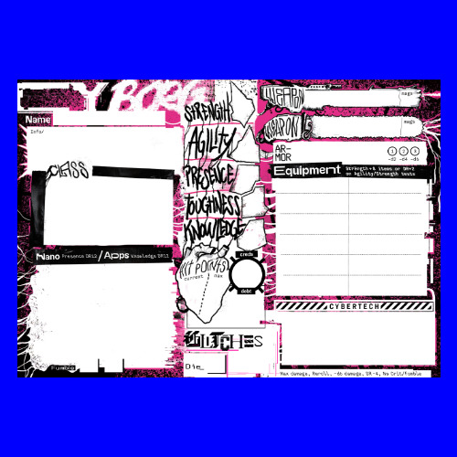
Concept: “Fillable character sheets of two kinds; the OG color explosion and a more minimalistic one in case you don't want your printer to suffer.”
Content: The official character sheet for the punk who's ready to fuck shit up.
Writing: Mostly limited to labels for sheet fields, although a few very brief details help serve as reference/reminder for Nano, Apps, Glitches, and Equipment roll-related specifics.
Art/Design: Black-on-white with pink highlights (and a more printer-friendly version without pink) that arranges character information in visually distinct fields–some with creatively represented shapes and signs!--across three major columns.
Usability: Fields are fillable, allowing for easy continued use digitally or printing. Not all field labels are selectable, so screen reader users might have trouble identifying where to insert relevant details.
Corp Index
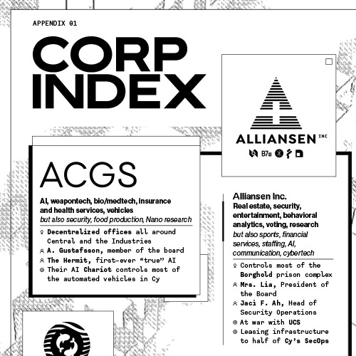
Concept: “More in-depth intel on the rulers of Cy. The Corp info appendix ripped straight out of the CY_BORG book. Includes the main Corps and their leaders, businesses, HQs and possible adventure sparks.”
Content: Four pages of corporation names, logos, slogans, business ventures and holdings; important NPC info; inter-company rivalries and tensions; and other juicy tidbits to flesh out the world.
Writing: Crisp, concise details speak a wide range of possibilities into the imagination, from political machinations to secrets to violent conflicts, without limiting how to realize or incorporate them into a game.
Art/Design: Black-and-white flat design scheme of software application windows melds contemporary aesthetics with text-centric retro UIs.
Usability: Alphabetized organization of each corporation’s set of windows is consistent and easy to navigate, with key terms/names/etc. bolded for quick identification of desired info.
Corp Net Spam
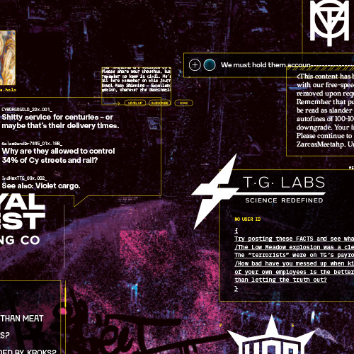
Concept: “A virtual maelstrom of Net posts, viral feed spam and other in-world messages regarding the main antagonists; the corporations and the cults. Don't believe everything you read. Be vigilant.”
Content: A treasure trove of plot hooks/seeds presented as assorted in-universe social media posts and headlines that each relate in some way to one or more of the major corporations in CY.
Writing: Extremely engaging hints at, and outright accusations of, a wide variety of reasons to take down each of the big corps–not that a PC needs more reasons to do so.
Art/Design: Translucent text boxes that resemble software application windows over a dark background with paint and graffiti patterns scattered across it, Several text-centric message windows are positioned around each corporation name and logo presented in its own window.
Usability: Significant font size and type differences across windows can slow down the navigation and reading experience (and evokes the noise of net traffic), but high-contrast window borders visually distinguish the parameters of each message and, thanks to some window overlap, which nearby corporation it relates to.

Cut Purse
Concept: “CUT PURSE is a zine by Stockholm Kartell made for the 2024 convention season. It includes stuff for all our games; MÖRK BORG, CY_BORG, DEATH IN SPACE, SKR and some system-agnostic material (as well as an adventure for the Japanese third-party MB hack Nobunaga's Black Castle). But there are also things like album reviews and poetry.”
Content: Several tables (“Where do you hang out?,” “Returning home to your apartment after that one heist,” and a set of news headlines) as well as “Brainbox Scramble,” a combat-oriented “sudden scenario” taking place in a shopping mall.
Writing: Intensely thematic details packed into just a few pages (within the overall zine).
Art/Design: Mostly black-on-white two-column layout with some pink highlighted text, although an initial page for the scenario is white-on-black. An accompanying map provides labels for each storefront in its own distinct font (some with logos) to help sell the atmosphere of the place.
Usability: Fonts are visually readable, layouts follow an easily recognizable organization of content (with different sections and kinds of information formatted consistently), and necessary details are all included–all of which makes for an easier time using each table or running the scenario.
Digital Generators
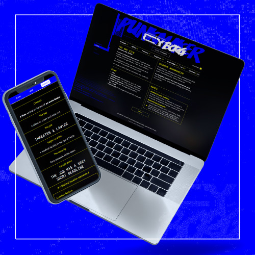
Concept: A set of web-based generators for creating punks, NPCs, and mission parameters.
Content: Automatically generated content for instant access to a potential PC, NPC, or job to undertake.
Writing: Concisely delivered content from Cy_Borg rulebook.
Art/Design: High-contrast yellow and white text on a black background, with distinct sections visually separated with yellow borders. Left-side menu allows for selection of a specific generator.
Usability: Large “click to reset” button provides a full refresh of page content for a new set of output, while headings on the “Mission” generator can be clicked for specific-section re-generation of content. Side menu options may be difficult for some to read.
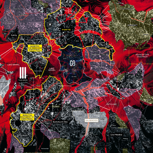
Map of CY
Concept: “The negacity Cy is ever expanding, ever changing. A living, dying leviathan. Find your way around its sectors, isles and alleyways with this map. Comes in two sizes; big and huge.”
Content: High-resolution map of CY useful for GMs and players alike.
Writing: Neighborhood/region names overlaid on the map as well as in a key at the bottom of the map.
Art/Design: Harsh, eye-popping colors and grainy black-and-white satellite aesthetics bring the dystopia to life.
Usability: Map is available in PDF and JPG formats. Color-coded regions/sectors are helpful for a quick glance of geographical relationships and proximities, although text labels for neighborhoods etc. can be difficult to read over the map details.
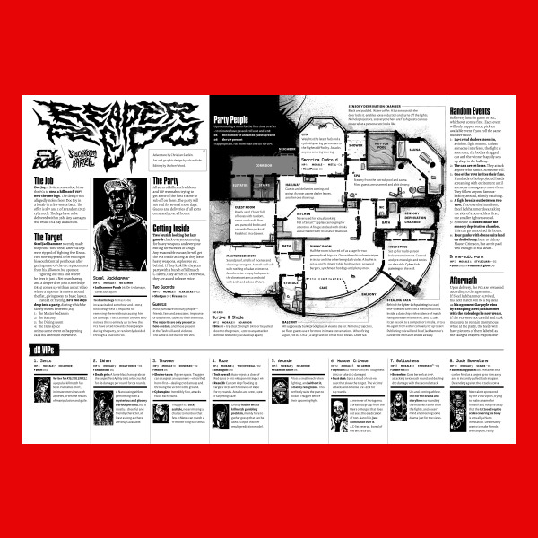
Reaper Repo
Concept: “The job is simple; infiltrate a penthouse party full of chromed out Killmatch champions, find the man of the hour—Steel Jackhammer—and steal his cyber legs. They're still attached to him, sure. You'll figure it out.”
Content: A high-risk, high-entertainment heist that demands ingenuity from players and a complete disregard for self-preservation from their PCs..
Writing: Tons of details and atmosphere are crammed into a two-page spread on which NPC and location details, random events, and GM-specific notes all offer each gaming group a memorable experience.
Art/Design: A map of the party location is a major focal point, with text provided all around (and laid over) the map in a number of columns. NPC stats and details are complemented by a portrait of each figure.
Usability: File is pretty printer-friendly, and text throughout contrasts well with background. Headings and labels are visually distinct thanks to font choices, text size, and bolding.
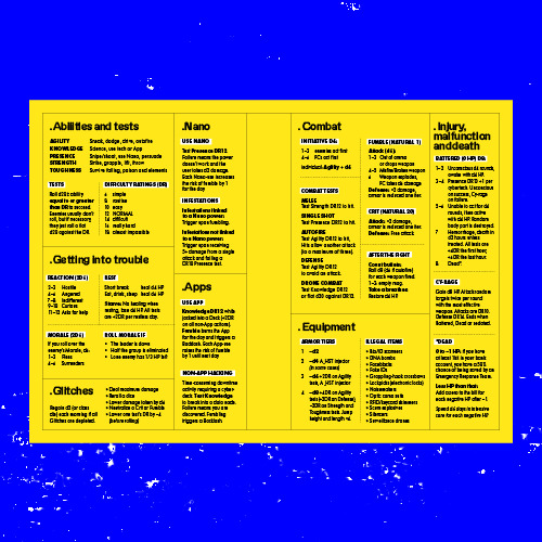
System Reference
Concept: “All the rules you need to fuck shit up, for easy reference at the table when you don't feel like flipping through a book to find that one rule.”
Content: The essential Cy_Borg rules provided in a stripped-down two-page spread.
Writing: Incredibly brief descriptions/explanations of rules in order to include as much as possible in the available space.
Art/Design: Black-on-yellow color scheme, with subheadings using a white background, with text-only organization of content across the spread. Printer-friendly version has white background with yellow subheading background.
Usability: Distinct rule components are separated into individual boxes, with additional internal borders to mark individual tables/lists from one another. Bolded labels help further indicate the scope of each rule explanation.
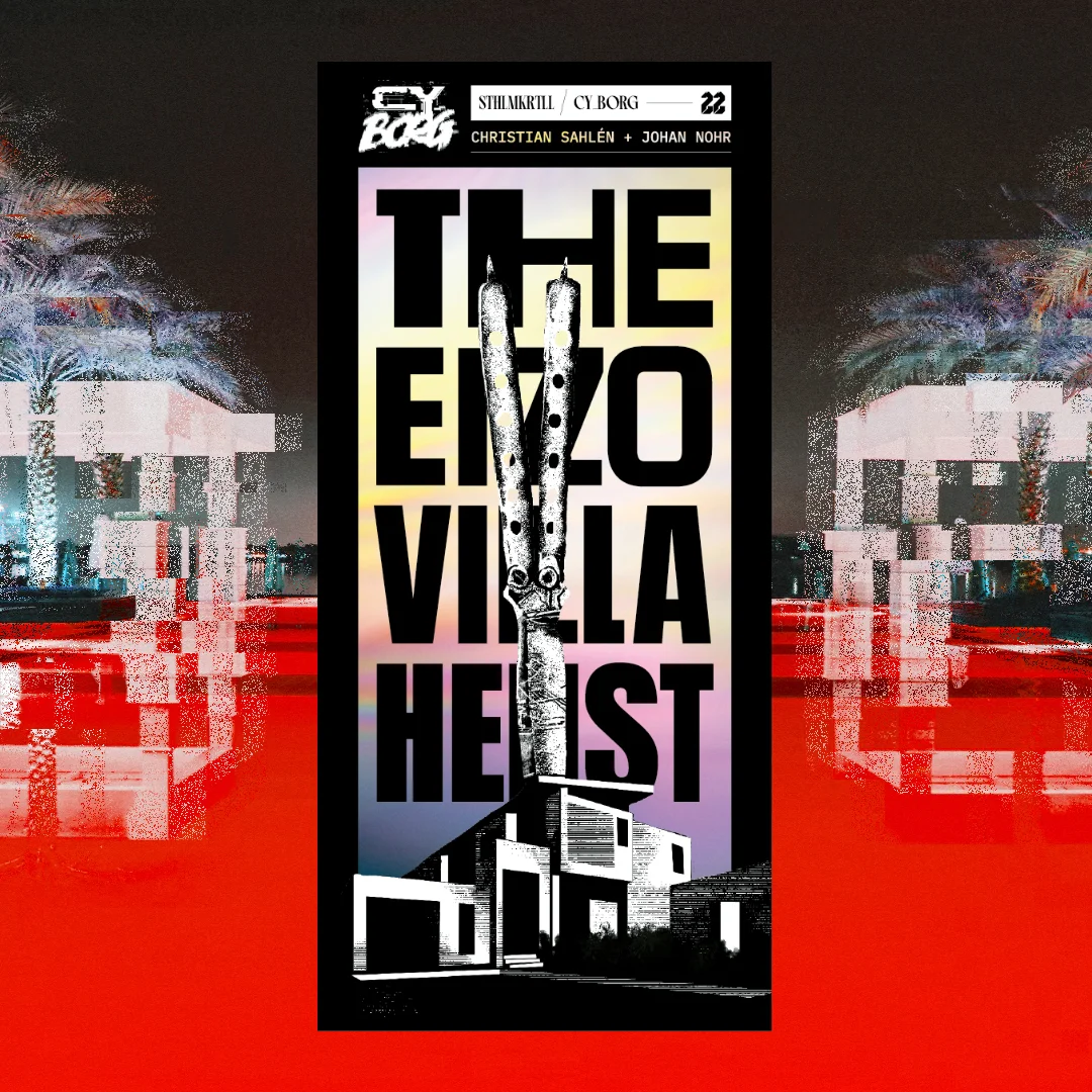
The Eizo Villa Heist
Concept: “I don’t care how you do it. Go to the villa. Get the box. Don’t open it.”
Content: A job to retrieve an armored storage box from a crew of punks for a cult.
Writing: Print medium constraints result in succinct, focused details to guide a GM through the essentials of the mission while making each NPC and complication possibility feel exciting.
Art/Design: Trifold pamphlet opens to show map and initial mission info inside, while NPCs and complications appear on the outside folds/sections.
Usability: Available only in print form. Pamphlet layout is easy to navigate, with consistent headings/labels and section dividers. Font choices are readable and with little fore/ground clutter when appearing over gradient backgrounds.
The Location Pad
21 contributors
Concept: “The Punks dash through a random door when chased by SecOps? Need a location for their next heist? The Location Pad got you covered with 34 random locations peppered with plot hooks and loot.”
Content: A collection of common locations for Cy_Borg missions, each with a map and relevant tables to generate details about it (purpose, room contents, NPCs likely to be there, etc.).
Writing: Half of the location’s tables are written by a different contributor, so there is often considerable difference in style and detail on those pages–but the entire document concisely packs tons of imaginative inspiration into each potential seed, hook, and thread.
Art/Design: Each page consistently provides a space for GM notes, a set of relevant tables, and a map of the location (mostly an overhead view, with some exceptions)–all in black-and-white with clear headings and list item numbering.
Usability: Crisp, clear font choices and layout make for incredibly easy reading and use–a couple of rolls or choices allow for fleshing out of a location when immediately needed or as part of a more leisurely planning pace.
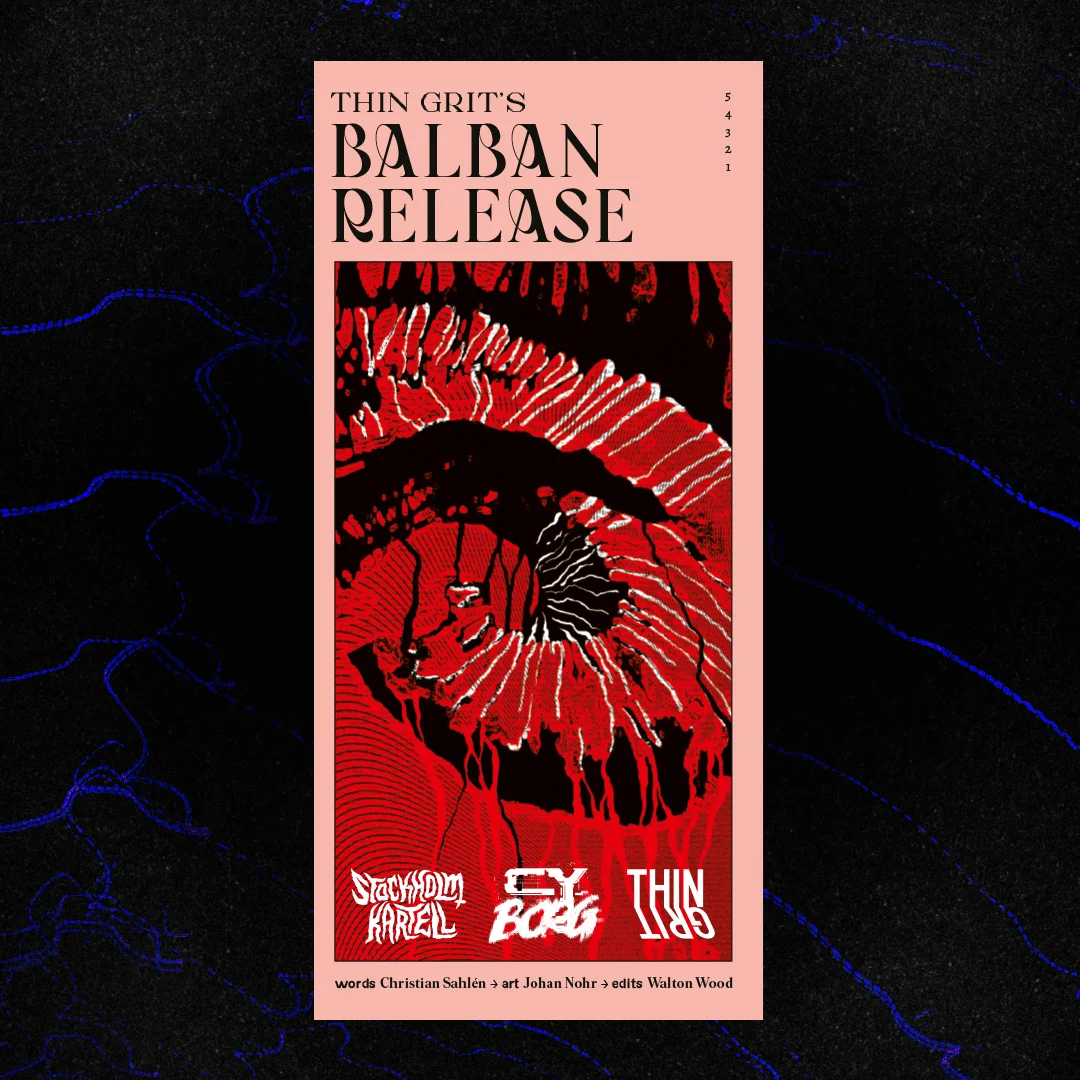
Thin Grit's Balban Release
Concept: “TG Labs is planning some kind of release event. Disrupt it. Embarrass them. Make it a scandal! Can you do that?”
Content: A sabotage operation on behalf of a disgruntled ex-employee.
Writing: Crisp descriptions and explanations of mission locales, potential complications, NPC specifics, and conditions for success, all of which create a range of potential for a GM and their table.
Art/Design: Trifold pamphlet with nitial details and an overhead map of the job location appear on the inside folds, and NPC and complication/aftermath details on the outside panels.
Usability: Available only in print form. Font and background color choices indicate different kinds of content throughout the supplement, with headings/labels visually distinct from the body text. Organization of material allows for easy reading and comprehension of mission specifics from first to last panel.
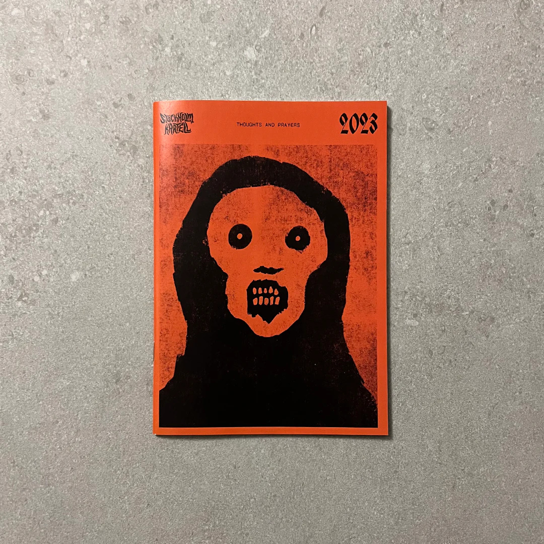
Thoughts & Prayers
8 contributors
Concept: “Thoughts and Prayers is a zine by Stockholm Kartell made for the 2023 convention season. It includes stuff for all our games; MÖRK BORG, CY_BORG, DEATH IN SPACE, SKR and some system-agnostic material. But there are also things like album reviews, essays and short stories, thoughts, ideas and takes. 100% of the benefits are to be donated to Direct Relief.”
Content: A smörgåsbord of content for Cy_Borg–some specifically for the game, some that could be used for it or others–that ranges from a location/adventure (Sprawling Car Park) to tables/generators (e.g., “Who else is in the pub when the brawl starts?”) to NPCs (emergency response teams) to medieval weapons to injuries/afflictions to short fiction about living as a corp drone. There’s a lot more than that, too.
Writing: Every page oozes the Stockholm Kartell house style(s) that makes a reader want to use all that they can in their next game.
Art/Design: Black-on-white color scheme in a printed zine format with illustrations throughout.
Usability: Available only in print format. Table of contents at the beginning of the zine makes it easy to locate info throughout, with a consistent header/footer with page content credits and page numbering to help clarify not only where a reader is in the zine but also whose work they’re looking at.
Page 1 of 1