Classes

(Ross') CY_OPS
Concept: “The city of CY, home to the sickest minds in human history. How finely can you grind people, how much of them can you crush and squeeze, until nothing is left at all? That's what they try to figure out. The obscenely rich, the fanatically obsessed, the god-complex egomaniacs obsessed with world domination. Their lairs, their schemes, their murderous henchmen.
Thankfully, there's also someone on the other side of the equation. Packing heat under a tuxedo, or stranglewire in an evening gown's lining. Sophisticated to a knife's edge, but ready to spatter fine suits with hired blood when the time comes to clean house. Organizations that do nothing but watch and wait, and hand out packets of interesting information about the habits and domicile of movers and shakers to people who know what needs to be done.
This is CY_OPS. Check the angle of your tie one last time, and get ready to raise hell.
No relation to existing supplements also named CY_OPS.“
Content: A set of tables to help bring a game of Cy_Borg to life: schemes, henchmen, painful deaths, lair details, and more, along with two classes: “exterminator pitbull” and “stirred and shaken.”
Writing: Lots of atmospheric detail intertwined with explanations of mechanical effects. The two classes offer very different and distinct approaches to how a punk might take on some of the ops hinted at throughout this supplement.
Art/Design: Provided in both full-color and black-and-white versions, with both making use of single-column text on each page. Full-color version provides some background images–ornate rooms, window blinds, silhouettes, etc.--with high-contrast text (black and yellow) on top.
Usability: Text layout and contrast provides mostly easy readability in full-color version, although some background images are busy enough to slow the reading process.
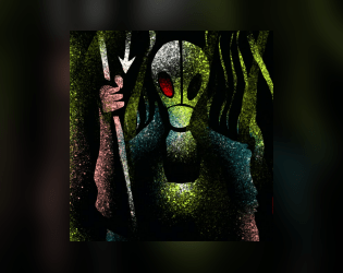
Abandoned Algae Farmer
Concept: “You were a cog in the massive machine that feeds the city of Cy. Now, for one reason or another, you had to abandon your algae farm. All you have is the clothes on your back, a couple pieces of gear, and whatever the fuck you found out in the emerald muck of the vast algae fields.”
Content: A class for the “rural” outsider who’s ready to make a mockery of the hero’s journey.
Writing: Really engaging, flavorful text pervades the entire document; mechanics information is distinguished by underlined phrases amidst the descriptive core content.
Art/Design: A lo-fi image of an algae farmer, surrounded by imposing stalks of their crop, supports bright green, yellow, and white text content.
Usability: A variety of visual markers–boxes, clearly labeled list items, color choices–very effectively organize the presentation of class information across a two-page spread.
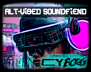
Alt-Vibed Soundfiend
Concept: “The pumping beats of the last Post-Grunge Blitz-Rave still course through your veins.”
Content: A class for the circuit-bending audiophile who’s long wanted to use their love of sick riffs and beats to obliterate the enemy.
Writing: Brief glimpses into a fully-formed lingo for the class detonate idea-bombs about how to live, and not just use, the vividly described mechanics provided here.
Art/Design: Filtered neon cityscapes and a close-up of a soundfiend on the prowl stand out as strongly as the bold, distinct headings for each set of class details/features.
Usability: General organization is quite navigable, although some font choices can make reading tricky; similarly, HP & Glitch calculation details blend into the background image.
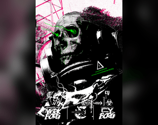
Beyond Cy
Concept: “The fields. Monoculture deserts of genetically enhanced crops like wheat 4.6, ultra-maize, and soykin. Spliced to perfection. All earth is sterile. Killed by an unhallowed mix of unfiltered UV-radiation and the most potent poisons. Only hard fertilization keeps the masses alive and fed. Traveling through the cultivations is not without peril. Chemships puke their concoctions onto the plants; mechanic harvesters that have never seen an animal or human cut down all in their path.”
Content: A treasure trove of rules (miseries, glitches, mutations), gear, location/site summaries and generators, map hexes, random encounters, enemies, classes (“Mutant” and “Elektron Rohre”), job seeds/contracts, and even a dungeon to explore.
Writing: Intense, vivid, and wry descriptions that bring to life the sprawling wastes that surround Cy.
Art/Design: A mix of collage, pixel art, graffiti, graphical user interfaces, print reports, and more to frame each page/spread uniquely but feeling comfortably in line with the official/core Cy_Borg aesthetic. Map hexes provided as additional file.
Usability: Wide variety of layouts, font choices/sizes/colors, and organization can slow down reading and navigation (e.g., class info interspersed among NPCs), but hyperlinked table of contents aids with identifying desired details.
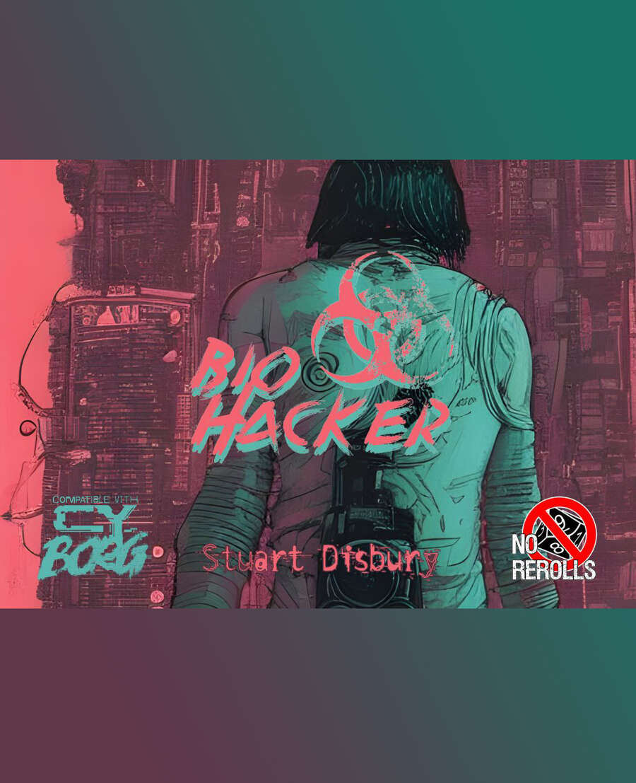
Bio Hacker
Concept: “You were a senior MedTech with T.G. Labs until you were found trafficking in synthetic organs, controlled stims, illegal mods, and little glass vials. Disgraced, blackballed, alone. You take work where you can find it.”
Content: A class for the mad scientist who wants to turn their side hustle into their main gig.
Writing: Class features articulated succinctly, with a table of derangements to add intense flavor to a bio hacker PC.
Art/Design: Very colorful mix of pinks, greens, and black, with multiple aesthetics over a partial map of CY, including a notepad being held by a (mostly off-page) hand. Two illustrations of a bio hacker appear–one on a title page and one amid the background collage of the main page.
Usability: Each section for class features appears in its own column/window. However, because of different colors for text and complex background patterns, some text is easier to read than others.
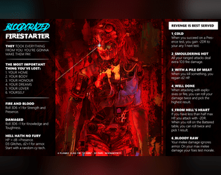
Bloodcrazed Firestarter
Concept: “They took everything from you. You’re gonna make them pay.”
Content: A class for the vengeful arsonist on a path of destruction.
Writing: Concise, intense text that merges pathos and mechanics into intriguing features.
Art/Design: A stunning illustration of a firestarter in red, framed on either side by a column of class features in white on black.
Usability: Text is easily readable and navigable, with helpful bolding for headers and horizontal rules for separating different class details.
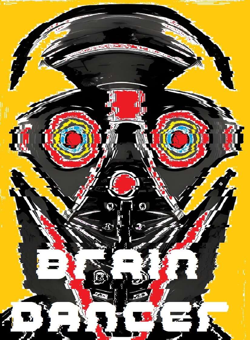
Brain Dancer
Concept: “Chiphead. Holobob. Eyerot. People talk a lot of shit. Let them. You know something they don’t: the whole world’s a stage, and you’re a motherfucking star. All you gotta do is keep dancing, and let the brain-tape roll.”
Content: A class for the talent, the face, the influencer, the fame addict.
Writing: Intriguing class features that evoke a mix of excitement and outright horror that feels completely appropriate for the streets of Cy.
Art/Design: Two-page spread with a portrait illustration of a brain dancer on the left with class features in creatively organized tables on the right.
Usability: For the most part, each section of content is visually distinct from the others, which makes for easy navigation on the page. However, the file is provided as a PNG, so text is not embedded (no searching or copying/pasting available).

BRAINROTTEN INFLUENCER
Concept: “When you signed up with the network, you didn’t expect your life to spiral downhill this quickly. Your RCD is modified to stream 24/7 on platforms like NuTube and Spasm, no pauses allowed.
Most of your colleagues died chasing fame. You’re still alive, barely teetering on the brink of psychological and physical collapse.”
Most of your colleagues died chasing fame. You’re still alive, barely teetering on the brink of psychological and physical collapse.”
Content: A class for the would-be social media mogul who’s breaking bad to maintain their follower count.
Writing: Bleak and pointed satire pervades the class abilities and descriptions to emphasize the daily life of a Cy resident.
Art/Design: One- and two-column black-on-white text layout, with a separate cover page showing an illustration of a brainrotten influencer portrait.
Usability: Consistent visual elements (headings, borders for distinct content sections, font choices, etc.) all contribute to an easily recognizable visual grammar and means of perusing class info.
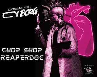
Chop Shop Reaper Doc
Concept: “Not all reaperdocs finish their schooling. That’s right, you’re a chop shop dropout. But you’re not going to let a thing like an unofficial license to practice stop you. What do they know?… What do you know…? Hey, you made it through enough classes to at least know where the heart is. Right?”
Content: A class for the flunkie physician who sees the human body as another junk heap to modify with varying degrees of success.
Writing: Laser-focused in-character descriptions to situate the class abilities and mechanics for the player.
Art/Design: Three major columns of content across a landscape-oriented spread, with white-on-black text framed by a picture of a reaper doc in front of a heart illustration on the right, tinged in pink.
Usability: Consistent presentation of headings, list items, body text, etc. across different sections of content. Visually high contrast to help with browsing/navigating class abilities. Text is not searchable or selectable.
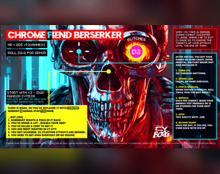
Chrome Fiend Berserker
Concept: “Obsessed with chrome and power, one man army, murder machine.”
Content: A class for the cyberware-focused ship of Theseus.
Writing: Brief bursts of evocative flavor and mechanics hint at intriguing possibilities for a unique character.
Art/Design: Bright colors draw attention to the content arranged around the page, with a large skull in the center that stares at the reader.
Usability: Text is very readable, and several different fonts and colors provide highly visible distinctions in content and purpose.
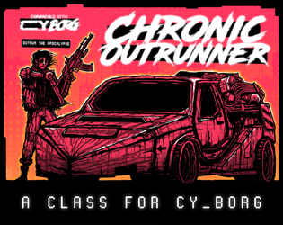
Chronic Outrunner
Concept: “
> > > Always out of time. Never out of gas. Somehow, you keep turning up. > > >
[[nowhere fast]] _drive through Cy, bolting new gear to your car as you go
[[built to last]] _jump forward in time while tethered to your custom ride
[[link to the past]] _perfect your vehicle and when the time is right—
FIND AN OPEN STRETCH OF ROAD AND OUTRUN THE APOCALYPSE”
Content: A class for the road warrior who wants to hit a high enough speed and see some serious shit.
Writing: A range of descriptive and mechanical features that emphasize the post-apocalyptic possibilities of life in CY and beyond.
Art/Design: Two versions: black on white and black on orange, organized as a landscape-oriented spread with distinct text elements framing an illustration of an outrunner next to their car.
Usability: Consistent presentation of headings, body text, and emphasized content all contribute to easy navigating and identifying desired information.
Conductive Convict
Concept: “You were just another dreg waiting for death. But then that explosion happened inside your prison transport. Your face is on every city corner, but your more concerned with the electricity shooting from your fingers. You don't hunger but crave the power of energy. You need answers, and you suspect you're not the only one of your kind. Will you blaze an unforgiving war path, or be a paragon of hope?”
Content: A class for the player whose relationship with electronics–or even static–is “complicated.”
Writing: Direct explanations of class features provided to situate the player toward the class and its assorted benefits and detriments.
Art/Design: A spread of class details in two columns beside an expressive image of a conductive convict rendered in chalk.
Usability: Layout facilitates navigation between sections and understanding content. However, the class is provided as an image, so text is not searchable or accessible as a result.
Cubicle Ninja
Concept: “Unlike some people, you actually have a job. Wake up, shower, force feed, commute, grind, commute, wind down, brush teeth, sleep. Repeat until put out to pasture.”
Content: A class for the everyman who’s working hard but yearns to be hardly working.
Writing: Succinct descriptions and class features to situate a player amid tedious labor conditions.
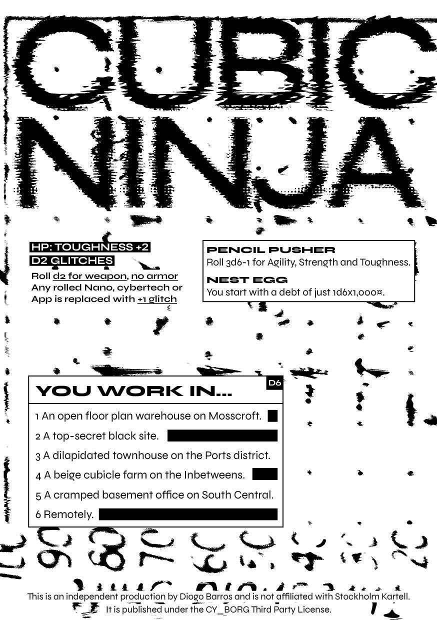
Art/Design: Black-on-white two-column spread layout with touches of static, glitch, and photocopied aesthetics.
Usability: High-contrast text in distinctly organized blocks of content make for easy identification and navigation throughout spread.
Cultured Swordsman
Concept: “While the VIPs were doing drugs and having sex in Ports You studied the blade. And when Your parents kicked you out You put your skills to use.”
Content: A class for the inner edgelord who wants to viciously dual-wield the tropes of anime and anime fan.
Writing: Helpfully clear mechanics drenched in the flavor of this class concept.
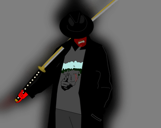
Art/Design: Clean illustration of archetype complements a minimalist layout.
Usability: Readable, navigable text with visually clear distinctions between types of class features/details.

Cyber-Luchador
Concept: “Take to the skies as an unarmed specialist and wrestling phenom! Use your fists and your repertoire of deadly special moves to bring your foes to their knees.”
Content: A class for the punk who lives to bring kayfabe to every battle.
Writing: Mostly informative text complemented by thematic description so as to focus the reader’s attention on embodying the luchador character.
Art/Design: Three-panel spread with an illustration of a cyber-luchador in the center and text on either side. Mostly white on pink fore/ground.
Usability: Different sections of content are organized and positioned distinctly from one another to help with navigation and identification of desired details. Font size and use of bolding strengthens visual readability of text.
Loading next page...
Page 1 of 4
Next page