Calen Heydt

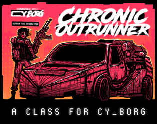
Chronic Outrunner
Concept: “
> > > Always out of time. Never out of gas. Somehow, you keep turning up. > > >
[[nowhere fast]] _drive through Cy, bolting new gear to your car as you go
[[built to last]] _jump forward in time while tethered to your custom ride
[[link to the past]] _perfect your vehicle and when the time is right—
FIND AN OPEN STRETCH OF ROAD AND OUTRUN THE APOCALYPSE”
Content: A class for the road warrior who wants to hit a high enough speed and see some serious shit.
Writing: A range of descriptive and mechanical features that emphasize the post-apocalyptic possibilities of life in CY and beyond.
Art/Design: Two versions: black on white and black on orange, organized as a landscape-oriented spread with distinct text elements framing an illustration of an outrunner next to their car.
Usability: Consistent presentation of headings, body text, and emphasized content all contribute to easy navigating and identifying desired information.

cy_BONES
Concept: “This pamphlet is a game master tool for adding hydraulic-powered boxing into your games without stretching melee combat too far.”
Content: A set of rules and tables to facilitate boxing/brawling, especially between cybernetically augmented fighters sparring for money.
Writing: Rules are terse and supplemented by similarly terse but vivid descriptions to situate the fights in CY.
Art/Design: Trifold pamphlet organization, with clearly distinct panels of differing text/background colors and contrast. An illustration of Greek fighters accents one panel.
Usability: Color and font choices mostly provide strong contrast and readability, with arrangement of panels allowing for rules/scenarios to unfold just as pamphlet unfolds physically. Two panels may be difficult to read visually for some (thanks to white on orange color scheme).

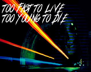
Too Fast to Live, Too Young to Die
26 contributors
Calen Heydt
industrialnation
Gnoll
Flintwyrm
Patch Adam Perryman
thefatherofcats
Johan Nohr
Prince “PROFANEKNOWLEDGE” Maxi
Leonard B
cyotee doge
Amaranth M
Brendan Carlson
Kevin Cantello
Patrick Möën
Gaffy
Michael T. Baker
Astrolich
Mal R
Ryan
Casanova Funkenstein
psyop.fyc
Torg_OR
KMSH
Daniel Scott
Olav
Jason “Anabasis” Brook
Concept: “Too Fast to Live, Too Young to Die is a rules expansion for CY_BORG giving you the chance to drive fast and wreak carnage hanging out the passenger side window (or just crash headlong into it, your mileage may vary). These rules are light-weight, but robust, and will add a ton of flavor to your chase scenes as you bolt down narrow streets in attempt to escape the piggies or track down a corpo shit-bag. Hell, you don't even need to catch 'em, just have a firefight between vehicles - we got rules for that!”
Content: An impressive cornucopia of content: rules for vehicle chases/races and driving hazards, classes for the “Got-Away Driver” and “High Speed Vigilante," stats for vehicles that are purchaseable (or not), enemies to encounter on the streets of CY, and an entire revenge-themed mission.
Writing: A focus on thematic details/voices to breathe life into included elements that are supported by succinct, direct rules and guidance for GMs to implement assorted features into a game.
Art/Design: A mix of layouts and aesthetics throughout the supplement. Some pages are laid out landscape-wise, and at least one two-page spread has text broken across its pages. Number and variety of illustrations and themes, along with their execution, are inspiring.
Usability: Body text font is pretty consistent throughout, and despite the range of page/spread layouts it’s easy to identify headings/labels and how they relate to nearby content. However, the text is not embedded, so searching/selecting and screen reader use is not possible.
Page 1 of 1