3rd-party licensed

(Ross') CY_OPS
Concept: “The city of CY, home to the sickest minds in human history. How finely can you grind people, how much of them can you crush and squeeze, until nothing is left at all? That's what they try to figure out. The obscenely rich, the fanatically obsessed, the god-complex egomaniacs obsessed with world domination. Their lairs, their schemes, their murderous henchmen.
Thankfully, there's also someone on the other side of the equation. Packing heat under a tuxedo, or stranglewire in an evening gown's lining. Sophisticated to a knife's edge, but ready to spatter fine suits with hired blood when the time comes to clean house. Organizations that do nothing but watch and wait, and hand out packets of interesting information about the habits and domicile of movers and shakers to people who know what needs to be done.
This is CY_OPS. Check the angle of your tie one last time, and get ready to raise hell.
No relation to existing supplements also named CY_OPS.“
Content: A set of tables to help bring a game of Cy_Borg to life: schemes, henchmen, painful deaths, lair details, and more, along with two classes: “exterminator pitbull” and “stirred and shaken.”
Writing: Lots of atmospheric detail intertwined with explanations of mechanical effects. The two classes offer very different and distinct approaches to how a punk might take on some of the ops hinted at throughout this supplement.
Art/Design: Provided in both full-color and black-and-white versions, with both making use of single-column text on each page. Full-color version provides some background images–ornate rooms, window blinds, silhouettes, etc.--with high-contrast text (black and yellow) on top.
Usability: Text layout and contrast provides mostly easy readability in full-color version, although some background images are busy enough to slow the reading process.
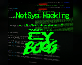
.NetSys Hacking
Concept: “H@ck the Pl@net! Use this streamlined system to hack network, or try to, as your fellow Punks take care of business in meat space. Included are rules to break into and hack systems one node at a time, activate commands in those nodes when accessed, and deal with any ICE or black ICE launched against you in addition to any other virtual denizens or invaders. Also, slot d12 new .Apps into your 'deck designed for use in virtual spaces.”
Content: A set of rules for netrunner-specific hacking procedures, along with brief stats for security/ICE NPC entities and a set of apps to kick that hacking into high gear. Full-color and black-and-white versions of the supplement are included.
Writing: Concise explanations of the hacking workflow and apps, complemented by flavorful names/labels for elements of both.
Art/Design: Full-color version resembles a green terminal UI aesthetic, with color-coded NPC info based on severity of threat and a yellow list of netrunner apps. A sample network diagram/map is included. Black-and-white version provides a clean alternative (although yellow alert symbols appear in both versions).
Usability: Text in both versions is visually identifiable and distinguishable, thanks to color and bolding/underlining to indicate certain kinds of content. Hacking workflow includes code-like line reference numbers and consistent indentation for subordinate/clarification details.
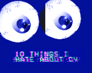
10 Things I Hate About CY
Concept: “10 urban legends whispered on the streets of CY and in the dark corners of the NET. The fact is usually worse than the fiction.”
Content: A collection of urban legends about mysterious individuals, locations, and events that might intrigue or terrify a group of punks.
Writing: Ominous tales framed as though potentially spoken by CY residents, allowing for easy slot-in ambience and plot hook/seed for GMs.
Art/Design: White, pink, and yellow text on dark blue with occasional purple circuit-board background designs and a large pair of eyeballs near the bottom of one page. Presented as three pages of single-column text.
Usability: Font choices and colors make for easy visual readability and identification of distinct content purposes (e.g., pink text for headings/labels, yellow for important details, names, and locations).
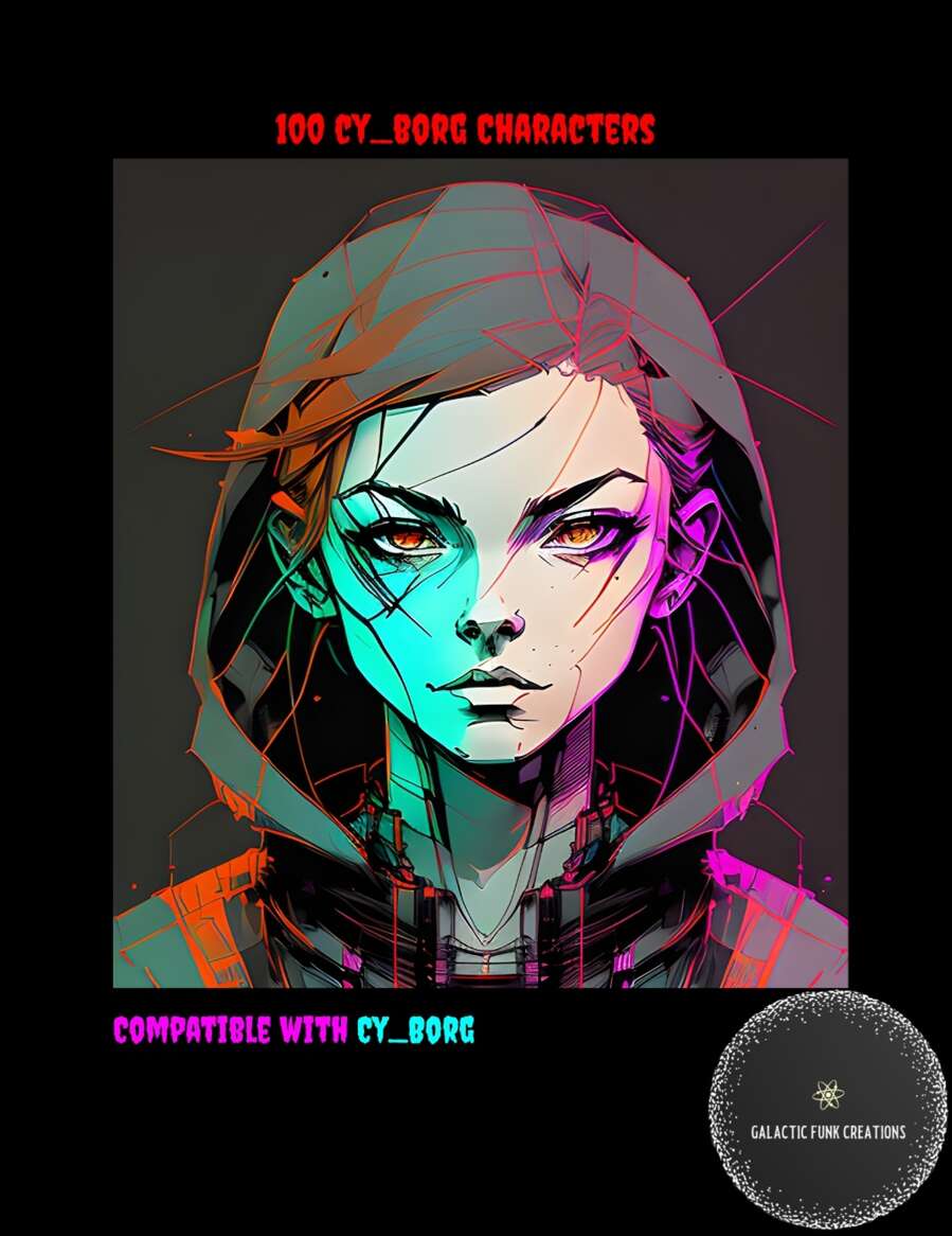
100 CY_BORG Characters
Concept: “Let me guess, your players are at prepping a heist and in the process take a turn you didn’t expect leading them to want to talk to someone that's not a part of their current goal. Sure you could improve something on the fly but why not let this list of 100 Cy_Borg Characters and their goals take some of the work of running the game off your shoulders?”
Content: A list of one hundred NPCs, each provided with a name and a one-sentence description of them.
Writing: Sentences are terse but hint at potential plot hooks for a table of punks to explore.
Art/Design: A cover page has an illustrated portrait of a young person in a hood. Otherwise, the list consists of single-column list entries in white on a black background (and a black-on-white version is also provided).
Usability: High-contrast text in a visually readable font, aided by consistent numbering and spacing throughout, makes for easy perusing and navigating to desired information.
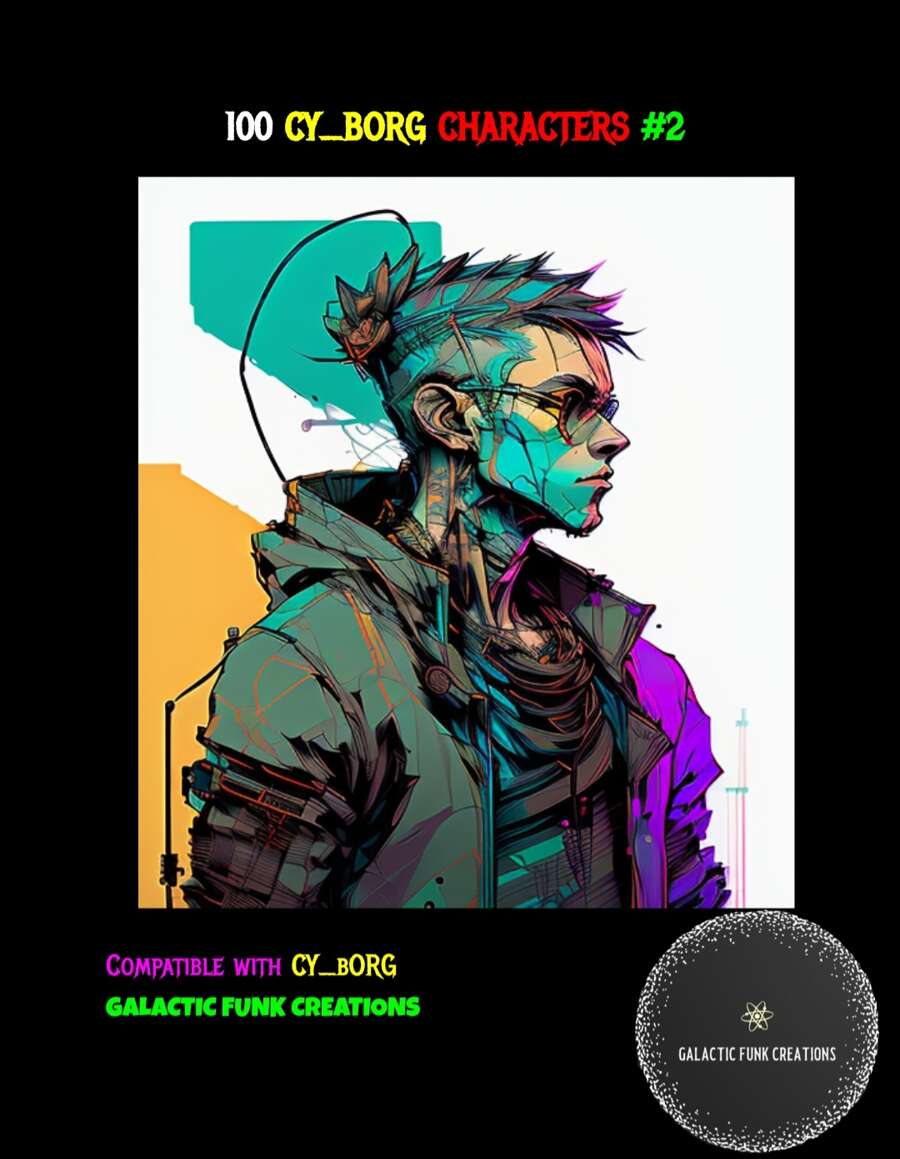
100 CY_BORG Characters #2
Concept: “Introducing ‘100 CY_BORG Characters #2’ – the perfect companion for your CY_BORG gaming sessions, designed to add depth and flavor to your adventures in this cyberpunk world. If you're a fan of CY_BORG, this supplement is a must-have addition to your collection.
Inside this resource, you'll find a collection of 100 NPCs, each complete with their own names, goals, stats, and personalities. These characters are tailor-made to fit seamlessly into your CY_BORG campaigns, whether you're a veteran player or just starting out.”
Inside this resource, you'll find a collection of 100 NPCs, each complete with their own names, goals, stats, and personalities. These characters are tailor-made to fit seamlessly into your CY_BORG campaigns, whether you're a veteran player or just starting out.”
Content: One hundred NPCs with which to populate Cy–complete with descriptions, personalities, stats, and motives.
Writing: Character details are terse but potent, allowing for a GM to make effective use of them at a table.
Art/Design: A full-color illustration of a cyberpunk-looking figure is on the cover page. Otherwise, details are provided as white-on-black text/background (and as a separate black-on-white version) in a single-column numbered list with bulleted subpoints.
Usability: Details are provided clearly and consistently, with text in a high-contrast visually readable font.
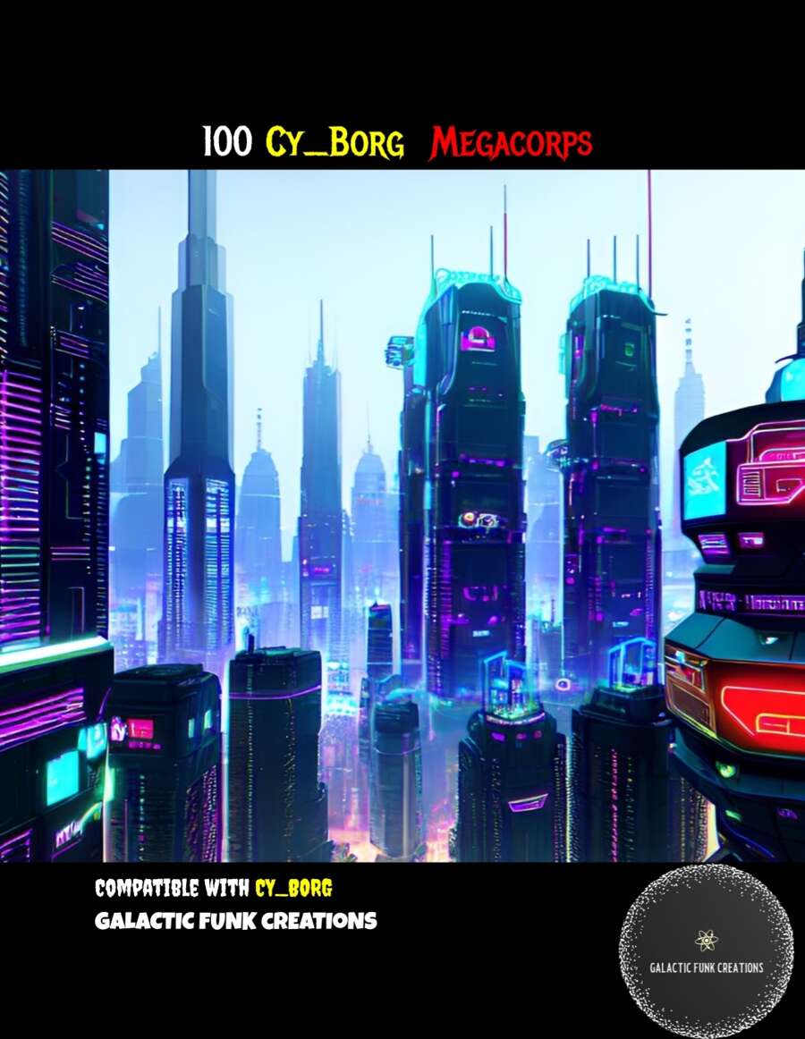
100 CY_BORG Megacorps
Concept: “Ruling high over the scum who wander the city of CY, Megacorps are the true power in the city. Most if not all are in debt to at least one of them, while everyone relies on them for what they need..as well as the vices that help them tune out. More than the gangs, the police, or rival teams, its the Megacorps and their CEOs who are the real enemy of all the powerless who call CY home. Here are 100 different corps and their CEOs to help you run your next CY_BORG game!”
Content: A set of one hundred corporations that contribute to making Cy as terrible a place as it is.
Writing: Each megacorp is provided with a brief overview of its area of industrial expertise and its CEO, along with the CEO’s public persona and secret goal.
Art/Design: White-on-black and black-on-white versions are both included; for each, megacorp entries are single-column text with bullet points. A full-color cityscape image is provided on the first page.
Usability: Text is high-contrast and in a visually readable font, with the list entries consistently presented (overall numbering and arrangement of bullet-point data).

199V
Concept: “The vampire apocalypse is coming. In the 1990s the ancient dead awoke to take control of their descendants. Their blood flows through all vampires and their will is the will of all vampires… except you. Something is wrong with you. You are a misfit, an anomaly, a broken vampire who thinks they can stop it. They can’t control you, at least not yet, so you see the designs of vampire dominance coming. You think you can stop it.
You are most likely wrong, but what else are you going to do?
Grab your ass by the fangs, sling your rifle and let’s go hunting our own!”
You are most likely wrong, but what else are you going to do?
Grab your ass by the fangs, sling your rifle and let’s go hunting our own!”
Content: A hack of Cy_Borg (and a bit of Frontier Scum) designed to emulate modern-day vampires hunting vampires.
Writing: Numerous rule systems on top of the base Cy_Borg structure in order to facilitate vampire powers, weaknesses, obsessions, etc.
Writing: Numerous rule systems on top of the base Cy_Borg structure in order to facilitate vampire powers, weaknesses, obsessions, etc.
Art/Design: A consistent aesthetic across the book, with distinct layouts and color schemes for particular pages/spreads. A variety of graphics (photos or photorealistic images, illustrations, splatter effects) complement the text.
Usability: Headings/labels are easy to visually identify for navigating the text. Some rule elements may be more complicated than others and involve multiple readings to get a handle on.
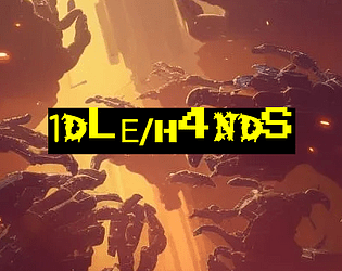
1DLE/H4NDS
Concept: “There's been a hushed-up incident at the Naiman Cybernetics factory in Bigmosse. The corpos are sweating and they need it cleaned up- fast and off-the-books. Head in and clean house, but stay on your guard: this is just the tip of the iceberg.”
Content: A clearance mission at a cybernetics facility where the situation has gotten dangerously out of hand. Content provided in three versions: a “classic look” black-on-yellow scheme, a “nite mode” black-on-gray scheme, and a “squeaky clean” black-on-white scheme that uses standard fonts.
Writing: Detailed breakdowns of locations, NPCs/enemies, potential events that might unfold (including an alternate plot hook), and an optional set of bonus goals for the PCs to achieve.
Art/Design: Each version makes use of a single-column text layout, simplified location maps, and illustrations of enemy cyborgs.
Usability: Very easily readable and navigable, with consistent use of distinct headings/labels to indicate different sections and kinds of content and important elements.
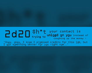
2d20 $h*t Your Contract Is Trying to Unload on You Instead of Coughing up the Money
Concept: “Your guy is trying to unload their garbage on you, maybe they want to get rid of it, maybe they are trying to scam you, maybe they genuinely don't have the money, maybe it was their plan all along…”
Content: A table of goods–some junk, some potentially valuable–that a GM might use to sprinkle in some randomness into a punk’s payday.
Writing: Tons of flavor crammed into brief descriptions of a variety of items.
Art/Design: Two versions: black-on-white and black-on-blue, each provided in primarily two-column text layout.
Usability: Both versions provide visual contrast between fore and ground, with readable font choices and consistent use of headings and list item numbering.
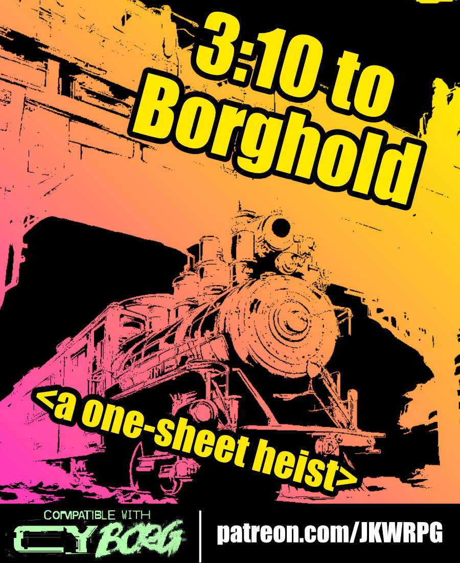
3:10 to Borghold
Concept: “It's time to rob a train---CY_BORG style! Do your research, plan your approach, and extract a high-value target from a prison transport before you're overwhelmed by security forces. Get in, get out, get paid!”
Content: A job to take care of (kill or extract) a target on a prison train.
Writing: Lots of helpful and flavorful details throughout from preparation to execution to tips on how different approaches/plans might play out.
Art/Design: Three-column landscape spread with an illustration of a train in the top center and white-on-black text with yellow headings all around.
Usability: Consistent organization and presentation of text (headings, bolded details, etc.) to make navigation and identification of desired details easy.
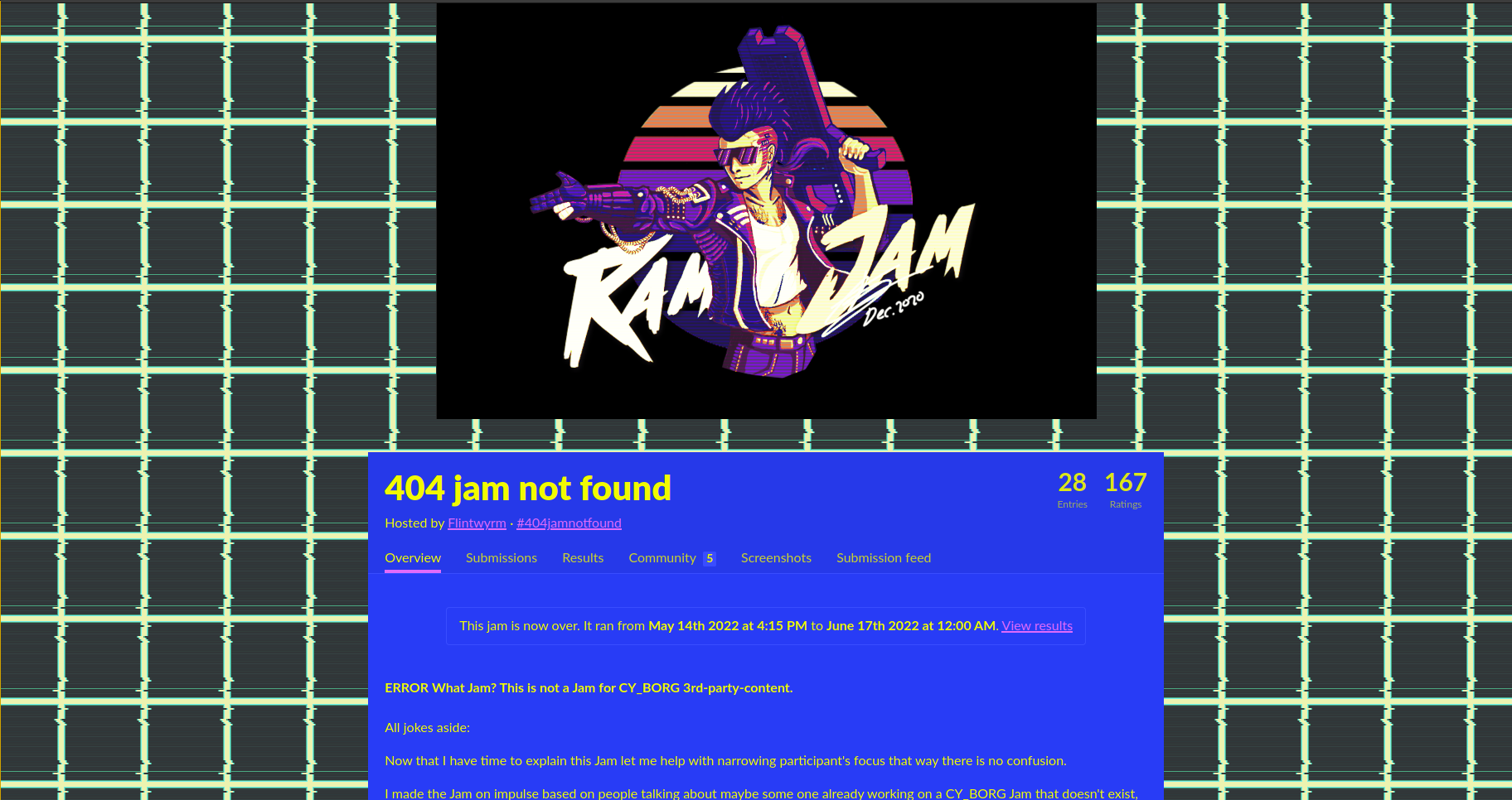
404 Jam Not Found
Concept: “*404 Jam not found's* theme is content that does not yet exist in a meta sense. CY_BORG as a TTRPG book is still new and has little content (aside from the enormous amount of amazing Mork Borg content out there). People can submit anything big or small. Maybe it’s an encounter table, NPC, creature, gear, weapons, some new mechanics, or even a class. This is for the community by the community and most importantly for fun. The ranking criteria is how Cyber and how Punk the submission is.“
Content: A wide variety of content to flesh out the Cy_Borg world for a table.
Content: A wide variety of content to flesh out the Cy_Borg world for a table.
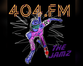
404.fm “THE JAMZ”
Concept: “A crazed socialite with a seemingly bottomless wallet and far more information and connections than one person in CY has any right to. He could take over this city in a matter of days, instead he’d rather play sick jams as the backing to an even sicker game.”
Content: An adventure/scenario for destructive PCs who enjoy a soundtrack to their chaos from a malevolent DJ.
Writing: Brief descriptions of tasks to complete cunningly reflect a variety of music genres that the GM is encouraged to develop a playlist for ahead of time (punk, metal, hip-hop, electronic, etc.).
Art/Design: White text on dark brick-pattern background with a hand-drawn chaotic punk in motion on the cover. Each page (focused on a musical genre and its tasks) is given unique character with font choices and text arrangement.
Usability: Large text makes identifying each element and its relation to other elements–and a similar structure for each page helps this identification and navigation. Helpful note for GMs on the last page also encourages combination and experimentation.
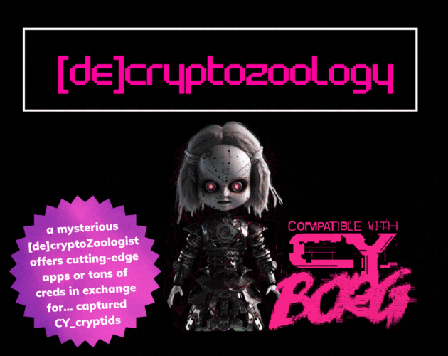
[DE]CRYPTOZOOLOGY
Concept: “In the shadowy depths of neon-lit Cy_, where man, creature, and machine meld into one, enigmatic |0r3N_C0@lM@N3|, a [de]cryptoZoologist, obsesses about cryptids. Offering bountiful creds or cutting-edge apps as rewards, she lures runners into capturing these elusive beings, her true intentions shrouded in mystery.”
Content: A collection of useful cryptid-related information and inspiration: a NPC and their laboratory, several NPCs, and a set of apps.
Writing: Descriptive overviews for entries along with mechanics that reflect the character of each.
Art/Design: Trifold pamphlet layout with pink and white on black, with each panel presented mostly as a single column of text and glitch-aesthetic illustrations.
Usability: Layout and text contrast provides easy reading and browsing for desired info.
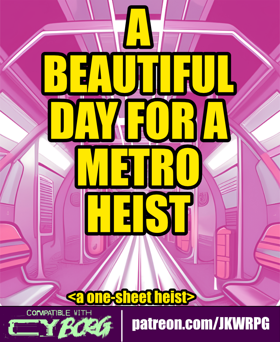
A Beautiful Day for a Metro Heist
Concept: “The heist begins as the PCs are traveling on the metro. First, the train blows past their stop. Then, the door locks engage. Finally, the train starts going fast. REALLY FAST. CYSG puts out a localized RCD blast: ‘To all aboard, the train has been hijacked… ...stop the train, get a reward… ...you have approximately...twenty minutes before the train derails…’”
Content: A gig to put a halt to a train-jacking.
Writing: Concise descriptions with bursts of flavor to flesh out train car events, inhabitants, and potential outcomes.
Art/Design: White on black with pink and yellow accents. Wide spread of content across quartered sections, with a diagonal map of a train car cutting across them. Illustrations of a train car interior and an NPC portrait accompany the text.
Usability: High contrast text/ground. Initial read-through may be somewhat confusing, as supplement “begins” on lower left and then moves up and to the right across multiple separated sections of diagonally oriented content. A player handout of train car map/layout is included.

A Garden of New Hope
Concept: “A Garden of New Hope is a fruitful and harvest rich module for Cy_Borg that dives into the twisted heart of The Sanctum, a seemingly blissful haven masking a sinister root cause. Bathe in mind-altering nanotoxins, overcome ruthless Keepers and Wardens, and uncover the fate of a mysterious visitor from G0. Made for those who relish moral dilemmas, accepting suicide missions from dangerously unhinged clients, and taking a nice stroll through a beautiful garden.”
Content: A job to retrieve a client’s son from a cult–or possibly something far worse–from a seemingly tranquil location.
Writing: Tons of detail about the situation, relevant NPCs, and organizations, as well as GM-oriented suggestions/advice about how to bring the mission to life.
Art/Design: ~20 pages of distinct single-page layouts with some consistent elements (heading placement, font choices, etc.) and a number of NPC illustrations. Multiple maps of the target location are also included, with room-based descriptions as well as security details.
Usability: Visually, the layout elements allow for easy identification and perusal of desired content. However, text is not embedded so searching or selecting text is not possible.
Loading next page...
Page 1 of 6
Next page