3rd-party licensed
A Hundred Thousand Burned Hackers
Concept: “Nova gives you free drinks sometimes. You pay when you can. Now she needs a favor. Got herself in deep. Owes a lot of creds to some unfriendly goons. Luckily a solution walked into her bar yesterday: Abyrn Bio Corp employee, high on Rattle. Showed her a stolen “HiveShock” NNEMP prototype. Going to use it to blackmail CPHRCORP. Pulse will take out half of Cy. Worth a fortune. Nova spotted a beaconworm tracker on it. Nice tech, but an easy hack. Rooted it while Rattlemouth wasn’t looking. Now it’s her tracker, not whoever planted it.”
Content: A gig to steal some shit for a pal who deserves the help.
Writing: Densely packed details of the target office complex, enemies to encounter, events unfolding, rumors about the op, and more.
Art/Design: Trifold brochure layout with a dark-themed outer set of panels and a light-themed inner set. A labeled map is provided on one panel, and a player-facing map/handout is included as a separate file.
Usability: Sections are clearly distinguished by a consistent set of borders, headings/labels, and panel-based whitespace to facilitate identifying desired information. Text is easily readable and uses high contrast (black on white and white on black).
A$$hole$ and Elbows
Concept: “A low-level, mid-tier manager type from Aegis Conglomerated—using the screen name Mr. Greensleeves—needs an Aegis BioTech prototype implant recovered. This rare tech was “mistakenly” put down the recycle chute and ended up in a Mosscroft junkyard, Big Dumpers. As reward for recovering the implant and saving his job Mr. G promises to provide a backdoor into Aegis Financial for potential debt reduction. It’s simple: get to Big Dumpers, search for the implant, get the fuck out, and return it to Mr. G. What could possibly go wrong?“
Content: A simple search and rescue operation–but the PCs aren’t the only ones performing it.
Writing: Tons of character packed into the junkyard location (with a dozen areas of interest) and NPC details.
Art/Design: Trifold pamphlet layout that includes a map of Big Dumpers and relevant specifics on the inner panels, while job and NPC information appears on the outer panels. Color scheme is a mix of black-on-white and white-on-blue/yellow-on-blue.
Usability: Organization is easily recognizable, with headers and important information consistently distinguished from body text by font choice, size, color, and inline bolding.
Abandoned Algae Farmer
Concept: “You were a cog in the massive machine that feeds the city of Cy. Now, for one reason or another, you had to abandon your algae farm. All you have is the clothes on your back, a couple pieces of gear, and whatever the fuck you found out in the emerald muck of the vast algae fields.”
Content: A class for the “rural” outsider who’s ready to make a mockery of the hero’s journey.
Writing: Really engaging, flavorful text pervades the entire document; mechanics information is distinguished by underlined phrases amidst the descriptive core content.
Art/Design: A lo-fi image of an algae farmer, surrounded by imposing stalks of their crop, supports bright green, yellow, and white text content.
Usability: A variety of visual markers–boxes, clearly labeled list items, color choices–very effectively organize the presentation of class information across a two-page spread.

ADDITIONAL_CYBERTECH
Concept: “10 additional Cybertechs for CY_BORG.”
Content: A set of cybertech options for further bodily customization.
Writing: Cybertech names and features are imaginative, suggesting creative opportunities for timely uses.
Art/Design: Two-column spread, with table of cybertech options on the left and a black-and-white illustration of an individual with significant cybernetic modifications. A black-on-white print-friendly version is also included.
Usability: Table contents are cleanly organized, with color/bold highlights for table row numbers and costs for each cybertech.
Advanced Armor Iteration 1
Concept: “Gear up with a few new pieces of cyber-enhanced equipment, including some references to popular games and media.”
Content: A set of armor, weaponry, and related tech to add to the marketplace in a game of Cy_Borg.
Writing: Equipment details are offered concisely and in a straightforward fashion, allowing item names to fill in potential flavor/character (whether they’re references to media or not).
Art/Design: Black text on yellow, with a faint caution tape illustration background and a similar pattern around the edges of the page.
Usability: Text is high contrast and easily readable, with a consistent organization for each item to allow quick grasp of and reference for item details as needed, including bolded damage/armor stats and a legend at the bottom of the page for some shared attributes.

After Market Parts
Concept: "After Market Parts are a series of mechs on A4, made for Kill ENGN and Cy_Borg. There will be more coming, keep an eye on this, follow along."
Content: A set of (currently) four unique mech enemies with which to populate hazardous regions of Cy.
Writing: Mostly quite concise in terms of providing stats for each mech, some have creative rules/abilities--and, in one case, a loot table--that can help a GM provide a memorable experience for their players.
Art/design: While each color scheme is a bit different, the files all have a consistent layout of a central illustration of the mech with boxes of stats & rule text, in a high-contrast color to the background, positioned on either side of the illustration.
Usability: Each set of abilities and explanations thereof is easy to identify and make use of.
All Roads Lead to Chrome
Concept: “Being a mercenary isn't easy work. Between the gunfights, dealing with shady corps, and fending off crazed psycho's, you are bound to get hurt. Sure, you can train to get better at handling these types of situations, and maybe you can shill out some creds for a new gun or two. But eventually, no matter what path you take, if you really wanna hit the big leagues…”
Content: A set of rules to flesh out cyberware and cy_rage, along with several new drugs and a job to snag some cargo from a tech-obsessed cult.
Writing: Accessible and concise rules, with lots of detail and explanation provided for the assorted cybertech and the job.
Art/Design: A mix of white-on-dark (for the cybertech rules & drugs) and black-on-white (for the job). Occasional images complement page text, with a brain-shaped map provided (and keyed0 for the job. Bright colors and bold text highlight important information and serve as headers. A print-friendly black-on-white version of the cybertech rules is also included.
Usability: Readable fonts, visually recognizable organization of page contents thanks to spacing/grouping and section borders. Consistent application of particular color choices and bolding to help with navigating and locating desired information.
Alt-Vibed Soundfiend
Concept: “The pumping beats of the last Post-Grunge Blitz-Rave still course through your veins.”
Content: A class for the circuit-bending audiophile who’s long wanted to use their love of sick riffs and beats to obliterate the enemy.
Writing: Brief glimpses into a fully-formed lingo for the class detonate idea-bombs about how to live, and not just use, the vividly described mechanics provided here.
Art/Design: Filtered neon cityscapes and a close-up of a soundfiend on the prowl stand out as strongly as the bold, distinct headings for each set of class details/features.
Usability: General organization is quite navigable, although some font choices can make reading tricky; similarly, HP & Glitch calculation details blend into the background image.
Amethyst Reign
Concept: “This month’s adventure sends some street toughs on a ridiculously difficult mission — assassinate one of the world’s most famous musicians, hours before he releases his hotly-anticipated new album. He’s holed himself up in a secret recording studio, and now the PCs need to track him down and kill him before his new album influences a new generation.”
Content: A job to take down a musician before the night is over.
Writing: If most Cy_Borg missions are stripped-down punk that hint at options a GM might use, this incredibly detailed gig is prog metal. Plenty of specific considerations to address a wide variety of possible PC actions.
Art/Design: Two-column layout (plus some handouts and pre-generated character sheets) with black text on a light background supplemented with full-color illustrations, blue-on-green maps with white labels, and NPC stat boxes.
Usability: Consistent organization, arrangement, headings/labels, and readable text all contribute to an easily navigable and usable document.

Anarchy Is What Corporations Make of It
Concept: "Corporations are the main antagonists of any Cyberpunk Dystopia. But they're not exactly behaving like they should be in that fictional climate. Instead, Gamemasters rely on old tropes to portray corporations as state-like institutions, with the only difference being that they're profit-driven.
This 15-page zine presents Corporations in a new light, based on political theories from International Relations & Geopolitics. It seeks to highlight the much shadier side of corporate rule: the fact that, in a world without governments, corporations would rather nuke each other into the ground if it meant the bottom line was a bit greener.
It also describes how it affects the lives of regular individuals, all while introducing 4 new mechanics in order to enhance play smoothly. Make your cyberpunk stories deeper without adding unnecessary complexity.
Make your corporations dynamic, ever-changing and profit-driven the way it was always intended. Remember: Corporations are the New Gods because they own you and everything you do or desire."
Content: Part treatise, part suggested mechanics and ideas for GMing a cyberpunk-focused TTRPG.
Writing: A concerted effort to situate the political, social, and economic ramifications of corporatist systems/structures in an accessible way for GMs and players who may struggle with what "cyberpunk" as a genre attempts to attend to.
Art/design: Colorful two-page spreads with distinct aesthetics and points of focus, often with complementary illustrations centered in a spread or along its margins.
Usability: Font choices and sized vary, although highlighted embellishment is consistent throughout. Busy and low-contrast background pattern images can make some pages incredibly difficult to read/parse.

Android Sprinter - Of Two Faces
Concept: "One of Janus Corp’s top men has had his family disappear. Jed Billington is desperate enough he turns to you. Can you find them in time? What dark secrets will you discover along the way? What will you do when the chips are down, and all secrets laid bare?"
Content: A job to track down missing family members.
Writing: Written for both Cy_Borg and the Year Zero Engine, this scenario included Cy_Borg stats and some guidance for GMs who want to make sure its parameters fit the game scope & tone. Details included for each location punks might visit, clues they might uncover, and encounters that may occur along the way.
Art/design: Primarily organized in two-column black-on-white layouts with hand-drawn illustrations of NPCs and locations amid the text. A keyed map of one major location is also included. Two player-facing handouts are provided as separate files.
Usability: Consistent presentation of content--main body text, headings, labels, stat boxes, etc.--and Cy_Borg-specific section on NPC stats all facilitate ease of navigation and location of desired info to more easily run the mission.

APEX Singularity
Concept: "First, you PVNKS infiltrate a shady research facility protected by a powerful AI. Tough job, as usual, but this time you've got a little help——and expect a decent reward.
Then what? Do you deliver the prize to your employers, or take up any of the alternative offers you've received? Time's ticking, punk...
How greedy are you? What are you willing to betray? Who can you trust?"
Content: A job to snag an important high-tech item and then hightail it out before things go south. Also included are maps, tokens, text messages, and more to help facilitate running this job.
Writing: Evocative setup and descriptions that are likely to speak to fans of cyberpunk motifs and of J.R.R. Tolkien, with plenty of GM-oriented assistive explanations to keep a table of punks on edge.
Art/design: Black-on-white two-column layout for most pages, with assorted images (photos, illustrations, etc.) around the periphery to reflect the content of those pages. A map is included in the main PDF as well as in the "toolkit" set of materials noted above to use for running the job whether in-person or virtually.
Usability: Consistent organization and formatting of text allows for quick perusal and identification of desired info, and included explanatory details should answer a number of questions about how to approach various aspects of the job and its many potential punk-related complications/twists.
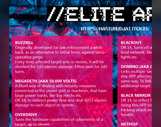
App's 4 Elite
Concept: “A bunch of custom APP's for CyBorg, to make hacking and hackers more fun.”
Content: A set of apps for the discerning hacker, whether they work with or against the PCs.
Writing: Imaginative descriptions and mechanicals effects that feel quintessentially cyberpunk.
Art/Design: Two-column layout of white text on translucent pink over a dark blue patterned background.
Usability: Clearly distinguishable app entries provide easy navigation, and text/background contrast provides accessible readability.

Assault on the Hills
Concept: “Buried deep within the twisting streets and endless hedge rows of the hills is the mansion of Helon Evontusk. Members of the board have tasked the punks with infiltrating Helon's home and finding a way to remove him from his position as CEO. If they can do this and escape without being captured, they will be rewarded with a massive collection of creds and some cutting-edge cybertech for the effort.”
Content: A job to take down one of the most narcissistic tech entrepreneurs in the Hills–with multiple options provided for dealing with him, each more satisfying than the last.
Writing: A tongue-in-cheek celebration of billionaire compeuppance. Sensory descriptions, random encounters and events, and NPC details all complement one another to build a vivid scene.
Art/Design: Sleek, mostly black-and-white layouts (with the exception of the cover and an isometric floor plan on the first two pages) that work to evoke the trappings of tech innovation. A set of top-down print-friendly and VTT-ready job site maps is provided as well.
Usability: Text is high-contrast throughout, and page layouts clearly provide visual indication of headings/labels vs. body text, with whitespace used to not only suggest related consent but also to guide reading and navigation through each page.
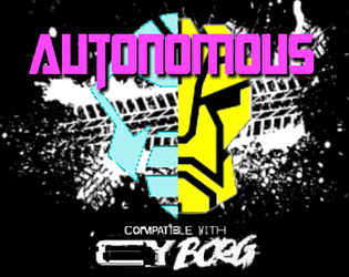
Autonomous
Concept: “Under the neon sky, amid the acrid fumes and blaring advertisements, something is present. They might have come with the rock, plunging into G0; or perhaps they were here long before then. There's no telling- there never is, not when the Autonians are on your planet. They blend in, fighting a shadow war- the crushing fist of an avaricious tyrant, and those few but proud who oppose him.”
Content: A collection of NPCs for tables where players & GMs prefer their robots to be more than meets the eye.
Writing: Bombastic worldbuilding that reflects the spirit of the source material it homages, with each robot having its own unique vehicle “altform.”
Art/Design: A mix of one- two-column content layouts with black text on white background, with each NPC stat block placed beside a colorful illustration of that NPC.
Usability: Stat blocks are provided consistently in organization and font selections, although introductory text uses a variety of fonts to indicate emphasis and proper names.
Avtozak
Concept: “Avtozak is a Cy_Borg expansion about riots.”
Content: A set of riot-related NPCs, weapons, and a table of riot causes.
Writing: Terse, frank descriptions and stats/mechanics for included content.
Art/Design: Illustrations of riot vehicles and participants (cops and protesters) with highlight colors are positioned alongside relevant high-contrast text.
Usability: Font choices are readable, with headings/labels and background colors for distinct sections that assist navigation and perusal.
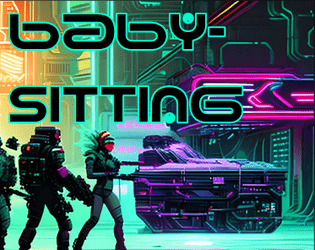
Babysitting
Concept: “An easy job ! Just sit around and babysit some corpo doctor and this box. Easy money?”
Content: A gig to retrieve, guard, and escort a person and their cargo to a designated safehouse.
Writing: Prolific details to flesh out the mission and the various groups with interests in its success–or failure.
Art/Design: Trifold brochure format provides initial parameters on the inner panels and later-stage conflicts on the outer panels. Predominantly white/yellow text on black, with NPC stats in black on brightly colored boxes, with portraits and street scenes complementing text. An additional page is provided with a safehouse location map and player-facing ‘breaking news’ info.
Usability: Color-coded text references draw attention to different NPC interactions, and consistent use of content section color and shape makes for easy identification of desired info.
Back to the Roots
Concept: “A custom collection for Cy_Borg ttrpg, that includes:
- 13 new weapons, 6 new drugs, 4 new items - made in the slums of CY.
- 11 new street-made cyber-tech and 9 new APP's
- Short descriptions of 5 new slum Gangs
- A simple and short Adventure/Mission.”
Content: Tons of material to flesh out a game, from equipment to drugs to gang NPCs/enemies, with a scenario in the slums to take down a sadistic AI (and a map for the location).
Writing: Concise, direct descriptions and explanations of mechanics for a huge number of entries for various categories.
Art/Design: Mostly two-column page layouts (each with its own color scheme/aesthetic) with content on a translucent background pane over detailed, high-tech images. Map of floorplan includes effective icons indicating room features.
Usability: Text is easily readable with distinct heading/label decoration present in each page’s layout aesthetic.
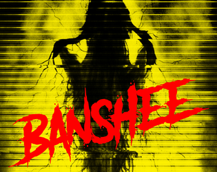
Banshee
Concept: “A mid level exec has lapsed into a coma after an unwise deep dive into the sewer levels of the net. When he came back up, it was with a permanent look of horror and endless babbling about ‘the woman’, yelping in terror at random moments, reacting to something that no-one else could see. He’s actually infected with the BANSHEE virus. It hijacks the carrier’s audio and visual implants, terrorising them until their brains overload and shut down.”
Content: A gig that takes a party of punks into an exec’s dying mind in search of important data.
Writing: A swirl of informative exposition and characterful style to situate a game group inside the mind of their target and all the horrors residing there.
Art/Design: Colorful one- and two-column text layouts, with each page having its own aesthetic and an accompanying illustration.
Usability: Text is easily readable across pages and assorted font choices, with each page’s organization recognizable through text size and color distinctions for headings/labels and body content.
Beyond Cy
Concept: “The fields. Monoculture deserts of genetically enhanced crops like wheat 4.6, ultra-maize, and soykin. Spliced to perfection. All earth is sterile. Killed by an unhallowed mix of unfiltered UV-radiation and the most potent poisons. Only hard fertilization keeps the masses alive and fed. Traveling through the cultivations is not without peril. Chemships puke their concoctions onto the plants; mechanic harvesters that have never seen an animal or human cut down all in their path.”
Content: A treasure trove of rules (miseries, glitches, mutations), gear, location/site summaries and generators, map hexes, random encounters, enemies, classes (“Mutant” and “Elektron Rohre”), job seeds/contracts, and even a dungeon to explore.
Writing: Intense, vivid, and wry descriptions that bring to life the sprawling wastes that surround Cy.
Art/Design: A mix of collage, pixel art, graffiti, graphical user interfaces, print reports, and more to frame each page/spread uniquely but feeling comfortably in line with the official/core Cy_Borg aesthetic. Map hexes provided as additional file.
Usability: Wide variety of layouts, font choices/sizes/colors, and organization can slow down reading and navigation (e.g., class info interspersed among NPCs), but hyperlinked table of contents aids with identifying desired details.
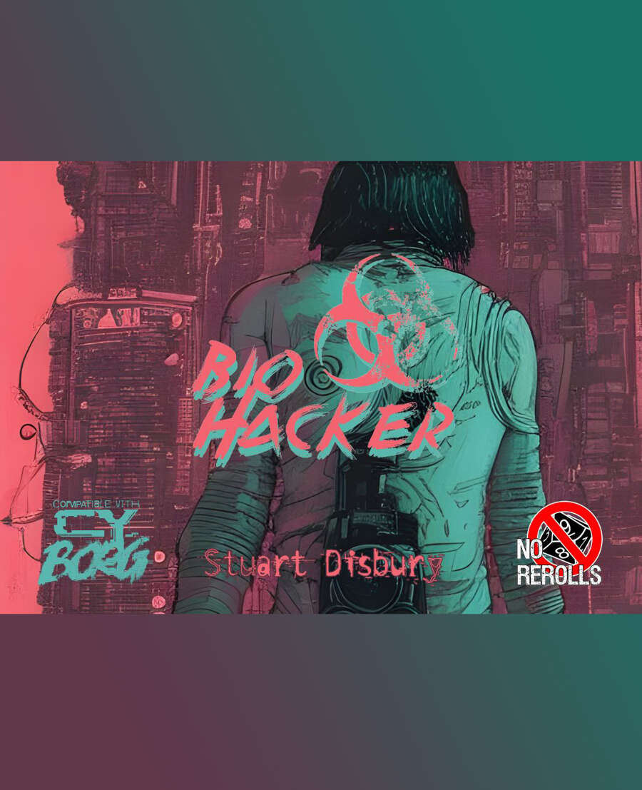
Bio Hacker
Concept: “You were a senior MedTech with T.G. Labs until you were found trafficking in synthetic organs, controlled stims, illegal mods, and little glass vials. Disgraced, blackballed, alone. You take work where you can find it.”
Content: A class for the mad scientist who wants to turn their side hustle into their main gig.
Writing: Class features articulated succinctly, with a table of derangements to add intense flavor to a bio hacker PC.
Art/Design: Very colorful mix of pinks, greens, and black, with multiple aesthetics over a partial map of CY, including a notepad being held by a (mostly off-page) hand. Two illustrations of a bio hacker appear–one on a title page and one amid the background collage of the main page.
Usability: Each section for class features appears in its own column/window. However, because of different colors for text and complex background patterns, some text is easier to read than others.
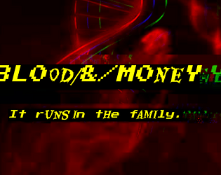
BL00D/&/M0NEY
Concept: “Crime families in the squalid megatropolis of CY. The deepest wounds of society- human traffickers, whoremongers, extortionists -have a tendency to crust over in stubborn scabs. Those who dare to commit evils nobody else has had the gall to perform before will find little competition in the field, and therefore great success. That’s how these families made their mark- bullets forever embedded in the cancerous and corrupt flesh of the great beast CY, they pushed the limits. And now, they’re here to stay, until someone’s willing to dig the slug out…”
Content: Information on six crime families/organizations that can be integrated into games of Cy_Borg: what their primary interests are, notable NPCs, and how GMs might make use of them.
Writing: Details provided in meaty paragraphs full of ideas and hooks, in a conversational voice that could be read straight to players as in-universe knowledge.
Art/Design: Black-on-gray single-column text layout, with an illustration at the bottom of each page that reflects the character of each crime family.
Usability: Easily readable/navigable, with solid contrast for text fore/ground. Headings and key terms/phrases are bolded for distinction and emphasis.
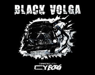
Black Volga
Concept: “A new, terrifying enemy straight from Polish urban legend - Black Volga. Now roaming the streets of CY, looking for petrol. But it's now what you think it is. ‘I’ve heard it. The sound of the engine weirdly resembles a beating heart. Guess it’s my weird imagination’ ‘Windows are pure black. I wonder… who is inside?’ ‘I swear to Balfogriff, I’ve seen tentacles slipping out of the windows!’”
Content: A demonic automobile that terrorizes the roadways.
Writing: Ominous and creepy flavor made all the creepier by the car’s devastating attack mechanics.
Art/Design: White and blue text on black surrounds a hand-drawn illustration of the Black Volga.
Usability: Visually, color, italics, and positioning of content help indicate the different purposes and kinds of text on the page. However, the text is not embedded, so no searching/selecting is possible.

BLACKFLOWER
Concept: “BLACKFLOWER is a CY_BORG heist to steal a defective exosuit with a rogue AI that puts your crew in the middle of a revenge plot. There’s a new security corp, new gang led by Xu, new shops, and a two-level apartment building map.”
Content: A job to acquire from a corporation some high-tech gear that might not actually want to leave.
Writing: A number of tables with writing that balances description/atmosphere and information/mechanics, reflect a range of NPCs, locations, business inventories & prices, and assorted events. Also included is a helpful two-page list of considerations/options for GMs.
Art/Design: Lots of black-and-white art and high-contrast pages and spreads with splashes of color (pink, yellow, blue). Illustrations reflect NPC portraits, a map of the job location, and close-ups of equipment.
Usability: Text is consistently easy to read visually and page layouts follow a reliable organizational grammar for headings, labels, emphasized text, body text, etc.
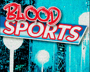
Blood Sports
Concept: “Some trashy random tables for generating odd sports and shows names punks play in CY_. You can roll some cocky champion names too and get some inspiration from the portraits provided.”
Content: Tables for quick generation of game types/specifics and famous sports NPCs, all of which are soaked in CY style.
Writing: Table results are vivid, grungy, and dystopian–exactly what you’d hope for.
Art/Design: Contrasting-color rows help with table navigation, with tables positioned around the edges of large image spreads (an arena and a gallery of NPC portraits), with an eye-bleeding aesthetic and palette.
Usability: While not all tables are labeled, it’s clear what each does functionally and how to use it alongside the others.
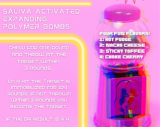
Bombles Chewable Grenades
Concept: “Yum! Delicious Bombles Chewable Grenades, a piece of equipment compatible with CY_BORG RPG. (DO NOT SWALLOW)”
Content: A fun and tasty way to weaponize one’s food.
Writing: Concise, direct explanation of bombles and how they operate mechanically.
Art/Design: White-on-pink (and yellow highlights) advertisement aesthetic with an image of a gumball machine on the right side of the page.
Usability: Info is easy to navigate and recognize particular content details, from bumble flavors to mechanical effects to credit cost. Supplement is provided as an image file, so text is not searchable or selectable.
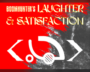
Boomhunter's Laughter & Satisfaction
Concept: “Burnchurch Hex’s latest [dist/att]raction is a kill club run by the infamous chromediator Boomhunter, a chromed out kill-club veteran with gunpowder cologne and grenades for jewels. To him, the only thing better than a good kill is a thumpin soundtrack.”
Content: Just about everything a GM might need to provide players with an entertaining time at a kill club: notable NPCs, locations, events/activities (and how to bet on them), and enemies to face off against.
Writing: Plenty of imaginative world-building detail supported with brief rules and mechanics when needed.
Art/Design: Two versions are provided: one that hews closely to the Cy_Borg design aesthetic, with a variety of two-page spread layouts, colors, and fonts; and one that offers a simple, printer-friendly black-on-white single-column arrangement of content.
Usability: Text in both versions is mostly high-contrast, although in the ‘regular’ version, some font choices and spread background ‘busy-ness’ may impact readability for some readers. Relationships between different content types/sections are visually distinct, thanks to consistent shifts in font size and bolding.
Borgpunk
Concept: “Maybe you're tired of Players rolling Presence to charm/snipe/shoot their way in and out of any situation, especially that Discharged Corp Killer who, for some reason, rolled a +3 on his Presence. Well, do not worry anymore, as this hack aims to fix that.”
Content: An expansion of stats and skills to add a bit more crunch to games of Cy_Borg.
Writing: Focused, direct explanation of optional mechanics to integrate into a game, along with an insightful rationale for the hack’s existence and a character sheet organized to include the new stats & skills.
Art/Design: Single-column white text on a dark black-and-purple patterned background. Character sheet mixes hand-drawn illustration, photo collage, and fillable fields.
Usability: Text in both files is high contrast and has consistent font use for headings/labels and body content. Unfortunately, text is not embedded in either file, so searching/selecting is not available.
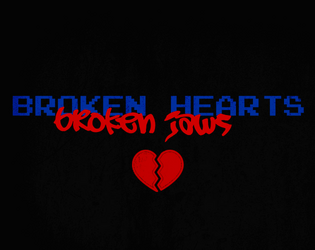
BR0KEN_HEARTS//BR0KEN_JAWS
Concept: "’Some desperate Alliansen admin put out a plea to rescue her AI program. Not sure why she doesn't just use company muscle to get it back, but she's promisin' the reward of "anything within her abilities," so here we are. Hope ya brought your earplugs though, cuz the goons that stole it are LOUD.’”
Content: A mission to recover an AI stolen by musicians.
Writing: Concise bursts of info to guide a GM toward notable encounters and fitting atmosphere.
Art/Design: Red and blue on black, with an aesthetic that mixes graffiti/tagging with software terminals, arranged in mostly one- and two-column layouts. A map of target location is provided in pink.
Usability: Consistent presentation of content elements throughout the document, making visual identification of headings etc. very easy. However, text is not embedded so no searching or selecting is possible.

Brain Trust
Concept: “A professor at the University of Cy has intel that her corporate rival has acquired a philosophical impossibility: A Boltzmann brain. A thought experiment that shouldn’t exist. She wants the brain acquired so that she can test for the truth.”
Content: A gig to procure a particular disembodied brain from a secure corporate facility.
Writing: Lots of atmospheric depth in details that range from location-specific info to locker room contents.
Art/Design: Mostly single-column layout of black-on-white text (with a few sporadic accent colors) complemented by maps of the job site–also provided separately in GM- and player-facing map images.
Usability: High-contrast text, document layout, and consistent presentation of distinct types of content all contribute to easy visual navigation and location of desired information.
Loading next page...