3rd-party licensed

BRAINROTTEN INFLUENCER
Concept: “When you signed up with the network, you didn’t expect your life to spiral downhill this quickly. Your RCD is modified to stream 24/7 on platforms like NuTube and Spasm, no pauses allowed.
Most of your colleagues died chasing fame. You’re still alive, barely teetering on the brink of psychological and physical collapse.”
Most of your colleagues died chasing fame. You’re still alive, barely teetering on the brink of psychological and physical collapse.”
Content: A class for the would-be social media mogul who’s breaking bad to maintain their follower count.
Writing: Bleak and pointed satire pervades the class abilities and descriptions to emphasize the daily life of a Cy resident.
Art/Design: One- and two-column black-on-white text layout, with a separate cover page showing an illustration of a brainrotten influencer portrait.
Usability: Consistent visual elements (headings, borders for distinct content sections, font choices, etc.) all contribute to an easily recognizable visual grammar and means of perusing class info.
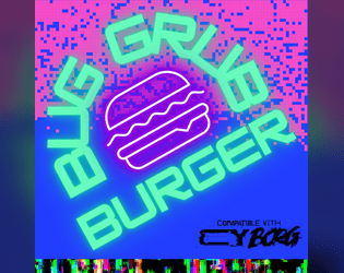
BugGrub Burger
Concept: “Narrow and crowded. The BugGrub Burger shines green and purple. Sounds of wet smacking. Insectoid mascots crowd the outer walls and ceilings, shrieking adverts … an explosion rains glass on all of it. The Heirs of Kargoz advance. Get in and out before they do.”
Content: A scenario for assassins and data thieves who prefer fast food to fine dining and want to know how the sausage gets made.
Writing: Inspired descriptions and scenario components bring the Burger joint to life and provide GMs with a plethora of dangerously grimy and horrifying details.
Art/Design: Primarily black-on-white text with colors to accent headings/labels and helpful images–a map of the site, employee portraits, etc.
Usability: Layout and color scheme is easy to make sense of for quick navigation and identification of desired info. While content is in PDF form, the text is not embedded, so no searching or copying content to clipboard is available.
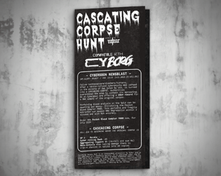
Cascading Corpse Hunt
Concept: "Fellow technomancers/slashers/hunters, After a nanite-infused cyberpsycho was zeroed in the streets of Oak Isles by UCS, it mutated into a CASCADING CORPSE. Authorities quarantined the area to contain the spread."
Content: A mission to collect DNA from the original corpse that has been self-replicating with disastrous results.
Writing: Bite-sized bursts of specific sensory elements or events for a variety of locations in the area, with similarly tantalizing notes about tests that might occur there to further complicate the PCs’ efforts.
Art/Design: White-on-black “1Bit” aesthetic that resembles lo-fi pixel/ASCII art, presented in a trifold pamphlet layout with job & location info on the outer panels and a large map of the area across the inner panels.
Usability: Visually apparent consistency in design grammar to distinguish different text content (headings, GM notes, etc.) and aid with navigation to desired info, with each location’s text beside a relevant graphic of that location taken from the area map.
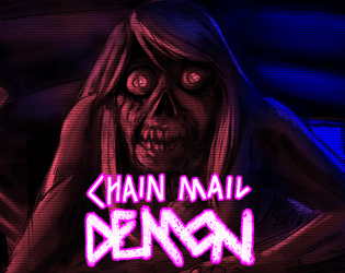
Chain Mail Demon
Concept: “After finding a cursed message on the 'Net, the Punks are hunted by a strange creature that attacks them when they sleep. Can they find a way to avoid its deadly touch? Or will they sacrifice their friends in order to be spared?”
Content: A creature to terrorize punks who check their inbox.
Writing: Half stats/mechanics and half flavorful messages relating to the monster, all of which evoke an appropriately frightening net-nightmare.
Art/Design: Neon and white on a dark background displaying the chain mail demon illuminated in red, surrounded by boxes with text content.
Usability: Supplement is provided as .png and .txt file. Visually, the .png version makes it easy to identify different kinds of content and how to locate desired info. The .txt version is helpfully organized and labeled, with excellent text descriptions of the visual elements of the .png to aid with accessibility.
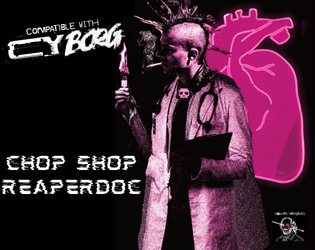
Chop Shop Reaper Doc
Concept: “Not all reaperdocs finish their schooling. That’s right, you’re a chop shop dropout. But you’re not going to let a thing like an unofficial license to practice stop you. What do they know?… What do you know…? Hey, you made it through enough classes to at least know where the heart is. Right?”
Content: A class for the flunkie physician who sees the human body as another junk heap to modify with varying degrees of success.
Writing: Laser-focused in-character descriptions to situate the class abilities and mechanics for the player.
Art/Design: Three major columns of content across a landscape-oriented spread, with white-on-black text framed by a picture of a reaper doc in front of a heart illustration on the right, tinged in pink.
Usability: Consistent presentation of headings, list items, body text, etc. across different sections of content. Visually high contrast to help with browsing/navigating class abilities. Text is not searchable or selectable.
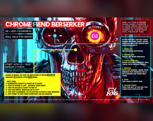
Chrome Fiend Berserker
Concept: “Obsessed with chrome and power, one man army, murder machine.”
Content: A class for the cyberware-focused ship of Theseus.
Writing: Brief bursts of evocative flavor and mechanics hint at intriguing possibilities for a unique character.
Art/Design: Bright colors draw attention to the content arranged around the page, with a large skull in the center that stares at the reader.
Usability: Text is very readable, and several different fonts and colors provide highly visible distinctions in content and purpose.
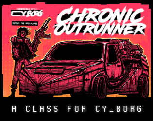
Chronic Outrunner
Concept: “
> > > Always out of time. Never out of gas. Somehow, you keep turning up. > > >
[[nowhere fast]] _drive through Cy, bolting new gear to your car as you go
[[built to last]] _jump forward in time while tethered to your custom ride
[[link to the past]] _perfect your vehicle and when the time is right—
FIND AN OPEN STRETCH OF ROAD AND OUTRUN THE APOCALYPSE”
Content: A class for the road warrior who wants to hit a high enough speed and see some serious shit.
Writing: A range of descriptive and mechanical features that emphasize the post-apocalyptic possibilities of life in CY and beyond.
Art/Design: Two versions: black on white and black on orange, organized as a landscape-oriented spread with distinct text elements framing an illustration of an outrunner next to their car.
Usability: Consistent presentation of headings, body text, and emphasized content all contribute to easy navigating and identifying desired information.
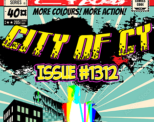
City of CY Issue #1312
Concept: “In a city where money is God, people are interchangeable pieces of hardware and morality is a way to put yourself in the red, what's a hero? Is it the most effective SecOps officer in history? A vigilante dedicated exclusively to beating up poor people? A time-hopping assassin who can extinguish a problem you didn't even have yet? They're faster than a rubber bullet, more powerful than a profit motive, able to leap entire slums in a single bound…”
Content: A set of super “heroes” who appropriately reflect the sociopolitical dynamics of CY, with backstories and stat blocks that allow easy integration into any group’s game.
Writing: Dark humor and commentary make each entry feel painfully real (or at least plausible, motive-wise), even while jam-packed with the gritty/edgy flavor of ‘90s comics.
Art/Design: Single-column text organization provided in two schemes: black-on-white and white-on-dark-gray.
Usability: Consistent presentation of entries and particular kinds of content makes it easy to navigate the document and locate desired information.
CLEAN BREAK
Concept: “>>WELCOME, BR4VE TRAVE1ER
S4N1—or “Sanny” as he prefers to be called—is CY’s sanitation AI, responsible for the timely expulsion of the city’s sewage, garbage, and miscellaneous waste. For decades, Sanny has faithfully and silently executed his function, unaware of the greater changes happening in CY; forgotten and taken for granted, nobody was around to notice the worm of some higher intelligence burrowing itself into the AI’s core programming. Replicating. Evolving. Taking over.
Now, Sanny wants to quit his job—a clean break—and you’re going to help him.”
Content: A series of jobs designed to liberate a sanitation systems AI from its electronic shackles.
Writing: Four interlocked missions with tons of descriptive flavor, tables to roll on, NPCs, and other information for GMs and players alike that provide inspiration and guidance to a given iteration of these jobs in play.
Art/Design: While the entire document is in black and white, each mission has its own aesthetic and arrangement, font types, and so on. Illustrations galore depict assorted characters, locations, maps, objects, etc. that punks might encounter in one or more of these jobs.
Usability: Visually recognizable and consistent uses of headings, bold text, table organizations, content columns, etc. make for easy navigating and reading. Distinct jobs’ aesthetics also indicate visually the boundaries of those jobs’ information to further facilitate identifying desired details.
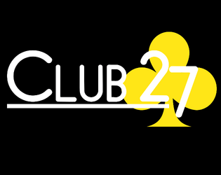
CLUB 27
Concept: “Club 27 is a Cy_Borg expansion about the Club 27 urban legend.”
Content: A nightclub with a discerning membership, some of whom can be hired as mercs.
Writing: Brief details about the club and its members that suggest a variety of ways that a GM might incorporate the place into their game.
Art/Design: Single-fold pamphlet layout with an immersive background club-aesthetic illustration for each panel overlaid with text content.
Usability: High-contrast text is easy to read, with headings and emphasized text visually distinct through font size and color. Most text is embedded, allowing for searching/selecting.
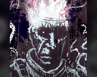
Conductive Convict
Concept: “You were just another dreg waiting for death. But then that explosion happened inside your prison transport. Your face is on every city corner, but your more concerned with the electricity shooting from your fingers. You don't hunger but crave the power of energy. You need answers, and you suspect you're not the only one of your kind. Will you blaze an unforgiving war path, or be a paragon of hope?”
Content: A class for the player whose relationship with electronics–or even static–is “complicated.”
Writing: Direct explanations of class features provided to situate the player toward the class and its assorted benefits and detriments.
Art/Design: A spread of class details in two columns beside an expressive image of a conductive convict rendered in chalk.
Usability: Layout facilitates navigation between sections and understanding content. However, the class is provided as an image, so text is not searchable or accessible as a result.
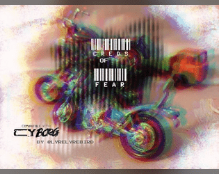
Creds of Fear
Concept: “Royal West Shipping has hired your gang for a non-union haul to their warehouse in Mosscroft. Only the desperate, or foolish would participate. Are you willing to sacrifice everything for the creds?”
Content: An adventure that involves transporting cargo through the city, complete with a number of hazards, obstacles, and other dangers that might await the unsuspecting punk.
Writing: Tight, concise descriptions of relevant details for GM and player creative elaboration/interpretation of the scenario events.
Art/Design: Two-column spread with a left-side glitch art illustration and a right-side single column of scenario text.
Usability: While the font choice is clean and sections are distinguished with whitespace and indentation, text is not embedded so not searchable or capable of copy/paste. A high-contrast version of the document is included.
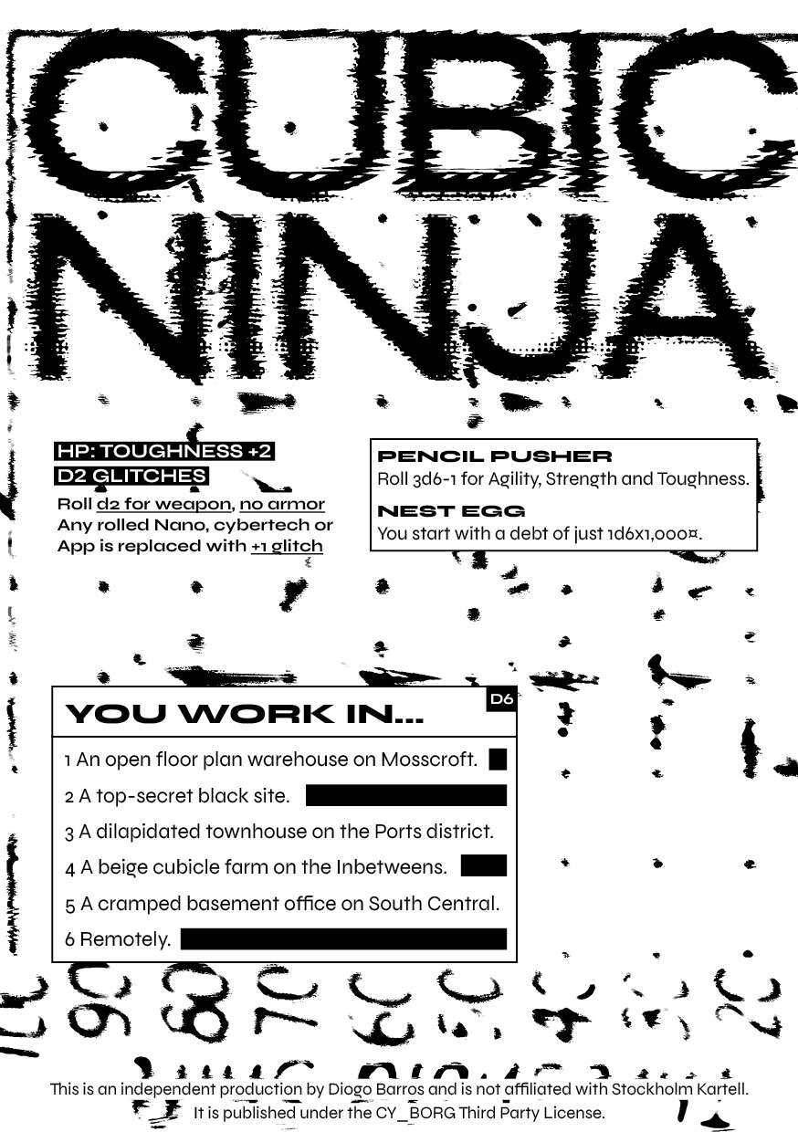
Cubicle Ninja
Concept: “Unlike some people, you actually have a job. Wake up, shower, force feed, commute, grind, commute, wind down, brush teeth, sleep. Repeat until put out to pasture.”
Content: A class for the everyman who’s working hard but yearns to be hardly working.
Writing: Succinct descriptions and class features to situate a player amid tedious labor conditions.
Art/Design: Black-on-white two-column spread layout with touches of static, glitch, and photocopied aesthetics.
Usability: High-contrast text in distinctly organized blocks of content make for easy identification and navigation throughout spread.
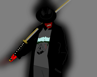
Cultured Swordsman
Concept: “While the VIPs were doing drugs and having sex in Ports You studied the blade. And when Your parents kicked you out You put your skills to use.”
Content: A class for the inner edgelord who wants to viciously dual-wield the tropes of anime and anime fan.
Writing: Helpfully clear mechanics drenched in the flavor of this class concept.
Art/Design: Clean illustration of archetype complements a minimalist layout.
Usability: Readable, navigable text with visually clear distinctions between types of class features/details.
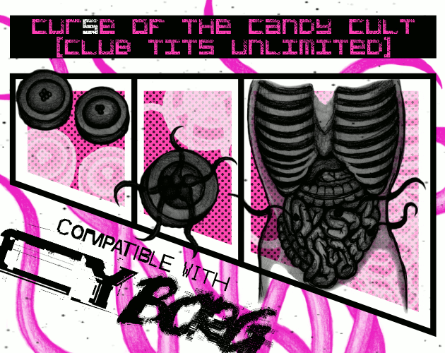
Cur(s)e of the Candy Cult (Club TITS Unlimited)
Concept: “New Location Pad Entry. A Strip Club Dungeon inhabited by a strange Candy Cult for TRIGGER WARNING Jam compatible with Cy Borg.”
Content: A mission to liberate a cultist from their organization’s lair. A pair of player-facing handouts (including a map) is also included.
- Writing: Terse and disturbing details that emphasize the insidious nature of the candy cult.
Art/Design: Two-column layout with black, pink, and white elements. Job details and NPC stats provided on the left, complemented by illustrations of candy, cultists, and–to the right–two levels of Club TITS Unlimited.
Usability: Text is mostly high-contrast and easy to discern purpose for, allowing for easy perusal and use. Only some text is embedded, which can complicate searching or selecting text.
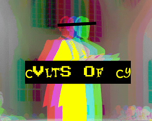
Cvlts of CY
Concept: “A sampling of cults from across the stricken districts of CY, peddlers of false hope to the rasping masses that congregate in the shadows of avarice and oppression. Each of these cults has a leader, an ideology and a specific trouble they cause to the already troubled city. However, where there is trouble to be caused there is opportunity to be seized, and pvnks with few scruples could make significant creds in the employ of these deranged zealots by doing their dirty work for them.”
Content: A collection of six cults and details about their goals, backgrounds, vices, and leaders.
Writing: Detailed descriptions and explanations of cults to be found in CY, with plenty of scenario/plot potential for a GM to develop further.
Art/Design: Layout is primarily a single column of text, with an evocative image reflecting each cult placed amid that cult’s descriptive paragraphs. Color scheme is black on yellow.
Usability: Layout is extremely easy for identifying particular elements and navigating to desired info. Cult entries are provided in a numbered list, and key information is bolded or highlighted.
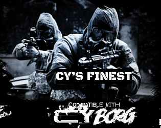
CY'S FINEST
Concept: “The SecOps aren't just faceless walls of flesh and Kevlar hiding behind riot shields. Some of them mean business. Some of them mean serious business. Some of them are zealous, some sadistic, some are just really chasing that dollar, but between one thing and another, this is the quiverful of crazies that the milcorps have to sling at anyone who's causing more trouble than the beat cop can handle.”
Content: A gaggle of highly skilled expert operatives capable of giving any punk in CY an absolutely terrible day.
Writing: A brief in-game description of each SecOps team precedes its stat block and abilities, providing a clear sense of the group’s approach as well as how others tend to think of them.
Art/Design: Each page includes a relevant graphic (e.g., a double helix structure for a biocommando team) above single-column text. Three versions are provided: “classic” (black on white color scheme), “nite mode” (white on gray), and text-only.
Usability: Font choices are easily readable, and headings/labels/decorated text cues are visually consistent throughout the document.

Cy-Borg Random NPC Generator (Cy-PD Database)
Concept: “The Cy-PD database contains info on all of the residents of Cy. State-of-the-art surveillance and quantum predicting allow for a 98.3% accurate live profile of all Cy residents.”
Content: An online tool for quickly generating details about an NPC in the world of Cy.
Writing: Terse details–from debts to fashion to physical description to pocket contents–hint at a fuller life that a GM can spin up about a given NPC.
Art/Design: Green-on-black computer terminal aesthetic includes text fields arranged in a table.
Usability: Text is clean, high-contrast, and easily navigable to locate and make use of desired information. Page can be reloaded quickly to generate new, entirely different, NPCs.

Cy_berpunk
Concept: "A rules light, Friday Night Firefight! This is a non-commercial fan adaptation of Cyberpunk 2077 for the Cy_Borg roleplaying system. This work is intended for personal use and sharing within the fan community under fair use principles. It is not intended for any profit or for sale. No copyright infringement is intended."
Content: A rules hack for the Cyberpunk 2077 fan who might want to use the Cy_Borg rules instead (or to make their version of Night City feel a bit more CY-inspired.)
Writing: Lots of matter-of-fact descriptions complemented with terse flavorful descriptors to call back to the Cyberpunk 2077 world.
Art/design: A range of distinct spreads and single-page layouts to reflect the focus for each page, often with hand-drawn illustrations of relevant material and employing similarly distinct color schemes.
Usability: While fonts change from layout to layout, there is a relatively consistent visual grammar to distinguish headings from body text or emphasized text elements. However, text is not embedded, so searching/selecting is not available.
CY_BORG Combat Tracker
Concept: "This tool is used for tracking combat encounters for the ttrpg CY_BORG. It has all of the NPCs from the base game and you can also create custom NPCs during the session."
Content: A Unity-based program for tracking HP and stats for assorted NPCs from the core rulebook (along with the option to create custom NPCs) in the browser or as a standalone Windows executable.
Writing: Terse instructions provided in the program for adding and using NPC tracker.
Art/design: Yellow-on-blue/black aesthetic with simple boxes of textual content.
Usability: Minimal clutter allows the UI features to stand out for easy achievement of the program's goal.
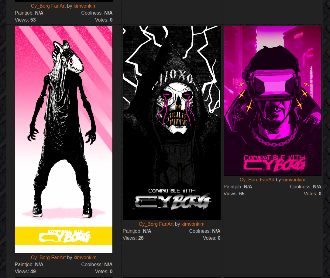
Cy_Borg Gallery
Concept: “All my Mörk Borg/Cy_Borg fanart can be used freely by anyone, without having to ask me and without crediting me!”
Content: A range of brightly colored images, mostly portraits, that fit into the world of CY.
Writing: Each image is accompanied by a brief description by the creator about the subject's name or occupation.
Art/Design: A gritty neon take on the cyberpunk “high tech, low life” juxtaposition as filtered through the harsh and messy Cy_Borg aesthetic.
Usability: Images are incredibly high resolution when clicked on from the gallery view.
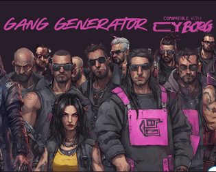
Cy_Borg Gang Generator
Concept: “One page of tables to roll up a gang for your Cy_Borg adventure. You'll get the gang's name, their criminal activity, their base, and who they're at war with.”
Content: A one-page set of tables with which to quickly create a CY-based gang.
Writing: Table entries are terse and evocative of different elements of cyberpunk tropes.
Art/Design: Tables are provided as light purple text on dark gray background boxes over a full-page background illustration of assorted gang members in a cityscape.
Usability: Contrast, readable fonts, and consistent presentation of each table all allow for easy use of the information here so as to bring a gang to life.
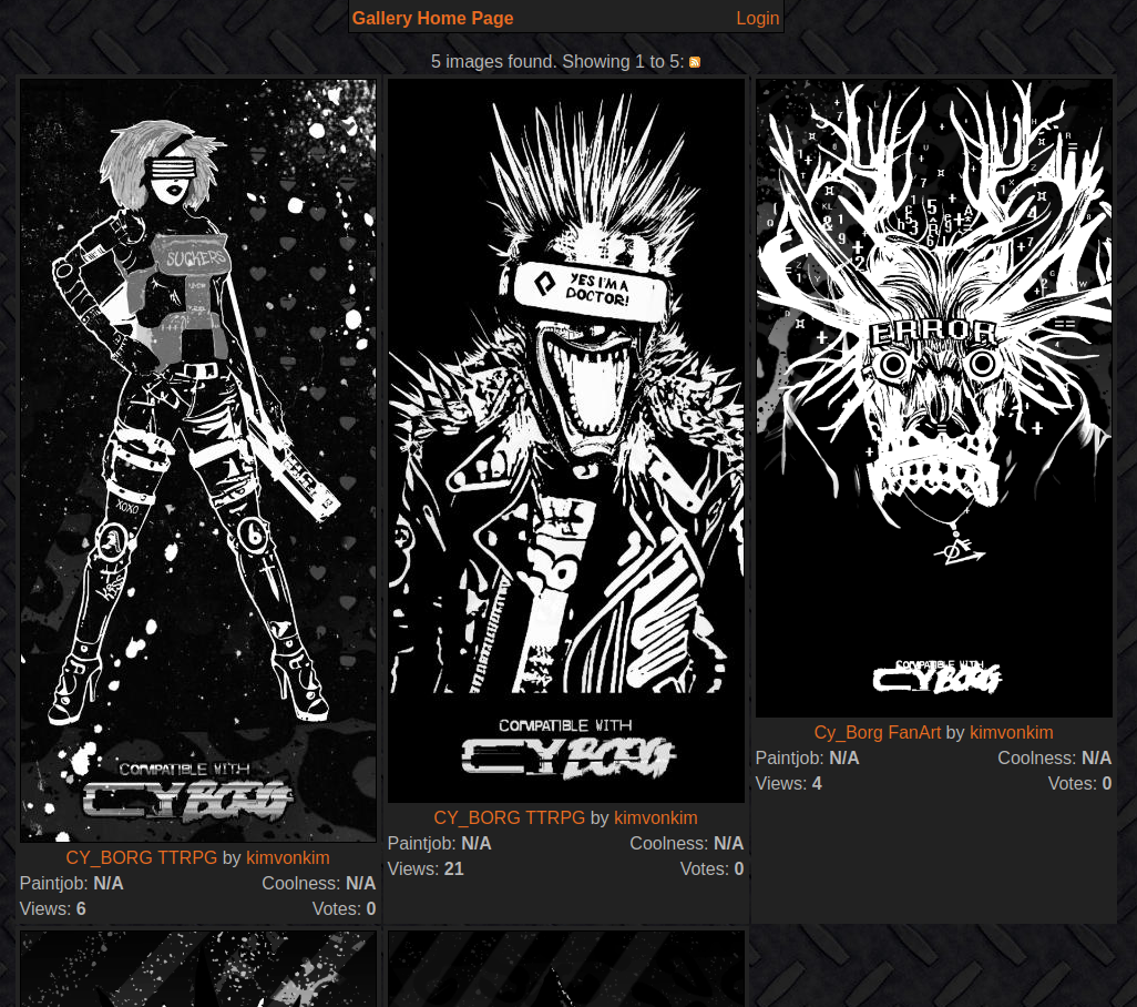
Cy_Borg Grey Tone Gallery
Concept: “All my Mörk Borg/Cy_Borg fanart can be used freely by anyone, without having to ask me and without crediting me!”
Content: A range of grayscale images, mostly portraits, that fit into the world of CY.
Writing: Each image is accompanied by a brief description by the creator about the subject's name or occupation.
Art/Design: A stark black-and-white take on the cyberpunk “high tech, low life” juxtaposition as filtered through the harsh and messy Cy_Borg aesthetic.
Usability: Images are incredibly high resolution when clicked on from the gallery view.

Cy_Borg Killmatch
Concept: “Two fighters enter the death pit to the deafening screams of a thousand bloodthirsty fans. One will become famous, the other will become a bloodstain on the concrete.”
Content: A set of rules for a deathmatch-style gladiator event/tournament.
Writing: Rules language is terse but includes a number of options and variants for running it in a way that makes sense for a particular table of punks.
Art/Design: Black on red in a landscape orientation/layout with multiple columns of text and images of fighters (individual and in combat).
Usability: Consistent use of particular fonts and text decorations serve to indicate how any particular element relates to others in the document. Some typos throughout may affect reading/browsing.
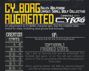
CY_BORG: AUGMENTED
Concept: “Alternate character gen rules, for a slightly more forgiving dystopian hellscape.”
Content: A set of rules to alter character creation, including increased HP and an adjustment to stat bonuses/penalities.
Writing: Explanations are terse and easily understandable.
Art/Design: Single-column layout with a stats table sidebar, with light gray text on a dark background.
Usability: Large headings and horizontal rules help indicate distinct sections and their purposes. Rule adjustments should provide quick adjustments to play.
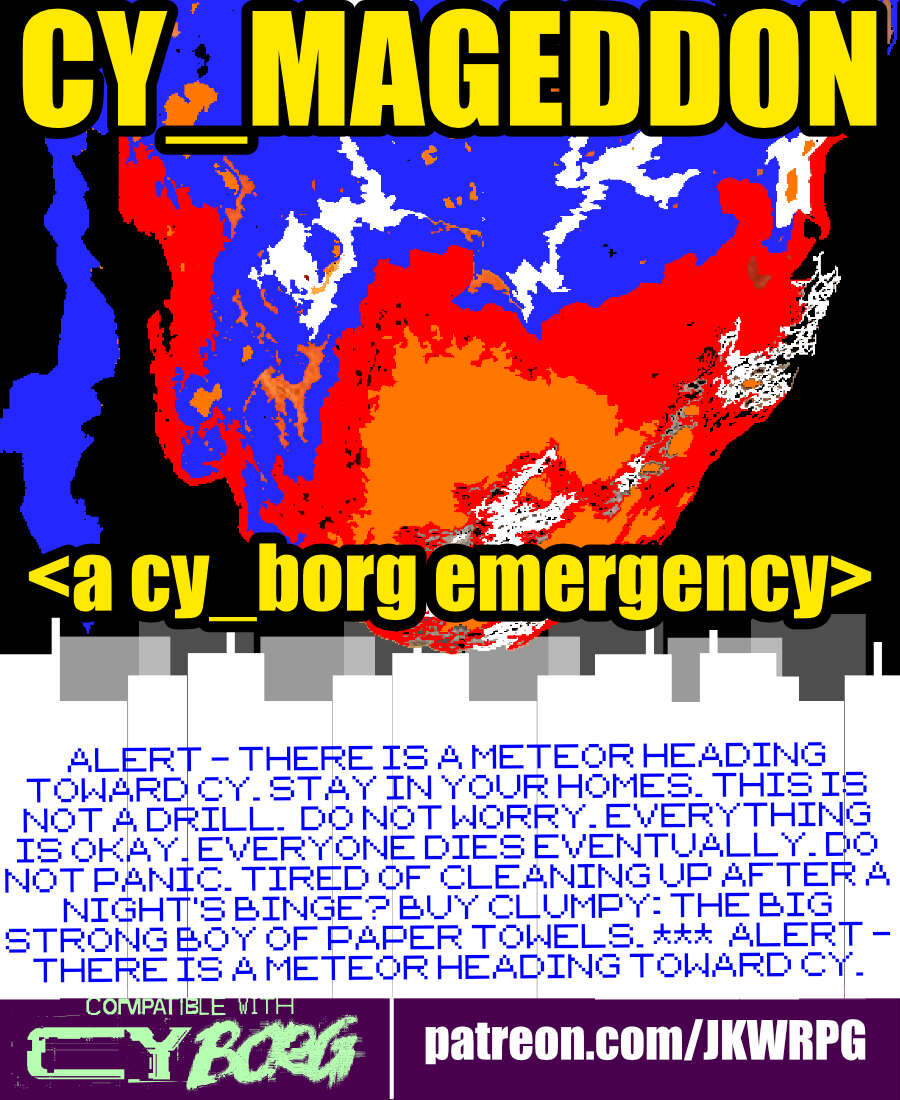
CY_MAGEDDON
Concept: “ALERT - THERE IS A METEOR HEADING TOWARD CY. STAY IN YOUR HOMES. THIS IS NOT A DRILL. DO NOT WORRY. EVERYTHING IS OKAY. EVERYONE DIES EVENTUALLY. DO NOT PANIC. TIRED OF CLEANING UP AFTER A NIGHT'S BINGE? BUY CLUMPY: THE BIG STRONG BOY OF PAPER TOWELS. *** ALERT - THERE IS A METEOR HEADING TOWARD CY. STAY IN YOUR HOMES. THIS IS NOT A DRILL. DO NOT WORRY. EVERYTHING IS OKAY. EVERYONE DIES EVENTUALLY. DO NOT PANIC. TIRED OF CLEANING UP AFTER A NIGHT'S BINGE? BUY CLUMPY: THE BIG STRONG BOY OF PAPER TOWELS.“
Content: A job to fly into outer space and destroy an incoming meteor that seems (intentionally) chock full of Bayhem.
Writing: Lots of informative details provided to help guide a GM through assorted possibilities/contingencies, tinged with sardonic in-game descriptions meant for players.
Art/Design: Three-column (one-sided) trifold arrangement with white and yellow text on black. A blue and orange illustration of a meteor hurtling toward CY occupies the top central area of the page.
Usability: High-contrast text, readable fonts, and consistent use of spacing and text ornamentation (for headings, important terms/concepts, etc.) all contribute to an easy time perusing and navigating the document.
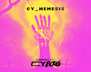
CY_NEMESIS
Concept: “Nothing is ever over. You don't just turn them off. This is CY; death is inconvenient but it's far from irreversible. Within, find a brief table of ways that old enemies might come back to h(/a)unt you across the streets and slums of the metropolis of the damned.“
Content: A table of ten entries describing different potential opportunities for a “dead” opponent to return with vengeance on their mind.
Writing: Each entry provides 2-3 sentences of ominous, flavorful (and sometimes mechanics-oriented) detail for GMs to make optimal use of against their players’ characters.
Art/Design: Single-column black-on-white numbered table. A cover page is included that makes use of a GUI file folder aesthetic to signal the difficulty of simply moving one’s nemesis to the proverbial trash.
Usability: Visually easily readable font with high-contrast color use makes for an easy time reading and locating desired information.

CY_OPS issue one
9 contributors
Concept: “CY_OPS is a 66 page A6 player-facing CY_BORG zine presented as an in-universe punk zine. No mechanics, no stats, just a chaotic little zine full of worldbuilding, quest hooks, items and a bunch of other cyberpunk stuff for your players to use in your CY_BORG games.”
Content: NPCs full of personality quirks, unique equipment ideas, and scenario/adventure ideas casually scattered across hectically organized spreads mixing hi- and lo-fi design and tech aesthetics. "Activity" pages offer even more direct involvement with the document.
Writing: Infectiously fun, engaging ideas presented as in-universe media, from QR codes to other CY_BORG material to instruction manual pages to chat transcripts and more. “Worldbuilding” feels like an understatement.
Art/Design: Two-page spreads stand mostly independent of one another, with some common fonts and illustration styles that draw attention to a wide range of character, occupation, and gear-related concepts that open up even more possibilities for immersing a party in CY.
Usability: Different spread layouts may not assist with consistency, but text is mostly high-contrast and readable (some pages’ white on pink might be difficult for some readers, as is text perpendicular to main orientation). Sheer amount of content is likely to keep readers interested and closely perusing each page.
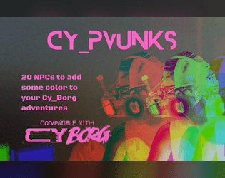
CY_PUNKS
Concept: “I used the CY_BORG NPC tables to roll up a bunch of punks and made images of them. I had a lot of fun making this one. Enjoy!”
Content: A set of NPC details (although no stats) to help flesh out CY for a table of punks.
Writing: Part brief characteristic, part detailed description of each NPC’s interests, motives, styles, features, and more.
Art/Design: Colorful single-column layout of NPCs, with a portrait image accompanying each NPC’s details that resembles a printed and painted miniature of that NPC.
Usability: Consistent presentation of text/image pairings for each NPC throughout the file. Unfortunately, text/background colors and font choices can make the text a bit difficult to read. Also, text is not embedded, so searching/selecting is not possible.
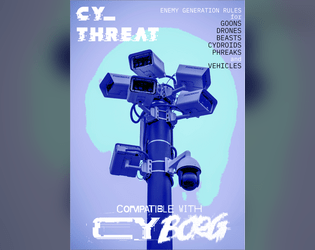
CY_THREAT
Concept: “Generate an infinite number of baddies that wander the streets of Cy. Capable of generating GOONS, DRONES, BEASTS, CYDROIDS, PHREAKS and VEHICLES.”
Content: A generator for NPC enemies that can be quickly refreshed for countless combinations and possibilities.
Writing: Sharp, concise descriptions of NPCs with stats and, occasionally, special traits, all of which bring a given character, creature, or object to life. Names are kept general (“goons,” “beasts,” etc.) to let GMs decide how to define them further.
Art/Design: Early Windows GUI aesthetic focuses attention on textual descriptions of NPCs, but a small map of Cy on the left side of the window points to locations in the city where the NPCs can be found.
Usability: “Export” function copies the currently generated NPC information to the clipboard as plain text for easy usage. Early Windows GUI aesthetic has only a few buttons to click for quick generation.
CY_THREAT Zine
Concept: “Generate an infinite number of baddies that wander the streets of Cy. Capable of generating GOONS, DRONES, BEASTS, CYDROIDS, PHREAKS and VEHICLES. 27 stylized pages detailing enemy creation rules. Over 100 new special abilities, more than 60 new NPC wants and 3d12 description tables per enemy type.”
Content: Tons of tables to determine encounter specifics–not only which enemies and how many appear but also what’s motivating them and what might be exceptional to this particular group (quirks, appearance, special attacks, etc.).
Writing: Imaginative and enticing table entries ensure each generated set of NPCs will feel like unique, fully formed characters.
Art/Design: Distinct two-page spread layouts include a background or centerpiece illustration surrounded by tables, mostly framed in translucent boxes to increase fore/ground contrast.
Usability: Font choices are easily readable, and headings/labels are consistently presented to help with ease of navigation and identification of desired info. However, text is not embedded, so searching/selecting text or using a screen reader are not possible.
CY_TRANSIT
Concept: “Modern design layout of the metro systems of Cy including over 60 stops, express lines and an accompanying shitty mobile app to route yourself around Cy. What more do you want?”
Content: A browser-based “transit terminal” that provides users with a text-based breakdown of the stops involved from Point A to Point B. Accompanied by a PDF of the city transit system map.
Writing: Succinct and direct explanation of the route from starting location to the desired destination.
Art/Design: Browser functionality provides a simple, terminal-like functionality with two selection lists and a button to generate the output. System map closely resembles many metro transit systems’ official maps, complete with multiple routes distinguished by different colors.
Usability: Incredibly easy to use both components, although many are likely to have a personal preference for the presentation/function of one over the other.

CY_TRAVEL
Concept: “Ever wanted the travel mechanics of medieval tabletops in your CYBERPUNK game? Tired of the same encounters with cops, corporates and hitmen? Ever thought of how to implement your players' favorite NPCs organically in the middle of the session?”
Content: Rules, means of transportation, and encounter tables to liven up travel through CY.
Writing: Tons of atmospheric flavor in the encounter tables to give GMs plenty to work with or be inspired by.
Art/Design: Landscape-oriented pages with yellow text on dark digital/noise-patterned background.
Usability: Different blocks of content are provided in visually distinct sections/pages. Despite very text-heavy nature of the content, text is not embedded so no searching or selecting is possible.
CY_x for .66
Concept: “Six new creatures for your CY_Borg game, featuring:
Bioproto 796
Felidae
Mrs. Porcelain
CY_limbs
PIXELART MK. II
PIXELART MK. S
Now with new cover art on which corps' serfs cannot put their dirty hands on!”
Bioproto 796
Felidae
Mrs. Porcelain
CY_limbs
PIXELART MK. II
PIXELART MK. S
Now with new cover art on which corps' serfs cannot put their dirty hands on!”
Content: A set of terrifying horrors to encounter on the streets of Cy.
Writing: Atmospheric descriptions of enemies punks won’t want to encounter complemented by mechanical effects to worry their players.
Art/Design: White-on-black text in two-column format, with each NPC’s description and stats positioned next to an illustration of that NPC (with several different styles, from a T-posed 3d model to pixel art to more conventional illustration).
Usability: High contrast between text & background, presented in a consistent format, allows for easy browsing and navigating to desired content.
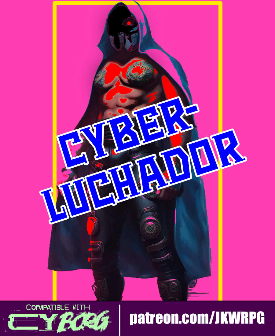
Cyber-Luchador
Concept: “Take to the skies as an unarmed specialist and wrestling phenom! Use your fists and your repertoire of deadly special moves to bring your foes to their knees.”
Content: A class for the punk who lives to bring kayfabe to every battle.
Writing: Mostly informative text complemented by thematic description so as to focus the reader’s attention on embodying the luchador character.
Art/Design: Three-panel spread with an illustration of a cyber-luchador in the center and text on either side. Mostly white on pink fore/ground.
Usability: Different sections of content are organized and positioned distinctly from one another to help with navigation and identification of desired details. Font size and use of bolding strengthens visual readability of text.
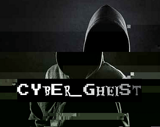
Cyber_Gheist
Concept: “What are you looking for? There isn’t anything here. Nothing. At all. Stop searching. Certainly not a digital ghost. A flicker on each camera, closer and closer to the penthouse suite. A single vital minute’s disruption in security. The scanner bleep you simply overlooked. A shadow in your programs. A knife in the neck in the time it takes to hit refresh. No, nothing like that at all. Probably just a glitch. You can probably ignore it.”
Content: A class for the player who lives and breathes stealth and evasion.
Writing: Colorful descriptions of class features provided mostly in engaging, full-sentence format addressing the player rather than as stat blocks or succinct phrases.
Art/Design: Two versions provided: a white-on-dark background version, which is overlaid on glitch art of a hooded figure and uses some yellow highlighting for emphasis and key terms, and a simple printer-friendly black-on-white version whose only embellishment is bolded text for emphasis and key terms.
Usability: Consistently readable visually (and as embedded text) and accessible in language. The calculation of SHADOW (as part of the “Haunting” feature/mechanic) might temporarily trip up some at first.
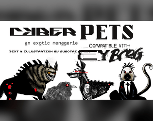
Cyber_Pets
Concept: “_EMPORIUM.ltd can not -and will not- be prosecuted or held responsible for damages, accidents, manglings, ablations, amputations, mutilations, rippings, crushings, decapitations or general acts of violence perpetrated by its proprietary software or hardware. (see UGC p.314, 34-95, all responsibility surrendered.)”
Content: A set of ten purchasable cyber-pet options (six “protection” and four “exhibition” options) and several mods to further enhance a given pet.
Writing: Categorical and pet-specific descriptions smoothly blend in-universe sales pitches and mechanical effects to entice an animal companion-seeking connoisseur.
Art/Design: Black text on white in mostly one- and two-column layouts, complemented by black-and-white illustrations of multiple pets sporting red highlights.
Usability: Sections and distinct kinds of content are consistently presented throughout, with visually readable text content. That said, some text is searchable/selectable but some is not, which might complicate some readers’ experience.
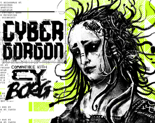
Cybergorgon
Concept: “They said they would make you beautiful. They lied. You were a model. A false beacon of hope and aspiration. In the shadowy boardrooms they made you a deal to stay young forever. It was only in the glint of the scalpel that you figured out too late you were sold, slush for a tax write off. An experiment in how badly you can fuck someone up. Now you are madness and steel.”
Content: A class for the highly motivated survivor spirit of vengeance and wrath.
Writing: Intense descriptions of class abilities and unfinished business can inspire tons of compelling roleplay opportunities.
Art/Design: A black and white illustration of a triumphant cybergorgon stands between columns of text describing class features and mechanics, with light green background accents throughout.
Usability: Class details are laid out in easily recognizable and navigable blocks with consistent presentation of headers, list item numbers, and so on.
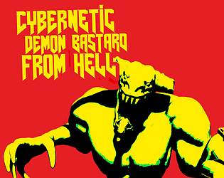
Cybernetic Demon Bastard from Hell
Concept: “There are creatures from worlds beyond our own, and all of them fucking hate you.”
Content: A nightmarish behemoth you’ll want a BFG just for the chance to frag it.
Writing: Deadly stats combined with a mesmerizing world-building overview of the creature’s origins.
Art/Design: A brightly colored two-page spread with an image of the monster and its stats next to its origin description.
Usability: Assorted content blocks are easily distinguishable, although the longer descriptive text block may become difficult for some to read over the background pattern near the bottom of the page.
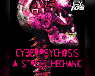
CYBERPSYCHOSIS
Concept: “Wanted to include mental struggles in your gameplay but didn't know how? Well, the new STRESS mechanic does just that: allows you (as the GM) to have characters get stressed out when they get their limbs cut off, their partner dies, their gun jams, their food tastes nasty, they're sitting in a piss-filled bar, the drink tastes like gasoline and any other stressful situation!”
Content: A set of rules to deal with the potential stress/strain of adding more and more cybertech in a single body.
Writing: A balanced mix of definition/description and mechanics to explain how each stressor and effect can impact a punk through both roleplay and dice rolls.
Art/Design: Colorful landscape-oriented pages with white text on a translucent content container shape to increase contrast with background colors/patterns.
Usability: Distinct content sections help indicate distinct purposes for each, with visually apparent headings. Background image/pattern noise might impact some readability. Text is not embedded, so searching/selecting is not possible.
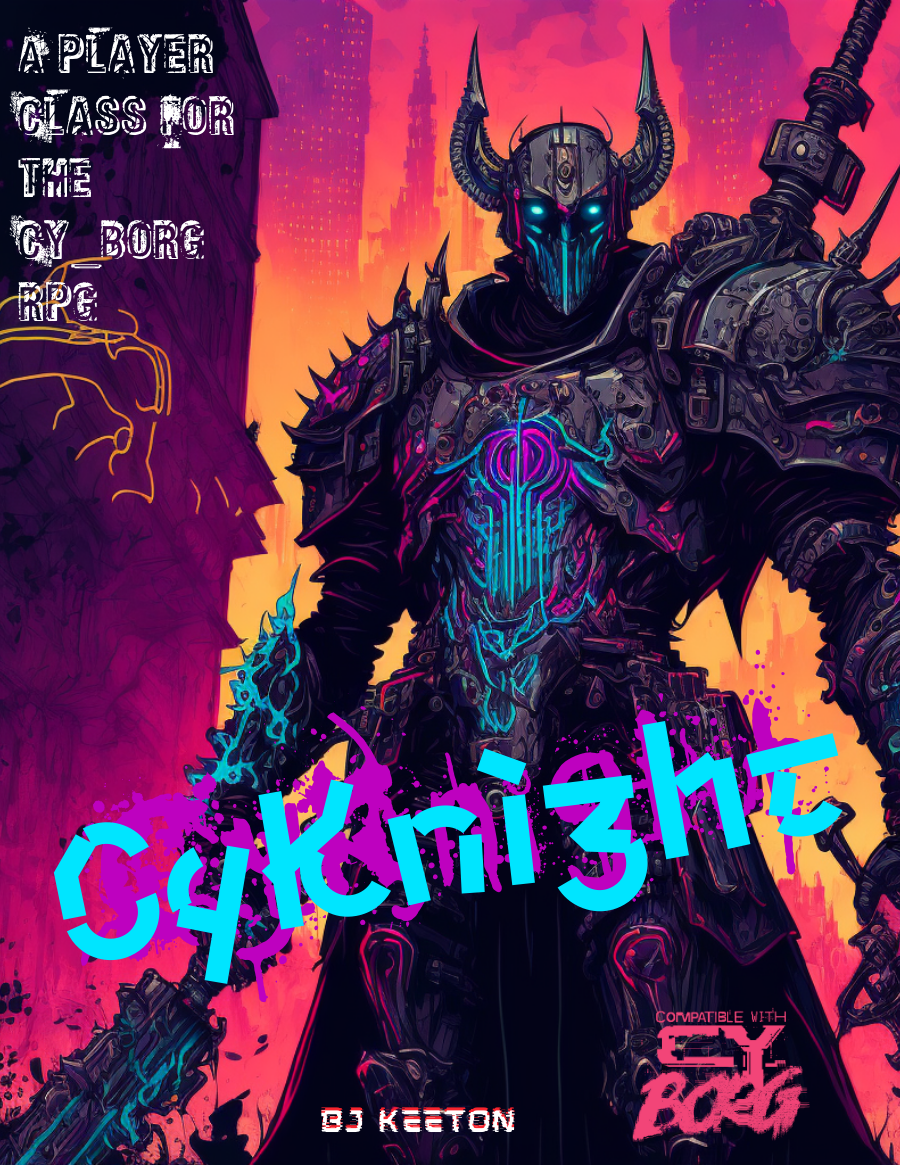
CyKnight
Concept: “Probably more metal than person by now. Your skin has the sheen of circuits, the smell of ozone. You’ve devoted your life to a cause. You fight, you pray, you train, you mod. You scream. You rage. But at what?”
Content: A class for the techno-paladin who’s on a mission, even if no one else can understand it.
Writing: Numerous options are concisely described, especially to suggest different armor/weapon upgrades with straightforward mechanical effects & explanations.
Art/Design: An illustration of a neon-highlighted, heavily armored cyknight surrounded by different tables/lists of class features/options. Mostly white text on a black background with neon-colored headings.
Usability: High-contrast text/ground color options increase readability, although sheer amount of text and its arrangement around the cyknight illustration might be confusing for some. Some lines are provided as borders between tables, and text color distinctions help as well, but text indentation can be inconsistent and affect navigation across page.
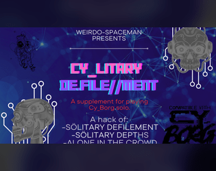
Cylitary De.file//ment
Concept: “This supplement is meant to translate the fantastic solo rules and oracles from Sölitary Defilement and Alone In the Crowd by 1d10+5, and Sölitary Depths by Chaoclypse (Brandon Yu).”
Content: A set of rules for solitary Cy_Borg play based on several other third-party rules supplements.
Writing: Direct, accessible explanations of rules presented alongside throngs of tables and oracles to facilitate solo play.
Art/Design: Two versions provided: one full-color landscape-oriented version and one plain black-on-white single-column portrait-oriented version.
Usability: Full-color version pages/slides differ in color scheme, with mostly high-contrast text (although the text is not embedded, so no searching or selecting). Plain version text is fully searchable.
CYTOBER 2023
- Concept: “A compilation of items, rules, enemies, and more for CY_BORG based on the Exeunt Press #MÖRKTOBER 2023 prompts. Originally posted on @krasiph.bsky.social and compiled here for ease of use. Some entries have been modified to include extra information such as prices and item types.”
- Content: Thirty-one spooktacular entries reflecting the year’s Mőrktober prompts, from weapons/apps/gear to NPCs to powers, food, and environmental phenomena.
- Writing: 1-2 brief paragraphs of potent content (descriptive and informative/mechanical) for each entry to frame it within the prompt’s overarching theme.
- Art/Design: Mostly black-on-white (some white-on-black) with green highlights with a range of item heading fonts and accented background splatter effects.
- Usability: Consistent content elements–heading, item number, description–facilitate browsing, even as arrangement of list items deviates at times from left->right, top->bottom orientation. Plain text version is also provided for potentially easier perusal.
d100 Things Found in a Gonk's Pocket
Concept: “Trinkets, trash, and trouble…”
Content: An alphabetized list of assorted items that might be found in the pockets of an inhabitant of CY.
Writing: Concise, wide-ranging inventory to help bring a character to life.
Art/Design: A two-page spread with a glitchy portrait on the left and the list in two columns to the right.
Usability: Extremely navigable and readable with high contrast between fore and ground.
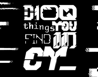
D100 things you find in CY_
12 contributors
Concept: ”As you roam the streets of CY_ you see something. It's shiny, a little dirty. As you remove the garbage surrounding it you realise it's a: 23: Lost shoe with 1D4 toes inside. 35: RFID card with the locale company card’s name on it. 75: Spray paint. Colour label reads “Rotblack”. Get a fun and slightly silly D100 table of stuff you can find in the city CY_.”
Content: A table of assorted valuables, junk, and the miscellanea in-between that might be discovered in CY.
Writing: Concise description complemented with the occasional introspective element or quirky voice that reminds the reader of the game and world at hand.
Art/Design: Table provided as three primary columns of content: a left-aligned list of items (#s 1-50), a center set with the table name and author credits, and a right-aligned list (#s 51-100). The list columns are black on white, with the central column’s scheme inverted, while horizontal black bars stretch from the center in either direction to fill the white space in each list item line.
Usability: Overall layout of page allows for relatively easy navigation/perusal to desired content. Consistent presentation of content in each major column aids with comprehension and use of table and its entries.

d66 Things Found Dumpster-Diving In Cy
Concept: "In the corpse of the city, the dumpsters don’t just hold garbage, they’re treasure chests for the desperate, the deranged, and the doomed. This is a d66 table of weird, grimy, and gross as hell finds for Cy_Borg, made for the Mondo Rando jam in the House of Borg Discord server.
Inside you’ll find rusted tech, twitching bio-waste, and street junk that’ll make you question why you reached in at all. No mechanics. No rules. Just pure, dripping flavor for your sessions. Roll, pick, or use as inspiration when your players go elbow-deep in the city’s refuse."
Content: A table of items that a punk might locate in an average dumpster in an average alley in Cy.
Writing: Pithy descriptions of random objects that evoke intriguing stories or uses.
Art/design: Three-panel layout with table items on the outer panels and a pink-on-white wire cityscape image and table title in the center.
Usability: Easily identifiable items and readable high-contrast text allow for quick navigation and location of desired information.
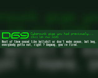
D69 Cyberpunk Gigs You Previously Had…
Concept: “Some of them sound like bullshit or don't make sense, but hey, everybody gotta eat, right ? Anyway, you're fired.”
Content: A table to flesh out the scope of a job/career a punk has previously held.
Writing: Terse but potent descriptions of various jobs, some far less appealing or lucrative than others but all quite apt for CY.
Art/Design: Two versions provided: one black-on-white and one white/green-on-dark green, both using a three-column layout for the table entries.
Usability: Headings, list item numbering, and sub-table organization are all visually evident and consistent, making for easy navigation and identification of desired details.
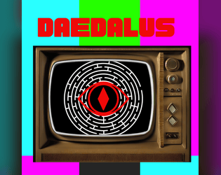
Daedalus
Concept: “A playable adventure zine compatible with Cy_Borg. This is my take on a cyber punk dungeon crawl. Probably better for more advanced characters. This hasn't been play tested so any notes or suggestions are appreciated!”
Content: A job to rescue a mob boss’s daughter from a booby-trapped maze.
Writing: Tons of informative detail to set up a GM well for running their players through a deadly labyrinth.
Art/Design: A lot of red, black, and white in a variety of aesthetics, complemented by occasionally different page styles (often in the form of digital interfaces/pop-up windows). Illustrations are provided to help set the stage for different elements of the job and to highlight NPCs. A keyed map of the maze is also included.
Usability: Font choices are visually readable with solid contrast on most pages. However, text is not embedded so no searching/selecting is possible.
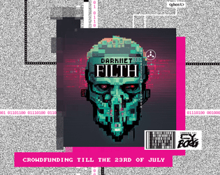
Darknet Filth
Concept: “404//SAN is the demented frontpage of the NET, where manifold rumors, advertisements, hoaxes, and conspiracies produce a worthless information sludge. Still, more than enough masochistic users flock to the site to be entertained by trolls or cheated out of their life's savings.”
Content: A one-stop shop for adventures/scenarios, NPCs, monsters, apps, cyberware and equipment, additional rules ideas, and more.
Writing: Every page provides dozens of imaginative and enticing ideas for inspiration, with many pages offering highly engaging in-universe descriptions or framing for their game content.
Art/Design: A variety of artistic and aesthetic styles that embody the artpunk philosophy. The browsing experience feels in line with the CY_BORG rulebook itself.
Usability: Requires close, and often slow, examination to identify and make effective use of content (text and image alike), especially when moving across very differently styled spreads–but very worth the effort.
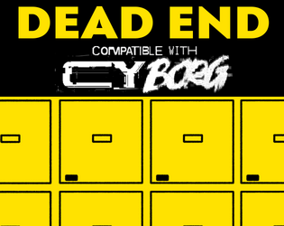
Dead End
Concept: “Henri, a connected security guard contacts the PCs. A legendary cyber killer has died and ended up in the morgue. Easy credits can be earned, one just needs to break in and strip off some of his cyberware.”
Content: A job to retrieve a cybernetically enhanced skull from a morgue.
Writing: Lively setup and detailed considerations of different events that might occur or approaches the PCs might take allow for a variety of engagements with mission parameters and unexpected hiccups.
Art/Design: A mix of black on white and yellow/white on black text accented with several NPC illustrations and a well-labeled map (and an unlabeled map to give to players).
Usability: High-contrast text and clean, recognizable layouts with consistent presentation of distinct kinds of text/content make navigation and reading easy.
Loading next page...