Philip Jensen
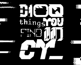
D100 things you find in CY_
12 contributors
Concept: ”As you roam the streets of CY_ you see something. It's shiny, a little dirty. As you remove the garbage surrounding it you realise it's a: 23: Lost shoe with 1D4 toes inside. 35: RFID card with the locale company card’s name on it. 75: Spray paint. Colour label reads “Rotblack”. Get a fun and slightly silly D100 table of stuff you can find in the city CY_.”
Content: A table of assorted valuables, junk, and the miscellanea in-between that might be discovered in CY.
Writing: Concise description complemented with the occasional introspective element or quirky voice that reminds the reader of the game and world at hand.
Art/Design: Table provided as three primary columns of content: a left-aligned list of items (#s 1-50), a center set with the table name and author credits, and a right-aligned list (#s 51-100). The list columns are black on white, with the central column’s scheme inverted, while horizontal black bars stretch from the center in either direction to fill the white space in each list item line.
Usability: Overall layout of page allows for relatively easy navigation/perusal to desired content. Consistent presentation of content in each major column aids with comprehension and use of table and its entries.
LTTPR VR CAFÉ
Concept: ”The VR Café is owned by Lotta and Perr, a hardworking couple that, strapped for cash, went to Örken, who agreed to relieve them of their debt. In return he now runs an underground operation stealing children’s imagination to create CREATIVITY_JOURNEY--v4 a drug sold under the counter.”
Content: A seedy VR cafe that’s so much sketchier than it appears–and only maybe will the punks be ready for the trouble that awaits.
Writing: Lots of flavorful sensory descriptions of the goings-on in each room of the cafe that helps immerse players into the situation.
Art/Design: Left third of the page is an overview of the locale and potential reasons for being there, while the remaining space on the page has a map with labels and room-specific information.
Usability: High-contrast text and bolded labels and distinct headings make reading and navigation easy, supported by lines to map areas (with a particularly ingenious staircase-shaped line connecting the upstairs office to its details).
Page 1 of 1