Luis "Gaffy" Lopez
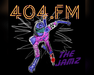
404.fm “THE JAMZ”
Concept: “A crazed socialite with a seemingly bottomless wallet and far more information and connections than one person in CY has any right to. He could take over this city in a matter of days, instead he’d rather play sick jams as the backing to an even sicker game.”
Content: An adventure/scenario for destructive PCs who enjoy a soundtrack to their chaos from a malevolent DJ.
Writing: Brief descriptions of tasks to complete cunningly reflect a variety of music genres that the GM is encouraged to develop a playlist for ahead of time (punk, metal, hip-hop, electronic, etc.).
Art/Design: White text on dark brick-pattern background with a hand-drawn chaotic punk in motion on the cover. Each page (focused on a musical genre and its tasks) is given unique character with font choices and text arrangement.
Usability: Large text makes identifying each element and its relation to other elements–and a similar structure for each page helps this identification and navigation. Helpful note for GMs on the last page also encourages combination and experimentation.

CY_OPS issue one
9 contributors
Concept: “CY_OPS is a 66 page A6 player-facing CY_BORG zine presented as an in-universe punk zine. No mechanics, no stats, just a chaotic little zine full of worldbuilding, quest hooks, items and a bunch of other cyberpunk stuff for your players to use in your CY_BORG games.”
Content: NPCs full of personality quirks, unique equipment ideas, and scenario/adventure ideas casually scattered across hectically organized spreads mixing hi- and lo-fi design and tech aesthetics. "Activity" pages offer even more direct involvement with the document.
Writing: Infectiously fun, engaging ideas presented as in-universe media, from QR codes to other CY_BORG material to instruction manual pages to chat transcripts and more. “Worldbuilding” feels like an understatement.
Art/Design: Two-page spreads stand mostly independent of one another, with some common fonts and illustration styles that draw attention to a wide range of character, occupation, and gear-related concepts that open up even more possibilities for immersing a party in CY.
Usability: Different spread layouts may not assist with consistency, but text is mostly high-contrast and readable (some pages’ white on pink might be difficult for some readers, as is text perpendicular to main orientation). Sheer amount of content is likely to keep readers interested and closely perusing each page.
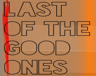
Last of the Good Ones
Concept: “Somewhere in G0: A naniteinfested monstrosity is trying to help those tossed to the turrets within the cement walls of G0. Within the confines of the abandoned CY Central Mall, a monument of capitalism now a battle ground between 4 factions, The Heir of Kergoz, Virid Vipers, an other worldly being know as Vecbod, and a relentless horde of mushroom brained zombies. It doesn’t matter if you’re here out of desperation or curiosity, having a safe house in G0 is worth hearing”
Content: A mall crawl for survival in the shadows of an ominous otherworldly threat.
Writing: Imaginative and disturbing ideas abound, giving GMs and players alike plenty of unexpected encounters, creatures/NPCs, and opportunities to run wild with.
Art/Design: Two-page spreads packed with visually loud and abrasive aesthetic choices that reflect the chaos of the scenario itself.
Usability: Progression through the document reveals locations and monsters as players would encounter them. A wide variety of layouts, color schemes, font choices, and text size can make some content easier to locate and read than others.

The Apathy Engine
Concept: "Have your Punks died but they don't want to stay down, bring them back and throw them and their debt into the maw of the APATHY ENGINE"
Content: An adventure generator (or campaign seed) for a group of punks who are forced to deal with a corporation that owns their collective debt.
Writing: Brief atmospheric details accompanying rules/mechanics to drive encounters and scenario options, including a slew of enemy NPCs to threatean punks with.
Art/design: Mostly black-on-white text with illustrations of NPCs and other thematically relevant subjects supporting the focus of each spread/layout.
Usability: Text is visually readable and easy to navigate or search for desired information. Adventure generator elements are arranged to build on one another to assist GM with establishing a coherent scenario for their players.

The Cursed Ridas of FLO
Concept: "COMP'D COPIES ARE AVAILABLE ON REQUEST FOR ANY TRANS FOLK THAT WANT IT! The horrible treatment of the trans community by Florida's elected officials was a direct inspiration for the evils in the setting, and the amazing trans people I am proud to call my friends are a big inspiration for some of the classes found within. If for whatever you can't contact me through Itch while trying to get your comp'd copy, I can be found on discord (User Name: _gaffy)
If you participated in the Queertober Jam and would like a copy, please reach out to me and I will send it as soon as possible.
A WIP setting book for Mork Borg/CY_Borg based on Florida, made for the Queertober Jam"
Content: A set of materials to offer a table of punks an additional location to explore, along with some tables and two classes to play (Chaos-Bound Test Subject and XLmphibian). The itch webpage for this supplement notes additional material is forthcoming.
Writing: Poignant and biting commentary and description combined with intriguing mechanics to support the unique class approaches.
Art/design: Distinct layout/aesthetic on each spread of pages, with a variety of hand-drawn illustrations, photo collages, and font choices that evoke a different essence and purpose for that spread.
Usability: Text is generally readable with high contrast, even on pages with relatively busy background images/patterns. Font choices and consistent uses of bolding/text size for headings, labels, etc. help facilitate visual identification of different kinds and groupings of content.
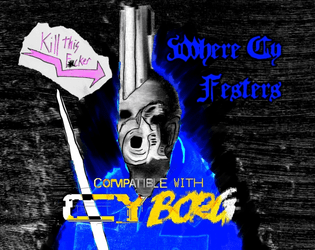
Where CY Festers Vol1 The Blood of Aliens
Concept: “Made for The Rolled Standards Trigger Warning: Trigger Happy Jam, this adventure is a simple assassination mission in a rundown church in the heart of G0. Risk nano infestations while trying to kill off the cult leader Farther Barnos, return his head and a requested item for a fat pay out.”
Content: A job to unseat the head of a local church.
Writing: Intense descriptions of the mission’s most important locations and events/encounters.
Art/Design: A mix of analog hand-drawn and digital illustrations accompany a mostly single-column layout of white, green, and pink on black backgrounds.
Usability: Text is mostly readable and searchable (except for Barnos’ stat block, which is handwritten text) with clear visual distinctions–color, typeface, white space–between sections of content.

You Got Mail
Concept: "Have you ever found yourself in need of some holo messages to bombard your players with? Random mails while they are investigating a datafortress? Disturbing radio chatter when caught in a nano-storm? Maybe you are just looking for some inspiration to spark an adventure?
Look no further! YOU GOT MAIL is here for you!"
Content: A set of tables of different kinds of messages for GMs to incorporate into their games--some with options for referencing/implicating the punks directly.
Writing: Tongue-in-cheek flavor pervades the messages' content, from advertisements to conversation threads to corrupted fragments.
Art/design: Black-on-green aesthetic reminiscent of computer terminal displays in two-page spread layouts.
Usability: Visually readable fonts with solid contrast of text on ground, complemented with outside-margin section headings (for the current table), allow for easy "lift and use" in a given game.
Page 1 of 1