Lettuce
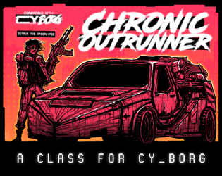
Chronic Outrunner
Concept: “
> > > Always out of time. Never out of gas. Somehow, you keep turning up. > > >
[[nowhere fast]] _drive through Cy, bolting new gear to your car as you go
[[built to last]] _jump forward in time while tethered to your custom ride
[[link to the past]] _perfect your vehicle and when the time is right—
FIND AN OPEN STRETCH OF ROAD AND OUTRUN THE APOCALYPSE”
Content: A class for the road warrior who wants to hit a high enough speed and see some serious shit.
Writing: A range of descriptive and mechanical features that emphasize the post-apocalyptic possibilities of life in CY and beyond.
Art/Design: Two versions: black on white and black on orange, organized as a landscape-oriented spread with distinct text elements framing an illustration of an outrunner next to their car.
Usability: Consistent presentation of headings, body text, and emphasized content all contribute to easy navigating and identifying desired information.

CY_OPS issue one
9 contributors
Concept: “CY_OPS is a 66 page A6 player-facing CY_BORG zine presented as an in-universe punk zine. No mechanics, no stats, just a chaotic little zine full of worldbuilding, quest hooks, items and a bunch of other cyberpunk stuff for your players to use in your CY_BORG games.”
Content: NPCs full of personality quirks, unique equipment ideas, and scenario/adventure ideas casually scattered across hectically organized spreads mixing hi- and lo-fi design and tech aesthetics. "Activity" pages offer even more direct involvement with the document.
Writing: Infectiously fun, engaging ideas presented as in-universe media, from QR codes to other CY_BORG material to instruction manual pages to chat transcripts and more. “Worldbuilding” feels like an understatement.
Art/Design: Two-page spreads stand mostly independent of one another, with some common fonts and illustration styles that draw attention to a wide range of character, occupation, and gear-related concepts that open up even more possibilities for immersing a party in CY.
Usability: Different spread layouts may not assist with consistency, but text is mostly high-contrast and readable (some pages’ white on pink might be difficult for some readers, as is text perpendicular to main orientation). Sheer amount of content is likely to keep readers interested and closely perusing each page.
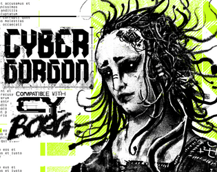
Cybergorgon
Concept: “They said they would make you beautiful. They lied. You were a model. A false beacon of hope and aspiration. In the shadowy boardrooms they made you a deal to stay young forever. It was only in the glint of the scalpel that you figured out too late you were sold, slush for a tax write off. An experiment in how badly you can fuck someone up. Now you are madness and steel.”
Content: A class for the highly motivated survivor spirit of vengeance and wrath.
Writing: Intense descriptions of class abilities and unfinished business can inspire tons of compelling roleplay opportunities.
Art/Design: A black and white illustration of a triumphant cybergorgon stands between columns of text describing class features and mechanics, with light green background accents throughout.
Usability: Class details are laid out in easily recognizable and navigable blocks with consistent presentation of headers, list item numbers, and so on.

Masterless Mascot
Concept: “You were a mascot. The corporation died. You kept the suit. You kept the SPIRIT. Welcome to the gig economy.”
Content: A class for the on-brand morale booster who’s been let go but who won’t let go.
Writing: A potent taste of character abilities and mechanics (with intriguingly weaponized commercial tools) crammed into a single, heavily redacted, page.
Art/Design: A single two-column spread with an illustration of a masterless mascot in the bottom right corner. Primarily black on white with red highlights, with a bit of white-on-black text in one table. Each section of the page has a different style that calls attention to its contributions to punks using this class.
Usability: Despite a wide variety of table/section-specific styles, there is consistent distinction between headings/labels and body text, and the page layout makes it easy to recognize how each section’s content relates to that of the others.
Page 1 of 1