Alessandro Minali
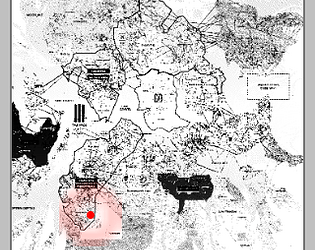
CY_THREAT
Concept: “Generate an infinite number of baddies that wander the streets of Cy. Capable of generating GOONS, DRONES, BEASTS, CYDROIDS, PHREAKS and VEHICLES.”
Content: A generator for NPC enemies that can be quickly refreshed for countless combinations and possibilities.
Writing: Sharp, concise descriptions of NPCs with stats and, occasionally, special traits, all of which bring a given character, creature, or object to life. Names are kept general (“goons,” “beasts,” etc.) to let GMs decide how to define them further.
Art/Design: Early Windows GUI aesthetic focuses attention on textual descriptions of NPCs, but a small map of Cy on the left side of the window points to locations in the city where the NPCs can be found.
Usability: “Export” function copies the currently generated NPC information to the clipboard as plain text for easy usage. Early Windows GUI aesthetic has only a few buttons to click for quick generation.
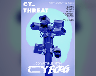
CY_THREAT Zine
Concept: “Generate an infinite number of baddies that wander the streets of Cy. Capable of generating GOONS, DRONES, BEASTS, CYDROIDS, PHREAKS and VEHICLES. 27 stylized pages detailing enemy creation rules. Over 100 new special abilities, more than 60 new NPC wants and 3d12 description tables per enemy type.”
Content: Tons of tables to determine encounter specifics–not only which enemies and how many appear but also what’s motivating them and what might be exceptional to this particular group (quirks, appearance, special attacks, etc.).
Writing: Imaginative and enticing table entries ensure each generated set of NPCs will feel like unique, fully formed characters.
Art/Design: Distinct two-page spread layouts include a background or centerpiece illustration surrounded by tables, mostly framed in translucent boxes to increase fore/ground contrast.
Usability: Font choices are easily readable, and headings/labels are consistently presented to help with ease of navigation and identification of desired info. However, text is not embedded, so searching/selecting text or using a screen reader are not possible.
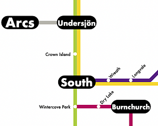
CY_TRANSIT
Concept: “Modern design layout of the metro systems of Cy including over 60 stops, express lines and an accompanying shitty mobile app to route yourself around Cy. What more do you want?”
Content: A browser-based “transit terminal” that provides users with a text-based breakdown of the stops involved from Point A to Point B. Accompanied by a PDF of the city transit system map.
Writing: Succinct and direct explanation of the route from starting location to the desired destination.
Art/Design: Browser functionality provides a simple, terminal-like functionality with two selection lists and a button to generate the output. System map closely resembles many metro transit systems’ official maps, complete with multiple routes distinguished by different colors.
Usability: Incredibly easy to use both components, although many are likely to have a personal preference for the presentation/function of one over the other.
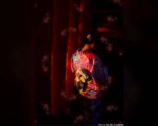
Nightcrawler Geisha
Concept: “You can't feel the warm breeze. You can't really remember the sensation either but what you can feel is anger. That's never left despite the countless body mods that stripped away your flesh, for something better. The contract was a wash and you're strung out. You promise your self that's the last time you take orders from the family. Make them regret letting you loose. Make them beg you to let them live.”
Content: A class for fans of cybernetically enhanced, Japanese-themed servants-turned-assassins.
Writing: Vividly descriptive class features and mechanics that juxtapose the PC’s facade and their essential nature/purpose.
Art/Design: Two-page spread with two columns of text beside an image of a woman in traditional Japanese attire.
Usability: Crisp, high-contrast fore and ground with immediately identifiable sections and headings that enable easy use of content.
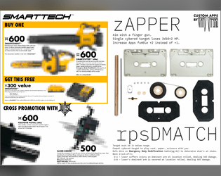
SMARTTECH(TM) Catalog
Concept: “Three new Smart ‘guns’, a new pistol, a new drone and two new apps.”
Content: Several killer items and apps for the player character that needs just the right tool for the job.
Writing: Crisp descriptions of equipment-specific mechanics and costs.
Art/Design: Weapon page layout resembles a store catalog/ad, while app page layout focuses attention on a central image of cassette components with app details above and below it.
Usability: For the most part, easily readable and navigable, although some equipment details are provided in a very small font.
Page 1 of 1