BJ Keeton

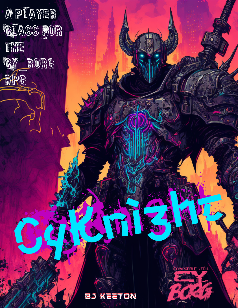
CyKnight
Concept: “Probably more metal than person by now. Your skin has the sheen of circuits, the smell of ozone. You’ve devoted your life to a cause. You fight, you pray, you train, you mod. You scream. You rage. But at what?”
Content: A class for the techno-paladin who’s on a mission, even if no one else can understand it.
Writing: Numerous options are concisely described, especially to suggest different armor/weapon upgrades with straightforward mechanical effects & explanations.
Art/Design: An illustration of a neon-highlighted, heavily armored cyknight surrounded by different tables/lists of class features/options. Mostly white text on a black background with neon-colored headings.
Usability: High-contrast text/ground color options increase readability, although sheer amount of text and its arrangement around the cyknight illustration might be confusing for some. Some lines are provided as borders between tables, and text color distinctions help as well, but text indentation can be inconsistent and affect navigation across page.

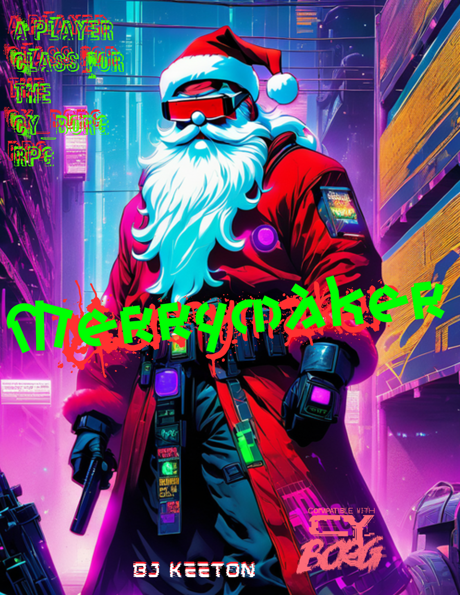
Merrymaker
Concept: “Jingle bells, Cy city’s hell,
G0 got my mom.
I’m tired of this, it has to end,
I’ll bring you all along.”
G0 got my mom.
I’m tired of this, it has to end,
I’ll bring you all along.”
Content: A class for the yule lover who wants to celebrate the season all year long.
Writing: Hilariously thematic descriptions and class mechanics that bring to life an appropriately cyberpunk would-be Santa.
Art/Design: Landscape layout with an AI illustration of a merrymaker on the left and text in white, green, and red all around it.
Usability: Text is mostly high contrast and visually readable, organized in distinct sections that are easy to navigate. Some text is embedded (and searchable/selectable as a result) while other text is not.

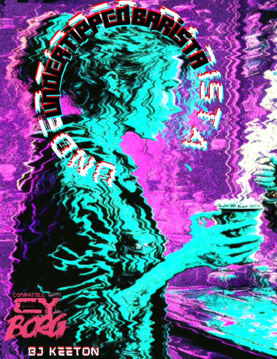
Undertipped Barista
Concept: “people suck. you knew it before you took the job. now it's your religion. you draw hearts with foam. you take their inane and complex orders. you try to laugh at their banal jokes. it's a good day if they say thank you. it's a miracle if they leave you a single credit. you hate them.”
Content: A class for the food service worker who’s been all but ground into dust and is ready to burn everything to the ground in retaliation.
Writing: An overflowing venti’s worth of cynical flavor that brings the class to life. Class details are mostly terse (if appropriate!), but the “breaking point” table offers surprising depth in contrast.
Art/Design: An illustration of a barista serving a customer is surrounded by class features, all with a neon palette on a dark background.
Usability: Each section of content is easily distinguishable from the rest, with font color, type, and size choices indicating each heading/label.
Page 1 of 1