Classes
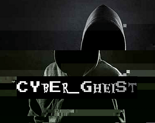
Cyber_Gheist
Concept: “What are you looking for? There isn’t anything here. Nothing. At all. Stop searching. Certainly not a digital ghost. A flicker on each camera, closer and closer to the penthouse suite. A single vital minute’s disruption in security. The scanner bleep you simply overlooked. A shadow in your programs. A knife in the neck in the time it takes to hit refresh. No, nothing like that at all. Probably just a glitch. You can probably ignore it.”
Content: A class for the player who lives and breathes stealth and evasion.
Writing: Colorful descriptions of class features provided mostly in engaging, full-sentence format addressing the player rather than as stat blocks or succinct phrases.
Art/Design: Two versions provided: a white-on-dark background version, which is overlaid on glitch art of a hooded figure and uses some yellow highlighting for emphasis and key terms, and a simple printer-friendly black-on-white version whose only embellishment is bolded text for emphasis and key terms.
Usability: Consistently readable visually (and as embedded text) and accessible in language. The calculation of SHADOW (as part of the “Haunting” feature/mechanic) might temporarily trip up some at first.
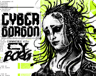
Cybergorgon
Concept: “They said they would make you beautiful. They lied. You were a model. A false beacon of hope and aspiration. In the shadowy boardrooms they made you a deal to stay young forever. It was only in the glint of the scalpel that you figured out too late you were sold, slush for a tax write off. An experiment in how badly you can fuck someone up. Now you are madness and steel.”
Content: A class for the highly motivated survivor spirit of vengeance and wrath.
Writing: Intense descriptions of class abilities and unfinished business can inspire tons of compelling roleplay opportunities.
Art/Design: A black and white illustration of a triumphant cybergorgon stands between columns of text describing class features and mechanics, with light green background accents throughout.
Usability: Class details are laid out in easily recognizable and navigable blocks with consistent presentation of headers, list item numbers, and so on.
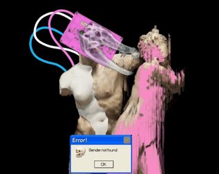
Cybernetic Hormone Vamp
Concept: “Reaperdoc [REDACTED] says //TRANS-RIGHTS // CANT AFFORD Over-the-Counter Estrogen // Testosterone ?? SICK OF WAITING 300+ years for HRT// Tiddy Skittles/Boy-Barcue Sauce// ??? Doc [REDACTED] has an EXPERIMENTAL Cy-Tech for YOU: VMP-F4NG Transfer SYSTEM Be a Vampire // Steal Hormones // you need ‘em more than most// - ReaperDoc [REDACTED] Reply [Y/N] to Accept”
Content: A class through which to explore the very essence of CY_BORG through augmentations and a “ferocity” resource.
Writing: Flavor and exigence for the class explode across the page, and the “ferocity” mechanic (which increases in combat until a threshold is reached to rage).
Art/Design: Trans flag colors draw attention to important class features and stand out against the white-on-black aesthetic. The accompanying image hints at the class’s possibilities, with the pop-up error message “Gender not found” juxtaposed well against the edited/remixed statues behind it.
Usability: Mechanics explained well; details/features organized in a manner to make navigation easy.
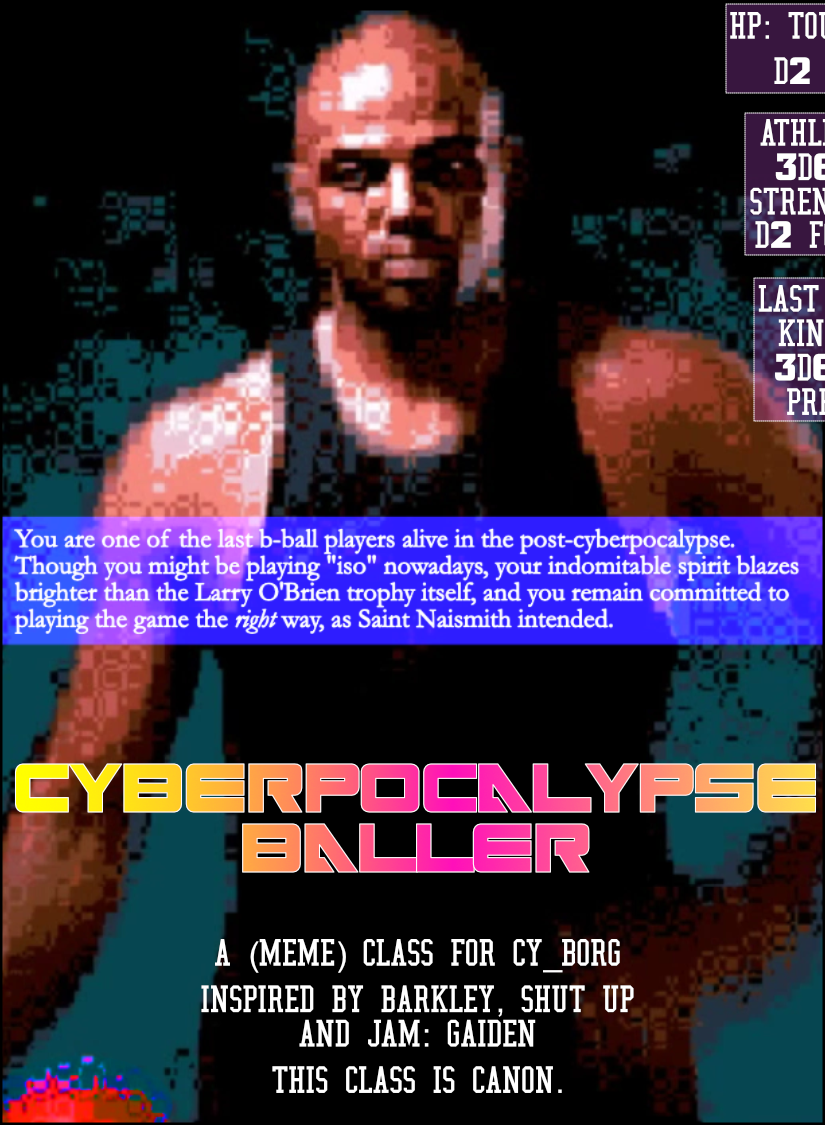
Cyberpocalypse Baller
Concept: “You are one of the last b-ball players alive in the post-cyberpocalypse. Though you might be playing "iso" nowadays, your indomitable spirit blazes brighter than the Larry O'Brien trophy itself, and you remain committed to playing the game the right way, as Saint Naismith intended.”
Content: A self-described “meme” class, for the player who understands ball is life.
Writing: Terse class feature labels and mechanics to keep the focus on core basketball elements.
Art/Design: Two-page spread with a pixelated image of Charles Barkley on the left and a cluttered ‘game plan’ arrangement of text boxes on the right, over a diagram of a basketball half-court. Text is mostly white on black/maroon and white on blue.
Usability: Visually, most text is high-contrast, with large bolded numbers to help distinguish each content item. However, text is not embedded, so no searching/selecting is possible. Also, one of the class ‘background’ tables is numbered in a potentially confusing manner for the reader scanning left-to-right and top-to-bottom.
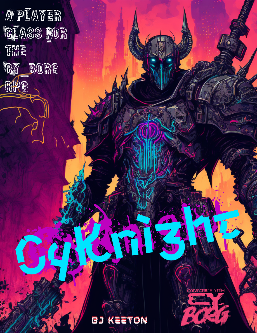
CyKnight
Concept: “Probably more metal than person by now. Your skin has the sheen of circuits, the smell of ozone. You’ve devoted your life to a cause. You fight, you pray, you train, you mod. You scream. You rage. But at what?”
Content: A class for the techno-paladin who’s on a mission, even if no one else can understand it.
Writing: Numerous options are concisely described, especially to suggest different armor/weapon upgrades with straightforward mechanical effects & explanations.
Art/Design: An illustration of a neon-highlighted, heavily armored cyknight surrounded by different tables/lists of class features/options. Mostly white text on a black background with neon-colored headings.
Usability: High-contrast text/ground color options increase readability, although sheer amount of text and its arrangement around the cyknight illustration might be confusing for some. Some lines are provided as borders between tables, and text color distinctions help as well, but text indentation can be inconsistent and affect navigation across page.
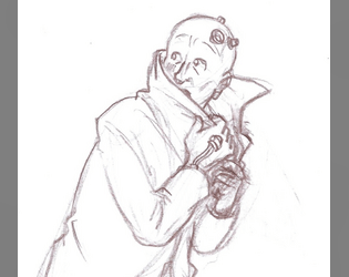
Defrosted Relic of the Past
Concept: “One moment you're living your life in the everyday world of smart phones and student loans. Next thing you know, you're out on the streets of CY, everyone you've ever known is dead and nothing makes sense anymore.”
Content: A class for the outcast who loves reflecting on their situation with critical distance and who wants to lean hard on being a fish out of water.
Writing: Hilarious pastiches of the “relic” trope through media with the occasional heart-rending vignette/idea that underscores the terror of life in CY.
Art/Design: Really bold yellow/pink color scheme for text-heavy content with an adorably wary pencil sketch of a relic looking over their shoulder.
Usability: High contrast fore/ground and easily recognizable content blocks make for easy recognition of the purpose for every element.

Demonic Drummer
Concept: "Each beat of the drum punches a hole in corporate security, each roll manifests as cascading buffer overflows. They call you an occult maniac; they don’t understand that the Net isn’t just code. It’s a goddamn symphony of destruction waiting to be conducted."
Content: A class for the hacker who recognizes in code the music of the spheres, and that music is death metal.
Writing: Thematically focused descriptions and mechanics that create a vivid sense of the demonic drummer in action.
Art/design: A cover page with a pixel-art depiction of a demonic drummer in a spotlight followed by a two-page spread of mostly single-column text.
Usability: Consistently presented, readable text with recognizably distinct sections and purposes of information that makes for easy navigation and identification of desired details.
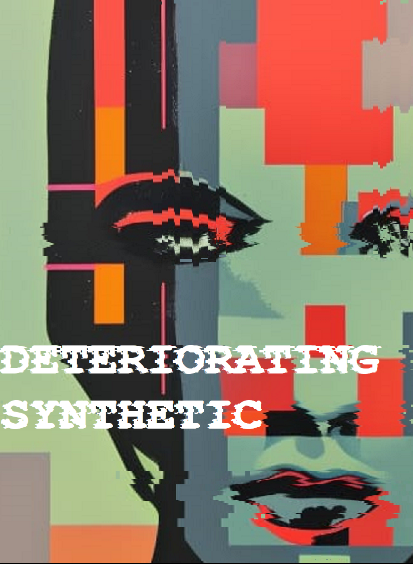
Deteriorating Synthetic
Concept: “Your time’s almost up. Like all life, you’re destined to die. The light that burns twice as bright burns half as long, and you have burned so very, very brightly. But if you are gonna burn out, you may as well take the city with you.”
Content: A class for the player whose fleeting time is an inspiration to be punk as fuck.
Writing: Incredibly brief class features and descriptions that call on recognizable archetypes from cyberpunk media to suggest character possibilities.
Art/Design: Two-page spread with class details to the left, enmeshed amidst a skyline background image, and a pixelated glitch art portrait illustration of a synthetic to the right.
Usability: Some text is very easy to identify and read, while others are a bit trickier due to contrast issues. Because class is provided as a PNG, text is not embedded (so no searching or copying/pasting is available).
Disavowed Medtech
Concept: “You joined the Medical Corps thinking you could make a difference, that you could save lives! But you didn't know the corps only save if you have the Creds to pay for it, and often times they'll leave you in the mud and blood if a higher paying call comes in. Supposedly the Hippocratic Oath you took when you Joined up only applies to those serving in the corps, guess that means you can defend yourself when helping the wounded now huh?”
Content: A class for the freelancing EMT who’s ready to shed as much blood as they staunch.
Writing: A mix of straightforward informative explanation and potently characterful description of character features and mechanics through which to bring a medtech to life.
Art/Design: Three visually distinct versions are provided: a landscape-oriented “printer killer” version with white text on black and red background colors, a portrait-oriented “splash of color” version, and a black-on-white text-only version.
Usability: Each version makes use of different fonts, text sizes, layouts, and colors to indicate a visual grammar for that version. The print-friendly version has searchable/selectable text.
Discarded Animatronic Toy
Concept: “You don’t remember who owned you, just that you used to belong. Maybe you went out of fashion. Maybe someone outgrew you. Some tech-head fished you out of the gutter, patched you up and set you loose on the streets, burdening you with the curse of sapience, just for kicks.”
Content: A class for anyone who wants something big–and violent, and terrifying–in a small package. Making this happen is child’s play, really.
Writing: Hilarious class details/features with which to develop a nuanced murder-bot that can hold its own without feeling one-note.
Art/Design: Vivid sketch of an example character atop a psychedelic background pattern. Text blocks in different fonts and colors provide distinct information across spread.
Usability: Visually distinct text areas provide distinct types of content. Some of the text can be a bit difficult to read against the busy background pattern.

Disenfranchised Unionite
Concept: “Cost of living and injuries skyrocket, wages and work conditions remain pitiful. Sick of the bullshit, you joined the Ungrateful Unionites, and quietly organized a local. Then you all got doxxed. Everyone was made an example of: gunned down by CySec, or sent to scream in black, bloody room——wishing they were. Everyone but you.”
Content: A class for the worker who has nothing to lose and everything to topple.
Writing: Vivid class features/details will definitely make a player want to organize, agitate, and overthrow. “Rage” mechanic offers additional means for accomplishing goals.
Art/Design: Industrial aesthetic with red/green color scheme complemented by a bit-art flyer for the union. Text organized in two-page spread.
Usability: Combinations of highlighted and italicized text, along with high-contrast colors, make for easy reading and navigation.

Disgraced Cubicle Zombie
Concept: “One bad day. A round of layoffs. Corporate Downsizing. Locked out of your coffin apartment. Your life subscription cancelled. Thrown out like garbage. Disposable. Replaceable. Not anymore. Stick it to the corpo pigs that ruined your life over an automated rounding error.
Make them pay.”
Make them pay.”
Content: A class for the wage slave who’s falling down and ready to bring those who wronged them to the gutter as well.
Writing: Potently concise descriptive and mechanical details highlight essential qualities of the class.
Art/Design: A rainbow of neon colors across the landscape-oriented spread, with an image of a disgraced cubicle zombie standing on a car toward the left side of the page, with class information taking up the remaining space.
Usability: While the colors are eye-searing (with the initial descriptive paragraph having the last contrast on the page), different kinds of content are consistently and reliably tinted, arranged, and spaced for more easily identification and navigation throughout.
Disgraced Face
Concept: “A new class option for CY_BORG! I worked up some mechanics for how to find contacts in the CY, as well as allow players and GMs to explore famous and high profile characters. All donations greatly appreciated!!”
Content: A class for the fallen angel who’s become accustomed to life in the grime and gutter.
Writing: A set of mechanics and background details that complement one another to give this sort of ruined punk a chance to wreak havoc on their former life.
Art/Design: Bright colors and a variety of illustration styles reflect a 1980s-esque vaporwave style, with text content in yellow-orange on purple boxes in a single-column format.
Usability: Consistent organization and presentation of different kinds of content help with navigation through the file to locate desired information. Unfortunately, text is not embedded, so no searching/selecting.
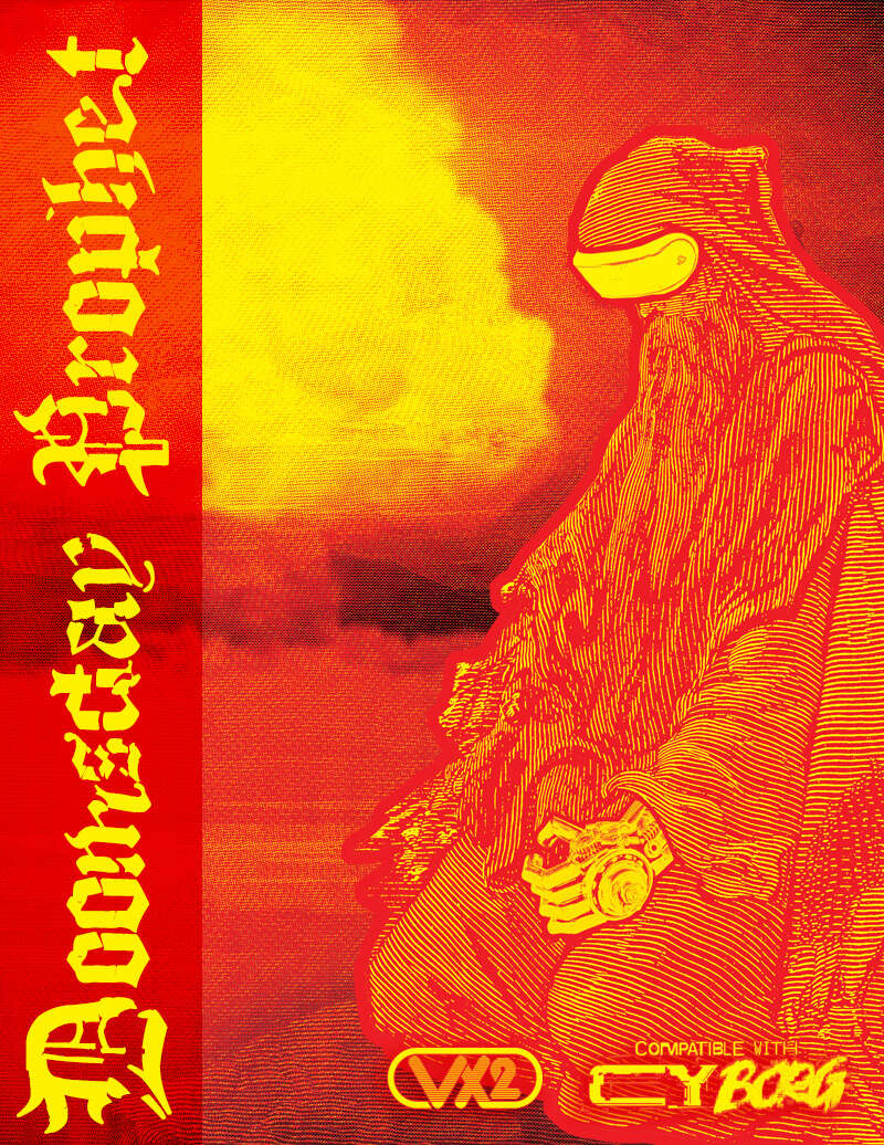
Doomsday Prophet
Concept: “Are you a STREET CORNER preacher barking out prophecies at every passerby? Or a wild-eyed bookworm, nose-deep in a YELLOWED TOME filled with nameless scriptures? Perhaps you hold the key to DIVINE BOMB or wield a HOLY HANDGUN giving you the power to smite the unworthy? To convey your SIGNS & PORTENTS, do you wear simple sandwich boards and carry placards, or do you wear the OCULUS OF THE ORACLE?”
Content: A class for the divinely inspired orators or those who make clerical errors, those compelled to share the word of whatever god is speaking to them.
Writing: Text and font choices work well together to indicate the ravings, or insights, of a doomsayer in CY. Every sentence contributes to a full sense of the class.
Art/Design: Harsh red and yellow color scheme brings to life the mushroom cloud and woodcut image of a prophet character across a pair of two-page spreads.
Usability: Text blocks are organized for easy visual distinction from others, and highlight color choices emphasize mechanics and flavor details. d666 table is particularly intriguing for both generating ideas and affecting the game world.
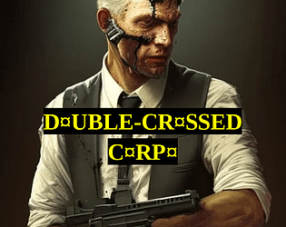
Double-Crossed Corpo
Concept: “It started innocent, didn't it? Just street brawling and hanging around in dingy pvnk haven bars, then slipping back into your other life in the high-placed corpo job. But it couldn't last. Now it's not just a hobby, a 'second life' for you to run as a pvnk. It's your actual life, and if you don't watch your back, it could be your death too. But you made it through the concrete jungle, the corporate arena. The streets of CY are just one cubicle block to claw your way through.”
Content: A class for the white-collar worker who’s found purpose in raging against the machine.
Writing: A mix of features to balance the punk’s former corporate identity and their current violent criminal undertaking, with a particularly interesting mechanic based on a poker-like 5d6 roll result.
Art/Design: Two versions are provided, both of which use a mostly single-column layout with a single table: a full-color version with white/yellow text on black background lines over colorful, pixelated background images of stock tickers/readouts; and a printer-friendly black-and-white version.
Usability: Both versions provide clear, consistent visual distinction of headings/labels and key terms that are emphasized in various lines of text. Full-color version may be slightly more difficult for some to read easily due to busy nature of the background image.

Dumpster Ninja
Concept: “Any dumpster is your home, and CY is full of them. Lone wolf, actually more like a lone rat, you embrace the filth while others seek comfort in tech and wealth. A pungent smell foreshadows your presence but no one notices you until it's too late. SHIIIING! SPLOTCH!”
Content: A class for the shadowy warrior who studied the garbage as well as the blade.
Writing: Character details balance absurdity and poignancy to allow for more depth and dimension than the class title might initially suggest.
Art/Design: Landscape-oriented spread with an illustration of a dumpster ninja on the left and two columns of text on the right (white on black) with red accents.
Usability: Consistent uses of emphasized labels and headings, along with red-accent borders to distinguish separate content sections, assist reading and navigation.
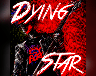
Dying Star
Concept: “You sung the theme of revolution. Now, you desperately run from entropy.”
Content: A class for the has-been who’s not quite ready to burn out or fade away.
Writing: Intriguing class features that reflect artistic creation (with a game mechanics dimension), vices, and origin stories.
Art/Design: A red-tinged illustration of dying star characters overlaid with contrasting patches of space where class details are laid out.
Usability: Content is arranged in distinct areas that make for easier navigation. Font choices and color scheme can be difficult for some to read, in part due to overall busy nature of the spread. Class is provided as .png file, so text is not embedded, making it difficult for searching/copying/pasting or using a screen reader.
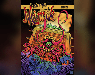
Dzika Karta
Concept: “Stare niszczy nowe. Lepsze jest wrogiem dobrego. Jedyny sposób, by przetrwać w korpo-piekle dnia powszedniego, to ciągle dopasowywać się do zmian. Fali nie da się powstrzymać. Możesz na niej płynąć albo czekać, aż cię porwie, pochłonie, zmiażdży niczym zęby kombajnu. Na szczęście o adaptacji wiesz wszystko – w końcu codziennie stajesz się kimś innym.”
Content: A class for the person who likes to reinvent themselves on a day-by-day basis. Included in an issue of the Polish-language zine Potencjalny Mimik. (The author shared an English translation on the Mörk Borg Discord server.)
Writing: A wide range of character abilities and quirks that reflects just how different a “wild card” might be than expected, which can add some important versatility for someone who wants to try out a whole bunch of different approaches to Cy_Borg play.
Art/Design: Two two-page spreads: one ‘light’ aesthetic scheme with a purple focus and one ‘dark’ aesthetic scheme with a yellow-tinted collage portrait illustration.
Usability: Distinct sections are visually apparent and make use of consistent visual grammar to indicate headings, labels, emphasized text, borders, etc. within each spread.

Entangled Displacer
Concept: “Your entangled alters are severed—no shared memories or thoughts. Strangers exchanging realities, you rely on the world around you to piece together who the other is. No magic, no science, no tech will ever bridge that gap between you two. You are alone if not in your originating world.”
Content: A class for the punk who wants to minimize their Borg-related character generation time and maximize their playing time.
Writing: A mix of atmosphere from Mörk Borg and Cy_Borg that manages to combine both in a manner that supports the premise of the class.
Art/Design: A landscape-oriented spread with Mörk Borg-related info on the left and Cy_Borg-related info on the right, with color changes from yellow to pink to help visually demonstrate the break. An illustration of an entangled displacer appears in the center of the page, with two styles that also reflect the games’ mashed-up existence here.
Usability: Font choices have some strong visual contrast, with different sections/blocks of text also recognizably different in style and arrangement. However, screen reader programs may have some trouble with some text elements.
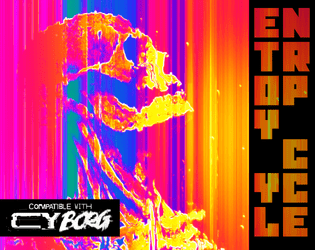
Entropy Cycle: Fragmentation Protocol
Concept: “The world has ended too many times. A copy of a copy of a copy. Something was bound to break. On the plus side there's a bunch of weird shit the mess around with.”
Content: Preview/excerpt of an as-yet unreleased supplement that includes a class (“Glitch Thief”), a set of “anomalous relics” with positive and negative qualities, NPCs, and a custom PC sheet.
Writing: Each spread is filled with inventive and interesting flavor and mechanics that might cause some players to weigh their decisions about whether and how to make use of particular options/features.
Art/Design: A set of two-page spreads with distinct layouts and color schemes, each of which balances a page of text and a page of illustration.
Usability: High-contrast text on each page, with distinct font choices and decoration to indicate different blocks’ or phrases’ purposes (e.g., label, key information, NPC stat). Text on the custom sheet is not embedded, so no searching/selecting is possible there.
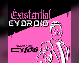
Existential Cydroid
Concept: “You’re a machine. An imitation of humanity. But you’re sure you were a real person before. Someone made you into THIS: A steel chameleon with a holographic face, and you hate them for it.”
Content: A class for the punk who gazed into the mirror and found the abyss gazing back.
Writing: Evocative class features/abilities with detailed explanations of relevant mechanics.
Art/Design: Pink, white, and black triptych general layout, with a bright pink triangle splitting the central and left areas of the page, framing a portrait of an existential cydroid reaching toward the viewer for a handshake. Text on the left and right of the triangle completes the character creation details.
Usability: Sections are clearly delineated from one another thanks to central image/triangle graphic. Text is provided in high contrast (white and pink on black, black on pink) in high-resolution .pdf and .png versions.

Explosive Ideologue
Concept: “The world is over. The human race is fucked. Alien AIs are the new overlords. They want our precious thought waves and reproductive organs. It’s all their fault. You know who. That’s why they want to stop you. That’s why they want to destroy your prophetic visions. They want to stop you from telling the TRUTH. You have to make people pay attention to your message otherwise a corpo hit squad doesn’t just disappear you and scrub everything. The only thing people pay attention to is violence. Time to make your own fertilizer and stuff drones full of high explosives. The TRUTH needs to be told.”
Content: A class for the conspiracy theorist who’s ready to put their ideas into practice.
Writing: An emphasis on descriptions and mechanics that reflect the information overload and sensory assault of the class works well to position a player who wants to give the class a try.
Art/Design: Extremely loud prismatic color scheme with purple having prominence. Nearly every line is a different font or color from those around it. An illustration of an explosive ideologue is placed to the left of the single-column text taking up the majority of the page.
Usability: Text is not embedded, so no searching/selecting text. The variety of fonts, text sizes, and color choices means that the content may be incredibly difficult for many to read.
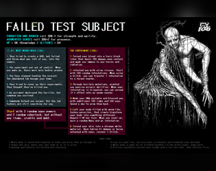
Failed Test Subject
Concept: “Failed test subject, is a horrible mutated and augmented thing, broken and abandoned by its creators.”
Content: A class for forgotten and wretched castaways and fans of intense body horror.
Writing: Expressive class details supported by a range of imaginative mechanics.
Art/Design: Black-and-white illustration of a subject beside two columns of class features and mechanics with colorful headers and muted element backgrounds.
Usability: Easy to read and distinguish different elements from one another.
Fallen Hill Angel
Concept: “You once had it made. A life in the Hills, free from the burdens of capitalism. But something happened. You were cast out, thrown from Heaven’s Gates. Welcome to hell.”
Content: A class for anyone who had it all but now feels less than zero.
Writing: Vivid background tables and features serve as vignettes around which a tragic character can easily cohere.
Art/Design: An abstract illustration of an angel fills the left side of a two-page spread, while class details are arranged around a pattern near the center of the spread.
Usability: Distinct sections are recognizable and readable, with identifiable headings/labels. However, class is provided as a PNG so text is not selectable (no searching, copying/pasting, or screen reader functionality available)
Forgotten Salary Drone
Concept: “Once a desk jockey for a powerful corp, the system has forgotten you even exist. You are now freed from your shackles with only your debts remaining. Free to weaponize the skills and connections they gave you against them. Even the streets are better company than the spineless losers you had the displeasure of calling coworkers.”
Content: A class for the overlooked and overburdened worker who’s ready to demolish the master’s house with the master’s tools.
Writing: Bursts of flavorful text that support intriguing mechanics that set the class apart from others (and that definitely aren’t HR-approved).
Art/Design: Spread layout highlights a glitch-tastic portrait of a salary drone beside class abilities and a description on a post-it note.
Usability: Different sections of class details are easily distinguished and laid out for quick navigability. Dark green on black can be difficult to read.
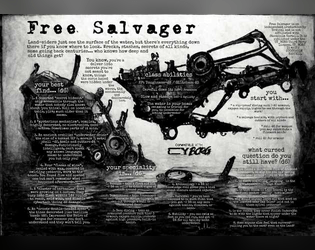
Free Salvager
Concept: “Most people just see the surface of the water, but there’s a lot down there if you know where to look. Wrecks, stashes, secrets of all kinds, some going back centuries…who knows how deep and old things get?”
Content: A class for the enterprising underwater dumpster diver–another scumbag’s trash is your sunken treasure.
Writing: Description and mechanics are concise and clear, with straightforward indications of the scope of the class.
Art/Design: A dark blue, watery background offers helpful contrast to the white text in this spread.
Usability: Class details are easy to recognize and navigate, with strategic bolding to highlight important elements that complete the character.

Frostbitten Pollutionist
Concept: “Out from the dark, I remember it was here I died.
Once a promising researcher, an incident took your body from you, the remains are forever sustained in a sealed cryogenic coffin suit. Your voice is a heavy mechanical rasp. The heart grew cold with your first death, this is false life.”
Once a promising researcher, an incident took your body from you, the remains are forever sustained in a sealed cryogenic coffin suit. Your voice is a heavy mechanical rasp. The heart grew cold with your first death, this is false life.”
Content: A class for the empty shell of a once-passionate scholar who still has work to do.
Writing: Darkly atmospheric and tragic details bring the punk’s situation to light, complemented by brief mechanical abilities/effects.
Art/Design: A two-page spread with a large image of a frostbitten pollutionist on the left side and a two-column white-on-black set of tables on the right.
Usability: Text is high-contrast, consistently organized and formatted, and distinct sections of content are clearly marked to indicate relationships between types of information.
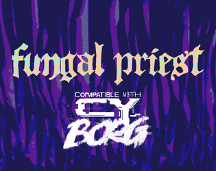
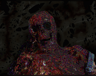
Fungal Priest
Concept: “You have been blessed with the touch of GOD. GOD, in this case, is a fungal growth deep below the City. It hungers for new converts, to spread and grow. You accepted its gift, and now bear the scars of your awakening.”
Content: A class for the zealous collector of spores, molds, and fungus.
Writing: A rhizome-licious mix of terse mechanics, humorous descriptions of class features, and horrifying labels.
Art/Design: A two-page spread with an abstract illustration and general class introduction on the left, and class features/tables on the right.
Usability: Color-coded text to distinguish headings and stats from body text, and distinct font choices for each section of body text, assists with identifying and locating desired info.

G0OG
Concept: "It's been a while, since i've made anything for CyBorg, so here is a new custom class."
Content: A class for the gangsta rap fan who wants to live by the code of the streets.
Writing: Mechanics wrapped in the conceit of a rap album track list & liner notes but still presented accessibly for easy use.
Art/design: White-on-black with one- and two-column layouts of textual information. A class/album cover page shows a collage depiction of a G0OG and a 'parental advisory: explicit content' label.
Usability: Text is easy to navigate visually, with distinct sections of information and recognizable headings & labels. Class-specific "Problem" mechanics are integrated throughout the provided materials to ensure thug life feels adequately brutal.
Genetically Modified Freak
Concept: “Valued user, Thank you for enrolling in the GENETIC OPERATIVE testing program. Per request of entities we cannot disclose, you been imbued with the finest BIO-IMPLANTS R&D has workshopped. Your valiant work in product testing is important in forging a brighter future. This concludes our correspondence. We take no responsibility for any action you take from this point forward. Goodbye.”
Content: A class for the transhumanist body horror aficionado.
Writing: Sparse but incredibly vivid description of class abilities complemented by an equally vivid but more detailed table of bio-implants.
Art/Design: A variety of message styles present class info with a colorful and gruesome skull-faced figure to demonstrate just how freakish the class is.
Usability: Different class details are easy to identify and distinguish from one another; bio-implants table is a necessity for maximum enjoyment/potential.
Loading next page...