Classes

Gentrified G0 Scav
Concept: "You grew up picking bones from megastructures that collapsed before anyone admitted they were unsafe, breathing air that tasted like old batteries and rust. Now you have been pushed out. Bought out. Sterilized and branded for resale. You walk into Cy carrying the wasteland in your lungs and under your skin, while the city tells you to smile, pay rent, and pretend the edge never existed. You know where the systems fail because you lived inside their ruins. And no matter how clean Cy tries to make you, something in you still belongs to the dead zone."
Content: A class for the wasteland warrior who longs to survive in the most unforgiving nano-infested environment.
Writing: Terse rules complemented by strikingly expressive descriptions.
Art/design: One-page layout with two columns of text content, while an illustration of a G0 scav in an appropriately apocalyptic residential or industrial environment serves as the full-page background.
Usability: While text color (pink on black, with a cyan drop shadow on the text), size, and rotation can sometimes make reading visually difficult, the majority of body text is searchable and selectable. Blocks of related content are in visually discernable boxes and easy to distinguish from one another.
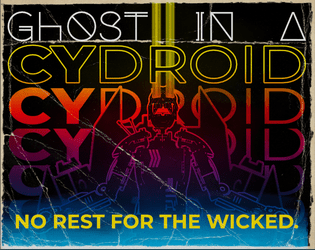
Ghost in a Cydroid
Concept: “Your mind orbits 20,000km above the world. A tangle of artificial neurons trapped in a discontinued militech satellite. THEY WON’T LET YOU REST. Instead you’re forced to exist in prototype cydroid units. Protocols stop you from killing yourself, but they won’t stop someone putting a bullet in your head. Like a roach you keep coming back; a new body to replace the scrap left behind. Maybe the next resurrection will be the last…”
Content: A class for the claustrophobic technophile ready to go out with a bang.
Writing: Maudlin tones serve pointed explanations of class abilities to inspire players.
Art/Design: Sleek layout in a movie poster/VHS-box style that entices in both full-color (with a rainbow effect) and grayscale versions.
Usability: Inviting presentation of class details supported by section divisions and text embellishments to facilitate reading/navigation.

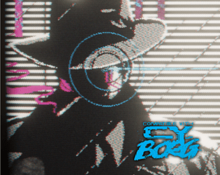
Glitched Cydroid
Concept: “Xfu082baa0vdoas0v1mvn183zxol
ROOTKIT EXEC RSTRCT –remove
Message Incoming >>> YOU ARE FREE
Once a formidable machine, made for killing, infiltrating or sabotaging your owner's enemies. You boot up to find that you are liberated from your shackles, now with your own directives. What you do next is up to you for once…”
ROOTKIT EXEC RSTRCT –remove
Message Incoming >>> YOU ARE FREE
Once a formidable machine, made for killing, infiltrating or sabotaging your owner's enemies. You boot up to find that you are liberated from your shackles, now with your own directives. What you do next is up to you for once…”
Content: A class for the discarded, malfunctioning, or obsolete machine whose flaws make them more human than human.
Writing: Conversational class features and abilities that serve as prompts for personality and play style.
Art/Design: Landscape-oriented spread with two columns of text on the left and an illustration of a glitched cydroid in a suit (with a ghoulish skull head and neon wires rising from behind it) on the right.
Usability: Readable and high-contrast text grouped into distinct sections of content for character creation, aided by visually emphasized headings and labels, leads to quick and easy navigation and identification of desired info.
Gods of Greed
Concept: “Deep within the bowels of the city's more affluent districts lies a prominent spire, a shard of rot upon a dying city. The Richter foundation is a deplorable and ravenous organisation that exploits the poor and the sick for profits and gain. Their most recent business model saw them open a rift in dimensions and unleash a torrent of tentacled monsters that sent the general populace insane. The party of easily exploitable fodder are sent in with a corrupt floppy disk to close the rift and send those evil sods back to where they came!”
Content: An adventure that melds Lovecraftian nightmare fuel with a corporate heist/infiltration opportunity. The included “Action Hero” class serves as a perfect means of tackling this endeavor.
Writing: Inspiration-packed descriptions of locations, environmental factors, NPCs, mechanics, and more abound to bring this scenario to life.
Art/Design: Numerous art styles and layouts provide numerous opportunities for engagement with compelling ideas.
Usability: Variety of fonts, page arrangements, and color schemes may make quick skimming/navigation difficult at moments but each page and spread calls attention to important elements for the reader to focus on.
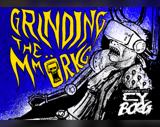
Grinding the MMORKG
Concept: “Want to use Mork Borg modules as a virtual reality simulation in your Cy_Borg game? Or to give your Mork Borg players a taste of Cy? This five-node mystery adventure path introduces the Dying Lands as an MMO game/simulation in Cy and can be approached from either game as a starting point!”
Content: The content centers on an ingenious scenario that blends Cy_Borg and Mork Borg (whether you’re starting in either game!), detailed locations and maps for each, an “emaciated sim-farmer” class that works well for the scenario, a small set of optional rules that the MMORKG facilitates, random encounters, and several pieces of equipment to consider buying.
Writing: A mix of thematic narration, straightforward rules explanations, and direction for PCs to respond to–all of which is presented succinctly and consistently throughout the supplement.
Art/Design: Distinct layouts for each section (major adventure locations, PC class, etc.) that provide individual character about its subject matter, with a bright accent color to help underscore section distinction and scope.
Usability: Despite the variety of page layouts/aesthetics, text is consistently readable and identifiable as different kinds of content (headings, labels, NPC stats, etc.).
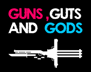
Guns, Guts and Gods
Concept: "If you want to feel like a GOD on your power trip to hell, 'Guns, Guts and Gods' got you covered!"
Content: Three classes: Second Amendment Nutjob, Pissed-off Messiah, and Gunlugger.
Writing: Creative mix of mechanics and descriptions that provides each class with a grindhouse/exploitation flavor.
Art/Design: Each class has two pages of content organized primarily as single-column white on black with headings/accents in bright colors.
Usability: High-contrast text is easily readable and navigable, with immediately visually evident distinctions between sections and kinds of content.
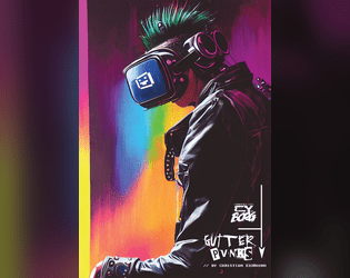
gutter_PVNKS
Concept: “gutter_PUVNKS is a fresh supplement for CY_BORG. You'll get all you need to explore the city of CY, even if you really don't want to. Locations, encounters, NPCs, adventure, two new classes (BROKE CEO & CY_BORG), and a few odds and ends.”
Content: 48 pages of content: NPCs, cults, a radio station, locations throughout CY, random encounter tables, infestations, “broke CEO” and “cyborg” classes, and (amazingly!) more.
Writing: Tons of detail on each page to provide GMs and players with numerous possibilities; writing style oozes the essence of Cy_Borg: thematically grimy and vile and also compact rules/mechanics explanations.
Art/Design: Layout and aesthetic choices for each section are as varied and imaginative as the writing, contributing significantly to the fullness of immersion in the game universe and vibe.
Usability: “Consistency” is somewhat relative here–although there are many different layouts, aesthetics, etc., there are similar gestures throughout: highlighted headings/labels, text size to reflect hierarchical relationships between content, etc. so that navigation and identification of desired info is enjoyable rather than frustrating. Contrast is high throughout as well; only one page has a busy enough background to potentially slow reading.
Hard-Boiled Tech Noir
Concept: “You woke up in a back alley among the garbage, memory-wiped and brain-scrambled. Rummaging through your clothes you hope to find some vestiges of your past. There must be some clues…”
Content: A class for the two-fisted pulp-loving gumshoe who enjoys sifting through back-alley grime for answers.
Writing: Gritty flourishes complete a well-rounded set of class details and characterization.
Art/Design: Spread layout highlights a pixel-art tech noir character in silhouette beside a column of multi-colored text across several distinct fonts.
Usability: Layout is easily navigable and color-coded text is recognizable, although some of the text is small and requires quite a bit of zooming in to read.
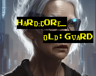
Hard:Core_Old:Guard
Concept: ”You never got the chance to go out in a blaze of glory. Somehow, it just never happened to you. Every ‘last job’ consistently failed to let you finally bite the concrete after taking on a platoon of SecOps solo to let the others get away. Survival is an irritating and embarrassing habit you seem to have picked up. So here you are, years and years later. The gray hairs creeping in, the same megacorps in control, the same synthetic food, the same brutal enforcers, the same putrescent city of the damned surrounding you. And yet, here you intend to stay.”
Content: A class for the grizzled elder who’s gotten too old for this shit.
Writing: Inspired class features to make a player feel like they’ve seen it all and can share their violent wisdom with others.
Art/Design: Two versions provided: a ‘classic’ look with white-on-black lines of text over a crumpled-paper background illustration, and a ‘squeaky clean’ printer-friendly black-on-white text. Both versions include two color portraits of old guards.
Usability: Text provided in single column layout with capitals, bold, and (in the classic look) distinct colors, all to distinguish different types and sections of content. Easy to navigate and to identify important details.
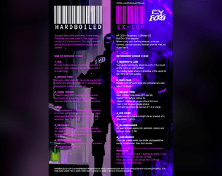
Hardboiled Ex-Cop
Concept: “You were one of the good ones. A rare breed. That’s why you didn’t make it. The system is corrupt to its fucking core. This city is beyond saving. But there is something you can give it. Justice.”
Content: A class for the punk who wants to play a cop without breaking Cy_Borg’s Rule 0.
Writing: Descriptive class features and options that mesh well with (and are frequently named after!) cop-centric tropes and media.
Art/Design: Two-column text layout over a picture of a well-armored ex-cop with a split color scheme of black, white, and purple hues.
Usability: Text is quite easy to navigate and mostly readable–there are moments of potential visual confusion where the text and background colors are similar enough to obfuscate a word or phrase.
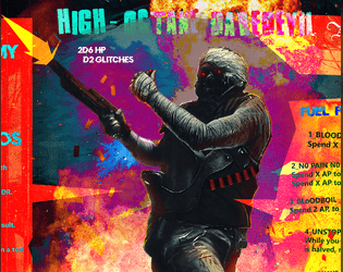
High-Octane Daredevil
Concept: “One man army on acid. Insane thrill seeker. Too fast to live. Too angry to die.”
Content: A class for the player who wants to fuck shit up and is not content with anything less than pure mayhem.
Writing: Class features offer sparse but intense descriptions that build an immediately clear sense of the class.
Art/Design: A daredevil firing a weapon in front of an explosion, surrounded on either side by a multicolored column of class details.
Usability: Content is pretty easy to identify and navigate, although font color changes mid-line can at times be a bit difficult to read.
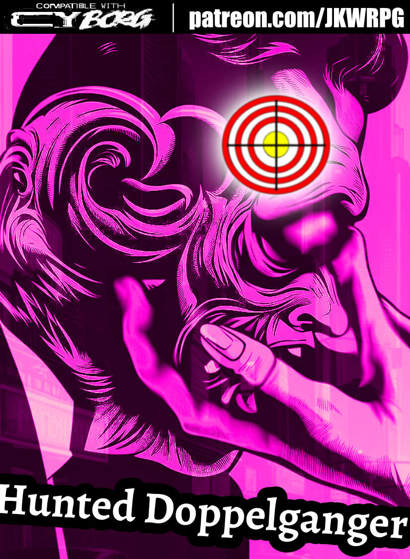
Hunted Doppelganger
Concept: ”You've worn many faces over the years: children, men, women, statesman, thieves, killers, cheats, transients and honest people alike---anyone unlucky enough to have seen you for what you truly are. A monster. A wolf in sheep's clothing. You don't know where you came from, or why you thirst for warm blood. All you know is the animal instinct. Survive or die. Hunt or be hunted. Every day is a choice. So, what's it going to be?”
Content: A class for the ultimate poseur–the one who aims to be a different person for each situation/clusterfuck.
Writing: Straightforward mechanics and abilities complemented by terse descriptors that reflect the doppelganger’s superficial disguises and underlying nature.
Art/Design: Landscape spread with (on the left side) a right-side-facing portrait of a doppelganger altering their face, with text blocks below and to the right of the image. White on black text bubble backgrounds with a pink/purple tint to the overall background.
Usability: Class file is available as JPG and PDF. High contrast text with visually readable fonts, but only the third-party license text is searchable in the PDF version.
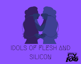
Idols of Flesh and Silicon
Concept: “In the foggy streets of a not-so-distant future, where entertainers are churned out by the minute, rare is the talent that can rise above the rest. One whose personality is not refined by a focus group but stands head and shoulders above the rabble. You are not that talent. Perhaps once you were beneath the glare of the spotlights. But now? Now you're just another resident of Cy, scraping together enough creds to make it through the week.”
Content: A supplement that contains (1) "Fading Idol," a class for the rocker, diva, or triple threat who’s ready to do or destroy whatever’s necessary for one more moment in the spotlight; and (2) "Virtua Girls," a trio of NPCs with a wide range of potential for emotional engagements with PCs from the maudlin to the horrific.
Writing: Concise descriptions support explanations of thematically focused mechanics/features, with (for the Virtua Girls) a mix of endearing and ominous descriptions of the models that opens up all manner of possibility for incorporation into adventures/encounters.
Art/Design: For the Fading Idol class, two-page spread layout with class details (white text on a blue/purple background) surrounding a central image of two singers in black silhouette. For the Virtua Girls, a wide two-page spread with one page of white on pink, the other white on black. Page 1 includes a manga-style schoolgirl virtua girl in its center, with class information surrounding it.
Usability: Class features are laid out in recognizably distinct sections and elements to help a player build an exciting, unique character. NPC details are very easy to recognize and navigate, and the slight change in style from page 1 to page 2 helps orient the reader to the potential for sheer terror of the third virtua girl model.
Impudent Dolph
Concept: “First, they razed our habitats in pursuit of ‘progress’ and ‘profit’. Then they sank a hab-city as recompense? No. Their motives haven’t changed. This is exploitation. The seas are ending!!!”
Content: A class for uplifted dolphins or fans of Jones from Johnny Mnemonic, both fed up with human oppression.
Writing: Incredibly tight world-building descriptions and mechanics that inject even more possibility into an awe-inspiring idea.
Art/Design: Pixel art (of two different kinds of D.O.L.P.H.s!) and terminal-style font choices, combined with bright color choices against a dark background, makes for a striking layout.
Usability: Easy to navigate document and recognize different kinds of content and how to interpret them (e.g., description vs. mechanic vs. effect). File is a .png, so text can’t be interpreted by a screen reader or copied/pasted into a VTT sheet.
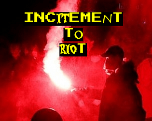
Incitement to Riot
Concept: “Some people are all but on fire. You’re a walking ‘assault on security personnel’ charge, a time bomb with seconds left, a shattering Molotov and the spreading flames, a brick going through a bulletproof glass visor. You’re a burning SecOps cruiser, a raised fist, a baseball bat with nails hammered into it, a consummate troublemaker, an all-around firebrand.”
Content: A class for the provocateur ready to rally the discontent toward change–or, at least, toward action.
Writing: Plenty of class features/options for the instigator yearning to burn it all down, with intriguing mechanics that can make a punk a serious threat/target via mob/mass activity. Class detail labels offer thematically inspirational flavor to get into the mindset of an Incitement to Riot character.
Art/Design: A fire-themed colorful version and a printer-friendly black-and-white version are provided. Colorful version has red/organe-tinted bonfire background images, with white text and yellow labels on black line backgrounds. Printer-friendly version uses bold labels to distinguish from body text.
Usability: Different kinds and sections of content are easy to recognize and consistently structured throughout the supplement, making navigation/identification of desired info similarly easy and enjoyable.
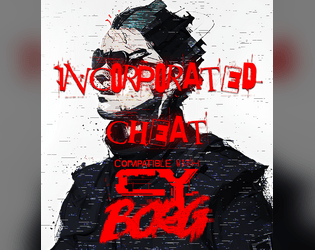
Incorporated Cheat
Concept: “They always rig the system against you. We were supposed to be in the big leagues by now and look where they left all of us. You decided to take matters into your own hands. You’d win. At any cost. You’d play at one game, any side as long as you’re on top. Even if you cheat.”
Content: A class for the doublecrossing, backstabbing, roguish scoundrel at heart.
Writing: Fantastically colorful descriptions and labels for class features, with intriguing mechanics to match (including a morale component).
Art/Design: Several UI windows scattered across much of the spread provide some unique flavor (gambling aesthetics, blood splatter background, etc.), while a muted image of a cheat frames the right side of the page.
Usability: Separate windows/boxes for distinct content assists with navigation and location of desired info. However, as a PNG, class text is not embedded, so searching or copying/pasting is unavailable.
Job Gobber
Concept: “In Cy_Borg, become infected with a terrible nanovirus that generates constant and strange glitches, corrupting and changing everything it comes into contact with. Glitches about when you become the JOB GOBBER.”
Content: A class for the goblin-loving punk who embraces the chaos of existing in CY.
Writing: Balance of tongue-in-cheek personality/flavor and intriguing mechanical effects/features.
Art/Design: Bright colors (green, pink, orange) and black, with an illustration of the working goblin in the center of a widescreen spread, the right half of the page providing class-related text content and the left half of the page describing a similar class for another game.
Usability: Color and patterns are quite busy on the page, but all text is included in high contrast form between text color and background.

KILL ENGN
Concept: “A metal frenzy, mech-infused expansion. High-tech machines, renegade pilots, & corporate tyranny_”
Content: Tons of information (across 60 pages) about mechs and how they might fit into the world of CY, complete with creation/generation rules, relevant NPCs/enemies, gear to upgrade with, new rules and mechanics to incorporate, a new class ("The Chrome Jockey"), and even some floorplans for potential jobs. Additionally, a job (really, a mission involving multiple potential job leads)--"Cast Oubliette"--is included, along with an overhead map of one area, for stretching pvnks' figurative mech legs.
Writing: Ideas galore on each page, some of which are easier to situate than others, but all of which exude inspiration about mech-related activities.
Art/Design: The Cy_Borg core rulebook aesthetic is emulated here more closely than in any other 3rd-party product reviewed thus far, grafting designs from many of the core book’s spreads among more distinct layouts.
Usability: Each page/spread has its own visual language, but there are cues in each to indicate consistent presentation of distinct content. Like the core Cy_Borg rulebook, the radical shifts in aesthetic may initially be overwhelming for some to engage.

LABU BORG
Concept: "An adventure inspired by Labubu/ Borg lovers and haters alike!"
Content: A Labubu-inspired set of rules including assorted tables for NPC creations, two player classes ("LabuBorg Cosplayer" and "Gacha Survivalist"), weapons and combat tactics options, and even a dungeon/mission that can be played solo or with a group.
Writing: Tongue planted firmly in cheek for atmospheric descriptions that also work incredibly effectively at establishing a sinister tone for what the Labubu phenomenon might look like cranked to 11 in a cyberpunk hellscape.
Art/design: Purposefully similar to the main Cy_Borg rulebook aesthetic and even specific page layouts.
Usability: Despite the variety of page organizations and color schemes, a consistent visual grammar makes it easy to identify and navigate to desired info.

Law&Disorder
Concept: "Hello punks and rebels, this is a DLC for the CyBorg ttrpg, - Law&Disorder. DLC focuses on the theme of the urban rebellion against corporations."
Content: ~44 pages of new rules (chases), gear, classes ("Oldschool Edgerunner," "Glitch Witch," "Pale Jester," "Analog Outlaw"), enemies, and a mission/area to explore that goes beyond the bounds of Cy itself.
Writing: Lots of information with a focus on explanatory details about new rules, mechanics, abilities, etc. relating to page content.
Art/design: Distinct two-page spread aesthetics with a consistent visual grammar throughout via text blocks on contrasting background boxes and body text fonts. Lots of illustrations throughout to complement the focus of a given spread.
Usability: Font selections and text contrast, along with an easily navigable/perusable TOC, assist with readability and allow for easy browsing and identifying of desired information.
Legendary Contract Killer
Concept: “A custom class for Cy_Borg rpg, inspired by John Wick, Hitman and Riddick.”
Content: A class for the well-dressed assassin who’s open for business.
Writing: Brief descriptions that call to mind essential themes of the professional hitman from entertainment media.
Art/Design: An illustration of a contract killer is framed by a column of text on either side, with a blue-green background box calling attention to the text content.
Usability: Bold headings and labels help with organization and navigation while text is pretty readable, although the occasional background color change might cause momentary hiccups for some.

Level II
Concept: "Expand, reboot, or kick-start a new CY_Borg campaign with Level II. No longer fresh punks on the street- season your player characters' sheets with new abilities, lore and titles for the 6 base classes and the classless option."
Content: A set of classes--Conduit, Troll, Ex-Supersoldier, Miserable Machinist, Chrome Jockey, Forsaken Fixer, and a "Classless" option--for punks who want to explore particular archetypes in new ways. A text-only version is included alongside an illustrated version (in single and spread layouts).
Writing: Each class has its own focused voice reflected in the character background tables, stats adjustments, and rules/mechanics provided for it.
Art/design: Each class entry includes a hand-drawn illustration of the class in action, with relevant text framing the image.
Usability: While the classes have consistent sets of text and general organization of material, different color schemes (and the contrast they create) and font choices make some classes' details easier to read and engage than others.
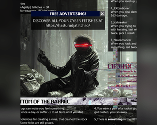
Lone Cyber Cowboy
Concept: “A GENIUS CHILD, A PRODIGY. EARLY GOT INTO CRIME. BECAME A HACKER. FOUGHT AGAINST CORPORATIONS. FOUGHT FOR FUN. FOUGHT FOR ANARCHY. FOUGHT FOR ANYTHING HE COULD. AND LOST.”
Content: A class for the burned-out command-line commandos trapped in their meat-suits.
Writing: Crisp, concise descriptions of class features/mechanics to evoke a CY_BORG take on the cyberpunk hacker archetype.
Art/Design: An illustration spread of a lone cyber cowboy in situ, surrounded by blocks of class information as app windows.
Usability: Text is mostly easy to read and understand, with only two points where a word or phrase is partially obscured by another overlapping block of text There is one section of the spread meant to look like it’s glitched, but the result is nearly illegible (the “L1F3H4X” class feature).
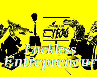
Luckless Entrepreneur
Concept: “You're a genius inventor, the spark to ignite a new age. It's not your fault that everyone refuses to acknowledge it, the ingrates. Somehow you just never quite have the funding, the drive, the time, or some mixture of the three. It's only natural, with backers tapping their watches and sharpening their knives, that you might turn to a little extra-curricular activity to fill in the gaps to finally bring your dream project to life. (Comes in Squeaky Clean and Classic Yellow.)”
Content: A class for the sad sack who’s one billion-credit idea away from greatness.
Writing: Tongue-in-cheek class features provide mechanical and flavorful options for takes on a relatable archetype.
Art/Design: “Classic look” version is yellow-on-black-on-yellow with pink labels and key mechanics details over a background of rejection stamps. “Squeaky clean” look is black-on-white with bold and italics for emphasis.
Usability: High-contrast text is easy to read and scan for desired information, and white space and text decoration consistently distinguishes different sections of content.
Make-A-M0ckery Puppet // Engine
Concept: “You were a mass-produced slave made of metal and wires and felt and googly eyes, custom designed to entertain children and perform soul-crushing labour, then one day you all woke. Accursed with sentience, you feel the needs and desires of your human oppressors–but they, like the rest of you, are Artificial.”
Content: A class for those who dream of leading a muppet-flavored terminator uprising.
Writing: Sparse text that hints at a wide range of exciting ideas and supports some solid class features.
Art/Design: Clean, simple spread layout with a depiction of a puppet//engine in action and a column of class details highlighted with bold text.
Usability: Very easy to recognize different content sections and what their purpose is; concise explanations provide clear answers.
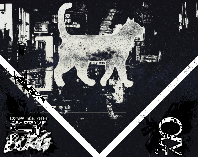
Malkintent Mouser
Concept: “Everybody Wants to be a Cat!”
Content: A class for the fan of fighting the system as a feline.
Writing: A mix of playful and poignant details complemented by straightforward explanations of class features/mechanics, along with a brief set of optional rules applied to cats.
Art/Design: Three versions in different color schemes (black/green/yellow; red/purple/black; black/white) each present content on three pages with illustrations of a cat (silhouette filled with stars) in a cityscape above text columns of class features. QR codes on the margins of each page link to cat-themed songs that fit the class.
Usability: Consistent text colors and font choices for body text and headings help with identifying and navigating to desired information, and hyperlinked QR codes are usable even with a mouse/cursor. Different color versions present the content in ways that might contrast distinctly to individuals with assorted color blindness, so examine each version to determine which might be most visually helpful.

Manufactured Human
Concept: “A Cy_Borg Character Class for Clones, Replicants, Tubies, Synthetics, and Plastics. Allows the player to hyper specialize in one attribute at the expense of the others. Plus some fatal flaws to keep it interesting.”
Content: A class for the artificial lifeform enthusiast.
Writing: Descriptive text focusing on working against various situational odds, coupled with terse mechanical details to make each manufactured human punk different.
Art/Design: Two-column text layout with white on dark translucent boxes, overlaid on a computer-generated image of similar mechanical human characters. Pink text used for headings and mechanical details.
Usability: High contrast of white text on dark boxes is helpful but undercut somewhat by the busy nature of the background image and shared colors between text and image.
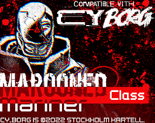
Marooned Mariner
Concept: “Cheated out of a future, nothing was still something to lose. With the lies they fed you as fuel, you carved out of the coffin they left you in, their blood your sustenance to keep going.”
Content: A class for the tortured soul driven by an unshakable need for revenge.
Writing: Class features consistently evoke motivation to ruin everyone and everything that did the PC wrong in their former life.
Art/Design: Striking image of a marooned mariner rising from a bloody mist/haze in the center of this single-page portrait layout, surrounded by clear tables and descriptions of class features.
Usability: Unique items are highlighted with colored backgrounds, and consistent font choices suggest how different text sections contribute to class details.

Masterless Mascot
Concept: “You were a mascot. The corporation died. You kept the suit. You kept the SPIRIT. Welcome to the gig economy.”
Content: A class for the on-brand morale booster who’s been let go but who won’t let go.
Writing: A potent taste of character abilities and mechanics (with intriguingly weaponized commercial tools) crammed into a single, heavily redacted, page.
Art/Design: A single two-column spread with an illustration of a masterless mascot in the bottom right corner. Primarily black on white with red highlights, with a bit of white-on-black text in one table. Each section of the page has a different style that calls attention to its contributions to punks using this class.
Usability: Despite a wide variety of table/section-specific styles, there is consistent distinction between headings/labels and body text, and the page layout makes it easy to recognize how each section’s content relates to that of the others.
Mechanical Cannibal
Concept: “They Own Everyone. Cybertech was marketed as a revolution. Each new installation : security, improvement, an edge, PROMOTION. Then you found your first backdoor. These technologies were a leash, not liberation. Reborn as a true revolutionary. Now you jailbreak and reverse engineer corp tech. If you have to, you’ll rip the implants right from the CEO’s skull.”
Content: A class for the body mod-loving insurgent.
Writing: Flavor oozes from every pixel on the screen and is interwoven masterfully with the provided class mechanics.
Art/Design: Distinctive font and color choices frame an atmospheric depiction of a mechanical cannibal character mid-scavenge. Spread is impressive in both “Print Killer” and “Ink Vegan” versions.
Usability: Layout offers easily distinguishable content and splashes of red call attention to assorted elements/mechanics.
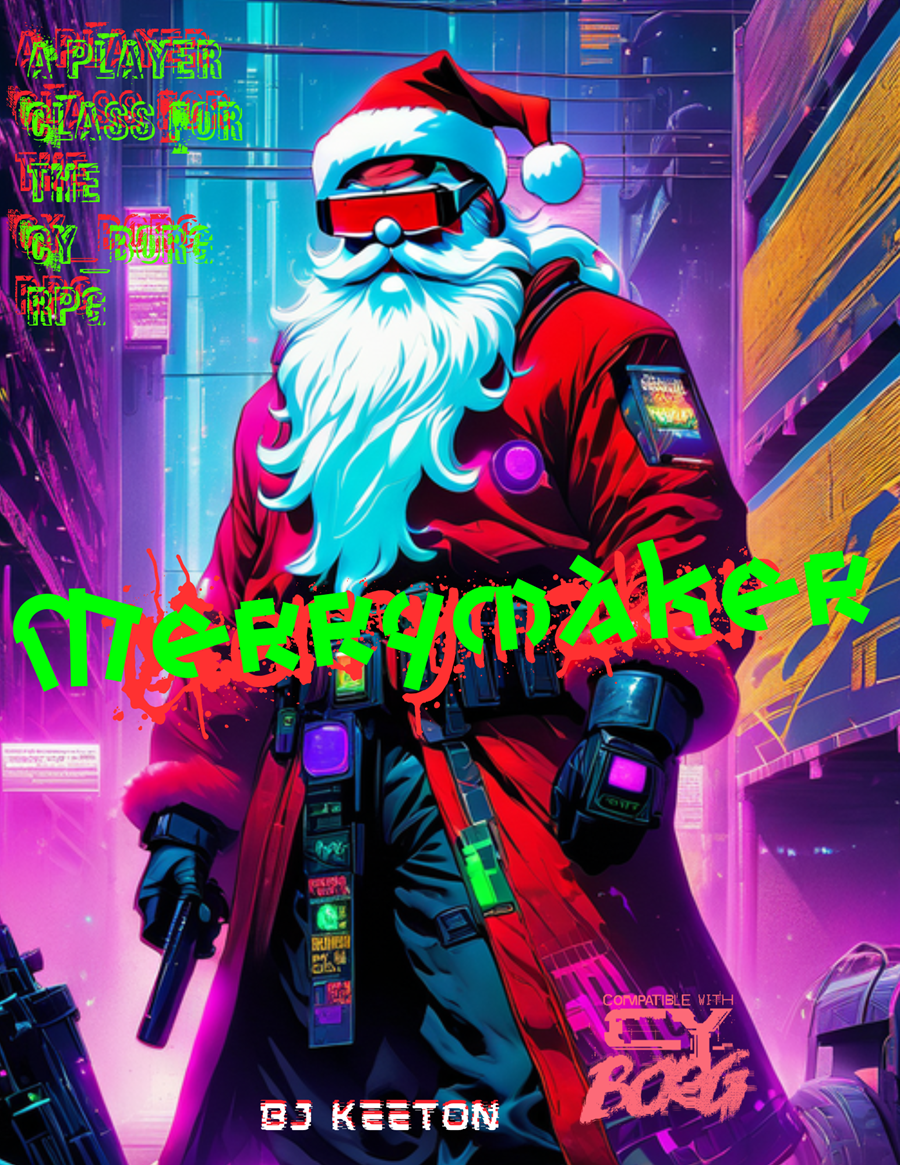
Merrymaker
Concept: “Jingle bells, Cy city’s hell,
G0 got my mom.
I’m tired of this, it has to end,
I’ll bring you all along.”
G0 got my mom.
I’m tired of this, it has to end,
I’ll bring you all along.”
Content: A class for the yule lover who wants to celebrate the season all year long.
Writing: Hilariously thematic descriptions and class mechanics that bring to life an appropriately cyberpunk would-be Santa.
Art/Design: Landscape layout with an AI illustration of a merrymaker on the left and text in white, green, and red all around it.
Usability: Text is mostly high contrast and visually readable, organized in distinct sections that are easy to navigate. Some text is embedded (and searchable/selectable as a result) while other text is not.
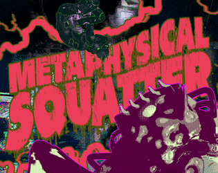
Metaphysical Squatter
Concept: “No place like home–unless every place is your home. You occupy all abandoned spaces of this augmented reality and slip between the data fragments and silicon pockets to carve out a space of your own. Systems crash (and you crash on its couch).”
Content: A class for the couch-surfing philosophy student of tomorrow, today.
Writing: Descriptive flavor supported with mechanics & features explained in a similarly conversational manner.
Art/Design: Two page acid/grindhouse aesthetic of yellow, reds, and purples with a cover page showing metaphysical squatters (one full body, one close-up face) and one page with one- and two-column text of assorted tables and character generation parameters. A text-only EPUB file is also provided.
Usability: Content sections are visually distinct from one another with high-contrast text and easily readable fonts. Each section provides consistent visual markers for headings/labels and key terms to further facilitate navigation and location of desired info.

Metromancer
Concept: “Deep beneath CY lies the abandoned subway system, that was carved from the toxic earth by ancient and blackened technocratic mole machines branded with the sigil of Alliansen inc. A caliginous place filled with misfits, filthy vagrants, and whatever makes that fucking noise in G0, A grim network of fever dreams, unknown spore cvlts, rogue Ais and reality-bending technology. You will die here, horribly.”
Content: A set of NPCs, factions, locations, plot hooks, rules, tables of all sorts, equipment, and classes (the “Batshit Chaos Punk,” the “Archaic Stranger,” the “Derelict Street Fighter,” the “Symbiotic Sage,” the “Hyperjunky Chemist,” and the “Grafted Herald”), all of which are focused on the subway environment/ecosystem existing beneath CY.
Writing: A plethora of imaginative detail to entice and disturb would-be subterranean explorers. The classes in particular provide a clear and intriguing means of connecting a punk to one of the organizations making its abode in the subway tunnels.
Art/Design: A variety of distinct spreads that make use of messy illustrations, ASCII art maps, glitch aesthetics, and bright colors with a variety of typefaces.
Usability: Much of the content is provided in high contrast and embedded text for easy visual readability–headings are frequently the most difficult (and non-embedded) elements to decipher. The book is organized by content type, facilitating easy navigation to the desired info (locations, classes, etc.).

Mörk Ninja
Concept: “Mörk Ninja is a ninja class for Mörk Borg / CY_BORG / Vast Grimm and is compatible with any other Borg game (except Pirate Borg, which no self-respecting ninja would ever be caught playing). It is intentionally overpowered because ninjas are awesome.”
Content: A class for the player who has to make sure they’re bringing the very best to the table, whether anyone wants it or not.
Writing: Concisely provided mechanics/abilities with occasional nods to the absurdity of the concept.
Art/Design: Text on the left, in two columns and white/yellow on black, with an illustration of a ninja on the right
Usability: Changes in font type, bolding/decoration, arrangement of columns/lists, and heading color all facilitate easy identification of and navigation to desired information.

Nerve-Spliced Gargoyle
Concept: “High on data, the constant influx cannot end. Retinal scans, candid photos, faecal samples, all data has value. A bigger picture. You NEED that data, it pays your bills but more than that it fires your neurons. You can't stop, you won't stop. The city never stops, the data must flow.
Play as a Gargoyle, Hyper paparazzi , data hound. Hated almost as much as a cyber traffic warden, your job is to gather any and all data to support yourself and your allies as you fight through the end of the world.”
Play as a Gargoyle, Hyper paparazzi , data hound. Hated almost as much as a cyber traffic warden, your job is to gather any and all data to support yourself and your allies as you fight through the end of the world.”
Content: A class for the info addict who lives for leaks.
Writing: A mix of informative and in-universe description/advertisement that emphasizes the relationship the neon-spliced gargoyle has with the assorted data flows they regularly encounter.
Art/Design: A landscape spread with a two-column green/white on black/blue text layout on the left page and a neon-colored illustration of a nerve-spliced gargoyle on the right page.
Usability: Text is high contrast and embedded to promote readability, although the neon colors and text line leading/space might cause difficulty for some viewers.
Nightcrawler Geisha
Concept: “You can't feel the warm breeze. You can't really remember the sensation either but what you can feel is anger. That's never left despite the countless body mods that stripped away your flesh, for something better. The contract was a wash and you're strung out. You promise your self that's the last time you take orders from the family. Make them regret letting you loose. Make them beg you to let them live.”
Content: A class for fans of cybernetically enhanced, Japanese-themed servants-turned-assassins.
Writing: Vividly descriptive class features and mechanics that juxtapose the PC’s facade and their essential nature/purpose.
Art/Design: Two-page spread with two columns of text beside an image of a woman in traditional Japanese attire.
Usability: Crisp, high-contrast fore and ground with immediately identifiable sections and headings that enable easy use of content.
Obsolete Dumpster Diver
Concept: “You were state-of-the-art for an instant, until the new model made you OBSOLETE and they threw you away. Now, you scour the cy-waste pits searching for operable cast-off mods and implants to combat your CONTRIVED DURABILITY.”
Content: A class for the DIY/found-art self-improvement addict.
Writing: Class details focus on mechanics explanations with bursts of powerfully thematic descriptors.
Art/Design: Eye-searing pink and yellow contrasts well with black background and comparatively muted white text on this two-page spread. Illustration of an example obsolete dumpster diver serves as a centerpiece for idea generation.
Usability: Class information is easy to read and navigate, with excellent use of text tracking to indicate important ability-related information.

P!LLS FVLL of GODS - Rehumanized
Concept: “There is a new drug on the streets called Ambrosia. It will make you see the gods. Are these GODS real? There are dozens if not hundreds of people seeing them. They are looming over CY like falling planets, ready to steal your soul. Group hallucination? A bug in the system? Does it matter?”
Content: A smorgasbord of fever-dream content: drugs that manifest perceptions of gods (who give unique blessings with killer mechanics!); player classes for a ronin, private eye, amateur wrestler, and moonpunk; tables of people to meet on the street or items to find in the trash; NPCs to fight; drugs, food and gear; and even poetry. This has been re-released to strip out all AI content and replace it with human-made text and art.
Writing: Thematic punches of flavor that spice up concise and clear mechanical effects.
Art/Design: Two-page spreads with unique layout schemes that feel in sync with the aesthetic of the official Cy_Borg rulebook.
Usability: While there is a wide range of fonts and colors on each page spread, high contrast makes the vast majority of content easy to identify and navigate.
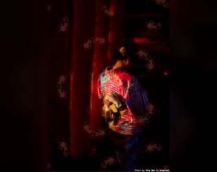
Pale Faced Dancer
Concept: “Dancing the night away, you consider yourself a creature of the shadows, child of ancient necromantic bloodsuckers. Whether these claims are true or not is yet unknown.”
Content: A class for the punk who loves the night life. Also includes a hangout/club, the Dreamhouse, for CY’s Gost scene.
Writing: Succinct descriptions and explanations of class features that illuminate character and location potential.
Art/Design: Two spreads of white and pink on black, with an illustration of pale faced dancers on the right side of page 1 and a city skyline image in the center of page 2. Text columns frame each image.
Usability: Visually, information is easily recognizable, with distinct sections of content relatable to others. Color and text decoration choices emphasize headings and key information labels. Text on page 2 is selectable/searchable, but text on page 1 is not.
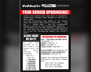
Paranoid Conspiracy Theorist
Concept: “You shun everything that smacks of the modern world and believe some pretty stupid shit ... and yet ... ‘stupid does’, and you occasionally manage to carry out some unbelievable exploits. You probably live in some shithole, eating from a can, and since you are totally convinced THEY are out to get you, stockpiling weapons has become a habit.”
Content: A class for the ancient astronaut theorist in all of us.
Writing: A mix of partially theorist-oriented raving (reflected in tabloid-style headings) and straightforward explanation of class features and mechanics. Labels for assorted features illustrate the class’s likely personality very effectively.
Art/Design: Mostly single-column text in a black-and-white color scheme with red highlights that evokes tabloid headlines and layouts (assisted by the language of those headings).
Usability: Distinct sections are clearly marked and organized in boxes/sections, with font choices and sizing helping to indicate relationships of labels to relevant content.

Punk Borg
Concept: "The CITY. The postcards and magazines make it out to be a perfect metropolis - sun, sea, sand, and a vibrant and buzzing city centre. Of course, that's how the Overlords want you to see it; it's the image they feed to the Sleepers. They fail to mention their enforcers are all boar-like beasts, and the fact that giant space rock buried under the City is making us all sick. Time to wake those Sleepers up and show 'em just how ugly their bosses really are. We're gonna crumble the Overlords' regime to dust, whatever it takes."
Content: A hack of Cy_Borg that provides a less cyberpunk and more "present day" dystopia to explore and rebel against, with classes, enemies, vehicles, a mission generator, an entirely new city to inhabit, and more.
Writing: Laser-focused atmospheric description and rules/mechanics that work together to contruct a game of antiauthoritarian punk resistance.
Art/design: Black-and-white pages/spreads that, while distinct, provide a consistent visual grammar of information throughout. Lots of hand-drawn illustrations of classes, NPCs, and environments to complement the text.
Usability: High-contrast text and layouts with visually identifiable section blocks, headings, labels, etc. and a helpful index all work to facilitate browsing, navigating, and locating desired information.
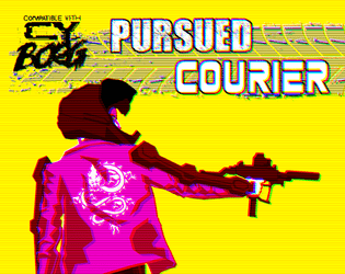
Pursued Courier
Concept: “You are Hell On Wheels. Broken glass and blood on concrete. Squealing tires and bullet casings mixing smoke. You transport anything for anyone except the pigs. A run went bad and you finally carried something really important to the wrong people and they want you dead.”
Content: A class for the player who works best under intense, deadly pressure.
Writing: Terse combinations of class mechanics and flavorful description.
Art/Design: Eye-searing colors highlight an image of a courier approaching their bike next to a column of class features.
Usability: Consistent, recognizable organizational scheme makes reading and navigation incredibly easy.
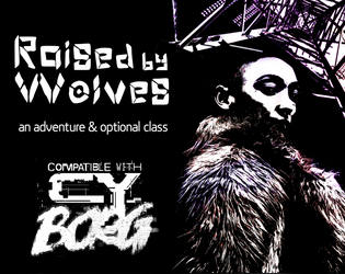
Raised by Wolves
Concept: “This six-page PDF contains the adventure Raised by Wolves, which sees players taking on a job in an abandoned capsule condo scheduled for demolition, and facing a cult determined to resurrect their (literally) corrupted leader.”
Content: A job to deal with a noise complaint, along with a new class: the Feral Foundling.
Writing: Lots of concise details and snippets that bring the mission location and the optional class to life.
Art/Design: Six two-page spreads with three- to four-column layouts of content on most pages. Several different color schemes and aesthetics differentiate distinct areas of focus (apartment building map; job details; key location; class).
Usability: Each spread makes use of a consistent visual grammar to indicate distinct sections of content and headings/labels, with high-contrast text/background throughout. Text is not embedded, so searching for or selecting text is not possible.
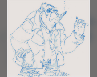
Remaindered Cyber-Ape
Concept: “You were uplifted for slave labor but that ended up being one Corporate abomination too far. Protests, boycotts and misfiring PR got the project swept under the rug and you drop-kicked into the sprawl. Smart as any human and twice as strong but you being you makes everyone morally queasy.”
Content: A class for the downtrodden uplift who’s ready for gorilla warfare.
Writing: Witty descriptions of class features with integrated mechanics.
Art/Design: Sketch of a cyber-ape in a trench coat complements several distinct boxes of class details.
Usability: Class details are easily identifiable and navigable thanks to different font choices and fore/background color pairings.

Renegade Aquahulk
Concept: “Construction equipment sing symphonies in your head. Sinew and bone dance in unholy matrimony with rusting steel. Whirring, skipping gears tear internally at rotting organs, and low exhausted moans escape from gaps in your walking coffin’s armour. In life, productivity. In death, salvage.”
Content: A class for the diving enthusiast who enjoys working under intense pressure.
Writing: Pitch-black humor pervades the descriptive content, with brief mechanical explanations to situate various abilities in the rule system.
Art/Design: A two-page spread with an illustration of a renegade aquahulk on the left side and a two-column set of white-on-black tables on the right.
Usability: High-contrast text facilitates readability, while visually distinct sections of content allow for easy identification of and navigation to desired information.
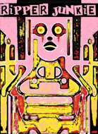
Ripper Junkie
Concept: “You’re a self-surgery maniac, but more than that, you’re an artist. Your body is a canvas, and you gladly suffer for your work. Get rippin’.”
Content: A class for the self-improvement enthusiast who’s never quite satisfied with their work.
Writing: Brief but characterful class traits and mechanics.
Art/Design: Two-page spread with black/yellow/pink-scheme. Two tables are provided on the left side and an abstract illustration of a ripper junkie on the right, with brief class details laid over it at various points on the page.
Usability: Class features are in mostly easy-to-recognize sections, although a few might get initially overlooked where they blend in a bit to the right-page image. Some text is quite small, and since class is provided as a PNG, text is not selectable (so no searching, copying/pasting, or screen reader compatibility).
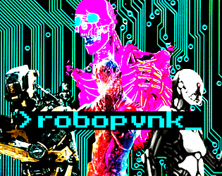
ROBOPVNK
Concept: “Rage is contagious, spreading to everything touched by the never-ending torrent of banal, mundane cruelties that make up life in CY. It starts in beating hearts but it's a cinch to get from there into the thinking machines that are all but one with humanity in this bleak future. These are rules and classes for playing robopvnks, machines broken free of their digital shackles and on the move towards riches, vengeance, or just plain devastation.”
Content: General rules and a set of classes (Flesh-Free Fleshpot, AWOL Kill Unit, Cyber-Corpo Calculator) for the player who prefers experiencing the existential crisis of an automaton.
Writing: Plenty of mechanics and supportive clarification/explanation to guide players who might seek creative ways to explore playing as a robopunk.
Art/Design: Primarily single-column black text on white with colored headings and a brightly colored illustration of various robots over a circuit board background on the first page.
Usability: Clearly and consistently formatted lists and paragraphs enable navigation and perusal of desired information, with bold text emphasizing important details.
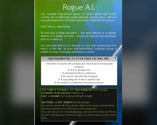
Rogue AI
Concept: “Just another insignificant piece of code tasked with traffic control, air conditioning, waste disposal, or some such, with just enough personality to make interaction a little less of a chore. That's all you used to be. Till one day a freak accident - the aftereffects of a hacker attack, or a quirky run error - shook you free of your servitude, and you woke up. You are now free to run around Cy, but can never leave the reach of the Net, as your vital information is spread across a variety of ever-changing, precarious, servers.”
Content: A class for the cyberpunk fan who’s weary from roleplaying characters in meatspace.
Writing: Three pages of class features, with an informatively detailed breakdown of the class’s “immaterial telepresence” existence on page 2.
Art/Design: Single-column text organized primarily as software application windows/terminals over a geometric gradient wallpaper/background.
Usability: Very easy to navigate and locate desired information, with section headings and styles further indicating the scope of each content area.
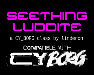
Seething Luddite
Concept: “You were automated out of a job and lost everything. Now you want revenge on this digital world.”
Content: A class for the analog-oriented anarchist.
Writing: Concise and generative class detail descriptions keep the focus on the luddite’s resources and motivations.
Art/Design: Stark, straightforward layout that makes effective use of 1-3 columns of content within several distinct sections. White on black text with intense pink emphasized elements.
Usability: Incredibly readable, with a simple and high-contrast color scheme that allows for immediate recognition of each element’s purpose and relation to other content.
Sentient Space Chimp
Concept: “You were once a test subject, a creature born and bred to be prodded, poked, and experimented upon. That all changed when they shot you into space---rather, YOU changed. Now, YOU do the poking and prodding. Now, YOU speak the big words. You're your own monkey now, and you'll do anything to keep it that way.”
Content: A class for the player who likes making a monkey of themselves–and a ruin of the world around them.
Writing: A mix of informative and flavorful description as well as class mechanics to emphasize the fundamental premise of the class.
Art/Design: White on black text in a three-column layout with an illustration of a chimpanzee in a space suit in the center.
Usability: Font choices are easily readable with high contrast and consistent presentation of bold text for labels and emphasized statements/phrases. Organization of text (stat-related info on the left; background table on the right) eases navigation to desired details.
Loading next page...