hed0rah

KILL ENGN
Concept: “A metal frenzy, mech-infused expansion. High-tech machines, renegade pilots, & corporate tyranny_”
Content: Tons of information (across 60 pages) about mechs and how they might fit into the world of CY, complete with creation/generation rules, relevant NPCs/enemies, gear to upgrade with, new rules and mechanics to incorporate, a new class ("The Chrome Jockey"), and even some floorplans for potential jobs. Additionally, a job (really, a mission involving multiple potential job leads)--"Cast Oubliette"--is included, along with an overhead map of one area, for stretching pvnks' figurative mech legs.
Writing: Ideas galore on each page, some of which are easier to situate than others, but all of which exude inspiration about mech-related activities.
Art/Design: The Cy_Borg core rulebook aesthetic is emulated here more closely than in any other 3rd-party product reviewed thus far, grafting designs from many of the core book’s spreads among more distinct layouts.
Usability: Each page/spread has its own visual language, but there are cues in each to indicate consistent presentation of distinct content. Like the core Cy_Borg rulebook, the radical shifts in aesthetic may initially be overwhelming for some to engage.

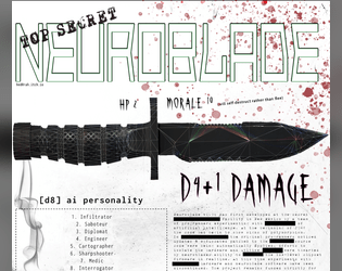
NeuroBlade
Concept: “NeuroBlade is a sentient knife that gives you 1 of 8 buffs while wielding it.”
Content: An intelligent weapon for the punk who sees each piece of equipment as a potential collaborator.
Writing: Spartan details to focus on the pragmatic role(s) the neuroblade might serve when used (and how that translates into game mechanics).
Art/Design: Dark-on-light color scheme with a large illustration of a combat knife above two-column arrangement of text content sections.
Usability: Different font sizes and choices used to reflect different kinds of content. Visually, text is mostly high-contrast, although some smaller text might be difficult to read. File is provided as .png, so text is not embedded (meaning no searching/selecting or using a screen reader).

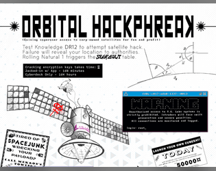
Orbital HackPhreak
Concept: “Gaining superuser access to corp-owned satellites for fun and profit.”
Content: A set of rules and tables relating to hacking into satellites or similar orbital systems.
Writing: Straightforward rules doused in cyberpunk flavor/effect to make each hacking attempt a memorable one.
Art/Design: Content provided in both .png (with a two-column, black-on-white, one-page portrait scheme) and .txt (single-column text with some ASCII art/embellishment) formats.
Usability: Distinct rules sections are visually distinguished in each format type, and ASCII art in .txt version provides an aesthetically similar experience to viewing .png version.

So, Your Best Friend is a Doppel?
Concept: “
[recruiter77@mandela ~]$ sudo project-mandela --help
#################—BEGIN TRANSMISSION—#################
<<<<<<< In these tumultuous times, our beloved Cy faces a dangerous threat – Doppels, insidious infiltrators that mimic the human form. It is our collective responsibility to be vigilant guardians of our society, defending against those who wish to undermine our way of life. This pamphlet provides you with the essential knowledge required to identify and dispose of these impostors safely.
########################—END—########################
[recruiter77@mandela ~]$ _
“
Content: An “in-world” pamphlet providing rules for “doppels” and information on how and where to hunt them down.
Writing: Textual content balances between informative approach for players and GMs and informative for PCs, maintaining an ominous undertone for both sets of audiences.
Art/Design: Trifold pamphlet layout, with single-column text in each panel. Black-on-white text is accompanied by full-color illustrations on pamphlet cover (of a girl and her doppel) and on one inside panel (of a doppel detector). One version of the pamphlet is provided with a background texture while the other is without.
Usability: Easily recognizable visual organization of content and use of particular arrangement and fonts to indicate relationship between text blocks and panels.

Thirty One Dark Nights
Concept: “Each year, during October, Exeunt Press hosts Mörktober. A 31 day event that encourages creators to make something each day for MÖRK BORG or other BORG games, in this case Cy_Borg, based on a prompt list and then share it with the community. More about Mörktober.
Thirty One Dark Nights is a compilation of the 31 Cy_Borg compatible creations I made for the 2024's Mörktober event.”
Thirty One Dark Nights is a compilation of the 31 Cy_Borg compatible creations I made for the 2024's Mörktober event.”
Content: A collection of enemies/threats, equipment, locations, drugs, viruses, surgical options, and more with which to make a game of Cy_Borg vividly fucked up in fantastic ways. (Note: individual entries are PWYW, with a paid option for a fully compiled set of the entries.)
Writing: Mörktober’s purposefully morbid and eerie atmosphere is mixed with pitch-black humor, while unique abilities/rules/effects situate each concept for game rulings.
Art/Design: White/gray on black with a different accent color (and heading typeface) and accompanying illustration for each entry/page.
Usability: Consistent body text and label emphasis/decoration allows for navigation to and recognition of desired info elements, while distinctions in entry accent colors and headings orient the reader to the essence of that entry.

Welcome, Friend, to Project Mandela
Concept: “
[recruiter77@mandela ~]$ sudo project-mandela --help
#################—BEGIN TRANSMISSION—#################
<<<<<<< Project Mandela is a collaborative effort, a beacon of hope in the ever changing face of uncertainty. Our mission is to unveil the truth behind and expose the Doppels, who silently infiltrate our lives. With your assistance, we can protect ourselves and our loved ones from the horrors of being ‘replaced’. Join now.
########################—END—########################
[recruiter77@mandela ~]$ _
“
Content: A set of rules for a secret organization that tracks down “doppels” and its secret/coded message system.
Writing: “In-world” content speaks directly to PCks while also providing GMs and players with the details needed to work the Project Mandela organization into a given game.
Art/Design: Pages are laid out as “in-world” printed flyers (complete with tear-off tags at the bottom of one page). Three versions are provided: one spread layout and two single-page layouts, with one of these optimized for printer-friendliness.
Usability: Text is mostly quite readable, with distinct sections of content clearly identifiable visually, with consistent font choices to indicate relationships between different text blocks.
Page 1 of 1