Classes

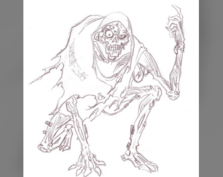
Shade City Blues - Character Class - LEECH
Concept: “You contracted VAMP and now you're a bloodthirsty, good for nothing, LEECH. Immortal... with a catch. Feeding is the only way to stay ahead of the infection and losing your cool will get you riddled with R0T-bRaiN.
UnLiFe in Shade City isn't the best flip of the coin but UnLiFe is Life... even though life ain't worth shit on these god forsaken streets, it's better than fuck all.”
UnLiFe in Shade City isn't the best flip of the coin but UnLiFe is Life... even though life ain't worth shit on these god forsaken streets, it's better than fuck all.”
Content: A class for the vampire fan who’s looking for a Cy-based take on an old favorite.
Writing: Brief, powerfully atmospheric details that offer both flavorful description and class mechanics.
Art/Design: A range of colors and font choices in a landscape two-column organization, with a large red vampiric skull image serving as the focal point of the spread’s background.
Usability: The majority of text on the page is embedded, allowing for searching/selecting. Distinct content sections are easily identifiable, although at least one font choice has variable text thickness/intensity and uses a number of colors with varying fore/ground contrast, which can disrupt some readers.

SIS/TR: Hang the DJ
Concept: “SIS/TR [Starborn Invasion System / Turret Regenerator] is a mini boss that you can drop into any Cy_Borg setting and cause nearly limitless havoc.
Half Operating Manual / Half Setting
The first half of the book has Cy_Borg stats for SIS/TR's main body (the big black cube) and its five turrets (smaller cubes). If you want to adapt SIS/TR to your own campaign or setting, you can have it mangling people in minutes.
The Setting - HANG THE DJ
Famous DJ Ronnie Fissure's live-in sound studio / office has been invaded by SIS/TR for reasons unknown to the half-dead staff. Service droids dance--sparking and smoking--by themselves. On top of its many attacks, SIS/TR has turned itself into a towering mixtape of terror, deploying deafening LRADs, streams of molten vinyl records, and bowel-emptying bass.”
Content: A combination of a malevolent technological enemy, with a variety of detailed stats, tactics, and scenarios; a more extensive mission to save a DJ from the techno-threat; and two “subclasses,” the “Emancipated Companion” and the “Haunted Assassin,” both of which have ties, atmospherically and mechanically, to the SIS/TR entity.
Writing: Helpfully informative explanations throughout to ease initial use of the SIS/TR mechanics conceptually and in practice (via the “Hang the DJ” scenario).
Art/Design: Primarily black on white/light multicolored backgrounds in single- and double-column content layouts. Illustrations of NPCs, locations/maps, equipment, and SIS/TR components complement the text on numerous pages.
Usability: Text is easily readable and navigable throughout, with high-contrast and embedded text and font choices that facilitate visual and screen reading experiences. SIS/TR mechanics (based on d6 dice results/faces) involve some detail for initial employment but should become easy to pick up quickly.
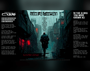
Slumdog Scavenger
Concept: “I’m nobody. I’m a tramp, a bum, a hobo. I’m a boxcar and a jug of wine...and a straight razor if you get too close to me.”
Content: A class for the player who likes their cyberpunk absolutely coated in gutter grime.
Writing: Concise class mechanics explained by strong doses of thematic flavor to bring a character to life.
Art/Design: An extremely atmospheric image of a scavenger walking down an alley in the rain framed on either side by class details and features.
Usability: High-contrast text is easily readable, and the overall layout makes for quick scanning and locating desired information.
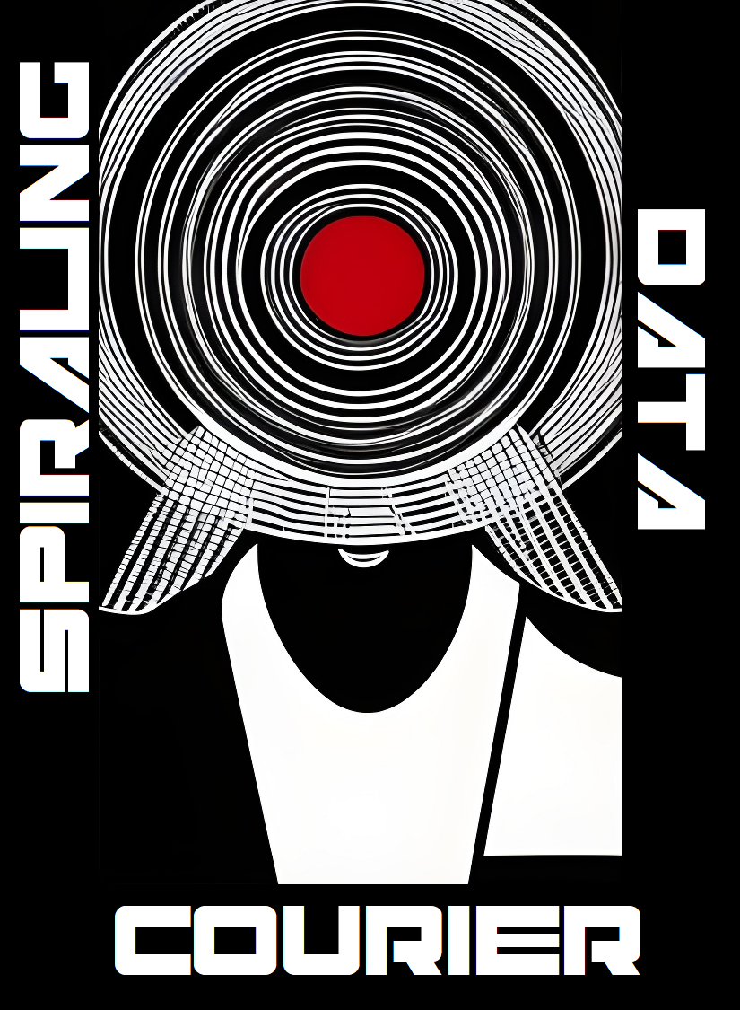
Spiraling Data Courier
Concept: “You’re losing your grip. You carry ghosts in your head, chatty artifacts of all that precious data you’ve shepherded from one client to another over the years. You really should find a new line of work, but fuck that. The biz don’t stop, and neither do you.”
Content: A class for the info jockey who dreams of room service, club sandwich, cold Mexican beer, and more–at least until it’s time to free up more space for data storage.
Writing: Brief descriptions of class features that pay homage to Johnny Mnemonic with a Cy-based flair.
Art/Design: Two sets of circles are the focal points for a two-page spread that includes class details and mechanics on the left and a stylized portrait illustration of a courier on the right.
Usability: Contrast is mostly strong, although a few fields may be difficult for some to read. Class is provided as a PNG, so text is not embedded (no searching or copying/pasting is available).

Stalkers of G0
Concept: “Stalkers of G0 is a 40-page supplement on the exclusion zone in the heart of the City of Y!̸͆̅̌”̶͌̉#̸͇̞̻̌̚”̶̨̻̘̇̉̊͆̈́͒̌̆̓̕͜#̶̖̣̘̻͖̥͕̙̀̃̈́́̄̕̕͜͠2̶̧̻̺̝̥̮̣̒͒̂͐͐̍́́͘̕̕4̴̿̌’̷̛̙͍̠̙̿. It describes its environments, eccentric denizens and horrors beyond human understanding through the lens of Stalkers. Stalkers are individuals from all walks of life, inexplainably inclined to risk dying horribly in this hellhole.”
Content: Tons of details to bring G0 to life: locations, factions, enemies, mission generators, anomalies, a class (“Stalker of G0”), and more.
Writing: Extremely flavorful atmosphere evoked through vivid descriptions and conversational tone taken to address the reader. Mechanics (such as the abilities of the Stalker class) feel appropriately in tune with the intended vibe.
Art/Design: Different page/spread layouts throughout, with color schemes and font choices often used to link together multiple related pages.
Usability: Recognizable headers (on any given page as well as chapter/section headings), high-contrast text, and contextual framing of page content all make navigating and locating desired info easier to accomplish.

Temperamental Upgrades
Concept: "A collection of rules expansions and player options to take your punks to edge!"
Content: A trove of material, including: classes, locations, jobs/scenarios, vehicle combat & chase rules, tables of all sorts, and even rules for taking on more debt.
Writing: A mix of straightforward explanatory information and vividly atmospheric description, suitable for players and GMs alike.
Art/design: Distinct, striking aesthetics on each spread, although some shared visual language occurs across multiple spreads for a particular kind of content (e.g., across spreads for classes).
Usability: Visual markers and spacing/proximity assists with allowing related or distinct blocks of text to be recognizable, especially given the range of fonts and character sizes used across spreads. Fore/ground contrast is high and allows for consistent visual readability.
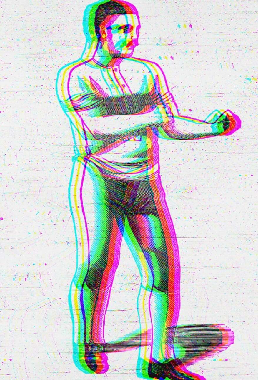
Th3 C0nt3nd3r
Concept: “Having made your mark within the pugilism circuit in Cy, you have decided to retire and become a Punk.”
Content: A class for the raging bull.
Writing: Straightforwardly informative and descriptive.
Art/Design: Two-column black and blue on white organization. An image of a pugilist is provided in the top right corner.
Usability: Headings and body text are visually distinct and provided in high contrast, and individual sections of content are consistently presented to indicate the bounds of each.
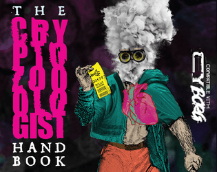
The Cryptozoologist Handbook
Concept: “BEHOLD! Creatures said impossible to exist! BEWITCH! Fill your body with strange, powerful substances! BEGUILE! Confound friends & enemies with cryptic behavior! BELABORED! This bit has gone on too long.”
Content: A PC class, several NPC cryptids, and a job to track down a serial killer.
Writing: A variety of details for different sections, from terse NPC ability descriptions to in-depth mission/adventure specifics for both GMs and players to work with. Cryptozoologist class offers a fascinating take on the researcher-becoming-the-monster archetype.
Art/Design: Visually distinct spreads for each section–bright colors for the cryptozoologist, dark tones and inverted colors for the cryptids, and black-and-white for the mission (with a bit of pink accent/highlight).
Usability: Numerous fonts and sizes, but always high contrast. Easily distinguishable text purpose on a given spread helps browsing and identifying desired info.

The Cursed Ridas of FLO
Concept: "COMP'D COPIES ARE AVAILABLE ON REQUEST FOR ANY TRANS FOLK THAT WANT IT! The horrible treatment of the trans community by Florida's elected officials was a direct inspiration for the evils in the setting, and the amazing trans people I am proud to call my friends are a big inspiration for some of the classes found within. If for whatever you can't contact me through Itch while trying to get your comp'd copy, I can be found on discord (User Name: _gaffy)
If you participated in the Queertober Jam and would like a copy, please reach out to me and I will send it as soon as possible.
A WIP setting book for Mork Borg/CY_Borg based on Florida, made for the Queertober Jam"
Content: A set of materials to offer a table of punks an additional location to explore, along with some tables and two classes to play (Chaos-Bound Test Subject and XLmphibian). The itch webpage for this supplement notes additional material is forthcoming.
Writing: Poignant and biting commentary and description combined with intriguing mechanics to support the unique class approaches.
Art/design: Distinct layout/aesthetic on each spread of pages, with a variety of hand-drawn illustrations, photo collages, and font choices that evoke a different essence and purpose for that spread.
Usability: Text is generally readable with high contrast, even on pages with relatively busy background images/patterns. Font choices and consistent uses of bolding/text size for headings, labels, etc. help facilitate visual identification of different kinds and groupings of content.
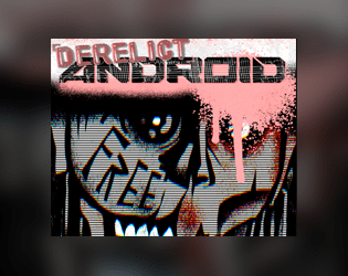
The Derelict Android
Concept: “Purpose-made. A monument to corporate ingenuity. The modern slave. You’ve lived well beyond your best-by date. Now, there are newer, flashier models doing your old job better than you ever could. So, the old master littered you into the city like the dreg of silicon and flesh you are.”
Content: A class for the forsaken and abandoned who want to find and create meaning post-obsolescence.
Writing: Crisp description establishes class features/details and underscores the precarity of life as product/property.
Art/Design: Muted but powerful color scheme with a 1980s font choice vibe from the title; close-up of android face with gaunt, damaged features focuses attention on the punk philosophy informing CY_BORG.
Usability: Spread layout uses contrast well to distinguish text blocks, and highlights emphasize mechanics.

The Drug-Addled Riff Wretch
Concept: "The Drug-Addled Riff Wretch is a specialized class for the tabletop RPG CY_BORG – part street scvm busker, part bardic force multiplier."
Content: A zine-styled set of material surrounding the Drug-Addled Riff Wretch class--not only class specifics but also information on a special weapon (the "plasmaxe"), powers/abilities (songs), relevant NPCs, and more--even a flowchart for using the class's abilities.
Writing: Predominantly conversational and in-universe in voice and tone, with some concise rules-oriented explanations accompanying.
Art/design: Different pages/spreads have unique layouts and aesthetics, although there is an overall cohesiveness thanks to the zine/mixtape-esque organization and conceit of the class supplement overall. Lots of color and font variety, and many images have a mix of digital and hand-drawn illustrations that evoke various approaches to the Drug-Addled Riff Wretch as a character.
Usability: While the variety of layouts across pages can be disorienting at first, there is a generally recognizable visual grammar that facilitates navigation and use of details on each page. Text is also generally in high contrast with background patterns/colors and can overwhelmingly be selected or searched.
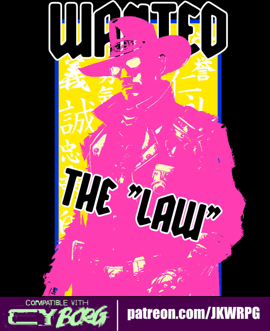
The Law
Concept: “Street samurais, rejoice! Grab your gun and sword, dust off your copy of the Hagakure (or your favorite philosophy book of choice), and start cleaning up the mean streets of CY!”
Content: A class for the chrome cowpoke whose grit is cybernetically augmented. (Note: despite the name, this does not appear to be a character class that would break Rule #00.)
Writing: Each line exudes character and flavor to highlight classic cyberpunk themes.
Art/Design: Three-column overall layout of white-on-black with a bright pink illustration of a “law” character in the middle flanked by character mechanics on the left and a Bushido personal code to follow on the right.
Usability: Text is high-contrast and in a readable font that makes use of bolded text for labels and emphasized phrase elements.
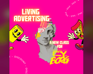
The Living Advertising
Concept: “Offer your existence to the promotion of advertisements? Why not! Perhaps your parents designed you for this very purpose, or perhaps you have always wanted to have this life. You are a living advertising. An agreement was made between you and some enterprises so that, day after day, you would share aggressive, disturbing but lucrative advertisements in your daily life. But in the end... It's all about the money. $$$$”
Content: A class for the flashy consumer who’s all about showing off their sponsorship allegiances, whether they want to or not.
Writing: Vivid descriptions of class features complemented by focused, direct mechanics.
Art/Design: Two page tri-fold layout whose visual style is appropriately busy visually, with a plethora of cartoony mascots and icons amid tables and brief paragraphs of class details.
Usability: Despite busy pages, text content is marked with distinctive labels and table roll result numbers for quick identification of desired info.
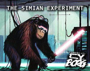
The Simian Experiment
Concept: “You are an ape ‘gifted’ with human intellect. The experimentation you went through to get here gave you perspective on many things; mortality, pain, the self, ideology. Mostly, it just made you realize how evil humans can be.”
Content: A class for those whose vengeful rage is more augmented than their uplifted intelligence.
Writing: Class details are concise and evocative of the myriad permutations of modification and torture that could result in a charater.
Art/Design: Two-page spread layout displayed around an illustration of a simian experiment, with text styled as crisply organized research documentation.
Usability: Consistent presentation of class details facilitate quick navigation and accessible reading, with occasional bold or underlined text for emphasis.
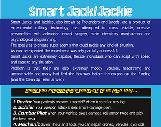
The Smart Jack/Jackie
Concept: “Smart Jacks, and Jackies, also known as Pretenders and jarods, are a product of experimental military technology that attempted to cross volatile, creative personalities with advanced neural surgery, brain chemistry manipulation and psychological programming....To breed natural Jacks-of-all-trades.”
Content: A class for the state-of-the-art technodabbler.
Writing: Detailed descriptions set up the class conceptually, with concise background-related tables offering a more direct glimpse into what a Smart Jack(ie) might care about.
Art/Design: Single-column text in distinct color-coded sections, with a description of Smart-Tech and Smart-Chips gear in a skewed/angled text layout.
Usability: Text is mostly readable, with high contrast between text/background and with clear headings and labels provided with different font, color, or bold/italics. Angled Smart-Tech section might pose trouble for screen reader programs.
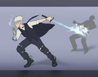
The Terminated Contract Killer
Concept: “You made problems disappear, terminate contracts, and anything else the client told you to do. All assets in this corporate hellscape are disposable to some degree, your expiration date just came sooner than expected.”
Content: A class for the professional hitman who’s burned, bitter, and bloodthirsty.
Writing: Intriguing ideas provided in a calm, straightforward voice that evokes the professional mindset of the contract killer.
Art/Design: A two-page layout emphasizes a terminated contract killer in action on page 1 and a set of distinctly styled boxes for assorted class details on page 2.
Usability: Distinct partitions of class content makes for quick identification of and focus on desired information; one minor exception is the large header across the top page 2, which relates to the left-side boxed list of corporations beneath it.
The Unlicensed Ripper
Concept: “Someone has to patch the lowlifes up. It’s a good thing no one asks where you learned your trade.”
Content: A class for the inquisitive tinkerer who loves getting elbow-deep in their work.
Writing: Intriguing class mechanics are augmented with medical-grade descriptive flavor.
Art/Design: Single-column layout allows for easily understandable navigation/reading scheme, and a minimalist illustration of an unlicensed ripper punctuates the document.
Usability: Distinct and consistent color scheme that highlights the medical/clinical nature of the class, but green text on blue background can be difficult for some to read, especially in combination with font size for body text.
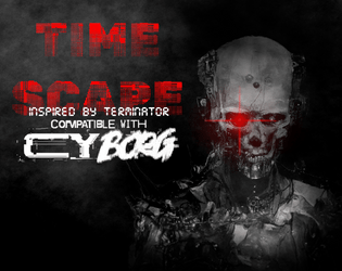
Time Scape
Concept: “In the not so distant future… Out of the unholy marriage of Super A.I. and alchemy of flesh, a new type of being came into existence. In the year 20X9, the machines rule every aspect of daily life, forever looking to further optimize culling the ‘dregs’ of society, ensuring any threat to its existence is either exterminated with the extreme prejudice of nu-capitalism, or by force. But the final battle for humanity will not be fought in the future. It will be fought here, it present day CY. Tonight…”
Content: A mission to save the future by terminating a CEO. Additional classes ("Time Target," "Veteran of the Future War," and "Reprogrammed Hunter Killer"), supplemental glitch rules, and a murderous NPC are also included.
Writing: Creativity permeates every page/spread, offering plenty of details to flesh out each encounter with a clear sense of in-game urgency for the stakes involved.
Art/Design: Distinct full-color layouts for each page/spread that manage to share a dark-themed aesthetic for a sense of consistency throughout. Numerous illustrations provide visuals for the landscape, significant NPCs, and maps.
Usability: Visually, most pages provide high-contrast text/background for easy reading, with immediately apparent headings/labels and distinct content sections (whether via whitespace, borders, etc.). However, the text is not embedded, so no searching or selecting is possible. A ToC is provided at the end of the supplement.
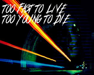
Too Fast to Live, Too Young to Die
26 contributors
Astrolich
Calen Heydt
industrialnation
Gnoll
Flintwyrm
Patch Adam Perryman
thefatherofcats
Johan Nohr
Prince “PROFANEKNOWLEDGE” Maxi
Leonard B
cyotee doge
Amaranth M
Brendan Carlson
Kevin Cantello
Patrick Möën
Gaffy
Michael T. Baker
Mal R
Ryan
Casanova Funkenstein
psyop.fyc
Torg_OR
KMSH
Daniel Scott
Olav
Jason “Anabasis” Brook
Concept: “Too Fast to Live, Too Young to Die is a rules expansion for CY_BORG giving you the chance to drive fast and wreak carnage hanging out the passenger side window (or just crash headlong into it, your mileage may vary). These rules are light-weight, but robust, and will add a ton of flavor to your chase scenes as you bolt down narrow streets in attempt to escape the piggies or track down a corpo shit-bag. Hell, you don't even need to catch 'em, just have a firefight between vehicles - we got rules for that!”
Content: An impressive cornucopia of content: rules for vehicle chases/races and driving hazards, classes for the “Got-Away Driver” and “High Speed Vigilante," stats for vehicles that are purchaseable (or not), enemies to encounter on the streets of CY, and an entire revenge-themed mission.
Writing: A focus on thematic details/voices to breathe life into included elements that are supported by succinct, direct rules and guidance for GMs to implement assorted features into a game.
Art/Design: A mix of layouts and aesthetics throughout the supplement. Some pages are laid out landscape-wise, and at least one two-page spread has text broken across its pages. Number and variety of illustrations and themes, along with their execution, are inspiring.
Usability: Body text font is pretty consistent throughout, and despite the range of page/spread layouts it’s easy to identify headings/labels and how they relate to nearby content. However, the text is not embedded, so searching/selecting and screen reader use is not possible.
Trauma Team Specialist
Concept: “Become a trauma team member today.”
Content: A class for the broke med student who wants to chase endorphins via battlefield surgery.
Writing: Brief descriptions and explanations of class features/mechanics that feel appropriately “clinical” and at home in CY.
Art/Design: Two-page spread, with a left-side column of text (reddish pink on white) and a right-side digital illustration of a gun-toting medical specialist.
Usability: Class details are easy to read and navigate, with distinct headings that indicate the scope of each section.

Tribute
Concept: “Tribute — a 48-page triple-threat zine with content for Mörk Borg, CY_BORG, Death in Space. Whatever sick or sad ideas came to my mind, I banished into this cursed little booklet. [...] CY_BORG. Go dumpster diving (in CY), visit the REAKTOR, die in horrible car accidents, and play as a revolutionist chemist!
By day, you mix and cook in the corps’ polluted factories; the ¤ ¤ ¤ are much needed. Reaction kinetics are on your mind. By night, you burn the palaces. You poison the organism that feeds you. Your concoctions are august.”
By day, you mix and cook in the corps’ polluted factories; the ¤ ¤ ¤ are much needed. Reaction kinetics are on your mind. By night, you burn the palaces. You poison the organism that feeds you. Your concoctions are august.”
Content: A zine whose focus is partially on several Cy_Borg-related supplements: a class (Revolutionist Chemist); a mini-game (Dumpster-diving) with random encounters and loot tables; and a club location (Reaktor) with related tables for drinks, NPCs, trouble, and music genres.
Writing: An overall balance of general and atmospheric description, in-universe text (such as instant messages/social media posts), and mechanical/rules-based explanation.
Art/Design: Distinct spreads/pages for each entry, with a variety of aesthetics and graphics (photo collage, hand-drawn illustration, simple icons, etc.).
Usability: While spreads do vary aesthetically, each has an identifiable organization and layout that consistently presents information throughout for ease of navigation and use.
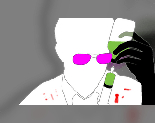
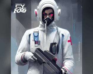
Unauthorized Biotechnician
Concept: “The union of mind and body is an incredible machine, gifted with unbelievable resources, most of which are not readily apparent. As a Biotech you can tap in these secret wells to enhance the body's efficiency, or smother the flame that animates it. Your tools are the tools given you by science: surgery, psychology, pharmacology, cybernetics... To what ends will you use this panoply?”
Content: A class for street docs, freelance paramedics, and back-alley barber-surgeons.
Writing: Terse descriptions that distill the essence of class features and mechanics.
Art/Design: Two pages of stark red and black on yellow with white highlights that keep class details as the focus, with a biohazard symbol and a silhouette image of a figure in a hazmat suit underscoring the work entailed by the class.
Usability: Easy to navigate and recognize different elements providing distinct purposes via specific color and font choices.
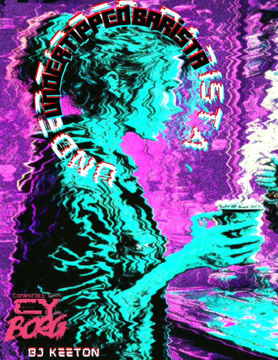
Undertipped Barista
Concept: “people suck. you knew it before you took the job. now it's your religion. you draw hearts with foam. you take their inane and complex orders. you try to laugh at their banal jokes. it's a good day if they say thank you. it's a miracle if they leave you a single credit. you hate them.”
Content: A class for the food service worker who’s been all but ground into dust and is ready to burn everything to the ground in retaliation.
Writing: An overflowing venti’s worth of cynical flavor that brings the class to life. Class details are mostly terse (if appropriate!), but the “breaking point” table offers surprising depth in contrast.
Art/Design: An illustration of a barista serving a customer is surrounded by class features, all with a neon palette on a dark background.
Usability: Each section of content is easily distinguishable from the rest, with font color, type, and size choices indicating each heading/label.
Upcycled Cyber-Undead
Concept: “You died. Through means fair or foul, you departed this plane of existence, of that you are mightily certain. Then? Your cyber-attachments brought you back online. Or maybe it was some sort of nanoplague or something. In any case, you’re back. Except no one wants you back. You smell bad. You sound bad. You look very, very bad indeed. You’re way too deep into the Uncanny Valley to pass as one of the living. Sorry.”
Content: A class for those inhabiting the venn diagram overlap of “zombie lover,” “cyborg-curious,” and “body horror fanatic.”
Writing: Class detail descriptions are not for the faint of heart but are a must-read for anyone vaguely interested in the idea, with dark humor balancing the gore with levity. Mechanics are concise and complement the descriptions well.
Art/Design: Eye-searing colors faithfully reflect the unsettling nature of the class concept, and a sketch of an upcycled cyber-undead further brings the idea to (un)life. Text is sectioned into boxes set askew with distinct color and font choices that indicate different purposes.
Usability: Askew text angles support recognition of distinct purposes for each text box, inviting closer examination of enticing class possibilities. However, text is non-selectable and inaccessible to a screen reader.
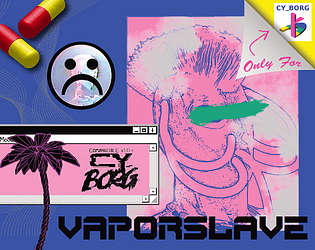
Vaporslave
Concept: “You are constantly jacked into your Vapestim-Pack, emitting vapor clouds. You have to stay sedated! Drugs for everyone! Down with the luxury elite!”
Content: A class for the languid lotus-eater and sedate spice fiend who wants, or needs, to constantly moderate their mood–and who wants everyone else to, too.
Writing: Class detail descriptions and mechanics explanations support one another well to present a cohesive concept through the document.
Art/Design: Two-page pink-heavy spread layout highlights a vaporslave illustration, a rendering of capsules, and an early GUI in addition to distinct sections of text framed as a cassette track list.
Usability: Class details are organized for quick identification of desired information, and different aesthetic components invite further exploration and engagement.
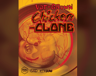
Vat-Grown Chicken Clone
Concept: “Are you more human than chicken or more chicken than human? Engineered to be tastier, juicier, more finger-licking good. Implanted with a brain that was not your own, and GMOd to decay at a slower rate — so when the skies fall, only you and the cockroaches will be left ruling the roost.”
Content: A class for the egghead who enjoys fowl play, whether it’s original or extra crispy.
Writing: Since this class is an homage to the creator’s “Vat-grown Repli-clone” class, chicken-themed references and puns abound that provide the class with intriguing and unique options/mechanics.
Art/Design: Wide spread in a yellow/orange color scheme with a graphic of a chicken embryo (much like the repli-clone class’s graphic) toward the left, while three columns of content take up the bulk of the page.
Usability: Each column of text content has its own visual design, but each provides a consistent presentation to distinguish headings, labels, emphasized text, and so on. Searching/selecting text may cause some issues due to unexpected spacing between and clustering of characters.
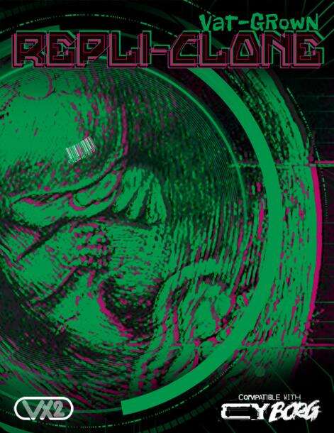
Vat-grown Repli-clone
Concept: “Engineered to be better, stronger, faster; implanted with memories that are not your own; and genetically encoded to degrade at an accelerated rate. Live fast, die young embodied. And your time is almost up.”
Content: A class for the discarded or obsolete duplicant who wants their maker to pay for their profane hubris.
Writing: Drawing on iconic literature and film for its inspiration, class features are concisely packed with ideas to spur introspective and destructive roleplay.
Art/Design: Sleek spread layout of class details complemented amazingly with green/pink color scheme to highlight page elements, with a large background illustration of a vat-grown fetus to underscore the character’s origins.
Usability: While there’s a lot happening on the page, it’s eminently readable, with high contrast and bordered framing of text guiding visual navigation through the document.

Vat-Grown Runaway
Concept: “You are an artificially designed human being, grown in a lab, who ends up finding themselves roaming in the alleyways of CY, lost and confused.”
Content: A class for the not-quite-a-person who’s trying to figure out what they are and why.
Writing: Brief and vivid character details for background and motivation complemented with terse mechanical effects/features.
Art/Design: An illustration of a runaway on the right side of a landscape-oriented spread, with white text on black (with yellow and pink highlights & headings).
Usability: Distinct typefaces and groupings of text allow for quick navigation between different content areas.
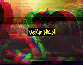
Verminkin
Concept: “In CY, it's easy to feel like there's nobody to trust. Everyone wants creds or drugs or alcohol or fame or whatever, and most people are willing to backstab each other for it. But you- you're secure. Your friends would never betray you, and you make friends very easily, at least, with some people. The kind of people who have greasy black feathers and pick at trash dumps, or gnawing teeth and skitter under floorboards, or slimy skin and creep through the gutters. Your friends have your back. Anyone who wants to get to you will have to go through them.”
Content: A class for the rat bastard who works best with partners, the nastier the better.
Writing: Inspired class features that bring a feral animal-loving misfit to life, complete with mechanics for one or more vermin companions.
Art/Design: Full-color version is yellow-on-black with rat photographs with color treatments as backgrounds, while print-friendly version is black-on-white text. Both versions use single-column text content layout.
Usability: Distinct sections are immediately recognizable in both versions thanks to consistent heading/label presentation and white space. Full-color version employs an additional handwritten-aesthetic font for labels and emphasized terms/phrases.
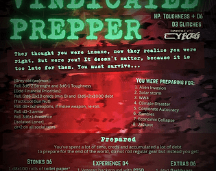
Vindicated Prepper
Concept: “‘They thought you were insane, now they realize you were right. But were you? It doesn't matter, because it is too late for them. You must survive…’ An old man or woman who have spent their lives preparing for the apocalypse who now finds themselves in a perpetual never ending one. Will they survive? Even thrive?”
Content: A class for the punk who’s well-stocked for nearly any apocalyptic occasion.
Writing: Brief, extremely flavorful tables and mechanics that round out assorted approaches to playing a vindicated prepper, provided in a mix of straightforward and tongue-in-cheek tones.
Art/Design: Bright green on a red cloudy pattern background, organized mainly in a three-column format.
Usability: Consistent presentation of content sections via organization, headings, emphasized info, etc. all make for easy navigation and identification of desired details.
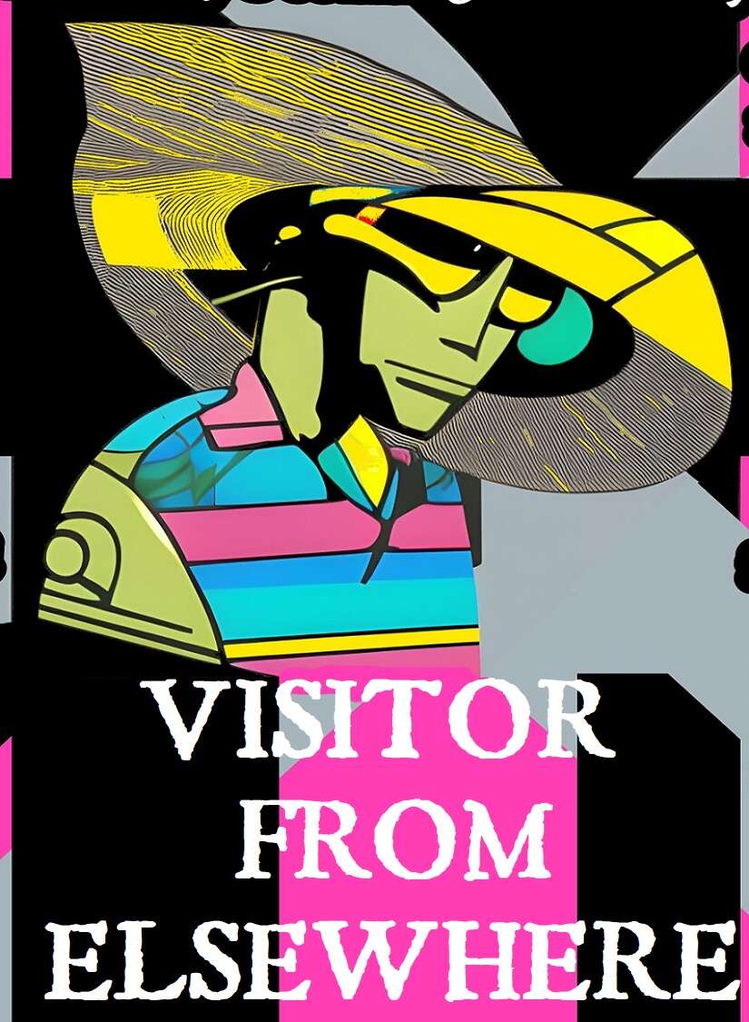
Visitor from Elsewhere
Concept: “You hail from a world unknown to humanity, far beyond the outer bounds of the Terran solar system. All data projections point to planet Earth as the site of some great future calamity, one that will resonate throughout the entire universe—but what could it be, and why here? You’ve been stranded on Earth (what’s left of it, anyway) for a few months now, and so far, only one thing’s been made abundantly clear: this place is a shithole, and nobody’s coming to rescue you.”
Content: A class for the stranger in a strange land with no way to leave it.
Writing: Class details mix levity and bizarre sci-fi tropes for a unique class experience in a cyberpunk milieu.
Art/Design: Black-edged white text on black, pink, and gray with some green text accents. Class features are arranged around a central illustration of a visitor over a background pattern of criss-crossing X shapes.
Usability: Visually, this is a busy spread, which may make reading/scanning difficult for some, augmented by the lack of embedded text (so no searching or copying/pasting). Bold text for important info and labels consistently helps distinguish individual list items and content sections.
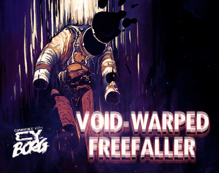
Void-Warped Freefaller
Concept: “It was nothing like they advertised; there were no off-world colonies, no bold unknown, no strange new worlds–only more cramped corridors and self-devouring consumerism in the name of the tourist industry. And then one night SOMETHING shocked the shuttle systems, and you began floating in a most peculiar way…”
Content: A class for those who were changed in irrevocable, horrifying ways when they walked among the stars–and who are now shackled to the earth once again.
Writing: Vivid, evocative descriptions of features and mechanics are both illuminating and unsettling in the best way.
Art/Design: Two two-page spreads with class details and a set of alien infestations, with white text on dark background throughout. An image of a void-warped freefaller emphasizes the cosmic horror at the core of this class and the effect it has on the character.
Usability: Easy to navigate, read, and comprehend, with key components visually embellished for identification of their significance and purpose.

Wasteland Degenerates
Concept: “‘Tomorrow is nothing, today is too late; the good lived yesterday.’ - Marcus Aurelius
Welcome to the gas-guzzling, high octane post-apocalyptic hack of Cy_Borg, about miserable, radiated scum struggling to survive in tomorrow's unforgiving carcass!”
Welcome to the gas-guzzling, high octane post-apocalyptic hack of Cy_Borg, about miserable, radiated scum struggling to survive in tomorrow's unforgiving carcass!”
Content: A Mad Max-style take on Cy_Borg rules, with some new and different systems while others very closely resemble those of the base game. (Note: At the time of writing, the "Jumper Cable Edition" version of the game has been released. A fuller version of the game is set to be published in the future.)
Writing: A balanced amount of thematic description and mechanical explanation of effects/features that situate players and GMs to the game’s focus (especially in comparison to that of Cy_Borg).
Art/Design: Aesthetics of the core rulebook with some occasional pages/spreads and illustrations that break out in a different direction (such as in the more comic book-like “The world has ended” spread early in the book, or the Vast Grimm-style “lagunasuga” monster spread created by VG creator Brian Colin).
Usability: The fore/ground contrast varies significantly from page to page, as do fonts/typefaces, either of which can make some text quite difficult to read.

Wiggly Dorpher
Concept: "Wiggly Dorpher introduces new game options for CYBORG hyperlinked to DRUGS.
'Getting high and playing holos is fun; but have you ever zeroed someone while trippin' balls? It's exhilarating!'"
Content: Sets of equipment, nano powers, a class (Wiggly Dorpher), a location, an enemy, and more--all relating to drugs in some way.
Writing: Potently and concisely atmospheric, with rules/mechanics explanations complementing the descriptive aims.
Art/design: A mix of page/spread aesthetics and organizations that reflects the core Cy_Borg design variety.
Usability: While most pages have significant text/background contrast to facilitate reading, much of the text content is not embedded and thus cannot be searched or selected.

You Got Mail
Concept: "Have you ever found yourself in need of some holo messages to bombard your players with? Random mails while they are investigating a datafortress? Disturbing radio chatter when caught in a nano-storm? Maybe you are just looking for some inspiration to spark an adventure?
Look no further! YOU GOT MAIL is here for you!"
Content: A set of tables of different kinds of messages for GMs to incorporate into their games--some with options for referencing/implicating the punks directly.
Writing: Tongue-in-cheek flavor pervades the messages' content, from advertisements to conversation threads to corrupted fragments.
Art/design: Black-on-green aesthetic reminiscent of computer terminal displays in two-page spread layouts.
Usability: Visually readable fonts with solid contrast of text on ground, complemented with outside-margin section headings (for the current table), allow for easy "lift and use" in a given game.
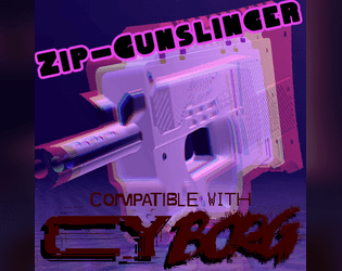
Zip-Gunslinger
Concept: “Zip guns are sold everwhere, as multipacks in bodegas and as singles in vending machines. These mass-produced deadly toys are made of the cheapest materials in the cheapest way possible and designed to break after a single shot, but that's all you need, right?”
Content: A class for the venn diagram intersection of firearms fanatic and gashapon addict.
Writing: Concise, approachable descriptions of class features and mechanics with a dash of thematic flavor to glue the concepts to the setting.
Art/Design: Plain text format with whitespace between paragraphs and lists.
Usability: The file format allows for incredibly easy resizing/formatting content in one’s preferred text editor or word processing program.
Previous page
Page 4 of 4