Quint Nigro

The Derelict Android
Concept: “Purpose-made. A monument to corporate ingenuity. The modern slave. You’ve lived well beyond your best-by date. Now, there are newer, flashier models doing your old job better than you ever could. So, the old master littered you into the city like the dreg of silicon and flesh you are.”
Content: A class for the forsaken and abandoned who want to find and create meaning post-obsolescence.
Writing: Crisp description establishes class features/details and underscores the precarity of life as product/property.
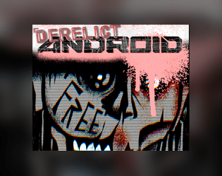
Art/Design: Muted but powerful color scheme with a 1980s font choice vibe from the title; close-up of android face with gaunt, damaged features focuses attention on the punk philosophy informing CY_BORG.
Usability: Spread layout uses contrast well to distinguish text blocks, and highlights emphasize mechanics.

The Ultra Upset
Concept: “You have taken a gig from a rising leader named Yosel, a high-ranking member of one of Cy's most violent ultra firms. The firm's old leadership has to go, and you will be the people to make that happen. Infiltrate a stadium, sabotage a career, buy some merch! Play it cool and leave without a trace, or kick the door down and get net-famous. As you infiltrate deeper into the Duodrome, you will find unique loot, dangerous NPCs, and the dark secret keeping this streaming-sport operation together…”
Content: A job to humiliate a traitor in a Nechruball firm.
Writing: Plenty of specifics, especially gritty sensory details, on the situation, relevant locations, and NPCs that the table might encounter while undertaking this mission.
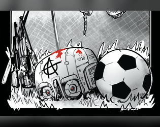
Art/Design: White-on-black design (except for two pages of tables in a green-text terminal aesthetic) with key terms emphasized in bright colors, and overhead maps are provided both as direct aids and as part of illustrations as blueprints pinned to a wall, and portraits breathe life into included major NPCs.
Usability: Really intriguing consistent color use to highlight particular NPCs/entities as well as the source of specific mechanics/details. However, text is not embedded, so searching/selecting text or using a screen reader successfully aren’t possible.

Viruses to Brick Your Brain
Concept: “Embedded in ads, lurking in the top search result, loaded as a hacker’s dead hand, coursing through a derelict net node. Viruses are everywhere, infecting everyone, stealing a portion of everything. Most of them are unnoticeable, lurking in your RCD, implants, accounts, everything. These? Less so. Bisecting your consciousness. Hijacking your implants. This is the result of someone else’s malice or misconduct. It will break you down until you get rid of it.”
Content: A set of tables to make a player’s life living hell through the power of compromised technology.
Writing: Concise and powerfully thematic explanations of relevant variables, including how the virus spreads, how it affects a player mechanically, who developed it, how to get rid of it.
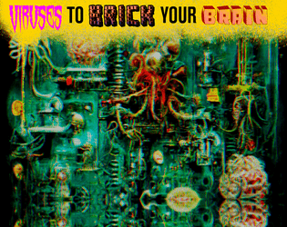
Art/Design: A visual overload of colors, fonts, graphics, and stylistic clashes that feels entirely appropriate given the rules’ purpose.
Usability: While overall consistency is out the window, it is possible to understand and navigate each table/element while focusing on that section.
Page 1 of 1