Gear/Items
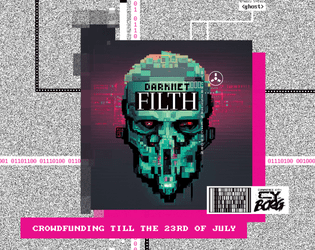
Darknet Filth
Concept: “404//SAN is the demented frontpage of the NET, where manifold rumors, advertisements, hoaxes, and conspiracies produce a worthless information sludge. Still, more than enough masochistic users flock to the site to be entertained by trolls or cheated out of their life's savings.”
Content: A one-stop shop for adventures/scenarios, NPCs, monsters, apps, cyberware and equipment, additional rules ideas, and more.
Writing: Every page provides dozens of imaginative and enticing ideas for inspiration, with many pages offering highly engaging in-universe descriptions or framing for their game content.
Art/Design: A variety of artistic and aesthetic styles that embody the artpunk philosophy. The browsing experience feels in line with the CY_BORG rulebook itself.
Usability: Requires close, and often slow, examination to identify and make effective use of content (text and image alike), especially when moving across very differently styled spreads–but very worth the effort.
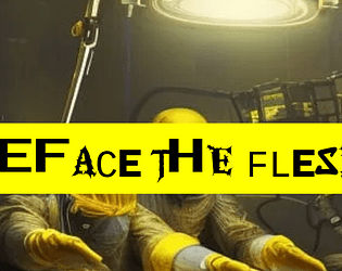
Deface the Flesh
Concept: “Gruesome implants and upgrades for a future where the body is irrelevant and flesh has no sanctity. Defile your physicality to keep up in the rat race of society. Set-dressing or inspiration from grim-dark cybernetics.”
Content: A d10 table of bizarre and grotesquely functional options for upgrading one’s imperfect and disappointing meat-suit.
Writing: Powerfully inventive descriptions of implants that suggest a wide range of uses and reasons for their potential ubiquity in CY–but no stats or game mechanics are attached. It’s all flavor, and it is zesty.
Art/Design: Black text on yellow, with a chaotic-looking font or set of font choices for each entry’s label. An image of disturbing surgeons working on an unseen patient frames the supplement’s title.
Usability: While each label can be difficult to read due to the intentionally inconsistent appearance of each character, the text overall is very easy to read and navigate to consider options or to locate desired info.
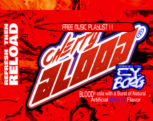
Drink BLOOD Cola
Concept: “Guards and Goons got you on the down and out? Drink delicious Cherry BLOOD cola for the pick-me-up you need to get the job done!”
Content: An in-game drink for a punk to chug and get that pick-me-up needed to take down some big business bastards. (Creator notes that content will be updated in the future with additional drink options.)
Writing: Terse description focusing on mechanical effects that ingeniously last until a character (or player?) needs to urinate.
Art/Design: This might be the most diegetic third-party content out as of this entry's publication. Item details are provided as soda can/bottle wraparound labels, with game stats replacing the usual nutrition details.
Usability: White on red can be difficult for some to read. QR code provided on label takes the reader to a playlist that fits the tone of drinking the cola.
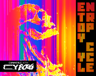
Entropy Cycle: Fragmentation Protocol
Concept: “The world has ended too many times. A copy of a copy of a copy. Something was bound to break. On the plus side there's a bunch of weird shit the mess around with.”
Content: Preview/excerpt of an as-yet unreleased supplement that includes a class (“Glitch Thief”), a set of “anomalous relics” with positive and negative qualities, NPCs, and a custom PC sheet.
Writing: Each spread is filled with inventive and interesting flavor and mechanics that might cause some players to weigh their decisions about whether and how to make use of particular options/features.
Art/Design: A set of two-page spreads with distinct layouts and color schemes, each of which balances a page of text and a page of illustration.
Usability: High-contrast text on each page, with distinct font choices and decoration to indicate different blocks’ or phrases’ purposes (e.g., label, key information, NPC stat). Text on the custom sheet is not embedded, so no searching/selecting is possible there.
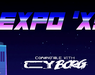
EXPO 'X3
Concept: “Are you hyped for Expo 'X3? Every megacorp in CY will be strutting their latest innovations, every star will be walking the red carpet at the Kinotorium, every cuisine will be there for the tasting at The Spot food market, every corpo suit will be dragging themselves in to 'touch base' and 'network'- just about everything about CY will be scrunched down into these fairgrounds for a bash like you've never seen (since the last one). Get your tickets now!”
Content: A special city event with tons of attractions, locations, food/stuff to buy, enemies to encounter, and other reasons to attend.
Writing: Copious details and helpful information about who’s who, what’s what, and where’s where in the expo for GMs and players alike, written primarily in a cheerful-but-snarky voice that reflects the tone of many expo info kiosk staffers.
Art/Design: Primarily black-on-white single column text complemented by color illustrations, with occasionally more colorful pages with full-color and dark backgrounds.
Usability: High-contrast, readable text provided throughout, with consistent presentation of visually identifiable headings, labels, list item numbering, etc.
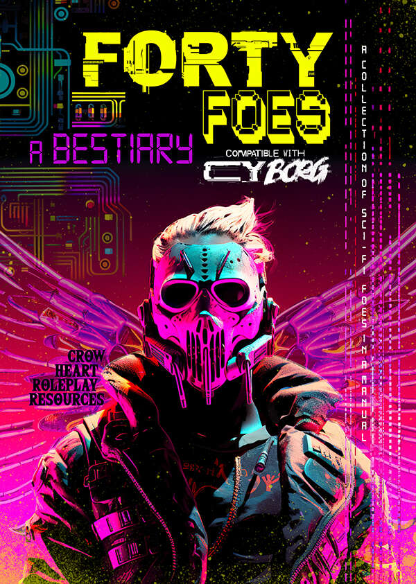
Forty Foes
Concept: “Ahead of you lies a sci-fi bestiary for the game of Cy Borg. This is not an official product but is presented in the familiar doom metal style, each foe being empowered by this energy and inspired by the work of Johan Nohr.
A perpetual darkness hangs over The Cy. In its malaise of gang warfare, in between the slums and festering rivers, hidden within the quarantined zones of the GO, standing in plain sight in the consumer hell of the Undersjon, is an incurable sickness. It breeds malevolence and jacks up the citizens. It lingers long enough to rot away the core and from this darkness comes all manner of twisted visage. Warped beings appear, the upshot of a city that is consuming itself. Let these foes appear among us say the consequential voices.”
A perpetual darkness hangs over The Cy. In its malaise of gang warfare, in between the slums and festering rivers, hidden within the quarantined zones of the GO, standing in plain sight in the consumer hell of the Undersjon, is an incurable sickness. It breeds malevolence and jacks up the citizens. It lingers long enough to rot away the core and from this darkness comes all manner of twisted visage. Warped beings appear, the upshot of a city that is consuming itself. Let these foes appear among us say the consequential voices.”
Content: A variety of angry, terrifying, and otherwise hostile beings to encounter on the streets of CY. Tables for nano powers, drinks, infestations, hazards, drugs, weaponry, technical glitches, and more are also provided.
Writing: Imaginative descriptions of enemies (or other entries) accompany stat blocks and special abilities/mechanics reflecting the essence of each subject.
Art/Design: Full-color illustrations and layouts on each page, although styles for pages may vary considerably from page to page.
Usability: Different page layouts can slow down reading/navigating experience, but font choices are mostly quite readable with high contrast against simple or patterned backgrounds–although there are occasional exceptions throughout.
G.M.M. or Grotesque Mutant Mushroom
Concept: “A Fungal themed Zine to Cy_Borg, It contains: 3 Enemies; 4 Themed Items; Hallucination condition.”
Content: A cluster of mushroom-based threats and loot.
Writing: Brief mechanics-focused stat blocks with thematically potent names and descriptions.
Art/Design: Two pages of bright pink and blue with green, with the first page having a fungal background image.
Usability: Color scheme and layout feel appropriately chaotic for the theme, but color intensity and relative lack of consistent organization may lead some readers to overlook important elements (e.g., small-text Hallucination rule just above the 3rd party license on p. 1).

Gimme gimme more
Concept: “A simple collection of 8 new weapons/tools to use in your Cy_Borg games!”
Content: A set of items that an enterprising punk might use for fucking shit up.
Writing: Succinct product names and rules to clearly indicate why someone might want and use each one.
Art/Design: Black-on-white “photocopied flyer” aesthetic, with an illustration accompanying each item description.
Usability: Very easy to visually navigate the page and recognize how each element contributes to an understanding of the equipment, from capitalized item names to bolded DR values. However, text is not searchable/selectable.
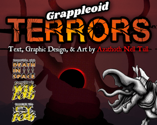
Grappleoid TERRORS
Concept: “An eight page bestiary featuring a multi-stage creature based on those from [the first three] TREMORS movies, as well as bits of lore, and a few new bonus weapons. This was made as part of the second Slasher Jam: Monster Mash for the ttRPGs Mork Borg, CY_Borg, and Death in Space.”
Content: A set of five creatures (really, one creature with several distinct life stages) that are sure to terrify even hardened punks.
Writing: Brief statistics and stage-specific characteristics are complemented with lore tables and an informative breakdown of the creature’s life cycle. Bonus table of weapons that might be used against the terrors.
Art/Design: Two-page spreads of red-tinged wasteland backgrounds with hand-drawn illustrations of terrors at each stage and distinct blocks of content arranged consistently throughout the supplement.
Usability: Consistent visual grammar for creature details provides a helpful means of recognizing and using desired information, and color combinations for text are high-contrast. However, some text is searchable and selectable, but not all.
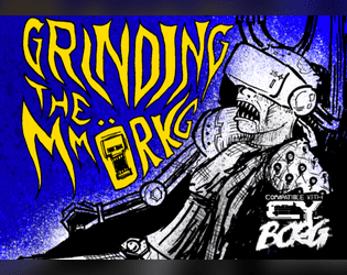
Grinding the MMORKG
Concept: “Want to use Mork Borg modules as a virtual reality simulation in your Cy_Borg game? Or to give your Mork Borg players a taste of Cy? This five-node mystery adventure path introduces the Dying Lands as an MMO game/simulation in Cy and can be approached from either game as a starting point!”
Content: The content centers on an ingenious scenario that blends Cy_Borg and Mork Borg (whether you’re starting in either game!), detailed locations and maps for each, an “emaciated sim-farmer” class that works well for the scenario, a small set of optional rules that the MMORKG facilitates, random encounters, and several pieces of equipment to consider buying.
Writing: A mix of thematic narration, straightforward rules explanations, and direction for PCs to respond to–all of which is presented succinctly and consistently throughout the supplement.
Art/Design: Distinct layouts for each section (major adventure locations, PC class, etc.) that provide individual character about its subject matter, with a bright accent color to help underscore section distinction and scope.
Usability: Despite the variety of page layouts/aesthetics, text is consistently readable and identifiable as different kinds of content (headings, labels, NPC stats, etc.).

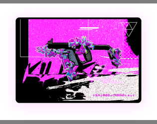
Gun-Ends
Concept: "CY's premier weapon and attachment catalogue is back in business!
Featuring over 8 (and by that I mean 9) unique weapon attachments to spice up your guns with, 1 table, and a lot of flavour text to give off a real catalogue feel.
Just be careful, they aren't exactly the most durable things on the market. You wouldn't even be able to afford the durable stuff anyway."
Content: A collection of weapon attachments and modifications designed to make a pvnk's violent tendencies all the more brutal and chaotic.
Writing: Snarky in-universe descriptions of weapon mods duct-taped to brief, matter-of-fact mechanics/effects.
Art/design: A visually overwhelming mix of green tones, irregularly sized boxes of text and image, and weapon attachment silhouettes all presented as an in-game catalog of products.
Usability: Relatively high contrast for much of the text, making reading visually easy despite the variety of fonts, colors, and related effects. Only some text is embedded, though, so not all content can be searched/selected.
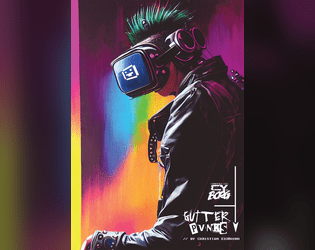
gutter_PVNKS
Concept: “gutter_PUVNKS is a fresh supplement for CY_BORG. You'll get all you need to explore the city of CY, even if you really don't want to. Locations, encounters, NPCs, adventure, two new classes (BROKE CEO & CY_BORG), and a few odds and ends.”
Content: 48 pages of content: NPCs, cults, a radio station, locations throughout CY, random encounter tables, infestations, “broke CEO” and “cyborg” classes, and (amazingly!) more.
Writing: Tons of detail on each page to provide GMs and players with numerous possibilities; writing style oozes the essence of Cy_Borg: thematically grimy and vile and also compact rules/mechanics explanations.
Art/Design: Layout and aesthetic choices for each section are as varied and imaginative as the writing, contributing significantly to the fullness of immersion in the game universe and vibe.
Usability: “Consistency” is somewhat relative here–although there are many different layouts, aesthetics, etc., there are similar gestures throughout: highlighted headings/labels, text size to reflect hierarchical relationships between content, etc. so that navigation and identification of desired info is enjoyable rather than frustrating. Contrast is high throughout as well; only one page has a busy enough background to potentially slow reading.
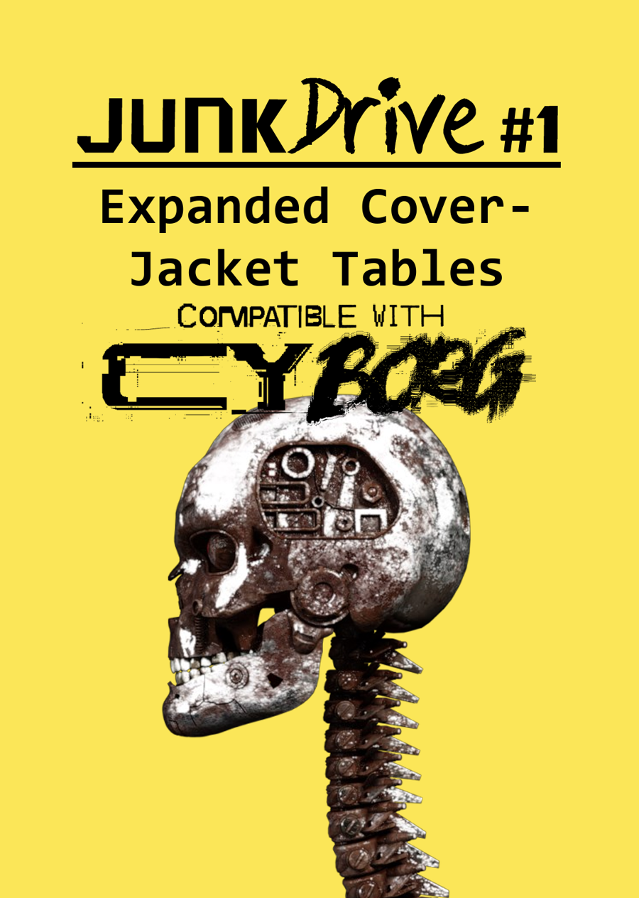
JunkDrive #1: Expanded Cover-Jacket Tables for CY_BORG
Concept: “This supplement takes the four tables found on the cover-jacket pages of CY_BORG and expands them, doubling the options available when combined with those provided by the core book.”
Content: A set of tables (names, weather, pocket lint, infestetd items) to provide more options/results for GMs looking to bring their table’s version of Cy to life.
Writing: A wide range of appropriately flavorful results and details (some purely thematic, some with mechanical effects).
Art/Design: Black-on-yellow mostly single-column text design. The cover page includes an image of a skull and spine that appear to be mechanically augmented.
Usability: Text is high-contrast in a readable font, while headings and labels are consistently provided in visually distinct ways (text size, bolding, etc.).

KILL ENGN
Concept: “A metal frenzy, mech-infused expansion. High-tech machines, renegade pilots, & corporate tyranny_”
Content: Tons of information (across 60 pages) about mechs and how they might fit into the world of CY, complete with creation/generation rules, relevant NPCs/enemies, gear to upgrade with, new rules and mechanics to incorporate, a new class ("The Chrome Jockey"), and even some floorplans for potential jobs. Additionally, a job (really, a mission involving multiple potential job leads)--"Cast Oubliette"--is included, along with an overhead map of one area, for stretching pvnks' figurative mech legs.
Writing: Ideas galore on each page, some of which are easier to situate than others, but all of which exude inspiration about mech-related activities.
Art/Design: The Cy_Borg core rulebook aesthetic is emulated here more closely than in any other 3rd-party product reviewed thus far, grafting designs from many of the core book’s spreads among more distinct layouts.
Usability: Each page/spread has its own visual language, but there are cues in each to indicate consistent presentation of distinct content. Like the core Cy_Borg rulebook, the radical shifts in aesthetic may initially be overwhelming for some to engage.
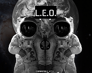
L.E.O.
Concept: “If you thought life planet-side was bad, just wait until you get to The Brink, the space-station that skulks in orbit, where the corpos can decide to shut off your oxygen.
- Walk the lovely avenues of the Arcology or relax in the parlors of Paradise Bloc
- ...if you're filthy rich, which you probably aren't
- otherwise, mill around in Middling, and retire to the sterile squalor of the Pods
- fight for your profits (and your life, but that's just incidental) in the cutthroat competition of the Thruways
- join up with stationside pvnks to try and make a difference
- eat space food! (it's not very good)
“
Content: An orbital location with tons of different areas to explore, people to meet, jobs to run, and a bit of food to eat.
Writing: Extensively detailed information about the station and what goes on there, along with a number of tables to add a bit of additional surprise or variety to a given table’s experience on The Brink.
Art/Design: Several different page layouts and color schemes provide variety from one page to the next while also providing some consistency across each time a given aesthetic appears.
Usability: Text is mostly high-contrast and easily readable, with visually distinct headings and labels. Some color and font choices may momentarily slow down the reading/navigation experience.

Law&Disorder
Concept: "Hello punks and rebels, this is a DLC for the CyBorg ttrpg, - Law&Disorder. DLC focuses on the theme of the urban rebellion against corporations."
Content: ~44 pages of new rules (chases), gear, classes ("Oldschool Edgerunner," "Glitch Witch," "Pale Jester," "Analog Outlaw"), enemies, and a mission/area to explore that goes beyond the bounds of Cy itself.
Writing: Lots of information with a focus on explanatory details about new rules, mechanics, abilities, etc. relating to page content.
Art/design: Distinct two-page spread aesthetics with a consistent visual grammar throughout via text blocks on contrasting background boxes and body text fonts. Lots of illustrations throughout to complement the focus of a given spread.
Usability: Font selections and text contrast, along with an easily navigable/perusable TOC, assist with readability and allow for easy browsing and identifying of desired information.
Legendary Cheat Codes
Concept: “Ultra rear secrets cheat codes for your weapons rumored in the dark web.”
Content: Unlockable modifications for firearms–if one can find the cheat sheet for them.
Writing: Brief setup and modification details that allow a GM to work the cheat codes into their game as they desire.
Art/Design: Two white-on-black images, each with a block of text (setup) above three-column presentation of weapon mods, with a neon-colored glitch art illustration of a gun below.
Usability: Text is high contrast with clearly labeled sections of content, but due to JPG format, text is not selectable/searchable.

Meat&Greed
Concept: "The Meat Might Be Fake, but the Greed Is Real!"
Content: A pair of jobs (one to free animals from a meat plant, the other to procure an item from G0), a mall to explore, a number of NPCs, and several tables of gear, status effects, chat messages, and more.
Writing: Evocative descriptions complemented by concise rules/mechanics that underscore the essence of their subject.
Art/design: Distinct spread layouts with intense colors, text, illustrations, and arrangements thereof.
Usability: While some spreads are visually busy, text is overwhelmingly presented in high contrast with a clear visual grammar for the layout, leading to easy navigation and identification of desired info for ease of reference & use in a game.

Metromancer
Concept: “Deep beneath CY lies the abandoned subway system, that was carved from the toxic earth by ancient and blackened technocratic mole machines branded with the sigil of Alliansen inc. A caliginous place filled with misfits, filthy vagrants, and whatever makes that fucking noise in G0, A grim network of fever dreams, unknown spore cvlts, rogue Ais and reality-bending technology. You will die here, horribly.”
Content: A set of NPCs, factions, locations, plot hooks, rules, tables of all sorts, equipment, and classes (the “Batshit Chaos Punk,” the “Archaic Stranger,” the “Derelict Street Fighter,” the “Symbiotic Sage,” the “Hyperjunky Chemist,” and the “Grafted Herald”), all of which are focused on the subway environment/ecosystem existing beneath CY.
Writing: A plethora of imaginative detail to entice and disturb would-be subterranean explorers. The classes in particular provide a clear and intriguing means of connecting a punk to one of the organizations making its abode in the subway tunnels.
Art/Design: A variety of distinct spreads that make use of messy illustrations, ASCII art maps, glitch aesthetics, and bright colors with a variety of typefaces.
Usability: Much of the content is provided in high contrast and embedded text for easy visual readability–headings are frequently the most difficult (and non-embedded) elements to decipher. The book is organized by content type, facilitating easy navigation to the desired info (locations, classes, etc.).
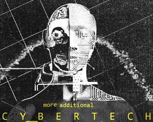
MORE_ADDITIONAL_CYBERTECH
Concept: “10 more additional Cybertechs for CY_BORG.”
Content: A table of ten cybertech options with a range of functions/features.
Writing: Very brief details and mechanic descriptions that together create vivid ideas for using/implementing each at the table.
Art/Design: Landscape layout using a photocopied aesthetic, with table on the left in yellow text and a black-and-white illustration of a cyborg-esque figure on the right. A black-on-white print-friendly version is also included.
Usability: High-contrast text and table layout make for easy navigation/perusal.
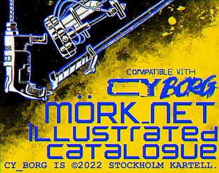
Mörk_NET Illustrated Catalogue - a Cy_BORG Artwork Pack
Concept: “Digging through the graft of society, very few things appease the eyes, so feast on these that bring to sight what only resided in the mind. Mörk_NET Illustrated Catalogue follows with this purpose, bringing out high quality artwork with the destructive punk aesthetic known to the scenario while being consistent between each piece, perfect for Virtual Tabletop's weapon icons and inventory management. The pack currently contains nine images, covering the basic Melee Weapons in the system, each of them packaged individually in .png format and transparent background for ease of use.”
Content: A set of images for several melee weapons included in the Cy_Borg rulebook, provided with and without colorful backgrounds.
Writing: N/A
Art/Design: Hand-drawn style is augmented effectively by colorful spray paint-like accents.
Usability: Files are descriptively named and image formats make for easy implementation in VTT or even in-person games.
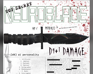
NeuroBlade
Concept: “NeuroBlade is a sentient knife that gives you 1 of 8 buffs while wielding it.”
Content: An intelligent weapon for the punk who sees each piece of equipment as a potential collaborator.
Writing: Spartan details to focus on the pragmatic role(s) the neuroblade might serve when used (and how that translates into game mechanics).
Art/Design: Dark-on-light color scheme with a large illustration of a combat knife above two-column arrangement of text content sections.
Usability: Different font sizes and choices used to reflect different kinds of content. Visually, text is mostly high-contrast, although some smaller text might be difficult to read. File is provided as .png, so text is not embedded (meaning no searching/selecting or using a screen reader).
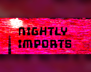
Nightly Imports
Concept: “A Cy_Borg zine featuring: D12 Cybertech from Nueuropa [...] D6 Legends of Cy [... and] Street Cred - A New Mechanic.”
Content: Options for gear, NPCs, and a ‘street cred’ reputation tracker that can add extra dimensions to a game.
Writing: Four pages of enticing tables filled with flavorful descriptions and mechanics that reflect strange, horrifying, and completely appropriate events and circumstances.
Art/Design: Four two-page spreads each have a distinct focus and color scheme that extends from one to the next, from a stark red/black/white to a neon purple/blue.
Usability: Language is direct and straightforward in describing and explaining each subject, with each table making use of a consistent visual grammar to help with navigation. However, text is not embedded, so no searching or copying/pasting is possible.

Noize Weaponz
Concept: “Part of the Street Death series and inspired by Jetset Radio, graffiti culture and skateboard competitions, Noize Weaponz is a Cy_Borg supplement that adds 2 audio weapons that ignore armour, deafen enemies and play in stereo.
With the rifle esque NoisBlaster and the explosive EMP 3 Player you can melt the ears off of any enemy and if you save up enough you can augment your listening experience with equalizer settings to buff the damage of your base cannons!“
With the rifle esque NoisBlaster and the explosive EMP 3 Player you can melt the ears off of any enemy and if you save up enough you can augment your listening experience with equalizer settings to buff the damage of your base cannons!“
Content: Three equipment options (two weapons and an upgrade) for engaging in sonic warfare with one’s enemies or victims.
Writing: Terse, crisp explanations of weapon abilities and their effects on those nearby.
Art/Design: Colorful pixel art and a pixel-style font (black on green) across two pages.
Usability: Consistent organization of content throughout the supplement allows for quick navigation and identification of desired information, from item name to credits to effects.

P!LLS FVLL of GODS - Rehumanized
Concept: “There is a new drug on the streets called Ambrosia. It will make you see the gods. Are these GODS real? There are dozens if not hundreds of people seeing them. They are looming over CY like falling planets, ready to steal your soul. Group hallucination? A bug in the system? Does it matter?”
Content: A smorgasbord of fever-dream content: drugs that manifest perceptions of gods (who give unique blessings with killer mechanics!); player classes for a ronin, private eye, amateur wrestler, and moonpunk; tables of people to meet on the street or items to find in the trash; NPCs to fight; drugs, food and gear; and even poetry. This has been re-released to strip out all AI content and replace it with human-made text and art.
Writing: Thematic punches of flavor that spice up concise and clear mechanical effects.
Art/Design: Two-page spreads with unique layout schemes that feel in sync with the aesthetic of the official Cy_Borg rulebook.
Usability: While there is a wide range of fonts and colors on each page spread, high contrast makes the vast majority of content easy to identify and navigate.
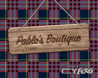
Pablo's Boutique
Concept: “You don’t remember seeing this odd structure here last time your crew came this way. An eye-catching tartan pattern covers this strange tent. A short flag-pole peaks from the top displaying a pink hand axe on a plain black field. A burned wood sign above the entrance reads “Pablo’s Boutique”. The space inside the tent feels expansive- way bigger that it seemed like from the outside. The product displays are spartan chic. Various offerings are for sale here unlike what you would find at your normal local supply store.”
Content: A selection of goods themed around Paul Bunyan and lumberjacks that also are entirely suitable for a punk in CY.
Writing: A balance of descriptions of the boutique’s various areas, the items on display in each, and the mechanics that come into play when a given item is used.
Art/Design: Three two-page spreads of single-column black text on a light background that each feature different kinds of items, with the first spread complemented by an illustration of Pablo and a flannel-pattern background beneath a graphic of a wooden sign.
Usability: High-contrast text is readable and easy to navigate and distinguish, facilitating quick identification and use of desired info.
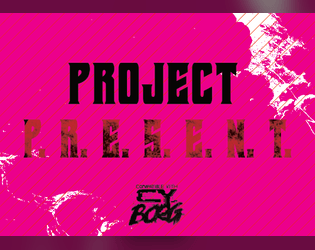
Project P.R.E.S.E.N.T.
Concept: “When you really really REALLY need to make someone go away, give them a final gift with the P.R.E.S.E.N.T. - Personal Rectilinear Electromagnetic Slug Emitter; Neutralizes Targets. It's gonna cost you, but can you really put a price on joy?”
Content: A highly illegal weapon for when a punk needs to absolutely obliterate an opponent as well as anyone or anything with the misfortune of standing behind that opponent.
Writing: Terse details leave plenty of room for imaginative interpretation.
Art/Design: Mix of black-on-white and black-on-bright pink/purple and red. Primarily single-column text save for weapon name and damage, which frame the main content area.
Usability: Plain text version is provided for potentially easier reading experience.

Punk Borg
Concept: "The CITY. The postcards and magazines make it out to be a perfect metropolis - sun, sea, sand, and a vibrant and buzzing city centre. Of course, that's how the Overlords want you to see it; it's the image they feed to the Sleepers. They fail to mention their enforcers are all boar-like beasts, and the fact that giant space rock buried under the City is making us all sick. Time to wake those Sleepers up and show 'em just how ugly their bosses really are. We're gonna crumble the Overlords' regime to dust, whatever it takes."
Content: A hack of Cy_Borg that provides a less cyberpunk and more "present day" dystopia to explore and rebel against, with classes, enemies, vehicles, a mission generator, an entirely new city to inhabit, and more.
Writing: Laser-focused atmospheric description and rules/mechanics that work together to contruct a game of antiauthoritarian punk resistance.
Art/design: Black-and-white pages/spreads that, while distinct, provide a consistent visual grammar of information throughout. Lots of hand-drawn illustrations of classes, NPCs, and environments to complement the text.
Usability: High-contrast text and layouts with visually identifiable section blocks, headings, labels, etc. and a helpful index all work to facilitate browsing, navigating, and locating desired information.

PVNX/R/VS
Concept: “A cavalcade of the bizarre and horrid in the wretched metropolis of CY. Within you'll find pirate lords, eldritch entities of the deep NET, kill-games champions, floating fortresses with maniac overseers, dangerous prototype cyberdecks, collectivist agitators, and worse still than that in this cross-section of the endless end of days in the city of CY.”
Content: A smorgasbord of assorted content, from enemies/acquaintances–physical and digital alike–to cyberdecks to locations to to overheard quotes to a new class (“The Last Ideologue”).
Writing: Terse mechanical explanations are consistently complemented by vivid in-universe descriptions that can aid both GMs and players in imagining and making use of the subject at hand.
Art/Design: Single-column black-on-white text throughout, with some differing font choices for headings/labels of distinct sections.
Usability: High-contrast text, visually readable fonts (with one purposeful exception), and a recognizable organization for layout makes for successful perusal and use of the document.
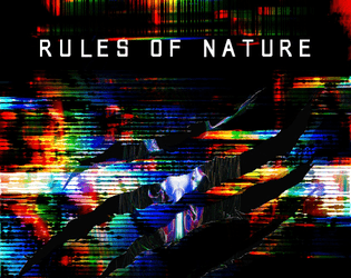
Rules of Nature
Concept: “Design a man-made predator on the verge of death, drawing you closer to your last breath. It's survival of the fittest, but evolution has taken a backseat. A build-able, A.I. pet that you can trick out with various weapons and gear. Think of Bladewolf from Metal Gear Rising. Yeah, basically that, but for CY_Borg.“
Content: Order your own cyber-pet and its customizable loadout/upgrades.
Writing: Set up as an in-universe catalog, rules are provided tightly alongside potent descriptions and upgrade labels.
Art/Design: Two-page spread of content, with black text on white accented with blue elements (e.g., upgrade costs) and light gray illustrations in the background. Two dark-themed front/back cover pages frame the main content.
Usability: Font choices are easily readable and mostly high-contrast, with visually evident headings and demarcations of content. Text is not searchable/selectable.
Loading next page...