Jobs/Missions

Assault on the Hills
Concept: “Buried deep within the twisting streets and endless hedge rows of the hills is the mansion of Helon Evontusk. Members of the board have tasked the punks with infiltrating Helon's home and finding a way to remove him from his position as CEO. If they can do this and escape without being captured, they will be rewarded with a massive collection of creds and some cutting-edge cybertech for the effort.”
Content: A job to take down one of the most narcissistic tech entrepreneurs in the Hills–with multiple options provided for dealing with him, each more satisfying than the last.
Writing: A tongue-in-cheek celebration of billionaire compeuppance. Sensory descriptions, random encounters and events, and NPC details all complement one another to build a vivid scene.
Art/Design: Sleek, mostly black-and-white layouts (with the exception of the cover and an isometric floor plan on the first two pages) that work to evoke the trappings of tech innovation. A set of top-down print-friendly and VTT-ready job site maps is provided as well.
Usability: Text is high-contrast throughout, and page layouts clearly provide visual indication of headings/labels vs. body text, with whitespace used to not only suggest related consent but also to guide reading and navigation through each page.
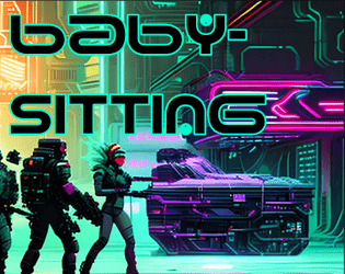
Babysitting
Concept: “An easy job ! Just sit around and babysit some corpo doctor and this box. Easy money?”
Content: A gig to retrieve, guard, and escort a person and their cargo to a designated safehouse.
Writing: Prolific details to flesh out the mission and the various groups with interests in its success–or failure.
Art/Design: Trifold brochure format provides initial parameters on the inner panels and later-stage conflicts on the outer panels. Predominantly white/yellow text on black, with NPC stats in black on brightly colored boxes, with portraits and street scenes complementing text. An additional page is provided with a safehouse location map and player-facing ‘breaking news’ info.
Usability: Color-coded text references draw attention to different NPC interactions, and consistent use of content section color and shape makes for easy identification of desired info.
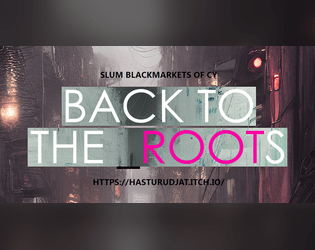
Back to the Roots
Concept: “A custom collection for Cy_Borg ttrpg, that includes:
- 13 new weapons, 6 new drugs, 4 new items - made in the slums of CY.
- 11 new street-made cyber-tech and 9 new APP's
- Short descriptions of 5 new slum Gangs
- A simple and short Adventure/Mission.”
Content: Tons of material to flesh out a game, from equipment to drugs to gang NPCs/enemies, with a scenario in the slums to take down a sadistic AI (and a map for the location).
Writing: Concise, direct descriptions and explanations of mechanics for a huge number of entries for various categories.
Art/Design: Mostly two-column page layouts (each with its own color scheme/aesthetic) with content on a translucent background pane over detailed, high-tech images. Map of floorplan includes effective icons indicating room features.
Usability: Text is easily readable with distinct heading/label decoration present in each page’s layout aesthetic.
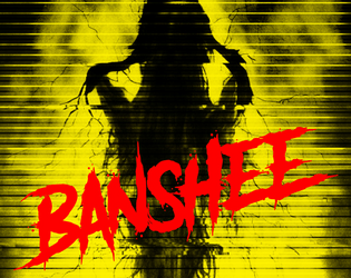
Banshee
Concept: “A mid level exec has lapsed into a coma after an unwise deep dive into the sewer levels of the net. When he came back up, it was with a permanent look of horror and endless babbling about ‘the woman’, yelping in terror at random moments, reacting to something that no-one else could see. He’s actually infected with the BANSHEE virus. It hijacks the carrier’s audio and visual implants, terrorising them until their brains overload and shut down.”
Content: A gig that takes a party of punks into an exec’s dying mind in search of important data.
Writing: A swirl of informative exposition and characterful style to situate a game group inside the mind of their target and all the horrors residing there.
Art/Design: Colorful one- and two-column text layouts, with each page having its own aesthetic and an accompanying illustration.
Usability: Text is easily readable across pages and assorted font choices, with each page’s organization recognizable through text size and color distinctions for headings/labels and body content.
Beyond Cy
Concept: “The fields. Monoculture deserts of genetically enhanced crops like wheat 4.6, ultra-maize, and soykin. Spliced to perfection. All earth is sterile. Killed by an unhallowed mix of unfiltered UV-radiation and the most potent poisons. Only hard fertilization keeps the masses alive and fed. Traveling through the cultivations is not without peril. Chemships puke their concoctions onto the plants; mechanic harvesters that have never seen an animal or human cut down all in their path.”
Content: A treasure trove of rules (miseries, glitches, mutations), gear, location/site summaries and generators, map hexes, random encounters, enemies, classes (“Mutant” and “Elektron Rohre”), job seeds/contracts, and even a dungeon to explore.
Writing: Intense, vivid, and wry descriptions that bring to life the sprawling wastes that surround Cy.
Art/Design: A mix of collage, pixel art, graffiti, graphical user interfaces, print reports, and more to frame each page/spread uniquely but feeling comfortably in line with the official/core Cy_Borg aesthetic. Map hexes provided as additional file.
Usability: Wide variety of layouts, font choices/sizes/colors, and organization can slow down reading and navigation (e.g., class info interspersed among NPCs), but hyperlinked table of contents aids with identifying desired details.

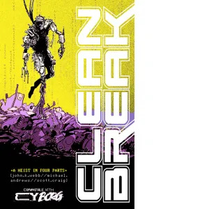
BLACKFLOWER
Concept: “BLACKFLOWER is a CY_BORG heist to steal a defective exosuit with a rogue AI that puts your crew in the middle of a revenge plot. There’s a new security corp, new gang led by Xu, new shops, and a two-level apartment building map.”
Content: A job to acquire from a corporation some high-tech gear that might not actually want to leave.
Writing: A number of tables with writing that balances description/atmosphere and information/mechanics, reflect a range of NPCs, locations, business inventories & prices, and assorted events. Also included is a helpful two-page list of considerations/options for GMs.
Art/Design: Lots of black-and-white art and high-contrast pages and spreads with splashes of color (pink, yellow, blue). Illustrations reflect NPC portraits, a map of the job location, and close-ups of equipment.
Usability: Text is consistently easy to read visually and page layouts follow a reliable organizational grammar for headings, labels, emphasized text, body text, etc.
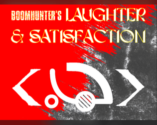
Boomhunter's Laughter & Satisfaction
Concept: “Burnchurch Hex’s latest [dist/att]raction is a kill club run by the infamous chromediator Boomhunter, a chromed out kill-club veteran with gunpowder cologne and grenades for jewels. To him, the only thing better than a good kill is a thumpin soundtrack.”
Content: Just about everything a GM might need to provide players with an entertaining time at a kill club: notable NPCs, locations, events/activities (and how to bet on them), and enemies to face off against.
Writing: Plenty of imaginative world-building detail supported with brief rules and mechanics when needed.
Art/Design: Two versions are provided: one that hews closely to the Cy_Borg design aesthetic, with a variety of two-page spread layouts, colors, and fonts; and one that offers a simple, printer-friendly black-on-white single-column arrangement of content.
Usability: Text in both versions is mostly high-contrast, although in the ‘regular’ version, some font choices and spread background ‘busy-ness’ may impact readability for some readers. Relationships between different content types/sections are visually distinct, thanks to consistent shifts in font size and bolding.
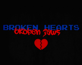
BR0KEN_HEARTS//BR0KEN_JAWS
Concept: "’Some desperate Alliansen admin put out a plea to rescue her AI program. Not sure why she doesn't just use company muscle to get it back, but she's promisin' the reward of "anything within her abilities," so here we are. Hope ya brought your earplugs though, cuz the goons that stole it are LOUD.’”
Content: A mission to recover an AI stolen by musicians.
Writing: Concise bursts of info to guide a GM toward notable encounters and fitting atmosphere.
Art/Design: Red and blue on black, with an aesthetic that mixes graffiti/tagging with software terminals, arranged in mostly one- and two-column layouts. A map of target location is provided in pink.
Usability: Consistent presentation of content elements throughout the document, making visual identification of headings etc. very easy. However, text is not embedded so no searching or selecting is possible.

Brain Trust
Concept: “A professor at the University of Cy has intel that her corporate rival has acquired a philosophical impossibility: A Boltzmann brain. A thought experiment that shouldn’t exist. She wants the brain acquired so that she can test for the truth.”
Content: A gig to procure a particular disembodied brain from a secure corporate facility.
Writing: Lots of atmospheric depth in details that range from location-specific info to locker room contents.
Art/Design: Mostly single-column layout of black-on-white text (with a few sporadic accent colors) complemented by maps of the job site–also provided separately in GM- and player-facing map images.
Usability: High-contrast text, document layout, and consistent presentation of distinct types of content all contribute to easy visual navigation and location of desired information.
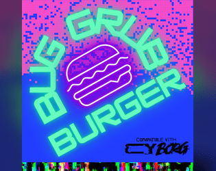
BugGrub Burger
Concept: “Narrow and crowded. The BugGrub Burger shines green and purple. Sounds of wet smacking. Insectoid mascots crowd the outer walls and ceilings, shrieking adverts … an explosion rains glass on all of it. The Heirs of Kargoz advance. Get in and out before they do.”
Content: A scenario for assassins and data thieves who prefer fast food to fine dining and want to know how the sausage gets made.
Writing: Inspired descriptions and scenario components bring the Burger joint to life and provide GMs with a plethora of dangerously grimy and horrifying details.
Art/Design: Primarily black-on-white text with colors to accent headings/labels and helpful images–a map of the site, employee portraits, etc.
Usability: Layout and color scheme is easy to make sense of for quick navigation and identification of desired info. While content is in PDF form, the text is not embedded, so no searching or copying content to clipboard is available.
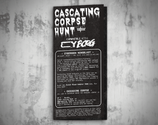
Cascading Corpse Hunt
Concept: "Fellow technomancers/slashers/hunters, After a nanite-infused cyberpsycho was zeroed in the streets of Oak Isles by UCS, it mutated into a CASCADING CORPSE. Authorities quarantined the area to contain the spread."
Content: A mission to collect DNA from the original corpse that has been self-replicating with disastrous results.
Writing: Bite-sized bursts of specific sensory elements or events for a variety of locations in the area, with similarly tantalizing notes about tests that might occur there to further complicate the PCs’ efforts.
Art/Design: White-on-black “1Bit” aesthetic that resembles lo-fi pixel/ASCII art, presented in a trifold pamphlet layout with job & location info on the outer panels and a large map of the area across the inner panels.
Usability: Visually apparent consistency in design grammar to distinguish different text content (headings, GM notes, etc.) and aid with navigation to desired info, with each location’s text beside a relevant graphic of that location taken from the area map.
CLEAN BREAK
Concept: “>>WELCOME, BR4VE TRAVE1ER
S4N1—or “Sanny” as he prefers to be called—is CY’s sanitation AI, responsible for the timely expulsion of the city’s sewage, garbage, and miscellaneous waste. For decades, Sanny has faithfully and silently executed his function, unaware of the greater changes happening in CY; forgotten and taken for granted, nobody was around to notice the worm of some higher intelligence burrowing itself into the AI’s core programming. Replicating. Evolving. Taking over.
Now, Sanny wants to quit his job—a clean break—and you’re going to help him.”
Content: A series of jobs designed to liberate a sanitation systems AI from its electronic shackles.
Writing: Four interlocked missions with tons of descriptive flavor, tables to roll on, NPCs, and other information for GMs and players alike that provide inspiration and guidance to a given iteration of these jobs in play.
Art/Design: While the entire document is in black and white, each mission has its own aesthetic and arrangement, font types, and so on. Illustrations galore depict assorted characters, locations, maps, objects, etc. that punks might encounter in one or more of these jobs.
Usability: Visually recognizable and consistent uses of headings, bold text, table organizations, content columns, etc. make for easy navigating and reading. Distinct jobs’ aesthetics also indicate visually the boundaries of those jobs’ information to further facilitate identifying desired details.
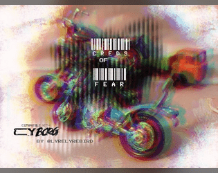
Creds of Fear
Concept: “Royal West Shipping has hired your gang for a non-union haul to their warehouse in Mosscroft. Only the desperate, or foolish would participate. Are you willing to sacrifice everything for the creds?”
Content: An adventure that involves transporting cargo through the city, complete with a number of hazards, obstacles, and other dangers that might await the unsuspecting punk.
Writing: Tight, concise descriptions of relevant details for GM and player creative elaboration/interpretation of the scenario events.
Art/Design: Two-column spread with a left-side glitch art illustration and a right-side single column of scenario text.
Usability: While the font choice is clean and sections are distinguished with whitespace and indentation, text is not embedded so not searchable or capable of copy/paste. A high-contrast version of the document is included.
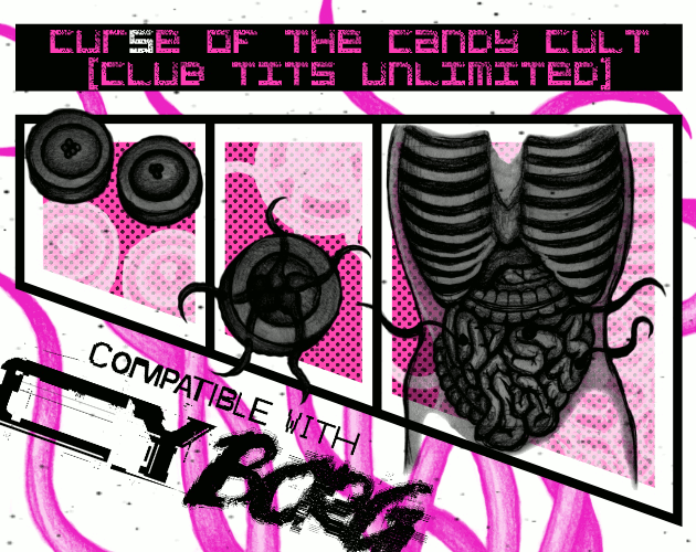
Cur(s)e of the Candy Cult (Club TITS Unlimited)
Concept: “New Location Pad Entry. A Strip Club Dungeon inhabited by a strange Candy Cult for TRIGGER WARNING Jam compatible with Cy Borg.”
Content: A mission to liberate a cultist from their organization’s lair. A pair of player-facing handouts (including a map) is also included.
- Writing: Terse and disturbing details that emphasize the insidious nature of the candy cult.
Art/Design: Two-column layout with black, pink, and white elements. Job details and NPC stats provided on the left, complemented by illustrations of candy, cultists, and–to the right–two levels of Club TITS Unlimited.
Usability: Text is mostly high-contrast and easy to discern purpose for, allowing for easy perusal and use. Only some text is embedded, which can complicate searching or selecting text.

Cut Purse
Concept: “CUT PURSE is a zine by Stockholm Kartell made for the 2024 convention season. It includes stuff for all our games; MÖRK BORG, CY_BORG, DEATH IN SPACE, SKR and some system-agnostic material (as well as an adventure for the Japanese third-party MB hack Nobunaga's Black Castle). But there are also things like album reviews and poetry.”
Content: Several tables (“Where do you hang out?,” “Returning home to your apartment after that one heist,” and a set of news headlines) as well as “Brainbox Scramble,” a combat-oriented “sudden scenario” taking place in a shopping mall.
Writing: Intensely thematic details packed into just a few pages (within the overall zine).
Art/Design: Mostly black-on-white two-column layout with some pink highlighted text, although an initial page for the scenario is white-on-black. An accompanying map provides labels for each storefront in its own distinct font (some with logos) to help sell the atmosphere of the place.
Usability: Fonts are visually readable, layouts follow an easily recognizable organization of content (with different sections and kinds of information formatted consistently), and necessary details are all included–all of which makes for an easier time using each table or running the scenario.
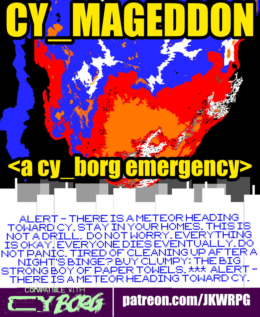
CY_MAGEDDON
Concept: “ALERT - THERE IS A METEOR HEADING TOWARD CY. STAY IN YOUR HOMES. THIS IS NOT A DRILL. DO NOT WORRY. EVERYTHING IS OKAY. EVERYONE DIES EVENTUALLY. DO NOT PANIC. TIRED OF CLEANING UP AFTER A NIGHT'S BINGE? BUY CLUMPY: THE BIG STRONG BOY OF PAPER TOWELS. *** ALERT - THERE IS A METEOR HEADING TOWARD CY. STAY IN YOUR HOMES. THIS IS NOT A DRILL. DO NOT WORRY. EVERYTHING IS OKAY. EVERYONE DIES EVENTUALLY. DO NOT PANIC. TIRED OF CLEANING UP AFTER A NIGHT'S BINGE? BUY CLUMPY: THE BIG STRONG BOY OF PAPER TOWELS.“
Content: A job to fly into outer space and destroy an incoming meteor that seems (intentionally) chock full of Bayhem.
Writing: Lots of informative details provided to help guide a GM through assorted possibilities/contingencies, tinged with sardonic in-game descriptions meant for players.
Art/Design: Three-column (one-sided) trifold arrangement with white and yellow text on black. A blue and orange illustration of a meteor hurtling toward CY occupies the top central area of the page.
Usability: High-contrast text, readable fonts, and consistent use of spacing and text ornamentation (for headings, important terms/concepts, etc.) all contribute to an easy time perusing and navigating the document.
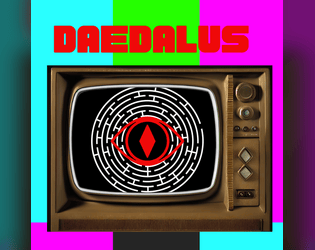
Daedalus
Concept: “A playable adventure zine compatible with Cy_Borg. This is my take on a cyber punk dungeon crawl. Probably better for more advanced characters. This hasn't been play tested so any notes or suggestions are appreciated!”
Content: A job to rescue a mob boss’s daughter from a booby-trapped maze.
Writing: Tons of informative detail to set up a GM well for running their players through a deadly labyrinth.
Art/Design: A lot of red, black, and white in a variety of aesthetics, complemented by occasionally different page styles (often in the form of digital interfaces/pop-up windows). Illustrations are provided to help set the stage for different elements of the job and to highlight NPCs. A keyed map of the maze is also included.
Usability: Font choices are visually readable with solid contrast on most pages. However, text is not embedded so no searching/selecting is possible.
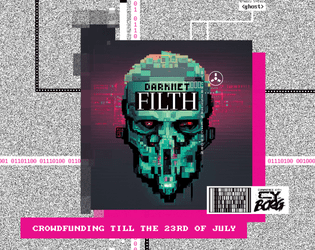
Darknet Filth
Concept: “404//SAN is the demented frontpage of the NET, where manifold rumors, advertisements, hoaxes, and conspiracies produce a worthless information sludge. Still, more than enough masochistic users flock to the site to be entertained by trolls or cheated out of their life's savings.”
Content: A one-stop shop for adventures/scenarios, NPCs, monsters, apps, cyberware and equipment, additional rules ideas, and more.
Writing: Every page provides dozens of imaginative and enticing ideas for inspiration, with many pages offering highly engaging in-universe descriptions or framing for their game content.
Art/Design: A variety of artistic and aesthetic styles that embody the artpunk philosophy. The browsing experience feels in line with the CY_BORG rulebook itself.
Usability: Requires close, and often slow, examination to identify and make effective use of content (text and image alike), especially when moving across very differently styled spreads–but very worth the effort.
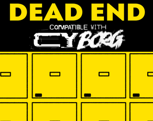
Dead End
Concept: “Henri, a connected security guard contacts the PCs. A legendary cyber killer has died and ended up in the morgue. Easy credits can be earned, one just needs to break in and strip off some of his cyberware.”
Content: A job to retrieve a cybernetically enhanced skull from a morgue.
Writing: Lively setup and detailed considerations of different events that might occur or approaches the PCs might take allow for a variety of engagements with mission parameters and unexpected hiccups.
Art/Design: A mix of black on white and yellow/white on black text accented with several NPC illustrations and a well-labeled map (and an unlabeled map to give to players).
Usability: High-contrast text and clean, recognizable layouts with consistent presentation of distinct kinds of text/content make navigation and reading easy.
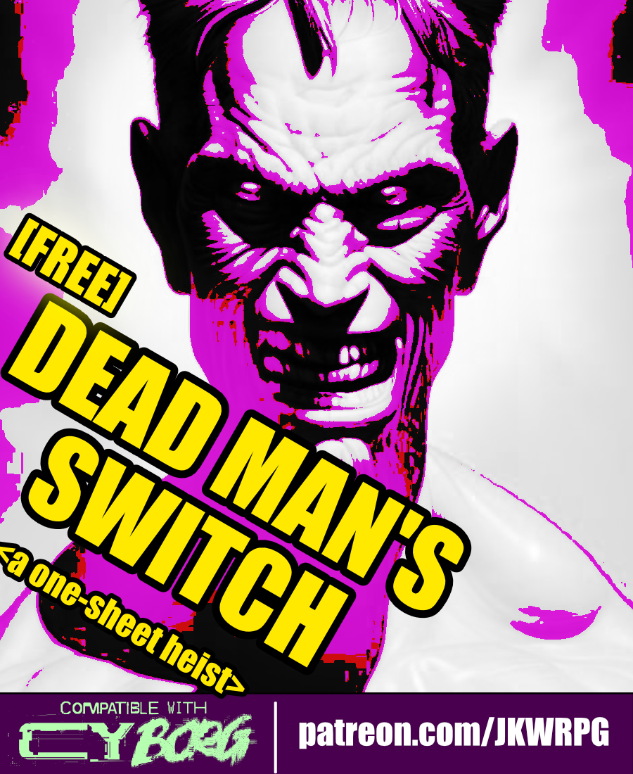
Dead Man's Switch
Concept: “Emily Radfield, a ripperdoc based in westside Laketon, received a postmortem message from her friend, Sarna---a dead man's switch. Emily hires the PCs to infiltrate a cyber-scav chop shop and recover Sarna's remains. She also wants the PCs to ‘kill as many of those scum-sucking assholes as humanly possible.’”
Content: A gig to infiltrate and retrieve a body from a scavenger stronghold.
Writing: Plenty of details to outline what the deal is, who’s involved and why, and what a GM can spring on the PCs as they seek out their target.
Art/Design: Ultra-wide four-column layout, with three columns of text on the left and a map of the chop shop on the right. Black-on-white color scheme complemented by color highlights in and around the map.
Usability: Each section of content is consistently presented, with distinct whitespace and border use to indicate particular kinds of content. Bold and italics help to emphasize key elements GMs may want to attend to.
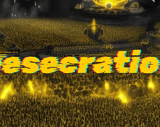
Desecration
Concept: “1EDX is the biggest viscpop band in all of CY. Now, their songwriter has contacted a bunch of punks to try and 'kidnap'--that is, free--them from the clutches of the band. Currently, they're in 1EDX's luxury mansion compound. But it's just the time for a rescue op, as 1EDX is opening their doors to a few lucky winners of a raffle for a tour of their mansion. Act fast.“
Content: A scenario to infiltrate, locate, and liberate the abused talent from the city’s biggest pop stars. Two versions of content included: "Classic Look" and "Squeaky Clean."
Writing: Plenty of engaging detail to flesh out the locale, the situation, and the NPCs that the PCs might encounter, including some juicy secrets for the GM to incorporate or have the players discover as appropriate.
Art/Design: Primarily black, single-column text on yellow, with some color-coded labels to indicate particularly important details and (near the end of the supplement) approaches to the mission. Clean, lo-fi overhead map layouts of the mansion with color-coded layouts and labels. An image of a massively populated concert frames the adventure title on page 1.
Usability: Color-coding helps tremendously to relate particular elements to one another, and layout allows for quick navigation and identification of desired info. “Squeaky Clean” version is included for even easier reading, and more printer-friendly, experience (black on white with less color use throughout).
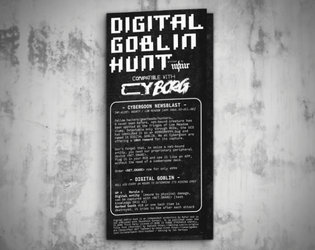
Digital Goblin Hunt
Concept: “Fellow hackers/gearheads/hunters, A never seen before, net-bound creature has been spotted at the fringes of Low Meadow slums. Detectable only through RCDs, the UCS has identified it as an #ERROR#999.bug and named it DIGITAL GOBLIN.”
Content: A contest to capture a goblin hiding out somewhere in the net.
Writing: Ten locations where the goblin could be found, described with brief but vivid details and complemented by tests and events that occur when exploring each.
Art/Design: White-on-black lo-fi “1Bit” pixel/ASCII art aesthetic arranged as a trifold pamphlet, with mission and location specifics on the outer panels and a large map of the region across the inner panels.
Usability: Visually apparent consistency in design grammar to distinguish different text content (headings, GM notes, etc.) and aid with navigation to desired info, with each location’s text beside a relevant graphic of that location taken from the area map.
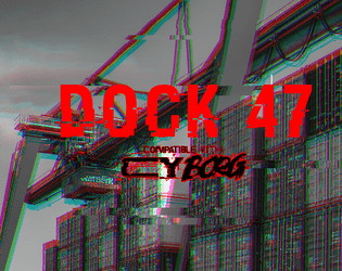
Dock 47
Concept: “You are hired by one of the most prominent gangs in CY. Your target is their former high ranking officer, Marco D’Elysio. Marco, after ratting out on his own organization, was promised immunity. The police, as usual, didn’t give a shit about their promise and left him out in the cold. He is now trying to escape in a cargo ship. But there are some complications - the engine is busted and the captain is missing. Dock 47, where the ship is sitting, is closed and full of bodyguards, those who are still loyal to Marco.”
Content: An opportunity to assassinate a rat on a docked vessel.
Writing: Several lists/tables relating to the gig/location are provided, as is a set of optional challenges for the punks to complete. Each of these entries offers a very brief but characterful dimension to the job.
Art/Design: Wide spread with text on the left and labeled maps of the ship and dock on the right. Almost entirely black-on-white except for the adventure title.
Usability: Font choices are easily readable and each section is consistently organized to quickly identify and navigate to desired info. Unfortunately, text is not embedded, so searching/selecting is not possible.
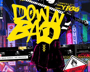
Down Bad
Concept: “Adventures in the cursed sprawl.”
Content: A set of adventures as well as solo rules (“Neon Borg”) for exploring different facets of life as a punk in CY.
Writing: Every page has five pounds of flavor stuffed into a one-pound bag: descriptive details, informative suggestions for GMs, additional tables, alternate outcomes, and typically infused with bone-dry humor.
Art/Design: A mix of black-on-white and full-color page layouts as well as a variety of fonts and organizational schemes. Maps in different styles and occasional illustrations of NPCs and atmospheric scenes complement the text.
Usability: Despite variety of page layouts etc., text is mostly quite readable visually (thanks to contrast and font choices) and searchable/selectable. Use of accent colors helps draw attention to particular info elements on assorted pages.
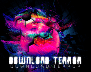
Download Terror
Concept: “A group of rich fucks kidnaps vulnerable, poor, and homeless, forcibly data-rips their minds to mint NFTs of them. Those suit fuckers keep them as trophies, trapping their concsciousness in a neverending digital nightmare. In the attachment there are the coordinates to one of their rip-labs. Infiltrate it, find the access keys to their mainframe, and let us in. We can end the victims’ suffering. There might still be survivors – help them. Kill any suit and pig in sight, they’re all in on this. Do this and we will erase your debt. Cross us and we will erase your life. Do well and you will hear from us again. Show no mercy. Your answer Y/N:”
Content: An adventure that offers players a chance to be “heroic” through relentless vengeance.
Writing: Tons of incredible details that flesh out the adventure, from room descriptions to soda machine choices to the results from various PC ability checks. There’s a staggering amount to work with here.
Art/Design: Each page is an eye-watering burst of psychedelic glitch/digital art that mixes with overhead map layouts and informative blocks of text. There's never any doubt this is a CY_Borg adventure, to be sure.
Usability: The psychedelic color scheme/aesthetic can be overwhelming to some, and there are occasionally text blocks that might be a bit difficult to read, but overwhelmingly each page works really well to communicate important information through text and graphics (maps, monster blueprints, etc.) with a visual grammar that can be picked up quickly if one’s willing to take the initial effort
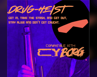
Drug-Heist
Concept: “A CY_Borg adventure for three or more players. A heist mission on a boat with a twist ending! Sneak around and find the stash or go in full John Wu action style.”
Content: A job to snag some drugs from a boat that sounds (and, of course, is) too good to be true. Details for two additional/rival teams of NPC punks are also included.
Writing: Terse details for each of a number of dimensions of the job, from info-gathering to specific rooms/areas of the ship itself.
Art/Design: White text on (mostly) dark background illustrations, organized on different pages either single-column or double-column (text and graphic) layouts. A clean black-on-white version is also provided.
Usability: For the full-color version, font is mostly readable thanks to high contrast of fore/ground on majority of pages. Visually, some pages have “busier” background illustrations than others, which can complicate reading/navigation (made much easier in the black & white version).
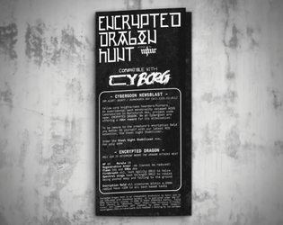
Encrypted Dragon Hunt
Concept: “Fellow corp knights/nano hoarders/hunters, An experimental mech monstrosity escaped ACGS laboratories in Burnchurch Hex, project code name: ENCRYPTED DRAGON.”
Content: A job to destroy a technological abomination in an industrial hellscape.
Writing: Brief but powerful descriptions of locations, threats, and goings-on complement the mission premise.
Art/Design: White-on-black “1Bit” aesthetic that resembles lo-fi pixel/ASCII art, presented in a trifold pamphlet layout with job & location info on the outer panels and a large map of the area across the inner panels.
Usability: Trifold pamphlet layout provides textual information (basic parameters, location specifics, etc.) on outer panels and a map of the mission area on the inner panels.

Enter Red Room
Concept: “The rumors spread like blood leaking from a wound. Everybody knows somebody who watched a red room. Some of those people have disappeared, others claim to be continual viewers. No matter what they say, you have stumbled upon a supposed invite for a red room in a dark corner of the net. A door stands in front of you, screams heard from the other side. Do you dare open the door? Do you dare enter the RED ROOM?”
Content: A cluster of plot ideas, relevant rumors, and random table additions to set the stage for a mission focused on the mysterious red room.
Writing: Brief but clever details to help assemble a suitable job for a group of net-interested punks.
Art/Design: Two columns of black text on a dark red background, with a cover/title page showing two doors, one labeled ‘yes’ and the other ‘no’.
Usability: Text contrast allows for readability, and each list is easily distinguishable from the others to facilitate navigation and identification of specific info.

Family Business
Concept: "Your head feels heavy as you lift it from a pool of your own drool. The buzz intensifies, ads crawl toward the center of your screen like worms marching toward a corpse. Messages from your employers are listed in the background, giving you no quarter...
Family Business is the new gamebook, a.k.a. choose-your-own-path book, for CY_BORG. Dive into a dystopian, ad-ridden world where your choices determine your fate. Along the way, you'll create characters fully ready for use in your CY_Borg games... assuming you make the right decisions and survive corporate hell."
Content: A game book through which to experience the thrill of life in an ultra-capitalist dystopia.
Writing: Wry, tongue-in-cheek narration, with myriad decisions and paths to explore, that can keep a reader grounded amid the crushing immersion of this futuristic hellscape.
Art/design: Single-column text of white on black boxes (with a red/black tech-themed background pattern underneath) as distinctly numbered entries that are consistently formatted with clear heading numbers. Occasionally, in-universe ads are inserted amid the blocks, and on rare occasions there is entry text formatted differently to accent its purpose and exceptional nature.
Usability: Text is (generally) consistently presented, with a hyperlink to each possible destination entry, and breaks from the typical format are visually apparent to function in a way distinct from the typical setup. When dice rolling or specific rules mechanics come into play, they are clearly/directly indicated.
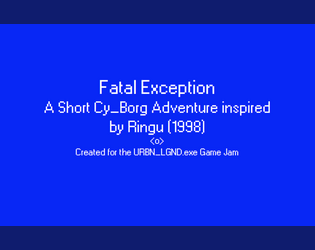
Fatal Exception
Concept: “In the early days of the Net, there were those who saw its potential and sought to harness it. Among them was a naturally gifted hacker who was known to those in the community only as 0nryo. She was one of the first to dive deep beyond the surface and what she found permanently altered her. She spent more and more time diving into the Net, attempting to learn to control it. Eventually people stopped hearing from her. Some assumed her to have gone insane or to have died: black-iced within the Net. However the hackers that would follow her footsteps into the deep would swear that her consciousness remains within the labyrinthine web of data that makes up the Net, waiting for those foolhardy enough to go in too far. These rumors were given new life when a hacker group ventured in searching for her and died a week later.”
Content: A mission to deal with a curse from a fabled hacker’s app cartridge.
Writing: Tons of detailed description of the mission site, unfolding events, and background lore for the GM to employ strategically.
Art/Design: Primarily single-column white on blue, with a gridded map of the destination oil rig and an instance of thematically appropriate glitch text/art.
Usability: Distinct content sections are marked with visible decoration, while major headings are immediately evident as larger text. Directions from each room to others are also helpfully provided.
Loading next page...