Jobs/Missions
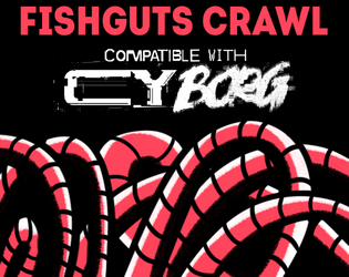
Fishguts Crawl
Concept: “Sveri Suplex, up-and-coming cybertech influencer has lost it and joined a cult of neoprimitivists in Mosscroft. His handlers in Tulles&deVerte offer good ¤ for finding and bringing him back to civilization.”
Content: A delightfully disgusting romp through a rotting whale to liberate an off-the-grid social media darling.
Writing: Tons of Lovecraftian and body-horror atmosphere to unsettle punks out for easy creds. Cultist and organ generators provided to help flesh out the locations.
Art/Design: A mix of red, black, and white for text, background, and illustrations (of NPCs, the overall map, interesting objects/phenomena) with one or more columns of content on a given page.
Usability: Visually recognizable and high-contrast headings and organizations of content on each page thanks to consistent decisions with font sizes and color choices. Two player-facing versions of the location map (one full-color, the other black and white) are provided as well.

Gentrifisled ASHCAN
Concept: "At the time of the GØ disaster, a devastating earthquake ripped through the isles. Nuclear reactors located in Nastrond and in Copper Cauldron simultaneously explode in twin balls of hell fire. Ever since, seawater has to be constantly sprayed over the damaged reactor cores to prevent them from overheating, but contaminating the seawater in the process. Now (unfortunately for the residents of GEN) this contaminated radioactive seawater is being dumped back into the Ocean and the consequences could be DIRE!"
Content: An "ocean crawl" teeming with sharks, enemies, and all sorts of weather events with which to challenge punks on the waters.
Writing: Direct, engaging language that remains firmly tongue-in-cheek while peppering atmospheric and in-universe messages among encounter-specific rules and NPC stats.
Art/design: Blisteringly loud, colorful spread layout with an equally stylistic cover. A helpful map of the crawl area accompanies columns of encounter table entries and an illustration of a shark.
Usability: Despite the visual overload, there is a recognizable grammar to the layout and each distinct section of information that makes navigating and locating specific details relatively easy. The crawl map has a helpful accompanying legend to indicate locations & kinds of aquatic terrain to be encountered.
Gigapixel Tower Place
Concept: “For use in CY_BORG as a test for the party on a roadway crossing of Central Cy, with campaign potential in respect of the pikecorps and their use of pikecraft.”
Content: An automotive scenario to complicate punks’ lives as they travel through CY.
Writing: Predominantly in-universe description for the punks themselves, supplemented with brief explanations of relevant mechanics/triggers while traveling.
Art/Design: Two pages, one with a colorful map of the turnpike and general info, while the other features a table with the scenario rules and mechanics.
Usability: Text overlaid on page 1 map has a translucent background to help with readability, while page 2 table uses shading and border emphasis to indicate different cells’ relationship to one another. Map has color coding (green, yellow, orange, red), but it’s not immediately evident as to what the colors represent.
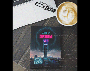
Gods of Greed
Concept: “Deep within the bowels of the city's more affluent districts lies a prominent spire, a shard of rot upon a dying city. The Richter foundation is a deplorable and ravenous organisation that exploits the poor and the sick for profits and gain. Their most recent business model saw them open a rift in dimensions and unleash a torrent of tentacled monsters that sent the general populace insane. The party of easily exploitable fodder are sent in with a corrupt floppy disk to close the rift and send those evil sods back to where they came!”
Content: An adventure that melds Lovecraftian nightmare fuel with a corporate heist/infiltration opportunity. The included “Action Hero” class serves as a perfect means of tackling this endeavor.
Writing: Inspiration-packed descriptions of locations, environmental factors, NPCs, mechanics, and more abound to bring this scenario to life.
Art/Design: Numerous art styles and layouts provide numerous opportunities for engagement with compelling ideas.
Usability: Variety of fonts, page arrangements, and color schemes may make quick skimming/navigation difficult at moments but each page and spread calls attention to important elements for the reader to focus on.

Green Piece(s)
Concept: “Radia Embtell, a junior executive officer of Cynergy Water & Power Co., has been given the onerous task of liberating an offshore oil rig from a group of eco-terrorists calling themselves “the Bitter Suns.” The Bitter Suns’ list of demands consists of but a single item: the immediate ceasing of planetary resource exploitation. “A fantasy, of course. Utter nonsense…” Radia has no idea what the Bitter Suns are planning with the oil rig—and she doesn’t care, either. She hires the PCs to retake the oil rig, “using whatever means necessary. If you can’t do the job, don’t bother coming back—I’ll kill you myself.” Though Radia isn’t one to explain herself to a group of scum-sucking street punks, she’ll let slip during negotiations that Cynergy Water & Power Co. is unwilling to mobilize its corporate military against the Bitter Suns. She will not elaborate on why, however.”
Content: A job to repossess an oil rig occupied by eco-terrorists.
Writing: Mission and NPC details, including intelligent enemy tactics and motives, are seeded with hooks and in-roads to provide players and GMs with unique experiences.
Art/Design: Wide landscape layout with four major content columns (three text columns, one overhead map illustration of the mission site). Black-on-white for most of the document, including a portrait of a key NPC; map is provided on a dark background in the main document, with a color-inverted version provided as a separate player handout image.
Usability: Consistently recognizable headings, borders, horizontal rules, and whitespace distinguish separate content sections, while bold and italicized text calls attention to important terms and information.
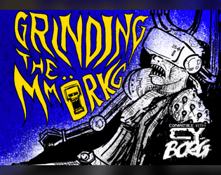
Grinding the MMORKG
Concept: “Want to use Mork Borg modules as a virtual reality simulation in your Cy_Borg game? Or to give your Mork Borg players a taste of Cy? This five-node mystery adventure path introduces the Dying Lands as an MMO game/simulation in Cy and can be approached from either game as a starting point!”
Content: The content centers on an ingenious scenario that blends Cy_Borg and Mork Borg (whether you’re starting in either game!), detailed locations and maps for each, an “emaciated sim-farmer” class that works well for the scenario, a small set of optional rules that the MMORKG facilitates, random encounters, and several pieces of equipment to consider buying.
Writing: A mix of thematic narration, straightforward rules explanations, and direction for PCs to respond to–all of which is presented succinctly and consistently throughout the supplement.
Art/Design: Distinct layouts for each section (major adventure locations, PC class, etc.) that provide individual character about its subject matter, with a bright accent color to help underscore section distinction and scope.
Usability: Despite the variety of page layouts/aesthetics, text is consistently readable and identifiable as different kinds of content (headings, labels, NPC stats, etc.).
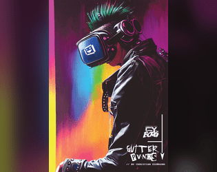
gutter_PVNKS
Concept: “gutter_PUVNKS is a fresh supplement for CY_BORG. You'll get all you need to explore the city of CY, even if you really don't want to. Locations, encounters, NPCs, adventure, two new classes (BROKE CEO & CY_BORG), and a few odds and ends.”
Content: 48 pages of content: NPCs, cults, a radio station, locations throughout CY, random encounter tables, infestations, “broke CEO” and “cyborg” classes, and (amazingly!) more.
Writing: Tons of detail on each page to provide GMs and players with numerous possibilities; writing style oozes the essence of Cy_Borg: thematically grimy and vile and also compact rules/mechanics explanations.
Art/Design: Layout and aesthetic choices for each section are as varied and imaginative as the writing, contributing significantly to the fullness of immersion in the game universe and vibe.
Usability: “Consistency” is somewhat relative here–although there are many different layouts, aesthetics, etc., there are similar gestures throughout: highlighted headings/labels, text size to reflect hierarchical relationships between content, etc. so that navigation and identification of desired info is enjoyable rather than frustrating. Contrast is high throughout as well; only one page has a busy enough background to potentially slow reading.

Heads Frozen in Vaults Enduring
Concept: “Escort a live streamer into the G0 wasteland in search of an underground cryovault! More action means more viewers, and viewers are creds. So remember to smile for the cameras while the nanophreaks shred your face!”
Content: A job to make sure a streamer survives a break-in attempt to a cryo facility, with extra cash on the line if the stream looks dangerous and exciting. A player-facing map and a ‘frozen celeb head generator’ (for potential inclusion in the cryovault) are also provided.
Writing: Tons of imaginatively expressive details provided in brief phrases and statements so that a broad range of locations, enemies, and unfolding events can be mentioned.
Art/Design: Trifold pamphlet layout with mission parameters on the outer panels (with a white-on-black color scheme) and the location/NPC specifics, along with a map, on the inner panels (with a black-on-white scheme).
Usability: Visually apparent organization/arrangement of content, with distinct headings, labels, and section borders to more clearly indicate scope and relation of each to the others. Room descriptions even include references to other rooms via map/description labels for quick navigation.

Highline Hijack
Concept: “CY’s corporate elites soar over the city aboard the Highline, a private maglev train known for its exclusive drug-fuelled raves. But tonight the Highline plays host to more than just high fashion and designer narcotics. A weapon is being smuggled aboard the train and you’re being paid handsomely to extract it. Get on the train, get the goods and get out of there before any junked-up plutocrats figure out who you really are.”
Content: A job to swipe a smuggled mech from the Virid Vipers while aboard a private train. A player-facing handout with some information about the train layout & contents is also included.
Writing: Lots of concise details about relevant train cars, passengers, events, and more impressively stuffed into several pages.
Art/Design: Black-on-white clean aesthetic (for both the mission details and the player handout) using multiple columns on each page with several sleek maps/diagrams to help situate the job and its variables.
Usability: High-contrast and consistent use of fonts, arrangement, emphasis, borders, etc. all contribute to quick and effective navigation and identification/location of information.
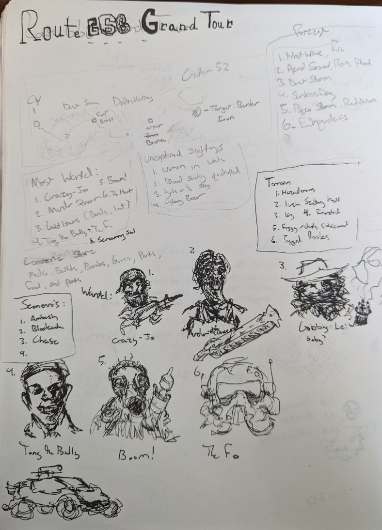
Highway 666 Grand Tour 1 Page Concept
Concept: “Wasteland adventure with mad bandits, cannibals, and unspeakable things that hide in the badlands. The completed project would have tables for natural and unnatural weather events, terrain, vehicles, warbands, loot, and combat scenarios.”
Content: A stripped-down one-page highway adventure/crawl.
Writing: Very little detail, with tables of brief options (most wanted NPCs, unexplained sightings, terrain, and more).
Art/Design: Handwritten text in several boxes across three major columns of content, framed by a simple map of the adventure above the text and a series of portraits below, along with a sketch of a car.
Usability: Some text may be very difficult for some to read, both in terms of the handwriting legibility and the variable contrast of pencil and ink on scanned paper. Content is provided as a .png, which will further reduce potential readability (as text is not embedded).
Holographic Black Capes
Concept: “Lhamo Rigosa, the biggest horror vidstar in CY is dead. But their co-star has been receiving incomprehensible voice notes from them. And was that stream coming from inside a coffin? The transmissions are coming from the set of their new film but hasn’t that been abandoned?”
Content: A scenario based on Bauhaus’ “Bela Lugosi’s Dead” that gives PCs a chance to engage in a horror/slasher adventure.
Writing: Vividly detailed descriptions of scenario setup, locations, items to discover, and NPC motives/perspectives are all tinted with a macabre flair.
Art/Design: High-contrast text on dark background across three spreads, with a bright orange grid map of an abandoned movie set.
Usability: Consistent color and font choices provide easy identification of and navigation through scenario content.
Ice Bath Killer
Concept: “‘You woke up in a bath of ice And they’d removed an organ!... Was it expensive?’ ‘It was natural!’”
Content: A gig to investigate organs stolen by a group of purists.
Writing: Plenty of details surrounding the job–people, places, motives–and guidance as to how a GM might want to approach it in different ways.
Art/Design: Trifold pamphlet layout in white and neon colors on black, with NPC portraits and a map of a key location. An additional page of player handouts is included (breaking news and a simple map of the district).
Usability: Different kinds of content are distinguishable by color and ‘box’ shape, with bolded and colored labels to call attention to key details. A few blocks of text are angled and rasterized, but vast majority of text is selectable/searchable. Map is helpfully overlaid with room/space details in each room/space.

In the Court of the Crypto King
Concept: "A light-hearted scenario, designed to be played in one session. Players will explore a recently-uncovered ancient facility, defeat a range of unique threats, and contend with a virulent horror from the world-that-was: blockchain technology."
Content: An opportunity to investigate long-buried ancient technology and ignore dire warnings about the blockchain.
Writing: Tongue-in-cheek tone throughout that balances the scenario's absurdity with the highly lethal threats inside it.
Art/design: White and pink text and illustrations and collages on black, along with a GM- and a player-facing map of the job location.
Usability: Text is high contrast and uses visually readable font choices, with organization allowing for quick navigation to and identification of desired info.
Jarhead
Concept: “Tales of wealthy eccentrics having their heads cryogenically frozen, have been around for a long time. They can't really be true, can they? Raid an automated facility to make off with some corpo's frozen noggin' for phat creds with this easy to integrate Urban Legend.”
Content: A set of quick job hooks that can stand alone or be inserted into other jobs/missions a group of punks might pursue, along with a map for a typical cryogenic storage facility.
Writing: Terse descriptions and setup leave much up to the GM, but there’s enough presented with a particular attitude in mind that can guide how to frame the gig(s).
Art/Design: A wide spread of job info presented as white text on blue sidebar and a full-color gallery of the target heads-in-jars (note: although they’re decapitated heads in jars, the images aren’t gory), with the map provided as an additional one-page blueprint-style white-on-blue.
Usability: Text is easily distinguishable in terms of content sections and the purpose for each, with a recognizable organization scheme to facilitate browsing and locating specific info.
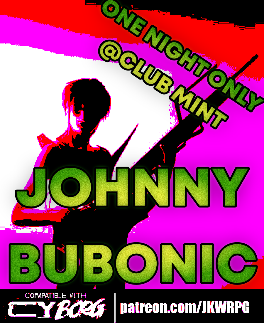
Johnny Bubonic
Concept: “Gort Phaserbekker, former front man for the mega-hit deathcore-noize band ACCESSORY TO INSANITY, has a special request for the PCs: kidnap the guy who replaced him. ACCESSORY TO INSANITY is playing a show at the “highly exclusive” Club Mint tomorrow night. Phaserbekker can get the PCs some tickets—aside from that, they’re on their own. He doesn’t give a shit how the job gets done: his only stipulation is that the target is returned alive.”
Content: A revenge mission to kidnap a musician who’s made his predecessor a has-been.
Writing: Packed full of details about goings-on at the club to provide a table with multiple sessions of fun while pursuing their target.
Art/Design: Wide two-page spread with a map of the club on the right, an illustration of a musician at the bottom, and several columns of text regarding the mission, the location, random events, NPC stats, and more.
Usability: Text is easily scannable and readable, with consistent presentation to ensure identification of desired info.

KILL ENGN
Concept: “A metal frenzy, mech-infused expansion. High-tech machines, renegade pilots, & corporate tyranny_”
Content: Tons of information (across 60 pages) about mechs and how they might fit into the world of CY, complete with creation/generation rules, relevant NPCs/enemies, gear to upgrade with, new rules and mechanics to incorporate, a new class ("The Chrome Jockey"), and even some floorplans for potential jobs. Additionally, a job (really, a mission involving multiple potential job leads)--"Cast Oubliette"--is included, along with an overhead map of one area, for stretching pvnks' figurative mech legs.
Writing: Ideas galore on each page, some of which are easier to situate than others, but all of which exude inspiration about mech-related activities.
Art/Design: The Cy_Borg core rulebook aesthetic is emulated here more closely than in any other 3rd-party product reviewed thus far, grafting designs from many of the core book’s spreads among more distinct layouts.
Usability: Each page/spread has its own visual language, but there are cues in each to indicate consistent presentation of distinct content. Like the core Cy_Borg rulebook, the radical shifts in aesthetic may initially be overwhelming for some to engage.

Krok Hunters
Concept: “Kroks lurk beneath the neon giants, prowling the drug-laced wastewaters high society discharges [flush by flush]. Moneyed aristocracy adores the animals’ hardened skins, cladding themselves in the hides of once sentient beings to project a capitalistic air of murderous consciouslessness.
Descend into CY’s sewers to harvest hides, fight the legendary King Krok, and other nasties.”
Descend into CY’s sewers to harvest hides, fight the legendary King Krok, and other nasties.”
Content: A trifold pamphlet job to seek out and collect sewer-dwelling creatures’ hides.
Writing: Lots of terse descriptions and notes about assorted locations, inhabitants, and potential encounters for punks to deal with below the streets of Cy.
Art/Design: Black-on-yellow and black-on-white trifold layout, with page two including a simplified/abstract map of the sewers that also serves as a set of content section borders. A photograph of a large crocodile serves as the cover art. A black-on-white printer-friendly version is also provided.
Usability: Consistent presentation and layout of content allows for quick navigation to and identification of desired information, and the sewer map visual overlay/integration complements the text descriptions of relevant locations.

LABU BORG
Concept: "An adventure inspired by Labubu/ Borg lovers and haters alike!"
Content: A Labubu-inspired set of rules including assorted tables for NPC creations, two player classes ("LabuBorg Cosplayer" and "Gacha Survivalist"), weapons and combat tactics options, and even a dungeon/mission that can be played solo or with a group.
Writing: Tongue planted firmly in cheek for atmospheric descriptions that also work incredibly effectively at establishing a sinister tone for what the Labubu phenomenon might look like cranked to 11 in a cyberpunk hellscape.
Art/design: Purposefully similar to the main Cy_Borg rulebook aesthetic and even specific page layouts.
Usability: Despite the variety of page organizations and color schemes, a consistent visual grammar makes it easy to identify and navigate to desired info.
Last of the Good Ones
Concept: “Somewhere in G0: A naniteinfested monstrosity is trying to help those tossed to the turrets within the cement walls of G0. Within the confines of the abandoned CY Central Mall, a monument of capitalism now a battle ground between 4 factions, The Heir of Kergoz, Virid Vipers, an other worldly being know as Vecbod, and a relentless horde of mushroom brained zombies. It doesn’t matter if you’re here out of desperation or curiosity, having a safe house in G0 is worth hearing”
Content: A mall crawl for survival in the shadows of an ominous otherworldly threat.
Writing: Imaginative and disturbing ideas abound, giving GMs and players alike plenty of unexpected encounters, creatures/NPCs, and opportunities to run wild with.
Art/Design: Two-page spreads packed with visually loud and abrasive aesthetic choices that reflect the chaos of the scenario itself.
Usability: Progression through the document reveals locations and monsters as players would encounter them. A wide variety of layouts, color schemes, font choices, and text size can make some content easier to locate and read than others.

Law&Disorder
Concept: "Hello punks and rebels, this is a DLC for the CyBorg ttrpg, - Law&Disorder. DLC focuses on the theme of the urban rebellion against corporations."
Content: ~44 pages of new rules (chases), gear, classes ("Oldschool Edgerunner," "Glitch Witch," "Pale Jester," "Analog Outlaw"), enemies, and a mission/area to explore that goes beyond the bounds of Cy itself.
Writing: Lots of information with a focus on explanatory details about new rules, mechanics, abilities, etc. relating to page content.
Art/design: Distinct two-page spread aesthetics with a consistent visual grammar throughout via text blocks on contrasting background boxes and body text fonts. Lots of illustrations throughout to complement the focus of a given spread.
Usability: Font selections and text contrast, along with an easily navigable/perusable TOC, assist with readability and allow for easy browsing and identifying of desired information.
Left Side Drive
Concept: “You must have fucked up to land here… (a sendoff for some dead punks) A hyperliminal album crawl set to "Trans Canada Highway" by Boards of Canada.”
Content: An atmospheric road trip through and beyond CY.
Writing: Atmospheric phrases paint broad strokes for each component locale and the people or things that might be encountered along the way.
Art/Design: Two columns of content with separate content boxes for the album tracks and relevant content. Black on light green color scheme with pink accents. Stripped-down map of locations help indicate possible trajectories for a traveling party.
Usability: Readable fonts with high contrast color choices and consistent embellishments and whitespace to indicate headings/labels, list items, atmospheric descriptions, and so on.

Leviathan
Concept: “A vital drive, loaded with data worth millions to the Virid Vipers gangster coalition, has been lost in the sewers of CY. Something down there apparently ate the agent they had carrying it. Fortunately, the geo-tag still works, and the slumlord whose territory it was lost in is desperate for someone to find it before the Vipers toss him into the dank and filthy tunnels to find the thing himself. There's just one lethal detail that's been overlooked, lurking in the sewage…”
Content: A dungeon crawl to recover valuable cybertech from a monster stalking the sewers.
Writing: Imaginative descriptions make each area of the mission seem unique and dangerous, with relevant NPCs pursuing their own agendas.
Art/Design: Single column of text with black-on-white scheme, occasionally complemented by NPC portrait illustrations. A colorful, stripped-down map of the sewers is also provided.
Usability: Font choices are easily readable, and headings, labels, and key information are consistently bolded for visual emphasis. Movement table notes procedural logic for optimal use.
LTTPR VR CAFÉ
Concept: ”The VR Café is owned by Lotta and Perr, a hardworking couple that, strapped for cash, went to Örken, who agreed to relieve them of their debt. In return he now runs an underground operation stealing children’s imagination to create CREATIVITY_JOURNEY--v4 a drug sold under the counter.”
Content: A seedy VR cafe that’s so much sketchier than it appears–and only maybe will the punks be ready for the trouble that awaits.
Writing: Lots of flavorful sensory descriptions of the goings-on in each room of the cafe that helps immerse players into the situation.
Art/Design: Left third of the page is an overview of the locale and potential reasons for being there, while the remaining space on the page has a map with labels and room-specific information.
Usability: High-contrast text and bolded labels and distinct headings make reading and navigation easy, supported by lines to map areas (with a particularly ingenious staircase-shaped line connecting the upstairs office to its details).
Magenta Pages of Cy_
Concept: “A collection of one-page, one-shot gigs for your favorite sci-fi RPG, with Cy_Borg compatible stat blocks.”
Content: Several adventures, each on its own two-page spread. Two have been previously published individually: “No More Heroes” and “The Trouble with Ta1l-Yp-0.”
Writing: Each adventure provides a focus on description and ambience, supported with brief mechanics (NPCs, random encounters, etc.) for GM use.
Art/Design: Some adventures are provided with a map on the right-side page, while one has a hand-drawn illustration of a key NPC in its habitat. The left side of each adventure is black-on-white text arranged in one and two columns of distinct content sections.
Usability: Fonts are readable, with visually evident features for headings, labels, and body text (which might differ between each spread but is consistent for a given adventure). Borders and white space help separate distinct text blocks.
Meat in Mosscroft
Concept: “There are rumors of a warehouse owned by Gene Industrial in Mosscroft containing actual real steaks. These Bromaha steaks are supposedly in a huge walk in freezer, and they should get collected before word gets out. The street gang is offering 2d10 x 1K credits for the steaks. If they accept, Nimo will provide a small piece of paper with the address of the warehouse.”
Content: A beef break-in with the bonus of beaucoup bucks.
Writing: Deadpan descriptions lay out the absurdity of the situation, which should help a GM create a unique and memorable experience for their table.
Art/Design: Landscape-oriented pages with bright colored text on black background accompanied by relevant images of NPCs, corporate logos, and a simple map of the target facility.
Usability: Almost every block of text is a different color and font or text size than the others and positioned differently on each page, but each font is easily readable and all text is embedded for quick searching/selecting.

Meat&Greed
Concept: "The Meat Might Be Fake, but the Greed Is Real!"
Content: A pair of jobs (one to free animals from a meat plant, the other to procure an item from G0), a mall to explore, a number of NPCs, and several tables of gear, status effects, chat messages, and more.
Writing: Evocative descriptions complemented by concise rules/mechanics that underscore the essence of their subject.
Art/design: Distinct spread layouts with intense colors, text, illustrations, and arrangements thereof.
Usability: While some spreads are visually busy, text is overwhelmingly presented in high contrast with a clear visual grammar for the layout, leading to easy navigation and identification of desired info for ease of reference & use in a game.

Metromancer
Concept: “Deep beneath CY lies the abandoned subway system, that was carved from the toxic earth by ancient and blackened technocratic mole machines branded with the sigil of Alliansen inc. A caliginous place filled with misfits, filthy vagrants, and whatever makes that fucking noise in G0, A grim network of fever dreams, unknown spore cvlts, rogue Ais and reality-bending technology. You will die here, horribly.”
Content: A set of NPCs, factions, locations, plot hooks, rules, tables of all sorts, equipment, and classes (the “Batshit Chaos Punk,” the “Archaic Stranger,” the “Derelict Street Fighter,” the “Symbiotic Sage,” the “Hyperjunky Chemist,” and the “Grafted Herald”), all of which are focused on the subway environment/ecosystem existing beneath CY.
Writing: A plethora of imaginative detail to entice and disturb would-be subterranean explorers. The classes in particular provide a clear and intriguing means of connecting a punk to one of the organizations making its abode in the subway tunnels.
Art/Design: A variety of distinct spreads that make use of messy illustrations, ASCII art maps, glitch aesthetics, and bright colors with a variety of typefaces.
Usability: Much of the content is provided in high contrast and embedded text for easy visual readability–headings are frequently the most difficult (and non-embedded) elements to decipher. The book is organized by content type, facilitating easy navigation to the desired info (locations, classes, etc.).
Mia's Day Off
Concept: “Masato Dvorak, a Virid Vipers crime lord, needs someone to take Mia Dvorak—his wife—out for the day. He instructs the PCs to bring Mia to the Kaytell Makers Proudly Presents: Fun!™ corpo-amusement park; their job is to keep Mia safe—and, perhaps more importantly, entertained—during their visit. Mia has had a few of these “outings” in the past, and she’s yet to have a caretaker survive. Word around the campfire is that her last one, Antwan, ended up ‘thrown off a building into a glass motherfuckin’ house. Since then, he’s kind of developed a speech impediment…’”
Content: The PCs get hired to babysit a crime lord’s daughter, and fun ensues.
Writing: Concise, informative details about the mission, NPCs, and relevant events to complicate matters.
Art/Design: Four columns of content across a wide one-page layout, with a map of the amusement park on the far right. An illustration of Mia and of roller skaters complements mission text. A player handout of the amusement park map is also included.
Usability: Consistent presentation–headings/labels, whitespace, and borders–makes it easy to identify and distinguish sections of content and important details (NPCs, stats, etc.).

Mind Rot
Concept: "What place could be more twisted than inside the mind of a hacker obsessed with bloody holo sports shows and has merged consciousness with a reckless sentient AI? Venture into their minds and free her from this prison, or seek a more chaotic and potentially profitable conclusion."
Content: A virtual reality mission to rescue a hacker from her own brain.
Writing: Tons of informative and descriptive details about the scenario, locations and phenomena to investigate, provided in a direct and conversational tone.
Art/design: Primarily black-on-white two-column layout accented with shades of blue, with NPC illustrations and a map (player- and GM-facing versions included).
Usability: High-contrast text in readable fonts, with consistently formatted headings, labels, etc. to indicate specific kinds of information, all organized in a manner that allows for easy navigation and location of desired details.
MISERYS_KEEP
Concept: “An Heir of Kergoz has cracked a forbidden code and is using a coterie of childlike CYDROIDS™ to bring out the end times. It's up to you to hunt him down in his keep at the edge of G0 and end this madness.”
Content: A job involving a doomsday ritual that needs to be interrupted/prevented, presented in one of a number of different ways (via the parameters of Phil’s TTRPG Layout Jam 2023).
Writing: Several key variables have been tweaked from the default adventure copy to more seamlessly integrate the adventure into CY.
Art/Design: Presentation reflects an early Atari-style video game map/booklet layout with black-on-white scheme (and occasional blood spatter), with each room’s description/contents provided in text beside the location map where the relevant room has been highlighted in gray.
Usability: Font choices and contrast make for visual readability (although some text is quite small, such as the content in gray call-out boxes beneath some maps). However, text is not embedded, so searching or selecting text is unavailable.

Nano Sickness
Concept: "The PCs previous job has gone badly. In their haste to retrieve the loot they opened the wrong door and were exposed to an unusual fog. They all feel weak and struggle to walk. They eventually find the exit where they are greeted by men in white hazmat suits. Unable to resist, they are bundled into a van."
Content: An escape mission from a secret science facility that includes info for numerous rooms in the facility, enemies populating it, and tables to help flesh out different elements of the scenario.
Writing: Concise vibe descriptions for each location complemented by details for various encounters, opportunities, and other phenomena.
Art/design: Two-column black-on-white text layout, with color illustrations in a hand-drawn style accompany each room/location.
Usability: Each kind of text content (headings, GM notes, NPC stat blocks, etc.) is consistently presented to facilitate browsing and locating desired info.
NEON CROSSES
Concept: “Artificial intelligence has had a divine vision. It is seeking to hire a group of punks to deliver it to the ancient Hill of Neon Crosses located in the center of the forbidden GO district. To fullfil their task, punks will have to deal with a research blacksite and delve into THE NET deep within the Hill Of NEON Crosses.”
Content: A job to deliver an AI payload into an auspicious site in G0.
Writing: A mix of darkly ominous and tongue-in-cheek tones that hew closely to the core Cy_Borg spirit.
Art/Design: Mostly black-on-white spreads with one to two columns of content, with almost every page complemented by neon hand-drawn and glitch-art graphics.
Usability: Consistent presentations of text and page layouts with distinct content sections make for easy perusal and identification of desired information.
NEUROBLAST / PROJECT_CYTØR
Concept: ”Let me get into your hands this state-of-the-last-century HyperCard DiskZine tech stack full of pixel + dither cyberpunk art, interviews with fringe-dwelling outsiders, original reality-dulling cocktail recipes, tabletop game asset connoisseurs and designers, 1-bit tech noir AKIRA-inspired comics, industrial and modular synthesizer musicians, sci-fi urban fiction distopias, obscure trash-culture aficionados, early-90s computer counter-culture, and an original agriTech body-horror adventure for your next MÖRK BORG / CY_BORG game session. Best viewed on a classic Macintosh. Or running in your preferred Classic Mac Emulator.”
Content: A job to retrieve sensitive materials from a facility occupied by eco-terrorists, provided in both a HyperCard program format (available to view in a classic Mac emulator) and in PDF.
Writing: Sensory details, unfolding actions/encounters, and NPC motives abound to bring the mission to life.
Art/Design: Simple single-column layout, presented primarily as plain text with ASCII-art maps and clearly distinguishable headings. A lo-fi black-and-white illustration of a screaming cyborg head is provided on the cover page/card.
Usability: Text is easily navigable and readable, although the HyperCard version and classic Mac environment might be unfamiliar to some readers.
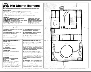
No More Heroes
Concept: “A UCS super soldier lab hidden in plain sight between a dentist and a night club.”
Content: A set of tables to generate jobs for infiltrating a lab and a map of said lab.
Writing: Vivid, unsettling bursts of description in tables (for contacts, job parameters, potential enemies, etc.) hint at possible ways for a GM to implement roll results into a unique mission.
Art/Design: Two-page black-on-white spread with tables on the left and a hand-drawn map of the facility on the right.
Usability: Text content laid out in easily navigable columns with consistent text and border formatting to identify each table’s elements and important names/phrases.
Nuclear God-Lizard
Concept: “A 120-meter-tall monster emerges from the waters around Cy. Its behavior baffles scientists and officials; it isn’t hunting or nesting, it just moves.”
Content: A scenario for surviving the onslaught of an unstoppable roving apocalypse.
Writing: Focused, direct descriptions of a wide range of relevant factors (from available subplots to environmental obstacles to military actions) provide GMs with an immersive adventure/experience for their players.
Art/Design: Current ashcan edition has a simple, barebones layout subject to change when more art assets are finalized.
Usability: Different kinds of content are immediately distinguishable, high-contrast fore/ground colors assist accessibility, and navigation through the document is incredibly easy.
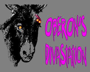
Oberon's DivaStation
Concept: “A small nightclub with a proprietor you must gain the trust of, then kill. Life here is brutal and pointless. Roll the dice, Drink, and Imbibe.”
Content: A gig to kill a club owner.
Writing: Text is mostly atmospheric, including music playing at the club, a drink menu, a drink effects table, a loot table, and a small handful of NPC stats.
Art/Design: Busy pages with lots of bright colors on gray backgrounds, with text and background illustrations, that all together reflect the tone of the mission and feel like a visual representation of the nightclub environment. A labeled map of the club is also provided.
Usability: Variety in font choices, colors, sizes, and positioning (such as over a busy background image/pattern) can drastically affect the reading experience. Text is not embedded, so searching/selecting is not possible.

Operation: Cold Shadow
Concept: “Operation Cold Shadow is a supplement for CY_BORG. This scenario is a starter or early adventure for your party and is designed to test players and keep them on their toes. You'll get to infiltrate and extract data from a place secured by the Virid Viper as an unexpected complication flips the tables. A mechanical class expansion is also available if you wish to transform your players into gruesome machines of destruction. Operation Cold Shadow also includes 9 new enemies in a fully detailed PDF file.“
Content: A seemingly easy gig for punks looking for a quick score that very quickly goes south.
Writing: Helpful details provide about the job parameters, NPCs that the punks will encounter, goings-on at the location, and more.
Art/Design: A mix of full-color digital interface-esque and print aesthetics, with hand-drawn maps and a wide variety of graphics (NPC portraits, background images, etc.).
Usability: Visually, organization cues–distinctive borders and color-coded elements–help guide a reader toward their desired info. However, text is not selectable/searchable which can hinder navigation or screen reader use.
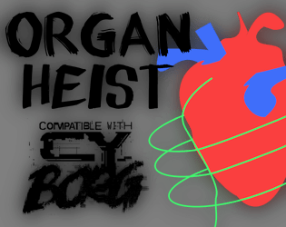
Organ Heist
Concept: “Race against time to grab the coveted cyber-liver, the only thing guaranteed to filter out 99.99% of microplastics!”
Content: A job to nab a high-tech liver from a health care company.
Writing: Focused, terse descriptions focus on mechanics and unfolding events/actions, allowing a GM to inject their preferred atmosphere into the gig.
Art/Design: Trifold layout provides mission parameters/outcome and NPC details on the outer panels and map with room-specific info on the inner panels. Mostly black-on-white color scheme with full-color graphics on title panel and parameters panel.
Usability: Clearly labeled sections of content easily distinguished from others thanks to font choices and border/shading visual decorations, with text info in close proximity to relevant map location.
Penny Slots for Cy_b0rg
Concept: “An arcade location for Cy_b0rg with two jobs.”
Content: A murder-for-hire job and a cred heist in a run-down arcade.
Writing: Concise descriptions of the location and two jobs’ specifics, along with brief NPC stats and complications for each mission.
Art/Design: Black text on a white background, with simple whitespace use to distinguish sections of content. A colorful overhead map of the arcade is provided.
Usability: Text is easily readable and navigable, and different kinds of content (e.g., d6 lists/tables and NPC stats) are quickly identifiable.
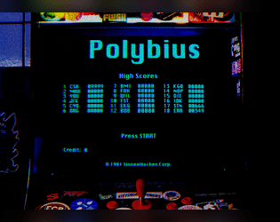
Polybius Arcadia
Concept: “Inspiration for this project was taken from the urban legend of Polybius, an arcade game that might have or might have not appeared in 1981 Portland, OR as top secret, governmental, conspiring, crowdsourced, psychological, mind control experiment. The game was highly addictive, with unpleasant side effects. All game cabinets disappeared without a trace. Polybius was the greatest game that never existed!”
Content: Two supplements: (1) rules for a poker-like arcade game and (2) a job to extract data from an arcade machine.
Writing: Crisp descriptions and directions that sketch the mission parameters & events (along with rumors about Polybius) and the rules for playing the Polybius game.
Art/Design: The Polybius rules are provided in a CRT terminal-like font/aesthetic with a graphic of an arcade game cabinet. The heist details are provided in a clean black-on-white three-column layout with a second page containing a map of the arcade location.
Usability: Each supplement’s layout is easily recognizable and navigable, with visually distinguishable types and sections of content. The arcade heist text content is embedded, allowing for searching/selecting, but the Polybius text content is not.

Project Puppeteer
Concept: “A Corporate espionage assignment…
Extreme security measures…
Mind reading AI…
Quantom Computer Hacks…
Megalomaniacal computer scientists…
‘Don't threaten me with a good time!’”
Extreme security measures…
Mind reading AI…
Quantom Computer Hacks…
Megalomaniacal computer scientists…
‘Don't threaten me with a good time!’”
Content: A “hacker heist” in which a group of punks is tasked with stealing a powerful AI from its laboratory home.
Writing: Lots of descriptive detail about important events, encounters, NPCs, and more, along with some rules relating to hacking the AI in question.
Art/Design: Green on black color scheme and single-column text layout, with a variety of images from illustrations to photos to a map and a circuit board “hacking” map/layout.
Usability: Text contrast allows for visual readability that is complemented by consistent presentation of distinct types of content (headings, list numbering, etc.) to provide a recognizable visual grammar. Some typos throughout may affect browsing/searching.
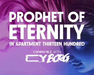
Prophet of Eternity in Apartment Thirteen Hundred
Concept: “All over Cy, people are getting strange calls on their phone and RCDs. Some hang up immediately. Others begin with a robotic “Can you hear me?” A few claim to be from The Prophet of Eternity proclaiming a new era of AI that will free the city.”
Content: A mission to deal with a robocaller cult on behalf of a group of anarchists.
Writing: An impressive amount of description re: job parameters, goings-on, cult NPCs, and location-specific sensory details.
Art/Design: Trifold pamphlet layout, with initial job info on the outside (with a statuesque portrait as its background) and tables/lists featuring assorted details on the inner panels in a black-on-white scheme, complete with a labeled map of the destination apartment complex. A black-and-white player-facing handout with map and initial job details is also provided.
Usability: Content sections are visually distinct and consistently styled to facilitate navigation and identification of desired information, complemented by color-coded map labels.
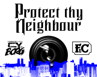
Protect Thy Neighbour
Concept: “In 20 hours Alliansen Inc. is sending an automated Xplorer Mk I , a heavily armoured drone operated by an AI, to clean up an old tower in Bigmosse. The drone will be deployed from the Security Centre in South Central and is to make its way to the housing block in the slums. This is a routine operation so unimportant that the only verification required is a geo-located live feed of the pile of rubble after the explosion. Which makes it the perfect occasion to put corpo property to public use.”
Content: An escort mission perfect for fans of two- and four-wheeled mayhem.
Writing: Focused and direct descriptions of involved parties, locations, events, and conditions that should help kick GMing this adventure into high gear.
Art/Design: Trifold layout (with a screen-based version as well) with a cityscape image serving as a general map for the escort route.
Usability: High-contrast fore/ground with occasional blue highlighting, bolded text, and particular fonts used to indicate different and specific kinds of content throughout the pamphlet.

Punk Borg
Concept: "The CITY. The postcards and magazines make it out to be a perfect metropolis - sun, sea, sand, and a vibrant and buzzing city centre. Of course, that's how the Overlords want you to see it; it's the image they feed to the Sleepers. They fail to mention their enforcers are all boar-like beasts, and the fact that giant space rock buried under the City is making us all sick. Time to wake those Sleepers up and show 'em just how ugly their bosses really are. We're gonna crumble the Overlords' regime to dust, whatever it takes."
Content: A hack of Cy_Borg that provides a less cyberpunk and more "present day" dystopia to explore and rebel against, with classes, enemies, vehicles, a mission generator, an entirely new city to inhabit, and more.
Writing: Laser-focused atmospheric description and rules/mechanics that work together to contruct a game of antiauthoritarian punk resistance.
Art/design: Black-and-white pages/spreads that, while distinct, provide a consistent visual grammar of information throughout. Lots of hand-drawn illustrations of classes, NPCs, and environments to complement the text.
Usability: High-contrast text and layouts with visually identifiable section blocks, headings, labels, etc. and a helpful index all work to facilitate browsing, navigating, and locating desired information.
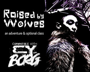
Raised by Wolves
Concept: “This six-page PDF contains the adventure Raised by Wolves, which sees players taking on a job in an abandoned capsule condo scheduled for demolition, and facing a cult determined to resurrect their (literally) corrupted leader.”
Content: A job to deal with a noise complaint, along with a new class: the Feral Foundling.
Writing: Lots of concise details and snippets that bring the mission location and the optional class to life.
Art/Design: Six two-page spreads with three- to four-column layouts of content on most pages. Several different color schemes and aesthetics differentiate distinct areas of focus (apartment building map; job details; key location; class).
Usability: Each spread makes use of a consistent visual grammar to indicate distinct sections of content and headings/labels, with high-contrast text/background throughout. Text is not embedded, so searching for or selecting text is not possible.
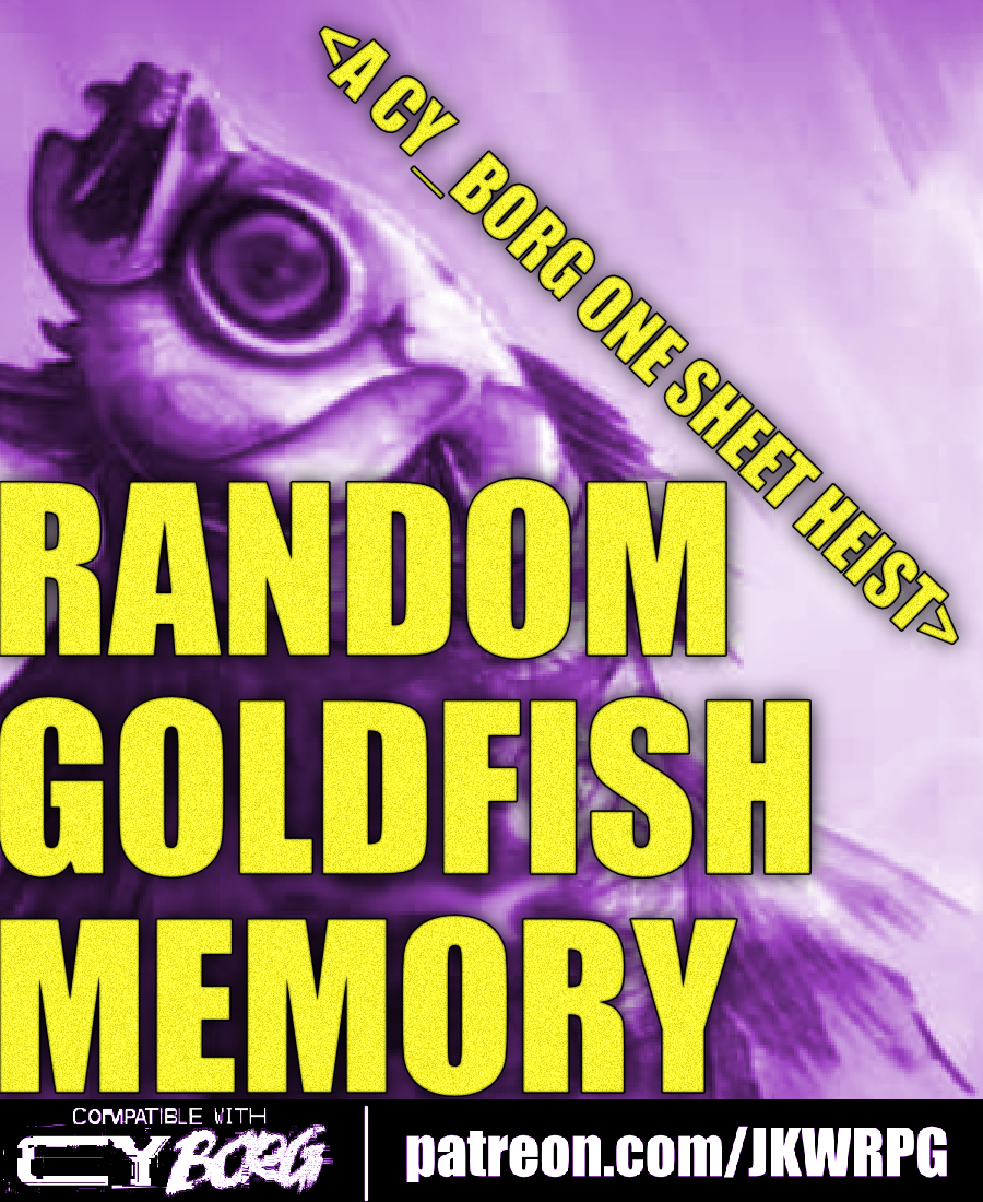
Random Goldfish Memory
Concept: “Cosmia Kowasaki, an AST Endless Seas researcher, had something stolen from her team: a data-fish with a heap of corporate secrets tucked away in its little chip-brain.”
Content: A recovery job that involves fishing for secrets at an upscale villa.
Writing: Brief but vivid details are included to cover essential dimensions of job locations, NPCs, secrets, and key events as the mission unfolds.
Art/Design: A two-page spread with mission specifics in two columns on the left and an overhead map of the site and additional information, with an illustration of the data-fish, beneath it on the right.
Usability: Text layout is readable and easily navigable, and headings/labels are consistently presented to further improve identifying and locating desired info.

Raw Drug
Concept: “A relic of a thousand catastrophes’ past. This pharmaceutical playground houses a biochem cult called THE ARGON ANNIALHIT. Nanorobotic blood-treatments, agonizing bodymods, and ‘The Last High in CY’ – a micro-ink shop and ooze lounge – permeate this piss-hole too. But even in the inebriated ruins of this importunate husk, there is worth. Mere pixels of .NET/organic mutter of a sealed organ freezer the ANNIALHIT has yet to open. Open it.”
Content: A mission to infiltrate a cult headquarters in search of chemical riches.
Writing: Job parameters are flexible thanks to “Client” and “Looking For” tables, resulting in a variety of distinct gigs. Site room descriptions provide short, concentrated features and scenery to help GMs bring the place to life.
Art/Design: Trifold brochure layout in black-and-light-tan color scheme with mission parameters on the outer panels and room info with central hand-drawn map on the inner panels.
Usability: Easily navigable pages with visually distinct headings, with a variety of readable fonts. NPC/enemy information is provided in contrasting boxes for quick identification and reference.
Reaper Repo
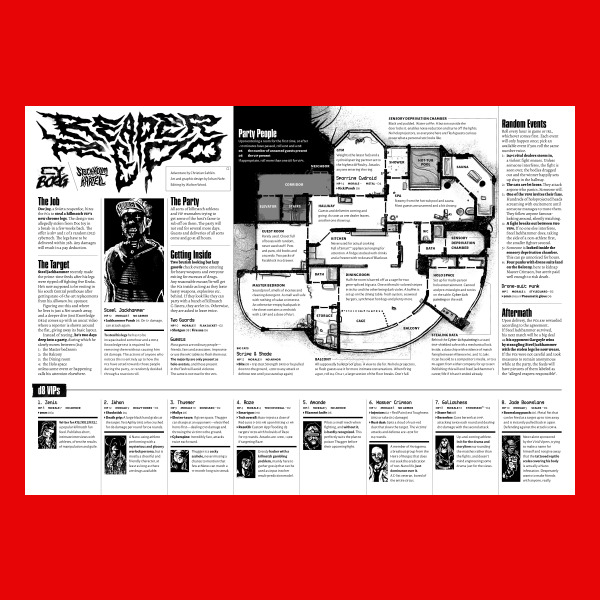
Concept: “The job is simple; infiltrate a penthouse party full of chromed out Killmatch champions, find the man of the hour—Steel Jackhammer—and steal his cyber legs. They're still attached to him, sure. You'll figure it out.”
Content: A high-risk, high-entertainment heist that demands ingenuity from players and a complete disregard for self-preservation from their PCs..
Writing: Tons of details and atmosphere are crammed into a two-page spread on which NPC and location details, random events, and GM-specific notes all offer each gaming group a memorable experience.
Art/Design: A map of the party location is a major focal point, with text provided all around (and laid over) the map in a number of columns. NPC stats and details are complemented by a portrait of each figure.
Usability: File is pretty printer-friendly, and text throughout contrasts well with background. Headings and labels are visually distinct thanks to font choices, text size, and bolding.
Reformation
Concept: “Another day, another run-in with an unknown street gang. A little shootout leads to an offer you can't refuse. ‘Just get the job done, and you never need to hear from us again.’”
Content: A job to track down a high-tech and highly desirable medical device stolen by an unknown gang of street punks.
Writing: Focused attention on unfolding events to guide a GM through the adventure, with supporting details about involved NPCs and their motivations to act.
Art/Design: Trifold brochure layout with white/yellow on back complemented by neon colors and specific font choices for headings, maps, and NPC stat blocks. Several NPC portrait illustrations provided as well. Final showdown map creatively places each room description in that room on the map. Two player-facing handouts/notes are included on an additional page.
Usability: Visually distinct colors, shapes, and orientations help identify how different kinds of content function in relation to the others. Most text is embedded for easy searching/selecting, although a few content blocks are not, which might momentarily complicate an attempt to select that text
Right the Wrong of the Greater
Concept: “A linear CY_Crawl based on Skinny Puppy's album "The Greater Wrong Of The Right" made for the Album Crawl 3.0 Y2K Jam. Take your life back from those in power and scale their brutalist tower to Right the Wrong… Each room of the crawl is based of a track from the album. Lyrical content was the main source of inspiration for what happens in each.”
Content: A revenge mission/crawl up through a high-rise, set to Skinny Puppy.
Writing: Location/track pairings served with atmospheric details about each site and the goings-on there that the punks might run into during their ascent.
Art/Design: Overall aesthetic as record sleeves & inserts, with a mix of hand-drawn illustrations, pasted/collaged elements, and screenprinting. Maps, location features, and NPC portraits are all provided.
Usability: Organization of content is easy to follow, with alternating text/graphic pages and consistent labeling and fore/ground contrast throughout. However, text is not selectable, which might impact some readers’ experience.
Loading next page...