Jobs/Missions
Riot & Blackmail
Concept: “In a clash between ten thousand citizens of CY and the heavily armed and violent Sec Ops, the players are asked to tail someone and get blackmail material. The ending puts the players us against the #1 unbreakable rule of Cy_Borg!”
Content: A mission to sniff out a rat in the midst of a riot and then decide what to do about what’s discovered.
Writing: Lots of helpful details about the situation at hand, NPCs to be encountered, and events that may unfold.
Art/Design: A full-color and a black & white version are provided. Page layouts tend to use one or two columns of text and interspersed AI illustrations of NPCs. Background images taken from photos of riot scenes.
Usability: Text is mostly high contrast but some font choices over busy background images can make reading difficult on some pages. Text is also not embedded so searching/selecting is not possible.
Sealegs
Concept: “The PCs have just returned the stolen chrome legs to Doc Joy (or whatever our PCs have just done) when the good Doc muses about a recent surge in demand for augmented legs. He attributes it first to prominent bloodsport players, eager for an advantage, though now it’s become fashionable - a bubble that’s soon to burst. But for now, there’s good money to be made.”
Content: Intended as a followup to Reaper Repo, this cargo ship heist presents a chance for PCs to explore a locale that may not frequently get the spotlight.
Writing: Crisp, dense descriptions of locations and NPCs (who are excellently fleshed out with motivations & likely behaviors) bring the adventure to life, especially via strategically bolded key terms and adjectives.
Art/Design: Asymmetrical two-column layouts across several pages along with an illustration of the salvaged cargo ship.
Usability: Large headers and bolding provide helpful means of identifying important information and navigating different elements.

Signature Touch
Concept: “Vince Riggs is in trouble. He builds DNA bombs, and he's something of an artist about it. However, he's taken his artistry too far with his signature touch: Riggs has a proclivity for adding his own sample to each of his products.
The result? His genetic fingerprint has become the only common link between three high-profile crimes committed in the last month. He needs help – psychologically, yes, but also specifically – yours.”
The result? His genetic fingerprint has become the only common link between three high-profile crimes committed in the last month. He needs help – psychologically, yes, but also specifically – yours.”
Content: A job to retrieve incriminating evidence from the cops and maybe start a passive income stream as a result.
Writing: Details about the location, people to encounter, things happening, and so on are all packed with vivid character, from descriptions to loot tables to conversational snippets.
Art/Design: Black-on-white with some color accents in a (mostly) single-column text layout with a map of the target precinct--with separate GM- and player-facing map images included.
Usability: High-contrast text and easily distinguishable types of content allow for navigation and perusal of material; a few notes throughout about how to facilitate accessing the job in different ways can help newer GMs with some decision-making.

SIS/TR: Hang the DJ
Concept: “SIS/TR [Starborn Invasion System / Turret Regenerator] is a mini boss that you can drop into any Cy_Borg setting and cause nearly limitless havoc.
Half Operating Manual / Half Setting
The first half of the book has Cy_Borg stats for SIS/TR's main body (the big black cube) and its five turrets (smaller cubes). If you want to adapt SIS/TR to your own campaign or setting, you can have it mangling people in minutes.
The Setting - HANG THE DJ
Famous DJ Ronnie Fissure's live-in sound studio / office has been invaded by SIS/TR for reasons unknown to the half-dead staff. Service droids dance--sparking and smoking--by themselves. On top of its many attacks, SIS/TR has turned itself into a towering mixtape of terror, deploying deafening LRADs, streams of molten vinyl records, and bowel-emptying bass.”
Content: A combination of a malevolent technological enemy, with a variety of detailed stats, tactics, and scenarios; a more extensive mission to save a DJ from the techno-threat; and two “subclasses,” the “Emancipated Companion” and the “Haunted Assassin,” both of which have ties, atmospherically and mechanically, to the SIS/TR entity.
Writing: Helpfully informative explanations throughout to ease initial use of the SIS/TR mechanics conceptually and in practice (via the “Hang the DJ” scenario).
Art/Design: Primarily black on white/light multicolored backgrounds in single- and double-column content layouts. Illustrations of NPCs, locations/maps, equipment, and SIS/TR components complement the text on numerous pages.
Usability: Text is easily readable and navigable throughout, with high-contrast and embedded text and font choices that facilitate visual and screen reading experiences. SIS/TR mechanics (based on d6 dice results/faces) involve some detail for initial employment but should become easy to pick up quickly.
Sleep Module T:[ERROR]
Concept: “Delve into the deepest and most primal corridors of consciousness. Coveted neural pathways for corporate exploitation. Map the ever expanding subconscious and come face to face with communal fears in the form of urban legends, cryptids, and the things conjured by the imagination.“
Content: A clinical trial in which participants navigate a simulation.
Writing: An inventive set of rules for generating the job’s labyrinth and for dealing with the effects that navigating it can have on a PC, supplemented with vivid and informative room-specific sensory details and special rules.
Art/Design: A mix of aesthetics, with some pages using labelmaker-like text or sketches on stained paper, while others resemble computer terminals or clean, slick interfaces.
Usability: Wide variety of fonts can take some page-by-page adjustment, but headings/labels are applied pretty consistently throughout (i.e., reversing the primary font color and highlighting its background). A lot of text content is provided, but none of it is embedded, so it is not possible to search/select.

Surviving G0
Concept: "Inside the quarantine zone, everything is hostile—the ground, the air, the water, and most certainly, the people. But hidden amongst the danger are riches of unimaginable wealth—the type of wealth that can take a punk from the slums all the way to the hills. Food and water are hard to come by, and net service is nearly unreachable. Everything inside of G0 is hidden from the view of Cy’s citizens, making it home to the forgotten corners of society. It’s the kind of place where adventure finds you, whether you want it or not."
Content: A combined generator for G0 hex maps and adventures/scenarios, along with the NPCs that populate those locations. A set of map images for VTT use is also included.
Writing: Tons of description and table entries of all kinds with which to cultivate a fully-formed G0 for punks to explore and face the consequences for doing so.
Art/design: Black-and-white color scheme with illustrations and graphics (of NPCs, of location maps, of two-page spread images) accompanying assorted tables and explanations of relevant points of interest. Map images are crisp and named to indicate not only their content but grid dimensions for VTT implementation.
Usability: While page layouts change occasionally, text content is presented quite consistently (e.g., distinguishing headings from body text or formatting table entries or breakdowns of location details).

Sweat Blood Tears
Concept: “Sweat/Blood/Tears is a strtup making a bank off of shitty fitness centers and uncancellable gym memberships. A group of problem solvers is hired by disgruntled customers to free them of the draconian contracts by any means necessary.”
Content: A job to stop predatory gym membership subscriptions by any means necessary.
Writing: A dark but tongue-in-cheek look at an AI-driven fitness center, with a variety of thematic details for NPCs and locations/rooms to fuel a table of punks looking to take down the gym.
Art/Design: Black-and-white layouts presented both as a pamphlet and as a series of portrait-oriented pages, with illustrations of NPCs likely to be encountered and a helpful map of the gym with room descriptions provided inside each room. A player-facing map is also included.
Usability: Consistent high-contrast text, content area borders, font choices and embellishment, etc. all contribute to ease of visual navigation and location of desired info.
Symptom of Aggression World Tour
Concept: “Did you hear, everyone's least fucking favorite, overly popular, shit sucking poser ass band “Symptom of Aggression” is going on tour for like the 40 billionth time. I can't believe all the complete fucking idiot ass gob noblers in this trash fire of a city listen to that inaudible dreck! I mean like, every asshole in that band has just had controversy after controversy, its totally sickening. I guess that's the kind of immoral audio diarrhea that turns people on these... these waning miserable days. People and their lack of compassion, on top of everything else, it just makes me loose all hope. Man, this city fucking sucks.................. -RAWsum”
Content: An encounter/scenario involving a touring band and their massive bus, complete with band member NPC details and potential reasons for getting involved.
Writing: A refreshing mix of straightforward description and vivid, characterful condemnation of Symptom of Aggression.
Art/Design: Harsh, brightly colored illustrations of the tour bus and NPCs and two versions of maps of the bus (GM and player-facing alike), with relevant text in all directions and embellished with scrawled shapes and figures.
Usability: Pages are busy, which reflects the high-energy nature of the atmosphere, and text has strong contrast with background. Angled lines of text may be difficult for screen readers or copying/pasting attempts.
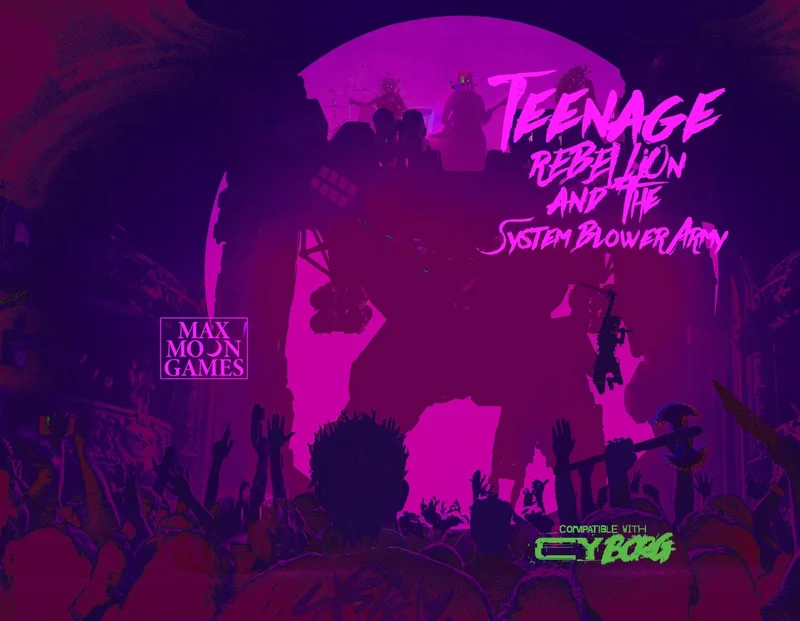
Teenage Rebellion & the System Blower Army
Concept: “The anarchist glitchpunk movement credits SYSTEM BLOWER for its founding and recent explosion centralized in the Ports. This isn't just political noise, it's a full-blown anti-civilization movement, and as the fanbase has grown, the time for action is now! SYSTEM BLOWER has a job for you. Turns out that Celia Samson, the teen progeny of that moron exec at the top of this hill, Marlo Samson, is a huge SYSTEM BLOWER fan but hasn't gone full System Blower Army yet. This is where you come in. SYSTEM BLOWER has a plan that's going to get creds, piss off the hegemony, and stir up a media storm like never before. All you need to do is pull off this heist and create a scene so no one misses it! It would be great if you survived it...but that's not the point. Raid the mansion. Kidnap or convert Celia Samson to the cause, doesn't matter which, just be sure to get her to the finale show before soundcheck...and then it's time to BLOW THE SYSTEM!!!!”
Content: A good old-fashioned adventure scenario: raid a mansion to kidnap a wealthy heiress for cash and publicity.
Writing: A plethora of engaging details about the setup, relevant NPCs, the location, timing-related concerns, and tables for generating band names, albums, and songs.
Art/Design: Vibrant neon colors and mostly white text on a dark translucent background, with a light-colored glitch art pattern behind that. Pictures of NPCs with similar glitch aesthetic appear occasionally throughout the file. Maps provided of the mansion (with both GM and player versions).
Usability: Text/background contrast makes for pretty easy reading, and headings/labels are visually distinct to assist with navigating supplement and understanding relationships between blocks of content. However, much of the text in the document is not embedded, limiting the ability to search, copy/paste, or use a screen reader.

Telesto's Weapon
Concept: "There is an undiscovered fourth shuttle, the Telesto, under the casino no one knows about. It contains his beloved last project, an experimental weapon."
Content: A job that picks up right where Lucky Flight Casino (might) end, allowing punks to get even further into the shit with several corps seeking experimental weaponry.
Writing: A mix of straightforward explanation and vivid atmosphere to help a GM immerse their table in experiencing the scenario, with "vibe" details for each room on the shuttle, tables of various kinds of materials to search, and NPC stat blocks.
Art/design: Mostly two-column black on white with occasional accent colors in NPC illustrations. A map of the Telesto is provided as well.
Usability: Consistent presentation of high-contrast text (with distinct fonts, text sizes, etc. as well) to facilitate navigating to and identifying desired info, with keyed map rooms to assist.

The 55
Concept: “A megablock of capsule apartments, local markets, ruined amenities, gangs, and mysteries. A city within the city. Some residents have never left. Some make things you cannot find anywhere else. Most are desperate. The corpos and cops call it STACK # 95563. But everyone who lives here calls it: THE 55.”
Content: Less an adventure than a setting absolutely crammed with details: locations, NPCs, events, and different ways to go about experiencing it all.
Writing: Concise tidbits reflect the essence of each item, with 8-36 options per page, all categorized by area/region or purpose.
Art/Design: Each page has its own distinct aesthetic that tends to visually relate to the written content theme for the page. High contrast fore/ground with accent colors and design elements (illustrations, decorations, etc.) to call attention to particular details.
Usability: Text is generally quite readable, contrast- and font-wise. Despite each page’s individual aesthetic, the supplement offers a recognizable and reliable visual grammar for organization and navigation.

The Apathy Engine
Concept: "Have your Punks died but they don't want to stay down, bring them back and throw them and their debt into the maw of the APATHY ENGINE"
Content: An adventure generator (or campaign seed) for a group of punks who are forced to deal with a corporation that owns their collective debt.
Writing: Brief atmospheric details accompanying rules/mechanics to drive encounters and scenario options, including a slew of enemy NPCs to threatean punks with.
Art/design: Mostly black-on-white text with illustrations of NPCs and other thematically relevant subjects supporting the focus of each spread/layout.
Usability: Text is visually readable and easy to navigate or search for desired information. Adventure generator elements are arranged to build on one another to assist GM with establishing a coherent scenario for their players.
The Backrooms
Concept: “An assassin has been pulling off hits that no one would have dreamed possible. They have been infiltrating secure locations across Central and The Hills. The punks have a job: take out the assassin. Figuring out who they are working for or how they have been able to access VIPs across Cy would be good, too. The punks have a location: a lucky SecOp tagged the assassin and tracked them to a nearby slum. Are they ready for what is waiting for them? Can they possibly be ready to get pulled into The Backrooms?”
Content: A gig to take down an assassin in a disorienting locale. Mission details provided in full-color and black-and-white versions, along with a player handout of the location map.
Writing: Helpful, descriptive explanations provide GMs with the means to run this mission successfully.
Art/Design: Tri-fold pamphlet layout offers mission info across three internal panels (along with an abstract map of the Backrooms), while key NPC and additional app info is provided on outer panels.
Usability: Layout and color scheme allow for easy navigation and recognition of each content element.
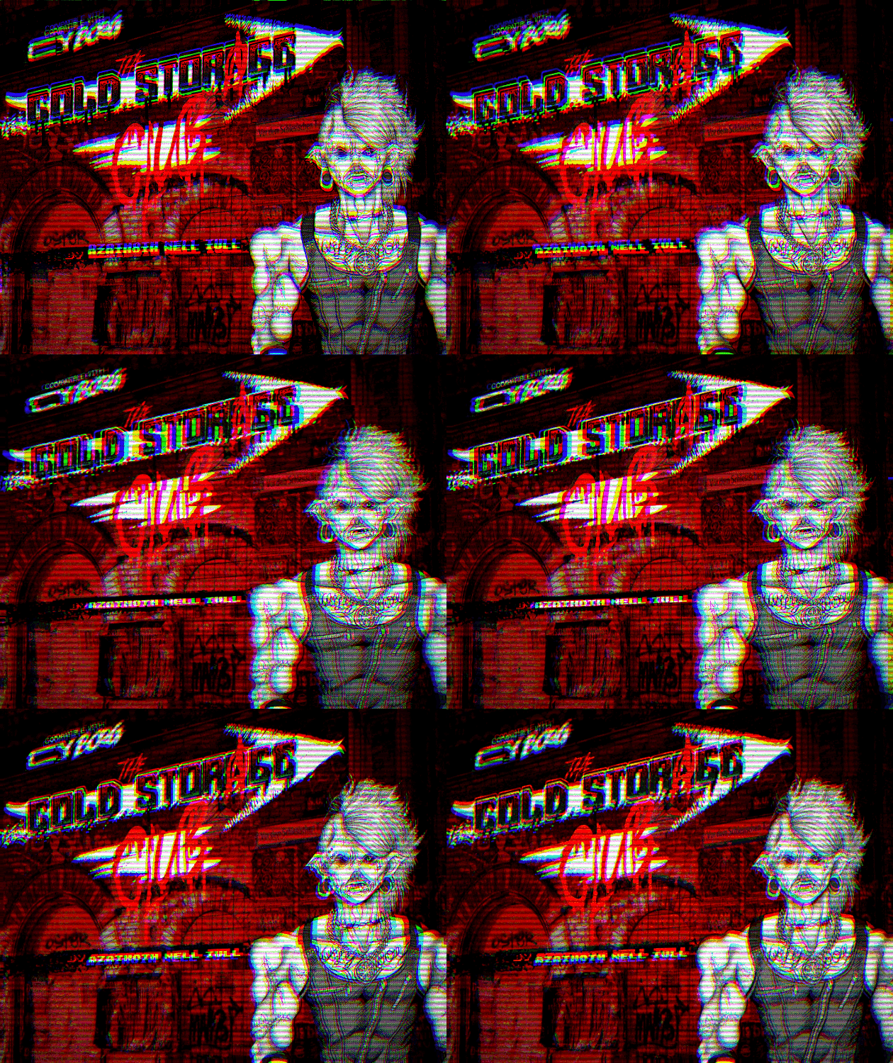
The Cold Storage Club
Concept: “All of that great punk rock flavor you love, none of the added cyber implants! Bar, lore, ambiance, events menu & more.”
Content: The skeleton for an action-packed adventure or atmospheric encounter–a bar location complete with map; tables for ambiance, food, drinks, and events; and NPC staff that PCs are likely to encounter.
Writing: Lists of categorized material to flesh out the club provide a range of adventure seeds and motivations while leaving plenty of room for a GM to expand further as desired.
Art/Design: Black and white and red all over in two-page spreads with a background photo of club activity on each, and several illustrations help bring the club and its staff to life.
Usability: Consistent organization of content throughout, creating a recognizable grammar for navigation that helps when maneuvering frequently between pages. A few blocks of text are somewhat difficult to read due to relative lack of contrast (black on dark red).
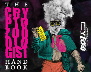
The Cryptozoologist Handbook
Concept: “BEHOLD! Creatures said impossible to exist! BEWITCH! Fill your body with strange, powerful substances! BEGUILE! Confound friends & enemies with cryptic behavior! BELABORED! This bit has gone on too long.”
Content: A PC class, several NPC cryptids, and a job to track down a serial killer.
Writing: A variety of details for different sections, from terse NPC ability descriptions to in-depth mission/adventure specifics for both GMs and players to work with. Cryptozoologist class offers a fascinating take on the researcher-becoming-the-monster archetype.
Art/Design: Visually distinct spreads for each section–bright colors for the cryptozoologist, dark tones and inverted colors for the cryptids, and black-and-white for the mission (with a bit of pink accent/highlight).
Usability: Numerous fonts and sizes, but always high contrast. Easily distinguishable text purpose on a given spread helps browsing and identifying desired info.

The Cult of Juliet
Concept: "Eighteen years ago, the wasteland mutant prophet Janet Jewel Eyes died while giving birth to her second daughter, Juliet. Before her death she gave her followers a final message. “This daughter of mine will be something strange, new, and special. Take care of her and keep her safe. She’ll be awful weird and hard to understand, but she’ll grow into something divinely beautiful and terrible. She will be the herald of a new age, and will teach all of humanity how to live and grow in wonderful new ways.” And the child she birthed was so strange, so terrible, that few among her flock doubted it was destined for great things. Fast forward to present day, the cult is certain that Juliet is about to enter adulthood and metamorphose into her divine adult form. Her appetite has grown monstrous and she can no longer be supported by the cult’s hydroponic harvest. In order to feed themselves and their young god, they have started raiding agricultural shipments into the city of Cy. This is where the players come in. They have been hired by The Tillerson Agricultural Group as resource retention specialists, tasked with stopping the raids by any means necessary."
Content: A job to take out a raider cult before the arrival of its messiah's true form.
Writing: Lots of detail about the scenario and the central figure(s), with supplemental details left terse for a GM to flesh out as desired/appropriate.
Art/design: Trifold pamphlet layout in black-on-white color scheme, with several illustrations of key information (Juliet, the cult base, important NPCs, etc.).
Usability: Consistent organization, font choices and text embellishment for headings/labels, and whitespace all contribute to easy visual recognition of related/distinct sections of content. Arrangement of trifold panels may cause initial confusion for some, depending on expectations of how to navigate such a layout.
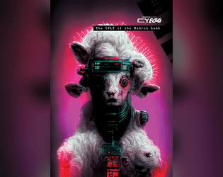
The CVLT of the Hadron Lamb
Concept: “The director of the L.A.M.B. project, Dr. Seraphima, Had her brains blown out by a 1.4 petaelectronvolts proton beam. The parts of her brain which tethered her to reality and sanity, anyway. Now, she's the revered leader of an exponentially growing cult. Daily, Dozens of hopeful disciples enter the L.A.M.B. to have their craniums fried, hoping to awaken something that elevates them above NPC status. Through the usual back channels, Dr. Daevy hired disposable punks to take care of the situation in a violent fashion. Alas, for now, they all died or joined the CVLT of the Hadron Lamb.”
Content: 48 pages of jaw-dropping inspiration–a full adventure to seek out the head of a strange cult who keeps turning her enemies into acolytes, with tons of exciting seeds and ideas for further exploration.
Writing: Eichhorn manages to wield an impressive variety of styles and voices that provide impressive depth and nuance to the range of subjects covered from one page to the next.
Art/Design: Artpunk spreads that feel at home alongside the rulebook. Each set of pages evokes a distinct facet of the grimy cyberpunk aesthetic and philosophy that draws players to the game–it’s as easy to be drawn in to the intriguing layouts as it is to the writing.
Usability: For a quick skim-and-find experience, look elsewhere–but consider a shift in reading orientation. This adventure is deeply engaging and requires the reader to attend closely to the combination of writing and design if they are to successfully GM it.
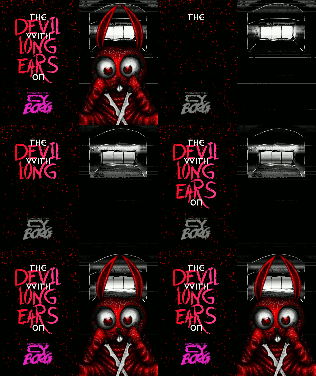
The DEVIL With LONG EARS On
Concept: “A 14+6 page Murder Mystery with: d6 Rumors, 3+ Cases, Puzzles, 4 Big Maps, 3+ NPCs, & 1 Killer Bunnyman; Inspired by the BUNNYMAN urban legend for CY Borg's Urban Legend Jam.”
Content: A mission to hunt a serial killer across a series of ominous locations. “Digital,” “print,” and "bare bones" versions provided along with an asset/maps booklet.
Writing: Vivid descriptions and helpful guidance for GMs make for a dark but entertaining experience.
Art/Design: Primarily a dark color scheme, with white text on black and black text on white/gray elements, while pink and red accent headings and images. Numerous scenic illustrations and NPC portraits bring myriad dimensions of the mystery to life.
Usability: Fonts in each version are readable and fully embedded, which facilitates searching or selecting text–especially content that is arranged perpendicular to the default orientation.
The Drone Collector
Concept: “A minor security intervention in the neighbouring district of Bigmosse has inadvertently spilled over into Svärta. Alliansen’s head of security operations, a Ms. Ah, has instructed you to retrieve one of their drones that was damaged and wandered off.”
Content: A mission to locate and abstain a drone somewhere in a semi-decrepit neighborhood.
Writing: Copious amounts of detail bring the neighborhood to life, from building and business descriptions to NPC motives & likely actions and beyond.
Art/Design: An overhead map of the locale in orange on black precedes the text, which appears in several high-contrast layout configurations, with an illustration of a threatening pair of eyes appearing amid info about an important NPC and environmental conditions.
Usability: Text is readable throughout, with bold text and color choices emphasizing eadings/labels, key terms, and phrases that a GM should attend to, especially given the amount of text content across these pages.
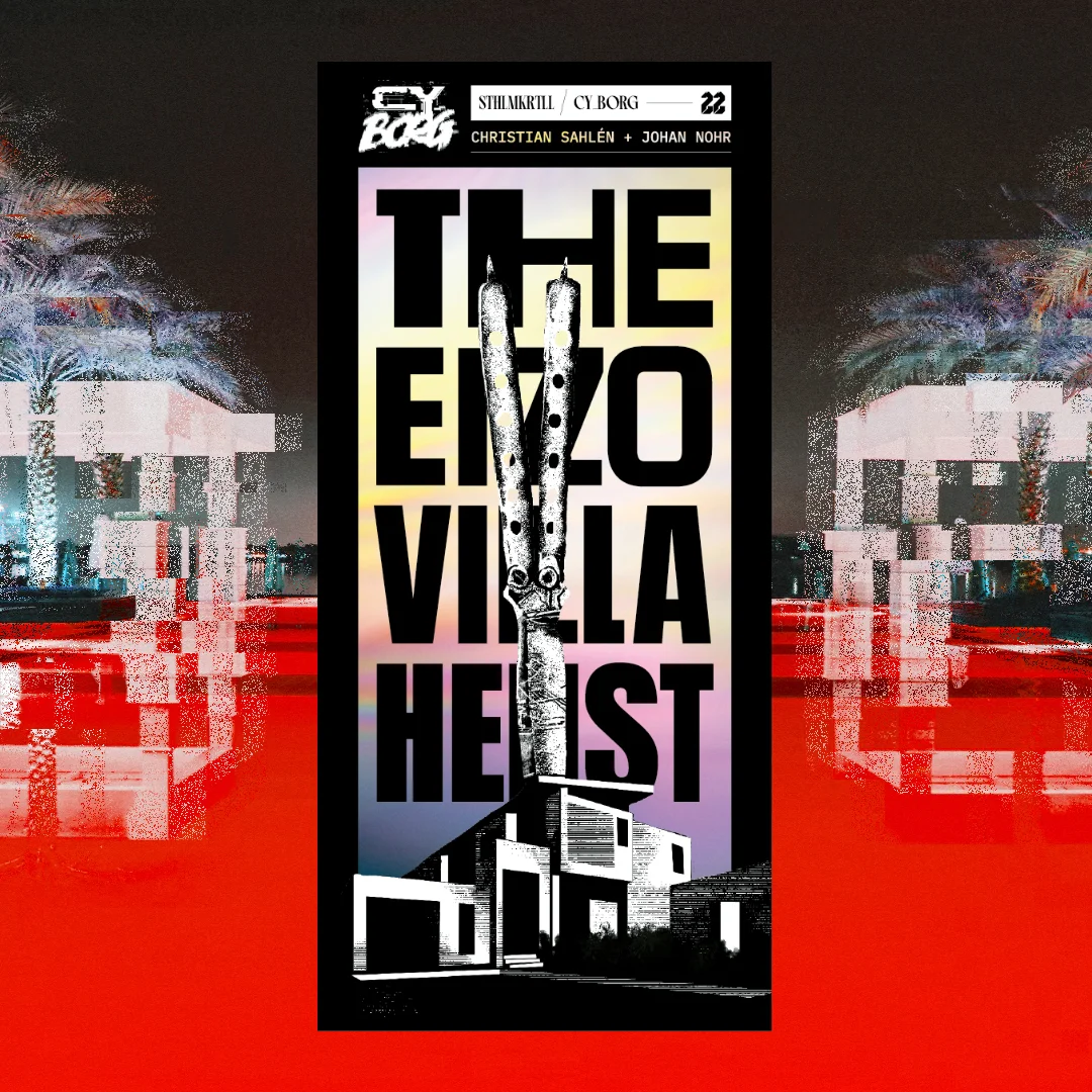
The Eizo Villa Heist
Concept: “I don’t care how you do it. Go to the villa. Get the box. Don’t open it.”
Content: A job to retrieve an armored storage box from a crew of punks for a cult.
Writing: Print medium constraints result in succinct, focused details to guide a GM through the essentials of the mission while making each NPC and complication possibility feel exciting.
Art/Design: Trifold pamphlet opens to show map and initial mission info inside, while NPCs and complications appear on the outside folds/sections.
Usability: Available only in print form. Pamphlet layout is easy to navigate, with consistent headings/labels and section dividers. Font choices are readable and with little fore/ground clutter when appearing over gradient backgrounds.
The First Job
Concept: “A message from an old friend promises a decent amount of creds, maybe enough to pay off what you owe, or at least get you started. Looks like you are heading into the massive underwater commerce district of Undersjön. Under the pressure of the waters, and just under pressure because of the deadline, can you complete your task and earn your payday?”
Content: A heist scenario with a twist: the punks have to find what they’re looking for before they can begin to think about leaving with it. Two versions provided: a full neon-color version and a printer-friendly black-and-white version.
Writing: Engaging details bring to life the location and the punks’ contact, both of which could serve a table long after this specific adventure. Random encounters and an off-duty cop name generator add personality.
Art/Design: Two major columns of content across two pages, with the full color version using different section background and heading/label colors to help distinguish different kinds of content, while the black-and-white version makes use of section borders and heading/label bolding. An isometric map of the adventure location is provided.
Usability: Text throughout is readable with high contrast against background and is easily identifiable as a component of a particular content section (e.g., random encounters, NPC info, etc.).
The Gorgon Pit
Concept: “Something slithers in the forgotten sewers beneath the city. A strange creature that turns people to stone. A corporation that would control it. Cultists that worship it like a god. A gang hell-bent on revenge. All will drown in the filth of…The Gorgon Pit”
Content: A job to investigate a sewer-dwelling monster, themed around ancient Greek myth.
Writing: Lots of descriptive detail surrounding numerous aspects of the gig, from potential employers and their motives to unfolding events whenever a particular area of the sewer is traversed.
Art/Design: Single- and double-column black-on-white content layouts with an aesthetic that closely resembles much of the Mörk Borg design style, from font types to neoclassical lithographs. A full map of the job location is provided, and map segments (for different areas) are included on the page for their relevant area.
Usability: Font choices are visually readable and reflect distinct kinds of content (headings, labels, etc.). However, text is not embedded, so searching/selecting is not possible.
The Ivory Tower
Concept: “As you roll around in the filth of Cy's streets, the corpo scum look down on you, sat on expensive chairs, in lavish offices, in their Ivory Towers. Judging which corp is the worst is like comparing cyanide apples with asbestos oranges, but SynerGYST media definitely is rotten for sure. AI generated content and mindless-slop churned out to the masses, designed to hit the correct sequence of neurons so you buy their collectable figurines and cheap t-shirts. Repeat this every week ad infinitum and somehow rake in billions of credits at the same time. You have the golden opportunity to knock these slime bags down a peg, and make some creds while your at it. Seems like the perfect job right?...“
Content: A job for enterprising punks to deal with a corp executive.
Writing: Important details for fourteen rooms’ worth of dangers, d6 reasons to take down the target, NPC stats, and situationally relevant rules to provide even more of a memorable challenge for players at a table.
Art/Design: Black-on-white landscape-oriented spread with three columns of content (two with text, one with two building floors’ layouts keyed to room descriptions).
Usability: Sections are clearly marked and distinct from one another, with recognizable headings, labels, and arrangement of similar sections’ content.

The Lair of Eucalyptus
Concept: “In this adventure, you will face close encounters with the rulers of CY_. Assault their ghostly dwellings but, behold! The Hills abound in living Urban Legends. These sophisticated terrors are inspired by the ancient Colombian tradition. <>”
Content: A heist to retrieve untold riches from a well-secured mansion.
Writing: Unbelievable amounts of detail regarding the job parameters, NPCs, random encounters, locations, and dialogue with multiple outcomes.
Art/Design: Mostly single-column text layout over a background pattern made from a simple color-coded map of the region.
Usability: Text is high-contrast and in a readable font, with consistent presentation throughout of headings and labels. Map is provided at multiple points in the document, which reduces the need to flip through entire file to make use of it.
The Location Pad
21 contributors
Concept: “The Punks dash through a random door when chased by SecOps? Need a location for their next heist? The Location Pad got you covered with 34 random locations peppered with plot hooks and loot.”
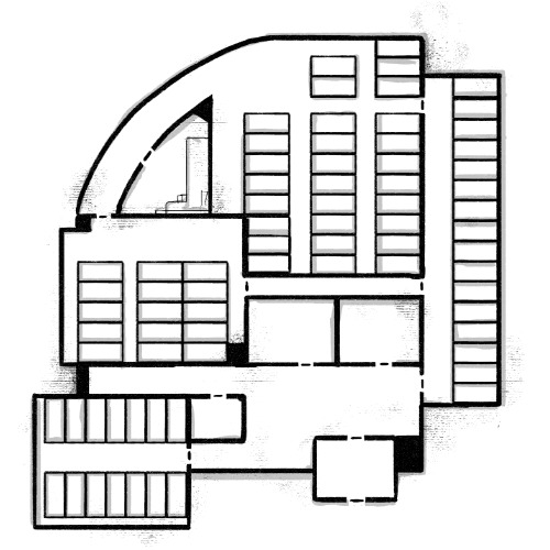
Content: A collection of common locations for Cy_Borg missions, each with a map and relevant tables to generate details about it (purpose, room contents, NPCs likely to be there, etc.).
Writing: Half of the location’s tables are written by a different contributor, so there is often considerable difference in style and detail on those pages–but the entire document concisely packs tons of imaginative inspiration into each potential seed, hook, and thread.
Art/Design: Each page consistently provides a space for GM notes, a set of relevant tables, and a map of the location (mostly an overhead view, with some exceptions)–all in black-and-white with clear headings and list item numbering.
Usability: Crisp, clear font choices and layout make for incredibly easy reading and use–a couple of rolls or choices allow for fleshing out of a location when immediately needed or as part of a more leisurely planning pace.

The Trench Grub's Thirst
Concept: "Inspired by The Andromeda Strain by Michael Crichton and the “The Last Question” short story by Isaac Asimov, The Trench Grub’s Thirst is a retro sci-fi heist of low-tech hacking under the Nevada desert.
Hidden beneath an isolated field office, a corporate cult feeds stolen memories to a vast worm. The more thoughts this grub devours, the more it is able to answer any question, and the closer Omni Mineral & Electric National (OMEN) Corporation comes to its goal of controlling all knowledge.
Save the memories.
Kill the grub."
Content: A mission to infiltrate a top-secret lab and shut it down, whatever's going on.
Writing: Focused thematic description to exude the retro sci-fi vibes that inspired the adventure, with occasional brief NPC stats/rules to complement the atmosphere.
Art/design: Four-page layout (front & back covers with an interior two-page spread) intentionally reminiscent of a cheap dime novel. Font, color, and map aesthetic (with four vertical levels & multiple areas on each level to explore) all contribute to completing the picture.
Usability: Distinct sections are visibly demarcated, with consistent heading & label embellishments to stand out from main body text. Labeled map and accompanying legend provide reference for GMs and punks alike.
The Trouble with Juan
Concept: “Initially just looking for some snacks and road beers at Juan's Bodega, your Punks clock a group of Red Suns looking to rob the place, but more worrying, Juan is missing. And Juan's never closes. Where is he? Can your Punks find out?”
Content: An adventure scenario that seems like a basic bodega battle but can unfold into a more insidious encounter.
Writing: Tons of informative and descriptive sensory details packed into two pages that cover scenario locations, enemy NPCs, interested factions, random events, and more.
Art/Design: Provided in both an eye-searing neon full-color version and a stripped-down black-and-white printer-friendly version, text info occurs in a central section of the page and in clearly marked marginal boxes. Important terms and tests are highlighted with a different color (in the full color version) or in bold (in the printer-friendly version). A simple map of the bodega is provided on page 2.
Usability: Both versions offer a variety of visual cues–font choices, borders, bolding & different colored text–that make it easy to locate, identify, and navigate particular kinds of content.
The Ultra Upset
Concept: “You have taken a gig from a rising leader named Yosel, a high-ranking member of one of Cy's most violent ultra firms. The firm's old leadership has to go, and you will be the people to make that happen. Infiltrate a stadium, sabotage a career, buy some merch! Play it cool and leave without a trace, or kick the door down and get net-famous. As you infiltrate deeper into the Duodrome, you will find unique loot, dangerous NPCs, and the dark secret keeping this streaming-sport operation together…”
Content: A job to humiliate a traitor in a Nechruball firm.
Writing: Plenty of specifics, especially gritty sensory details, on the situation, relevant locations, and NPCs that the table might encounter while undertaking this mission.
Art/Design: White-on-black design (except for two pages of tables in a green-text terminal aesthetic) with key terms emphasized in bright colors, and overhead maps are provided both as direct aids and as part of illustrations as blueprints pinned to a wall, and portraits breathe life into included major NPCs.
Usability: Really intriguing consistent color use to highlight particular NPCs/entities as well as the source of specific mechanics/details. However, text is not embedded, so searching/selecting text or using a screen reader successfully aren’t possible.
The Zoo
Concept: “In the post-war world, luxury is often those things that cannot be bought… You need a job, you need the ¤ and you don't care how you get it. So when a slick fixer named Mr Gato gives you a job, you take it. Break into a private zoo, grab a cat and get out. Easy job and good money. Sounds simple, right? But ain't nothing simple in Cy_city.”
Content: A repo heist in a location full of dangerous animals and that requires a bit of precision. Content warning from author: “Cy_bernetic animals will try to kill you, you will need to defend yourself or end up flat-lined. Also Swearing.”
Writing: Brief but informative stat blocks for enemies and descriptions of locations, with helpful tables offering in-character explanations for diseases, souvenirs, and the sudden appearance of a replacement PC.
Art/Design: Two pages of content; on the first is mostly text with a silhouette of an anonymous client. On the second, an abstract map of the zoo is surrounded by room details and a pair of stylized illustrations of a turtle and a gorilla’s head.
Usability: Text is mostly easy to read, with orange-on-black scheme providing solid contrast. Room numbers on map might be easily overlooked–numbering scheme goes left->right, top->down.
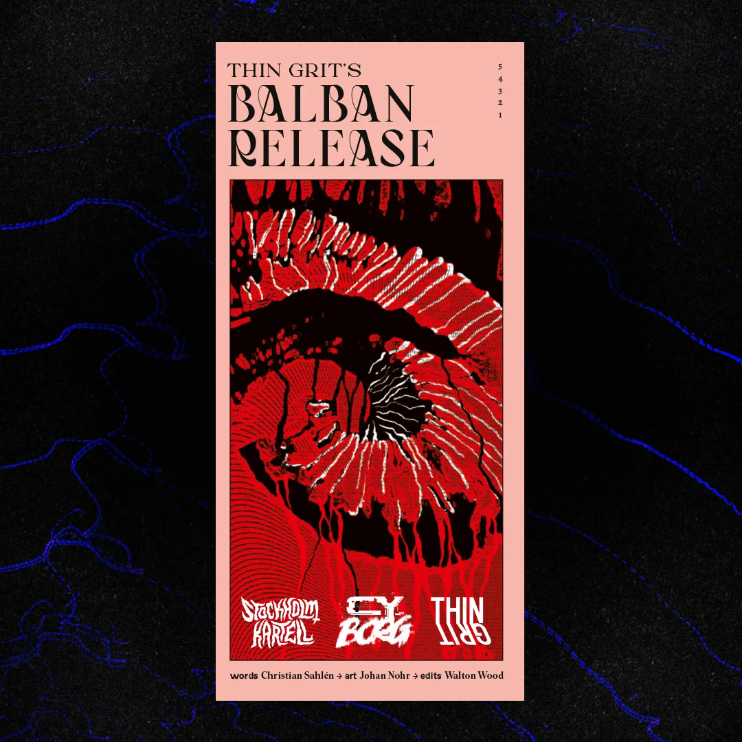
Thin Grit's Balban Release
Concept: “TG Labs is planning some kind of release event. Disrupt it. Embarrass them. Make it a scandal! Can you do that?”
Content: A sabotage operation on behalf of a disgruntled ex-employee.
Writing: Crisp descriptions and explanations of mission locales, potential complications, NPC specifics, and conditions for success, all of which create a range of potential for a GM and their table.
Art/Design: Trifold pamphlet with nitial details and an overhead map of the job location appear on the inside folds, and NPC and complication/aftermath details on the outside panels.
Usability: Available only in print form. Font and background color choices indicate different kinds of content throughout the supplement, with headings/labels visually distinct from the body text. Organization of material allows for easy reading and comprehension of mission specifics from first to last panel.
Thoughts & Prayers
8 contributors
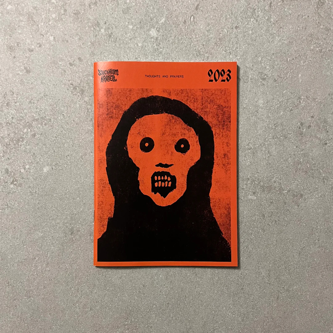
Concept: “Thoughts and Prayers is a zine by Stockholm Kartell made for the 2023 convention season. It includes stuff for all our games; MÖRK BORG, CY_BORG, DEATH IN SPACE, SKR and some system-agnostic material. But there are also things like album reviews, essays and short stories, thoughts, ideas and takes. 100% of the benefits are to be donated to Direct Relief.”
Content: A smörgåsbord of content for Cy_Borg–some specifically for the game, some that could be used for it or others–that ranges from a location/adventure (Sprawling Car Park) to tables/generators (e.g., “Who else is in the pub when the brawl starts?”) to NPCs (emergency response teams) to medieval weapons to injuries/afflictions to short fiction about living as a corp drone. There’s a lot more than that, too.
Writing: Every page oozes the Stockholm Kartell house style(s) that makes a reader want to use all that they can in their next game.
Art/Design: Black-on-white color scheme in a printed zine format with illustrations throughout.
Usability: Available only in print format. Table of contents at the beginning of the zine makes it easy to locate info throughout, with a consistent header/footer with page content credits and page numbering to help clarify not only where a reader is in the zine but also whose work they’re looking at.

Thy Flesh, Transformed
Concept: “On an expedition into the subways of G0, beneath an ancient foundry, the punks are infected with the IRON VIRUS a nanovirus that turns flesh to metal, hair to wire and nails to scalpels. The subway screens flicker to life. The metal tyrant Wodan announces the countdown of sacrifices to priming the Iron Egg. If not stopped, it will destroy everything in a Nearby District. STOP THEM”
Content: A body horror-centric race against the clock to stop a virus-wielding tyrant.
Writing: A disgustingly fascinating adventure, complete with a set of viral nano-infections to make one’s skin crawl (perhaps literally).
Art/Design: Two-page spreads of the scenario setup (and impressively vivid depiction of the virus in action), GM notes, infection list, adventure locations and creatures, and a map.
Usability: Easy to navigate and text (primarily white on black) is readable–the opposite end of the “unsettling” spectrum of document’s content.
Tim Is of the Essence
Concept: “Run. Shoot. Steal. Lie. It doesn't matter what you do, just find Tim! He's the key to something bigger than all of us. The corpos want him quieted. He's gotta be in the Negapike. I know, I know. The hell hole in between Cy and the NegaCity. Don't worry, you'll be fine, I left you the keys to the B34S7. Fire it up. Be quick about it, you only have 2 hours.”
Content: A mission to extract your pal Tim from an armored carrier somewhere on the tangled roadways of the Negapike.
Writing: A simple premise with inspired contours and complications to make the rescue attempt all the trickier. Tables provide variety in mission background and random events.
Art/Design: Mix of layouts reflects different general purposes: target vehicle, job specifics, Negapike details, tables. Mostly light-on-dark color schemes, with blueprints of armored carrier and Negapike aerial view serving as primary graphic elements. With tables rendered as UNIX man pages on a CRT display.
Usability: Organization facilitates understanding the relationship of different pages’ content. Most text is visually readable (font choice, text size, contrast) and searchable/selectable, although the latter is not so for text on pages with a CRT display aesthetic.
Time Scape
Concept: “In the not so distant future… Out of the unholy marriage of Super A.I. and alchemy of flesh, a new type of being came into existence. In the year 20X9, the machines rule every aspect of daily life, forever looking to further optimize culling the ‘dregs’ of society, ensuring any threat to its existence is either exterminated with the extreme prejudice of nu-capitalism, or by force. But the final battle for humanity will not be fought in the future. It will be fought here, it present day CY. Tonight…”
Content: A mission to save the future by terminating a CEO. Additional classes ("Time Target," "Veteran of the Future War," and "Reprogrammed Hunter Killer"), supplemental glitch rules, and a murderous NPC are also included.
Writing: Creativity permeates every page/spread, offering plenty of details to flesh out each encounter with a clear sense of in-game urgency for the stakes involved.
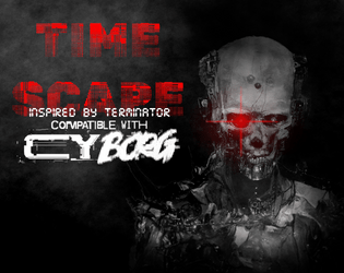
Art/Design: Distinct full-color layouts for each page/spread that manage to share a dark-themed aesthetic for a sense of consistency throughout. Numerous illustrations provide visuals for the landscape, significant NPCs, and maps.
Usability: Visually, most pages provide high-contrast text/background for easy reading, with immediately apparent headings/labels and distinct content sections (whether via whitespace, borders, etc.). However, the text is not embedded, so no searching or selecting is possible. A ToC is provided at the end of the supplement.
Too Fast to Live, Too Young to Die
26 contributors
Johan Nohr
Astrolich
Calen Heydt
industrialnation
Gnoll
Flintwyrm
Patch Adam Perryman
thefatherofcats
Prince “PROFANEKNOWLEDGE” Maxi
Leonard B
cyotee doge
Amaranth M
Brendan Carlson
Kevin Cantello
Patrick Möën
Gaffy
Michael T. Baker
Mal R
Ryan
Casanova Funkenstein
psyop.fyc
Torg_OR
KMSH
Daniel Scott
Olav
Jason “Anabasis” Brook
Concept: “Too Fast to Live, Too Young to Die is a rules expansion for CY_BORG giving you the chance to drive fast and wreak carnage hanging out the passenger side window (or just crash headlong into it, your mileage may vary). These rules are light-weight, but robust, and will add a ton of flavor to your chase scenes as you bolt down narrow streets in attempt to escape the piggies or track down a corpo shit-bag. Hell, you don't even need to catch 'em, just have a firefight between vehicles - we got rules for that!”
Content: An impressive cornucopia of content: rules for vehicle chases/races and driving hazards, classes for the “Got-Away Driver” and “High Speed Vigilante," stats for vehicles that are purchaseable (or not), enemies to encounter on the streets of CY, and an entire revenge-themed mission.
Writing: A focus on thematic details/voices to breathe life into included elements that are supported by succinct, direct rules and guidance for GMs to implement assorted features into a game.
Art/Design: A mix of layouts and aesthetics throughout the supplement. Some pages are laid out landscape-wise, and at least one two-page spread has text broken across its pages. Number and variety of illustrations and themes, along with their execution, are inspiring.
Usability: Body text font is pretty consistent throughout, and despite the range of page/spread layouts it’s easy to identify headings/labels and how they relate to nearby content. However, the text is not embedded, so searching/selecting and screen reader use is not possible.

Train Through the Pain
Concept: “A self-improvement cult headed by a mad NET influencer has kidnapped a brilliant biochemist. Independent entrepreneurs all over CY are scrambling to break him out and use his talents in their shady business ventures.”
Content: A job to “liberate” a scientist from one sketchy situation so they can serve a different one.
Writing: Terse, conversational descriptions of important NPCs and location details are complemented by even briefer relevant stats/mechanics.
Art/Design: Black-and-white text and images presented in both a pamphlet format and as standard portrait-oriented pages. A map of the target location and illustrations of some NPCs accompany the text (along with a cover image of a hairy or veiny individual being assaulted from all sides). A player-facing map is also included.
Usability: High-contrast text and consistent use of specific fonts/embellishment for headings, body text, emphasized info, etc. helps with easy visual navigation and identification of desired details. Room descriptions in each relevant map room similarly allow for quick reference/atmosphere notes.

Tranquility
Concept: "During one of the earliest lunar prospecting missions, the commander of Chrysus 14, Alan Shepard, famously played a game of golf on the moon’s dusty-white surface. Two golf balls were lost and left behind that day. An anonymous CEO wants one (or better both) for their private collection. One golf ball = 2,500¤! The trip to the moon is already paid for, basic space suits included. What are you still standing around for? Off to the spaceport with your sorry wetware!"
Content: A simple job to travel to the surface of the moon and retrieve golf balls.
Writing: Concise descriptions and rules, encounters, and similar GM-facing info for each location that might be visited on the trip.
Art/design: Mission details are provided in a trifold brochure/pamphlet format, in both full-color version (with high-res background graphics of the moon's surface) and a black-on-white printer-friendly version. Distinct boxes separate out each scenario location, with one pamphlet panel dedicated to distinct NPC stat blocks and another to mission-related overview info for the GM.
Usability: Each separate content block is recognizably distinct, with a consistent aesthetic for recognizing similar kinds of content (block borders and, for the full-color version, block accent colors). Fonts are readable with visually distinct decorations for headings, labels, etc.
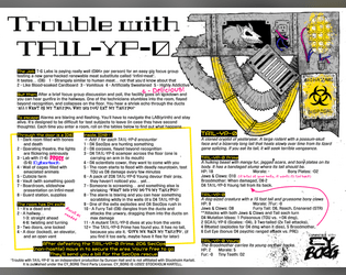
Trouble with TA1L-YP-0
Concept: “It's a real easy gig... Just taste test T-G Labs new Infini-meat and participate in a quick focus group! You'll soon be on your way with a fistful of kreds. Where's the meat come from you ask? I'm afraid we can't share that proprietary information.”
Content: A mission to survive a marketing research meeting.
Writing: Brief bursts of flavor and mechanics (including an intriguing set of maze/escape tables) directed to both GM and player.
Art/Design: Landscape-oriented black-on-white spread (with yellow, pink, and blue highlights) includes a hand-drawn illustration of a cryptid in the top right corner, and two main columns of text content (the left of which has two columns of tables within it).
Usability: Consistent presentation of content, with visually identifiable headings, labels, and marginal notes. Layout makes referring to specific info easy, especially stats for NPCs appearing in maze room encounters.
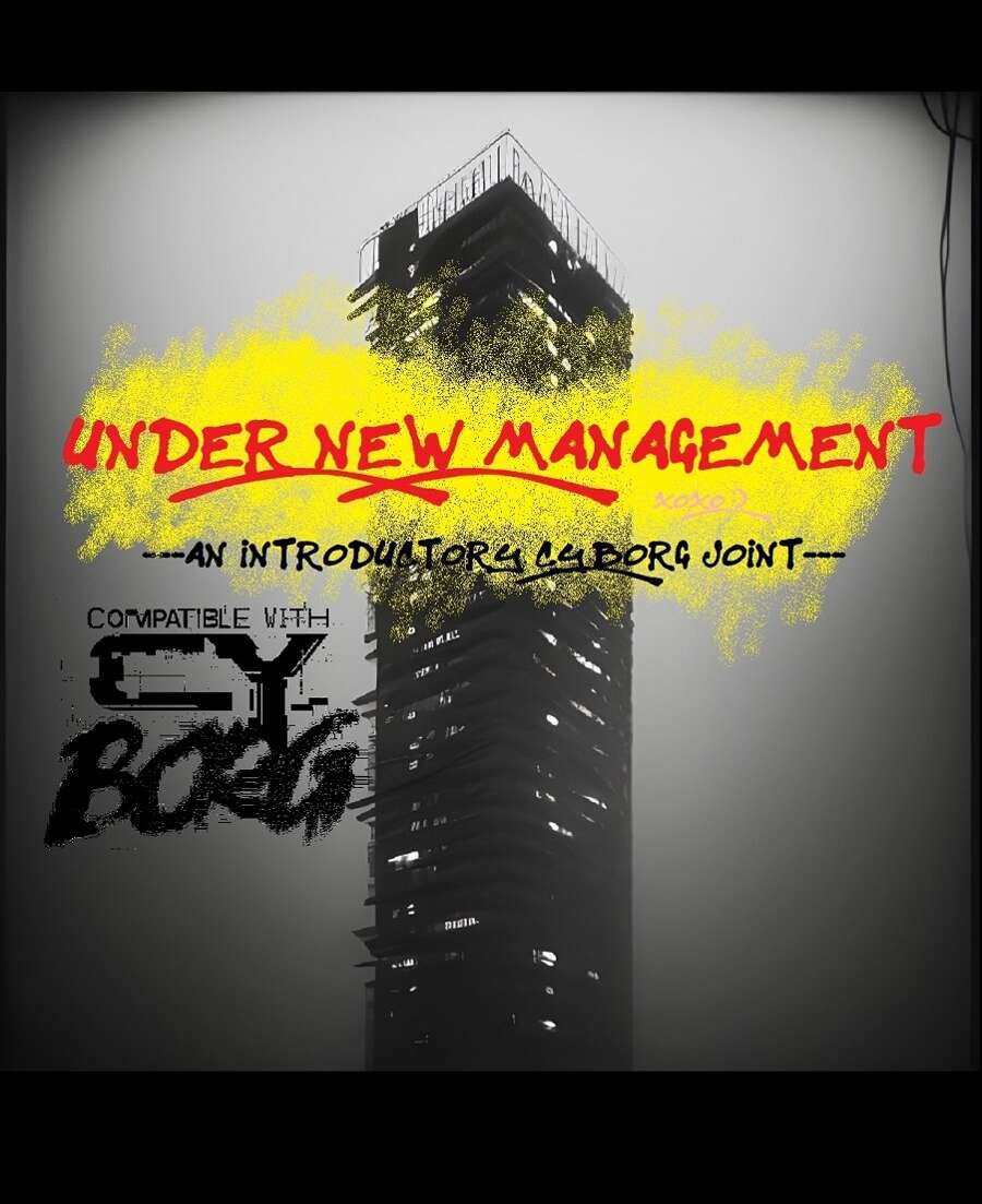
Under New Management
Concept: “UNDER NEW MANAGEMENT is an introductory three-part CY_BORG adventure inspired by classic movies like Running Man and Judge Dredd (2012), wherein the player characters must ascend a crumbling apartment tower and take out its self-appointed gang-goon leader, Jinghai Soan. It's nonstop action and weirdness that's perfect for introducing new players into the setting and system!”
Content: A scenario for PCs to get intimately familiar with life in a high-rise habitat on lockdown in order to bring down the crime lord at its apex.
Writing: Tons of details about apartment residents, the building’s aesthetic, recent rumors, NPC stats, a map, and more.
Art/Design: White-on-black monospace text with red and yellow graffiti/handwritten headings and embellishments. Occasional borders help indicate the extent of a particular sidebar or table. Black-and-white map and portrait of Jinghai Soan are included.
Usability: Text is provided mostly in one- and two-column formats with occasional exceptions. While text contrast makes for easy reading, the text is not embedded, so no searching or copying/pasting is available.
VIP Abduction
Concept: “The punks have a mission. Kidnap Lukas Tosk. He's traveling with just his driver today. It'll be a quick 10k¤. Or so they think. VIP Abduction is a pamphlet-sized module for CY_BORG. It includes a map of a Virid Viper safe house and everything you need to put inside to set up the abduction mission. The module includes stat blocks for new characters and page numbers for referencing the CY_BORG rule book for other stat blocks and tables.”
Content: A kidnapping mission with a bonus automotive theft component.
Writing: Job setup and preparation/site location info is provided first, followed by sections on the mission execution and target/enemy NPCs.
Art/Design: Two versions: full-color and black-and-white. Trifold brochure layout with full color outer panels (in full color version), while inner panels are black and white in both versions. An overhead map of the mission locale is also included as a separate file.
Usability: Bolded headers and key labels/descriptors help call attention to important information, and consistent spacing makes it easy to identify individual sections of content. Overall arrangement of info reduces need to jump around between panels to locate immediately useful specifics. Full-color gradient pattern background on outer panels provides decent contrast to maintain text readability.

WAR MACHINE
Concept: “War makes money, at the end of the day, and the corps of CY are interested in anything that makes money, no matter how many cadavers will be piled up alongside those heaps of cash. “
Content: An arsenal of material–enemies, squad makeups, potential job seeds, environmental tables, and more–with which to make corps even more terrifying, overwhelming, omnipresent, and all-around dangerous.
Writing: A mix of informative mechanics and in-universe flavorful commentary on each entry that balances black humor on the edge of bleakness.
Art/Design: Simple black-on-white single-column layout over fourteen pages.
Usability: Visually distinct and consistent font and text decoration choices, along with helpful whitespace use, result in an easily navigable document.
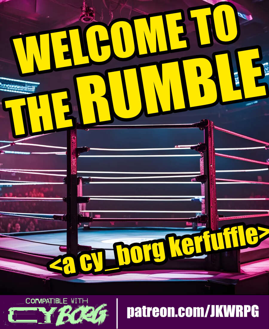
WELCOME TO THE RUMBLE
Concept: “Tonight, we are going to witness the most anticipated match in the history of professional wrestling---for the CY Wrestling Federation Championship Belt! Are you ready? Wrestling fans, ARE YOU READY?! For the thousands in attendance, and the millions watching from around the world, from the capital city of CY...ladies and gentleman...LLLLEEEET'S GET RRRREAADY TO RRRRRRUUUUMMMMBBBBBLLLLLEEEEE!”
Content: An opportunity for punks to up their side-hustle game by making some bank as a wrestling champion–assuming they win, of course.
Writing: Primarily informative details about the mechanics of the encounter, accented by some headings to reflect the tenor of the wrestling scene.
Art/Design: Wide three-column layout of content with a bloody wrestling mat map in the center of the document. White text on black with yellow headings, while a bit of pink highlights the mat image and the license info.
Usability: High-contrast text and easily readable fonts facilitate reading and navigation. Skewed text may occasionally pose issues for screen readers.
Wh1tewashed T0mb
Concept: “Megapastor Apollo Imra is in the crosshairs- his wife's, to be specific. One of his twenty-odd wives. You've been hired to take out this lecherous philanderer, right in his own temple vestry, where he's taking tonight's dose of infidelity. But beware: there's more going on here than you might think…”
Content: A mission to serve divorce papers, of a sort.
Writing: Extensive information provided about the job, the site, NPCs the punks might encounter, and more.
Art/Design: Primarily black-on-white single-column text layout complemented by illustrations of key NPC portraits and neon-colored maps.
Usability: Font choices promote readability, and heading/label bolding, italics, and highlighting are applied consistently throughout to facilitate quick navigation toward desired details.
Where CY Festers Vol1 The Blood of Aliens
Concept: “Made for The Rolled Standards Trigger Warning: Trigger Happy Jam, this adventure is a simple assassination mission in a rundown church in the heart of G0. Risk nano infestations while trying to kill off the cult leader Farther Barnos, return his head and a requested item for a fat pay out.”
Content: A job to unseat the head of a local church.
Writing: Intense descriptions of the mission’s most important locations and events/encounters.
Art/Design: A mix of analog hand-drawn and digital illustrations accompany a mostly single-column layout of white, green, and pink on black backgrounds.
Usability: Text is mostly readable and searchable (except for Barnos’ stat block, which is handwritten text) with clear visual distinctions–color, typeface, white space–between sections of content.
Zwyntar Pass / Moonshine - A Borg Dovble Featvre
Concept: “This is a double feature, 2 one shots for 2 different Borg Systems. One is "Moonshine" for the Cy_Borg system. It features players robbing a rich senator's house to steal his supply of crypto-moonshine. The other is called Zwyntar Pass for the MorkBorg system. It features players trying to hunt a troll at a pass at Graven-Tosk. Both scenarios were inspired by a Ukrainian band called Zwyntar.”
Content: A job to steal a bunch of crypto-moonshine from a senator’s home.
Writing: Concise details that cover important elements for the score and how different approaches might lead to different results.
Art/Design: Eye-blistering neon purple, pink, and yellow (with a bit of green-on-black) across two pages: one text-heavy GM-focused page and one player-facing page with a map of the job location.
Usability: Headings and different blocks of content are visually distinct from one another thanks to font size choices and whitespace use.
Previous page
Page 4 of 4