PWYW
Pay What You Want

Android Sprinter - Of Two Faces
Concept: "One of Janus Corp’s top men has had his family disappear. Jed Billington is desperate enough he turns to you. Can you find them in time? What dark secrets will you discover along the way? What will you do when the chips are down, and all secrets laid bare?"
Content: A job to track down missing family members.
Writing: Written for both Cy_Borg and the Year Zero Engine, this scenario included Cy_Borg stats and some guidance for GMs who want to make sure its parameters fit the game scope & tone. Details included for each location punks might visit, clues they might uncover, and encounters that may occur along the way.
Art/design: Primarily organized in two-column black-on-white layouts with hand-drawn illustrations of NPCs and locations amid the text. A keyed map of one major location is also included. Two player-facing handouts are provided as separate files.
Usability: Consistent presentation of content--main body text, headings, labels, stat boxes, etc.--and Cy_Borg-specific section on NPC stats all facilitate ease of navigation and location of desired info to more easily run the mission.
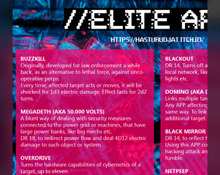
App's 4 Elite
Concept: “A bunch of custom APP's for CyBorg, to make hacking and hackers more fun.”
Content: A set of apps for the discerning hacker, whether they work with or against the PCs.
Writing: Imaginative descriptions and mechanicals effects that feel quintessentially cyberpunk.
Art/Design: Two-column layout of white text on translucent pink over a dark blue patterned background.
Usability: Clearly distinguishable app entries provide easy navigation, and text/background contrast provides accessible readability.
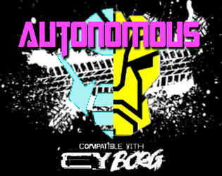
Autonomous
Concept: “Under the neon sky, amid the acrid fumes and blaring advertisements, something is present. They might have come with the rock, plunging into G0; or perhaps they were here long before then. There's no telling- there never is, not when the Autonians are on your planet. They blend in, fighting a shadow war- the crushing fist of an avaricious tyrant, and those few but proud who oppose him.”
Content: A collection of NPCs for tables where players & GMs prefer their robots to be more than meets the eye.
Writing: Bombastic worldbuilding that reflects the spirit of the source material it homages, with each robot having its own unique vehicle “altform.”
Art/Design: A mix of one- two-column content layouts with black text on white background, with each NPC stat block placed beside a colorful illustration of that NPC.
Usability: Stat blocks are provided consistently in organization and font selections, although introductory text uses a variety of fonts to indicate emphasis and proper names.
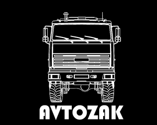
Avtozak
Concept: “Avtozak is a Cy_Borg expansion about riots.”
Content: A set of riot-related NPCs, weapons, and a table of riot causes.
Writing: Terse, frank descriptions and stats/mechanics for included content.
Art/Design: Illustrations of riot vehicles and participants (cops and protesters) with highlight colors are positioned alongside relevant high-contrast text.
Usability: Font choices are readable, with headings/labels and background colors for distinct sections that assist navigation and perusal.
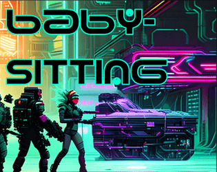
Babysitting
Concept: “An easy job ! Just sit around and babysit some corpo doctor and this box. Easy money?”
Content: A gig to retrieve, guard, and escort a person and their cargo to a designated safehouse.
Writing: Prolific details to flesh out the mission and the various groups with interests in its success–or failure.
Art/Design: Trifold brochure format provides initial parameters on the inner panels and later-stage conflicts on the outer panels. Predominantly white/yellow text on black, with NPC stats in black on brightly colored boxes, with portraits and street scenes complementing text. An additional page is provided with a safehouse location map and player-facing ‘breaking news’ info.
Usability: Color-coded text references draw attention to different NPC interactions, and consistent use of content section color and shape makes for easy identification of desired info.
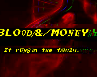
BL00D/&/M0NEY
Concept: “Crime families in the squalid megatropolis of CY. The deepest wounds of society- human traffickers, whoremongers, extortionists -have a tendency to crust over in stubborn scabs. Those who dare to commit evils nobody else has had the gall to perform before will find little competition in the field, and therefore great success. That’s how these families made their mark- bullets forever embedded in the cancerous and corrupt flesh of the great beast CY, they pushed the limits. And now, they’re here to stay, until someone’s willing to dig the slug out…”
Content: Information on six crime families/organizations that can be integrated into games of Cy_Borg: what their primary interests are, notable NPCs, and how GMs might make use of them.
Writing: Details provided in meaty paragraphs full of ideas and hooks, in a conversational voice that could be read straight to players as in-universe knowledge.
Art/Design: Black-on-gray single-column text layout, with an illustration at the bottom of each page that reflects the character of each crime family.
Usability: Easily readable/navigable, with solid contrast for text fore/ground. Headings and key terms/phrases are bolded for distinction and emphasis.
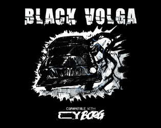
Black Volga
Concept: “A new, terrifying enemy straight from Polish urban legend - Black Volga. Now roaming the streets of CY, looking for petrol. But it's now what you think it is. ‘I’ve heard it. The sound of the engine weirdly resembles a beating heart. Guess it’s my weird imagination’ ‘Windows are pure black. I wonder… who is inside?’ ‘I swear to Balfogriff, I’ve seen tentacles slipping out of the windows!’”
Content: A demonic automobile that terrorizes the roadways.
Writing: Ominous and creepy flavor made all the creepier by the car’s devastating attack mechanics.
Art/Design: White and blue text on black surrounds a hand-drawn illustration of the Black Volga.
Usability: Visually, color, italics, and positioning of content help indicate the different purposes and kinds of text on the page. However, the text is not embedded, so no searching/selecting is possible.
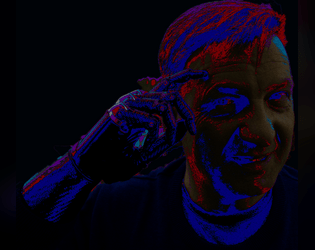
Blackhand's Blackmarket
Concept: "Listen choombatta, I just finished trekking to this MegaCity from beyond the pond. Either you buy this gear or you scram! I'm tired of punks trying to haggle - these are the prices, these are the wares, do not *%$! with me!"
A lone grey-haired man with a black van stands in front of you. All he's carrying is a revolver and a black cybernetic hand. Somehow, you catch the feeling that he knows more about Cy than you ever will…
And he's selling Cybertech & Drugs! New mechanics are associated with them, giving you the EDGE you need to topple your enemies - but, as all addictions and drugs and hubris, it comes with severe costs/drawbacks. Are you willing to take the hit and chrome up? The dark future awaits…”
Content: A set of six drugs and six pieces of cybertech for punks to use or misuse on the streets of CY.
Writing: An intriguing mix of mechanical effects (some more complex or complicated than others) and their very colorful names.
Art/Design: Yellow and pink text (one color on each page) over a dark background illustration.
Usability: Text is mostly visually contrasted enough to be readable, although some background elements may momentarily slow reading or browsing. Text is not embedded so no searching/selecting is possible.
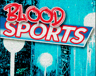
Blood Sports
Concept: “Some trashy random tables for generating odd sports and shows names punks play in CY_. You can roll some cocky champion names too and get some inspiration from the portraits provided.”
Content: Tables for quick generation of game types/specifics and famous sports NPCs, all of which are soaked in CY style.
Writing: Table results are vivid, grungy, and dystopian–exactly what you’d hope for.
Art/Design: Contrasting-color rows help with table navigation, with tables positioned around the edges of large image spreads (an arena and a gallery of NPC portraits), with an eye-bleeding aesthetic and palette.
Usability: While not all tables are labeled, it’s clear what each does functionally and how to use it alongside the others.
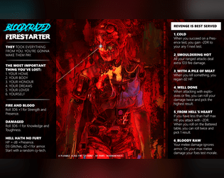
Bloodcrazed Firestarter
Concept: “They took everything from you. You’re gonna make them pay.”
Content: A class for the vengeful arsonist on a path of destruction.
Writing: Concise, intense text that merges pathos and mechanics into intriguing features.
Art/Design: A stunning illustration of a firestarter in red, framed on either side by a column of class features in white on black.
Usability: Text is easily readable and navigable, with helpful bolding for headers and horizontal rules for separating different class details.
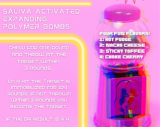
Bombles Chewable Grenades
Concept: “Yum! Delicious Bombles Chewable Grenades, a piece of equipment compatible with CY_BORG RPG. (DO NOT SWALLOW)”
Content: A fun and tasty way to weaponize one’s food.
Writing: Concise, direct explanation of bombles and how they operate mechanically.
Art/Design: White-on-pink (and yellow highlights) advertisement aesthetic with an image of a gumball machine on the right side of the page.
Usability: Info is easy to navigate and recognize particular content details, from bumble flavors to mechanical effects to credit cost. Supplement is provided as an image file, so text is not searchable or selectable.
Borgpunk
Concept: “Maybe you're tired of Players rolling Presence to charm/snipe/shoot their way in and out of any situation, especially that Discharged Corp Killer who, for some reason, rolled a +3 on his Presence. Well, do not worry anymore, as this hack aims to fix that.”
Content: An expansion of stats and skills to add a bit more crunch to games of Cy_Borg.
Writing: Focused, direct explanation of optional mechanics to integrate into a game, along with an insightful rationale for the hack’s existence and a character sheet organized to include the new stats & skills.
Art/Design: Single-column white text on a dark black-and-purple patterned background. Character sheet mixes hand-drawn illustration, photo collage, and fillable fields.
Usability: Text in both files is high contrast and has consistent font use for headings/labels and body content. Unfortunately, text is not embedded in either file, so searching/selecting is not available.
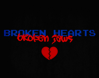
BR0KEN_HEARTS//BR0KEN_JAWS
Concept: "’Some desperate Alliansen admin put out a plea to rescue her AI program. Not sure why she doesn't just use company muscle to get it back, but she's promisin' the reward of "anything within her abilities," so here we are. Hope ya brought your earplugs though, cuz the goons that stole it are LOUD.’”
Content: A mission to recover an AI stolen by musicians.
Writing: Concise bursts of info to guide a GM toward notable encounters and fitting atmosphere.
Art/Design: Red and blue on black, with an aesthetic that mixes graffiti/tagging with software terminals, arranged in mostly one- and two-column layouts. A map of target location is provided in pink.
Usability: Consistent presentation of content elements throughout the document, making visual identification of headings etc. very easy. However, text is not embedded so no searching or selecting is possible.
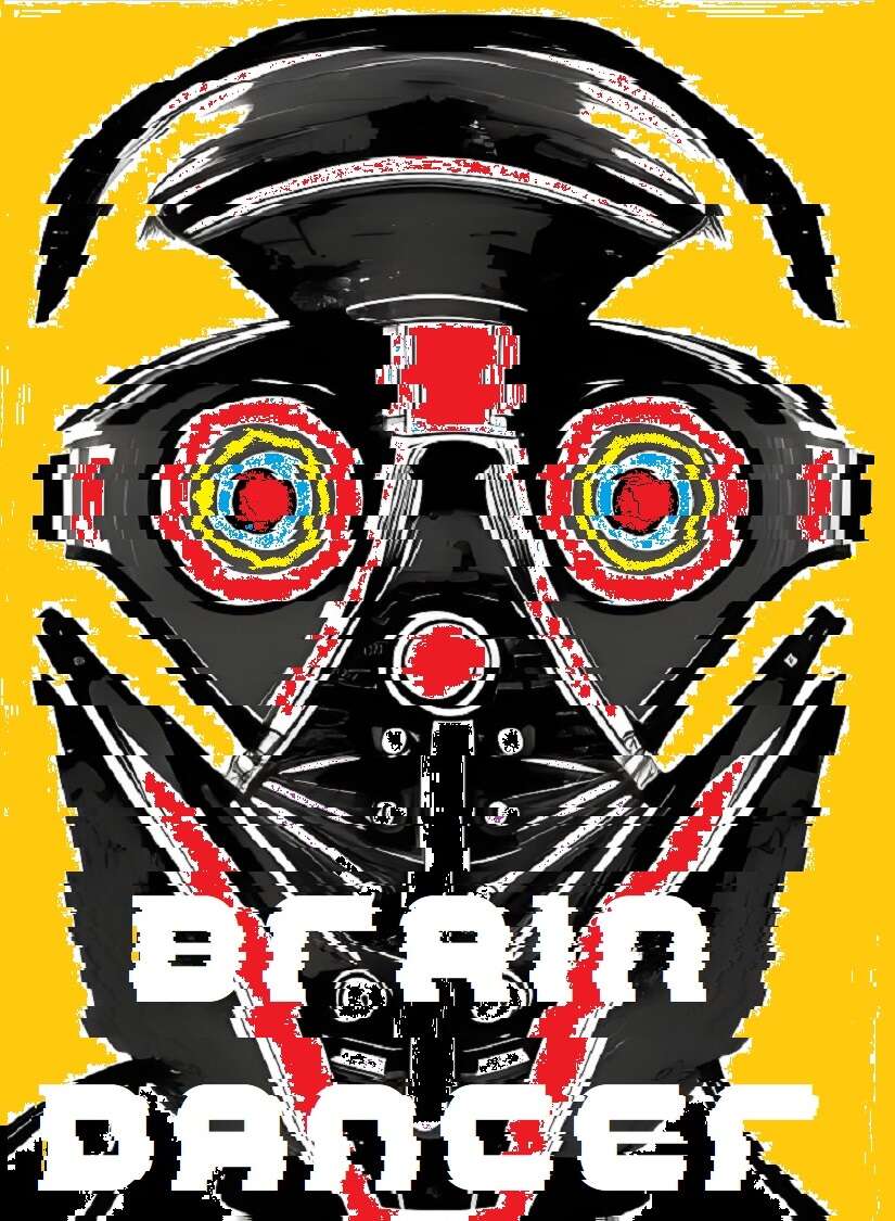
Brain Dancer
Concept: “Chiphead. Holobob. Eyerot. People talk a lot of shit. Let them. You know something they don’t: the whole world’s a stage, and you’re a motherfucking star. All you gotta do is keep dancing, and let the brain-tape roll.”
Content: A class for the talent, the face, the influencer, the fame addict.
Writing: Intriguing class features that evoke a mix of excitement and outright horror that feels completely appropriate for the streets of Cy.
Art/Design: Two-page spread with a portrait illustration of a brain dancer on the left with class features in creatively organized tables on the right.
Usability: For the most part, each section of content is visually distinct from the others, which makes for easy navigation on the page. However, the file is provided as a PNG, so text is not embedded (no searching or copying/pasting available).

Brain Trust
Concept: “A professor at the University of Cy has intel that her corporate rival has acquired a philosophical impossibility: A Boltzmann brain. A thought experiment that shouldn’t exist. She wants the brain acquired so that she can test for the truth.”
Content: A gig to procure a particular disembodied brain from a secure corporate facility.
Writing: Lots of atmospheric depth in details that range from location-specific info to locker room contents.
Art/Design: Mostly single-column layout of black-on-white text (with a few sporadic accent colors) complemented by maps of the job site–also provided separately in GM- and player-facing map images.
Usability: High-contrast text, document layout, and consistent presentation of distinct types of content all contribute to easy visual navigation and location of desired information.

BRAINROTTEN INFLUENCER
Concept: “When you signed up with the network, you didn’t expect your life to spiral downhill this quickly. Your RCD is modified to stream 24/7 on platforms like NuTube and Spasm, no pauses allowed.
Most of your colleagues died chasing fame. You’re still alive, barely teetering on the brink of psychological and physical collapse.”
Most of your colleagues died chasing fame. You’re still alive, barely teetering on the brink of psychological and physical collapse.”
Content: A class for the would-be social media mogul who’s breaking bad to maintain their follower count.
Writing: Bleak and pointed satire pervades the class abilities and descriptions to emphasize the daily life of a Cy resident.
Art/Design: One- and two-column black-on-white text layout, with a separate cover page showing an illustration of a brainrotten influencer portrait.
Usability: Consistent visual elements (headings, borders for distinct content sections, font choices, etc.) all contribute to an easily recognizable visual grammar and means of perusing class info.
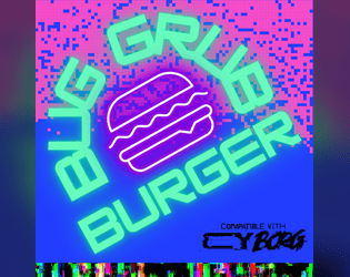
BugGrub Burger
Concept: “Narrow and crowded. The BugGrub Burger shines green and purple. Sounds of wet smacking. Insectoid mascots crowd the outer walls and ceilings, shrieking adverts … an explosion rains glass on all of it. The Heirs of Kargoz advance. Get in and out before they do.”
Content: A scenario for assassins and data thieves who prefer fast food to fine dining and want to know how the sausage gets made.
Writing: Inspired descriptions and scenario components bring the Burger joint to life and provide GMs with a plethora of dangerously grimy and horrifying details.
Art/Design: Primarily black-on-white text with colors to accent headings/labels and helpful images–a map of the site, employee portraits, etc.
Usability: Layout and color scheme is easy to make sense of for quick navigation and identification of desired info. While content is in PDF form, the text is not embedded, so no searching or copying content to clipboard is available.
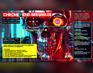
Chrome Fiend Berserker
Concept: “Obsessed with chrome and power, one man army, murder machine.”
Content: A class for the cyberware-focused ship of Theseus.
Writing: Brief bursts of evocative flavor and mechanics hint at intriguing possibilities for a unique character.
Art/Design: Bright colors draw attention to the content arranged around the page, with a large skull in the center that stares at the reader.
Usability: Text is very readable, and several different fonts and colors provide highly visible distinctions in content and purpose.
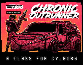
Chronic Outrunner
Concept: “
> > > Always out of time. Never out of gas. Somehow, you keep turning up. > > >
[[nowhere fast]] _drive through Cy, bolting new gear to your car as you go
[[built to last]] _jump forward in time while tethered to your custom ride
[[link to the past]] _perfect your vehicle and when the time is right—
FIND AN OPEN STRETCH OF ROAD AND OUTRUN THE APOCALYPSE”
Content: A class for the road warrior who wants to hit a high enough speed and see some serious shit.
Writing: A range of descriptive and mechanical features that emphasize the post-apocalyptic possibilities of life in CY and beyond.
Art/Design: Two versions: black on white and black on orange, organized as a landscape-oriented spread with distinct text elements framing an illustration of an outrunner next to their car.
Usability: Consistent presentation of headings, body text, and emphasized content all contribute to easy navigating and identifying desired information.
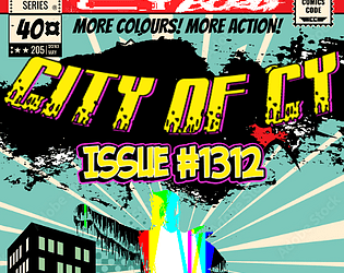
City of CY Issue #1312
Concept: “In a city where money is God, people are interchangeable pieces of hardware and morality is a way to put yourself in the red, what's a hero? Is it the most effective SecOps officer in history? A vigilante dedicated exclusively to beating up poor people? A time-hopping assassin who can extinguish a problem you didn't even have yet? They're faster than a rubber bullet, more powerful than a profit motive, able to leap entire slums in a single bound…”
Content: A set of super “heroes” who appropriately reflect the sociopolitical dynamics of CY, with backstories and stat blocks that allow easy integration into any group’s game.
Writing: Dark humor and commentary make each entry feel painfully real (or at least plausible, motive-wise), even while jam-packed with the gritty/edgy flavor of ‘90s comics.
Art/Design: Single-column text organization provided in two schemes: black-on-white and white-on-dark-gray.
Usability: Consistent presentation of entries and particular kinds of content makes it easy to navigate the document and locate desired information.
CLUB 27
Concept: “Club 27 is a Cy_Borg expansion about the Club 27 urban legend.”
Content: A nightclub with a discerning membership, some of whom can be hired as mercs.
Writing: Brief details about the club and its members that suggest a variety of ways that a GM might incorporate the place into their game.
Art/Design: Single-fold pamphlet layout with an immersive background club-aesthetic illustration for each panel overlaid with text content.
Usability: High-contrast text is easy to read, with headings and emphasized text visually distinct through font size and color. Most text is embedded, allowing for searching/selecting.
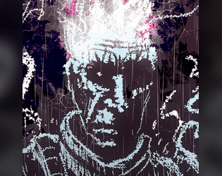
Conductive Convict
Concept: “You were just another dreg waiting for death. But then that explosion happened inside your prison transport. Your face is on every city corner, but your more concerned with the electricity shooting from your fingers. You don't hunger but crave the power of energy. You need answers, and you suspect you're not the only one of your kind. Will you blaze an unforgiving war path, or be a paragon of hope?”
Content: A class for the player whose relationship with electronics–or even static–is “complicated.”
Writing: Direct explanations of class features provided to situate the player toward the class and its assorted benefits and detriments.
Art/Design: A spread of class details in two columns beside an expressive image of a conductive convict rendered in chalk.
Usability: Layout facilitates navigation between sections and understanding content. However, the class is provided as an image, so text is not searchable or accessible as a result.
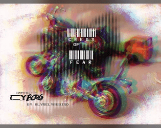
Creds of Fear
Concept: “Royal West Shipping has hired your gang for a non-union haul to their warehouse in Mosscroft. Only the desperate, or foolish would participate. Are you willing to sacrifice everything for the creds?”
Content: An adventure that involves transporting cargo through the city, complete with a number of hazards, obstacles, and other dangers that might await the unsuspecting punk.
Writing: Tight, concise descriptions of relevant details for GM and player creative elaboration/interpretation of the scenario events.
Art/Design: Two-column spread with a left-side glitch art illustration and a right-side single column of scenario text.
Usability: While the font choice is clean and sections are distinguished with whitespace and indentation, text is not embedded so not searchable or capable of copy/paste. A high-contrast version of the document is included.
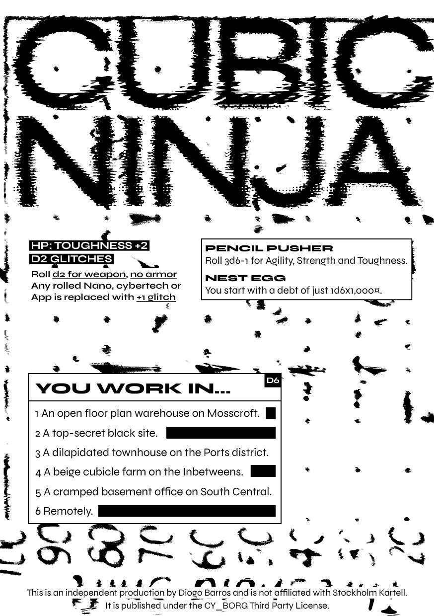
Cubicle Ninja
Concept: “Unlike some people, you actually have a job. Wake up, shower, force feed, commute, grind, commute, wind down, brush teeth, sleep. Repeat until put out to pasture.”
Content: A class for the everyman who’s working hard but yearns to be hardly working.
Writing: Succinct descriptions and class features to situate a player amid tedious labor conditions.
Art/Design: Black-on-white two-column spread layout with touches of static, glitch, and photocopied aesthetics.
Usability: High-contrast text in distinctly organized blocks of content make for easy identification and navigation throughout spread.
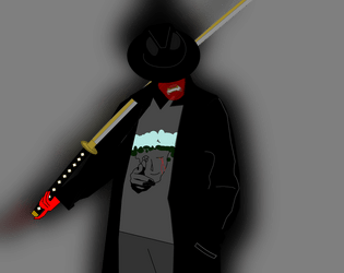
Cultured Swordsman
Concept: “While the VIPs were doing drugs and having sex in Ports You studied the blade. And when Your parents kicked you out You put your skills to use.”
Content: A class for the inner edgelord who wants to viciously dual-wield the tropes of anime and anime fan.
Writing: Helpfully clear mechanics drenched in the flavor of this class concept.
Art/Design: Clean illustration of archetype complements a minimalist layout.
Usability: Readable, navigable text with visually clear distinctions between types of class features/details.
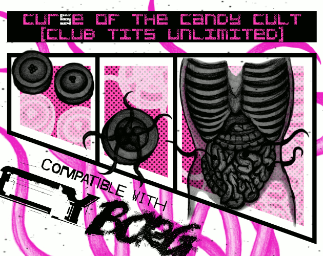
Cur(s)e of the Candy Cult (Club TITS Unlimited)
Concept: “New Location Pad Entry. A Strip Club Dungeon inhabited by a strange Candy Cult for TRIGGER WARNING Jam compatible with Cy Borg.”
Content: A mission to liberate a cultist from their organization’s lair. A pair of player-facing handouts (including a map) is also included.
- Writing: Terse and disturbing details that emphasize the insidious nature of the candy cult.
Art/Design: Two-column layout with black, pink, and white elements. Job details and NPC stats provided on the left, complemented by illustrations of candy, cultists, and–to the right–two levels of Club TITS Unlimited.
Usability: Text is mostly high-contrast and easy to discern purpose for, allowing for easy perusal and use. Only some text is embedded, which can complicate searching or selecting text.
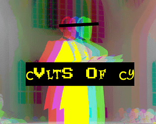
Cvlts of CY
Concept: “A sampling of cults from across the stricken districts of CY, peddlers of false hope to the rasping masses that congregate in the shadows of avarice and oppression. Each of these cults has a leader, an ideology and a specific trouble they cause to the already troubled city. However, where there is trouble to be caused there is opportunity to be seized, and pvnks with few scruples could make significant creds in the employ of these deranged zealots by doing their dirty work for them.”
Content: A collection of six cults and details about their goals, backgrounds, vices, and leaders.
Writing: Detailed descriptions and explanations of cults to be found in CY, with plenty of scenario/plot potential for a GM to develop further.
Art/Design: Layout is primarily a single column of text, with an evocative image reflecting each cult placed amid that cult’s descriptive paragraphs. Color scheme is black on yellow.
Usability: Layout is extremely easy for identifying particular elements and navigating to desired info. Cult entries are provided in a numbered list, and key information is bolded or highlighted.
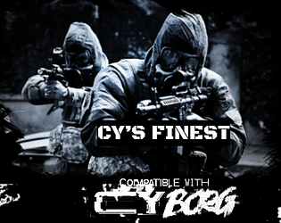
CY'S FINEST
Concept: “The SecOps aren't just faceless walls of flesh and Kevlar hiding behind riot shields. Some of them mean business. Some of them mean serious business. Some of them are zealous, some sadistic, some are just really chasing that dollar, but between one thing and another, this is the quiverful of crazies that the milcorps have to sling at anyone who's causing more trouble than the beat cop can handle.”
Content: A gaggle of highly skilled expert operatives capable of giving any punk in CY an absolutely terrible day.
Writing: A brief in-game description of each SecOps team precedes its stat block and abilities, providing a clear sense of the group’s approach as well as how others tend to think of them.
Art/Design: Each page includes a relevant graphic (e.g., a double helix structure for a biocommando team) above single-column text. Three versions are provided: “classic” (black on white color scheme), “nite mode” (white on gray), and text-only.
Usability: Font choices are easily readable, and headings/labels/decorated text cues are visually consistent throughout the document.
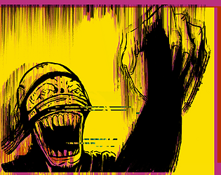
Cy_Borg - Living Dead Rules
Concept: "Random tables to spice up your PCs."
Content: Two tables for customizing living dead creatures: d6 heinous powers and d6 ways to become undead.
Writing: Flavor is hilariously macabre, and mechanics are explained clearly but also in line with macabre flavor.
Art/Design: Black/yellow color scheme accents the image of a deranged living dead creature surrounded by table entries.
Usability: Content is easy to read but tables are “exploded” across the page.
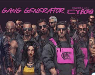
Cy_Borg Gang Generator
Concept: “One page of tables to roll up a gang for your Cy_Borg adventure. You'll get the gang's name, their criminal activity, their base, and who they're at war with.”
Content: A one-page set of tables with which to quickly create a CY-based gang.
Writing: Table entries are terse and evocative of different elements of cyberpunk tropes.
Art/Design: Tables are provided as light purple text on dark gray background boxes over a full-page background illustration of assorted gang members in a cityscape.
Usability: Contrast, readable fonts, and consistent presentation of each table all allow for easy use of the information here so as to bring a gang to life.
Loading next page...