Ross_Hollander

(Ross') CY_OPS
Concept: “The city of CY, home to the sickest minds in human history. How finely can you grind people, how much of them can you crush and squeeze, until nothing is left at all? That's what they try to figure out. The obscenely rich, the fanatically obsessed, the god-complex egomaniacs obsessed with world domination. Their lairs, their schemes, their murderous henchmen.
Thankfully, there's also someone on the other side of the equation. Packing heat under a tuxedo, or stranglewire in an evening gown's lining. Sophisticated to a knife's edge, but ready to spatter fine suits with hired blood when the time comes to clean house. Organizations that do nothing but watch and wait, and hand out packets of interesting information about the habits and domicile of movers and shakers to people who know what needs to be done.
This is CY_OPS. Check the angle of your tie one last time, and get ready to raise hell.
No relation to existing supplements also named CY_OPS.“
Content: A set of tables to help bring a game of Cy_Borg to life: schemes, henchmen, painful deaths, lair details, and more, along with two classes: “exterminator pitbull” and “stirred and shaken.”
Writing: Lots of atmospheric detail intertwined with explanations of mechanical effects. The two classes offer very different and distinct approaches to how a punk might take on some of the ops hinted at throughout this supplement.
Art/Design: Provided in both full-color and black-and-white versions, with both making use of single-column text on each page. Full-color version provides some background images–ornate rooms, window blinds, silhouettes, etc.--with high-contrast text (black and yellow) on top.
Usability: Text layout and contrast provides mostly easy readability in full-color version, although some background images are busy enough to slow the reading process.
1DLE/H4NDS
Concept: “There's been a hushed-up incident at the Naiman Cybernetics factory in Bigmosse. The corpos are sweating and they need it cleaned up- fast and off-the-books. Head in and clean house, but stay on your guard: this is just the tip of the iceberg.”
Content: A clearance mission at a cybernetics facility where the situation has gotten dangerously out of hand. Content provided in three versions: a “classic look” black-on-yellow scheme, a “nite mode” black-on-gray scheme, and a “squeaky clean” black-on-white scheme that uses standard fonts.
Writing: Detailed breakdowns of locations, NPCs/enemies, potential events that might unfold (including an alternate plot hook), and an optional set of bonus goals for the PCs to achieve.
Art/Design: Each version makes use of a single-column text layout, simplified location maps, and illustrations of enemy cyborgs.
Usability: Very easily readable and navigable, with consistent use of distinct headings/labels to indicate different sections and kinds of content and important elements.
Autonomous
Concept: “Under the neon sky, amid the acrid fumes and blaring advertisements, something is present. They might have come with the rock, plunging into G0; or perhaps they were here long before then. There's no telling- there never is, not when the Autonians are on your planet. They blend in, fighting a shadow war- the crushing fist of an avaricious tyrant, and those few but proud who oppose him.”
Content: A collection of NPCs for tables where players & GMs prefer their robots to be more than meets the eye.
Writing: Bombastic worldbuilding that reflects the spirit of the source material it homages, with each robot having its own unique vehicle “altform.”
Art/Design: A mix of one- two-column content layouts with black text on white background, with each NPC stat block placed beside a colorful illustration of that NPC.
Usability: Stat blocks are provided consistently in organization and font selections, although introductory text uses a variety of fonts to indicate emphasis and proper names.
BL00D/&/M0NEY
Concept: “Crime families in the squalid megatropolis of CY. The deepest wounds of society- human traffickers, whoremongers, extortionists -have a tendency to crust over in stubborn scabs. Those who dare to commit evils nobody else has had the gall to perform before will find little competition in the field, and therefore great success. That’s how these families made their mark- bullets forever embedded in the cancerous and corrupt flesh of the great beast CY, they pushed the limits. And now, they’re here to stay, until someone’s willing to dig the slug out…”
Content: Information on six crime families/organizations that can be integrated into games of Cy_Borg: what their primary interests are, notable NPCs, and how GMs might make use of them.
Writing: Details provided in meaty paragraphs full of ideas and hooks, in a conversational voice that could be read straight to players as in-universe knowledge.
Art/Design: Black-on-gray single-column text layout, with an illustration at the bottom of each page that reflects the character of each crime family.
Usability: Easily readable/navigable, with solid contrast for text fore/ground. Headings and key terms/phrases are bolded for distinction and emphasis.
City of CY Issue #1312
Concept: “In a city where money is God, people are interchangeable pieces of hardware and morality is a way to put yourself in the red, what's a hero? Is it the most effective SecOps officer in history? A vigilante dedicated exclusively to beating up poor people? A time-hopping assassin who can extinguish a problem you didn't even have yet? They're faster than a rubber bullet, more powerful than a profit motive, able to leap entire slums in a single bound…”
Content: A set of super “heroes” who appropriately reflect the sociopolitical dynamics of CY, with backstories and stat blocks that allow easy integration into any group’s game.
Writing: Dark humor and commentary make each entry feel painfully real (or at least plausible, motive-wise), even while jam-packed with the gritty/edgy flavor of ‘90s comics.
Art/Design: Single-column text organization provided in two schemes: black-on-white and white-on-dark-gray.
Usability: Consistent presentation of entries and particular kinds of content makes it easy to navigate the document and locate desired information.
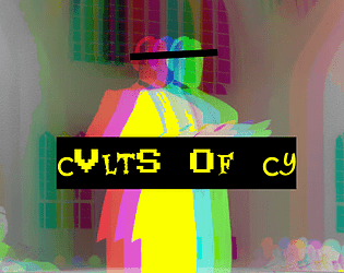
Cvlts of CY
Concept: “A sampling of cults from across the stricken districts of CY, peddlers of false hope to the rasping masses that congregate in the shadows of avarice and oppression. Each of these cults has a leader, an ideology and a specific trouble they cause to the already troubled city. However, where there is trouble to be caused there is opportunity to be seized, and pvnks with few scruples could make significant creds in the employ of these deranged zealots by doing their dirty work for them.”
Content: A collection of six cults and details about their goals, backgrounds, vices, and leaders.
Writing: Detailed descriptions and explanations of cults to be found in CY, with plenty of scenario/plot potential for a GM to develop further.
Art/Design: Layout is primarily a single column of text, with an evocative image reflecting each cult placed amid that cult’s descriptive paragraphs. Color scheme is black on yellow.
Usability: Layout is extremely easy for identifying particular elements and navigating to desired info. Cult entries are provided in a numbered list, and key information is bolded or highlighted.
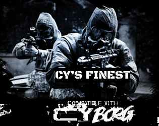
CY'S FINEST
Concept: “The SecOps aren't just faceless walls of flesh and Kevlar hiding behind riot shields. Some of them mean business. Some of them mean serious business. Some of them are zealous, some sadistic, some are just really chasing that dollar, but between one thing and another, this is the quiverful of crazies that the milcorps have to sling at anyone who's causing more trouble than the beat cop can handle.”
Content: A gaggle of highly skilled expert operatives capable of giving any punk in CY an absolutely terrible day.
Writing: A brief in-game description of each SecOps team precedes its stat block and abilities, providing a clear sense of the group’s approach as well as how others tend to think of them.
Art/Design: Each page includes a relevant graphic (e.g., a double helix structure for a biocommando team) above single-column text. Three versions are provided: “classic” (black on white color scheme), “nite mode” (white on gray), and text-only.
Usability: Font choices are easily readable, and headings/labels/decorated text cues are visually consistent throughout the document.
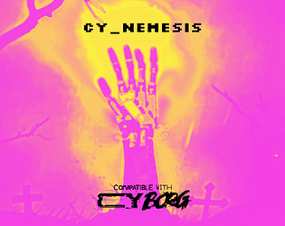
CY_NEMESIS
Concept: “Nothing is ever over. You don't just turn them off. This is CY; death is inconvenient but it's far from irreversible. Within, find a brief table of ways that old enemies might come back to h(/a)unt you across the streets and slums of the metropolis of the damned.“
Content: A table of ten entries describing different potential opportunities for a “dead” opponent to return with vengeance on their mind.
Writing: Each entry provides 2-3 sentences of ominous, flavorful (and sometimes mechanics-oriented) detail for GMs to make optimal use of against their players’ characters.
Art/Design: Single-column black-on-white numbered table. A cover page is included that makes use of a GUI file folder aesthetic to signal the difficulty of simply moving one’s nemesis to the proverbial trash.
Usability: Visually easily readable font with high-contrast color use makes for an easy time reading and locating desired information.
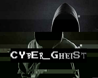
Cyber_Gheist
Concept: “What are you looking for? There isn’t anything here. Nothing. At all. Stop searching. Certainly not a digital ghost. A flicker on each camera, closer and closer to the penthouse suite. A single vital minute’s disruption in security. The scanner bleep you simply overlooked. A shadow in your programs. A knife in the neck in the time it takes to hit refresh. No, nothing like that at all. Probably just a glitch. You can probably ignore it.”
Content: A class for the player who lives and breathes stealth and evasion.
Writing: Colorful descriptions of class features provided mostly in engaging, full-sentence format addressing the player rather than as stat blocks or succinct phrases.
Art/Design: Two versions provided: a white-on-dark background version, which is overlaid on glitch art of a hooded figure and uses some yellow highlighting for emphasis and key terms, and a simple printer-friendly black-on-white version whose only embellishment is bolded text for emphasis and key terms.
Usability: Consistently readable visually (and as embedded text) and accessible in language. The calculation of SHADOW (as part of the “Haunting” feature/mechanic) might temporarily trip up some at first.
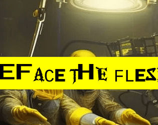
Deface the Flesh
Concept: “Gruesome implants and upgrades for a future where the body is irrelevant and flesh has no sanctity. Defile your physicality to keep up in the rat race of society. Set-dressing or inspiration from grim-dark cybernetics.”
Content: A d10 table of bizarre and grotesquely functional options for upgrading one’s imperfect and disappointing meat-suit.
Writing: Powerfully inventive descriptions of implants that suggest a wide range of uses and reasons for their potential ubiquity in CY–but no stats or game mechanics are attached. It’s all flavor, and it is zesty.
Art/Design: Black text on yellow, with a chaotic-looking font or set of font choices for each entry’s label. An image of disturbing surgeons working on an unseen patient frames the supplement’s title.
Usability: While each label can be difficult to read due to the intentionally inconsistent appearance of each character, the text overall is very easy to read and navigate to consider options or to locate desired info.
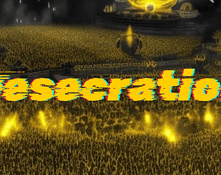
Desecration
Concept: “1EDX is the biggest viscpop band in all of CY. Now, their songwriter has contacted a bunch of punks to try and 'kidnap'--that is, free--them from the clutches of the band. Currently, they're in 1EDX's luxury mansion compound. But it's just the time for a rescue op, as 1EDX is opening their doors to a few lucky winners of a raffle for a tour of their mansion. Act fast.“
Content: A scenario to infiltrate, locate, and liberate the abused talent from the city’s biggest pop stars. Two versions of content included: "Classic Look" and "Squeaky Clean."
Writing: Plenty of engaging detail to flesh out the locale, the situation, and the NPCs that the PCs might encounter, including some juicy secrets for the GM to incorporate or have the players discover as appropriate.
Art/Design: Primarily black, single-column text on yellow, with some color-coded labels to indicate particularly important details and (near the end of the supplement) approaches to the mission. Clean, lo-fi overhead map layouts of the mansion with color-coded layouts and labels. An image of a massively populated concert frames the adventure title on page 1.
Usability: Color-coding helps tremendously to relate particular elements to one another, and layout allows for quick navigation and identification of desired info. “Squeaky Clean” version is included for even easier reading, and more printer-friendly, experience (black on white with less color use throughout).
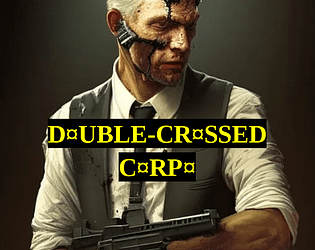
Double-Crossed Corpo
Concept: “It started innocent, didn't it? Just street brawling and hanging around in dingy pvnk haven bars, then slipping back into your other life in the high-placed corpo job. But it couldn't last. Now it's not just a hobby, a 'second life' for you to run as a pvnk. It's your actual life, and if you don't watch your back, it could be your death too. But you made it through the concrete jungle, the corporate arena. The streets of CY are just one cubicle block to claw your way through.”
Content: A class for the white-collar worker who’s found purpose in raging against the machine.
Writing: A mix of features to balance the punk’s former corporate identity and their current violent criminal undertaking, with a particularly interesting mechanic based on a poker-like 5d6 roll result.
Art/Design: Two versions are provided, both of which use a mostly single-column layout with a single table: a full-color version with white/yellow text on black background lines over colorful, pixelated background images of stock tickers/readouts; and a printer-friendly black-and-white version.
Usability: Both versions provide clear, consistent visual distinction of headings/labels and key terms that are emphasized in various lines of text. Full-color version may be slightly more difficult for some to read easily due to busy nature of the background image.
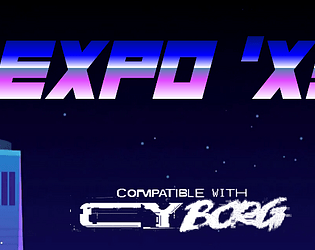
EXPO 'X3
Concept: “Are you hyped for Expo 'X3? Every megacorp in CY will be strutting their latest innovations, every star will be walking the red carpet at the Kinotorium, every cuisine will be there for the tasting at The Spot food market, every corpo suit will be dragging themselves in to 'touch base' and 'network'- just about everything about CY will be scrunched down into these fairgrounds for a bash like you've never seen (since the last one). Get your tickets now!”
Content: A special city event with tons of attractions, locations, food/stuff to buy, enemies to encounter, and other reasons to attend.
Writing: Copious details and helpful information about who’s who, what’s what, and where’s where in the expo for GMs and players alike, written primarily in a cheerful-but-snarky voice that reflects the tone of many expo info kiosk staffers.
Art/Design: Primarily black-on-white single column text complemented by color illustrations, with occasionally more colorful pages with full-color and dark backgrounds.
Usability: High-contrast, readable text provided throughout, with consistent presentation of visually identifiable headings, labels, list item numbering, etc.
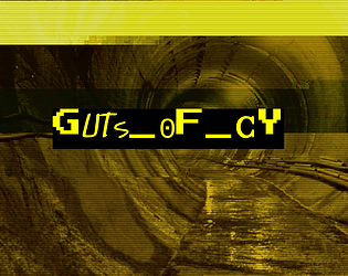
GUTS_OF_CY
Concept: “CY is a great beast and these are its bowels, the living guts of the city. Awash in filth and the prowling grounds of criminals, scvm beneath notice, maintenance workers, bounty hunters and strange monstrosities bred in the noisome darkness beneath this city. Features a d66 table of encounters in the sewers of CY and a d20 table of tunnel graffiti.”
Content: A set of tables to flesh out the grimy, dangerous CY undercity.
Writing: Vivid descriptions of encounter seeds (not only who/what players might find but what’s going on when they find something) and graffiti messages and styles to be found on sewer walls.
Art/Design: Black text on yellow in a single column of text. A glitch-art illustration of a sewer tunnel frames the supplement title on the first page.
Usability: Tables are numbered, with bolded labels for NPCs and their special attacks to emphasize details a GM might be scanning the page to locate.

HAIL KERGOZ
Concept: “Across CY prayers are whispered through rotting lips to a demoniac God of rotting flesh and the things that grow and squirm within it. The lines between machinery and mortality are gnawed through and collapse; heartbeats meld with motors in a morass of meat and metal barely distinguishable from each other.”
Content: A cathedral’s worth of faith-powered enemies with which to unleash pestilence and disease on a table of punks.
Writing: Potent descriptions of each kind of NPC are accompanied by thematically apt mechanics, each more disturbing than the last. Tables of names, targets, treasure/loot, and potential NPC quotes are also provided.
Art/Design: Primarily single-column black text on white background, with a full-color digital collage image on the cover page.
Usability: While different sections of the document differ stylistically, each section has a consistent visual organization/grammar that makes it easy to navigate (heading/label placement and emphasis, whitespace use, etc.). High contrast black-on-white and readable fonts allow for quick and accurate location of desired info.
Loading next page...
Page 1 of 2
Next page