Ross_Hollander
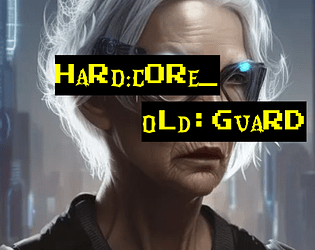
Hard:Core_Old:Guard
Concept: ”You never got the chance to go out in a blaze of glory. Somehow, it just never happened to you. Every ‘last job’ consistently failed to let you finally bite the concrete after taking on a platoon of SecOps solo to let the others get away. Survival is an irritating and embarrassing habit you seem to have picked up. So here you are, years and years later. The gray hairs creeping in, the same megacorps in control, the same synthetic food, the same brutal enforcers, the same putrescent city of the damned surrounding you. And yet, here you intend to stay.”
Content: A class for the grizzled elder who’s gotten too old for this shit.
Writing: Inspired class features to make a player feel like they’ve seen it all and can share their violent wisdom with others.
Art/Design: Two versions provided: a ‘classic’ look with white-on-black lines of text over a crumpled-paper background illustration, and a ‘squeaky clean’ printer-friendly black-on-white text. Both versions include two color portraits of old guards.
Usability: Text provided in single column layout with capitals, bold, and (in the classic look) distinct colors, all to distinguish different types and sections of content. Easy to navigate and to identify important details.
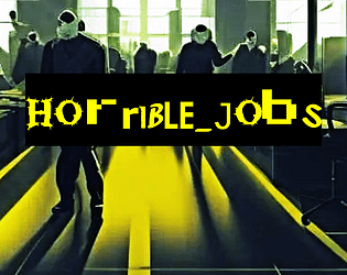
Horrible Jobs
Concept: “A CY_BORG zine featuring soul-throttling cyberpunk occupations. Your past, or perhaps your alter ego, in the crush of CY. Demeaning and pointless jobs that drove you into a new path.”
Content: A two-page d10 table of mundanity meant to provide PCs with painfully dreadful backgrounds that reflect the oppressive daily existence of the masses.
Writing: Morbidly hilarious and creative options speak to the breadth of crushing banality that makes for most characters’ familiar reality.
Art/Design: Mostly single-column text (black on yellow) with key terms/phrases emphasized in either a different font or a chaotic collection of fonts. An image of faceless workers in an office setting frames the zine’s title on page 1.
Usability: High-contrast color scheme helps with readability, as does simple layout of table content. Font(s) used for key terms can be difficult to read thanks to the purposeful disruption of character size/decoration/etc.
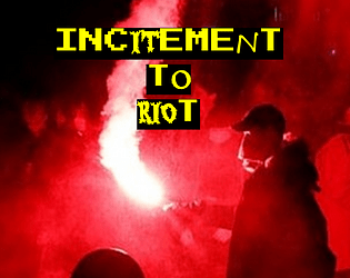
Incitement to Riot
Concept: “Some people are all but on fire. You’re a walking ‘assault on security personnel’ charge, a time bomb with seconds left, a shattering Molotov and the spreading flames, a brick going through a bulletproof glass visor. You’re a burning SecOps cruiser, a raised fist, a baseball bat with nails hammered into it, a consummate troublemaker, an all-around firebrand.”
Content: A class for the provocateur ready to rally the discontent toward change–or, at least, toward action.
Writing: Plenty of class features/options for the instigator yearning to burn it all down, with intriguing mechanics that can make a punk a serious threat/target via mob/mass activity. Class detail labels offer thematically inspirational flavor to get into the mindset of an Incitement to Riot character.
Art/Design: A fire-themed colorful version and a printer-friendly black-and-white version are provided. Colorful version has red/organe-tinted bonfire background images, with white text and yellow labels on black line backgrounds. Printer-friendly version uses bold labels to distinguish from body text.
Usability: Different kinds and sections of content are easy to recognize and consistently structured throughout the supplement, making navigation/identification of desired info similarly easy and enjoyable.
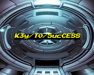
K3y/T0/5ucCESS
Concept: “Nothing ever goes smoothly, does it? Life of a pvnk in CY. There you are, about to score big on your job after the gunfights and hacking and double-crossing and more, and there's just one problem in the way: the door. This zine presents ten unusual conditions for getting at your loot, likely the brainchild of paranoid corpos with too much money on their hands. You'll have to put your mind to work on how to get past them. Available in Classic yellow, Nite grey or Clean white.”
Content: A set of potential complications or other unexpected qualities oriented around physical or digital keys, any of which can be used as twists or obstacles to just about any job a group of punks is looking to complete.
Writing: Each key is described in terms of its essential features, the specifics of its use, and potential reactions or consequences that might occur from its (mis)use.
Art/Design: Three versions are provide: a “classic look” version of black-on-yellow, a “night mode” version of black-on-gray, and a “squeaky clean” version of black-on-white. Each version includes a cover page with the supplement title centered on an illustration of a high-tech vault door. Layout is single-column text with a unique quality of each key provided in bold.
Usability: Easy to read and navigate, with clearly identifiable list elements.
L.E.O.
Concept: “If you thought life planet-side was bad, just wait until you get to The Brink, the space-station that skulks in orbit, where the corpos can decide to shut off your oxygen.
- Walk the lovely avenues of the Arcology or relax in the parlors of Paradise Bloc
- ...if you're filthy rich, which you probably aren't
- otherwise, mill around in Middling, and retire to the sterile squalor of the Pods
- fight for your profits (and your life, but that's just incidental) in the cutthroat competition of the Thruways
- join up with stationside pvnks to try and make a difference
- eat space food! (it's not very good)
“
Content: An orbital location with tons of different areas to explore, people to meet, jobs to run, and a bit of food to eat.
Writing: Extensively detailed information about the station and what goes on there, along with a number of tables to add a bit of additional surprise or variety to a given table’s experience on The Brink.
Art/Design: Several different page layouts and color schemes provide variety from one page to the next while also providing some consistency across each time a given aesthetic appears.
Usability: Text is mostly high-contrast and easily readable, with visually distinct headings and labels. Some color and font choices may momentarily slow down the reading/navigation experience.

Leviathan
Concept: “A vital drive, loaded with data worth millions to the Virid Vipers gangster coalition, has been lost in the sewers of CY. Something down there apparently ate the agent they had carrying it. Fortunately, the geo-tag still works, and the slumlord whose territory it was lost in is desperate for someone to find it before the Vipers toss him into the dank and filthy tunnels to find the thing himself. There's just one lethal detail that's been overlooked, lurking in the sewage…”
Content: A dungeon crawl to recover valuable cybertech from a monster stalking the sewers.
Writing: Imaginative descriptions make each area of the mission seem unique and dangerous, with relevant NPCs pursuing their own agendas.
Art/Design: Single column of text with black-on-white scheme, occasionally complemented by NPC portrait illustrations. A colorful, stripped-down map of the sewers is also provided.
Usability: Font choices are easily readable, and headings, labels, and key information are consistently bolded for visual emphasis. Movement table notes procedural logic for optimal use.
Luckless Entrepreneur
Concept: “You're a genius inventor, the spark to ignite a new age. It's not your fault that everyone refuses to acknowledge it, the ingrates. Somehow you just never quite have the funding, the drive, the time, or some mixture of the three. It's only natural, with backers tapping their watches and sharpening their knives, that you might turn to a little extra-curricular activity to fill in the gaps to finally bring your dream project to life. (Comes in Squeaky Clean and Classic Yellow.)”
Content: A class for the sad sack who’s one billion-credit idea away from greatness.
Writing: Tongue-in-cheek class features provide mechanical and flavorful options for takes on a relatable archetype.
Art/Design: “Classic look” version is yellow-on-black-on-yellow with pink labels and key mechanics details over a background of rejection stamps. “Squeaky clean” look is black-on-white with bold and italics for emphasis.
Usability: High-contrast text is easy to read and scan for desired information, and white space and text decoration consistently distinguishes different sections of content.

PUNX
Concept: “A pocket-sized system for punkery in CY. Cut to the absolute bone, and with the marrow removed and sold to the reaperdocs. No relation to works by Keith Giffen.”
Content: A stripped-down take on Cy_Borg that can fit on both sides of an index card. Provided in color and black-and-white versions.
Writing: Concisely described rules focus on stats, tricks, enemies, and dice rolls to resolve task attempts.
Art/Design: Three columns of text with different sections of content have distinct indentations/formatting, while emphasized text is consistently bolded throughout. Color version makes some use of fore/ground color-swapping as well (yellow on black rather than black on yellow). A three-axis graph is provided to assist with trick generation.
Usability: Text is high contrast, and each section of text is relatively easy to visually discern from the others. Changes in text size and indentation may slow down reading and navigation for some.

PVNX/R/VS
Concept: “A cavalcade of the bizarre and horrid in the wretched metropolis of CY. Within you'll find pirate lords, eldritch entities of the deep NET, kill-games champions, floating fortresses with maniac overseers, dangerous prototype cyberdecks, collectivist agitators, and worse still than that in this cross-section of the endless end of days in the city of CY.”
Content: A smorgasbord of assorted content, from enemies/acquaintances–physical and digital alike–to cyberdecks to locations to to overheard quotes to a new class (“The Last Ideologue”).
Writing: Terse mechanical explanations are consistently complemented by vivid in-universe descriptions that can aid both GMs and players in imagining and making use of the subject at hand.
Art/Design: Single-column black-on-white text throughout, with some differing font choices for headings/labels of distinct sections.
Usability: High-contrast text, visually readable fonts (with one purposeful exception), and a recognizable organization for layout makes for successful perusal and use of the document.
Quickdraw Combat
Concept: “A more you-go-they-go style to keep combat chancy and mobile in CY_BORG. Dare to try and clear the field before anyone can pull a gun, or would you rather hunker down until your heavy weapons are spun up and ready to open fire?“
Content: A set of rules to attempt faster and potentially deadlier combat than in the Cy_Borg rulebook.
Writing: Mechanics are provided in a straightforward and helpful manner, which may reduce likelihood of confusion or disagreement at a table.
Art/Design: Two versions are provided: a full-color version and a “plain text” version. Full-color version has yellow text on black background (with other neon colors for emphasized terms/rules) overlaid on an image of a samurai in a cyberpunk setting. Plain text version is black-on-white with bolded text to emphasize headings and important terms. Both versions use a two-column landscape-oriented arrangement of text.
Usability: Both versions provide high-contrast text, although different font choices as well as different colors and visual elements may result in varying reading experiences.
R1ot
Concept: “‘Like carousing but for you miserable pvnks. Riots are always a gamble, and with bad odds on your side, because private SecCorp security usually bring it on with better gear than a bunch of pvnks do. So why keep going to them? Because sometimes you need a reflective bulletproof glass visor to smash your fist through, that’s why. RAGE burns away concepts like “outnumbered” or “discretion”.’ Random table for just how wrecked or lucky you got at a riot in CY, plus a fast-roll table for simpler results.”
Content: A d66 table of results from participating in a riot in CY, with a “quick table” option for an even more focused generation of events.
Writing: Immersive descriptions/events feel simultaneously absurd and completely plausible, intersecting with an axis of hilarious to horrific.
Art/Design: Single column of black text on yellow, with additional content blocks in bordered boxes and important terms highlighted in yellow text on a black background. An illustration of gas-masked rioters serves as the background for the title on page 1.
Usability: Extremely easy to read, navigate, recognize, and understand information throughout the supplement.
ROBOPVNK
Concept: “Rage is contagious, spreading to everything touched by the never-ending torrent of banal, mundane cruelties that make up life in CY. It starts in beating hearts but it's a cinch to get from there into the thinking machines that are all but one with humanity in this bleak future. These are rules and classes for playing robopvnks, machines broken free of their digital shackles and on the move towards riches, vengeance, or just plain devastation.”
Content: General rules and a set of classes (Flesh-Free Fleshpot, AWOL Kill Unit, Cyber-Corpo Calculator) for the player who prefers experiencing the existential crisis of an automaton.
Writing: Plenty of mechanics and supportive clarification/explanation to guide players who might seek creative ways to explore playing as a robopunk.
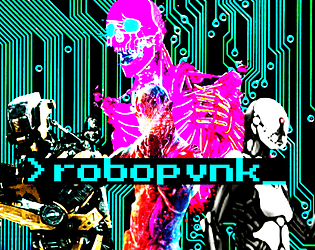
Art/Design: Primarily single-column black text on white with colored headings and a brightly colored illustration of various robots over a circuit board background on the first page.
Usability: Clearly and consistently formatted lists and paragraphs enable navigation and perusal of desired information, with bold text emphasizing important details.
Unhallowed
Concept: “An eerie chill sweeps the streets of CY, and the shadows between the neon lights seem ever darker this time of year. Within creep seven frightful ghouls to haunt the sewers, stalking any pvnk so foolish as to roam the dreadful night.“
Content: A collection of high-tech terrors, from the data spectre to the flesh debtor, with which to haunt a table of punks as they try to survive life in Cy.
Writing: A colorful set of descriptions and mechanical abilities that paint vivid possibilities for each NPC’s uses in a game.
Art/Design: Two versions available: one black-on-white printer-friendly version and one orange-on-maroon version with occasional illustrations to complement the ambience of the writing. Both use single-column text layout.
Usability: Consistent page organization, font usage, and presentation of NPC mechanics to make reading and navigating through the document easy and helpful.
Verminkin
Concept: “In CY, it's easy to feel like there's nobody to trust. Everyone wants creds or drugs or alcohol or fame or whatever, and most people are willing to backstab each other for it. But you- you're secure. Your friends would never betray you, and you make friends very easily, at least, with some people. The kind of people who have greasy black feathers and pick at trash dumps, or gnawing teeth and skitter under floorboards, or slimy skin and creep through the gutters. Your friends have your back. Anyone who wants to get to you will have to go through them.”
Content: A class for the rat bastard who works best with partners, the nastier the better.
Writing: Inspired class features that bring a feral animal-loving misfit to life, complete with mechanics for one or more vermin companions.
Art/Design: Full-color version is yellow-on-black with rat photographs with color treatments as backgrounds, while print-friendly version is black-on-white text. Both versions use single-column text content layout.
Usability: Distinct sections are immediately recognizable in both versions thanks to consistent heading/label presentation and white space. Full-color version employs an additional handwritten-aesthetic font for labels and emphasized terms/phrases.

WAR MACHINE
Concept: “War makes money, at the end of the day, and the corps of CY are interested in anything that makes money, no matter how many cadavers will be piled up alongside those heaps of cash. “
Content: An arsenal of material–enemies, squad makeups, potential job seeds, environmental tables, and more–with which to make corps even more terrifying, overwhelming, omnipresent, and all-around dangerous.
Writing: A mix of informative mechanics and in-universe flavorful commentary on each entry that balances black humor on the edge of bleakness.
Art/Design: Simple black-on-white single-column layout over fourteen pages.
Usability: Visually distinct and consistent font and text decoration choices, along with helpful whitespace use, result in an easily navigable document.
Wh1tewashed T0mb
Concept: “Megapastor Apollo Imra is in the crosshairs- his wife's, to be specific. One of his twenty-odd wives. You've been hired to take out this lecherous philanderer, right in his own temple vestry, where he's taking tonight's dose of infidelity. But beware: there's more going on here than you might think…”
Content: A mission to serve divorce papers, of a sort.
Writing: Extensive information provided about the job, the site, NPCs the punks might encounter, and more.
Art/Design: Primarily black-on-white single-column text layout complemented by illustrations of key NPC portraits and neon-colored maps.
Usability: Font choices promote readability, and heading/label bolding, italics, and highlighting are applied consistently throughout to facilitate quick navigation toward desired details.
Previous page
Page 2 of 2