Mosscroft
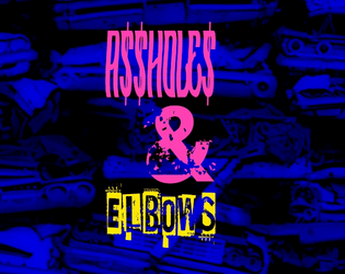
A$$hole$ and Elbows
Concept: “A low-level, mid-tier manager type from Aegis Conglomerated—using the screen name Mr. Greensleeves—needs an Aegis BioTech prototype implant recovered. This rare tech was “mistakenly” put down the recycle chute and ended up in a Mosscroft junkyard, Big Dumpers. As reward for recovering the implant and saving his job Mr. G promises to provide a backdoor into Aegis Financial for potential debt reduction. It’s simple: get to Big Dumpers, search for the implant, get the fuck out, and return it to Mr. G. What could possibly go wrong?“
Content: A simple search and rescue operation–but the PCs aren’t the only ones performing it.
Writing: Tons of character packed into the junkyard location (with a dozen areas of interest) and NPC details.
Art/Design: Trifold pamphlet layout that includes a map of Big Dumpers and relevant specifics on the inner panels, while job and NPC information appears on the outer panels. Color scheme is a mix of black-on-white and white-on-blue/yellow-on-blue.
Usability: Organization is easily recognizable, with headers and important information consistently distinguished from body text by font choice, size, color, and inline bolding.
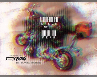
Creds of Fear
Concept: “Royal West Shipping has hired your gang for a non-union haul to their warehouse in Mosscroft. Only the desperate, or foolish would participate. Are you willing to sacrifice everything for the creds?”
Content: An adventure that involves transporting cargo through the city, complete with a number of hazards, obstacles, and other dangers that might await the unsuspecting punk.
Writing: Tight, concise descriptions of relevant details for GM and player creative elaboration/interpretation of the scenario events.
Art/Design: Two-column spread with a left-side glitch art illustration and a right-side single column of scenario text.
Usability: While the font choice is clean and sections are distinguished with whitespace and indentation, text is not embedded so not searchable or capable of copy/paste. A high-contrast version of the document is included.
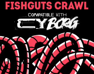
Fishguts Crawl
Concept: “Sveri Suplex, up-and-coming cybertech influencer has lost it and joined a cult of neoprimitivists in Mosscroft. His handlers in Tulles&deVerte offer good ¤ for finding and bringing him back to civilization.”
Content: A delightfully disgusting romp through a rotting whale to liberate an off-the-grid social media darling.
Writing: Tons of Lovecraftian and body-horror atmosphere to unsettle punks out for easy creds. Cultist and organ generators provided to help flesh out the locations.
Art/Design: A mix of red, black, and white for text, background, and illustrations (of NPCs, the overall map, interesting objects/phenomena) with one or more columns of content on a given page.
Usability: Visually recognizable and high-contrast headings and organizations of content on each page thanks to consistent decisions with font sizes and color choices. Two player-facing versions of the location map (one full-color, the other black and white) are provided as well.
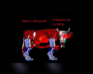
Meat in Mosscroft
Concept: “There are rumors of a warehouse owned by Gene Industrial in Mosscroft containing actual real steaks. These Bromaha steaks are supposedly in a huge walk in freezer, and they should get collected before word gets out. The street gang is offering 2d10 x 1K credits for the steaks. If they accept, Nimo will provide a small piece of paper with the address of the warehouse.”
Content: A beef break-in with the bonus of beaucoup bucks.
Writing: Deadpan descriptions lay out the absurdity of the situation, which should help a GM create a unique and memorable experience for their table.
Art/Design: Landscape-oriented pages with bright colored text on black background accompanied by relevant images of NPCs, corporate logos, and a simple map of the target facility.
Usability: Almost every block of text is a different color and font or text size than the others and positioned differently on each page, but each font is easily readable and all text is embedded for quick searching/selecting.

Raiders of the Doom Engine
Concept: "Embark on a journey below the wastes of Cy to a world long forgotten."
Content: A gig to eradicate a crew of motorcycle-riding knights occupying a fortified area in Mosscroft.
Writing: Tons of fever-dream-like details that mix together futuristic cyberpunk, medieval chivalric romances, and fourth-wall-breaking acknowledgments.
Art/design: Primarily white-on-black layout in a trifold brochure setup, with each panel crammed full of descriptive text, GM guidance, tables, and NPC stat blocks. Assorted technicolor illustrations and collage images decorate the margins.
Usability: Despite the sheer amount of information packed into these pages, there is some visual grammar to indicate relationships across different content blocks and to distinguish each from the others. Text size & font choices may make reading occasionally difficult for some readers.
Page 1 of 1