URBN_LGND.exe Jam
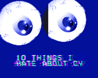
10 Things I Hate About CY
Concept: “10 urban legends whispered on the streets of CY and in the dark corners of the NET. The fact is usually worse than the fiction.”
Content: A collection of urban legends about mysterious individuals, locations, and events that might intrigue or terrify a group of punks.
Writing: Ominous tales framed as though potentially spoken by CY residents, allowing for easy slot-in ambience and plot hook/seed for GMs.
Art/Design: White, pink, and yellow text on dark blue with occasional purple circuit-board background designs and a large pair of eyeballs near the bottom of one page. Presented as three pages of single-column text.
Usability: Font choices and colors make for easy visual readability and identification of distinct content purposes (e.g., pink text for headings/labels, yellow for important details, names, and locations).
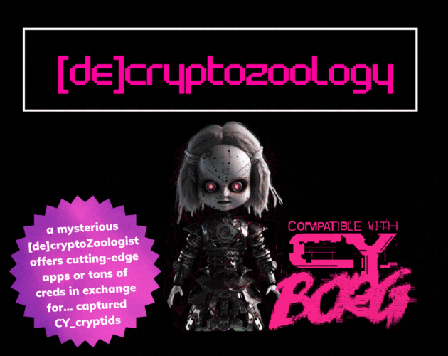
[DE]CRYPTOZOOLOGY
Concept: “In the shadowy depths of neon-lit Cy_, where man, creature, and machine meld into one, enigmatic |0r3N_C0@lM@N3|, a [de]cryptoZoologist, obsesses about cryptids. Offering bountiful creds or cutting-edge apps as rewards, she lures runners into capturing these elusive beings, her true intentions shrouded in mystery.”
Content: A collection of useful cryptid-related information and inspiration: a NPC and their laboratory, several NPCs, and a set of apps.
Writing: Descriptive overviews for entries along with mechanics that reflect the character of each.
Art/Design: Trifold pamphlet layout with pink and white on black, with each panel presented mostly as a single column of text and glitch-aesthetic illustrations.
Usability: Layout and text contrast provides easy reading and browsing for desired info.
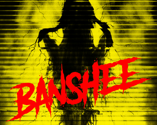
Banshee
Concept: “A mid level exec has lapsed into a coma after an unwise deep dive into the sewer levels of the net. When he came back up, it was with a permanent look of horror and endless babbling about ‘the woman’, yelping in terror at random moments, reacting to something that no-one else could see. He’s actually infected with the BANSHEE virus. It hijacks the carrier’s audio and visual implants, terrorising them until their brains overload and shut down.”
Content: A gig that takes a party of punks into an exec’s dying mind in search of important data.
Writing: A swirl of informative exposition and characterful style to situate a game group inside the mind of their target and all the horrors residing there.
Art/Design: Colorful one- and two-column text layouts, with each page having its own aesthetic and an accompanying illustration.
Usability: Text is easily readable across pages and assorted font choices, with each page’s organization recognizable through text size and color distinctions for headings/labels and body content.
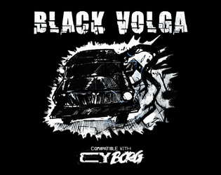
Black Volga
Concept: “A new, terrifying enemy straight from Polish urban legend - Black Volga. Now roaming the streets of CY, looking for petrol. But it's now what you think it is. ‘I’ve heard it. The sound of the engine weirdly resembles a beating heart. Guess it’s my weird imagination’ ‘Windows are pure black. I wonder… who is inside?’ ‘I swear to Balfogriff, I’ve seen tentacles slipping out of the windows!’”
Content: A demonic automobile that terrorizes the roadways.
Writing: Ominous and creepy flavor made all the creepier by the car’s devastating attack mechanics.
Art/Design: White and blue text on black surrounds a hand-drawn illustration of the Black Volga.
Usability: Visually, color, italics, and positioning of content help indicate the different purposes and kinds of text on the page. However, the text is not embedded, so no searching/selecting is possible.
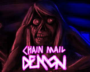
Chain Mail Demon
Concept: “After finding a cursed message on the 'Net, the Punks are hunted by a strange creature that attacks them when they sleep. Can they find a way to avoid its deadly touch? Or will they sacrifice their friends in order to be spared?”
Content: A creature to terrorize punks who check their inbox.
Writing: Half stats/mechanics and half flavorful messages relating to the monster, all of which evoke an appropriately frightening net-nightmare.
Art/Design: Neon and white on a dark background displaying the chain mail demon illuminated in red, surrounded by boxes with text content.
Usability: Supplement is provided as .png and .txt file. Visually, the .png version makes it easy to identify different kinds of content and how to locate desired info. The .txt version is helpfully organized and labeled, with excellent text descriptions of the visual elements of the .png to aid with accessibility.
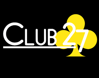
CLUB 27
Concept: “Club 27 is a Cy_Borg expansion about the Club 27 urban legend.”
Content: A nightclub with a discerning membership, some of whom can be hired as mercs.
Writing: Brief details about the club and its members that suggest a variety of ways that a GM might incorporate the place into their game.
Art/Design: Single-fold pamphlet layout with an immersive background club-aesthetic illustration for each panel overlaid with text content.
Usability: High-contrast text is easy to read, with headings and emphasized text visually distinct through font size and color. Most text is embedded, allowing for searching/selecting.
cy_BONES
Concept: “This pamphlet is a game master tool for adding hydraulic-powered boxing into your games without stretching melee combat too far.”
Content: A set of rules and tables to facilitate boxing/brawling, especially between cybernetically augmented fighters sparring for money.
Writing: Rules are terse and supplemented by similarly terse but vivid descriptions to situate the fights in CY.
Art/Design: Trifold pamphlet organization, with clearly distinct panels of differing text/background colors and contrast. An illustration of Greek fighters accents one panel.
Usability: Color and font choices mostly provide strong contrast and readability, with arrangement of panels allowing for rules/scenarios to unfold just as pamphlet unfolds physically. Two panels may be difficult to read visually for some (thanks to white on orange color scheme).
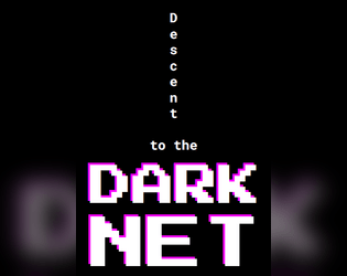
Descent to the Dark Net
Concept: “>> Welcome to the twisted amalgamation of junky code and depravity that we call The Net, where non-euclidean labyrinthine nooks and crannies will leave you feeling both bewildered and exhilarated. But don't be fooled, for there is still a twisted structure lurking within the chaos, with some arcane notion of up and down.”
Content: A collection of Net-focused locations, tables, NPCs, enemies, and rules for app-like scripting.
Writing: Bursts of intense and ominous detail that shines light on myriad dimensions of the Net that punks might seek out or otherwise come across..
Art/Design: Pixelated and monospace fonts appear throughout on a number of distinct page layouts with a variety of color and graphic elements.
Usability: Despite the variety of layouts, text is consistently readable–pages with complex graphic elements keep text on simpler backgrounds. Note: text content for the scripting rules page is not searchable/selectable.

Enter Red Room
Concept: “The rumors spread like blood leaking from a wound. Everybody knows somebody who watched a red room. Some of those people have disappeared, others claim to be continual viewers. No matter what they say, you have stumbled upon a supposed invite for a red room in a dark corner of the net. A door stands in front of you, screams heard from the other side. Do you dare open the door? Do you dare enter the RED ROOM?”
Content: A cluster of plot ideas, relevant rumors, and random table additions to set the stage for a mission focused on the mysterious red room.
Writing: Brief but clever details to help assemble a suitable job for a group of net-interested punks.
Art/Design: Two columns of black text on a dark red background, with a cover/title page showing two doors, one labeled ‘yes’ and the other ‘no’.
Usability: Text contrast allows for readability, and each list is easily distinguishable from the others to facilitate navigation and identification of specific info.
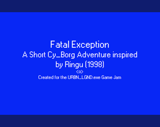
Fatal Exception
Concept: “In the early days of the Net, there were those who saw its potential and sought to harness it. Among them was a naturally gifted hacker who was known to those in the community only as 0nryo. She was one of the first to dive deep beyond the surface and what she found permanently altered her. She spent more and more time diving into the Net, attempting to learn to control it. Eventually people stopped hearing from her. Some assumed her to have gone insane or to have died: black-iced within the Net. However the hackers that would follow her footsteps into the deep would swear that her consciousness remains within the labyrinthine web of data that makes up the Net, waiting for those foolhardy enough to go in too far. These rumors were given new life when a hacker group ventured in searching for her and died a week later.”
Content: A mission to deal with a curse from a fabled hacker’s app cartridge.
Writing: Tons of detailed description of the mission site, unfolding events, and background lore for the GM to employ strategically.
Art/Design: Primarily single-column white on blue, with a gridded map of the destination oil rig and an instance of thematically appropriate glitch text/art.
Usability: Distinct content sections are marked with visible decoration, while major headings are immediately evident as larger text. Directions from each room to others are also helpfully provided.
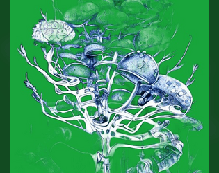
G.M.M. or Grotesque Mutant Mushroom
Concept: “A Fungal themed Zine to Cy_Borg, It contains: 3 Enemies; 4 Themed Items; Hallucination condition.”
Content: A cluster of mushroom-based threats and loot.
Writing: Brief mechanics-focused stat blocks with thematically potent names and descriptions.
Art/Design: Two pages of bright pink and blue with green, with the first page having a fungal background image.
Usability: Color scheme and layout feel appropriately chaotic for the theme, but color intensity and relative lack of consistent organization may lead some readers to overlook important elements (e.g., small-text Hallucination rule just above the 3rd party license on p. 1).
Gigapixel Tower Place
Concept: “For use in CY_BORG as a test for the party on a roadway crossing of Central Cy, with campaign potential in respect of the pikecorps and their use of pikecraft.”
Content: An automotive scenario to complicate punks’ lives as they travel through CY.
Writing: Predominantly in-universe description for the punks themselves, supplemented with brief explanations of relevant mechanics/triggers while traveling.
Art/Design: Two pages, one with a colorful map of the turnpike and general info, while the other features a table with the scenario rules and mechanics.
Usability: Text overlaid on page 1 map has a translucent background to help with readability, while page 2 table uses shading and border emphasis to indicate different cells’ relationship to one another. Map has color coding (green, yellow, orange, red), but it’s not immediately evident as to what the colors represent.

Gimme gimme more
Concept: “A simple collection of 8 new weapons/tools to use in your Cy_Borg games!”
Content: A set of items that an enterprising punk might use for fucking shit up.
Writing: Succinct product names and rules to clearly indicate why someone might want and use each one.
Art/Design: Black-on-white “photocopied flyer” aesthetic, with an illustration accompanying each item description.
Usability: Very easy to visually navigate the page and recognize how each element contributes to an understanding of the equipment, from capitalized item names to bolded DR values. However, text is not searchable/selectable.
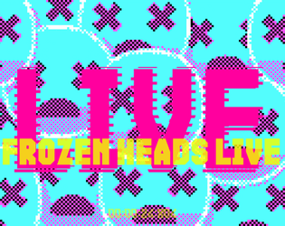
Heads Frozen in Vaults Enduring
Concept: “Escort a live streamer into the G0 wasteland in search of an underground cryovault! More action means more viewers, and viewers are creds. So remember to smile for the cameras while the nanophreaks shred your face!”
Content: A job to make sure a streamer survives a break-in attempt to a cryo facility, with extra cash on the line if the stream looks dangerous and exciting. A player-facing map and a ‘frozen celeb head generator’ (for potential inclusion in the cryovault) are also provided.
Writing: Tons of imaginatively expressive details provided in brief phrases and statements so that a broad range of locations, enemies, and unfolding events can be mentioned.
Art/Design: Trifold pamphlet layout with mission parameters on the outer panels (with a white-on-black color scheme) and the location/NPC specifics, along with a map, on the inner panels (with a black-on-white scheme).
Usability: Visually apparent organization/arrangement of content, with distinct headings, labels, and section borders to more clearly indicate scope and relation of each to the others. Room descriptions even include references to other rooms via map/description labels for quick navigation.
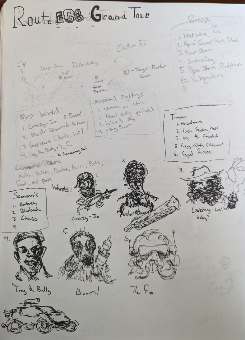
Highway 666 Grand Tour 1 Page Concept
Concept: “Wasteland adventure with mad bandits, cannibals, and unspeakable things that hide in the badlands. The completed project would have tables for natural and unnatural weather events, terrain, vehicles, warbands, loot, and combat scenarios.”
Content: A stripped-down one-page highway adventure/crawl.
Writing: Very little detail, with tables of brief options (most wanted NPCs, unexplained sightings, terrain, and more).
Art/Design: Handwritten text in several boxes across three major columns of content, framed by a simple map of the adventure above the text and a series of portraits below, along with a sketch of a car.
Usability: Some text may be very difficult for some to read, both in terms of the handwriting legibility and the variable contrast of pencil and ink on scanned paper. Content is provided as a .png, which will further reduce potential readability (as text is not embedded).
Loading next page...
Page 1 of 2
Next page