URBN_LGND.exe Jam
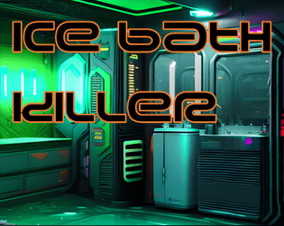
Ice Bath Killer
Concept: “‘You woke up in a bath of ice And they’d removed an organ!... Was it expensive?’ ‘It was natural!’”
Content: A gig to investigate organs stolen by a group of purists.
Writing: Plenty of details surrounding the job–people, places, motives–and guidance as to how a GM might want to approach it in different ways.
Art/Design: Trifold pamphlet layout in white and neon colors on black, with NPC portraits and a map of a key location. An additional page of player handouts is included (breaking news and a simple map of the district).
Usability: Different kinds of content are distinguishable by color and ‘box’ shape, with bolded and colored labels to call attention to key details. A few blocks of text are angled and rasterized, but vast majority of text is selectable/searchable. Map is helpfully overlaid with room/space details in each room/space.
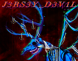
J3RS3Y_D3V1L
Concept: “A gnashing, winged nightmare that lurks where the pines grow. A rogue A.I. with a cybernetic body and a deer-like skull. A thing that should not exist and cannot be killed.”
Content: A destructive monster to deceive and potentially devour a party of punks.
Writing: Brief, intriguing features and stats and an extensive back story to situate the creature (or its urban legend) within CY.
Art/Design: Title page includes a neon pink-and-purple illustration of the devil, while page two includes text content in a single-column layout. Main version of the supplement includes color and font highlights, while an accessible version does not.
Usability: In both versions of the supplement, specific kinds and sections of content are recognizable and easily distinguishable from others.
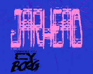
Jarhead
Concept: “Tales of wealthy eccentrics having their heads cryogenically frozen, have been around for a long time. They can't really be true, can they? Raid an automated facility to make off with some corpo's frozen noggin' for phat creds with this easy to integrate Urban Legend.”
Content: A set of quick job hooks that can stand alone or be inserted into other jobs/missions a group of punks might pursue, along with a map for a typical cryogenic storage facility.
Writing: Terse descriptions and setup leave much up to the GM, but there’s enough presented with a particular attitude in mind that can guide how to frame the gig(s).
Art/Design: A wide spread of job info presented as white text on blue sidebar and a full-color gallery of the target heads-in-jars (note: although they’re decapitated heads in jars, the images aren’t gory), with the map provided as an additional one-page blueprint-style white-on-blue.
Usability: Text is easily distinguishable in terms of content sections and the purpose for each, with a recognizable organization scheme to facilitate browsing and locating specific info.
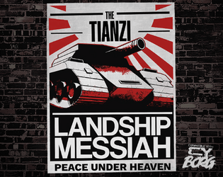
Landship Messiah
Concept: “To most in the upper echelons of Cy, this saviour is a myth. But still those under-blocks that it inhabits and pollutes are left alone, and those who live close revere it as a watchful penitent god, to whom those who sin must be taken.”
Content: A mythical vehicle of righteous vengeance and its acolytes.
Writing: Descriptions and NPC stats oozing with classic British grimdark sci-fi flavor.
Art/Design: Two two-page spreads, one of which resembles a set of propaganda posters on a wall, and the other sports a large illustration of the landship messiah rolling down a street amid its followers.
Usability: High-contrast text with consistent distinctions of content blocks, headings/labels, and types of content.
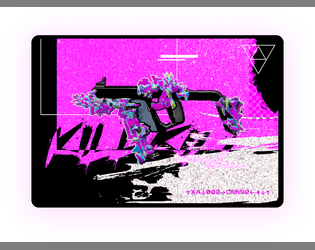
Legendary Cheat Codes
Concept: “Ultra rear secrets cheat codes for your weapons rumored in the dark web.”
Content: Unlockable modifications for firearms–if one can find the cheat sheet for them.
Writing: Brief setup and modification details that allow a GM to work the cheat codes into their game as they desire.
Art/Design: Two white-on-black images, each with a block of text (setup) above three-column presentation of weapon mods, with a neon-colored glitch art illustration of a gun below.
Usability: Text is high contrast with clearly labeled sections of content, but due to JPG format, text is not selectable/searchable.

Leviathan
Concept: “A vital drive, loaded with data worth millions to the Virid Vipers gangster coalition, has been lost in the sewers of CY. Something down there apparently ate the agent they had carrying it. Fortunately, the geo-tag still works, and the slumlord whose territory it was lost in is desperate for someone to find it before the Vipers toss him into the dank and filthy tunnels to find the thing himself. There's just one lethal detail that's been overlooked, lurking in the sewage…”
Content: A dungeon crawl to recover valuable cybertech from a monster stalking the sewers.
Writing: Imaginative descriptions make each area of the mission seem unique and dangerous, with relevant NPCs pursuing their own agendas.
Art/Design: Single column of text with black-on-white scheme, occasionally complemented by NPC portrait illustrations. A colorful, stripped-down map of the sewers is also provided.
Usability: Font choices are easily readable, and headings, labels, and key information are consistently bolded for visual emphasis. Movement table notes procedural logic for optimal use.
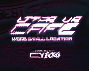
LTTPR VR CAFÉ
Concept: ”The VR Café is owned by Lotta and Perr, a hardworking couple that, strapped for cash, went to Örken, who agreed to relieve them of their debt. In return he now runs an underground operation stealing children’s imagination to create CREATIVITY_JOURNEY--v4 a drug sold under the counter.”
Content: A seedy VR cafe that’s so much sketchier than it appears–and only maybe will the punks be ready for the trouble that awaits.
Writing: Lots of flavorful sensory descriptions of the goings-on in each room of the cafe that helps immerse players into the situation.
Art/Design: Left third of the page is an overview of the locale and potential reasons for being there, while the remaining space on the page has a map with labels and room-specific information.
Usability: High-contrast text and bolded labels and distinct headings make reading and navigation easy, supported by lines to map areas (with a particularly ingenious staircase-shaped line connecting the upstairs office to its details).
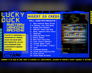
Lucky Duck Mystery Vending Machine
Concept: “Quack Quack! Compatible with CY_BORG and made for the URBN_LGND.exe jam.”
Content: A vending machine that provides an assortment of items–some trinkets, some useful items, and potentially more.
Writing: Inventive item names offer entertaining potential, and vending machine rumor/secret extends that significantly.
Art/Design: Three-column layout of basic info, vending machine contents, and a glitch-like illustration of a vending machine below a lucky duck icon.
Usability: Visually, content is extremely easy to navigate and identify. File is provided as an image, so text cannot be selected/searched or recognized by a screen reader.
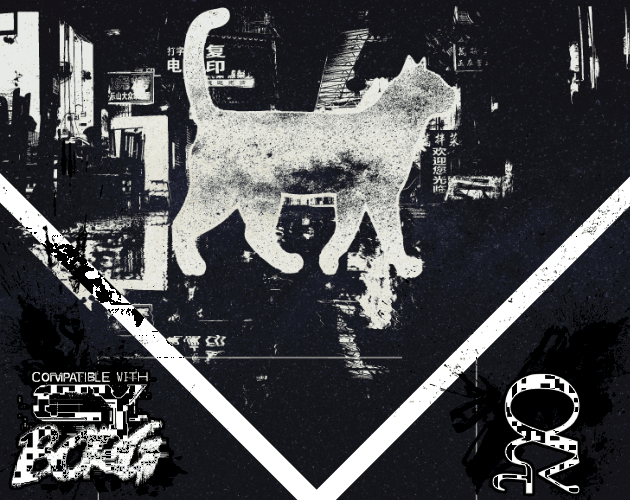
Malkintent Mouser
Concept: “Everybody Wants to be a Cat!”
Content: A class for the fan of fighting the system as a feline.
Writing: A mix of playful and poignant details complemented by straightforward explanations of class features/mechanics, along with a brief set of optional rules applied to cats.
Art/Design: Three versions in different color schemes (black/green/yellow; red/purple/black; black/white) each present content on three pages with illustrations of a cat (silhouette filled with stars) in a cityscape above text columns of class features. QR codes on the margins of each page link to cat-themed songs that fit the class.
Usability: Consistent text colors and font choices for body text and headings help with identifying and navigating to desired information, and hyperlinked QR codes are usable even with a mouse/cursor. Different color versions present the content in ways that might contrast distinctly to individuals with assorted color blindness, so examine each version to determine which might be most visually helpful.
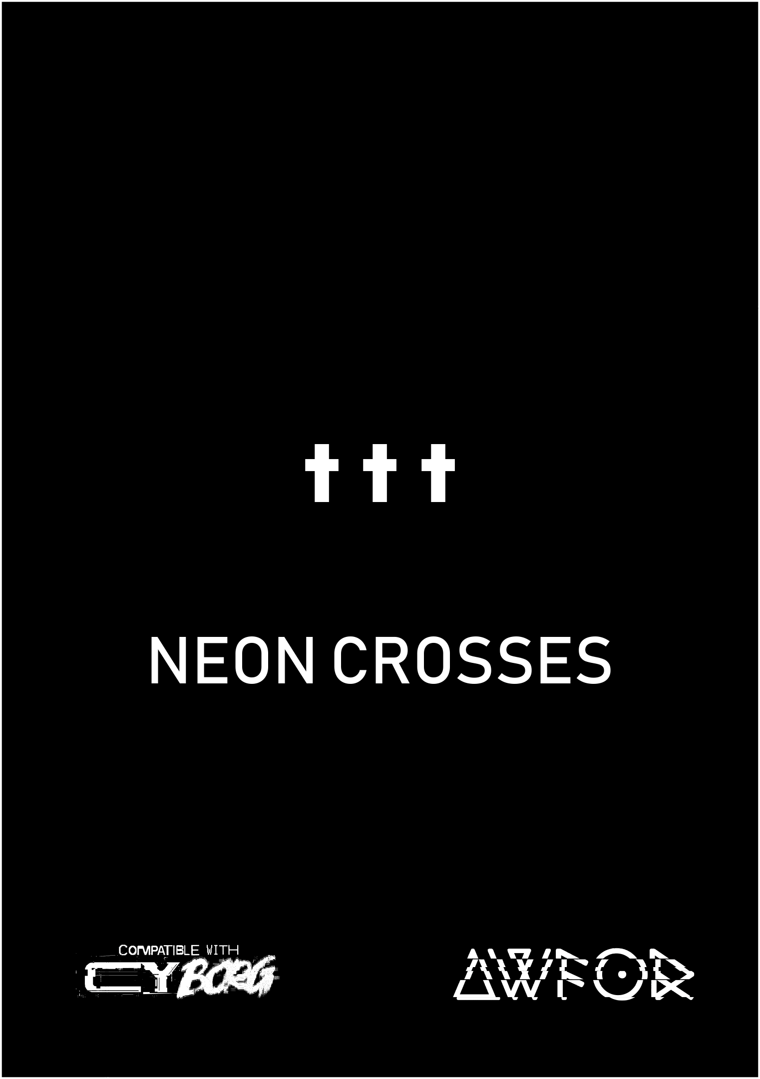
NEON CROSSES
Concept: “Artificial intelligence has had a divine vision. It is seeking to hire a group of punks to deliver it to the ancient Hill of Neon Crosses located in the center of the forbidden GO district. To fullfil their task, punks will have to deal with a research blacksite and delve into THE NET deep within the Hill Of NEON Crosses.”
Content: A job to deliver an AI payload into an auspicious site in G0.
Writing: A mix of darkly ominous and tongue-in-cheek tones that hew closely to the core Cy_Borg spirit.
Art/Design: Mostly black-on-white spreads with one to two columns of content, with almost every page complemented by neon hand-drawn and glitch-art graphics.
Usability: Consistent presentations of text and page layouts with distinct content sections make for easy perusal and identification of desired information.
NEUROBLAST / PROJECT_CYTØR
Concept: ”Let me get into your hands this state-of-the-last-century HyperCard DiskZine tech stack full of pixel + dither cyberpunk art, interviews with fringe-dwelling outsiders, original reality-dulling cocktail recipes, tabletop game asset connoisseurs and designers, 1-bit tech noir AKIRA-inspired comics, industrial and modular synthesizer musicians, sci-fi urban fiction distopias, obscure trash-culture aficionados, early-90s computer counter-culture, and an original agriTech body-horror adventure for your next MÖRK BORG / CY_BORG game session. Best viewed on a classic Macintosh. Or running in your preferred Classic Mac Emulator.”
Content: A job to retrieve sensitive materials from a facility occupied by eco-terrorists, provided in both a HyperCard program format (available to view in a classic Mac emulator) and in PDF.
Writing: Sensory details, unfolding actions/encounters, and NPC motives abound to bring the mission to life.
Art/Design: Simple single-column layout, presented primarily as plain text with ASCII-art maps and clearly distinguishable headings. A lo-fi black-and-white illustration of a screaming cyborg head is provided on the cover page/card.
Usability: Text is easily navigable and readable, although the HyperCard version and classic Mac environment might be unfamiliar to some readers.
Pablo's Boutique
Concept: “You don’t remember seeing this odd structure here last time your crew came this way. An eye-catching tartan pattern covers this strange tent. A short flag-pole peaks from the top displaying a pink hand axe on a plain black field. A burned wood sign above the entrance reads “Pablo’s Boutique”. The space inside the tent feels expansive- way bigger that it seemed like from the outside. The product displays are spartan chic. Various offerings are for sale here unlike what you would find at your normal local supply store.”
Content: A selection of goods themed around Paul Bunyan and lumberjacks that also are entirely suitable for a punk in CY.
Writing: A balance of descriptions of the boutique’s various areas, the items on display in each, and the mechanics that come into play when a given item is used.
Art/Design: Three two-page spreads of single-column black text on a light background that each feature different kinds of items, with the first spread complemented by an illustration of Pablo and a flannel-pattern background beneath a graphic of a wooden sign.
Usability: High-contrast text is readable and easy to navigate and distinguish, facilitating quick identification and use of desired info.
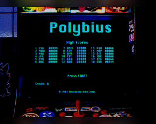
Polybius 20X3
Concept: “<RE: THIS GAME KILLS > Whispers about a killer new game have flooded the BBS message boards. An acquaintance said they knew someone who played it and ended up in a body bag. Is it another ACGS marketing stunt, or is there something else going on in vid-cades around Cy?”
Content: A mysterious arcade game, its rules, prizes, and a technician NPC.
Writing: Emphasis on rules/mechanics complemented by terse, flavorful names/labels.
Art/Design: Black and white text on a blue patterned background in a mostly single column layout accompanied by several monochromatic and full-color illustrations.
Usability: Large font size, distinct use of black and white for particular kinds of content, and border markers for distinct sections of content all contribute to ease of browsing and engaging the material. However, text is not selectable/searchable.
Polybius Arcadia
Concept: “Inspiration for this project was taken from the urban legend of Polybius, an arcade game that might have or might have not appeared in 1981 Portland, OR as top secret, governmental, conspiring, crowdsourced, psychological, mind control experiment. The game was highly addictive, with unpleasant side effects. All game cabinets disappeared without a trace. Polybius was the greatest game that never existed!”
Content: Two supplements: (1) rules for a poker-like arcade game and (2) a job to extract data from an arcade machine.
Writing: Crisp descriptions and directions that sketch the mission parameters & events (along with rumors about Polybius) and the rules for playing the Polybius game.
Art/Design: The Polybius rules are provided in a CRT terminal-like font/aesthetic with a graphic of an arcade game cabinet. The heist details are provided in a clean black-on-white three-column layout with a second page containing a map of the arcade location.
Usability: Each supplement’s layout is easily recognizable and navigable, with visually distinguishable types and sections of content. The arcade heist text content is embedded, allowing for searching/selecting, but the Polybius text content is not.
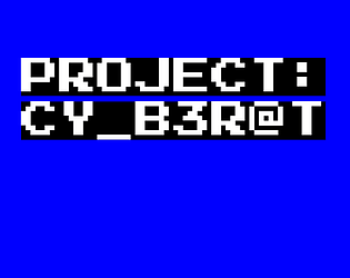
PROJECT: CY_B3R@T
Concept: “In the alleys and streets of the Cy, rumors of rats with intelligence far above normal exist. Some say it's a miracle, that they must've been blessed by whatever god they believe in, others say they are failed experiments, and affronts to nature.”
Content: A verminous creature at home in the alleys and gutters of CY.
Writing: Inventive mechanics and descriptive rumors provide GMs a variety of qualities to emphasize at a table.
Art/Design: Single-column layout of white and yellow text on a blue background.
Usability: Font choices and decoration consistently employed for distinct kinds and sections of content.
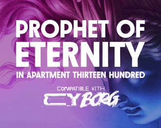
Prophet of Eternity in Apartment Thirteen Hundred
Concept: “All over Cy, people are getting strange calls on their phone and RCDs. Some hang up immediately. Others begin with a robotic “Can you hear me?” A few claim to be from The Prophet of Eternity proclaiming a new era of AI that will free the city.”
Content: A mission to deal with a robocaller cult on behalf of a group of anarchists.
Writing: An impressive amount of description re: job parameters, goings-on, cult NPCs, and location-specific sensory details.
Art/Design: Trifold pamphlet layout, with initial job info on the outside (with a statuesque portrait as its background) and tables/lists featuring assorted details on the inner panels in a black-on-white scheme, complete with a labeled map of the destination apartment complex. A black-and-white player-facing handout with map and initial job details is also provided.
Usability: Content sections are visually distinct and consistently styled to facilitate navigation and identification of desired information, complemented by color-coded map labels.
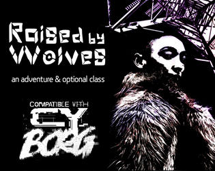
Raised by Wolves
Concept: “This six-page PDF contains the adventure Raised by Wolves, which sees players taking on a job in an abandoned capsule condo scheduled for demolition, and facing a cult determined to resurrect their (literally) corrupted leader.”
Content: A job to deal with a noise complaint, along with a new class: the Feral Foundling.
Writing: Lots of concise details and snippets that bring the mission location and the optional class to life.
Art/Design: Six two-page spreads with three- to four-column layouts of content on most pages. Several different color schemes and aesthetics differentiate distinct areas of focus (apartment building map; job details; key location; class).
Usability: Each spread makes use of a consistent visual grammar to indicate distinct sections of content and headings/labels, with high-contrast text/background throughout. Text is not embedded, so searching for or selecting text is not possible.
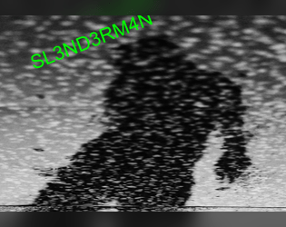
SL3ND3RM4N
Concept: “A homebrew antagonist for Cy_Borg. An antagonist that can provide some interesting interactions and possibly fun character arc. Created for the URBN_LGND jam.”
Content: A digital nightmare to haunt a table of punks.
Writing: A mix of ominous description and creative mechanics to affect the afflicted player.
Art/Design: Brightly colored text and black-on-white over a black and white static-y image of a creeping figure in silhouette.
Usability: Text contrast and font choices, along with whitespace/indentation, make for easy reading/navigation.
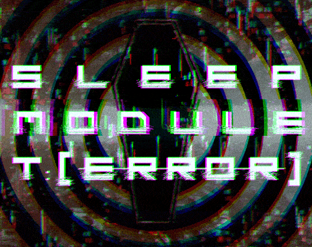
Sleep Module T:[ERROR]
Concept: “Delve into the deepest and most primal corridors of consciousness. Coveted neural pathways for corporate exploitation. Map the ever expanding subconscious and come face to face with communal fears in the form of urban legends, cryptids, and the things conjured by the imagination.“
Content: A clinical trial in which participants navigate a simulation.
Writing: An inventive set of rules for generating the job’s labyrinth and for dealing with the effects that navigating it can have on a PC, supplemented with vivid and informative room-specific sensory details and special rules.
Art/Design: A mix of aesthetics, with some pages using labelmaker-like text or sketches on stained paper, while others resemble computer terminals or clean, slick interfaces.
Usability: Wide variety of fonts can take some page-by-page adjustment, but headings/labels are applied pretty consistently throughout (i.e., reversing the primary font color and highlighting its background). A lot of text content is provided, but none of it is embedded, so it is not possible to search/select.
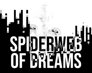
Spiderweb of Dreams
Concept: “BASILISK DISTRO STATION is broadcasting now… Corrupted data filtered through radio transmitters in precise patterns has the potential to scramble the human mind. Psionic data pushed through this same process has the potential to bring into reality the THOUGHTFORM; a shadowy mess of thoughts manifested as glitched reality.“
Content: A psionically-themed monster and cybertech item.
Writing: Concise, immersive descriptions and succinct mechanics for the ‘thoughtform’ creature and the ‘psionjack’ cybertech.
Art/Design: White-on-black spread with four columns of content accentuated with white character art designs and two dark illustrations.
Usability: Content is arranged to clearly distinguish specific sections and labels. Supplement is provided in pdf, png, and plain text versions.
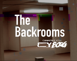
The Backrooms
Concept: “An assassin has been pulling off hits that no one would have dreamed possible. They have been infiltrating secure locations across Central and The Hills. The punks have a job: take out the assassin. Figuring out who they are working for or how they have been able to access VIPs across Cy would be good, too. The punks have a location: a lucky SecOp tagged the assassin and tracked them to a nearby slum. Are they ready for what is waiting for them? Can they possibly be ready to get pulled into The Backrooms?”
Content: A gig to take down an assassin in a disorienting locale. Mission details provided in full-color and black-and-white versions, along with a player handout of the location map.
Writing: Helpful, descriptive explanations provide GMs with the means to run this mission successfully.
Art/Design: Tri-fold pamphlet layout offers mission info across three internal panels (along with an abstract map of the Backrooms), while key NPC and additional app info is provided on outer panels.
Usability: Layout and color scheme allow for easy navigation and recognition of each content element.
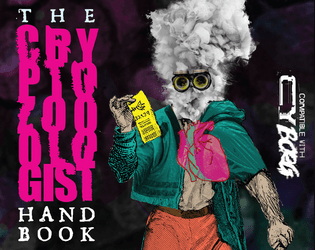
The Cryptozoologist Handbook
Concept: “BEHOLD! Creatures said impossible to exist! BEWITCH! Fill your body with strange, powerful substances! BEGUILE! Confound friends & enemies with cryptic behavior! BELABORED! This bit has gone on too long.”
Content: A PC class, several NPC cryptids, and a job to track down a serial killer.
Writing: A variety of details for different sections, from terse NPC ability descriptions to in-depth mission/adventure specifics for both GMs and players to work with. Cryptozoologist class offers a fascinating take on the researcher-becoming-the-monster archetype.
Art/Design: Visually distinct spreads for each section–bright colors for the cryptozoologist, dark tones and inverted colors for the cryptids, and black-and-white for the mission (with a bit of pink accent/highlight).
Usability: Numerous fonts and sizes, but always high contrast. Easily distinguishable text purpose on a given spread helps browsing and identifying desired info.
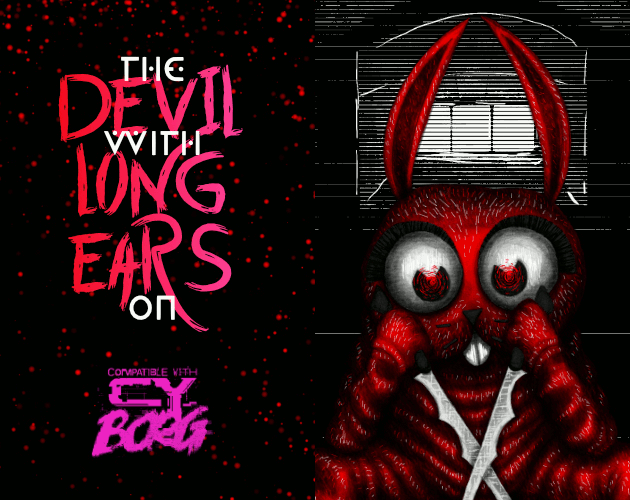
The DEVIL With LONG EARS On
Concept: “A 14+6 page Murder Mystery with: d6 Rumors, 3+ Cases, Puzzles, 4 Big Maps, 3+ NPCs, & 1 Killer Bunnyman; Inspired by the BUNNYMAN urban legend for CY Borg's Urban Legend Jam.”
Content: A mission to hunt a serial killer across a series of ominous locations. “Digital,” “print,” and "bare bones" versions provided along with an asset/maps booklet.
Writing: Vivid descriptions and helpful guidance for GMs make for a dark but entertaining experience.
Art/Design: Primarily a dark color scheme, with white text on black and black text on white/gray elements, while pink and red accent headings and images. Numerous scenic illustrations and NPC portraits bring myriad dimensions of the mystery to life.
Usability: Fonts in each version are readable and fully embedded, which facilitates searching or selecting text–especially content that is arranged perpendicular to the default orientation.

The Lair of Eucalyptus
Concept: “In this adventure, you will face close encounters with the rulers of CY_. Assault their ghostly dwellings but, behold! The Hills abound in living Urban Legends. These sophisticated terrors are inspired by the ancient Colombian tradition. <>”
Content: A heist to retrieve untold riches from a well-secured mansion.
Writing: Unbelievable amounts of detail regarding the job parameters, NPCs, random encounters, locations, and dialogue with multiple outcomes.
Art/Design: Mostly single-column text layout over a background pattern made from a simple color-coded map of the region.
Usability: Text is high-contrast and in a readable font, with consistent presentation throughout of headings and labels. Map is provided at multiple points in the document, which reduces the need to flip through entire file to make use of it.
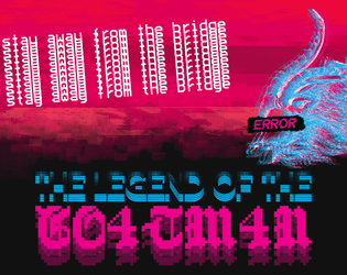
The Legend of the Goatman
Concept: “Deep in the Net, a daemon inhabits a bridge. A deal is a deal. The Goatman is an ancient AI of unknown origin - an entity designed solely to make deals. The purpose of the Goatman's deals are ultimately unknown, lost to time or purposeful obfuscation.”
Content: A scenario/set of rules for a deal-making daemon.
Writing: A mix of straightforward rules/mechanics explanations and an in-universe vignette framed as file contents about an unsuspecting punk’s encounters with the Goatman.
Art/Design: Two pages of three major columns/panels (potential trifold configuration). White, red, and green text on black, accompanied by two glitch-art illustrations of daemons.
Usability: Text is easy to read and navigate, with distinct visual markers for different kinds and sections of content (font choices, colors, sizes, etc.). Font selections also immediately make apparent which text describes the scenario and which serve as the vignette.
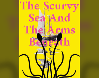
The Scurvy Sea And The Arms Beneath
Concept: “Night. The aquaculture cage maze. A chorus of motors rises against the sludgy lap of the waters. Light pierces the gloom, searching, calibrating, until it falls on a racing skiff. Painted in neon green, the craft banks around a submerged tangle of steel and plastic, cutting the turn slightly too wide. Gunfire hammers the silence. Punctured, the pilot falls from the bow. The boat spins out, catches the edge of another submerged structure, and turns into a spray of splinters that float atop the waves. Three more racing skiffs charge past the wreckage, drivers whooping as they go. The Cy Regatta has begun again.”
Content: Rules for participating in the Cy Regatta, a set of deadly boat races, along with a sea creature that might torment the racers.
Writing: Focused, specific details to explain the rules at play for the regatta, presented directly and concisely.
Art/Design: Lots of bright color combinations, full-page illustrations, and silhouette backgrounds of text pages/spreads.
Usability: Single-column text format with large headings facilitates reading and navigating, although some color combinations might strain some eyes, while others may have difficulty reading text overlaying more complex background illustrations.
The Society for Free Minds
Concept: “DO YOU WISH TO SEE THE UNKNOWN? A dash of conspiratorial thinking for your next CY_BORG game. Contains a table of weird things to find on the NET, two UFO themed enemies, equipment, and a bunch of references to sci-fi and horror.”
Content: A zine featuring governmental and alien menaces, a table of interesting net discoveries, and several items.
Writing: A balanced mix of unsettling horror and tongue-in-cheek humor presented as a mostly in-universe document.
Art/Design: Dark gray on light yellow/tan scheme (reflecting printed homemade zine aesthetic) with one- and two-column layouts of text, accompanied by cartoon and silhouette illustrations of enemies, items, and more.
Usability: High fore/ground contrast and font choices make for easy reading, with larger headings and handwritten marginal notes consistently applied throughout.
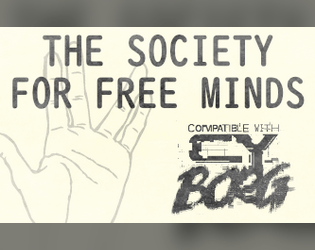
Trouble with TA1L-YP-0
Concept: “It's a real easy gig... Just taste test T-G Labs new Infini-meat and participate in a quick focus group! You'll soon be on your way with a fistful of kreds. Where's the meat come from you ask? I'm afraid we can't share that proprietary information.”
Content: A mission to survive a marketing research meeting.
Writing: Brief bursts of flavor and mechanics (including an intriguing set of maze/escape tables) directed to both GM and player.
Art/Design: Landscape-oriented black-on-white spread (with yellow, pink, and blue highlights) includes a hand-drawn illustration of a cryptid in the top right corner, and two main columns of text content (the left of which has two columns of tables within it).
Usability: Consistent presentation of content, with visually identifiable headings, labels, and marginal notes. Layout makes referring to specific info easy, especially stats for NPCs appearing in maze room encounters.
URBN_LGND.exe
Concept: “Urban Legends, the undercurrent of our cultures and personal narratives, a shared imagination that shapes our worldview. From Florida Man to Area 51, the illuminati to cryo-frozen billionaires; these are the stories and whispered secrets we tell to amuse and frighten ourselves. But what happens if our world's lore collides with the desperate city of CY? What new conspiracies are born, what new abominations draw breath? URBN_LGND.exe is a third party compatible game jam that asks YOU to CY_BORGify your favorite urban legend.“
Content: A variety of supplements–gigs, creatures, classes, optional rules, and beyond–reflecting various urban legends that might be (un)known to the punks that try to survive in CY.
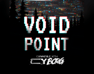
Voidpoint
Concept: “Meatspace decays. AR sputters. VR goes black. There are perilous chambers for those descending too deep in the THE NET. Nothing in them but shimmering entropy. Fractal pits. Voidpoints.”
Content: A set of rules for when a player fumbles an app roll while in the net, along with a set of locations to explore when doing so.
Writing: Brief, evocative descriptions of sensory experiences that can cause a punk to question their reality, even as digital dangers risk their annihilation.
Art/Design: Organized as a trifold pamphlet basic rules and title/credit info are provided on outer panels (in white-on-black color scheme), while voidpoint locations and a map are provided across the inner panels (in black-on-white color scheme).
Usability: Headings and labels are visually distinct from body text and consistent in appearance. Map locations are numbered and correspond to descriptions surrounding the map image. Text is not embedded, so searching/selecting is not possible.
Previous page
Page 2 of 2