AI Content/Assets
This material has explicitly noted or overtly recognizable AI content/assets of some kind.
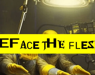
Deface the Flesh
Concept: “Gruesome implants and upgrades for a future where the body is irrelevant and flesh has no sanctity. Defile your physicality to keep up in the rat race of society. Set-dressing or inspiration from grim-dark cybernetics.”
Content: A d10 table of bizarre and grotesquely functional options for upgrading one’s imperfect and disappointing meat-suit.
Writing: Powerfully inventive descriptions of implants that suggest a wide range of uses and reasons for their potential ubiquity in CY–but no stats or game mechanics are attached. It’s all flavor, and it is zesty.
Art/Design: Black text on yellow, with a chaotic-looking font or set of font choices for each entry’s label. An image of disturbing surgeons working on an unseen patient frames the supplement’s title.
Usability: While each label can be difficult to read due to the intentionally inconsistent appearance of each character, the text overall is very easy to read and navigate to consider options or to locate desired info.
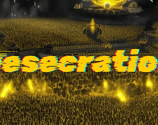
Desecration
Concept: “1EDX is the biggest viscpop band in all of CY. Now, their songwriter has contacted a bunch of punks to try and 'kidnap'--that is, free--them from the clutches of the band. Currently, they're in 1EDX's luxury mansion compound. But it's just the time for a rescue op, as 1EDX is opening their doors to a few lucky winners of a raffle for a tour of their mansion. Act fast.“
Content: A scenario to infiltrate, locate, and liberate the abused talent from the city’s biggest pop stars. Two versions of content included: "Classic Look" and "Squeaky Clean."
Writing: Plenty of engaging detail to flesh out the locale, the situation, and the NPCs that the PCs might encounter, including some juicy secrets for the GM to incorporate or have the players discover as appropriate.
Art/Design: Primarily black, single-column text on yellow, with some color-coded labels to indicate particularly important details and (near the end of the supplement) approaches to the mission. Clean, lo-fi overhead map layouts of the mansion with color-coded layouts and labels. An image of a massively populated concert frames the adventure title on page 1.
Usability: Color-coding helps tremendously to relate particular elements to one another, and layout allows for quick navigation and identification of desired info. “Squeaky Clean” version is included for even easier reading, and more printer-friendly, experience (black on white with less color use throughout).
Disavowed Medtech
Concept: “You joined the Medical Corps thinking you could make a difference, that you could save lives! But you didn't know the corps only save if you have the Creds to pay for it, and often times they'll leave you in the mud and blood if a higher paying call comes in. Supposedly the Hippocratic Oath you took when you Joined up only applies to those serving in the corps, guess that means you can defend yourself when helping the wounded now huh?”
Content: A class for the freelancing EMT who’s ready to shed as much blood as they staunch.
Writing: A mix of straightforward informative explanation and potently characterful description of character features and mechanics through which to bring a medtech to life.
Art/Design: Three visually distinct versions are provided: a landscape-oriented “printer killer” version with white text on black and red background colors, a portrait-oriented “splash of color” version, and a black-on-white text-only version.
Usability: Each version makes use of different fonts, text sizes, layouts, and colors to indicate a visual grammar for that version. The print-friendly version has searchable/selectable text.
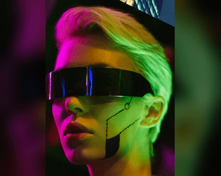
Disgraced Face
Concept: “A new class option for CY_BORG! I worked up some mechanics for how to find contacts in the CY, as well as allow players and GMs to explore famous and high profile characters. All donations greatly appreciated!!”
Content: A class for the fallen angel who’s become accustomed to life in the grime and gutter.
Writing: A set of mechanics and background details that complement one another to give this sort of ruined punk a chance to wreak havoc on their former life.
Art/Design: Bright colors and a variety of illustration styles reflect a 1980s-esque vaporwave style, with text content in yellow-orange on purple boxes in a single-column format.
Usability: Consistent organization and presentation of different kinds of content help with navigation through the file to locate desired information. Unfortunately, text is not embedded, so no searching/selecting.
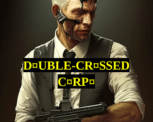
Double-Crossed Corpo
Concept: “It started innocent, didn't it? Just street brawling and hanging around in dingy pvnk haven bars, then slipping back into your other life in the high-placed corpo job. But it couldn't last. Now it's not just a hobby, a 'second life' for you to run as a pvnk. It's your actual life, and if you don't watch your back, it could be your death too. But you made it through the concrete jungle, the corporate arena. The streets of CY are just one cubicle block to claw your way through.”
Content: A class for the white-collar worker who’s found purpose in raging against the machine.
Writing: A mix of features to balance the punk’s former corporate identity and their current violent criminal undertaking, with a particularly interesting mechanic based on a poker-like 5d6 roll result.
Art/Design: Two versions are provided, both of which use a mostly single-column layout with a single table: a full-color version with white/yellow text on black background lines over colorful, pixelated background images of stock tickers/readouts; and a printer-friendly black-and-white version.
Usability: Both versions provide clear, consistent visual distinction of headings/labels and key terms that are emphasized in various lines of text. Full-color version may be slightly more difficult for some to read easily due to busy nature of the background image.
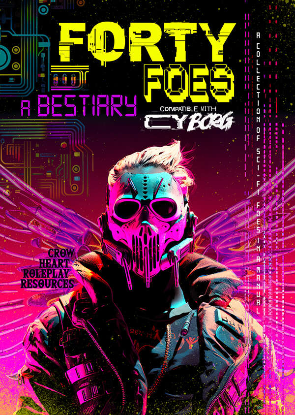
Forty Foes
Concept: “Ahead of you lies a sci-fi bestiary for the game of Cy Borg. This is not an official product but is presented in the familiar doom metal style, each foe being empowered by this energy and inspired by the work of Johan Nohr.
A perpetual darkness hangs over The Cy. In its malaise of gang warfare, in between the slums and festering rivers, hidden within the quarantined zones of the GO, standing in plain sight in the consumer hell of the Undersjon, is an incurable sickness. It breeds malevolence and jacks up the citizens. It lingers long enough to rot away the core and from this darkness comes all manner of twisted visage. Warped beings appear, the upshot of a city that is consuming itself. Let these foes appear among us say the consequential voices.”
A perpetual darkness hangs over The Cy. In its malaise of gang warfare, in between the slums and festering rivers, hidden within the quarantined zones of the GO, standing in plain sight in the consumer hell of the Undersjon, is an incurable sickness. It breeds malevolence and jacks up the citizens. It lingers long enough to rot away the core and from this darkness comes all manner of twisted visage. Warped beings appear, the upshot of a city that is consuming itself. Let these foes appear among us say the consequential voices.”
Content: A variety of angry, terrifying, and otherwise hostile beings to encounter on the streets of CY. Tables for nano powers, drinks, infestations, hazards, drugs, weaponry, technical glitches, and more are also provided.
Writing: Imaginative descriptions of enemies (or other entries) accompany stat blocks and special abilities/mechanics reflecting the essence of each subject.
Art/Design: Full-color illustrations and layouts on each page, although styles for pages may vary considerably from page to page.
Usability: Different page layouts can slow down reading/navigating experience, but font choices are mostly quite readable with high contrast against simple or patterned backgrounds–although there are occasional exceptions throughout.
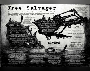
Free Salvager
Concept: “Most people just see the surface of the water, but there’s a lot down there if you know where to look. Wrecks, stashes, secrets of all kinds, some going back centuries…who knows how deep and old things get?”
Content: A class for the enterprising underwater dumpster diver–another scumbag’s trash is your sunken treasure.
Writing: Description and mechanics are concise and clear, with straightforward indications of the scope of the class.
Art/Design: A dark blue, watery background offers helpful contrast to the white text in this spread.
Usability: Class details are easy to recognize and navigate, with strategic bolding to highlight important elements that complete the character.
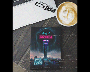
Gods of Greed
Concept: “Deep within the bowels of the city's more affluent districts lies a prominent spire, a shard of rot upon a dying city. The Richter foundation is a deplorable and ravenous organisation that exploits the poor and the sick for profits and gain. Their most recent business model saw them open a rift in dimensions and unleash a torrent of tentacled monsters that sent the general populace insane. The party of easily exploitable fodder are sent in with a corrupt floppy disk to close the rift and send those evil sods back to where they came!”
Content: An adventure that melds Lovecraftian nightmare fuel with a corporate heist/infiltration opportunity. The included “Action Hero” class serves as a perfect means of tackling this endeavor.
Writing: Inspiration-packed descriptions of locations, environmental factors, NPCs, mechanics, and more abound to bring this scenario to life.
Art/Design: Numerous art styles and layouts provide numerous opportunities for engagement with compelling ideas.
Usability: Variety of fonts, page arrangements, and color schemes may make quick skimming/navigation difficult at moments but each page and spread calls attention to important elements for the reader to focus on.
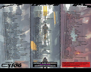
Gritbeat: 6x66 Songbooks
Concept: “Gritbeat 6x66 Songbooks provides d66 albums to listen to as soundtrack for your cyberpunk RPG sessions, for six separate moods/settings.”
Content: Six tables of albums suitable for Cy_Borg games, organized by general atmosphere: cinematic, cerebral, urban, visceral, heavy, disruptive.
Writing: Tables are consistently organized, with artist name, album title, and year of release. A set of hashtags is provided to help further clarify or help with determining each table’s usefulness for a given session/table’s intended ambience.
Art/Design: Table content is provided in two three-column spreads, with a different image evoking CY as the background for each table.
Usability: Each table is easy to navigate, with artist names in bold to help distinguish visually from album title and year of release.
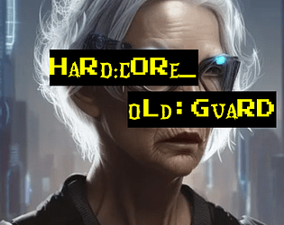
Hard:Core_Old:Guard
Concept: ”You never got the chance to go out in a blaze of glory. Somehow, it just never happened to you. Every ‘last job’ consistently failed to let you finally bite the concrete after taking on a platoon of SecOps solo to let the others get away. Survival is an irritating and embarrassing habit you seem to have picked up. So here you are, years and years later. The gray hairs creeping in, the same megacorps in control, the same synthetic food, the same brutal enforcers, the same putrescent city of the damned surrounding you. And yet, here you intend to stay.”
Content: A class for the grizzled elder who’s gotten too old for this shit.
Writing: Inspired class features to make a player feel like they’ve seen it all and can share their violent wisdom with others.
Art/Design: Two versions provided: a ‘classic’ look with white-on-black lines of text over a crumpled-paper background illustration, and a ‘squeaky clean’ printer-friendly black-on-white text. Both versions include two color portraits of old guards.
Usability: Text provided in single column layout with capitals, bold, and (in the classic look) distinct colors, all to distinguish different types and sections of content. Easy to navigate and to identify important details.
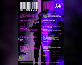
Hardboiled Ex-Cop
Concept: “You were one of the good ones. A rare breed. That’s why you didn’t make it. The system is corrupt to its fucking core. This city is beyond saving. But there is something you can give it. Justice.”
Content: A class for the punk who wants to play a cop without breaking Cy_Borg’s Rule 0.
Writing: Descriptive class features and options that mesh well with (and are frequently named after!) cop-centric tropes and media.
Art/Design: Two-column text layout over a picture of a well-armored ex-cop with a split color scheme of black, white, and purple hues.
Usability: Text is quite easy to navigate and mostly readable–there are moments of potential visual confusion where the text and background colors are similar enough to obfuscate a word or phrase.

Horrible Jobs
Concept: “A CY_BORG zine featuring soul-throttling cyberpunk occupations. Your past, or perhaps your alter ego, in the crush of CY. Demeaning and pointless jobs that drove you into a new path.”
Content: A two-page d10 table of mundanity meant to provide PCs with painfully dreadful backgrounds that reflect the oppressive daily existence of the masses.
Writing: Morbidly hilarious and creative options speak to the breadth of crushing banality that makes for most characters’ familiar reality.
Art/Design: Mostly single-column text (black on yellow) with key terms/phrases emphasized in either a different font or a chaotic collection of fonts. An image of faceless workers in an office setting frames the zine’s title on page 1.
Usability: High-contrast color scheme helps with readability, as does simple layout of table content. Font(s) used for key terms can be difficult to read thanks to the purposeful disruption of character size/decoration/etc.
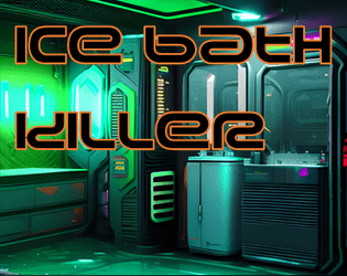
Ice Bath Killer
Concept: “‘You woke up in a bath of ice And they’d removed an organ!... Was it expensive?’ ‘It was natural!’”
Content: A gig to investigate organs stolen by a group of purists.
Writing: Plenty of details surrounding the job–people, places, motives–and guidance as to how a GM might want to approach it in different ways.
Art/Design: Trifold pamphlet layout in white and neon colors on black, with NPC portraits and a map of a key location. An additional page of player handouts is included (breaking news and a simple map of the district).
Usability: Different kinds of content are distinguishable by color and ‘box’ shape, with bolded and colored labels to call attention to key details. A few blocks of text are angled and rasterized, but vast majority of text is selectable/searchable. Map is helpfully overlaid with room/space details in each room/space.
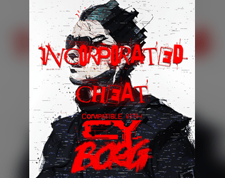
Incorporated Cheat
Concept: “They always rig the system against you. We were supposed to be in the big leagues by now and look where they left all of us. You decided to take matters into your own hands. You’d win. At any cost. You’d play at one game, any side as long as you’re on top. Even if you cheat.”
Content: A class for the doublecrossing, backstabbing, roguish scoundrel at heart.
Writing: Fantastically colorful descriptions and labels for class features, with intriguing mechanics to match (including a morale component).
Art/Design: Several UI windows scattered across much of the spread provide some unique flavor (gambling aesthetics, blood splatter background, etc.), while a muted image of a cheat frames the right side of the page.
Usability: Separate windows/boxes for distinct content assists with navigation and location of desired info. However, as a PNG, class text is not embedded, so searching or copying/pasting is unavailable.
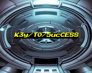
K3y/T0/5ucCESS
Concept: “Nothing ever goes smoothly, does it? Life of a pvnk in CY. There you are, about to score big on your job after the gunfights and hacking and double-crossing and more, and there's just one problem in the way: the door. This zine presents ten unusual conditions for getting at your loot, likely the brainchild of paranoid corpos with too much money on their hands. You'll have to put your mind to work on how to get past them. Available in Classic yellow, Nite grey or Clean white.”
Content: A set of potential complications or other unexpected qualities oriented around physical or digital keys, any of which can be used as twists or obstacles to just about any job a group of punks is looking to complete.
Writing: Each key is described in terms of its essential features, the specifics of its use, and potential reactions or consequences that might occur from its (mis)use.
Art/Design: Three versions are provide: a “classic look” version of black-on-yellow, a “night mode” version of black-on-gray, and a “squeaky clean” version of black-on-white. Each version includes a cover page with the supplement title centered on an illustration of a high-tech vault door. Layout is single-column text with a unique quality of each key provided in bold.
Usability: Easy to read and navigate, with clearly identifiable list elements.
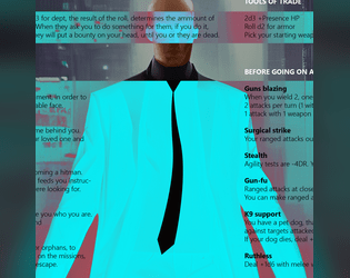
Legendary Contract Killer
Concept: “A custom class for Cy_Borg rpg, inspired by John Wick, Hitman and Riddick.”
Content: A class for the well-dressed assassin who’s open for business.
Writing: Brief descriptions that call to mind essential themes of the professional hitman from entertainment media.
Art/Design: An illustration of a contract killer is framed by a column of text on either side, with a blue-green background box calling attention to the text content.
Usability: Bold headings and labels help with organization and navigation while text is pretty readable, although the occasional background color change might cause momentary hiccups for some.
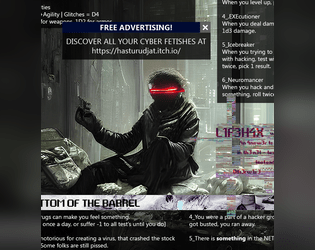
Lone Cyber Cowboy
Concept: “A GENIUS CHILD, A PRODIGY. EARLY GOT INTO CRIME. BECAME A HACKER. FOUGHT AGAINST CORPORATIONS. FOUGHT FOR FUN. FOUGHT FOR ANARCHY. FOUGHT FOR ANYTHING HE COULD. AND LOST.”
Content: A class for the burned-out command-line commandos trapped in their meat-suits.
Writing: Crisp, concise descriptions of class features/mechanics to evoke a CY_BORG take on the cyberpunk hacker archetype.
Art/Design: An illustration spread of a lone cyber cowboy in situ, surrounded by blocks of class information as app windows.
Usability: Text is mostly easy to read and understand, with only two points where a word or phrase is partially obscured by another overlapping block of text There is one section of the spread meant to look like it’s glitched, but the result is nearly illegible (the “L1F3H4X” class feature).

Manufactured Human
Concept: “A Cy_Borg Character Class for Clones, Replicants, Tubies, Synthetics, and Plastics. Allows the player to hyper specialize in one attribute at the expense of the others. Plus some fatal flaws to keep it interesting.”
Content: A class for the artificial lifeform enthusiast.
Writing: Descriptive text focusing on working against various situational odds, coupled with terse mechanical details to make each manufactured human punk different.
Art/Design: Two-column text layout with white on dark translucent boxes, overlaid on a computer-generated image of similar mechanical human characters. Pink text used for headings and mechanical details.
Usability: High contrast of white text on dark boxes is helpful but undercut somewhat by the busy nature of the background image and shared colors between text and image.
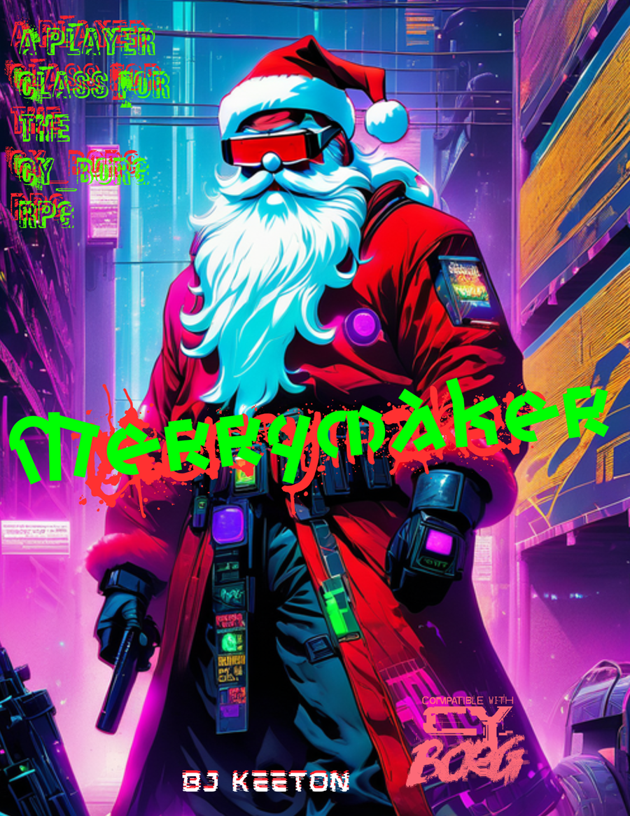
Merrymaker
Concept: “Jingle bells, Cy city’s hell,
G0 got my mom.
I’m tired of this, it has to end,
I’ll bring you all along.”
G0 got my mom.
I’m tired of this, it has to end,
I’ll bring you all along.”
Content: A class for the yule lover who wants to celebrate the season all year long.
Writing: Hilariously thematic descriptions and class mechanics that bring to life an appropriately cyberpunk would-be Santa.
Art/Design: Landscape layout with an AI illustration of a merrymaker on the left and text in white, green, and red all around it.
Usability: Text is mostly high contrast and visually readable, organized in distinct sections that are easy to navigate. Some text is embedded (and searchable/selectable as a result) while other text is not.

PVNX/R/VS
Concept: “A cavalcade of the bizarre and horrid in the wretched metropolis of CY. Within you'll find pirate lords, eldritch entities of the deep NET, kill-games champions, floating fortresses with maniac overseers, dangerous prototype cyberdecks, collectivist agitators, and worse still than that in this cross-section of the endless end of days in the city of CY.”
Content: A smorgasbord of assorted content, from enemies/acquaintances–physical and digital alike–to cyberdecks to locations to to overheard quotes to a new class (“The Last Ideologue”).
Writing: Terse mechanical explanations are consistently complemented by vivid in-universe descriptions that can aid both GMs and players in imagining and making use of the subject at hand.
Art/Design: Single-column black-on-white text throughout, with some differing font choices for headings/labels of distinct sections.
Usability: High-contrast text, visually readable fonts (with one purposeful exception), and a recognizable organization for layout makes for successful perusal and use of the document.
Quickdraw Combat
Concept: “A more you-go-they-go style to keep combat chancy and mobile in CY_BORG. Dare to try and clear the field before anyone can pull a gun, or would you rather hunker down until your heavy weapons are spun up and ready to open fire?“
Content: A set of rules to attempt faster and potentially deadlier combat than in the Cy_Borg rulebook.
Writing: Mechanics are provided in a straightforward and helpful manner, which may reduce likelihood of confusion or disagreement at a table.
Art/Design: Two versions are provided: a full-color version and a “plain text” version. Full-color version has yellow text on black background (with other neon colors for emphasized terms/rules) overlaid on an image of a samurai in a cyberpunk setting. Plain text version is black-on-white with bolded text to emphasize headings and important terms. Both versions use a two-column landscape-oriented arrangement of text.
Usability: Both versions provide high-contrast text, although different font choices as well as different colors and visual elements may result in varying reading experiences.
R1ot
Concept: “‘Like carousing but for you miserable pvnks. Riots are always a gamble, and with bad odds on your side, because private SecCorp security usually bring it on with better gear than a bunch of pvnks do. So why keep going to them? Because sometimes you need a reflective bulletproof glass visor to smash your fist through, that’s why. RAGE burns away concepts like “outnumbered” or “discretion”.’ Random table for just how wrecked or lucky you got at a riot in CY, plus a fast-roll table for simpler results.”
Content: A d66 table of results from participating in a riot in CY, with a “quick table” option for an even more focused generation of events.
Writing: Immersive descriptions/events feel simultaneously absurd and completely plausible, intersecting with an axis of hilarious to horrific.
Art/Design: Single column of black text on yellow, with additional content blocks in bordered boxes and important terms highlighted in yellow text on a black background. An illustration of gas-masked rioters serves as the background for the title on page 1.
Usability: Extremely easy to read, navigate, recognize, and understand information throughout the supplement.
Reformation
Concept: “Another day, another run-in with an unknown street gang. A little shootout leads to an offer you can't refuse. ‘Just get the job done, and you never need to hear from us again.’”
Content: A job to track down a high-tech and highly desirable medical device stolen by an unknown gang of street punks.
Writing: Focused attention on unfolding events to guide a GM through the adventure, with supporting details about involved NPCs and their motivations to act.
Art/Design: Trifold brochure layout with white/yellow on back complemented by neon colors and specific font choices for headings, maps, and NPC stat blocks. Several NPC portrait illustrations provided as well. Final showdown map creatively places each room description in that room on the map. Two player-facing handouts/notes are included on an additional page.
Usability: Visually distinct colors, shapes, and orientations help identify how different kinds of content function in relation to the others. Most text is embedded for easy searching/selecting, although a few content blocks are not, which might momentarily complicate an attempt to select that text
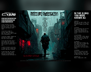
Slumdog Scavenger
Concept: “I’m nobody. I’m a tramp, a bum, a hobo. I’m a boxcar and a jug of wine...and a straight razor if you get too close to me.”
Content: A class for the player who likes their cyberpunk absolutely coated in gutter grime.
Writing: Concise class mechanics explained by strong doses of thematic flavor to bring a character to life.
Art/Design: An extremely atmospheric image of a scavenger walking down an alley in the rain framed on either side by class details and features.
Usability: High-contrast text is easily readable, and the overall layout makes for quick scanning and locating desired information.
The First Job
Concept: “A message from an old friend promises a decent amount of creds, maybe enough to pay off what you owe, or at least get you started. Looks like you are heading into the massive underwater commerce district of Undersjön. Under the pressure of the waters, and just under pressure because of the deadline, can you complete your task and earn your payday?”
Content: A heist scenario with a twist: the punks have to find what they’re looking for before they can begin to think about leaving with it. Two versions provided: a full neon-color version and a printer-friendly black-and-white version.
Writing: Engaging details bring to life the location and the punks’ contact, both of which could serve a table long after this specific adventure. Random encounters and an off-duty cop name generator add personality.
Art/Design: Two major columns of content across two pages, with the full color version using different section background and heading/label colors to help distinguish different kinds of content, while the black-and-white version makes use of section borders and heading/label bolding. An isometric map of the adventure location is provided.
Usability: Text throughout is readable with high contrast against background and is easily identifiable as a component of a particular content section (e.g., random encounters, NPC info, etc.).
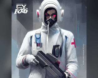
Trauma Team Specialist
Concept: “Become a trauma team member today.”
Content: A class for the broke med student who wants to chase endorphins via battlefield surgery.
Writing: Brief descriptions and explanations of class features/mechanics that feel appropriately “clinical” and at home in CY.
Art/Design: Two-page spread, with a left-side column of text (reddish pink on white) and a right-side digital illustration of a gun-toting medical specialist.
Usability: Class details are easy to read and navigate, with distinct headings that indicate the scope of each section.
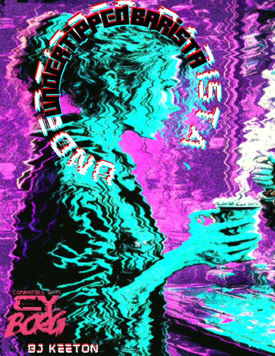
Undertipped Barista
Concept: “people suck. you knew it before you took the job. now it's your religion. you draw hearts with foam. you take their inane and complex orders. you try to laugh at their banal jokes. it's a good day if they say thank you. it's a miracle if they leave you a single credit. you hate them.”
Content: A class for the food service worker who’s been all but ground into dust and is ready to burn everything to the ground in retaliation.
Writing: An overflowing venti’s worth of cynical flavor that brings the class to life. Class details are mostly terse (if appropriate!), but the “breaking point” table offers surprising depth in contrast.
Art/Design: An illustration of a barista serving a customer is surrounded by class features, all with a neon palette on a dark background.
Usability: Each section of content is easily distinguishable from the rest, with font color, type, and size choices indicating each heading/label.
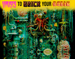
Viruses to Brick Your Brain
Concept: “Embedded in ads, lurking in the top search result, loaded as a hacker’s dead hand, coursing through a derelict net node. Viruses are everywhere, infecting everyone, stealing a portion of everything. Most of them are unnoticeable, lurking in your RCD, implants, accounts, everything. These? Less so. Bisecting your consciousness. Hijacking your implants. This is the result of someone else’s malice or misconduct. It will break you down until you get rid of it.”
Content: A set of tables to make a player’s life living hell through the power of compromised technology.
Writing: Concise and powerfully thematic explanations of relevant variables, including how the virus spreads, how it affects a player mechanically, who developed it, how to get rid of it.
Art/Design: A visual overload of colors, fonts, graphics, and stylistic clashes that feels entirely appropriate given the rules’ purpose.
Usability: While overall consistency is out the window, it is possible to understand and navigate each table/element while focusing on that section.
Previous page
Page 2 of 2