Enemies/NPCs
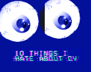
10 Things I Hate About CY
Concept: “10 urban legends whispered on the streets of CY and in the dark corners of the NET. The fact is usually worse than the fiction.”
Content: A collection of urban legends about mysterious individuals, locations, and events that might intrigue or terrify a group of punks.
Writing: Ominous tales framed as though potentially spoken by CY residents, allowing for easy slot-in ambience and plot hook/seed for GMs.
Art/Design: White, pink, and yellow text on dark blue with occasional purple circuit-board background designs and a large pair of eyeballs near the bottom of one page. Presented as three pages of single-column text.
Usability: Font choices and colors make for easy visual readability and identification of distinct content purposes (e.g., pink text for headings/labels, yellow for important details, names, and locations).
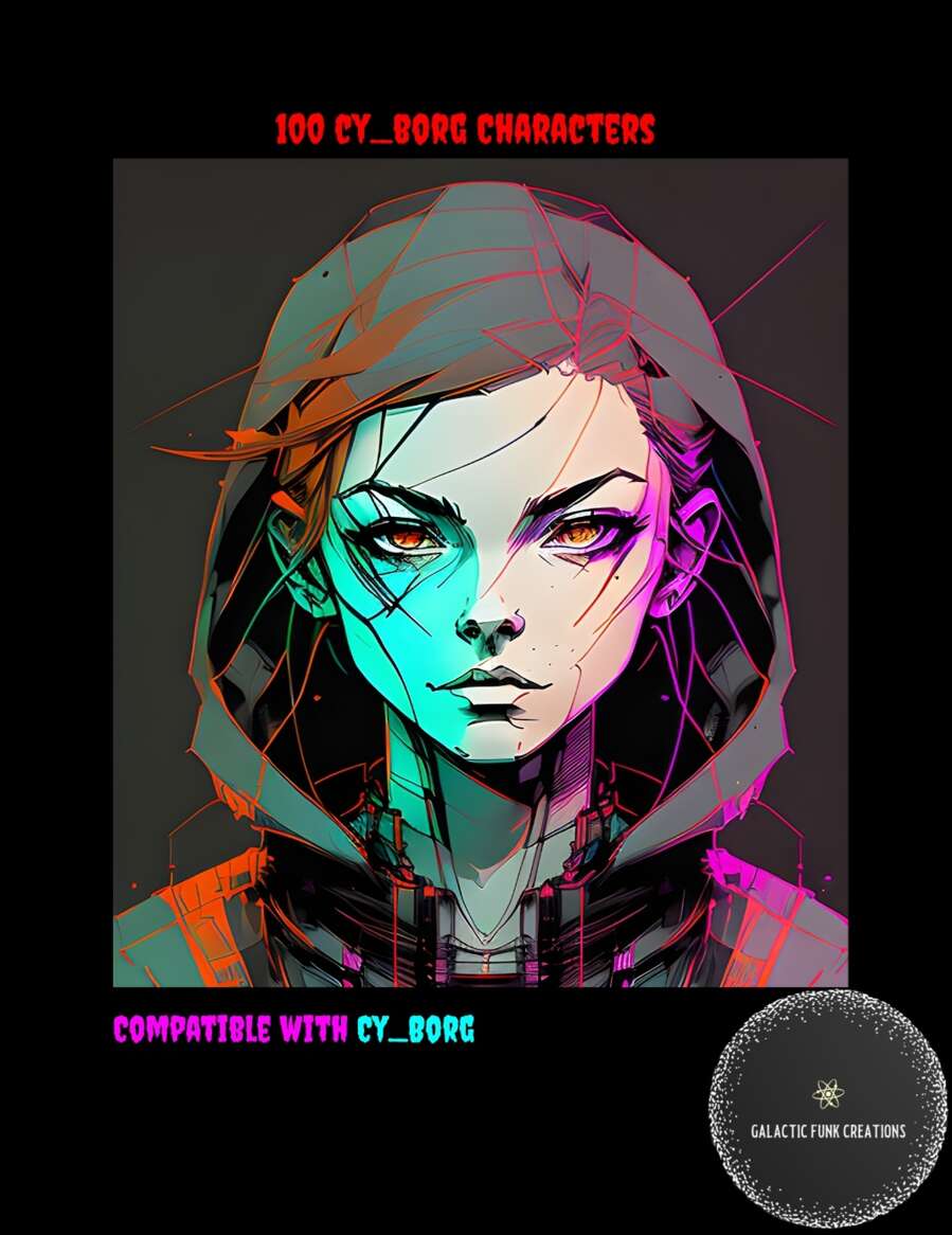
100 CY_BORG Characters
Concept: “Let me guess, your players are at prepping a heist and in the process take a turn you didn’t expect leading them to want to talk to someone that's not a part of their current goal. Sure you could improve something on the fly but why not let this list of 100 Cy_Borg Characters and their goals take some of the work of running the game off your shoulders?”
Content: A list of one hundred NPCs, each provided with a name and a one-sentence description of them.
Writing: Sentences are terse but hint at potential plot hooks for a table of punks to explore.
Art/Design: A cover page has an illustrated portrait of a young person in a hood. Otherwise, the list consists of single-column list entries in white on a black background (and a black-on-white version is also provided).
Usability: High-contrast text in a visually readable font, aided by consistent numbering and spacing throughout, makes for easy perusing and navigating to desired information.
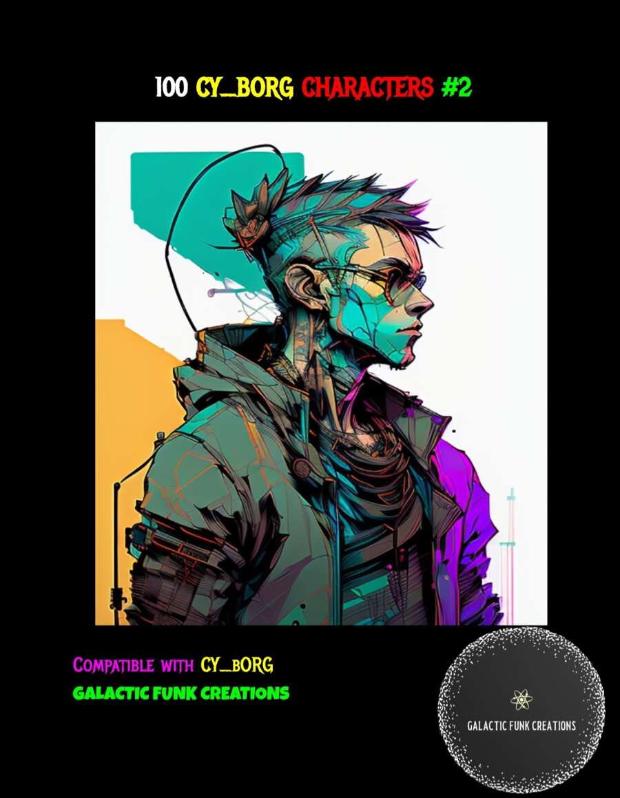
100 CY_BORG Characters #2
Concept: “Introducing ‘100 CY_BORG Characters #2’ – the perfect companion for your CY_BORG gaming sessions, designed to add depth and flavor to your adventures in this cyberpunk world. If you're a fan of CY_BORG, this supplement is a must-have addition to your collection.
Inside this resource, you'll find a collection of 100 NPCs, each complete with their own names, goals, stats, and personalities. These characters are tailor-made to fit seamlessly into your CY_BORG campaigns, whether you're a veteran player or just starting out.”
Inside this resource, you'll find a collection of 100 NPCs, each complete with their own names, goals, stats, and personalities. These characters are tailor-made to fit seamlessly into your CY_BORG campaigns, whether you're a veteran player or just starting out.”
Content: One hundred NPCs with which to populate Cy–complete with descriptions, personalities, stats, and motives.
Writing: Character details are terse but potent, allowing for a GM to make effective use of them at a table.
Art/Design: A full-color illustration of a cyberpunk-looking figure is on the cover page. Otherwise, details are provided as white-on-black text/background (and as a separate black-on-white version) in a single-column numbered list with bulleted subpoints.
Usability: Details are provided clearly and consistently, with text in a high-contrast visually readable font.
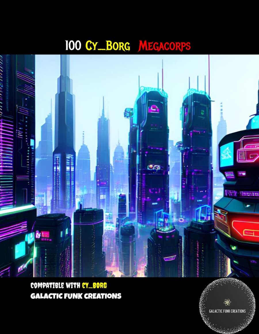
100 CY_BORG Megacorps
Concept: “Ruling high over the scum who wander the city of CY, Megacorps are the true power in the city. Most if not all are in debt to at least one of them, while everyone relies on them for what they need..as well as the vices that help them tune out. More than the gangs, the police, or rival teams, its the Megacorps and their CEOs who are the real enemy of all the powerless who call CY home. Here are 100 different corps and their CEOs to help you run your next CY_BORG game!”
Content: A set of one hundred corporations that contribute to making Cy as terrible a place as it is.
Writing: Each megacorp is provided with a brief overview of its area of industrial expertise and its CEO, along with the CEO’s public persona and secret goal.
Art/Design: White-on-black and black-on-white versions are both included; for each, megacorp entries are single-column text with bullet points. A full-color cityscape image is provided on the first page.
Usability: Text is high-contrast and in a visually readable font, with the list entries consistently presented (overall numbering and arrangement of bullet-point data).
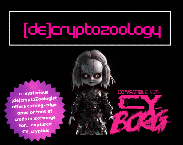
[DE]CRYPTOZOOLOGY
Concept: “In the shadowy depths of neon-lit Cy_, where man, creature, and machine meld into one, enigmatic |0r3N_C0@lM@N3|, a [de]cryptoZoologist, obsesses about cryptids. Offering bountiful creds or cutting-edge apps as rewards, she lures runners into capturing these elusive beings, her true intentions shrouded in mystery.”
Content: A collection of useful cryptid-related information and inspiration: a NPC and their laboratory, several NPCs, and a set of apps.
Writing: Descriptive overviews for entries along with mechanics that reflect the character of each.
Art/Design: Trifold pamphlet layout with pink and white on black, with each panel presented mostly as a single column of text and glitch-aesthetic illustrations.
Usability: Layout and text contrast provides easy reading and browsing for desired info.

Assault on the Hills
Concept: “Buried deep within the twisting streets and endless hedge rows of the hills is the mansion of Helon Evontusk. Members of the board have tasked the punks with infiltrating Helon's home and finding a way to remove him from his position as CEO. If they can do this and escape without being captured, they will be rewarded with a massive collection of creds and some cutting-edge cybertech for the effort.”
Content: A job to take down one of the most narcissistic tech entrepreneurs in the Hills–with multiple options provided for dealing with him, each more satisfying than the last.
Writing: A tongue-in-cheek celebration of billionaire compeuppance. Sensory descriptions, random encounters and events, and NPC details all complement one another to build a vivid scene.
Art/Design: Sleek, mostly black-and-white layouts (with the exception of the cover and an isometric floor plan on the first two pages) that work to evoke the trappings of tech innovation. A set of top-down print-friendly and VTT-ready job site maps is provided as well.
Usability: Text is high-contrast throughout, and page layouts clearly provide visual indication of headings/labels vs. body text, with whitespace used to not only suggest related consent but also to guide reading and navigation through each page.
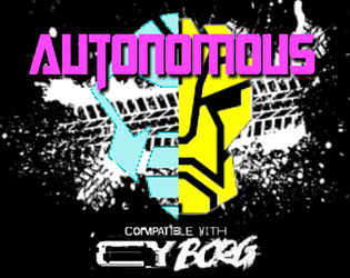
Autonomous
Concept: “Under the neon sky, amid the acrid fumes and blaring advertisements, something is present. They might have come with the rock, plunging into G0; or perhaps they were here long before then. There's no telling- there never is, not when the Autonians are on your planet. They blend in, fighting a shadow war- the crushing fist of an avaricious tyrant, and those few but proud who oppose him.”
Content: A collection of NPCs for tables where players & GMs prefer their robots to be more than meets the eye.
Writing: Bombastic worldbuilding that reflects the spirit of the source material it homages, with each robot having its own unique vehicle “altform.”
Art/Design: A mix of one- two-column content layouts with black text on white background, with each NPC stat block placed beside a colorful illustration of that NPC.
Usability: Stat blocks are provided consistently in organization and font selections, although introductory text uses a variety of fonts to indicate emphasis and proper names.
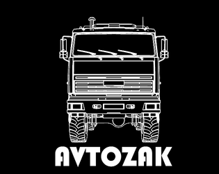
Avtozak
Concept: “Avtozak is a Cy_Borg expansion about riots.”
Content: A set of riot-related NPCs, weapons, and a table of riot causes.
Writing: Terse, frank descriptions and stats/mechanics for included content.
Art/Design: Illustrations of riot vehicles and participants (cops and protesters) with highlight colors are positioned alongside relevant high-contrast text.
Usability: Font choices are readable, with headings/labels and background colors for distinct sections that assist navigation and perusal.
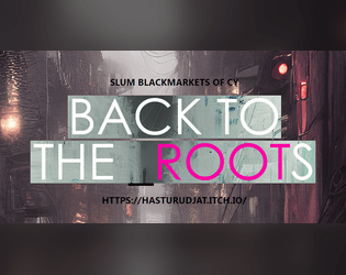
Back to the Roots
Concept: “A custom collection for Cy_Borg ttrpg, that includes:
- 13 new weapons, 6 new drugs, 4 new items - made in the slums of CY.
- 11 new street-made cyber-tech and 9 new APP's
- Short descriptions of 5 new slum Gangs
- A simple and short Adventure/Mission.”
Content: Tons of material to flesh out a game, from equipment to drugs to gang NPCs/enemies, with a scenario in the slums to take down a sadistic AI (and a map for the location).
Writing: Concise, direct descriptions and explanations of mechanics for a huge number of entries for various categories.
Art/Design: Mostly two-column page layouts (each with its own color scheme/aesthetic) with content on a translucent background pane over detailed, high-tech images. Map of floorplan includes effective icons indicating room features.
Usability: Text is easily readable with distinct heading/label decoration present in each page’s layout aesthetic.
Beyond Cy
Concept: “The fields. Monoculture deserts of genetically enhanced crops like wheat 4.6, ultra-maize, and soykin. Spliced to perfection. All earth is sterile. Killed by an unhallowed mix of unfiltered UV-radiation and the most potent poisons. Only hard fertilization keeps the masses alive and fed. Traveling through the cultivations is not without peril. Chemships puke their concoctions onto the plants; mechanic harvesters that have never seen an animal or human cut down all in their path.”
Content: A treasure trove of rules (miseries, glitches, mutations), gear, location/site summaries and generators, map hexes, random encounters, enemies, classes (“Mutant” and “Elektron Rohre”), job seeds/contracts, and even a dungeon to explore.
Writing: Intense, vivid, and wry descriptions that bring to life the sprawling wastes that surround Cy.
Art/Design: A mix of collage, pixel art, graffiti, graphical user interfaces, print reports, and more to frame each page/spread uniquely but feeling comfortably in line with the official/core Cy_Borg aesthetic. Map hexes provided as additional file.
Usability: Wide variety of layouts, font choices/sizes/colors, and organization can slow down reading and navigation (e.g., class info interspersed among NPCs), but hyperlinked table of contents aids with identifying desired details.
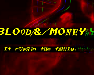
BL00D/&/M0NEY
Concept: “Crime families in the squalid megatropolis of CY. The deepest wounds of society- human traffickers, whoremongers, extortionists -have a tendency to crust over in stubborn scabs. Those who dare to commit evils nobody else has had the gall to perform before will find little competition in the field, and therefore great success. That’s how these families made their mark- bullets forever embedded in the cancerous and corrupt flesh of the great beast CY, they pushed the limits. And now, they’re here to stay, until someone’s willing to dig the slug out…”
Content: Information on six crime families/organizations that can be integrated into games of Cy_Borg: what their primary interests are, notable NPCs, and how GMs might make use of them.
Writing: Details provided in meaty paragraphs full of ideas and hooks, in a conversational voice that could be read straight to players as in-universe knowledge.
Art/Design: Black-on-gray single-column text layout, with an illustration at the bottom of each page that reflects the character of each crime family.
Usability: Easily readable/navigable, with solid contrast for text fore/ground. Headings and key terms/phrases are bolded for distinction and emphasis.
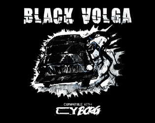
Black Volga
Concept: “A new, terrifying enemy straight from Polish urban legend - Black Volga. Now roaming the streets of CY, looking for petrol. But it's now what you think it is. ‘I’ve heard it. The sound of the engine weirdly resembles a beating heart. Guess it’s my weird imagination’ ‘Windows are pure black. I wonder… who is inside?’ ‘I swear to Balfogriff, I’ve seen tentacles slipping out of the windows!’”
Content: A demonic automobile that terrorizes the roadways.
Writing: Ominous and creepy flavor made all the creepier by the car’s devastating attack mechanics.
Art/Design: White and blue text on black surrounds a hand-drawn illustration of the Black Volga.
Usability: Visually, color, italics, and positioning of content help indicate the different purposes and kinds of text on the page. However, the text is not embedded, so no searching/selecting is possible.
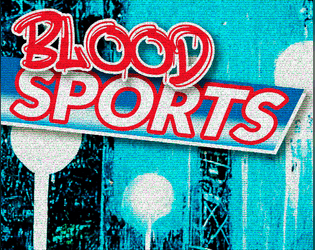
Blood Sports
Concept: “Some trashy random tables for generating odd sports and shows names punks play in CY_. You can roll some cocky champion names too and get some inspiration from the portraits provided.”
Content: Tables for quick generation of game types/specifics and famous sports NPCs, all of which are soaked in CY style.
Writing: Table results are vivid, grungy, and dystopian–exactly what you’d hope for.
Art/Design: Contrasting-color rows help with table navigation, with tables positioned around the edges of large image spreads (an arena and a gallery of NPC portraits), with an eye-bleeding aesthetic and palette.
Usability: While not all tables are labeled, it’s clear what each does functionally and how to use it alongside the others.
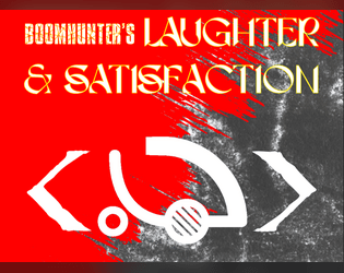
Boomhunter's Laughter & Satisfaction
Concept: “Burnchurch Hex’s latest [dist/att]raction is a kill club run by the infamous chromediator Boomhunter, a chromed out kill-club veteran with gunpowder cologne and grenades for jewels. To him, the only thing better than a good kill is a thumpin soundtrack.”
Content: Just about everything a GM might need to provide players with an entertaining time at a kill club: notable NPCs, locations, events/activities (and how to bet on them), and enemies to face off against.
Writing: Plenty of imaginative world-building detail supported with brief rules and mechanics when needed.
Art/Design: Two versions are provided: one that hews closely to the Cy_Borg design aesthetic, with a variety of two-page spread layouts, colors, and fonts; and one that offers a simple, printer-friendly black-on-white single-column arrangement of content.
Usability: Text in both versions is mostly high-contrast, although in the ‘regular’ version, some font choices and spread background ‘busy-ness’ may impact readability for some readers. Relationships between different content types/sections are visually distinct, thanks to consistent shifts in font size and bolding.
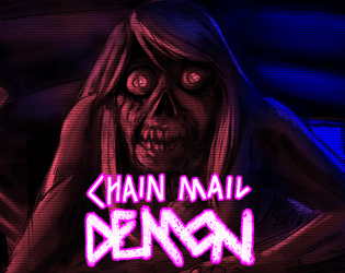
Chain Mail Demon
Concept: “After finding a cursed message on the 'Net, the Punks are hunted by a strange creature that attacks them when they sleep. Can they find a way to avoid its deadly touch? Or will they sacrifice their friends in order to be spared?”
Content: A creature to terrorize punks who check their inbox.
Writing: Half stats/mechanics and half flavorful messages relating to the monster, all of which evoke an appropriately frightening net-nightmare.
Art/Design: Neon and white on a dark background displaying the chain mail demon illuminated in red, surrounded by boxes with text content.
Usability: Supplement is provided as .png and .txt file. Visually, the .png version makes it easy to identify different kinds of content and how to locate desired info. The .txt version is helpfully organized and labeled, with excellent text descriptions of the visual elements of the .png to aid with accessibility.
Loading next page...
Page 1 of 4
Next page