Free
CY_BORG Combat Tracker
Concept: "This tool is used for tracking combat encounters for the ttrpg CY_BORG. It has all of the NPCs from the base game and you can also create custom NPCs during the session."
Content: A Unity-based program for tracking HP and stats for assorted NPCs from the core rulebook (along with the option to create custom NPCs) in the browser or as a standalone Windows executable.
Writing: Terse instructions provided in the program for adding and using NPC tracker.
Art/design: Yellow-on-blue/black aesthetic with simple boxes of textual content.
Usability: Minimal clutter allows the UI features to stand out for easy achievement of the program's goal.
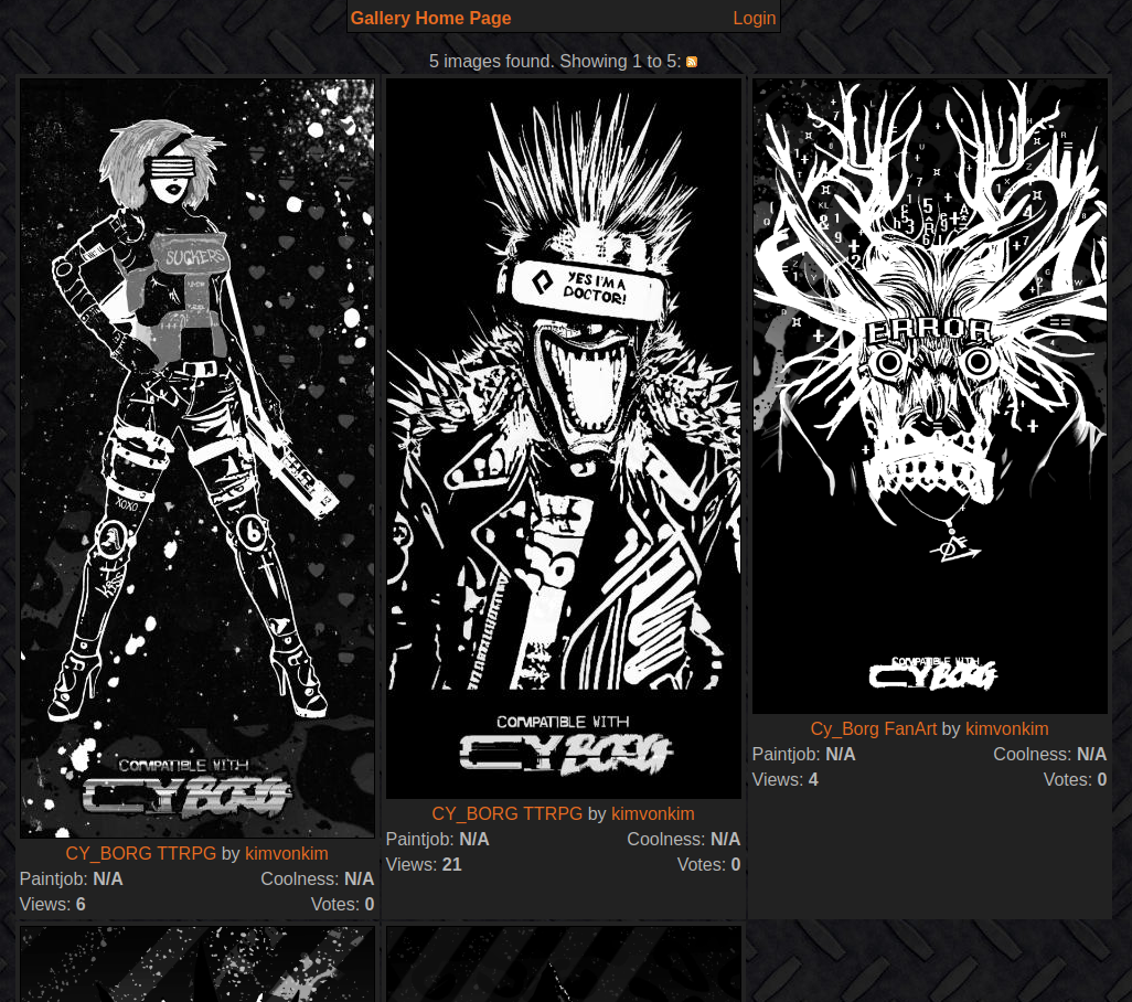
Cy_Borg Gallery
Concept: “All my Mörk Borg/Cy_Borg fanart can be used freely by anyone, without having to ask me and without crediting me!”
Content: A range of brightly colored images, mostly portraits, that fit into the world of CY.
Writing: Each image is accompanied by a brief description by the creator about the subject's name or occupation.
Art/Design: A gritty neon take on the cyberpunk “high tech, low life” juxtaposition as filtered through the harsh and messy Cy_Borg aesthetic.
Usability: Images are incredibly high resolution when clicked on from the gallery view.
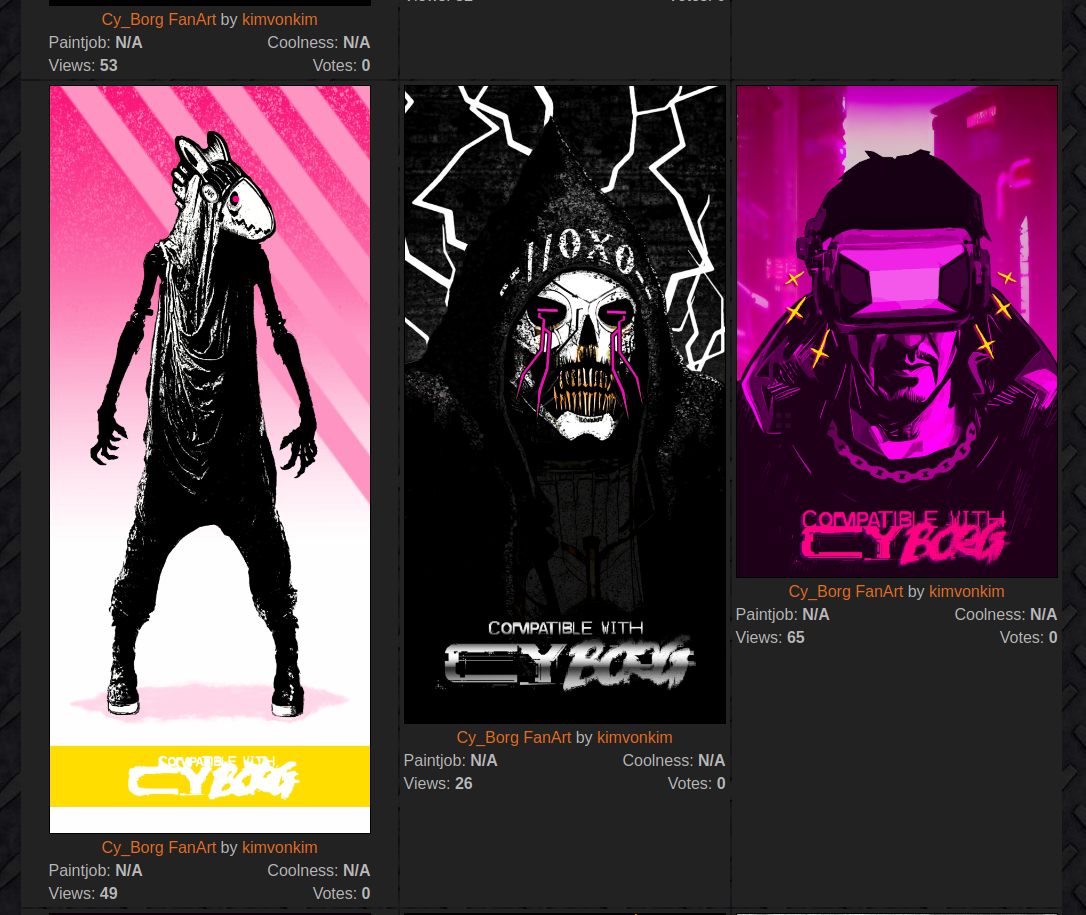
Cy_Borg Grey Tone Gallery
Concept: “All my Mörk Borg/Cy_Borg fanart can be used freely by anyone, without having to ask me and without crediting me!”
Content: A range of grayscale images, mostly portraits, that fit into the world of CY.
Writing: Each image is accompanied by a brief description by the creator about the subject's name or occupation.
Art/Design: A stark black-and-white take on the cyberpunk “high tech, low life” juxtaposition as filtered through the harsh and messy Cy_Borg aesthetic.
Usability: Images are incredibly high resolution when clicked on from the gallery view.
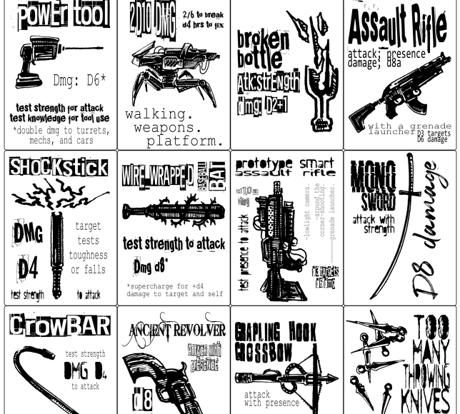
Cy_Borg Printable Weapons
Concept: “Printer Friendly weapons based on weapons and rules of CY_Borg.”
Content: Eighteen weapon tokens/cards to be printed out for use in a game of Cy_Borg.
Writing: Very brief rules/mechanics for each weapon to facilitate their use.
Art/Design: Black-and-white aesthetic with a grid of tokens/cards to be printed and cut for individual use. An image of each weapon is provided, along with relevant text (name of weapon and its mechanics) surrounding the image in different font faces/styles.
Usability: Some fonts are much easier to read than others due to text size, contrast, character ornateness, etc. Because files are PNGs, text is not searchable/selectable.
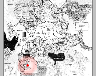
CY_THREAT
Concept: “Generate an infinite number of baddies that wander the streets of Cy. Capable of generating GOONS, DRONES, BEASTS, CYDROIDS, PHREAKS and VEHICLES.”
Content: A generator for NPC enemies that can be quickly refreshed for countless combinations and possibilities.
Writing: Sharp, concise descriptions of NPCs with stats and, occasionally, special traits, all of which bring a given character, creature, or object to life. Names are kept general (“goons,” “beasts,” etc.) to let GMs decide how to define them further.
Art/Design: Early Windows GUI aesthetic focuses attention on textual descriptions of NPCs, but a small map of Cy on the left side of the window points to locations in the city where the NPCs can be found.
Usability: “Export” function copies the currently generated NPC information to the clipboard as plain text for easy usage. Early Windows GUI aesthetic has only a few buttons to click for quick generation.
Cyber Personality Tables
Concept: “Optional tables to be used with your Cyberpunk or modern day games... well, lets just say it aloud -- it's intended to be used with CY_BORG first and foremost. It's absolutely awesome, just stop playing anything else right now. On a single page here you will find a broad diversity of cultural and visual aesthetic touches that you can easily apply to your PC or NPC characters, enhancing the level of immersion. It could be completely random or by your responsible choice, as it suits you and the nature of your games. As a note: for your character's gender definition you can use two types of randomization, d20 (higher chances to get cisgender result) and d12 (even chances between results). Use the one that fits your games. And feel free to pick anything that better suits your character. Zero offense intended.”
Content: A set of tables relating to personality, from ethnic background and gender identity to outfit style and hair & nail color.
Writing: A wide variety of options available in each table (from 8 to 40, depending on the table) that can help customize a punk.
Art/Design: Green on black boxes over a partial portrait of a punk character.
Usability: Consistent presentation across tables and high contrast between fore and ground make this usable and accessible.
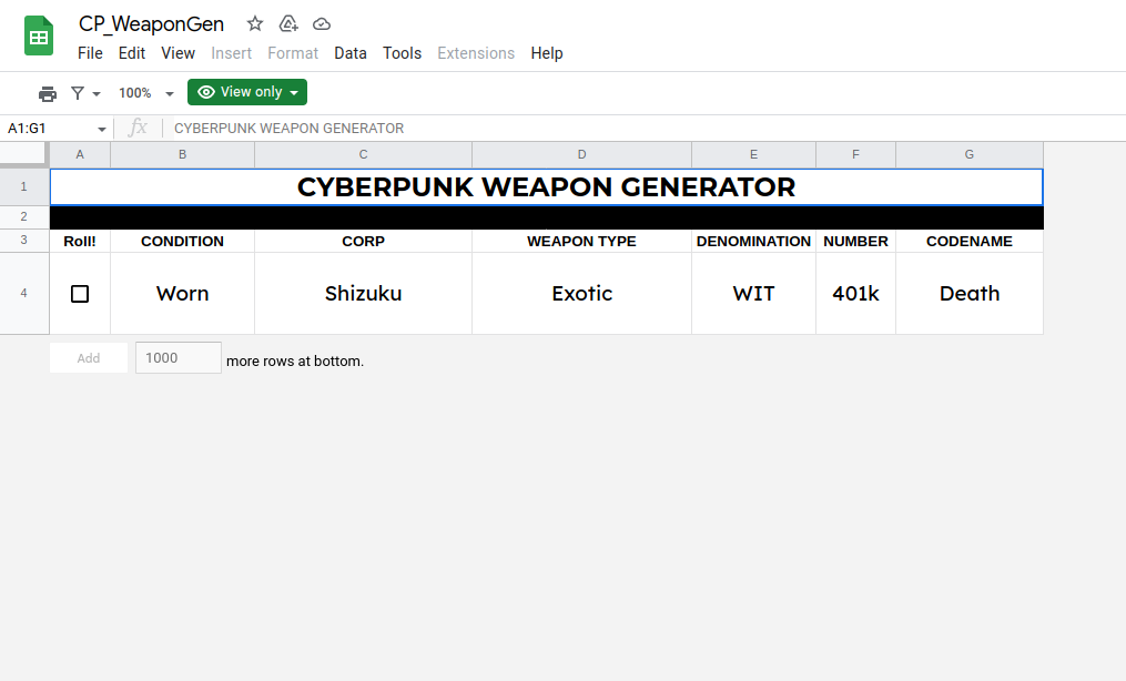
Cyberpunk Weapon Generator
Concept: A cyberpunk weapon generator.
Content: Details on a weapon one might find, complete with info about the manufacturer, designation, codename, condition, and weapon type.
Writing: Mostly single-word terms offer a surprising amount of character for each weapon, in part thanks to the combination of fields making each generated weapon feel unique.
Art/Design: Output is provided on a lightly stylized Google Spreadsheet, so text is large and positioned under each clearly labeled column.
Usability: Very readable layout and font choices, and refreshing the page will generate a new weapon quickly.
d100 Things Found in a Gonk's Pocket
Concept: “Trinkets, trash, and trouble…”
Content: An alphabetized list of assorted items that might be found in the pockets of an inhabitant of CY.
Writing: Concise, wide-ranging inventory to help bring a character to life.
Art/Design: A two-page spread with a glitchy portrait on the left and the list in two columns to the right.
Usability: Extremely navigable and readable with high contrast between fore and ground.
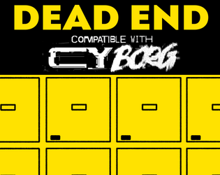
Dead End
Concept: “Henri, a connected security guard contacts the PCs. A legendary cyber killer has died and ended up in the morgue. Easy credits can be earned, one just needs to break in and strip off some of his cyberware.”
Content: A job to retrieve a cybernetically enhanced skull from a morgue.
Writing: Lively setup and detailed considerations of different events that might occur or approaches the PCs might take allow for a variety of engagements with mission parameters and unexpected hiccups.
Art/Design: A mix of black on white and yellow/white on black text accented with several NPC illustrations and a well-labeled map (and an unlabeled map to give to players).
Usability: High-contrast text and clean, recognizable layouts with consistent presentation of distinct kinds of text/content make navigation and reading easy.
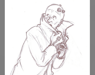
Defrosted Relic of the Past
Concept: “One moment you're living your life in the everyday world of smart phones and student loans. Next thing you know, you're out on the streets of CY, everyone you've ever known is dead and nothing makes sense anymore.”
Content: A class for the outcast who loves reflecting on their situation with critical distance and who wants to lean hard on being a fish out of water.
Writing: Hilarious pastiches of the “relic” trope through media with the occasional heart-rending vignette/idea that underscores the terror of life in CY.
Art/Design: Really bold yellow/pink color scheme for text-heavy content with an adorably wary pencil sketch of a relic looking over their shoulder.
Usability: High contrast fore/ground and easily recognizable content blocks make for easy recognition of the purpose for every element.
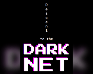
Descent to the Dark Net
Concept: “>> Welcome to the twisted amalgamation of junky code and depravity that we call The Net, where non-euclidean labyrinthine nooks and crannies will leave you feeling both bewildered and exhilarated. But don't be fooled, for there is still a twisted structure lurking within the chaos, with some arcane notion of up and down.”
Content: A collection of Net-focused locations, tables, NPCs, enemies, and rules for app-like scripting.
Writing: Bursts of intense and ominous detail that shines light on myriad dimensions of the Net that punks might seek out or otherwise come across..
Art/Design: Pixelated and monospace fonts appear throughout on a number of distinct page layouts with a variety of color and graphic elements.
Usability: Despite the variety of layouts, text is consistently readable–pages with complex graphic elements keep text on simpler backgrounds. Note: text content for the scripting rules page is not searchable/selectable.
Digital Generators
Concept: A set of web-based generators for creating punks, NPCs, and mission parameters.
Content: Automatically generated content for instant access to a potential PC, NPC, or job to undertake.
Writing: Concisely delivered content from Cy_Borg rulebook.
Art/Design: High-contrast yellow and white text on a black background, with distinct sections visually separated with yellow borders. Left-side menu allows for selection of a specific generator.
Usability: Large “click to reset” button provides a full refresh of page content for a new set of output, while headings on the “Mission” generator can be clicked for specific-section re-generation of content. Side menu options may be difficult for some to read.
Disavowed Medtech
Concept: “You joined the Medical Corps thinking you could make a difference, that you could save lives! But you didn't know the corps only save if you have the Creds to pay for it, and often times they'll leave you in the mud and blood if a higher paying call comes in. Supposedly the Hippocratic Oath you took when you Joined up only applies to those serving in the corps, guess that means you can defend yourself when helping the wounded now huh?”
Content: A class for the freelancing EMT who’s ready to shed as much blood as they staunch.
Writing: A mix of straightforward informative explanation and potently characterful description of character features and mechanics through which to bring a medtech to life.
Art/Design: Three visually distinct versions are provided: a landscape-oriented “printer killer” version with white text on black and red background colors, a portrait-oriented “splash of color” version, and a black-on-white text-only version.
Usability: Each version makes use of different fonts, text sizes, layouts, and colors to indicate a visual grammar for that version. The print-friendly version has searchable/selectable text.
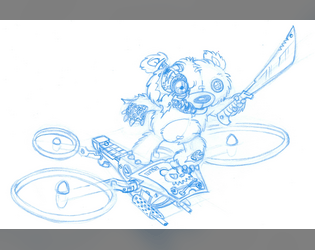
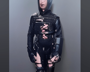
Discarded Animatronic Toy
Concept: “You don’t remember who owned you, just that you used to belong. Maybe you went out of fashion. Maybe someone outgrew you. Some tech-head fished you out of the gutter, patched you up and set you loose on the streets, burdening you with the curse of sapience, just for kicks.”
Content: A class for anyone who wants something big–and violent, and terrifying–in a small package. Making this happen is child’s play, really.
Writing: Hilarious class details/features with which to develop a nuanced murder-bot that can hold its own without feeling one-note.
Art/Design: Vivid sketch of an example character atop a psychedelic background pattern. Text blocks in different fonts and colors provide distinct information across spread.
Usability: Visually distinct text areas provide distinct types of content. Some of the text can be a bit difficult to read against the busy background pattern.

Disenfranchised Unionite
Concept: “Cost of living and injuries skyrocket, wages and work conditions remain pitiful. Sick of the bullshit, you joined the Ungrateful Unionites, and quietly organized a local. Then you all got doxxed. Everyone was made an example of: gunned down by CySec, or sent to scream in black, bloody room——wishing they were. Everyone but you.”
Content: A class for the worker who has nothing to lose and everything to topple.
Writing: Vivid class features/details will definitely make a player want to organize, agitate, and overthrow. “Rage” mechanic offers additional means for accomplishing goals.
Art/Design: Industrial aesthetic with red/green color scheme complemented by a bit-art flyer for the union. Text organized in two-page spread.
Usability: Combinations of highlighted and italicized text, along with high-contrast colors, make for easy reading and navigation.
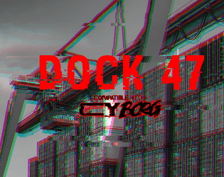
Dock 47
Concept: “You are hired by one of the most prominent gangs in CY. Your target is their former high ranking officer, Marco D’Elysio. Marco, after ratting out on his own organization, was promised immunity. The police, as usual, didn’t give a shit about their promise and left him out in the cold. He is now trying to escape in a cargo ship. But there are some complications - the engine is busted and the captain is missing. Dock 47, where the ship is sitting, is closed and full of bodyguards, those who are still loyal to Marco.”
Content: An opportunity to assassinate a rat on a docked vessel.
Writing: Several lists/tables relating to the gig/location are provided, as is a set of optional challenges for the punks to complete. Each of these entries offers a very brief but characterful dimension to the job.
Art/Design: Wide spread with text on the left and labeled maps of the ship and dock on the right. Almost entirely black-on-white except for the adventure title.
Usability: Font choices are easily readable and each section is consistently organized to quickly identify and navigate to desired info. Unfortunately, text is not embedded, so searching/selecting is not possible.
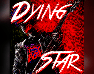
Dying Star
Concept: “You sung the theme of revolution. Now, you desperately run from entropy.”
Content: A class for the has-been who’s not quite ready to burn out or fade away.
Writing: Intriguing class features that reflect artistic creation (with a game mechanics dimension), vices, and origin stories.
Art/Design: A red-tinged illustration of dying star characters overlaid with contrasting patches of space where class details are laid out.
Usability: Content is arranged in distinct areas that make for easier navigation. Font choices and color scheme can be difficult for some to read, in part due to overall busy nature of the spread. Class is provided as .png file, so text is not embedded, making it difficult for searching/copying/pasting or using a screen reader.

Enter Red Room
Concept: “The rumors spread like blood leaking from a wound. Everybody knows somebody who watched a red room. Some of those people have disappeared, others claim to be continual viewers. No matter what they say, you have stumbled upon a supposed invite for a red room in a dark corner of the net. A door stands in front of you, screams heard from the other side. Do you dare open the door? Do you dare enter the RED ROOM?”
Content: A cluster of plot ideas, relevant rumors, and random table additions to set the stage for a mission focused on the mysterious red room.
Writing: Brief but clever details to help assemble a suitable job for a group of net-interested punks.
Art/Design: Two columns of black text on a dark red background, with a cover/title page showing two doors, one labeled ‘yes’ and the other ‘no’.
Usability: Text contrast allows for readability, and each list is easily distinguishable from the others to facilitate navigation and identification of specific info.
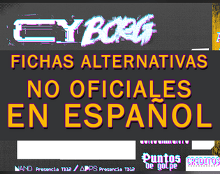
Fichas Alternativas para CY_BORG en Español
Concept: “Diez fichas no oficiales en castellano para usar en vuestras partidas de CY_BORG. PDF con páginas en formato A4 y en doble página en formato A.”
Content: A set of brightly colored character sheets, each with its own background hues and patterns.
Writing: Faithfully translated character sheet labels and explanations.
Art/Design: A range of fonts are used to indicate different fields, with a page layout that closely resembles the official sheet.
Usability: The font and color combinations make for mostly high-contrast readability across page.
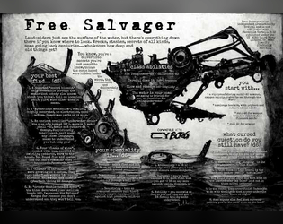
Free Salvager
Concept: “Most people just see the surface of the water, but there’s a lot down there if you know where to look. Wrecks, stashes, secrets of all kinds, some going back centuries…who knows how deep and old things get?”
Content: A class for the enterprising underwater dumpster diver–another scumbag’s trash is your sunken treasure.
Writing: Description and mechanics are concise and clear, with straightforward indications of the scope of the class.
Art/Design: A dark blue, watery background offers helpful contrast to the white text in this spread.
Usability: Class details are easy to recognize and navigate, with strategic bolding to highlight important elements that complete the character.
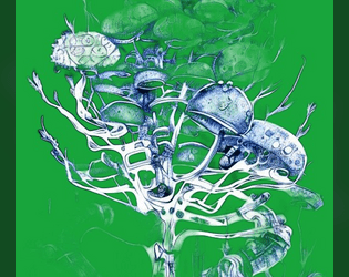
G.M.M. or Grotesque Mutant Mushroom
Concept: “A Fungal themed Zine to Cy_Borg, It contains: 3 Enemies; 4 Themed Items; Hallucination condition.”
Content: A cluster of mushroom-based threats and loot.
Writing: Brief mechanics-focused stat blocks with thematically potent names and descriptions.
Art/Design: Two pages of bright pink and blue with green, with the first page having a fungal background image.
Usability: Color scheme and layout feel appropriately chaotic for the theme, but color intensity and relative lack of consistent organization may lead some readers to overlook important elements (e.g., small-text Hallucination rule just above the 3rd party license on p. 1).
Gigapixel Tower Place
Concept: “For use in CY_BORG as a test for the party on a roadway crossing of Central Cy, with campaign potential in respect of the pikecorps and their use of pikecraft.”
Content: An automotive scenario to complicate punks’ lives as they travel through CY.
Writing: Predominantly in-universe description for the punks themselves, supplemented with brief explanations of relevant mechanics/triggers while traveling.
Art/Design: Two pages, one with a colorful map of the turnpike and general info, while the other features a table with the scenario rules and mechanics.
Usability: Text overlaid on page 1 map has a translucent background to help with readability, while page 2 table uses shading and border emphasis to indicate different cells’ relationship to one another. Map has color coding (green, yellow, orange, red), but it’s not immediately evident as to what the colors represent.
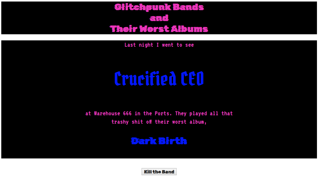
Glitchpunk Bands and Their Worst Albums
Concept: A random generator that displays a glitchpunk band name and the name of their worst album.
Content: A generator to immediately provide depth and atmosphere to life in CY.
Writing: Band and album name lists are both hilariously over-the-top and also seem completely appropriate for the genre.
Art/Design: Simple page design with a generator button beneath the main text output area, which provides some color-coordinated indication of static and randomized content.
Usability: Easily identifiable “kill the band” button functionality to generate new bands/albums. Text is mostly readable, although blue on black might be difficult for some to discern.
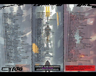
Gritbeat: 6x66 Songbooks
Concept: “Gritbeat 6x66 Songbooks provides d66 albums to listen to as soundtrack for your cyberpunk RPG sessions, for six separate moods/settings.”
Content: Six tables of albums suitable for Cy_Borg games, organized by general atmosphere: cinematic, cerebral, urban, visceral, heavy, disruptive.
Writing: Tables are consistently organized, with artist name, album title, and year of release. A set of hashtags is provided to help further clarify or help with determining each table’s usefulness for a given session/table’s intended ambience.
Art/Design: Table content is provided in two three-column spreads, with a different image evoking CY as the background for each table.
Usability: Each table is easy to navigate, with artist names in bold to help distinguish visually from album title and year of release.

Gun-Ends
Concept: "CY's premier weapon and attachment catalogue is back in business!
Featuring over 8 (and by that I mean 9) unique weapon attachments to spice up your guns with, 1 table, and a lot of flavour text to give off a real catalogue feel.
Just be careful, they aren't exactly the most durable things on the market. You wouldn't even be able to afford the durable stuff anyway."
Content: A collection of weapon attachments and modifications designed to make a pvnk's violent tendencies all the more brutal and chaotic.
Writing: Snarky in-universe descriptions of weapon mods duct-taped to brief, matter-of-fact mechanics/effects.
Art/design: A visually overwhelming mix of green tones, irregularly sized boxes of text and image, and weapon attachment silhouettes all presented as an in-game catalog of products.
Usability: Relatively high contrast for much of the text, making reading visually easy despite the variety of fonts, colors, and related effects. Only some text is embedded, though, so not all content can be searched/selected.
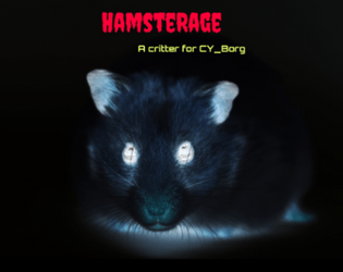
HamsteRage
Concept: “Your favourite evil corporation experimented with infecting gene-edited hamsters with nanites which resulted in horrible mutations.”
Content: A furry nightmare sure to overwhelm a party of punks, whether with murder or a slew of infestations.
Writing: Concise mix of adorable and haunting plot hook and creature stats.
Art/Design: An ominous portrait of an infected hamster stares at the reader while plot hooks and stats line either side.
Usability: A simple layout and immediately distinguishable color-coded content blocks make this incredibly easy to locate and make use of desired details.
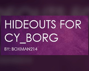
Hideouts for CY_BORG
Concept: “This is a subsystem to allow PCs in a CY_BORG campaign to buy and maintain a hideout or base of operations.“
Content: A set of rules for base-building, for the enterprising punks who manage to save enough creds to afford it.
Writing: Direct and helpful explanations of rules options that might work for or against the PC and their properties.
Art/Design: Mostly single-column body text with several tables of upgrades, misfortunes/threats, and contractors/employees.
Usability: High-contrast text is easily readable, with different kinds of content visually distinct (bolding, font size, table background color, etc.) to help with navigating to desired text.
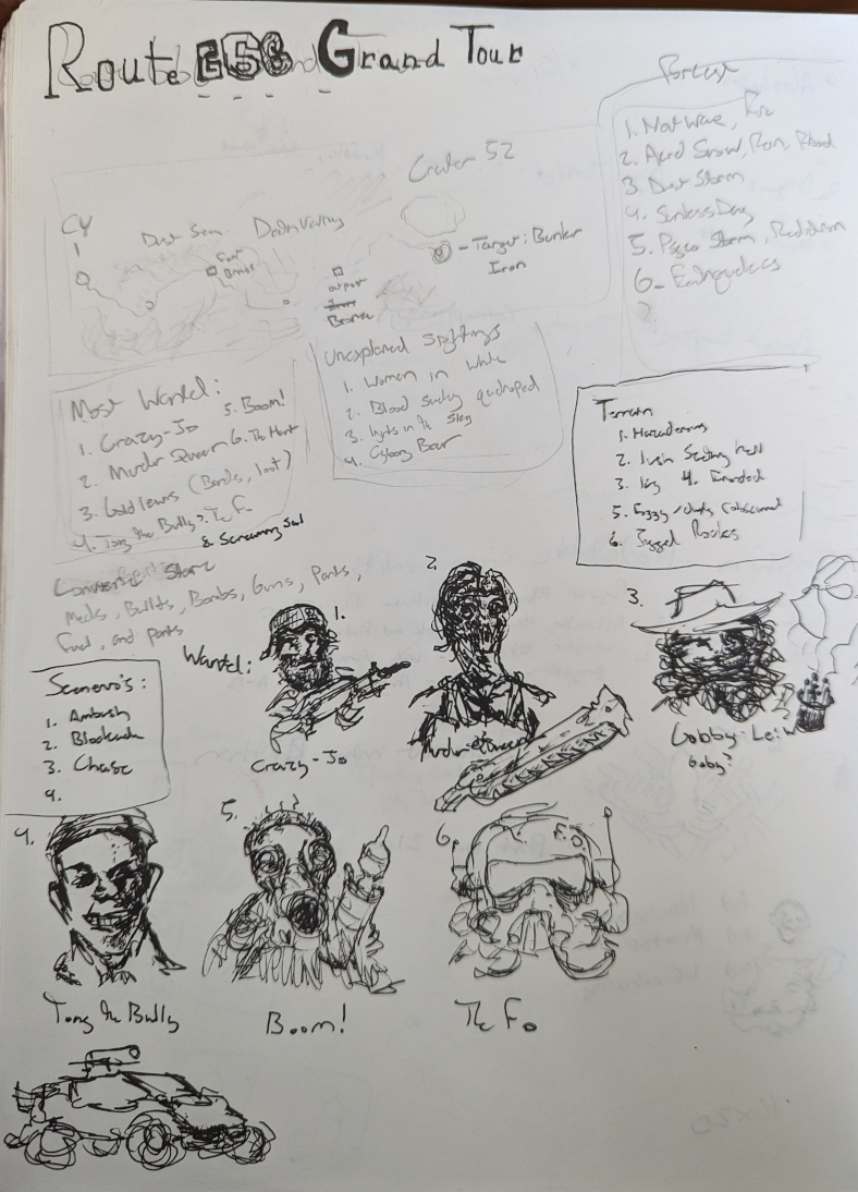
Highway 666 Grand Tour 1 Page Concept
Concept: “Wasteland adventure with mad bandits, cannibals, and unspeakable things that hide in the badlands. The completed project would have tables for natural and unnatural weather events, terrain, vehicles, warbands, loot, and combat scenarios.”
Content: A stripped-down one-page highway adventure/crawl.
Writing: Very little detail, with tables of brief options (most wanted NPCs, unexplained sightings, terrain, and more).
Art/Design: Handwritten text in several boxes across three major columns of content, framed by a simple map of the adventure above the text and a series of portraits below, along with a sketch of a car.
Usability: Some text may be very difficult for some to read, both in terms of the handwriting legibility and the variable contrast of pencil and ink on scanned paper. Content is provided as a .png, which will further reduce potential readability (as text is not embedded).
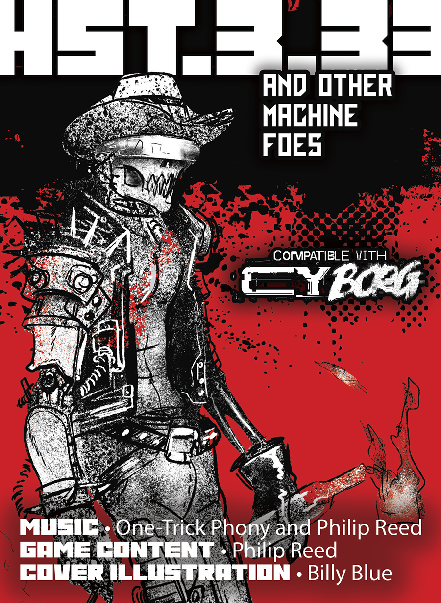
HST.3.33 and Other Machine Foes
Concept: “On the rain-slick streets of the city, a rogue ai lashes out at corruption. the machine strikes with typewriter and guns, raising awareness where possible and inflicting punishment when necessary. HST.3.33 is a machine on a mission and will stop at nothing to bring down the corporate criminals who control the world. Unfortunately, HST.3.33 is also an alcoholic, drug-addicted, insane monstrosity. the meat parts of the thing's cybernetic shell are desperate for mezcal, LSD, and PCP. The alcoholic, drug-addicted, insane machine is a terror or a folk hero depending on the time of day. Which version of the rogue ai will you meet?“
Content: Visually: a rogue AI and several additional robotic creatures that can ruin any punk’s day. Aurally: four soundscape tracks that inject an electronic noirish-western mood into one’s eardrums.
Writing: NPC stats are surrounded by intensely atmospheric passages, from technical descriptions to narrative vignettes.
Art/Design: A mix of slick and messy aesthetic that presents information across two wide spreads, with several images of included creatures in different artistic styles.
Usability: Different kinds of content–and there’s a lot of content on these pages!--are easily distinguishable and presented in readable fore/ground contrast (although white on bright red might be difficult for some).
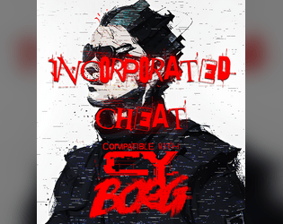
Incorporated Cheat
Concept: “They always rig the system against you. We were supposed to be in the big leagues by now and look where they left all of us. You decided to take matters into your own hands. You’d win. At any cost. You’d play at one game, any side as long as you’re on top. Even if you cheat.”
Content: A class for the doublecrossing, backstabbing, roguish scoundrel at heart.
Writing: Fantastically colorful descriptions and labels for class features, with intriguing mechanics to match (including a morale component).
Art/Design: Several UI windows scattered across much of the spread provide some unique flavor (gambling aesthetics, blood splatter background, etc.), while a muted image of a cheat frames the right side of the page.
Usability: Separate windows/boxes for distinct content assists with navigation and location of desired info. However, as a PNG, class text is not embedded, so searching or copying/pasting is unavailable.
Loading next page...