Free
Legendary Cheat Codes
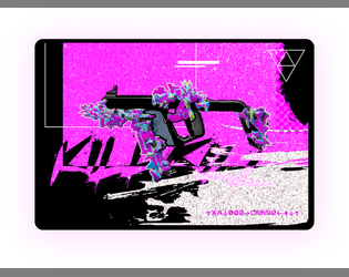
Concept: “Ultra rear secrets cheat codes for your weapons rumored in the dark web.”
Content: Unlockable modifications for firearms–if one can find the cheat sheet for them.
Writing: Brief setup and modification details that allow a GM to work the cheat codes into their game as they desire.
Art/Design: Two white-on-black images, each with a block of text (setup) above three-column presentation of weapon mods, with a neon-colored glitch art illustration of a gun below.
Usability: Text is high contrast with clearly labeled sections of content, but due to JPG format, text is not selectable/searchable.
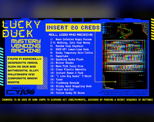
Lucky Duck Mystery Vending Machine
Concept: “Quack Quack! Compatible with CY_BORG and made for the URBN_LGND.exe jam.”
Content: A vending machine that provides an assortment of items–some trinkets, some useful items, and potentially more.
Writing: Inventive item names offer entertaining potential, and vending machine rumor/secret extends that significantly.
Art/Design: Three-column layout of basic info, vending machine contents, and a glitch-like illustration of a vending machine below a lucky duck icon.
Usability: Visually, content is extremely easy to navigate and identify. File is provided as an image, so text cannot be selected/searched or recognized by a screen reader.
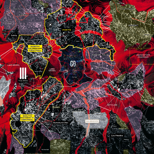
Map of CY
Concept: “The negacity Cy is ever expanding, ever changing. A living, dying leviathan. Find your way around its sectors, isles and alleyways with this map. Comes in two sizes; big and huge.”
Content: High-resolution map of CY useful for GMs and players alike.
Writing: Neighborhood/region names overlaid on the map as well as in a key at the bottom of the map.
Art/Design: Harsh, eye-popping colors and grainy black-and-white satellite aesthetics bring the dystopia to life.
Usability: Map is available in PDF and JPG formats. Color-coded regions/sectors are helpful for a quick glance of geographical relationships and proximities, although text labels for neighborhoods etc. can be difficult to read over the map details.
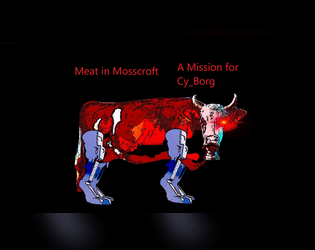
Meat in Mosscroft
Concept: “There are rumors of a warehouse owned by Gene Industrial in Mosscroft containing actual real steaks. These Bromaha steaks are supposedly in a huge walk in freezer, and they should get collected before word gets out. The street gang is offering 2d10 x 1K credits for the steaks. If they accept, Nimo will provide a small piece of paper with the address of the warehouse.”
Content: A beef break-in with the bonus of beaucoup bucks.
Writing: Deadpan descriptions lay out the absurdity of the situation, which should help a GM create a unique and memorable experience for their table.
Art/Design: Landscape-oriented pages with bright colored text on black background accompanied by relevant images of NPCs, corporate logos, and a simple map of the target facility.
Usability: Almost every block of text is a different color and font or text size than the others and positioned differently on each page, but each font is easily readable and all text is embedded for quick searching/selecting.
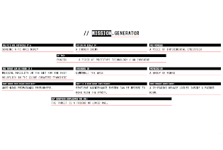
Mission.generator
Concept: “A random mission generator compatible with CY_BORG.”
Content: A web-based generator for the GM or player who wants to be inspired by the shotgun blast of immediate world-building results displayed on the screen.
Writing: Concise categories (based in part on Mörk Borg’s dungeon generator) frame answers to relevant questions (e.g., “The PCs are contacted by a _____”) and arranged to reveal an unfolding narrative for a GM to build an encounter or adventure around.
Art/Design: Stark, high-contrast, three-color, text-only layout distinguishes different sections of content with clear headers and mouseover highlighting of each element. Range of color options available for semi-customized display to fit the viewer’s aesthetic.
Usability: Countless possibilities can be generated quickly, or individual elements can be clicked to iterate through options more granually. Generated output can be printed or downloaded for preservation.

Mörk Ninja
Concept: “Mörk Ninja is a ninja class for Mörk Borg / CY_BORG / Vast Grimm and is compatible with any other Borg game (except Pirate Borg, which no self-respecting ninja would ever be caught playing). It is intentionally overpowered because ninjas are awesome.”
Content: A class for the player who has to make sure they’re bringing the very best to the table, whether anyone wants it or not.
Writing: Concisely provided mechanics/abilities with occasional nods to the absurdity of the concept.
Art/Design: Text on the left, in two columns and white/yellow on black, with an illustration of a ninja on the right
Usability: Changes in font type, bolding/decoration, arrangement of columns/lists, and heading color all facilitate easy identification of and navigation to desired information.
Nuclear God-Lizard
Concept: “A 120-meter-tall monster emerges from the waters around Cy. Its behavior baffles scientists and officials; it isn’t hunting or nesting, it just moves.”
Content: A scenario for surviving the onslaught of an unstoppable roving apocalypse.
Writing: Focused, direct descriptions of a wide range of relevant factors (from available subplots to environmental obstacles to military actions) provide GMs with an immersive adventure/experience for their players.
Art/Design: Current ashcan edition has a simple, barebones layout subject to change when more art assets are finalized.
Usability: Different kinds of content are immediately distinguishable, high-contrast fore/ground colors assist accessibility, and navigation through the document is incredibly easy.
Obsolete Dumpster Diver
Concept: “You were state-of-the-art for an instant, until the new model made you OBSOLETE and they threw you away. Now, you scour the cy-waste pits searching for operable cast-off mods and implants to combat your CONTRIVED DURABILITY.”
Content: A class for the DIY/found-art self-improvement addict.
Writing: Class details focus on mechanics explanations with bursts of powerfully thematic descriptors.
Art/Design: Eye-searing pink and yellow contrasts well with black background and comparatively muted white text on this two-page spread. Illustration of an example obsolete dumpster diver serves as a centerpiece for idea generation.
Usability: Class information is easy to read and navigate, with excellent use of text tracking to indicate important ability-related information.
Opthalmosphere
Concept: “A gaping maw beneath an all seeing eye. How badly do want to die? In the first waves of the demonic incursion into C.A.U’s generators, corpses mounted around energy pylons with staggering speed. Infernal power fused together the pulsating remains which took flight to join the demonic hordes.”
Content: A creature searching for its Doomguy soulmate–to murder them, of course.
Writing: Vividly ominous descriptions and features situate the creature as at home in the CY world.
Art/Design: Layout centers on an image of the opthalmosphere itself, with creature details surrounding it.
Usability: Text has clear distinctions for different types of content and mostly contrasts starkly with background except for one block of text for a special ability that might be difficult for some to read.
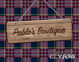
Pablo's Boutique
Concept: “You don’t remember seeing this odd structure here last time your crew came this way. An eye-catching tartan pattern covers this strange tent. A short flag-pole peaks from the top displaying a pink hand axe on a plain black field. A burned wood sign above the entrance reads “Pablo’s Boutique”. The space inside the tent feels expansive- way bigger that it seemed like from the outside. The product displays are spartan chic. Various offerings are for sale here unlike what you would find at your normal local supply store.”
Content: A selection of goods themed around Paul Bunyan and lumberjacks that also are entirely suitable for a punk in CY.
Writing: A balance of descriptions of the boutique’s various areas, the items on display in each, and the mechanics that come into play when a given item is used.
Art/Design: Three two-page spreads of single-column black text on a light background that each feature different kinds of items, with the first spread complemented by an illustration of Pablo and a flannel-pattern background beneath a graphic of a wooden sign.
Usability: High-contrast text is readable and easy to navigate and distinguish, facilitating quick identification and use of desired info.
PC Community Generator
Concept: “This is a tool to build a community for the player characters in a CY_BORG game.”
Content: A set of tables to be rolled and discussed during an initial party’s character creation session to flesh out a community for the PCs to be involved with in some way.
Writing: Succinct, varied options in several tables that breathe life or inspiration into community possibilities.
Art/Design: White text on a purple gradient background, organized in one- and two-column layouts.
Usability: PDF and plain-text versions are both easily readable and navigable.
Polybius 20X3
Concept: “<RE: THIS GAME KILLS > Whispers about a killer new game have flooded the BBS message boards. An acquaintance said they knew someone who played it and ended up in a body bag. Is it another ACGS marketing stunt, or is there something else going on in vid-cades around Cy?”
Content: A mysterious arcade game, its rules, prizes, and a technician NPC.
Writing: Emphasis on rules/mechanics complemented by terse, flavorful names/labels.
Art/Design: Black and white text on a blue patterned background in a mostly single column layout accompanied by several monochromatic and full-color illustrations.
Usability: Large font size, distinct use of black and white for particular kinds of content, and border markers for distinct sections of content all contribute to ease of browsing and engaging the material. However, text is not selectable/searchable.
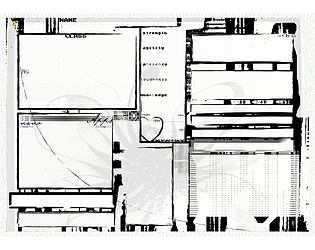
printable CY_BORG Character sheet V1
Concept: “A character sheet for the CY_BORG RPG game by Christian Sahlén & Johan Nohr: PRINTABLE”
Content: A stripped-down, print-friendly character sheet for CY_BORG in .PNG format.
Writing: N/A
Art/Design: Sheet employs the same general organization/layout for fields on the official character sheet but provides a more tonally consistent presentation of sheet areas.
Usability: Plenty of room for filling in fields. However, many fields have no label, perhaps on the assumption that players would already know their purpose.
PROJECT: CY_B3R@T
Concept: “In the alleys and streets of the Cy, rumors of rats with intelligence far above normal exist. Some say it's a miracle, that they must've been blessed by whatever god they believe in, others say they are failed experiments, and affronts to nature.”
Content: A verminous creature at home in the alleys and gutters of CY.
Writing: Inventive mechanics and descriptive rumors provide GMs a variety of qualities to emphasize at a table.
Art/Design: Single-column layout of white and yellow text on a blue background.
Usability: Font choices and decoration consistently employed for distinct kinds and sections of content.
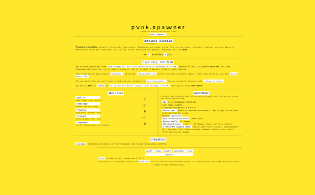
Pvnk.spawner
Concept: “A random pvnk (player character) generator compatible with CY_BORG.”
Content: A web-based generator for the player who needs a corp-hating bastard–or just some fantastic inspiration and gratification–instantaneously.
Writing: Vivid character descriptions and qualities that connect and flesh out the basic “Make a Punk” character generation procedure from the rulebook.
Art/Design: High-contrast, two-color, text-only layout clearly delineates each section for easy identification and navigation. Range of color options available for semi-customized display to fit the viewer’s aesthetic.
Usability: Countless possibilities can be generated quickly, or individual elements can be clicked to iterate through options more granularly. Generated output can be printed or downloaded for preservation.

Raiders of the Doom Engine
Concept: "Embark on a journey below the wastes of Cy to a world long forgotten."
Content: A gig to eradicate a crew of motorcycle-riding knights occupying a fortified area in Mosscroft.
Writing: Tons of fever-dream-like details that mix together futuristic cyberpunk, medieval chivalric romances, and fourth-wall-breaking acknowledgments.
Art/design: Primarily white-on-black layout in a trifold brochure setup, with each panel crammed full of descriptive text, GM guidance, tables, and NPC stat blocks. Assorted technicolor illustrations and collage images decorate the margins.
Usability: Despite the sheer amount of information packed into these pages, there is some visual grammar to indicate relationships across different content blocks and to distinguish each from the others. Text size & font choices may make reading occasionally difficult for some readers.
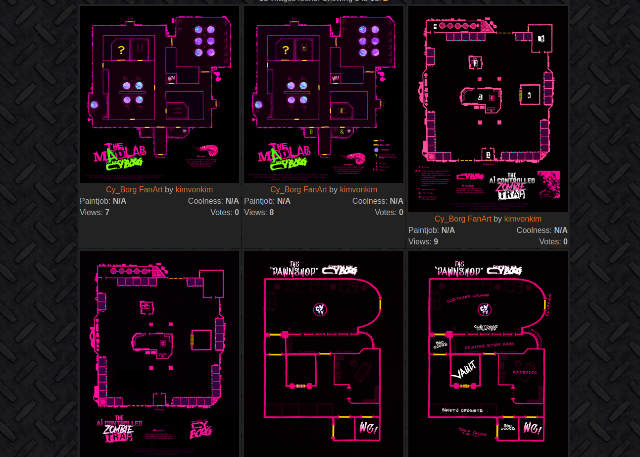
Random Location Gallery
Concept: “All my Mörk Borg/Cy_Borg fanart can be used freely by anyone, without having to ask me and without crediting me!”
Content: A collection of overhead maps for potential mission locations to be used in Cy_Borg games.
Writing: Some maps have brief mission parameters/goals, location names or nicknames, and/or room details.
Art/Design: Primarily neon pink and white on black, with some additional colors for important room features. At least one map has a black-on-pink color scheme.
Usability: Map images are high resolution for easy use printed or for VTT environments. Text details that are included are readable and consistently placed near the bottom of images.
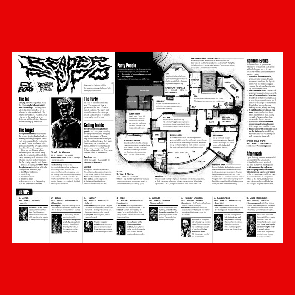
Reaper Repo
Concept: “The job is simple; infiltrate a penthouse party full of chromed out Killmatch champions, find the man of the hour—Steel Jackhammer—and steal his cyber legs. They're still attached to him, sure. You'll figure it out.”
Content: A high-risk, high-entertainment heist that demands ingenuity from players and a complete disregard for self-preservation from their PCs..
Writing: Tons of details and atmosphere are crammed into a two-page spread on which NPC and location details, random events, and GM-specific notes all offer each gaming group a memorable experience.
Art/Design: A map of the party location is a major focal point, with text provided all around (and laid over) the map in a number of columns. NPC stats and details are complemented by a portrait of each figure.
Usability: File is pretty printer-friendly, and text throughout contrasts well with background. Headings and labels are visually distinct thanks to font choices, text size, and bolding.
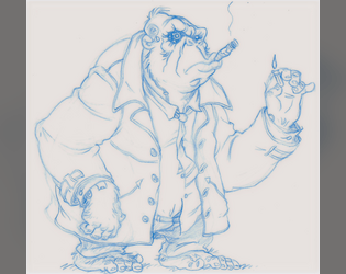
Remaindered Cyber-Ape
Concept: “You were uplifted for slave labor but that ended up being one Corporate abomination too far. Protests, boycotts and misfiring PR got the project swept under the rug and you drop-kicked into the sprawl. Smart as any human and twice as strong but you being you makes everyone morally queasy.”
Content: A class for the downtrodden uplift who’s ready for gorilla warfare.
Writing: Witty descriptions of class features with integrated mechanics.
Art/Design: Sketch of a cyber-ape in a trench coat complements several distinct boxes of class details.
Usability: Class details are easily identifiable and navigable thanks to different font choices and fore/background color pairings.
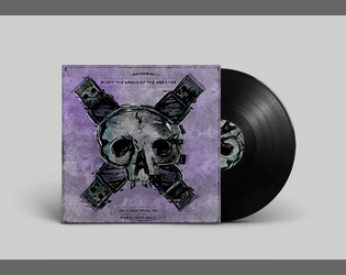
Right the Wrong of the Greater
Concept: “A linear CY_Crawl based on Skinny Puppy's album "The Greater Wrong Of The Right" made for the Album Crawl 3.0 Y2K Jam. Take your life back from those in power and scale their brutalist tower to Right the Wrong… Each room of the crawl is based of a track from the album. Lyrical content was the main source of inspiration for what happens in each.”
Content: A revenge mission/crawl up through a high-rise, set to Skinny Puppy.
Writing: Location/track pairings served with atmospheric details about each site and the goings-on there that the punks might run into during their ascent.
Art/Design: Overall aesthetic as record sleeves & inserts, with a mix of hand-drawn illustrations, pasted/collaged elements, and screenprinting. Maps, location features, and NPC portraits are all provided.
Usability: Organization of content is easy to follow, with alternating text/graphic pages and consistent labeling and fore/ground contrast throughout. However, text is not selectable, which might impact some readers’ experience.

Shade City Blues - Character Class - LEECH
Concept: “You contracted VAMP and now you're a bloodthirsty, good for nothing, LEECH. Immortal... with a catch. Feeding is the only way to stay ahead of the infection and losing your cool will get you riddled with R0T-bRaiN.
UnLiFe in Shade City isn't the best flip of the coin but UnLiFe is Life... even though life ain't worth shit on these god forsaken streets, it's better than fuck all.”
UnLiFe in Shade City isn't the best flip of the coin but UnLiFe is Life... even though life ain't worth shit on these god forsaken streets, it's better than fuck all.”
Content: A class for the vampire fan who’s looking for a Cy-based take on an old favorite.
Writing: Brief, powerfully atmospheric details that offer both flavorful description and class mechanics.
Art/Design: A range of colors and font choices in a landscape two-column organization, with a large red vampiric skull image serving as the focal point of the spread’s background.
Usability: The majority of text on the page is embedded, allowing for searching/selecting. Distinct content sections are easily identifiable, although at least one font choice has variable text thickness/intensity and uses a number of colors with varying fore/ground contrast, which can disrupt some readers.
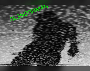
SL3ND3RM4N
Concept: “A homebrew antagonist for Cy_Borg. An antagonist that can provide some interesting interactions and possibly fun character arc. Created for the URBN_LGND jam.”
Content: A digital nightmare to haunt a table of punks.
Writing: A mix of ominous description and creative mechanics to affect the afflicted player.
Art/Design: Brightly colored text and black-on-white over a black and white static-y image of a creeping figure in silhouette.
Usability: Text contrast and font choices, along with whitespace/indentation, make for easy reading/navigation.
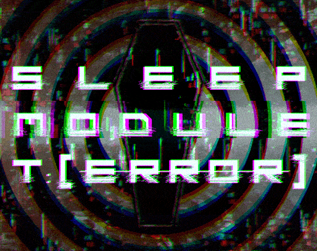
Sleep Module T:[ERROR]
Concept: “Delve into the deepest and most primal corridors of consciousness. Coveted neural pathways for corporate exploitation. Map the ever expanding subconscious and come face to face with communal fears in the form of urban legends, cryptids, and the things conjured by the imagination.“
Content: A clinical trial in which participants navigate a simulation.
Writing: An inventive set of rules for generating the job’s labyrinth and for dealing with the effects that navigating it can have on a PC, supplemented with vivid and informative room-specific sensory details and special rules.
Art/Design: A mix of aesthetics, with some pages using labelmaker-like text or sketches on stained paper, while others resemble computer terminals or clean, slick interfaces.
Usability: Wide variety of fonts can take some page-by-page adjustment, but headings/labels are applied pretty consistently throughout (i.e., reversing the primary font color and highlighting its background). A lot of text content is provided, but none of it is embedded, so it is not possible to search/select.
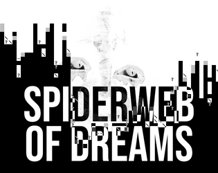
Spiderweb of Dreams
Concept: “BASILISK DISTRO STATION is broadcasting now… Corrupted data filtered through radio transmitters in precise patterns has the potential to scramble the human mind. Psionic data pushed through this same process has the potential to bring into reality the THOUGHTFORM; a shadowy mess of thoughts manifested as glitched reality.“
Content: A psionically-themed monster and cybertech item.
Writing: Concise, immersive descriptions and succinct mechanics for the ‘thoughtform’ creature and the ‘psionjack’ cybertech.
Art/Design: White-on-black spread with four columns of content accentuated with white character art designs and two dark illustrations.
Usability: Content is arranged to clearly distinguish specific sections and labels. Supplement is provided in pdf, png, and plain text versions.
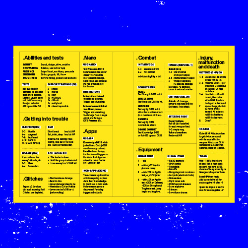
System Reference
Concept: “All the rules you need to fuck shit up, for easy reference at the table when you don't feel like flipping through a book to find that one rule.”
Content: The essential Cy_Borg rules provided in a stripped-down two-page spread.
Writing: Incredibly brief descriptions/explanations of rules in order to include as much as possible in the available space.
Art/Design: Black-on-yellow color scheme, with subheadings using a white background, with text-only organization of content across the spread. Printer-friendly version has white background with yellow subheading background.
Usability: Distinct rule components are separated into individual boxes, with additional internal borders to mark individual tables/lists from one another. Bolded labels help further indicate the scope of each rule explanation.
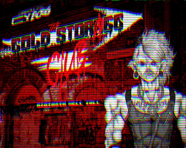
The Cold Storage Club
Concept: “All of that great punk rock flavor you love, none of the added cyber implants! Bar, lore, ambiance, events menu & more.”
Content: The skeleton for an action-packed adventure or atmospheric encounter–a bar location complete with map; tables for ambiance, food, drinks, and events; and NPC staff that PCs are likely to encounter.
Writing: Lists of categorized material to flesh out the club provide a range of adventure seeds and motivations while leaving plenty of room for a GM to expand further as desired.
Art/Design: Black and white and red all over in two-page spreads with a background photo of club activity on each, and several illustrations help bring the club and its staff to life.
Usability: Consistent organization of content throughout, creating a recognizable grammar for navigation that helps when maneuvering frequently between pages. A few blocks of text are somewhat difficult to read due to relative lack of contrast (black on dark red).
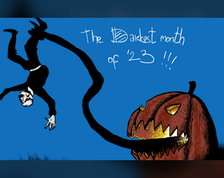
The Darkest Month of 2023
Concept: “Compilation of my Mörktober entries, all 31 of them, some monsters, some gear, some adventures, some NPC and some bits of lore, mostly Mörk borg, but also some CY_borg. All 31 are PNG format.”
Content: A few Cy_Borg rules and NPC entries to make CY all the spookier: “Haunted,” “Purple Stargazers,” and “God Damn Rain.”
Writing: Concise description and mechanics to focus a player’s (and a GM’s) attention on not only how each entry can affect the game but also how it can affect the character(s) who have to deal with it.
Art/Design: Each landscape-oriented entry contains an illustration of its subject and text taking up the remainder of the page. Lots of color choices that cement each entry in the Cy_Borg cyberpunk milieu.
Usability: Much of the text in each entry is high-contrast, and blocks of content are arranged to indicate distinction from one another as well as conceptual connection (e.g., list items). However, each entry is an image and so text is not searchable or selectable.
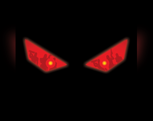
The Drone Collector
Concept: “A minor security intervention in the neighbouring district of Bigmosse has inadvertently spilled over into Svärta. Alliansen’s head of security operations, a Ms. Ah, has instructed you to retrieve one of their drones that was damaged and wandered off.”
Content: A mission to locate and abstain a drone somewhere in a semi-decrepit neighborhood.
Writing: Copious amounts of detail bring the neighborhood to life, from building and business descriptions to NPC motives & likely actions and beyond.
Art/Design: An overhead map of the locale in orange on black precedes the text, which appears in several high-contrast layout configurations, with an illustration of a threatening pair of eyes appearing amid info about an important NPC and environmental conditions.
Usability: Text is readable throughout, with bold text and color choices emphasizing eadings/labels, key terms, and phrases that a GM should attend to, especially given the amount of text content across these pages.
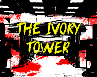
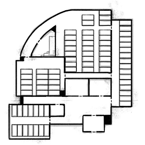
The Ivory Tower
Concept: “As you roll around in the filth of Cy's streets, the corpo scum look down on you, sat on expensive chairs, in lavish offices, in their Ivory Towers. Judging which corp is the worst is like comparing cyanide apples with asbestos oranges, but SynerGYST media definitely is rotten for sure. AI generated content and mindless-slop churned out to the masses, designed to hit the correct sequence of neurons so you buy their collectable figurines and cheap t-shirts. Repeat this every week ad infinitum and somehow rake in billions of credits at the same time. You have the golden opportunity to knock these slime bags down a peg, and make some creds while your at it. Seems like the perfect job right?...“
Content: A job for enterprising punks to deal with a corp executive.
Writing: Important details for fourteen rooms’ worth of dangers, d6 reasons to take down the target, NPC stats, and situationally relevant rules to provide even more of a memorable challenge for players at a table.
Art/Design: Black-on-white landscape-oriented spread with three columns of content (two with text, one with two building floors’ layouts keyed to room descriptions).
Usability: Sections are clearly marked and distinct from one another, with recognizable headings, labels, and arrangement of similar sections’ content.
The Location Pad
21 contributors
Concept: “The Punks dash through a random door when chased by SecOps? Need a location for their next heist? The Location Pad got you covered with 34 random locations peppered with plot hooks and loot.”
Content: A collection of common locations for Cy_Borg missions, each with a map and relevant tables to generate details about it (purpose, room contents, NPCs likely to be there, etc.).
Writing: Half of the location’s tables are written by a different contributor, so there is often considerable difference in style and detail on those pages–but the entire document concisely packs tons of imaginative inspiration into each potential seed, hook, and thread.
Art/Design: Each page consistently provides a space for GM notes, a set of relevant tables, and a map of the location (mostly an overhead view, with some exceptions)–all in black-and-white with clear headings and list item numbering.
Usability: Crisp, clear font choices and layout make for incredibly easy reading and use–a couple of rolls or choices allow for fleshing out of a location when immediately needed or as part of a more leisurely planning pace.
The Terminated Contract Killer
Concept: “You made problems disappear, terminate contracts, and anything else the client told you to do. All assets in this corporate hellscape are disposable to some degree, your expiration date just came sooner than expected.”
Content: A class for the professional hitman who’s burned, bitter, and bloodthirsty.
Writing: Intriguing ideas provided in a calm, straightforward voice that evokes the professional mindset of the contract killer.
Art/Design: A two-page layout emphasizes a terminated contract killer in action on page 1 and a set of distinctly styled boxes for assorted class details on page 2.
Usability: Distinct partitions of class content makes for quick identification of and focus on desired information; one minor exception is the large header across the top page 2, which relates to the left-side boxed list of corporations beneath it.

Things being yelled in the streets of CY
Concept: "The streets of CY_ are busy, crowded, chaotic, and most of all noisy. Things are being yelled, slogans, advertisings, chants, ramblings, or other kind of threats. Easily generate 4d10 slogans and 1d10 ways they are being yelled in the streets of the worst city on earth."
Content: A table of shouted comments and another for the source of those comments.
Writing: Flavorful combinations of ominous and inane, well-suited for random proclamations on the streets of Cy.
Art/design: One- and two-column text layout, provided in black-on-white and vivid black, yellow, and white-on-green (with pink accents).
Usability: The tables are organized for ease of use, with visually recognizable and consistent headings and list numbering, with a distinct font used for each table.
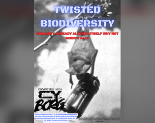
TWISTED BIODIVERSITY
Concept: “This zine contains a table for Animals and plants altered genetically, mechanically or both, some stat blocks and body modifications.”
Content: A collection of biological and technological creatures, parts, and modifications to bring more animalistic variety to a game.
Writing: Descriptions make use of a casual and conversational voice that makes even the more mundane entries engaging and humorous.
Art/Design: Three pages of red and blue text on a light gray hex-pattern background. Two pages use single-column text layouts, while the page of stat blocks has different NPCs’ info scattered around the page.
Usability: Each page provides a consistent visual grammar to indicate how to navigate its content. Center-aligned lists of creatures and modifications may slow down some reading of entries that span multiple lines of text.

UNMARKETABLE EXTRACURRICULARS
Concept: "D66 Adaptions, reflavours or substitutions of Unheroic Feats for CY_Borg
BONUS:
D66 Never seen before advantages for undiscerning scum"
Content: A set of tables providing new options for improvement (some with downsides!) that can help a punk feel like a more exceptional character.
Writing: Balanced mix of thematic description and mechanics explanation to help a player understand what a given feat does rule-wise and how to interpret that within the game and character headspace.
Art/design: Light-on-black two-column text organization, with some pages including a small hand-drawn illustration in a bottom corner.
Usability: Text is consistently color-coded to indicate the aim of each text block, and each table entry is distinguished from the others with consistent numbering and horizontal rule usage.
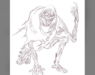
Upcycled Cyber-Undead
Concept: “You died. Through means fair or foul, you departed this plane of existence, of that you are mightily certain. Then? Your cyber-attachments brought you back online. Or maybe it was some sort of nanoplague or something. In any case, you’re back. Except no one wants you back. You smell bad. You sound bad. You look very, very bad indeed. You’re way too deep into the Uncanny Valley to pass as one of the living. Sorry.”
Content: A class for those inhabiting the venn diagram overlap of “zombie lover,” “cyborg-curious,” and “body horror fanatic.”
Writing: Class detail descriptions are not for the faint of heart but are a must-read for anyone vaguely interested in the idea, with dark humor balancing the gore with levity. Mechanics are concise and complement the descriptions well.
Art/Design: Eye-searing colors faithfully reflect the unsettling nature of the class concept, and a sketch of an upcycled cyber-undead further brings the idea to (un)life. Text is sectioned into boxes set askew with distinct color and font choices that indicate different purposes.
Usability: Askew text angles support recognition of distinct purposes for each text box, inviting closer examination of enticing class possibilities. However, text is non-selectable and inaccessible to a screen reader.
Previous page
Page 3 of 3