Rules
Creativity through constraint

So, Your Best Friend is a Doppel?
Concept: “
[recruiter77@mandela ~]$ sudo project-mandela --help
#################—BEGIN TRANSMISSION—#################
<<<<<<< In these tumultuous times, our beloved Cy faces a dangerous threat – Doppels, insidious infiltrators that mimic the human form. It is our collective responsibility to be vigilant guardians of our society, defending against those who wish to undermine our way of life. This pamphlet provides you with the essential knowledge required to identify and dispose of these impostors safely.
########################—END—########################
[recruiter77@mandela ~]$ _
“
Content: An “in-world” pamphlet providing rules for “doppels” and information on how and where to hunt them down.
Writing: Textual content balances between informative approach for players and GMs and informative for PCs, maintaining an ominous undertone for both sets of audiences.
Art/Design: Trifold pamphlet layout, with single-column text in each panel. Black-on-white text is accompanied by full-color illustrations on pamphlet cover (of a girl and her doppel) and on one inside panel (of a doppel detector). One version of the pamphlet is provided with a background texture while the other is without.
Usability: Easily recognizable visual organization of content and use of particular arrangement and fonts to indicate relationship between text blocks and panels.
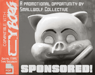
Sponsored!
Concept: “Even punks can earn money from promotional opportunities. A small ruleset designed for having punks make sponsored promotions, and what can go wrong if they fail to do so.”
Content: A set of rules that can be implemented pretty seamlessly into any mission or campaign, along with a “Mascot” NPC to ensure compliance with sponsorship stipulations.
Writing: Cheerfully on-brand narration offers clear descriptions of the ruleset components and intensely thematic tables.
Art/Design: White on brown and orange provides a striking two-page spread layout, complete with corporate barcode and an illustration of the bat-wielding company mascot.
Usability: Organization is recognizable and makes for quick navigation/browsing, although white text on orange may be difficult for some to read.

Stalkers of G0
Concept: “Stalkers of G0 is a 40-page supplement on the exclusion zone in the heart of the City of Y!̸͆̅̌”̶͌̉#̸͇̞̻̌̚”̶̨̻̘̇̉̊͆̈́͒̌̆̓̕͜#̶̖̣̘̻͖̥͕̙̀̃̈́́̄̕̕͜͠2̶̧̻̺̝̥̮̣̒͒̂͐͐̍́́͘̕̕4̴̿̌’̷̛̙͍̠̙̿. It describes its environments, eccentric denizens and horrors beyond human understanding through the lens of Stalkers. Stalkers are individuals from all walks of life, inexplainably inclined to risk dying horribly in this hellhole.”
Content: Tons of details to bring G0 to life: locations, factions, enemies, mission generators, anomalies, a class (“Stalker of G0”), and more.
Writing: Extremely flavorful atmosphere evoked through vivid descriptions and conversational tone taken to address the reader. Mechanics (such as the abilities of the Stalker class) feel appropriately in tune with the intended vibe.
Art/Design: Different page/spread layouts throughout, with color schemes and font choices often used to link together multiple related pages.
Usability: Recognizable headers (on any given page as well as chapter/section headings), high-contrast text, and contextual framing of page content all make navigating and locating desired info easier to accomplish.

Surviving G0
Concept: "Inside the quarantine zone, everything is hostile—the ground, the air, the water, and most certainly, the people. But hidden amongst the danger are riches of unimaginable wealth—the type of wealth that can take a punk from the slums all the way to the hills. Food and water are hard to come by, and net service is nearly unreachable. Everything inside of G0 is hidden from the view of Cy’s citizens, making it home to the forgotten corners of society. It’s the kind of place where adventure finds you, whether you want it or not."
Content: A combined generator for G0 hex maps and adventures/scenarios, along with the NPCs that populate those locations. A set of map images for VTT use is also included.
Writing: Tons of description and table entries of all kinds with which to cultivate a fully-formed G0 for punks to explore and face the consequences for doing so.
Art/design: Black-and-white color scheme with illustrations and graphics (of NPCs, of location maps, of two-page spread images) accompanying assorted tables and explanations of relevant points of interest. Map images are crisp and named to indicate not only their content but grid dimensions for VTT implementation.
Usability: While page layouts change occasionally, text content is presented quite consistently (e.g., distinguishing headings from body text or formatting table entries or breakdowns of location details).
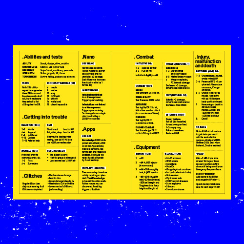
System Reference
Concept: “All the rules you need to fuck shit up, for easy reference at the table when you don't feel like flipping through a book to find that one rule.”
Content: The essential Cy_Borg rules provided in a stripped-down two-page spread.
Writing: Incredibly brief descriptions/explanations of rules in order to include as much as possible in the available space.
Art/Design: Black-on-yellow color scheme, with subheadings using a white background, with text-only organization of content across the spread. Printer-friendly version has white background with yellow subheading background.
Usability: Distinct rule components are separated into individual boxes, with additional internal borders to mark individual tables/lists from one another. Bolded labels help further indicate the scope of each rule explanation.
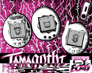
TamaGOTHi
Concept: “A virtual pet. A solo game (e.g. Dark Fort, Solitary Defilement) but one you play along side the main game, filling in the boxes depending on how well your main character does. Print it on the back of your character sheet.”
Content: A set of rules to facilitate raising/evolving a virtual pet while trying to survive in CY.
Writing: Rules are specific and concise to explain the rules/mechanics so that the pet’s evolution occurs alongside a punk’s success/failure. “Shell color” list evokes the ‘90s tamagotchi options quite vividly.
Art/Design: One-page landscape-oriented layout that closely resembles the aesthetic of the Cy_Borg character sheet, with three main columns of distinct types of content (evolutions/shell color, stats/medicine, rules). Pixel art in evolution boxes and tamagothi images complement the explosive, glitchy primary art style.
Usability: Supplement is provided as a text-accessible PDF as well as full-color and black-and-white .JPG files. Font choices are high contrast and generally readable visually, with the character sheet-based layout helping to guide Cy_Borg players to desired information quickly.

Temperamental Upgrades
Concept: "A collection of rules expansions and player options to take your punks to edge!"
Content: A trove of material, including: classes, locations, jobs/scenarios, vehicle combat & chase rules, tables of all sorts, and even rules for taking on more debt.
Writing: A mix of straightforward explanatory information and vividly atmospheric description, suitable for players and GMs alike.
Art/design: Distinct, striking aesthetics on each spread, although some shared visual language occurs across multiple spreads for a particular kind of content (e.g., across spreads for classes).
Usability: Visual markers and spacing/proximity assists with allowing related or distinct blocks of text to be recognizable, especially given the range of fonts and character sizes used across spreads. Fore/ground contrast is high and allows for consistent visual readability.

The 55
Concept: “A megablock of capsule apartments, local markets, ruined amenities, gangs, and mysteries. A city within the city. Some residents have never left. Some make things you cannot find anywhere else. Most are desperate. The corpos and cops call it STACK # 95563. But everyone who lives here calls it: THE 55.”
Content: Less an adventure than a setting absolutely crammed with details: locations, NPCs, events, and different ways to go about experiencing it all.
Writing: Concise tidbits reflect the essence of each item, with 8-36 options per page, all categorized by area/region or purpose.
Art/Design: Each page has its own distinct aesthetic that tends to visually relate to the written content theme for the page. High contrast fore/ground with accent colors and design elements (illustrations, decorations, etc.) to call attention to particular details.
Usability: Text is generally quite readable, contrast- and font-wise. Despite each page’s individual aesthetic, the supplement offers a recognizable and reliable visual grammar for organization and navigation.

The Apathy Engine
Concept: "Have your Punks died but they don't want to stay down, bring them back and throw them and their debt into the maw of the APATHY ENGINE"
Content: An adventure generator (or campaign seed) for a group of punks who are forced to deal with a corporation that owns their collective debt.
Writing: Brief atmospheric details accompanying rules/mechanics to drive encounters and scenario options, including a slew of enemy NPCs to threatean punks with.
Art/design: Mostly black-on-white text with illustrations of NPCs and other thematically relevant subjects supporting the focus of each spread/layout.
Usability: Text is visually readable and easy to navigate or search for desired information. Adventure generator elements are arranged to build on one another to assist GM with establishing a coherent scenario for their players.

The Cursed Ridas of FLO
Concept: "COMP'D COPIES ARE AVAILABLE ON REQUEST FOR ANY TRANS FOLK THAT WANT IT! The horrible treatment of the trans community by Florida's elected officials was a direct inspiration for the evils in the setting, and the amazing trans people I am proud to call my friends are a big inspiration for some of the classes found within. If for whatever you can't contact me through Itch while trying to get your comp'd copy, I can be found on discord (User Name: _gaffy)
If you participated in the Queertober Jam and would like a copy, please reach out to me and I will send it as soon as possible.
A WIP setting book for Mork Borg/CY_Borg based on Florida, made for the Queertober Jam"
Content: A set of materials to offer a table of punks an additional location to explore, along with some tables and two classes to play (Chaos-Bound Test Subject and XLmphibian). The itch webpage for this supplement notes additional material is forthcoming.
Writing: Poignant and biting commentary and description combined with intriguing mechanics to support the unique class approaches.
Art/design: Distinct layout/aesthetic on each spread of pages, with a variety of hand-drawn illustrations, photo collages, and font choices that evoke a different essence and purpose for that spread.
Usability: Text is generally readable with high contrast, even on pages with relatively busy background images/patterns. Font choices and consistent uses of bolding/text size for headings, labels, etc. help facilitate visual identification of different kinds and groupings of content.
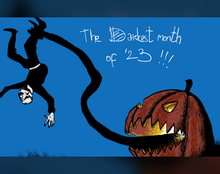
The Darkest Month of 2023
Concept: “Compilation of my Mörktober entries, all 31 of them, some monsters, some gear, some adventures, some NPC and some bits of lore, mostly Mörk borg, but also some CY_borg. All 31 are PNG format.”
Content: A few Cy_Borg rules and NPC entries to make CY all the spookier: “Haunted,” “Purple Stargazers,” and “God Damn Rain.”
Writing: Concise description and mechanics to focus a player’s (and a GM’s) attention on not only how each entry can affect the game but also how it can affect the character(s) who have to deal with it.
Art/Design: Each landscape-oriented entry contains an illustration of its subject and text taking up the remainder of the page. Lots of color choices that cement each entry in the Cy_Borg cyberpunk milieu.
Usability: Much of the text in each entry is high-contrast, and blocks of content are arranged to indicate distinction from one another as well as conceptual connection (e.g., list items). However, each entry is an image and so text is not searchable or selectable.

The Drug-Addled Riff Wretch
Concept: "The Drug-Addled Riff Wretch is a specialized class for the tabletop RPG CY_BORG – part street scvm busker, part bardic force multiplier."
Content: A zine-styled set of material surrounding the Drug-Addled Riff Wretch class--not only class specifics but also information on a special weapon (the "plasmaxe"), powers/abilities (songs), relevant NPCs, and more--even a flowchart for using the class's abilities.
Writing: Predominantly conversational and in-universe in voice and tone, with some concise rules-oriented explanations accompanying.
Art/design: Different pages/spreads have unique layouts and aesthetics, although there is an overall cohesiveness thanks to the zine/mixtape-esque organization and conceit of the class supplement overall. Lots of color and font variety, and many images have a mix of digital and hand-drawn illustrations that evoke various approaches to the Drug-Addled Riff Wretch as a character.
Usability: While the variety of layouts across pages can be disorienting at first, there is a generally recognizable visual grammar that facilitates navigation and use of details on each page. Text is also generally in high contrast with background patterns/colors and can overwhelmingly be selected or searched.
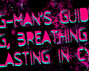
The G-Man's Guide to Living, Breathing, & Lasting in CY
Concept: “This Zine features 66 different locations (not 36, not d66, not 100, not 1, but 66) all across the CY, split into 11 different categories to aid all of your different encounters. Each has a description that encapsulates most things about it & a name (ex: HOLE IN THE OCEAN ). Every location (be it a club, a market or an industrial harbor) has a suggested "theme", a song which the G-man thought would fit perfectly to set the mood during gameplay.”
Content: A collection of location descriptions–fixer spots, combat clubs, industrial megaplexes, and more–that add a wide variety of flavors to the CY cityscape.
Writing: Each location writeup is a single paragraph of intensely atmospheric color that focuses as much on the essential being/purpose of each place as on physical description/explanation.
Art/Design: Three versions are provided: a dark themed “printer killer” version, a light themed “ink vegan” version, and a plain text version. For the first two versions, each page displays a similar-but-distinct aesthetic to present the relevant list items over a background image that illustrates that list’s focus.
Usability: Distinct headings are provided on each page, and the body text is mostly high-contrast with the background image color, although there are some areas where the text may be difficult to read due to color choices and/or busy graphic elements (which sometimes is clearly intentional). The plain text version has helpfully noted breaks for each list/page.
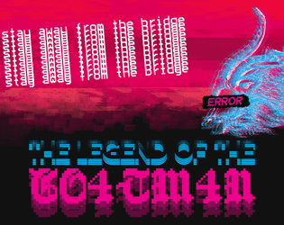
The Legend of the Goatman
Concept: “Deep in the Net, a daemon inhabits a bridge. A deal is a deal. The Goatman is an ancient AI of unknown origin - an entity designed solely to make deals. The purpose of the Goatman's deals are ultimately unknown, lost to time or purposeful obfuscation.”
Content: A scenario/set of rules for a deal-making daemon.
Writing: A mix of straightforward rules/mechanics explanations and an in-universe vignette framed as file contents about an unsuspecting punk’s encounters with the Goatman.
Art/Design: Two pages of three major columns/panels (potential trifold configuration). White, red, and green text on black, accompanied by two glitch-art illustrations of daemons.
Usability: Text is easy to read and navigate, with distinct visual markers for different kinds and sections of content (font choices, colors, sizes, etc.). Font selections also immediately make apparent which text describes the scenario and which serve as the vignette.
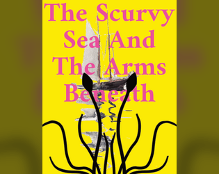
The Scurvy Sea And The Arms Beneath
Concept: “Night. The aquaculture cage maze. A chorus of motors rises against the sludgy lap of the waters. Light pierces the gloom, searching, calibrating, until it falls on a racing skiff. Painted in neon green, the craft banks around a submerged tangle of steel and plastic, cutting the turn slightly too wide. Gunfire hammers the silence. Punctured, the pilot falls from the bow. The boat spins out, catches the edge of another submerged structure, and turns into a spray of splinters that float atop the waves. Three more racing skiffs charge past the wreckage, drivers whooping as they go. The Cy Regatta has begun again.”
Content: Rules for participating in the Cy Regatta, a set of deadly boat races, along with a sea creature that might torment the racers.
Writing: Focused, specific details to explain the rules at play for the regatta, presented directly and concisely.
Art/Design: Lots of bright color combinations, full-page illustrations, and silhouette backgrounds of text pages/spreads.
Usability: Single-column text format with large headings facilitates reading and navigating, although some color combinations might strain some eyes, while others may have difficulty reading text overlaying more complex background illustrations.

Things being yelled in the streets of CY
Concept: "The streets of CY_ are busy, crowded, chaotic, and most of all noisy. Things are being yelled, slogans, advertisings, chants, ramblings, or other kind of threats. Easily generate 4d10 slogans and 1d10 ways they are being yelled in the streets of the worst city on earth."
Content: A table of shouted comments and another for the source of those comments.
Writing: Flavorful combinations of ominous and inane, well-suited for random proclamations on the streets of Cy.
Art/design: One- and two-column text layout, provided in black-on-white and vivid black, yellow, and white-on-green (with pink accents).
Usability: The tables are organized for ease of use, with visually recognizable and consistent headings and list numbering, with a distinct font used for each table.

Thirty One Dark Nights
Concept: “Each year, during October, Exeunt Press hosts Mörktober. A 31 day event that encourages creators to make something each day for MÖRK BORG or other BORG games, in this case Cy_Borg, based on a prompt list and then share it with the community. More about Mörktober.
Thirty One Dark Nights is a compilation of the 31 Cy_Borg compatible creations I made for the 2024's Mörktober event.”
Thirty One Dark Nights is a compilation of the 31 Cy_Borg compatible creations I made for the 2024's Mörktober event.”
Content: A collection of enemies/threats, equipment, locations, drugs, viruses, surgical options, and more with which to make a game of Cy_Borg vividly fucked up in fantastic ways. (Note: individual entries are PWYW, with a paid option for a fully compiled set of the entries.)
Writing: Mörktober’s purposefully morbid and eerie atmosphere is mixed with pitch-black humor, while unique abilities/rules/effects situate each concept for game rulings.
Art/Design: White/gray on black with a different accent color (and heading typeface) and accompanying illustration for each entry/page.
Usability: Consistent body text and label emphasis/decoration allows for navigation to and recognition of desired info elements, while distinctions in entry accent colors and headings orient the reader to the essence of that entry.
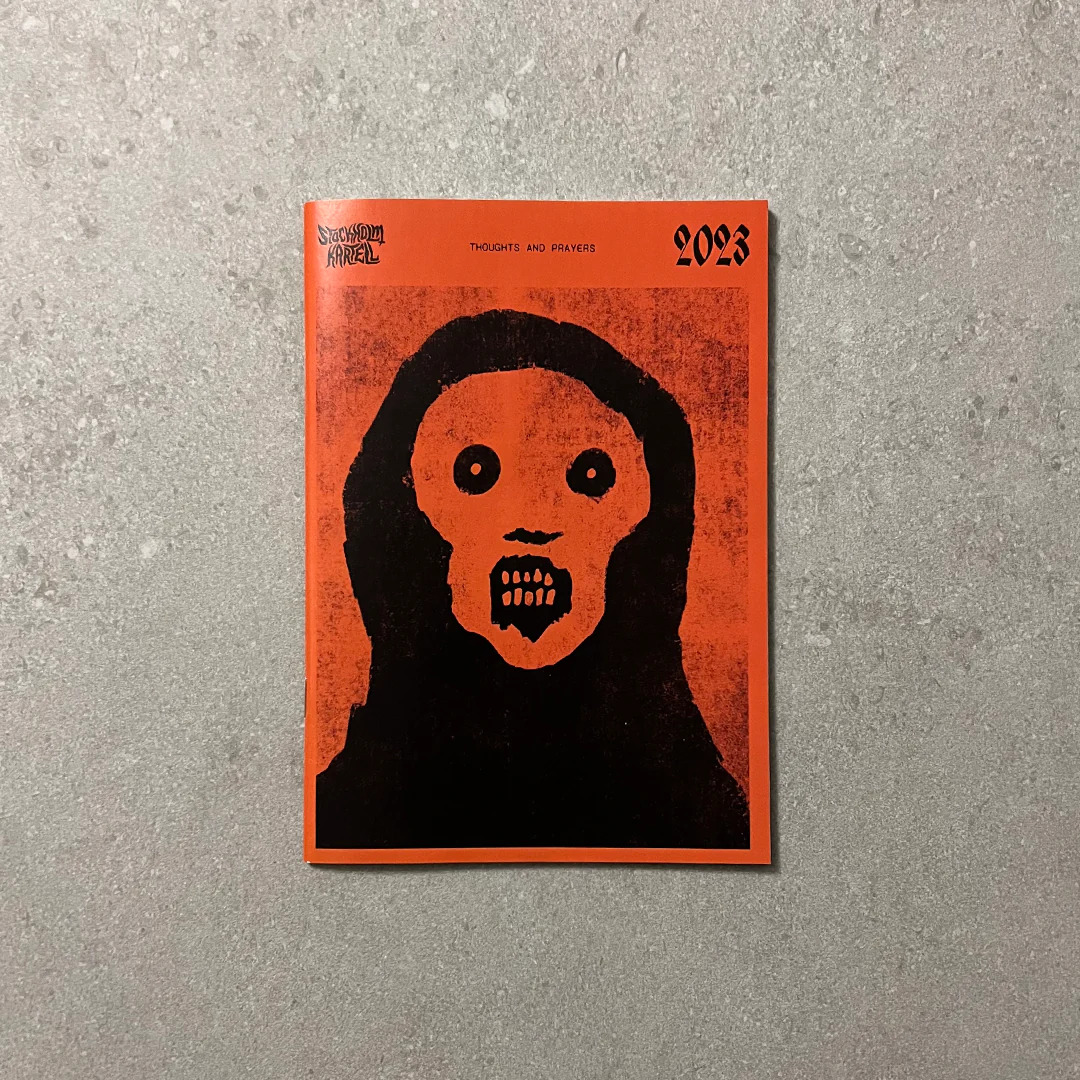
Thoughts & Prayers
8 contributors
Concept: “Thoughts and Prayers is a zine by Stockholm Kartell made for the 2023 convention season. It includes stuff for all our games; MÖRK BORG, CY_BORG, DEATH IN SPACE, SKR and some system-agnostic material. But there are also things like album reviews, essays and short stories, thoughts, ideas and takes. 100% of the benefits are to be donated to Direct Relief.”
Content: A smörgåsbord of content for Cy_Borg–some specifically for the game, some that could be used for it or others–that ranges from a location/adventure (Sprawling Car Park) to tables/generators (e.g., “Who else is in the pub when the brawl starts?”) to NPCs (emergency response teams) to medieval weapons to injuries/afflictions to short fiction about living as a corp drone. There’s a lot more than that, too.
Writing: Every page oozes the Stockholm Kartell house style(s) that makes a reader want to use all that they can in their next game.
Art/Design: Black-on-white color scheme in a printed zine format with illustrations throughout.
Usability: Available only in print format. Table of contents at the beginning of the zine makes it easy to locate info throughout, with a consistent header/footer with page content credits and page numbering to help clarify not only where a reader is in the zine but also whose work they’re looking at.
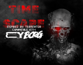
Time Scape
Concept: “In the not so distant future… Out of the unholy marriage of Super A.I. and alchemy of flesh, a new type of being came into existence. In the year 20X9, the machines rule every aspect of daily life, forever looking to further optimize culling the ‘dregs’ of society, ensuring any threat to its existence is either exterminated with the extreme prejudice of nu-capitalism, or by force. But the final battle for humanity will not be fought in the future. It will be fought here, it present day CY. Tonight…”
Content: A mission to save the future by terminating a CEO. Additional classes ("Time Target," "Veteran of the Future War," and "Reprogrammed Hunter Killer"), supplemental glitch rules, and a murderous NPC are also included.
Writing: Creativity permeates every page/spread, offering plenty of details to flesh out each encounter with a clear sense of in-game urgency for the stakes involved.
Art/Design: Distinct full-color layouts for each page/spread that manage to share a dark-themed aesthetic for a sense of consistency throughout. Numerous illustrations provide visuals for the landscape, significant NPCs, and maps.
Usability: Visually, most pages provide high-contrast text/background for easy reading, with immediately apparent headings/labels and distinct content sections (whether via whitespace, borders, etc.). However, the text is not embedded, so no searching or selecting is possible. A ToC is provided at the end of the supplement.
Too Fast to Live, Too Young to Die
26 contributors
Johan Nohr
Astrolich
Calen Heydt
industrialnation
Gnoll
Flintwyrm
Patch Adam Perryman
thefatherofcats
Prince “PROFANEKNOWLEDGE” Maxi
Leonard B
cyotee doge
Amaranth M
Brendan Carlson
Kevin Cantello
Patrick Möën
Gaffy
Michael T. Baker
Mal R
Ryan
Casanova Funkenstein
psyop.fyc
Torg_OR
KMSH
Daniel Scott
Olav
Jason “Anabasis” Brook
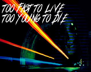
Concept: “Too Fast to Live, Too Young to Die is a rules expansion for CY_BORG giving you the chance to drive fast and wreak carnage hanging out the passenger side window (or just crash headlong into it, your mileage may vary). These rules are light-weight, but robust, and will add a ton of flavor to your chase scenes as you bolt down narrow streets in attempt to escape the piggies or track down a corpo shit-bag. Hell, you don't even need to catch 'em, just have a firefight between vehicles - we got rules for that!”
Content: An impressive cornucopia of content: rules for vehicle chases/races and driving hazards, classes for the “Got-Away Driver” and “High Speed Vigilante," stats for vehicles that are purchaseable (or not), enemies to encounter on the streets of CY, and an entire revenge-themed mission.
Writing: A focus on thematic details/voices to breathe life into included elements that are supported by succinct, direct rules and guidance for GMs to implement assorted features into a game.
Art/Design: A mix of layouts and aesthetics throughout the supplement. Some pages are laid out landscape-wise, and at least one two-page spread has text broken across its pages. Number and variety of illustrations and themes, along with their execution, are inspiring.
Usability: Body text font is pretty consistent throughout, and despite the range of page/spread layouts it’s easy to identify headings/labels and how they relate to nearby content. However, the text is not embedded, so searching/selecting and screen reader use is not possible.

Tribute
Concept: “Tribute — a 48-page triple-threat zine with content for Mörk Borg, CY_BORG, Death in Space. Whatever sick or sad ideas came to my mind, I banished into this cursed little booklet. [...] CY_BORG. Go dumpster diving (in CY), visit the REAKTOR, die in horrible car accidents, and play as a revolutionist chemist!
By day, you mix and cook in the corps’ polluted factories; the ¤ ¤ ¤ are much needed. Reaction kinetics are on your mind. By night, you burn the palaces. You poison the organism that feeds you. Your concoctions are august.”
By day, you mix and cook in the corps’ polluted factories; the ¤ ¤ ¤ are much needed. Reaction kinetics are on your mind. By night, you burn the palaces. You poison the organism that feeds you. Your concoctions are august.”
Content: A zine whose focus is partially on several Cy_Borg-related supplements: a class (Revolutionist Chemist); a mini-game (Dumpster-diving) with random encounters and loot tables; and a club location (Reaktor) with related tables for drinks, NPCs, trouble, and music genres.
Writing: An overall balance of general and atmospheric description, in-universe text (such as instant messages/social media posts), and mechanical/rules-based explanation.
Art/Design: Distinct spreads/pages for each entry, with a variety of aesthetics and graphics (photo collage, hand-drawn illustration, simple icons, etc.).
Usability: While spreads do vary aesthetically, each has an identifiable organization and layout that consistently presents information throughout for ease of navigation and use.
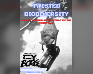
TWISTED BIODIVERSITY
Concept: “This zine contains a table for Animals and plants altered genetically, mechanically or both, some stat blocks and body modifications.”
Content: A collection of biological and technological creatures, parts, and modifications to bring more animalistic variety to a game.
Writing: Descriptions make use of a casual and conversational voice that makes even the more mundane entries engaging and humorous.
Art/Design: Three pages of red and blue text on a light gray hex-pattern background. Two pages use single-column text layouts, while the page of stat blocks has different NPCs’ info scattered around the page.
Usability: Each page provides a consistent visual grammar to indicate how to navigate its content. Center-aligned lists of creatures and modifications may slow down some reading of entries that span multiple lines of text.
Ultraviolent Entertainment
Concept: “A small collection of optional rules for Cy_Borg. Includes variations on Experience, Dice-few Combat (with revisions to how armor, weapons and initiative work), a biological alternative to Cybertech and doing away with Cy-Rage.”
Content: A set of rule proposals to affect characters in assorted ways that can provide some intriguing variety to a game of Cy_Borg.
Writing: Text is direct and focused on explaining the mechanical differences between these rules and those in the official rulebook. No fluff, all function.
Art/Design: Single-column text with a simple heading organization. Black-and-white with one heading level provided in red/pink. Background is a light noise/speckle pattern.
Usability: Font choices are easily readable, and the page background pattern shouldn’t cause much disruption of engagement with text. A few key terms and phrases are bolded and italicized for quick identification.

UNMARKETABLE EXTRACURRICULARS
Concept: "D66 Adaptions, reflavours or substitutions of Unheroic Feats for CY_Borg
BONUS:
D66 Never seen before advantages for undiscerning scum"
Content: A set of tables providing new options for improvement (some with downsides!) that can help a punk feel like a more exceptional character.
Writing: Balanced mix of thematic description and mechanics explanation to help a player understand what a given feat does rule-wise and how to interpret that within the game and character headspace.
Art/design: Light-on-black two-column text organization, with some pages including a small hand-drawn illustration in a bottom corner.
Usability: Text is consistently color-coded to indicate the aim of each text block, and each table entry is distinguished from the others with consistent numbering and horizontal rule usage.
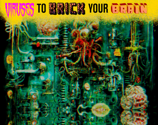
Viruses to Brick Your Brain
Concept: “Embedded in ads, lurking in the top search result, loaded as a hacker’s dead hand, coursing through a derelict net node. Viruses are everywhere, infecting everyone, stealing a portion of everything. Most of them are unnoticeable, lurking in your RCD, implants, accounts, everything. These? Less so. Bisecting your consciousness. Hijacking your implants. This is the result of someone else’s malice or misconduct. It will break you down until you get rid of it.”
Content: A set of tables to make a player’s life living hell through the power of compromised technology.
Writing: Concise and powerfully thematic explanations of relevant variables, including how the virus spreads, how it affects a player mechanically, who developed it, how to get rid of it.
Art/Design: A visual overload of colors, fonts, graphics, and stylistic clashes that feels entirely appropriate given the rules’ purpose.
Usability: While overall consistency is out the window, it is possible to understand and navigate each table/element while focusing on that section.
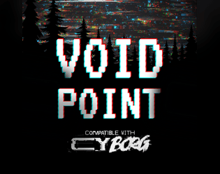
Voidpoint
Concept: “Meatspace decays. AR sputters. VR goes black. There are perilous chambers for those descending too deep in the THE NET. Nothing in them but shimmering entropy. Fractal pits. Voidpoints.”
Content: A set of rules for when a player fumbles an app roll while in the net, along with a set of locations to explore when doing so.
Writing: Brief, evocative descriptions of sensory experiences that can cause a punk to question their reality, even as digital dangers risk their annihilation.
Art/Design: Organized as a trifold pamphlet basic rules and title/credit info are provided on outer panels (in white-on-black color scheme), while voidpoint locations and a map are provided across the inner panels (in black-on-white color scheme).
Usability: Headings and labels are visually distinct from body text and consistent in appearance. Map locations are numbered and correspond to descriptions surrounding the map image. Text is not embedded, so searching/selecting is not possible.

WAR MACHINE
Concept: “War makes money, at the end of the day, and the corps of CY are interested in anything that makes money, no matter how many cadavers will be piled up alongside those heaps of cash. “
Content: An arsenal of material–enemies, squad makeups, potential job seeds, environmental tables, and more–with which to make corps even more terrifying, overwhelming, omnipresent, and all-around dangerous.
Writing: A mix of informative mechanics and in-universe flavorful commentary on each entry that balances black humor on the edge of bleakness.
Art/Design: Simple black-on-white single-column layout over fourteen pages.
Usability: Visually distinct and consistent font and text decoration choices, along with helpful whitespace use, result in an easily navigable document.

Wasteland Degenerates
Concept: “‘Tomorrow is nothing, today is too late; the good lived yesterday.’ - Marcus Aurelius
Welcome to the gas-guzzling, high octane post-apocalyptic hack of Cy_Borg, about miserable, radiated scum struggling to survive in tomorrow's unforgiving carcass!”
Welcome to the gas-guzzling, high octane post-apocalyptic hack of Cy_Borg, about miserable, radiated scum struggling to survive in tomorrow's unforgiving carcass!”
Content: A Mad Max-style take on Cy_Borg rules, with some new and different systems while others very closely resemble those of the base game. (Note: At the time of writing, the "Jumper Cable Edition" version of the game has been released. A fuller version of the game is set to be published in the future.)
Writing: A balanced amount of thematic description and mechanical explanation of effects/features that situate players and GMs to the game’s focus (especially in comparison to that of Cy_Borg).
Art/Design: Aesthetics of the core rulebook with some occasional pages/spreads and illustrations that break out in a different direction (such as in the more comic book-like “The world has ended” spread early in the book, or the Vast Grimm-style “lagunasuga” monster spread created by VG creator Brian Colin).
Usability: The fore/ground contrast varies significantly from page to page, as do fonts/typefaces, either of which can make some text quite difficult to read.
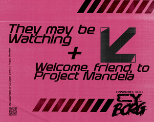
Welcome, Friend, to Project Mandela
Concept: “
[recruiter77@mandela ~]$ sudo project-mandela --help
#################—BEGIN TRANSMISSION—#################
<<<<<<< Project Mandela is a collaborative effort, a beacon of hope in the ever changing face of uncertainty. Our mission is to unveil the truth behind and expose the Doppels, who silently infiltrate our lives. With your assistance, we can protect ourselves and our loved ones from the horrors of being ‘replaced’. Join now.
########################—END—########################
[recruiter77@mandela ~]$ _
“
Content: A set of rules for a secret organization that tracks down “doppels” and its secret/coded message system.
Writing: “In-world” content speaks directly to PCks while also providing GMs and players with the details needed to work the Project Mandela organization into a given game.
Art/Design: Pages are laid out as “in-world” printed flyers (complete with tear-off tags at the bottom of one page). Three versions are provided: one spread layout and two single-page layouts, with one of these optimized for printer-friendliness.
Usability: Text is mostly quite readable, with distinct sections of content clearly identifiable visually, with consistent font choices to indicate relationships between different text blocks.

Wiggly Dorpher
Concept: "Wiggly Dorpher introduces new game options for CYBORG hyperlinked to DRUGS.
'Getting high and playing holos is fun; but have you ever zeroed someone while trippin' balls? It's exhilarating!'"
Content: Sets of equipment, nano powers, a class (Wiggly Dorpher), a location, an enemy, and more--all relating to drugs in some way.
Writing: Potently and concisely atmospheric, with rules/mechanics explanations complementing the descriptive aims.
Art/design: A mix of page/spread aesthetics and organizations that reflects the core Cy_Borg design variety.
Usability: While most pages have significant text/background contrast to facilitate reading, much of the text content is not embedded and thus cannot be searched or selected.
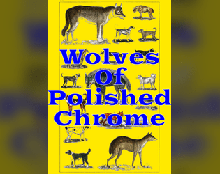
Wolves of Polished Chrome
Concept: “There's a sickness in the streets of CY. Rain drips like a broken IV. Dying adverts flicker in sallow shades. They say the world is ending. Has ended. Will end. They say the howls at night are Cy-Ragers. NanoPhreaks. Nothing to worry about. Nothing abnormal. The water is poison, but it always has been. The air is poison, but how bad can it be? It churns through your lungs all day and hasn't killed you yet. There's nanites in the trash, nanites growing like mold on the walls, nanites in the blood and bones of regular citizens, but all of this is familiar misery. Last night you stared blearily at your face in the bathroom mirror, watching it change. Watching it become something new. As you did, your cybernetics clicked like beetle legs, like teeth shuffling in the mouth of a cannibal. They squirmed and contorted to match your new flesh. You vomited your whole stomach lining into the sink, then washed it out with a swig of cheap ethanol. But the disinfectant didn't purify you. It just made you worse. Tonight, the glitching moon hangs low over the skyline and your body is wrong. Wrong for the city. Wrong for the life that clings to it. Wrong for the alien gods that have touched its streets. You hate them all, and that hate pours out of you in a howl.”
Content: A set of rules to incorporate werewolves into CY.
Writing: Matter-of-fact explanations and descriptions of a variety of factors pertinent to affected characters (transformation rules, clothing options that survive transformation, a “Festering Wolfborg” class, etc.) as well as several lycanthropic foes and their stats.
Art/Design: A mix of black-and-white splash images with brightly colored sections of content, each with its own bold color scheme.
Usability: Single-page, single-column layouts make for quick perusal and identification of desired content, assisted by a hyperlinked table of contents.

You Died, Dumbass
Concept: “You Died, Dumbass is a profile for another shitty subscription company, some rules for near death organ transplant (inspired by https://zordvil.itch.io/horrible-wounds) and related headlines made for the new-times-dumbass game jam.”
Content: A set of rules to complicate life when a punk at the table comes back from near death with a biosynthetic organ–complete with 4d4 additional relevant headlines to roll when a miserable headline is rolled.
Writing: A focus on the bleakly absurd atmosphere of a world where biosynthetic organs (and the late capitalist approach to their supply) is common, with brief mechanical features/effects supporting that focus.
Art/Design: Mix of black-on-white and white-on-black spreads/pages, using different layouts and aesthetics, with consistent appearance of red accents and highlights throughout. Several illustrations of NPCs and a location appear along with a silhouette to underscore our equally bleakly absurd reality
Usability: High-contrast text is consistently provided and page/spread layouts offer visually recognizable organizations of similarly presented and distinctly marked content.

You Got Mail
Concept: "Have you ever found yourself in need of some holo messages to bombard your players with? Random mails while they are investigating a datafortress? Disturbing radio chatter when caught in a nano-storm? Maybe you are just looking for some inspiration to spark an adventure?
Look no further! YOU GOT MAIL is here for you!"
Content: A set of tables of different kinds of messages for GMs to incorporate into their games--some with options for referencing/implicating the punks directly.
Writing: Tongue-in-cheek flavor pervades the messages' content, from advertisements to conversation threads to corrupted fragments.
Art/design: Black-on-green aesthetic reminiscent of computer terminal displays in two-page spread layouts.
Usability: Visually readable fonts with solid contrast of text on ground, complemented with outside-margin section headings (for the current table), allow for easy "lift and use" in a given game.
Previous page
Page 4 of 4