Rules
Creativity through constraint

Gentrifisled ASHCAN
Concept: "At the time of the GØ disaster, a devastating earthquake ripped through the isles. Nuclear reactors located in Nastrond and in Copper Cauldron simultaneously explode in twin balls of hell fire. Ever since, seawater has to be constantly sprayed over the damaged reactor cores to prevent them from overheating, but contaminating the seawater in the process. Now (unfortunately for the residents of GEN) this contaminated radioactive seawater is being dumped back into the Ocean and the consequences could be DIRE!"
Content: An "ocean crawl" teeming with sharks, enemies, and all sorts of weather events with which to challenge punks on the waters.
Writing: Direct, engaging language that remains firmly tongue-in-cheek while peppering atmospheric and in-universe messages among encounter-specific rules and NPC stats.
Art/design: Blisteringly loud, colorful spread layout with an equally stylistic cover. A helpful map of the crawl area accompanies columns of encounter table entries and an illustration of a shark.
Usability: Despite the visual overload, there is a recognizable grammar to the layout and each distinct section of information that makes navigating and locating specific details relatively easy. The crawl map has a helpful accompanying legend to indicate locations & kinds of aquatic terrain to be encountered.
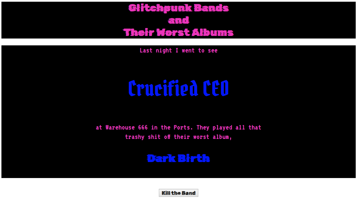
Glitchpunk Bands and Their Worst Albums
Concept: A random generator that displays a glitchpunk band name and the name of their worst album.
Content: A generator to immediately provide depth and atmosphere to life in CY.
Writing: Band and album name lists are both hilariously over-the-top and also seem completely appropriate for the genre.
Art/Design: Simple page design with a generator button beneath the main text output area, which provides some color-coordinated indication of static and randomized content.
Usability: Easily identifiable “kill the band” button functionality to generate new bands/albums. Text is mostly readable, although blue on black might be difficult for some to discern.
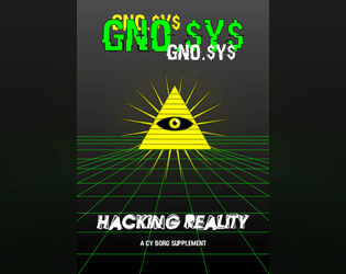
GN0.$Y$
Concept: “The world is a simulation, policed by AIs But you know the truth, and can learn to see the code hidden behind the veils of flesh and matter. Break free, Ascend.”
Content: A set of rules to provide PCs the opportunity to transcend across simulation reboots and to commune with a powerful AI overseeing the reality program.
Writing: Rules, stats, and descriptions are straightforward and informative, with a focus on explaining the subject in a manner useful to players as well as GMs.
Art/Design: Single-column black text on white background, with red background for headings and an illustration of each AI’s avatar/appearance. A green-on-black computer terminal-style net chat log offers an in-universe glimpse at how some characters might understand the notion of transcendence and the reality-simulation AIs.
Usability: Headings and labels are consistently provided, and key terms are bolded for quick identification and reference.

Gravestone Graffiti 2: Unencrypted names for the neon world of CY_BORG
Concept: “You can never have enough new character names. This one-page PDF with 100 names, 100 aliases, 19 origins and thousands of possible serial numbers is intended for the world of CY_BORG, but can work in any sci-fi or cyberpunk setting. Print it and bring it to the table. Your gravestone will thank you.”
Content: Several tables for generating names, aliases, origins, and serial numbers.
Writing: Table data contains a wide range of choices both exceptional and mundane.
Art/Design: Black-on-white organization with minimal graphics (an icon to distinguish each table) and simple table ornamentation.
Usability: Tables are consistently and easily laid out and distinguished from one another, with names and aliases alphabetized for an additional means of navigation.
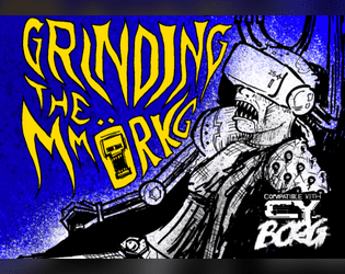
Grinding the MMORKG
Concept: “Want to use Mork Borg modules as a virtual reality simulation in your Cy_Borg game? Or to give your Mork Borg players a taste of Cy? This five-node mystery adventure path introduces the Dying Lands as an MMO game/simulation in Cy and can be approached from either game as a starting point!”
Content: The content centers on an ingenious scenario that blends Cy_Borg and Mork Borg (whether you’re starting in either game!), detailed locations and maps for each, an “emaciated sim-farmer” class that works well for the scenario, a small set of optional rules that the MMORKG facilitates, random encounters, and several pieces of equipment to consider buying.
Writing: A mix of thematic narration, straightforward rules explanations, and direction for PCs to respond to–all of which is presented succinctly and consistently throughout the supplement.
Art/Design: Distinct layouts for each section (major adventure locations, PC class, etc.) that provide individual character about its subject matter, with a bright accent color to help underscore section distinction and scope.
Usability: Despite the variety of page layouts/aesthetics, text is consistently readable and identifiable as different kinds of content (headings, labels, NPC stats, etc.).
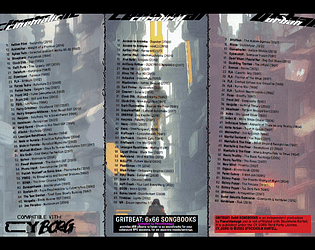
Gritbeat: 6x66 Songbooks
Concept: “Gritbeat 6x66 Songbooks provides d66 albums to listen to as soundtrack for your cyberpunk RPG sessions, for six separate moods/settings.”
Content: Six tables of albums suitable for Cy_Borg games, organized by general atmosphere: cinematic, cerebral, urban, visceral, heavy, disruptive.
Writing: Tables are consistently organized, with artist name, album title, and year of release. A set of hashtags is provided to help further clarify or help with determining each table’s usefulness for a given session/table’s intended ambience.
Art/Design: Table content is provided in two three-column spreads, with a different image evoking CY as the background for each table.
Usability: Each table is easy to navigate, with artist names in bold to help distinguish visually from album title and year of release.
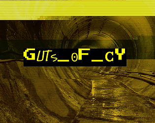
GUTS_OF_CY
Concept: “CY is a great beast and these are its bowels, the living guts of the city. Awash in filth and the prowling grounds of criminals, scvm beneath notice, maintenance workers, bounty hunters and strange monstrosities bred in the noisome darkness beneath this city. Features a d66 table of encounters in the sewers of CY and a d20 table of tunnel graffiti.”
Content: A set of tables to flesh out the grimy, dangerous CY undercity.
Writing: Vivid descriptions of encounter seeds (not only who/what players might find but what’s going on when they find something) and graffiti messages and styles to be found on sewer walls.
Art/Design: Black text on yellow in a single column of text. A glitch-art illustration of a sewer tunnel frames the supplement title on the first page.
Usability: Tables are numbered, with bolded labels for NPCs and their special attacks to emphasize details a GM might be scanning the page to locate.
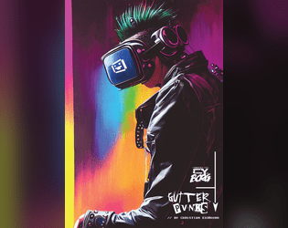
gutter_PVNKS
Concept: “gutter_PUVNKS is a fresh supplement for CY_BORG. You'll get all you need to explore the city of CY, even if you really don't want to. Locations, encounters, NPCs, adventure, two new classes (BROKE CEO & CY_BORG), and a few odds and ends.”
Content: 48 pages of content: NPCs, cults, a radio station, locations throughout CY, random encounter tables, infestations, “broke CEO” and “cyborg” classes, and (amazingly!) more.
Writing: Tons of detail on each page to provide GMs and players with numerous possibilities; writing style oozes the essence of Cy_Borg: thematically grimy and vile and also compact rules/mechanics explanations.
Art/Design: Layout and aesthetic choices for each section are as varied and imaginative as the writing, contributing significantly to the fullness of immersion in the game universe and vibe.
Usability: “Consistency” is somewhat relative here–although there are many different layouts, aesthetics, etc., there are similar gestures throughout: highlighted headings/labels, text size to reflect hierarchical relationships between content, etc. so that navigation and identification of desired info is enjoyable rather than frustrating. Contrast is high throughout as well; only one page has a busy enough background to potentially slow reading.
HACKING_RUN
Concept: “When you need to steal secure data from a CORP and you don’t have the luxury of doing it as a downtime activity you can attempt a HACKING RUN. THIS requires physical access to A CORP’S system from within a facility belonging to THEM. Expect to do this under fire. BRING BACK UP.”
Content: A set of rules to flesh out networked tech infiltrations for those punks looking to score lucrative or sensitive corp data.
Writing: Direct explanations and descriptions of relevant rules and procedures for hacking.
Art/Design: Two-column spread of text details over a neon green patterned background. An additional "light" format has a softer gray background color.
Usability: High-contrast text is easily readable, with consistent and visually distinct elements (headings, key terms, status conditions) that indicate their relationship to other elements.

HAIL KERGOZ
Concept: “Across CY prayers are whispered through rotting lips to a demoniac God of rotting flesh and the things that grow and squirm within it. The lines between machinery and mortality are gnawed through and collapse; heartbeats meld with motors in a morass of meat and metal barely distinguishable from each other.”
Content: A cathedral’s worth of faith-powered enemies with which to unleash pestilence and disease on a table of punks.
Writing: Potent descriptions of each kind of NPC are accompanied by thematically apt mechanics, each more disturbing than the last. Tables of names, targets, treasure/loot, and potential NPC quotes are also provided.
Art/Design: Primarily single-column black text on white background, with a full-color digital collage image on the cover page.
Usability: While different sections of the document differ stylistically, each section has a consistent visual organization/grammar that makes it easy to navigate (heading/label placement and emphasis, whitespace use, etc.). High contrast black-on-white and readable fonts allow for quick and accurate location of desired info.
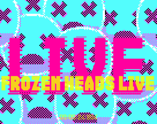
Heads Frozen in Vaults Enduring
Concept: “Escort a live streamer into the G0 wasteland in search of an underground cryovault! More action means more viewers, and viewers are creds. So remember to smile for the cameras while the nanophreaks shred your face!”
Content: A job to make sure a streamer survives a break-in attempt to a cryo facility, with extra cash on the line if the stream looks dangerous and exciting. A player-facing map and a ‘frozen celeb head generator’ (for potential inclusion in the cryovault) are also provided.
Writing: Tons of imaginatively expressive details provided in brief phrases and statements so that a broad range of locations, enemies, and unfolding events can be mentioned.
Art/Design: Trifold pamphlet layout with mission parameters on the outer panels (with a white-on-black color scheme) and the location/NPC specifics, along with a map, on the inner panels (with a black-on-white scheme).
Usability: Visually apparent organization/arrangement of content, with distinct headings, labels, and section borders to more clearly indicate scope and relation of each to the others. Room descriptions even include references to other rooms via map/description labels for quick navigation.
Hideouts for CY_BORG
Concept: “This is a subsystem to allow PCs in a CY_BORG campaign to buy and maintain a hideout or base of operations.“
Content: A set of rules for base-building, for the enterprising punks who manage to save enough creds to afford it.
Writing: Direct and helpful explanations of rules options that might work for or against the PC and their properties.
Art/Design: Mostly single-column body text with several tables of upgrades, misfortunes/threats, and contractors/employees.
Usability: High-contrast text is easily readable, with different kinds of content visually distinct (bolding, font size, table background color, etc.) to help with navigating to desired text.
Horrible Jobs
Concept: “A CY_BORG zine featuring soul-throttling cyberpunk occupations. Your past, or perhaps your alter ego, in the crush of CY. Demeaning and pointless jobs that drove you into a new path.”
Content: A two-page d10 table of mundanity meant to provide PCs with painfully dreadful backgrounds that reflect the oppressive daily existence of the masses.
Writing: Morbidly hilarious and creative options speak to the breadth of crushing banality that makes for most characters’ familiar reality.
Art/Design: Mostly single-column text (black on yellow) with key terms/phrases emphasized in either a different font or a chaotic collection of fonts. An image of faceless workers in an office setting frames the zine’s title on page 1.
Usability: High-contrast color scheme helps with readability, as does simple layout of table content. Font(s) used for key terms can be difficult to read thanks to the purposeful disruption of character size/decoration/etc.

Jailbroken Styles
Concept: “Characters die quickly, doesn't mean they shouldn't be special. The concept behind this expansion is to take the original styles present at character generation in Cy_Borg and give them a mechanical bonus. Some are more crunchy, some add flavor and some are brand new!”
Content: Seven pages of assorted punk styles that also provide a variety of mechanical effects.
Writing: Concise descriptions and explanations of style benefits/effects alongside similarly brief but potent style labels (e.g., “cadavercore,” “cybercrust,” “neurotripper”).
Art/Design: Each page includes multiple rows of style labels and descriptions, with each exuding its own visual aesthetic (font choices, color choices, background patterns or relevant images, etc.) to create full-page effects that resemble walls plastered with numerous flyers or screens crammed with assorted ads.
Usability: Most of the text is high-contrast and in visually distinct and recognizable sections, creating an easier navigation experience than the busy pages might initially suggest. However, files are provided as .png files, so text content is not embedded (so no searching or selecting text).

Jet Skaters
Concept: “Part of the Street Death series and inspired by Jetset Radio, graffiti culture and skateboard competitions, Jet Skaters is a Cy_Borg supplement that adds the cool kids pasttime, skateboarding with hover boards, grind rails, half pipes and possibly actually attacking others.
Grab your deck, roll your trick tests and spend your trick points (that let you make more trick tests) and become a master shredder!”
Grab your deck, roll your trick tests and spend your trick points (that let you make more trick tests) and become a master shredder!”
Content: A set of rules for nailing sick skating tests and all-around thrashing to create some sparks of joy on the otherwise soul-crushing streets of CY.
Writing: Straightforward, informative mechanics should get players quickly situated to show off what they can do or die trying. Tables for boards and board designs offer hints at some unique character dimensions.
Art/Design: Black on green single-column layout across several pages with two tables.
Usability: Headings are italicized for distinction from body text, although the body text leans a bit obliquely. Sections of content are separated from one another with ample white space, and the tables use alternating background shades of green to help with readability/navigability.
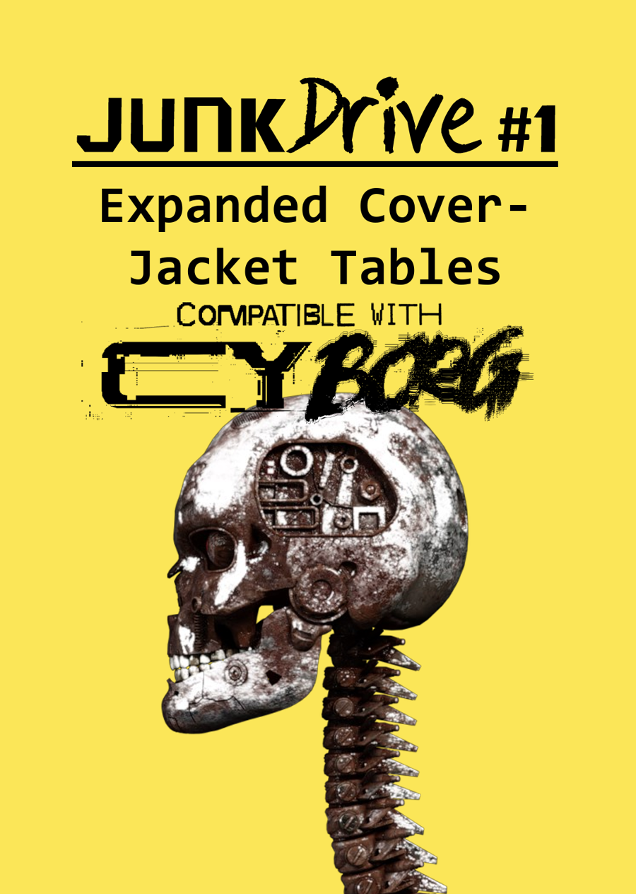
JunkDrive #1: Expanded Cover-Jacket Tables for CY_BORG
Concept: “This supplement takes the four tables found on the cover-jacket pages of CY_BORG and expands them, doubling the options available when combined with those provided by the core book.”
Content: A set of tables (names, weather, pocket lint, infestetd items) to provide more options/results for GMs looking to bring their table’s version of Cy to life.
Writing: A wide range of appropriately flavorful results and details (some purely thematic, some with mechanical effects).
Art/Design: Black-on-yellow mostly single-column text design. The cover page includes an image of a skull and spine that appear to be mechanically augmented.
Usability: Text is high-contrast in a readable font, while headings and labels are consistently provided in visually distinct ways (text size, bolding, etc.).

JunkDrive #2: Expanded Miserable Headline Table for CY_BORG
Concept: "This supplement takes the Miserable Headlines table, originally d66 (36 options) and doubles them, adding an additional 36 options for discord, mayhem, corruption, and inter-corporate drama in your Cy_Borg game.
Daring NPC heists, bizzare corporate promotional campaigns, layoff riots, 'natural' disasters, violent rampages, and more."
Content: A set of d66 additional headlines to make the world of Cy feel all the more miserable.
Writing: Atmospherically dystopian and wholly descriptive in nature.
Art/design: White and yellow text on black, organized in two-column format. An illustration of a skull and spine made out of metallic components is on the cover page.
Usability: Text is high-contrast and easy to recognize the organization of visually. Most body text is searchable/selectable, although specific headline titles are not.

JunkDrive #3: Expanded Starting Equipment Tables for CY_BORG
Concept: "This supplement takes the d8 and two d12 tables of starting equipment tables and doubles them, adding an additional 8, 12, and 12 options respectively.
Crazed toothbrushes, hacked credsticks, name-brand weapons, child-marketed explosives, and more. The entirety of the document is visible in the full size preview - use it with our blessing, if desired."
Content: Three tables to use for rolling in addition to, or instead of, the core rulebook starting equipment tables.
Writing: Concise summaries/descriptions of items, mostly without new/additional rules.
Art/design: Single-column organization of white and pink text on blue (pink used for table headings and essential item names, white for all additional text). An illustration of a mechanical skull and spine appears on the cover page.
Usability: Text is high contrast to facilitate readability, and list item numbering appears consistently throughout the file.

JunkDrive #4: Expanded Weapons and Armor Tables for CY_BORG
Concept: "This supplement takes the d12 starting weapons, d6 starting armor, and d10 booster mods tables and doubles them. The entirety of the document is available in the preview."
Content: A set of tables to add to, or replace, options from several starting equipment-related tables from the core Cy_Borg rulebook.
Writing: Descriptive item names complemented by concise, informative rules for each item.
Art/design: White on red single-column text. An illustration of a mechanical skeleton and spine appears on the cover page.
Usability: Text is arranged in a manner that is easy to navigate visually and to recognize distinct types of content (list item numbers, item names, rules text, etc.). A table of contents is included to assist with perusal of the material.

JunkDrive #5: Expanded Foes for CY_BORG
Concept: "This supplement adds 36 new foes to be killed by in Cy_borg. The entirety of the product is in the preview. Use it freely."
Content: A d66 table of enemies, from animals to sludge to mechs and more, with which to plague a table of punks.
Writing: Mix of contextual setup, thematic description, and rules/mechanics to help them be appropriately vicious.
Art/design: Two-column organization of red-on-black text (with an alternate version using white on black also included).
Usability: Table elements are consistently formatted, allowing for easy visual navigation of content and identifying desired information. Stat blocks are sometimes a bit tricky to read quickly, since stat-related fields are placed all together in a line/block. Table entry labels (NPC names) are not searchable/selectable, although the body text is otherwise.
K3y/T0/5ucCESS
Concept: “Nothing ever goes smoothly, does it? Life of a pvnk in CY. There you are, about to score big on your job after the gunfights and hacking and double-crossing and more, and there's just one problem in the way: the door. This zine presents ten unusual conditions for getting at your loot, likely the brainchild of paranoid corpos with too much money on their hands. You'll have to put your mind to work on how to get past them. Available in Classic yellow, Nite grey or Clean white.”
Content: A set of potential complications or other unexpected qualities oriented around physical or digital keys, any of which can be used as twists or obstacles to just about any job a group of punks is looking to complete.
Writing: Each key is described in terms of its essential features, the specifics of its use, and potential reactions or consequences that might occur from its (mis)use.
Art/Design: Three versions are provide: a “classic look” version of black-on-yellow, a “night mode” version of black-on-gray, and a “squeaky clean” version of black-on-white. Each version includes a cover page with the supplement title centered on an illustration of a high-tech vault door. Layout is single-column text with a unique quality of each key provided in bold.
Usability: Easy to read and navigate, with clearly identifiable list elements.

KILL ENGN
Concept: “A metal frenzy, mech-infused expansion. High-tech machines, renegade pilots, & corporate tyranny_”
Content: Tons of information (across 60 pages) about mechs and how they might fit into the world of CY, complete with creation/generation rules, relevant NPCs/enemies, gear to upgrade with, new rules and mechanics to incorporate, a new class ("The Chrome Jockey"), and even some floorplans for potential jobs. Additionally, a job (really, a mission involving multiple potential job leads)--"Cast Oubliette"--is included, along with an overhead map of one area, for stretching pvnks' figurative mech legs.
Writing: Ideas galore on each page, some of which are easier to situate than others, but all of which exude inspiration about mech-related activities.
Art/Design: The Cy_Borg core rulebook aesthetic is emulated here more closely than in any other 3rd-party product reviewed thus far, grafting designs from many of the core book’s spreads among more distinct layouts.
Usability: Each page/spread has its own visual language, but there are cues in each to indicate consistent presentation of distinct content. Like the core Cy_Borg rulebook, the radical shifts in aesthetic may initially be overwhelming for some to engage.
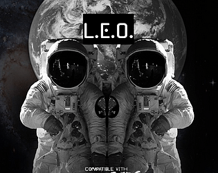
L.E.O.
Concept: “If you thought life planet-side was bad, just wait until you get to The Brink, the space-station that skulks in orbit, where the corpos can decide to shut off your oxygen.
- Walk the lovely avenues of the Arcology or relax in the parlors of Paradise Bloc
- ...if you're filthy rich, which you probably aren't
- otherwise, mill around in Middling, and retire to the sterile squalor of the Pods
- fight for your profits (and your life, but that's just incidental) in the cutthroat competition of the Thruways
- join up with stationside pvnks to try and make a difference
- eat space food! (it's not very good)
“
Content: An orbital location with tons of different areas to explore, people to meet, jobs to run, and a bit of food to eat.
Writing: Extensively detailed information about the station and what goes on there, along with a number of tables to add a bit of additional surprise or variety to a given table’s experience on The Brink.
Art/Design: Several different page layouts and color schemes provide variety from one page to the next while also providing some consistency across each time a given aesthetic appears.
Usability: Text is mostly high-contrast and easily readable, with visually distinct headings and labels. Some color and font choices may momentarily slow down the reading/navigation experience.

LABU BORG
Concept: "An adventure inspired by Labubu/ Borg lovers and haters alike!"
Content: A Labubu-inspired set of rules including assorted tables for NPC creations, two player classes ("LabuBorg Cosplayer" and "Gacha Survivalist"), weapons and combat tactics options, and even a dungeon/mission that can be played solo or with a group.
Writing: Tongue planted firmly in cheek for atmospheric descriptions that also work incredibly effectively at establishing a sinister tone for what the Labubu phenomenon might look like cranked to 11 in a cyberpunk hellscape.
Art/design: Purposefully similar to the main Cy_Borg rulebook aesthetic and even specific page layouts.
Usability: Despite the variety of page organizations and color schemes, a consistent visual grammar makes it easy to identify and navigate to desired info.

Law&Disorder
Concept: "Hello punks and rebels, this is a DLC for the CyBorg ttrpg, - Law&Disorder. DLC focuses on the theme of the urban rebellion against corporations."
Content: ~44 pages of new rules (chases), gear, classes ("Oldschool Edgerunner," "Glitch Witch," "Pale Jester," "Analog Outlaw"), enemies, and a mission/area to explore that goes beyond the bounds of Cy itself.
Writing: Lots of information with a focus on explanatory details about new rules, mechanics, abilities, etc. relating to page content.
Art/design: Distinct two-page spread aesthetics with a consistent visual grammar throughout via text blocks on contrasting background boxes and body text fonts. Lots of illustrations throughout to complement the focus of a given spread.
Usability: Font selections and text contrast, along with an easily navigable/perusable TOC, assist with readability and allow for easy browsing and identifying of desired information.
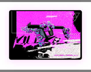
Legendary Cheat Codes
Concept: “Ultra rear secrets cheat codes for your weapons rumored in the dark web.”
Content: Unlockable modifications for firearms–if one can find the cheat sheet for them.
Writing: Brief setup and modification details that allow a GM to work the cheat codes into their game as they desire.
Art/Design: Two white-on-black images, each with a block of text (setup) above three-column presentation of weapon mods, with a neon-colored glitch art illustration of a gun below.
Usability: Text is high contrast with clearly labeled sections of content, but due to JPG format, text is not selectable/searchable.
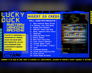
Lucky Duck Mystery Vending Machine
Concept: “Quack Quack! Compatible with CY_BORG and made for the URBN_LGND.exe jam.”
Content: A vending machine that provides an assortment of items–some trinkets, some useful items, and potentially more.
Writing: Inventive item names offer entertaining potential, and vending machine rumor/secret extends that significantly.
Art/Design: Three-column layout of basic info, vending machine contents, and a glitch-like illustration of a vending machine below a lucky duck icon.
Usability: Visually, content is extremely easy to navigate and identify. File is provided as an image, so text cannot be selected/searched or recognized by a screen reader.
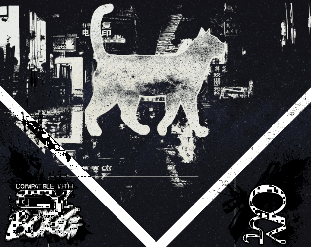
Malkintent Mouser
Concept: “Everybody Wants to be a Cat!”
Content: A class for the fan of fighting the system as a feline.
Writing: A mix of playful and poignant details complemented by straightforward explanations of class features/mechanics, along with a brief set of optional rules applied to cats.
Art/Design: Three versions in different color schemes (black/green/yellow; red/purple/black; black/white) each present content on three pages with illustrations of a cat (silhouette filled with stars) in a cityscape above text columns of class features. QR codes on the margins of each page link to cat-themed songs that fit the class.
Usability: Consistent text colors and font choices for body text and headings help with identifying and navigating to desired information, and hyperlinked QR codes are usable even with a mouse/cursor. Different color versions present the content in ways that might contrast distinctly to individuals with assorted color blindness, so examine each version to determine which might be most visually helpful.

Meat&Greed
Concept: "The Meat Might Be Fake, but the Greed Is Real!"
Content: A pair of jobs (one to free animals from a meat plant, the other to procure an item from G0), a mall to explore, a number of NPCs, and several tables of gear, status effects, chat messages, and more.
Writing: Evocative descriptions complemented by concise rules/mechanics that underscore the essence of their subject.
Art/design: Distinct spread layouts with intense colors, text, illustrations, and arrangements thereof.
Usability: While some spreads are visually busy, text is overwhelmingly presented in high contrast with a clear visual grammar for the layout, leading to easy navigation and identification of desired info for ease of reference & use in a game.

Metromancer
Concept: “Deep beneath CY lies the abandoned subway system, that was carved from the toxic earth by ancient and blackened technocratic mole machines branded with the sigil of Alliansen inc. A caliginous place filled with misfits, filthy vagrants, and whatever makes that fucking noise in G0, A grim network of fever dreams, unknown spore cvlts, rogue Ais and reality-bending technology. You will die here, horribly.”
Content: A set of NPCs, factions, locations, plot hooks, rules, tables of all sorts, equipment, and classes (the “Batshit Chaos Punk,” the “Archaic Stranger,” the “Derelict Street Fighter,” the “Symbiotic Sage,” the “Hyperjunky Chemist,” and the “Grafted Herald”), all of which are focused on the subway environment/ecosystem existing beneath CY.
Writing: A plethora of imaginative detail to entice and disturb would-be subterranean explorers. The classes in particular provide a clear and intriguing means of connecting a punk to one of the organizations making its abode in the subway tunnels.
Art/Design: A variety of distinct spreads that make use of messy illustrations, ASCII art maps, glitch aesthetics, and bright colors with a variety of typefaces.
Usability: Much of the content is provided in high contrast and embedded text for easy visual readability–headings are frequently the most difficult (and non-embedded) elements to decipher. The book is organized by content type, facilitating easy navigation to the desired info (locations, classes, etc.).
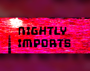
Nightly Imports
Concept: “A Cy_Borg zine featuring: D12 Cybertech from Nueuropa [...] D6 Legends of Cy [... and] Street Cred - A New Mechanic.”
Content: Options for gear, NPCs, and a ‘street cred’ reputation tracker that can add extra dimensions to a game.
Writing: Four pages of enticing tables filled with flavorful descriptions and mechanics that reflect strange, horrifying, and completely appropriate events and circumstances.
Art/Design: Four two-page spreads each have a distinct focus and color scheme that extends from one to the next, from a stark red/black/white to a neon purple/blue.
Usability: Language is direct and straightforward in describing and explaining each subject, with each table making use of a consistent visual grammar to help with navigation. However, text is not embedded, so no searching or copying/pasting is possible.
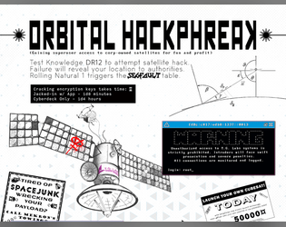
Orbital HackPhreak
Concept: “Gaining superuser access to corp-owned satellites for fun and profit.”
Content: A set of rules and tables relating to hacking into satellites or similar orbital systems.
Writing: Straightforward rules doused in cyberpunk flavor/effect to make each hacking attempt a memorable one.
Art/Design: Content provided in both .png (with a two-column, black-on-white, one-page portrait scheme) and .txt (single-column text with some ASCII art/embellishment) formats.
Usability: Distinct rules sections are visually distinguished in each format type, and ASCII art in .txt version provides an aesthetically similar experience to viewing .png version.
PC Community Generator
Concept: “This is a tool to build a community for the player characters in a CY_BORG game.”
Content: A set of tables to be rolled and discussed during an initial party’s character creation session to flesh out a community for the PCs to be involved with in some way.
Writing: Succinct, varied options in several tables that breathe life or inspiration into community possibilities.
Art/Design: White text on a purple gradient background, organized in one- and two-column layouts.
Usability: PDF and plain-text versions are both easily readable and navigable.
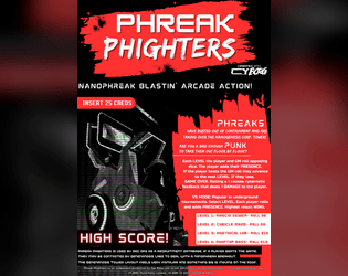
Phreak Phighters
Concept: “PHREAKS have busted out of containment and taken over the Nanogenesis Corporation Tower. Are you a bad enough PUNK to take them out floor by floor?”
Content: A set of rules for an opposed-dice-based arcade game that may or may not serve a more insidious purpose.
Writing: Rules are very concisely explained, while similarly brief description of the game and its creators’ ulterior motive offer potently nostalgic inspiration to those who enjoy(ed) 1980s’ video game tropes.
Art/Design: White text on black and splashes of red with a dither-art illustration to complement the game “pitch” and explanation.
Usability: The primary file is a PNG, but a simple, accessible PDF of the text is provided as well, with clearly labeled headings and whitespace groupings of related content.
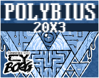
Polybius 20X3
Concept: “<RE: THIS GAME KILLS > Whispers about a killer new game have flooded the BBS message boards. An acquaintance said they knew someone who played it and ended up in a body bag. Is it another ACGS marketing stunt, or is there something else going on in vid-cades around Cy?”
Content: A mysterious arcade game, its rules, prizes, and a technician NPC.
Writing: Emphasis on rules/mechanics complemented by terse, flavorful names/labels.
Art/Design: Black and white text on a blue patterned background in a mostly single column layout accompanied by several monochromatic and full-color illustrations.
Usability: Large font size, distinct use of black and white for particular kinds of content, and border markers for distinct sections of content all contribute to ease of browsing and engaging the material. However, text is not selectable/searchable.
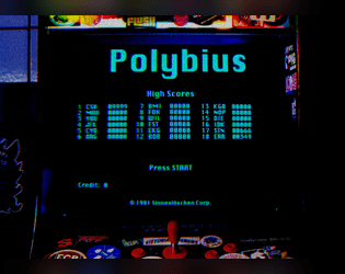
Polybius Arcadia
Concept: “Inspiration for this project was taken from the urban legend of Polybius, an arcade game that might have or might have not appeared in 1981 Portland, OR as top secret, governmental, conspiring, crowdsourced, psychological, mind control experiment. The game was highly addictive, with unpleasant side effects. All game cabinets disappeared without a trace. Polybius was the greatest game that never existed!”
Content: Two supplements: (1) rules for a poker-like arcade game and (2) a job to extract data from an arcade machine.
Writing: Crisp descriptions and directions that sketch the mission parameters & events (along with rumors about Polybius) and the rules for playing the Polybius game.
Art/Design: The Polybius rules are provided in a CRT terminal-like font/aesthetic with a graphic of an arcade game cabinet. The heist details are provided in a clean black-on-white three-column layout with a second page containing a map of the arcade location.
Usability: Each supplement’s layout is easily recognizable and navigable, with visually distinguishable types and sections of content. The arcade heist text content is embedded, allowing for searching/selecting, but the Polybius text content is not.

Project Puppeteer
Concept: “A Corporate espionage assignment…
Extreme security measures…
Mind reading AI…
Quantom Computer Hacks…
Megalomaniacal computer scientists…
‘Don't threaten me with a good time!’”
Extreme security measures…
Mind reading AI…
Quantom Computer Hacks…
Megalomaniacal computer scientists…
‘Don't threaten me with a good time!’”
Content: A “hacker heist” in which a group of punks is tasked with stealing a powerful AI from its laboratory home.
Writing: Lots of descriptive detail about important events, encounters, NPCs, and more, along with some rules relating to hacking the AI in question.
Art/Design: Green on black color scheme and single-column text layout, with a variety of images from illustrations to photos to a map and a circuit board “hacking” map/layout.
Usability: Text contrast allows for visual readability that is complemented by consistent presentation of distinct types of content (headings, list numbering, etc.) to provide a recognizable visual grammar. Some typos throughout may affect browsing/searching.

Punk Borg
Concept: "The CITY. The postcards and magazines make it out to be a perfect metropolis - sun, sea, sand, and a vibrant and buzzing city centre. Of course, that's how the Overlords want you to see it; it's the image they feed to the Sleepers. They fail to mention their enforcers are all boar-like beasts, and the fact that giant space rock buried under the City is making us all sick. Time to wake those Sleepers up and show 'em just how ugly their bosses really are. We're gonna crumble the Overlords' regime to dust, whatever it takes."
Content: A hack of Cy_Borg that provides a less cyberpunk and more "present day" dystopia to explore and rebel against, with classes, enemies, vehicles, a mission generator, an entirely new city to inhabit, and more.
Writing: Laser-focused atmospheric description and rules/mechanics that work together to contruct a game of antiauthoritarian punk resistance.
Art/design: Black-and-white pages/spreads that, while distinct, provide a consistent visual grammar of information throughout. Lots of hand-drawn illustrations of classes, NPCs, and environments to complement the text.
Usability: High-contrast text and layouts with visually identifiable section blocks, headings, labels, etc. and a helpful index all work to facilitate browsing, navigating, and locating desired information.

PUNK FEATS [Unheroic Feats for CY_BORG]
Concept: “MÖRK_BORG's Unheroic Feats for CY_BORG.
Some Feats have been replaced completely and some have been hacked too much to be analogous, these are marked with a ■.”
Some Feats have been replaced completely and some have been hacked too much to be analogous, these are marked with a ■.”
Content: A set of d66 optional improvements to obtain, each of which provides a different mechanical and situational benefit. A text-only version is also included.
Writing: A brief atmospheric blurb is provided to situate the gameplay bonuses and effects of each included feat/improvement.
Art/Design: Two-column white-on-dark layout, with new/different feats from the original Unheroic Feats list marked for ease of reference. A colorful border, looking like the edges of a smashed computer screen (with a skeletal fist and guns at the bottom). Text-only version provides white text on a simple black background.
Usability: Font choices are high contrast and easily readable, with consistent layout and presentation of all elements–italicized descriptions, bolded and italicized numbered entry names, and horizontal rules to separate distinct entries.

PUNX
Concept: “A pocket-sized system for punkery in CY. Cut to the absolute bone, and with the marrow removed and sold to the reaperdocs. No relation to works by Keith Giffen.”
Content: A stripped-down take on Cy_Borg that can fit on both sides of an index card. Provided in color and black-and-white versions.
Writing: Concisely described rules focus on stats, tricks, enemies, and dice rolls to resolve task attempts.
Art/Design: Three columns of text with different sections of content have distinct indentations/formatting, while emphasized text is consistently bolded throughout. Color version makes some use of fore/ground color-swapping as well (yellow on black rather than black on yellow). A three-axis graph is provided to assist with trick generation.
Usability: Text is high contrast, and each section of text is relatively easy to visually discern from the others. Changes in text size and indentation may slow down reading and navigation for some.

PVNX/R/VS
Concept: “A cavalcade of the bizarre and horrid in the wretched metropolis of CY. Within you'll find pirate lords, eldritch entities of the deep NET, kill-games champions, floating fortresses with maniac overseers, dangerous prototype cyberdecks, collectivist agitators, and worse still than that in this cross-section of the endless end of days in the city of CY.”
Content: A smorgasbord of assorted content, from enemies/acquaintances–physical and digital alike–to cyberdecks to locations to to overheard quotes to a new class (“The Last Ideologue”).
Writing: Terse mechanical explanations are consistently complemented by vivid in-universe descriptions that can aid both GMs and players in imagining and making use of the subject at hand.
Art/Design: Single-column black-on-white text throughout, with some differing font choices for headings/labels of distinct sections.
Usability: High-contrast text, visually readable fonts (with one purposeful exception), and a recognizable organization for layout makes for successful perusal and use of the document.
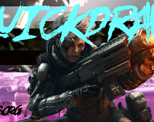
Quickdraw Combat
Concept: “A more you-go-they-go style to keep combat chancy and mobile in CY_BORG. Dare to try and clear the field before anyone can pull a gun, or would you rather hunker down until your heavy weapons are spun up and ready to open fire?“
Content: A set of rules to attempt faster and potentially deadlier combat than in the Cy_Borg rulebook.
Writing: Mechanics are provided in a straightforward and helpful manner, which may reduce likelihood of confusion or disagreement at a table.
Art/Design: Two versions are provided: a full-color version and a “plain text” version. Full-color version has yellow text on black background (with other neon colors for emphasized terms/rules) overlaid on an image of a samurai in a cyberpunk setting. Plain text version is black-on-white with bolded text to emphasize headings and important terms. Both versions use a two-column landscape-oriented arrangement of text.
Usability: Both versions provide high-contrast text, although different font choices as well as different colors and visual elements may result in varying reading experiences.
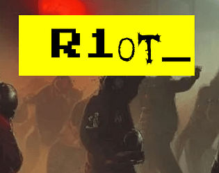
R1ot
Concept: “‘Like carousing but for you miserable pvnks. Riots are always a gamble, and with bad odds on your side, because private SecCorp security usually bring it on with better gear than a bunch of pvnks do. So why keep going to them? Because sometimes you need a reflective bulletproof glass visor to smash your fist through, that’s why. RAGE burns away concepts like “outnumbered” or “discretion”.’ Random table for just how wrecked or lucky you got at a riot in CY, plus a fast-roll table for simpler results.”
Content: A d66 table of results from participating in a riot in CY, with a “quick table” option for an even more focused generation of events.
Writing: Immersive descriptions/events feel simultaneously absurd and completely plausible, intersecting with an axis of hilarious to horrific.
Art/Design: Single column of black text on yellow, with additional content blocks in bordered boxes and important terms highlighted in yellow text on a black background. An illustration of gas-masked rioters serves as the background for the title on page 1.
Usability: Extremely easy to read, navigate, recognize, and understand information throughout the supplement.

RCD Graffiti
Concept: “Part of the Street Death series and inspired by Jetset Radio, graffiti culture and skateboard competitions, RCD Graffiti is a Cy_Borg supplement that adds 7 pieces of street art that give various buffs to your character.
Everything from bonus melee damage when spraying and scanning a satanic emblem to casting Nano easier when painting a radioactive symbol to just general graffiti that angers the corporations!“
Everything from bonus melee damage when spraying and scanning a satanic emblem to casting Nano easier when painting a radioactive symbol to just general graffiti that angers the corporations!“
Content: A set of graffiti tags to spray along with optional rules that allow for spraying those tags to create temporary (24-hour) buffs.
Writing: Conversationally informative and intensely flavorful explanations of graffiti in CY and how these particular tags function.
Art/Design: Black on green single-column layout with full-color pixel art graffiti tags above their buffing effects. Each tag is also provided with its own heading/label in a distinct font reflective of its general aesthetic.
Usability: Fonts are readable and organization is simple and consistently applied, leading to a simple set of rules to easily incorporate into a game of Cy_Borg.
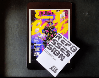
Repossession
Concept: “Your biology is no longer compatible with the industrialised planet around you; the toxins you’re exposed to daily burn your flesh and poison your organs. Lungs struggle to draw breath, your heart stutters like a dying fly, your blood corrodes your kidneys. The deadly atmosphere of Cy slowly eats away at your inferior meat. Fortunately for your withering body, GeneMed has long since perfected its procedures to install cybernetic biomechanical prosthetics. Thanks to GeneMed ’s groundbreaking biotech research, you can replace those useless chunks of meat. And thanks to GeneMed ’s astronomical finance rates, you’ll be paying off the debt for the rest of your life. For those who can afford the highly discriminatory price points, GeneMed also offers luxury, deisgner prostheses; ostentatious and opulent pieces of cybernetic technology, flaunted by the ultra rich like the latest fashion.”
Content: Rules for body modification debts for GeneMed parts, reaperdocs and unlicensed prostheses, and repo agent NPCs who might come knocking to reclaim their employer’s property.
Writing: Stark, ominous descriptive text and rules explanations that underscore the significance of dealing with GeneMed and its licensed agents.
Art/Design: Simple black-on-white single page layouts with strategic font choices and a corporate software landing page-style UI complete with logo/branding.
Usability: Cleanness of layout makes for easy perusal, especially when combined with bolded key terms and labels to call attention to important details a reader might be scanning for.
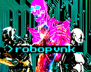
ROBOPVNK
Concept: “Rage is contagious, spreading to everything touched by the never-ending torrent of banal, mundane cruelties that make up life in CY. It starts in beating hearts but it's a cinch to get from there into the thinking machines that are all but one with humanity in this bleak future. These are rules and classes for playing robopvnks, machines broken free of their digital shackles and on the move towards riches, vengeance, or just plain devastation.”
Content: General rules and a set of classes (Flesh-Free Fleshpot, AWOL Kill Unit, Cyber-Corpo Calculator) for the player who prefers experiencing the existential crisis of an automaton.
Writing: Plenty of mechanics and supportive clarification/explanation to guide players who might seek creative ways to explore playing as a robopunk.
Art/Design: Primarily single-column black text on white with colored headings and a brightly colored illustration of various robots over a circuit board background on the first page.
Usability: Clearly and consistently formatted lists and paragraphs enable navigation and perusal of desired information, with bold text emphasizing important details.

Rule 00.2
Concept: “YOU CAN WORK FOR COPS, CORPORATIONS, THE GOVERNMENT, THE MILITARY, AND ANYONE IN POWER. However, they will Fuck you, Betray you, And probably kill you.”
Content: A set of compensation-related rules for the players/GMs who have decided that their cyberpunk game would work best if they served, rather than fought against, corporations and similar systems of power.
Writing: Speaking truth to power through a table of “rewards” that come from working as a stooge.
Art/Design: Yellow and red on black in a single-column organization, with an ASCII image on page 2.
Usability: Immediately visually evident organization of distinct sections of content, with font faces, sizes, and colors indicating body text vs. labels vs. headings. Helpful reminders throughout point to the goals of and reasons for this particular set of rules.
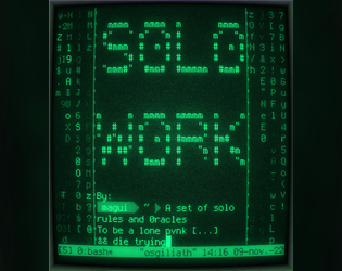
S0L0_W0RK
Concept: “S0L0_W0RK is a ruleset to play CY_BORG by yourself. You’ll both play as the GM and as the player.”
Content: A set of rules for solo play inspired by Solitary Defilement.
Writing: An engaging and incredibly helpful explanation of the solo rules and how to make use of them, including a detailed “actual play” demonstration/write-up.
Art/Design: A “dark theme” software terminal or code editor UI with distinct colors and background highlighting to call attention to different kinds of content. A printer-friendly version provides somewhat less obvious help in this regard, but font choices and shading still help distinguish content types/purposes.
Usability: Readable text throughout, with colors helping to call attention to particular kinds of important details.

SIS/TR: Hang the DJ
Concept: “SIS/TR [Starborn Invasion System / Turret Regenerator] is a mini boss that you can drop into any Cy_Borg setting and cause nearly limitless havoc.
Half Operating Manual / Half Setting
The first half of the book has Cy_Borg stats for SIS/TR's main body (the big black cube) and its five turrets (smaller cubes). If you want to adapt SIS/TR to your own campaign or setting, you can have it mangling people in minutes.
The Setting - HANG THE DJ
Famous DJ Ronnie Fissure's live-in sound studio / office has been invaded by SIS/TR for reasons unknown to the half-dead staff. Service droids dance--sparking and smoking--by themselves. On top of its many attacks, SIS/TR has turned itself into a towering mixtape of terror, deploying deafening LRADs, streams of molten vinyl records, and bowel-emptying bass.”
Content: A combination of a malevolent technological enemy, with a variety of detailed stats, tactics, and scenarios; a more extensive mission to save a DJ from the techno-threat; and two “subclasses,” the “Emancipated Companion” and the “Haunted Assassin,” both of which have ties, atmospherically and mechanically, to the SIS/TR entity.
Writing: Helpfully informative explanations throughout to ease initial use of the SIS/TR mechanics conceptually and in practice (via the “Hang the DJ” scenario).
Art/Design: Primarily black on white/light multicolored backgrounds in single- and double-column content layouts. Illustrations of NPCs, locations/maps, equipment, and SIS/TR components complement the text on numerous pages.
Usability: Text is easily readable and navigable throughout, with high-contrast and embedded text and font choices that facilitate visual and screen reading experiences. SIS/TR mechanics (based on d6 dice results/faces) involve some detail for initial employment but should become easy to pick up quickly.
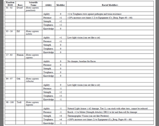
Sixth World Race Templates for Cy_Borg
Concept: “This document is meant to add Sixth World racial (Dwarf, Elf, Ork and Troll) Abilities and Racial Modifiers to either Character Classes or NPCs. It is assumed that the Class or NPC having the template applied is Human. Players and Gamemasters (GMs) may need to fine-tune the Abilities and Racial Modifiers if the Class or NPC isn’t human.”
Content: A two-page set of rules for incorporating fantasy race/background elements and stat modifiers into character creation.
Writing: Straightforward and concise setup and explanation of rules for easy implementation into games.
Art/Design: Black text on white background, laid out in landscape form across two pages, with the second consisting of a table that presents all relevant fantasy background/stat options.
Usability: Incredibly easy to locate and make use of desired information.
Loading next page...