PWYW
Pay What You Want
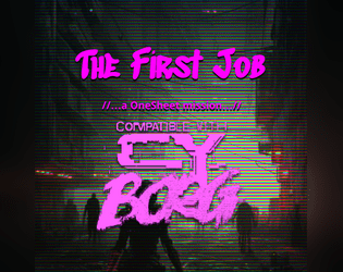
The First Job
Concept: “A message from an old friend promises a decent amount of creds, maybe enough to pay off what you owe, or at least get you started. Looks like you are heading into the massive underwater commerce district of Undersjön. Under the pressure of the waters, and just under pressure because of the deadline, can you complete your task and earn your payday?”
Content: A heist scenario with a twist: the punks have to find what they’re looking for before they can begin to think about leaving with it. Two versions provided: a full neon-color version and a printer-friendly black-and-white version.
Writing: Engaging details bring to life the location and the punks’ contact, both of which could serve a table long after this specific adventure. Random encounters and an off-duty cop name generator add personality.
Art/Design: Two major columns of content across two pages, with the full color version using different section background and heading/label colors to help distinguish different kinds of content, while the black-and-white version makes use of section borders and heading/label bolding. An isometric map of the adventure location is provided.
Usability: Text throughout is readable with high contrast against background and is easily identifiable as a component of a particular content section (e.g., random encounters, NPC info, etc.).

The Frozen
Concept: “That cold lump in your throat…
That shiver down your spine…
That sinking feeling in the dead of night…
The Frozen is pure fear made manifest; a coagulation of psychic dread from the collective consciousness of every living thing. It is a pitiless creature that delights in tormenting mortals. While it is capable of tearing flesh and breaking bone with ease, it prefers to sow terror, weakening the mind of its victims to the breaking point before offering them a choice: Death or Service.”
Content: An enemy provided with stats/contextualization for multiple game systems, including Cy_Borg as a psychotic AI. (Non-Cy_Borg elements not reviewed here.)
Writing: Descriptive text frames the Frozen effectively within the context of CY and mechanical effects reflect its potent capabilities.
Art/Design: White text in one- and two-column arrangements over a dark background that mixes a rainy cityscape and flat black.
Usability: Distinct sections of content are visually identifiable, with clear headings and labels to indicate what each element’s purpose is and how it relates to those around it.
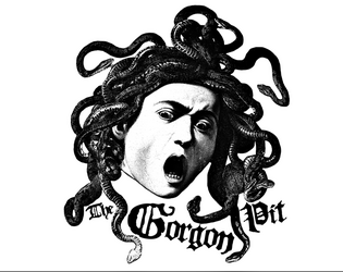
The Gorgon Pit
Concept: “Something slithers in the forgotten sewers beneath the city. A strange creature that turns people to stone. A corporation that would control it. Cultists that worship it like a god. A gang hell-bent on revenge. All will drown in the filth of…The Gorgon Pit”
Content: A job to investigate a sewer-dwelling monster, themed around ancient Greek myth.
Writing: Lots of descriptive detail surrounding numerous aspects of the gig, from potential employers and their motives to unfolding events whenever a particular area of the sewer is traversed.
Art/Design: Single- and double-column black-on-white content layouts with an aesthetic that closely resembles much of the Mörk Borg design style, from font types to neoclassical lithographs. A full map of the job location is provided, and map segments (for different areas) are included on the page for their relevant area.
Usability: Font choices are visually readable and reflect distinct kinds of content (headings, labels, etc.). However, text is not embedded, so searching/selecting is not possible.
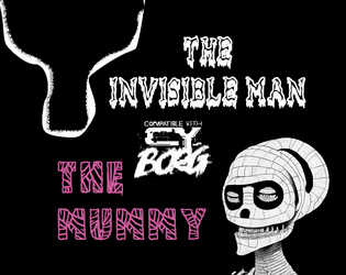
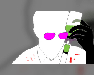
The Invisible Man + The Mummy | Enemies for CY_BORG
Concept: “Two new enemies for CY_BORG. Face against The Invisible Man and The Mummy, walking among the citizens of CY. Learn their motives and die by their hands. Over and over and over again. Be scared. Be very, very scared.”
Content: A pair of monsters that marry classic horror with the Cy_Borg hellscape experience.
Writing: Haunting and sympathetic descriptions of and tables & stats for the afflicted creatures.
Art/Design: Stark colors in a side-by-side spread, with an image of each enemy surrounded by its relevant text.
Usability: Text contrasts well with background colors and assorted types of content are easily distinguishable from others.

The Lair of Eucalyptus
Concept: “In this adventure, you will face close encounters with the rulers of CY_. Assault their ghostly dwellings but, behold! The Hills abound in living Urban Legends. These sophisticated terrors are inspired by the ancient Colombian tradition. <>”
Content: A heist to retrieve untold riches from a well-secured mansion.
Writing: Unbelievable amounts of detail regarding the job parameters, NPCs, random encounters, locations, and dialogue with multiple outcomes.
Art/Design: Mostly single-column text layout over a background pattern made from a simple color-coded map of the region.
Usability: Text is high-contrast and in a readable font, with consistent presentation throughout of headings and labels. Map is provided at multiple points in the document, which reduces the need to flip through entire file to make use of it.
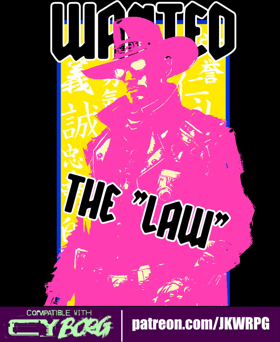
The Law
Concept: “Street samurais, rejoice! Grab your gun and sword, dust off your copy of the Hagakure (or your favorite philosophy book of choice), and start cleaning up the mean streets of CY!”
Content: A class for the chrome cowpoke whose grit is cybernetically augmented. (Note: despite the name, this does not appear to be a character class that would break Rule #00.)
Writing: Each line exudes character and flavor to highlight classic cyberpunk themes.
Art/Design: Three-column overall layout of white-on-black with a bright pink illustration of a “law” character in the middle flanked by character mechanics on the left and a Bushido personal code to follow on the right.
Usability: Text is high-contrast and in a readable font that makes use of bolded text for labels and emphasized phrase elements.
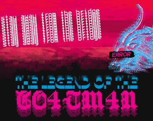
The Legend of the Goatman
Concept: “Deep in the Net, a daemon inhabits a bridge. A deal is a deal. The Goatman is an ancient AI of unknown origin - an entity designed solely to make deals. The purpose of the Goatman's deals are ultimately unknown, lost to time or purposeful obfuscation.”
Content: A scenario/set of rules for a deal-making daemon.
Writing: A mix of straightforward rules/mechanics explanations and an in-universe vignette framed as file contents about an unsuspecting punk’s encounters with the Goatman.
Art/Design: Two pages of three major columns/panels (potential trifold configuration). White, red, and green text on black, accompanied by two glitch-art illustrations of daemons.
Usability: Text is easy to read and navigate, with distinct visual markers for different kinds and sections of content (font choices, colors, sizes, etc.). Font selections also immediately make apparent which text describes the scenario and which serve as the vignette.
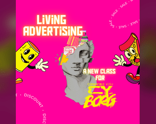
The Living Advertising
Concept: “Offer your existence to the promotion of advertisements? Why not! Perhaps your parents designed you for this very purpose, or perhaps you have always wanted to have this life. You are a living advertising. An agreement was made between you and some enterprises so that, day after day, you would share aggressive, disturbing but lucrative advertisements in your daily life. But in the end... It's all about the money. $$$$”
Content: A class for the flashy consumer who’s all about showing off their sponsorship allegiances, whether they want to or not.
Writing: Vivid descriptions of class features complemented by focused, direct mechanics.
Art/Design: Two page tri-fold layout whose visual style is appropriately busy visually, with a plethora of cartoony mascots and icons amid tables and brief paragraphs of class details.
Usability: Despite busy pages, text content is marked with distinctive labels and table roll result numbers for quick identification of desired info.
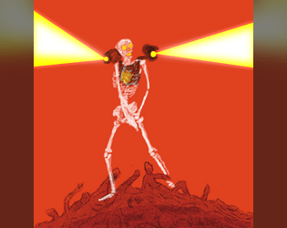
The Reused
Concept: “Towering skeletons of cobbled together bones, each the fused together remains of shattered dreams. When the Undead and Corrupted die, their parts are swept together and taken to the infernal furnaces. Molten remains poured into vats of malice. What emerges is a foe with a mastery over explosive technology and explosive language. Adapting C.A.U tech that got the living into this mess in the first place, it flits around in flights of frenzy.”
Content: Undead creature + rocket-powered explosions = exciting fun for everyone.
Writing: Hilariously morbid descriptions and NPC features provide a ton of personality to the monster.
Art/Design: Blistering red background intensifies white text and the central image of a reused creature firing its shoulder-mounted rockets.
Usability: Small white text on red might pose trouble for some, but it’s easy to recognize different kinds of content and how each contributes to an understanding of the creature and its mechanics.

The Ruiguztretzis
Concept: "THE RUIGUZTRETZIS ARE IN YOUR NEIGHBOURHOOD
A new family has arrived to buy all the ruined houses, evict the elderly and sell muffins. Rent is up. Criminals are in the run. Food is gone. Walls are stupidly blank. Everything is getting sanitised and sold to someone cleaner than you. THEY PREY ON YOU AND YOUR PEOPLE. Also, she has four arms and he's got a shoulder retro機関銃. You better shoot first."
Content: A pair of enemies--members of the Ruiguztretzi family--in the CY class war.
Writing: Extremely terse details complement stats provided for each of the enemies.
Art/design: Two pages of collage art that focus on a semi-surrealistic presentation of the fully demonic nature of the Ruiguztretzis. Text content is also part of the collage, having been cut and pasted onto each page/image.
Usability: Because the text is all part of the art, it's not really searchable/selectable. However, visually it's easy to identify each text block and recognize how it functions in relation to the NPC stat collection of which it is a part.
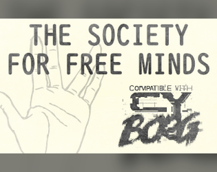
The Society for Free Minds
Concept: “DO YOU WISH TO SEE THE UNKNOWN? A dash of conspiratorial thinking for your next CY_BORG game. Contains a table of weird things to find on the NET, two UFO themed enemies, equipment, and a bunch of references to sci-fi and horror.”
Content: A zine featuring governmental and alien menaces, a table of interesting net discoveries, and several items.
Writing: A balanced mix of unsettling horror and tongue-in-cheek humor presented as a mostly in-universe document.
Art/Design: Dark gray on light yellow/tan scheme (reflecting printed homemade zine aesthetic) with one- and two-column layouts of text, accompanied by cartoon and silhouette illustrations of enemies, items, and more.
Usability: High fore/ground contrast and font choices make for easy reading, with larger headings and handwritten marginal notes consistently applied throughout.
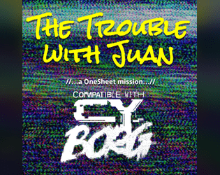
The Trouble with Juan
Concept: “Initially just looking for some snacks and road beers at Juan's Bodega, your Punks clock a group of Red Suns looking to rob the place, but more worrying, Juan is missing. And Juan's never closes. Where is he? Can your Punks find out?”
Content: An adventure scenario that seems like a basic bodega battle but can unfold into a more insidious encounter.
Writing: Tons of informative and descriptive sensory details packed into two pages that cover scenario locations, enemy NPCs, interested factions, random events, and more.
Art/Design: Provided in both an eye-searing neon full-color version and a stripped-down black-and-white printer-friendly version, text info occurs in a central section of the page and in clearly marked marginal boxes. Important terms and tests are highlighted with a different color (in the full color version) or in bold (in the printer-friendly version). A simple map of the bodega is provided on page 2.
Usability: Both versions offer a variety of visual cues–font choices, borders, bolding & different colored text–that make it easy to locate, identify, and navigate particular kinds of content.
The Unlicensed Ripper
Concept: “Someone has to patch the lowlifes up. It’s a good thing no one asks where you learned your trade.”
Content: A class for the inquisitive tinkerer who loves getting elbow-deep in their work.
Writing: Intriguing class mechanics are augmented with medical-grade descriptive flavor.
Art/Design: Single-column layout allows for easily understandable navigation/reading scheme, and a minimalist illustration of an unlicensed ripper punctuates the document.
Usability: Distinct and consistent color scheme that highlights the medical/clinical nature of the class, but green text on blue background can be difficult for some to read, especially in combination with font size for body text.
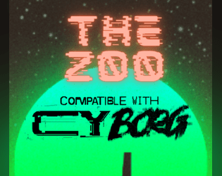
The Zoo
Concept: “In the post-war world, luxury is often those things that cannot be bought… You need a job, you need the ¤ and you don't care how you get it. So when a slick fixer named Mr Gato gives you a job, you take it. Break into a private zoo, grab a cat and get out. Easy job and good money. Sounds simple, right? But ain't nothing simple in Cy_city.”
Content: A repo heist in a location full of dangerous animals and that requires a bit of precision. Content warning from author: “Cy_bernetic animals will try to kill you, you will need to defend yourself or end up flat-lined. Also Swearing.”
Writing: Brief but informative stat blocks for enemies and descriptions of locations, with helpful tables offering in-character explanations for diseases, souvenirs, and the sudden appearance of a replacement PC.
Art/Design: Two pages of content; on the first is mostly text with a silhouette of an anonymous client. On the second, an abstract map of the zoo is surrounded by room details and a pair of stylized illustrations of a turtle and a gorilla’s head.
Usability: Text is mostly easy to read, with orange-on-black scheme providing solid contrast. Room numbers on map might be easily overlooked–numbering scheme goes left->right, top->down.

Thirty One Dark Nights
Concept: “Each year, during October, Exeunt Press hosts Mörktober. A 31 day event that encourages creators to make something each day for MÖRK BORG or other BORG games, in this case Cy_Borg, based on a prompt list and then share it with the community. More about Mörktober.
Thirty One Dark Nights is a compilation of the 31 Cy_Borg compatible creations I made for the 2024's Mörktober event.”
Thirty One Dark Nights is a compilation of the 31 Cy_Borg compatible creations I made for the 2024's Mörktober event.”
Content: A collection of enemies/threats, equipment, locations, drugs, viruses, surgical options, and more with which to make a game of Cy_Borg vividly fucked up in fantastic ways. (Note: individual entries are PWYW, with a paid option for a fully compiled set of the entries.)
Writing: Mörktober’s purposefully morbid and eerie atmosphere is mixed with pitch-black humor, while unique abilities/rules/effects situate each concept for game rulings.
Art/Design: White/gray on black with a different accent color (and heading typeface) and accompanying illustration for each entry/page.
Usability: Consistent body text and label emphasis/decoration allows for navigation to and recognition of desired info elements, while distinctions in entry accent colors and headings orient the reader to the essence of that entry.
Thy Flesh, Transformed
Concept: “On an expedition into the subways of G0, beneath an ancient foundry, the punks are infected with the IRON VIRUS a nanovirus that turns flesh to metal, hair to wire and nails to scalpels. The subway screens flicker to life. The metal tyrant Wodan announces the countdown of sacrifices to priming the Iron Egg. If not stopped, it will destroy everything in a Nearby District. STOP THEM”
Content: A body horror-centric race against the clock to stop a virus-wielding tyrant.
Writing: A disgustingly fascinating adventure, complete with a set of viral nano-infections to make one’s skin crawl (perhaps literally).
Art/Design: Two-page spreads of the scenario setup (and impressively vivid depiction of the virus in action), GM notes, infection list, adventure locations and creatures, and a map.
Usability: Easy to navigate and text (primarily white on black) is readable–the opposite end of the “unsettling” spectrum of document’s content.
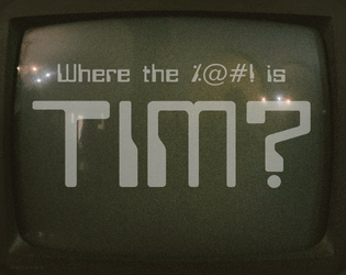
Tim Is of the Essence
Concept: “Run. Shoot. Steal. Lie. It doesn't matter what you do, just find Tim! He's the key to something bigger than all of us. The corpos want him quieted. He's gotta be in the Negapike. I know, I know. The hell hole in between Cy and the NegaCity. Don't worry, you'll be fine, I left you the keys to the B34S7. Fire it up. Be quick about it, you only have 2 hours.”
Content: A mission to extract your pal Tim from an armored carrier somewhere on the tangled roadways of the Negapike.
Writing: A simple premise with inspired contours and complications to make the rescue attempt all the trickier. Tables provide variety in mission background and random events.
Art/Design: Mix of layouts reflects different general purposes: target vehicle, job specifics, Negapike details, tables. Mostly light-on-dark color schemes, with blueprints of armored carrier and Negapike aerial view serving as primary graphic elements. With tables rendered as UNIX man pages on a CRT display.
Usability: Organization facilitates understanding the relationship of different pages’ content. Most text is visually readable (font choice, text size, contrast) and searchable/selectable, although the latter is not so for text on pages with a CRT display aesthetic.
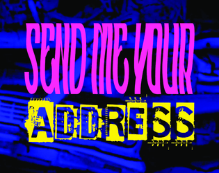
TIM, SEND ME YOUR ADDRESS
Concept: “If your name is Tim and you bought the physical version of A$$HOLE$ & ELBOWS in the last couple of weeks, SEND ME YOUR ADDRESS! You didn't fill out the form you were prompted to on itch. You haven't responded to my emails. I don't want a bad review or rating because I didn't send your pamphlet, but I literally can't. I don't have your address! Get in touch. Unless you were legit just trying to be nice and don't want the physical reward you paid for. But the uncertainty is KILLING ME! Thanks, hugs and kisses, Rugose Kohn”
Content: Includes NPC enemies, cultist and high priest for “The Cult of Tim,” whose practices revolve around the enigma that is Tim.
Writing: Tongue so far in cheek for this material that the two have fused together into a new Cronenberg-esque anatomy.
Art/Design: Black single-column text presented on the left page of a two-page spread with a tan background, with illustrations of NPC shadows combating one another across the spread.
Usability: Text contrast and font choices are very readable, with headings and labels visually distinct from main body text. The question of Tim’s existence/identity remains unanswered, however.

Train Through the Pain
Concept: “A self-improvement cult headed by a mad NET influencer has kidnapped a brilliant biochemist. Independent entrepreneurs all over CY are scrambling to break him out and use his talents in their shady business ventures.”
Content: A job to “liberate” a scientist from one sketchy situation so they can serve a different one.
Writing: Terse, conversational descriptions of important NPCs and location details are complemented by even briefer relevant stats/mechanics.
Art/Design: Black-and-white text and images presented in both a pamphlet format and as standard portrait-oriented pages. A map of the target location and illustrations of some NPCs accompany the text (along with a cover image of a hairy or veiny individual being assaulted from all sides). A player-facing map is also included.
Usability: High-contrast text and consistent use of specific fonts/embellishment for headings, body text, emphasized info, etc. helps with easy visual navigation and identification of desired details. Room descriptions in each relevant map room similarly allow for quick reference/atmosphere notes.
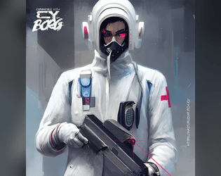
Trauma Team Specialist
Concept: “Become a trauma team member today.”
Content: A class for the broke med student who wants to chase endorphins via battlefield surgery.
Writing: Brief descriptions and explanations of class features/mechanics that feel appropriately “clinical” and at home in CY.
Art/Design: Two-page spread, with a left-side column of text (reddish pink on white) and a right-side digital illustration of a gun-toting medical specialist.
Usability: Class details are easy to read and navigate, with distinct headings that indicate the scope of each section.

Triune
Concept: "TRIUNE dominates screens, frequencies and can be found in every corner of the NET.
Their music is everywhere, their brand is inescapable, and their message is carefully crafted to keep you coming back for more, addicted, and consumed by desire.
MindE. Bodi. Spyrr. The perfect pop-idol machine, multiplied threefold. Identical triplets, the epitome of stardom: impossible bodies, voices tuned to unfathomable harmonies. They don’t just make music—they code emotions."
MindE. Bodi. Spyrr. The perfect pop-idol machine, multiplied threefold. Identical triplets, the epitome of stardom: impossible bodies, voices tuned to unfathomable harmonies. They don’t just make music—they code emotions."
Content: A three-in-one enemy with which to personify the essence of CY and also to make punks' lives miserable through the NPCs' popularity.
Writing: Disturbingly on-point mechanics for the NPCs, wrapped in equally (and appropriately) dystopian description of Triune and their reach/impact.
Art/design: Several spreads of slick marketing-aesthetic presentation (a mix of light-on-dark and synthwave neon color schemes) that uses a mix of illustration and glitchy accents to sell the in-universe nature of the document.
Usability: High-contrast text and recognizable distinctions between types and sections of content--along with concise and direct explanations of ruling-related abilities--allow for easy navigation, location, and use of desired info.
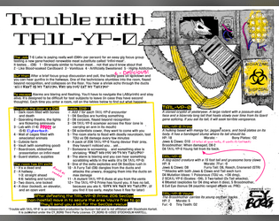
Trouble with TA1L-YP-0
Concept: “It's a real easy gig... Just taste test T-G Labs new Infini-meat and participate in a quick focus group! You'll soon be on your way with a fistful of kreds. Where's the meat come from you ask? I'm afraid we can't share that proprietary information.”
Content: A mission to survive a marketing research meeting.
Writing: Brief bursts of flavor and mechanics (including an intriguing set of maze/escape tables) directed to both GM and player.
Art/Design: Landscape-oriented black-on-white spread (with yellow, pink, and blue highlights) includes a hand-drawn illustration of a cryptid in the top right corner, and two main columns of text content (the left of which has two columns of tables within it).
Usability: Consistent presentation of content, with visually identifiable headings, labels, and marginal notes. Layout makes referring to specific info easy, especially stats for NPCs appearing in maze room encounters.
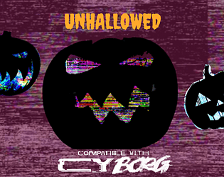
Unhallowed
Concept: “An eerie chill sweeps the streets of CY, and the shadows between the neon lights seem ever darker this time of year. Within creep seven frightful ghouls to haunt the sewers, stalking any pvnk so foolish as to roam the dreadful night.“
Content: A collection of high-tech terrors, from the data spectre to the flesh debtor, with which to haunt a table of punks as they try to survive life in Cy.
Writing: A colorful set of descriptions and mechanical abilities that paint vivid possibilities for each NPC’s uses in a game.
Art/Design: Two versions available: one black-on-white printer-friendly version and one orange-on-maroon version with occasional illustrations to complement the ambience of the writing. Both use single-column text layout.
Usability: Consistent page organization, font usage, and presentation of NPC mechanics to make reading and navigating through the document easy and helpful.
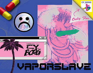
Vaporslave
Concept: “You are constantly jacked into your Vapestim-Pack, emitting vapor clouds. You have to stay sedated! Drugs for everyone! Down with the luxury elite!”
Content: A class for the languid lotus-eater and sedate spice fiend who wants, or needs, to constantly moderate their mood–and who wants everyone else to, too.
Writing: Class detail descriptions and mechanics explanations support one another well to present a cohesive concept through the document.
Art/Design: Two-page pink-heavy spread layout highlights a vaporslave illustration, a rendering of capsules, and an early GUI in addition to distinct sections of text framed as a cassette track list.
Usability: Class details are organized for quick identification of desired information, and different aesthetic components invite further exploration and engagement.
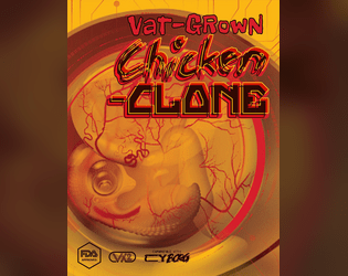
Vat-Grown Chicken Clone
Concept: “Are you more human than chicken or more chicken than human? Engineered to be tastier, juicier, more finger-licking good. Implanted with a brain that was not your own, and GMOd to decay at a slower rate — so when the skies fall, only you and the cockroaches will be left ruling the roost.”
Content: A class for the egghead who enjoys fowl play, whether it’s original or extra crispy.
Writing: Since this class is an homage to the creator’s “Vat-grown Repli-clone” class, chicken-themed references and puns abound that provide the class with intriguing and unique options/mechanics.
Art/Design: Wide spread in a yellow/orange color scheme with a graphic of a chicken embryo (much like the repli-clone class’s graphic) toward the left, while three columns of content take up the bulk of the page.
Usability: Each column of text content has its own visual design, but each provides a consistent presentation to distinguish headings, labels, emphasized text, and so on. Searching/selecting text may cause some issues due to unexpected spacing between and clustering of characters.
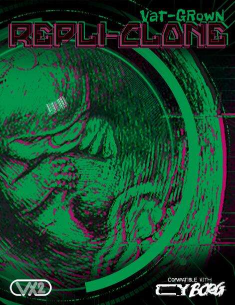
Vat-grown Repli-clone
Concept: “Engineered to be better, stronger, faster; implanted with memories that are not your own; and genetically encoded to degrade at an accelerated rate. Live fast, die young embodied. And your time is almost up.”
Content: A class for the discarded or obsolete duplicant who wants their maker to pay for their profane hubris.
Writing: Drawing on iconic literature and film for its inspiration, class features are concisely packed with ideas to spur introspective and destructive roleplay.
Art/Design: Sleek spread layout of class details complemented amazingly with green/pink color scheme to highlight page elements, with a large background illustration of a vat-grown fetus to underscore the character’s origins.
Usability: While there’s a lot happening on the page, it’s eminently readable, with high contrast and bordered framing of text guiding visual navigation through the document.

Vat-Grown Runaway
Concept: “You are an artificially designed human being, grown in a lab, who ends up finding themselves roaming in the alleyways of CY, lost and confused.”
Content: A class for the not-quite-a-person who’s trying to figure out what they are and why.
Writing: Brief and vivid character details for background and motivation complemented with terse mechanical effects/features.
Art/Design: An illustration of a runaway on the right side of a landscape-oriented spread, with white text on black (with yellow and pink highlights & headings).
Usability: Distinct typefaces and groupings of text allow for quick navigation between different content areas.
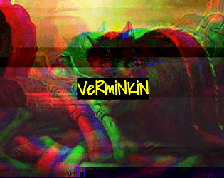
Verminkin
Concept: “In CY, it's easy to feel like there's nobody to trust. Everyone wants creds or drugs or alcohol or fame or whatever, and most people are willing to backstab each other for it. But you- you're secure. Your friends would never betray you, and you make friends very easily, at least, with some people. The kind of people who have greasy black feathers and pick at trash dumps, or gnawing teeth and skitter under floorboards, or slimy skin and creep through the gutters. Your friends have your back. Anyone who wants to get to you will have to go through them.”
Content: A class for the rat bastard who works best with partners, the nastier the better.
Writing: Inspired class features that bring a feral animal-loving misfit to life, complete with mechanics for one or more vermin companions.
Art/Design: Full-color version is yellow-on-black with rat photographs with color treatments as backgrounds, while print-friendly version is black-on-white text. Both versions use single-column text content layout.
Usability: Distinct sections are immediately recognizable in both versions thanks to consistent heading/label presentation and white space. Full-color version employs an additional handwritten-aesthetic font for labels and emphasized terms/phrases.
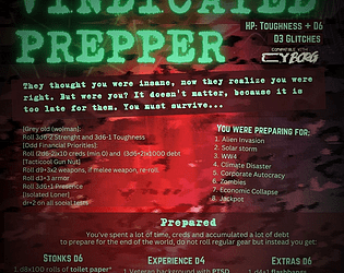
Vindicated Prepper
Concept: “‘They thought you were insane, now they realize you were right. But were you? It doesn't matter, because it is too late for them. You must survive…’ An old man or woman who have spent their lives preparing for the apocalypse who now finds themselves in a perpetual never ending one. Will they survive? Even thrive?”
Content: A class for the punk who’s well-stocked for nearly any apocalyptic occasion.
Writing: Brief, extremely flavorful tables and mechanics that round out assorted approaches to playing a vindicated prepper, provided in a mix of straightforward and tongue-in-cheek tones.
Art/Design: Bright green on a red cloudy pattern background, organized mainly in a three-column format.
Usability: Consistent presentation of content sections via organization, headings, emphasized info, etc. all make for easy navigation and identification of desired details.
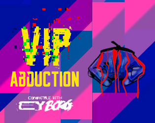
VIP Abduction
Concept: “The punks have a mission. Kidnap Lukas Tosk. He's traveling with just his driver today. It'll be a quick 10k¤. Or so they think. VIP Abduction is a pamphlet-sized module for CY_BORG. It includes a map of a Virid Viper safe house and everything you need to put inside to set up the abduction mission. The module includes stat blocks for new characters and page numbers for referencing the CY_BORG rule book for other stat blocks and tables.”
Content: A kidnapping mission with a bonus automotive theft component.
Writing: Job setup and preparation/site location info is provided first, followed by sections on the mission execution and target/enemy NPCs.
Art/Design: Two versions: full-color and black-and-white. Trifold brochure layout with full color outer panels (in full color version), while inner panels are black and white in both versions. An overhead map of the mission locale is also included as a separate file.
Usability: Bolded headers and key labels/descriptors help call attention to important information, and consistent spacing makes it easy to identify individual sections of content. Overall arrangement of info reduces need to jump around between panels to locate immediately useful specifics. Full-color gradient pattern background on outer panels provides decent contrast to maintain text readability.
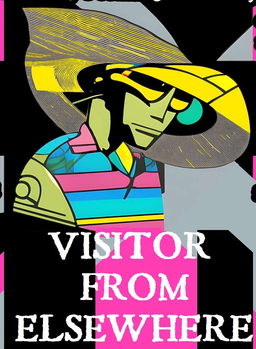
Visitor from Elsewhere
Concept: “You hail from a world unknown to humanity, far beyond the outer bounds of the Terran solar system. All data projections point to planet Earth as the site of some great future calamity, one that will resonate throughout the entire universe—but what could it be, and why here? You’ve been stranded on Earth (what’s left of it, anyway) for a few months now, and so far, only one thing’s been made abundantly clear: this place is a shithole, and nobody’s coming to rescue you.”
Content: A class for the stranger in a strange land with no way to leave it.
Writing: Class details mix levity and bizarre sci-fi tropes for a unique class experience in a cyberpunk milieu.
Art/Design: Black-edged white text on black, pink, and gray with some green text accents. Class features are arranged around a central illustration of a visitor over a background pattern of criss-crossing X shapes.
Usability: Visually, this is a busy spread, which may make reading/scanning difficult for some, augmented by the lack of embedded text (so no searching or copying/pasting). Bold text for important info and labels consistently helps distinguish individual list items and content sections.
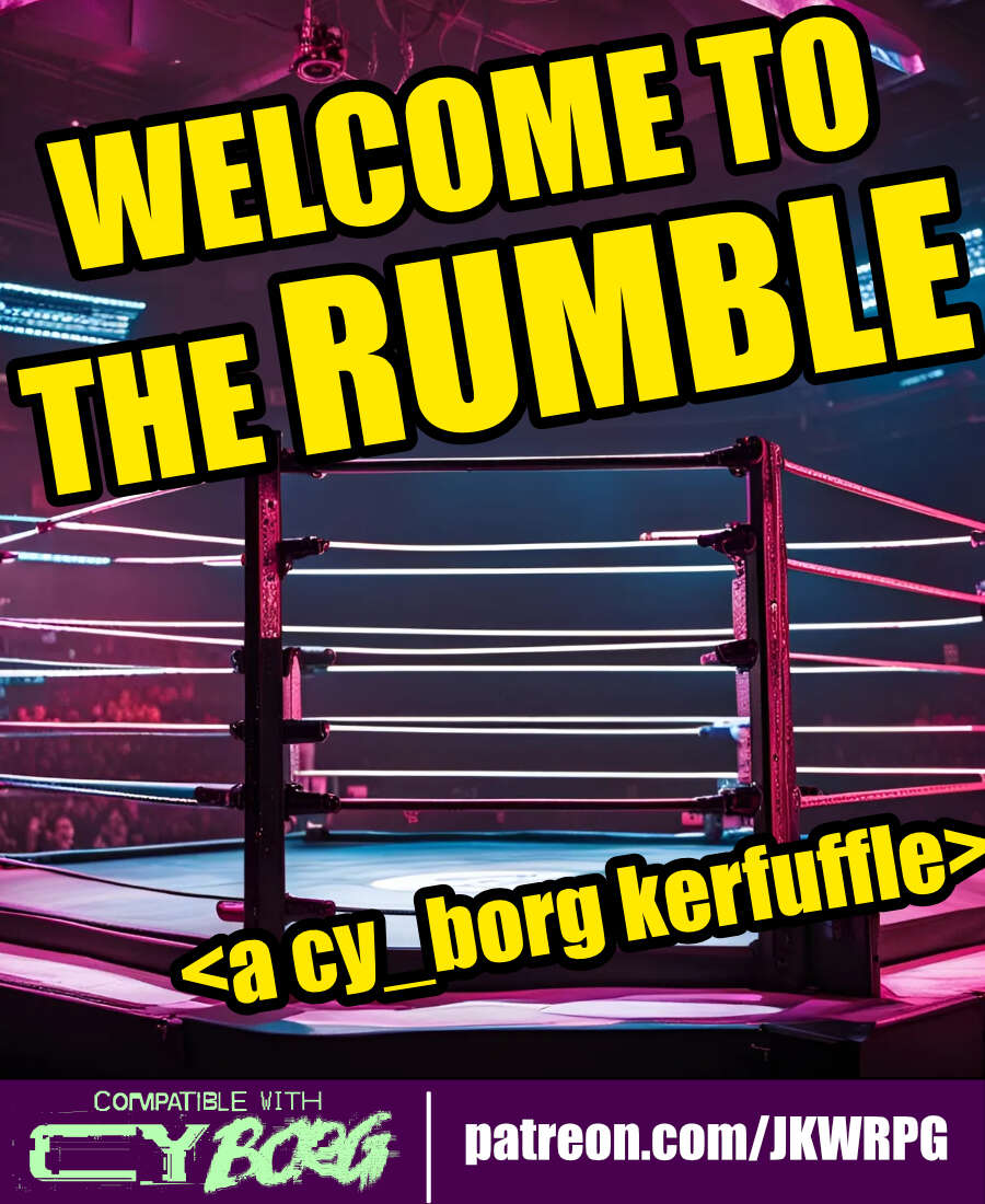
WELCOME TO THE RUMBLE
Concept: “Tonight, we are going to witness the most anticipated match in the history of professional wrestling---for the CY Wrestling Federation Championship Belt! Are you ready? Wrestling fans, ARE YOU READY?! For the thousands in attendance, and the millions watching from around the world, from the capital city of CY...ladies and gentleman...LLLLEEEET'S GET RRRREAADY TO RRRRRRUUUUMMMMBBBBBLLLLLEEEEE!”
Content: An opportunity for punks to up their side-hustle game by making some bank as a wrestling champion–assuming they win, of course.
Writing: Primarily informative details about the mechanics of the encounter, accented by some headings to reflect the tenor of the wrestling scene.
Art/Design: Wide three-column layout of content with a bloody wrestling mat map in the center of the document. White text on black with yellow headings, while a bit of pink highlights the mat image and the license info.
Usability: High-contrast text and easily readable fonts facilitate reading and navigation. Skewed text may occasionally pose issues for screen readers.
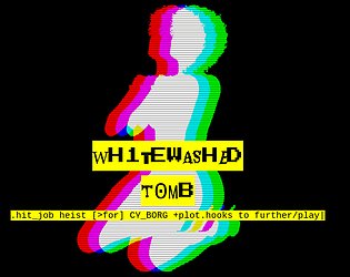
Wh1tewashed T0mb
Concept: “Megapastor Apollo Imra is in the crosshairs- his wife's, to be specific. One of his twenty-odd wives. You've been hired to take out this lecherous philanderer, right in his own temple vestry, where he's taking tonight's dose of infidelity. But beware: there's more going on here than you might think…”
Content: A mission to serve divorce papers, of a sort.
Writing: Extensive information provided about the job, the site, NPCs the punks might encounter, and more.
Art/Design: Primarily black-on-white single-column text layout complemented by illustrations of key NPC portraits and neon-colored maps.
Usability: Font choices promote readability, and heading/label bolding, italics, and highlighting are applied consistently throughout to facilitate quick navigation toward desired details.
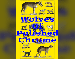
Wolves of Polished Chrome
Concept: “There's a sickness in the streets of CY. Rain drips like a broken IV. Dying adverts flicker in sallow shades. They say the world is ending. Has ended. Will end. They say the howls at night are Cy-Ragers. NanoPhreaks. Nothing to worry about. Nothing abnormal. The water is poison, but it always has been. The air is poison, but how bad can it be? It churns through your lungs all day and hasn't killed you yet. There's nanites in the trash, nanites growing like mold on the walls, nanites in the blood and bones of regular citizens, but all of this is familiar misery. Last night you stared blearily at your face in the bathroom mirror, watching it change. Watching it become something new. As you did, your cybernetics clicked like beetle legs, like teeth shuffling in the mouth of a cannibal. They squirmed and contorted to match your new flesh. You vomited your whole stomach lining into the sink, then washed it out with a swig of cheap ethanol. But the disinfectant didn't purify you. It just made you worse. Tonight, the glitching moon hangs low over the skyline and your body is wrong. Wrong for the city. Wrong for the life that clings to it. Wrong for the alien gods that have touched its streets. You hate them all, and that hate pours out of you in a howl.”
Content: A set of rules to incorporate werewolves into CY.
Writing: Matter-of-fact explanations and descriptions of a variety of factors pertinent to affected characters (transformation rules, clothing options that survive transformation, a “Festering Wolfborg” class, etc.) as well as several lycanthropic foes and their stats.
Art/Design: A mix of black-and-white splash images with brightly colored sections of content, each with its own bold color scheme.
Usability: Single-page, single-column layouts make for quick perusal and identification of desired content, assisted by a hyperlinked table of contents.

You Died, Dumbass
Concept: “You Died, Dumbass is a profile for another shitty subscription company, some rules for near death organ transplant (inspired by https://zordvil.itch.io/horrible-wounds) and related headlines made for the new-times-dumbass game jam.”
Content: A set of rules to complicate life when a punk at the table comes back from near death with a biosynthetic organ–complete with 4d4 additional relevant headlines to roll when a miserable headline is rolled.
Writing: A focus on the bleakly absurd atmosphere of a world where biosynthetic organs (and the late capitalist approach to their supply) is common, with brief mechanical features/effects supporting that focus.
Art/Design: Mix of black-on-white and white-on-black spreads/pages, using different layouts and aesthetics, with consistent appearance of red accents and highlights throughout. Several illustrations of NPCs and a location appear along with a silhouette to underscore our equally bleakly absurd reality
Usability: High-contrast text is consistently provided and page/spread layouts offer visually recognizable organizations of similarly presented and distinctly marked content.
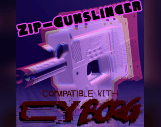
Zip-Gunslinger
Concept: “Zip guns are sold everwhere, as multipacks in bodegas and as singles in vending machines. These mass-produced deadly toys are made of the cheapest materials in the cheapest way possible and designed to break after a single shot, but that's all you need, right?”
Content: A class for the venn diagram intersection of firearms fanatic and gashapon addict.
Writing: Concise, approachable descriptions of class features and mechanics with a dash of thematic flavor to glue the concepts to the setting.
Art/Design: Plain text format with whitespace between paragraphs and lists.
Usability: The file format allows for incredibly easy resizing/formatting content in one’s preferred text editor or word processing program.
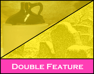
Zwyntar Pass / Moonshine - A Borg Dovble Featvre
Concept: “This is a double feature, 2 one shots for 2 different Borg Systems. One is "Moonshine" for the Cy_Borg system. It features players robbing a rich senator's house to steal his supply of crypto-moonshine. The other is called Zwyntar Pass for the MorkBorg system. It features players trying to hunt a troll at a pass at Graven-Tosk. Both scenarios were inspired by a Ukrainian band called Zwyntar.”
Content: A job to steal a bunch of crypto-moonshine from a senator’s home.
Writing: Concise details that cover important elements for the score and how different approaches might lead to different results.
Art/Design: Eye-blistering neon purple, pink, and yellow (with a bit of green-on-black) across two pages: one text-heavy GM-focused page and one player-facing page with a map of the job location.
Usability: Headings and different blocks of content are visually distinct from one another thanks to font size choices and whitespace use.
Previous page
Page 5 of 5