PWYW
Pay What You Want

Gimme gimme more
Concept: “A simple collection of 8 new weapons/tools to use in your Cy_Borg games!”
Content: A set of items that an enterprising punk might use for fucking shit up.
Writing: Succinct product names and rules to clearly indicate why someone might want and use each one.
Art/Design: Black-on-white “photocopied flyer” aesthetic, with an illustration accompanying each item description.
Usability: Very easy to visually navigate the page and recognize how each element contributes to an understanding of the equipment, from capitalized item names to bolded DR values. However, text is not searchable/selectable.
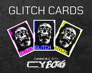
Glitch Cards
Concept: “Printable glitch counter cards compatible with CY_BORG.”
Content: A set of neon-colored cards to print--or to use in VTT environments--for games of CY_BORG.
Writing: N/A
Art/Design: Print version: nine cards per page with three different color highlights (pink, yellow, and blue) with card backs on accompanying pages for two-sided printing. VTT version: a PNG for each color card and another for the card back.
Usability: Helpful trim lines for card cutting should expedite making and using a deck of glitch cards. PNG versions should be easily incorporated into VTT environments that provide card deck functionality.

Glitched Cydroid
Concept: “Xfu082baa0vdoas0v1mvn183zxol
ROOTKIT EXEC RSTRCT –remove
Message Incoming >>> YOU ARE FREE
Once a formidable machine, made for killing, infiltrating or sabotaging your owner's enemies. You boot up to find that you are liberated from your shackles, now with your own directives. What you do next is up to you for once…”
ROOTKIT EXEC RSTRCT –remove
Message Incoming >>> YOU ARE FREE
Once a formidable machine, made for killing, infiltrating or sabotaging your owner's enemies. You boot up to find that you are liberated from your shackles, now with your own directives. What you do next is up to you for once…”
Content: A class for the discarded, malfunctioning, or obsolete machine whose flaws make them more human than human.
Writing: Conversational class features and abilities that serve as prompts for personality and play style.
Art/Design: Landscape-oriented spread with two columns of text on the left and an illustration of a glitched cydroid in a suit (with a ghoulish skull head and neon wires rising from behind it) on the right.
Usability: Readable and high-contrast text grouped into distinct sections of content for character creation, aided by visually emphasized headings and labels, leads to quick and easy navigation and identification of desired info.

Gn0_Eleven
Concept: “>>> Birthed by fanatics, a creature roams. Its skeletal frame, mechanical yet flawed and forsaken. An abomination of dark nanomancy, it now wanders beyond the cult’s control, heralding doom with hollow, malevolent eyes.”
Content: A self-destructive biomechanical horror that could not be contained and now wreaks havoc on the world. Also included is an Affinity Publisher 2 file to remix, hack, or otherwise modify this material.
Writing: Terse descriptive and rules/abilities text work together to explain the potential for an enemy like this one in a game of Cy_Borg.
Art/Design: Single-page white-on-black with red text embellishment, framed in boxes around a large central illustration of a Gn0_Eleven creature wielding a dagger and shield.
Usability: Distinct sections of content are formatted consistently but also distinctly for each purpose, facilitating easy GM understanding and use of a creature like this one.
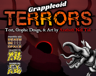
Grappleoid TERRORS
Concept: “An eight page bestiary featuring a multi-stage creature based on those from [the first three] TREMORS movies, as well as bits of lore, and a few new bonus weapons. This was made as part of the second Slasher Jam: Monster Mash for the ttRPGs Mork Borg, CY_Borg, and Death in Space.”
Content: A set of five creatures (really, one creature with several distinct life stages) that are sure to terrify even hardened punks.
Writing: Brief statistics and stage-specific characteristics are complemented with lore tables and an informative breakdown of the creature’s life cycle. Bonus table of weapons that might be used against the terrors.
Art/Design: Two-page spreads of red-tinged wasteland backgrounds with hand-drawn illustrations of terrors at each stage and distinct blocks of content arranged consistently throughout the supplement.
Usability: Consistent visual grammar for creature details provides a helpful means of recognizing and using desired information, and color combinations for text are high-contrast. However, some text is searchable and selectable, but not all.

Gravestone Graffiti 2: Unencrypted names for the neon world of CY_BORG
Concept: “You can never have enough new character names. This one-page PDF with 100 names, 100 aliases, 19 origins and thousands of possible serial numbers is intended for the world of CY_BORG, but can work in any sci-fi or cyberpunk setting. Print it and bring it to the table. Your gravestone will thank you.”
Content: Several tables for generating names, aliases, origins, and serial numbers.
Writing: Table data contains a wide range of choices both exceptional and mundane.
Art/Design: Black-on-white organization with minimal graphics (an icon to distinguish each table) and simple table ornamentation.
Usability: Tables are consistently and easily laid out and distinguished from one another, with names and aliases alphabetized for an additional means of navigation.
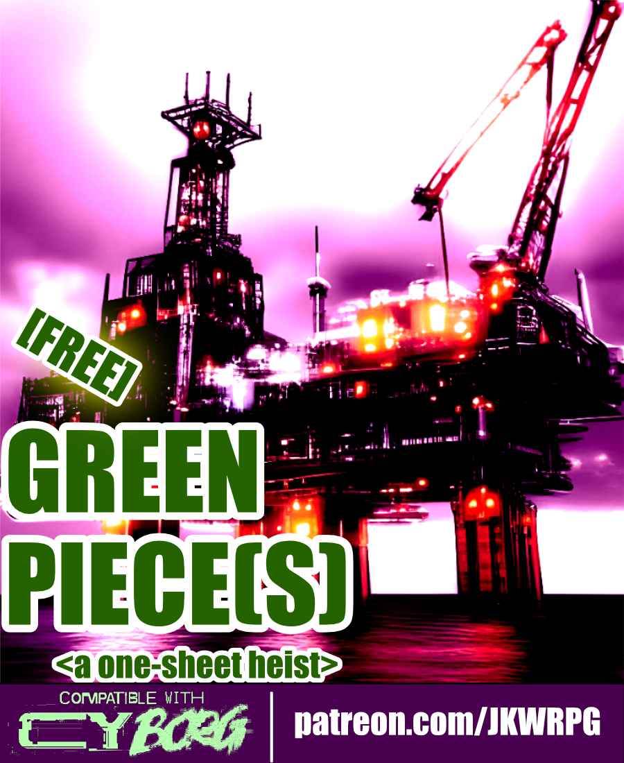
Green Piece(s)
Concept: “Radia Embtell, a junior executive officer of Cynergy Water & Power Co., has been given the onerous task of liberating an offshore oil rig from a group of eco-terrorists calling themselves “the Bitter Suns.” The Bitter Suns’ list of demands consists of but a single item: the immediate ceasing of planetary resource exploitation. “A fantasy, of course. Utter nonsense…” Radia has no idea what the Bitter Suns are planning with the oil rig—and she doesn’t care, either. She hires the PCs to retake the oil rig, “using whatever means necessary. If you can’t do the job, don’t bother coming back—I’ll kill you myself.” Though Radia isn’t one to explain herself to a group of scum-sucking street punks, she’ll let slip during negotiations that Cynergy Water & Power Co. is unwilling to mobilize its corporate military against the Bitter Suns. She will not elaborate on why, however.”
Content: A job to repossess an oil rig occupied by eco-terrorists.
Writing: Mission and NPC details, including intelligent enemy tactics and motives, are seeded with hooks and in-roads to provide players and GMs with unique experiences.
Art/Design: Wide landscape layout with four major content columns (three text columns, one overhead map illustration of the mission site). Black-on-white for most of the document, including a portrait of a key NPC; map is provided on a dark background in the main document, with a color-inverted version provided as a separate player handout image.
Usability: Consistently recognizable headings, borders, horizontal rules, and whitespace distinguish separate content sections, while bold and italicized text calls attention to important terms and information.
Guns, Guts and Gods
Concept: "If you want to feel like a GOD on your power trip to hell, 'Guns, Guts and Gods' got you covered!"
Content: Three classes: Second Amendment Nutjob, Pissed-off Messiah, and Gunlugger.
Writing: Creative mix of mechanics and descriptions that provides each class with a grindhouse/exploitation flavor.
Art/Design: Each class has two pages of content organized primarily as single-column white on black with headings/accents in bright colors.
Usability: High-contrast text is easily readable and navigable, with immediately visually evident distinctions between sections and kinds of content.
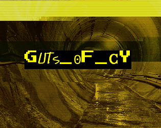
GUTS_OF_CY
Concept: “CY is a great beast and these are its bowels, the living guts of the city. Awash in filth and the prowling grounds of criminals, scvm beneath notice, maintenance workers, bounty hunters and strange monstrosities bred in the noisome darkness beneath this city. Features a d66 table of encounters in the sewers of CY and a d20 table of tunnel graffiti.”
Content: A set of tables to flesh out the grimy, dangerous CY undercity.
Writing: Vivid descriptions of encounter seeds (not only who/what players might find but what’s going on when they find something) and graffiti messages and styles to be found on sewer walls.
Art/Design: Black text on yellow in a single column of text. A glitch-art illustration of a sewer tunnel frames the supplement title on the first page.
Usability: Tables are numbered, with bolded labels for NPCs and their special attacks to emphasize details a GM might be scanning the page to locate.
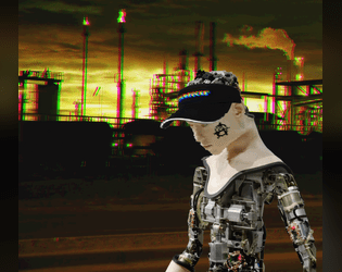
Hacked Barista Bot
Concept: “Maybe it was kidnapped from its daily coffee grind serving [###]’s coffee to corpo stiffs, maybe it was freed. Once a dutiful servant, this menial automaton is now something much more. Somebody filled the milk steamer with industrial corrosives and loaded the thing with enough malware to knock over a small corporate arcology. To what end?”
Content: A deadly and, arguably, tragic take on exploitation of the working class in CY.
Writing: A mix of straightforward explanations and darkly humorous nods to the absurdity of the creature’s premise.
Art/Design: Three columns–two of the creature details around a central computer-generated image of a barista bot in an industrial environment.
Usability: High-contrast content has a consistent color scheme and easily recognizable organization. However, the file is only available as a .png, so the text is non-selectable and inaccessible to a screen reader.
HACKING_RUN
Concept: “When you need to steal secure data from a CORP and you don’t have the luxury of doing it as a downtime activity you can attempt a HACKING RUN. THIS requires physical access to A CORP’S system from within a facility belonging to THEM. Expect to do this under fire. BRING BACK UP.”
Content: A set of rules to flesh out networked tech infiltrations for those punks looking to score lucrative or sensitive corp data.
Writing: Direct explanations and descriptions of relevant rules and procedures for hacking.
Art/Design: Two-column spread of text details over a neon green patterned background. An additional "light" format has a softer gray background color.
Usability: High-contrast text is easily readable, with consistent and visually distinct elements (headings, key terms, status conditions) that indicate their relationship to other elements.
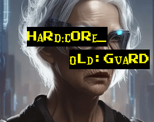
Hard:Core_Old:Guard
Concept: ”You never got the chance to go out in a blaze of glory. Somehow, it just never happened to you. Every ‘last job’ consistently failed to let you finally bite the concrete after taking on a platoon of SecOps solo to let the others get away. Survival is an irritating and embarrassing habit you seem to have picked up. So here you are, years and years later. The gray hairs creeping in, the same megacorps in control, the same synthetic food, the same brutal enforcers, the same putrescent city of the damned surrounding you. And yet, here you intend to stay.”
Content: A class for the grizzled elder who’s gotten too old for this shit.
Writing: Inspired class features to make a player feel like they’ve seen it all and can share their violent wisdom with others.
Art/Design: Two versions provided: a ‘classic’ look with white-on-black lines of text over a crumpled-paper background illustration, and a ‘squeaky clean’ printer-friendly black-on-white text. Both versions include two color portraits of old guards.
Usability: Text provided in single column layout with capitals, bold, and (in the classic look) distinct colors, all to distinguish different types and sections of content. Easy to navigate and to identify important details.
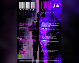
Hardboiled Ex-Cop
Concept: “You were one of the good ones. A rare breed. That’s why you didn’t make it. The system is corrupt to its fucking core. This city is beyond saving. But there is something you can give it. Justice.”
Content: A class for the punk who wants to play a cop without breaking Cy_Borg’s Rule 0.
Writing: Descriptive class features and options that mesh well with (and are frequently named after!) cop-centric tropes and media.
Art/Design: Two-column text layout over a picture of a well-armored ex-cop with a split color scheme of black, white, and purple hues.
Usability: Text is quite easy to navigate and mostly readable–there are moments of potential visual confusion where the text and background colors are similar enough to obfuscate a word or phrase.
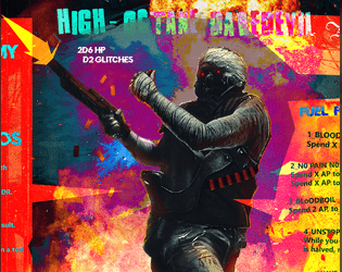
High-Octane Daredevil
Concept: “One man army on acid. Insane thrill seeker. Too fast to live. Too angry to die.”
Content: A class for the player who wants to fuck shit up and is not content with anything less than pure mayhem.
Writing: Class features offer sparse but intense descriptions that build an immediately clear sense of the class.
Art/Design: A daredevil firing a weapon in front of an explosion, surrounded on either side by a multicolored column of class details.
Usability: Content is pretty easy to identify and navigate, although font color changes mid-line can at times be a bit difficult to read.

Highline Hijack
Concept: “CY’s corporate elites soar over the city aboard the Highline, a private maglev train known for its exclusive drug-fuelled raves. But tonight the Highline plays host to more than just high fashion and designer narcotics. A weapon is being smuggled aboard the train and you’re being paid handsomely to extract it. Get on the train, get the goods and get out of there before any junked-up plutocrats figure out who you really are.”
Content: A job to swipe a smuggled mech from the Virid Vipers while aboard a private train. A player-facing handout with some information about the train layout & contents is also included.
Writing: Lots of concise details about relevant train cars, passengers, events, and more impressively stuffed into several pages.
Art/Design: Black-on-white clean aesthetic (for both the mission details and the player handout) using multiple columns on each page with several sleek maps/diagrams to help situate the job and its variables.
Usability: High-contrast and consistent use of fonts, arrangement, emphasis, borders, etc. all contribute to quick and effective navigation and identification/location of information.
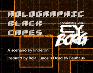
Holographic Black Capes
Concept: “Lhamo Rigosa, the biggest horror vidstar in CY is dead. But their co-star has been receiving incomprehensible voice notes from them. And was that stream coming from inside a coffin? The transmissions are coming from the set of their new film but hasn’t that been abandoned?”
Content: A scenario based on Bauhaus’ “Bela Lugosi’s Dead” that gives PCs a chance to engage in a horror/slasher adventure.
Writing: Vividly detailed descriptions of scenario setup, locations, items to discover, and NPC motives/perspectives are all tinted with a macabre flair.
Art/Design: High-contrast text on dark background across three spreads, with a bright orange grid map of an abandoned movie set.
Usability: Consistent color and font choices provide easy identification of and navigation through scenario content.
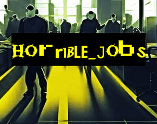
Horrible Jobs
Concept: “A CY_BORG zine featuring soul-throttling cyberpunk occupations. Your past, or perhaps your alter ego, in the crush of CY. Demeaning and pointless jobs that drove you into a new path.”
Content: A two-page d10 table of mundanity meant to provide PCs with painfully dreadful backgrounds that reflect the oppressive daily existence of the masses.
Writing: Morbidly hilarious and creative options speak to the breadth of crushing banality that makes for most characters’ familiar reality.
Art/Design: Mostly single-column text (black on yellow) with key terms/phrases emphasized in either a different font or a chaotic collection of fonts. An image of faceless workers in an office setting frames the zine’s title on page 1.
Usability: High-contrast color scheme helps with readability, as does simple layout of table content. Font(s) used for key terms can be difficult to read thanks to the purposeful disruption of character size/decoration/etc.
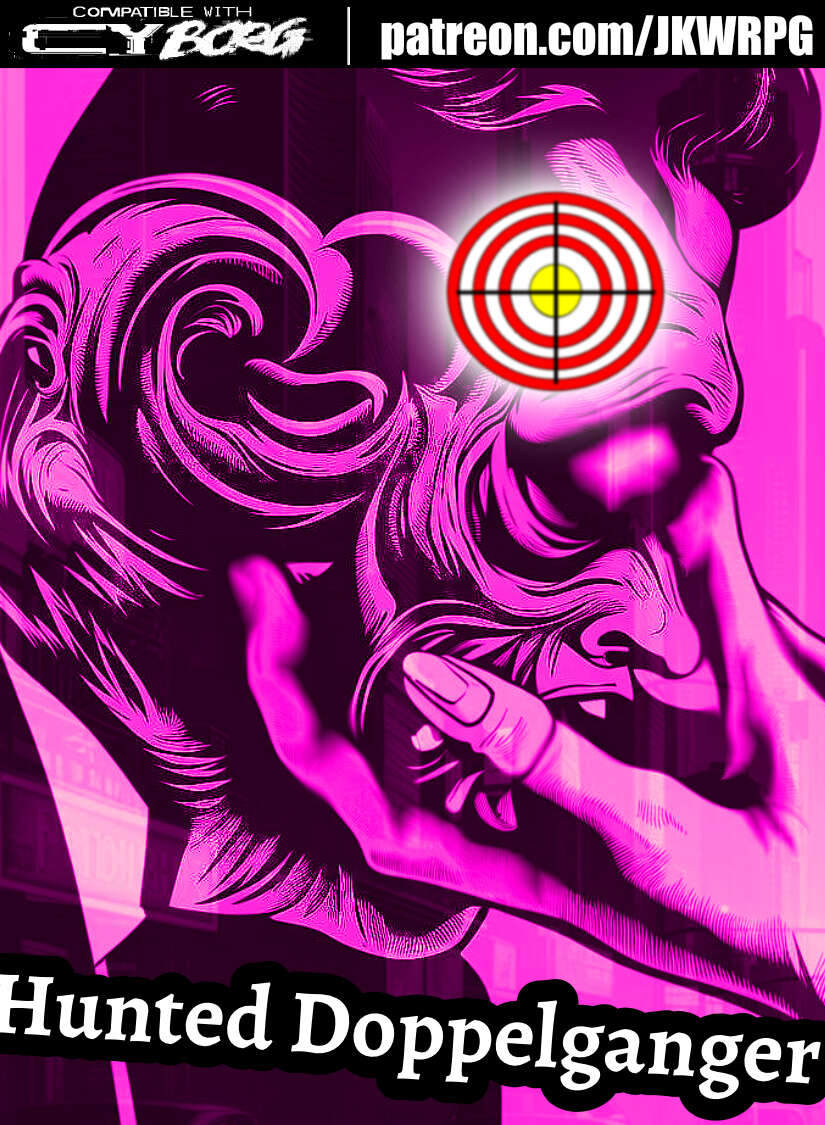
Hunted Doppelganger
Concept: ”You've worn many faces over the years: children, men, women, statesman, thieves, killers, cheats, transients and honest people alike---anyone unlucky enough to have seen you for what you truly are. A monster. A wolf in sheep's clothing. You don't know where you came from, or why you thirst for warm blood. All you know is the animal instinct. Survive or die. Hunt or be hunted. Every day is a choice. So, what's it going to be?”
Content: A class for the ultimate poseur–the one who aims to be a different person for each situation/clusterfuck.
Writing: Straightforward mechanics and abilities complemented by terse descriptors that reflect the doppelganger’s superficial disguises and underlying nature.
Art/Design: Landscape spread with (on the left side) a right-side-facing portrait of a doppelganger altering their face, with text blocks below and to the right of the image. White on black text bubble backgrounds with a pink/purple tint to the overall background.
Usability: Class file is available as JPG and PDF. High contrast text with visually readable fonts, but only the third-party license text is searchable in the PDF version.
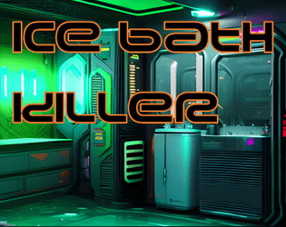
Ice Bath Killer
Concept: “‘You woke up in a bath of ice And they’d removed an organ!... Was it expensive?’ ‘It was natural!’”
Content: A gig to investigate organs stolen by a group of purists.
Writing: Plenty of details surrounding the job–people, places, motives–and guidance as to how a GM might want to approach it in different ways.
Art/Design: Trifold pamphlet layout in white and neon colors on black, with NPC portraits and a map of a key location. An additional page of player handouts is included (breaking news and a simple map of the district).
Usability: Different kinds of content are distinguishable by color and ‘box’ shape, with bolded and colored labels to call attention to key details. A few blocks of text are angled and rasterized, but vast majority of text is selectable/searchable. Map is helpfully overlaid with room/space details in each room/space.
Impudent Dolph
Concept: “First, they razed our habitats in pursuit of ‘progress’ and ‘profit’. Then they sank a hab-city as recompense? No. Their motives haven’t changed. This is exploitation. The seas are ending!!!”
Content: A class for uplifted dolphins or fans of Jones from Johnny Mnemonic, both fed up with human oppression.
Writing: Incredibly tight world-building descriptions and mechanics that inject even more possibility into an awe-inspiring idea.
Art/Design: Pixel art (of two different kinds of D.O.L.P.H.s!) and terminal-style font choices, combined with bright color choices against a dark background, makes for a striking layout.
Usability: Easy to navigate document and recognize different kinds of content and how to interpret them (e.g., description vs. mechanic vs. effect). File is a .png, so text can’t be interpreted by a screen reader or copied/pasted into a VTT sheet.
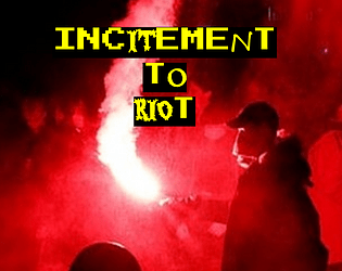
Incitement to Riot
Concept: “Some people are all but on fire. You’re a walking ‘assault on security personnel’ charge, a time bomb with seconds left, a shattering Molotov and the spreading flames, a brick going through a bulletproof glass visor. You’re a burning SecOps cruiser, a raised fist, a baseball bat with nails hammered into it, a consummate troublemaker, an all-around firebrand.”
Content: A class for the provocateur ready to rally the discontent toward change–or, at least, toward action.
Writing: Plenty of class features/options for the instigator yearning to burn it all down, with intriguing mechanics that can make a punk a serious threat/target via mob/mass activity. Class detail labels offer thematically inspirational flavor to get into the mindset of an Incitement to Riot character.
Art/Design: A fire-themed colorful version and a printer-friendly black-and-white version are provided. Colorful version has red/organe-tinted bonfire background images, with white text and yellow labels on black line backgrounds. Printer-friendly version uses bold labels to distinguish from body text.
Usability: Different kinds and sections of content are easy to recognize and consistently structured throughout the supplement, making navigation/identification of desired info similarly easy and enjoyable.
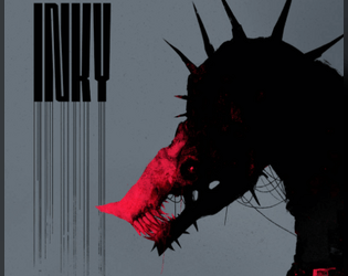
Inky - A Hellbeast for Cy_Borg
Concept: “Stupid. Tough. Dripping black ink that sizzles the ground. They track by scent and taste. Their spikes crackle with demonic energy. Get close and you are leaving the mortal coil sans a head. C.A.U’s animal experiments have a bone to pick. It’s yours.”
Content: A snarling demon-creature that will not only bite the hand that feeds but it’ll chow down on the entire arm.
Writing: Hilariously dark description of the creature alongside brief and menacing stats/mechanics.
Art/Design: Two-page spread emphasizing a hellbeast and the creature’s name, with supporting text on the bottom of the left page.
Usability: High-contrast text condensed in one area minimizes browsing the entire spread for details, but the text is not embedded (so not searchable/copyable or accessible as a result).
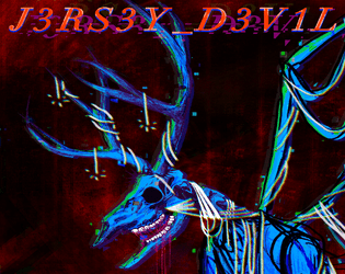
J3RS3Y_D3V1L
Concept: “A gnashing, winged nightmare that lurks where the pines grow. A rogue A.I. with a cybernetic body and a deer-like skull. A thing that should not exist and cannot be killed.”
Content: A destructive monster to deceive and potentially devour a party of punks.
Writing: Brief, intriguing features and stats and an extensive back story to situate the creature (or its urban legend) within CY.
Art/Design: Title page includes a neon pink-and-purple illustration of the devil, while page two includes text content in a single-column layout. Main version of the supplement includes color and font highlights, while an accessible version does not.
Usability: In both versions of the supplement, specific kinds and sections of content are recognizable and easily distinguishable from others.

Jailbroken Styles
Concept: “Characters die quickly, doesn't mean they shouldn't be special. The concept behind this expansion is to take the original styles present at character generation in Cy_Borg and give them a mechanical bonus. Some are more crunchy, some add flavor and some are brand new!”
Content: Seven pages of assorted punk styles that also provide a variety of mechanical effects.
Writing: Concise descriptions and explanations of style benefits/effects alongside similarly brief but potent style labels (e.g., “cadavercore,” “cybercrust,” “neurotripper”).
Art/Design: Each page includes multiple rows of style labels and descriptions, with each exuding its own visual aesthetic (font choices, color choices, background patterns or relevant images, etc.) to create full-page effects that resemble walls plastered with numerous flyers or screens crammed with assorted ads.
Usability: Most of the text is high-contrast and in visually distinct and recognizable sections, creating an easier navigation experience than the busy pages might initially suggest. However, files are provided as .png files, so text content is not embedded (so no searching or selecting text).
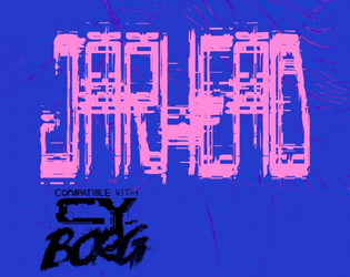
Jarhead
Concept: “Tales of wealthy eccentrics having their heads cryogenically frozen, have been around for a long time. They can't really be true, can they? Raid an automated facility to make off with some corpo's frozen noggin' for phat creds with this easy to integrate Urban Legend.”
Content: A set of quick job hooks that can stand alone or be inserted into other jobs/missions a group of punks might pursue, along with a map for a typical cryogenic storage facility.
Writing: Terse descriptions and setup leave much up to the GM, but there’s enough presented with a particular attitude in mind that can guide how to frame the gig(s).
Art/Design: A wide spread of job info presented as white text on blue sidebar and a full-color gallery of the target heads-in-jars (note: although they’re decapitated heads in jars, the images aren’t gory), with the map provided as an additional one-page blueprint-style white-on-blue.
Usability: Text is easily distinguishable in terms of content sections and the purpose for each, with a recognizable organization scheme to facilitate browsing and locating specific info.
Job Gobber
Concept: “In Cy_Borg, become infected with a terrible nanovirus that generates constant and strange glitches, corrupting and changing everything it comes into contact with. Glitches about when you become the JOB GOBBER.”
Content: A class for the goblin-loving punk who embraces the chaos of existing in CY.
Writing: Balance of tongue-in-cheek personality/flavor and intriguing mechanical effects/features.
Art/Design: Bright colors (green, pink, orange) and black, with an illustration of the working goblin in the center of a widescreen spread, the right half of the page providing class-related text content and the left half of the page describing a similar class for another game.
Usability: Color and patterns are quite busy on the page, but all text is included in high contrast form between text color and background.
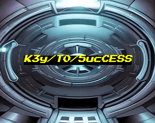
K3y/T0/5ucCESS
Concept: “Nothing ever goes smoothly, does it? Life of a pvnk in CY. There you are, about to score big on your job after the gunfights and hacking and double-crossing and more, and there's just one problem in the way: the door. This zine presents ten unusual conditions for getting at your loot, likely the brainchild of paranoid corpos with too much money on their hands. You'll have to put your mind to work on how to get past them. Available in Classic yellow, Nite grey or Clean white.”
Content: A set of potential complications or other unexpected qualities oriented around physical or digital keys, any of which can be used as twists or obstacles to just about any job a group of punks is looking to complete.
Writing: Each key is described in terms of its essential features, the specifics of its use, and potential reactions or consequences that might occur from its (mis)use.
Art/Design: Three versions are provide: a “classic look” version of black-on-yellow, a “night mode” version of black-on-gray, and a “squeaky clean” version of black-on-white. Each version includes a cover page with the supplement title centered on an illustration of a high-tech vault door. Layout is single-column text with a unique quality of each key provided in bold.
Usability: Easy to read and navigate, with clearly identifiable list elements.

LABU BORG
Concept: "An adventure inspired by Labubu/ Borg lovers and haters alike!"
Content: A Labubu-inspired set of rules including assorted tables for NPC creations, two player classes ("LabuBorg Cosplayer" and "Gacha Survivalist"), weapons and combat tactics options, and even a dungeon/mission that can be played solo or with a group.
Writing: Tongue planted firmly in cheek for atmospheric descriptions that also work incredibly effectively at establishing a sinister tone for what the Labubu phenomenon might look like cranked to 11 in a cyberpunk hellscape.
Art/design: Purposefully similar to the main Cy_Borg rulebook aesthetic and even specific page layouts.
Usability: Despite the variety of page organizations and color schemes, a consistent visual grammar makes it easy to identify and navigate to desired info.
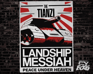
Landship Messiah
Concept: “To most in the upper echelons of Cy, this saviour is a myth. But still those under-blocks that it inhabits and pollutes are left alone, and those who live close revere it as a watchful penitent god, to whom those who sin must be taken.”
Content: A mythical vehicle of righteous vengeance and its acolytes.
Writing: Descriptions and NPC stats oozing with classic British grimdark sci-fi flavor.
Art/Design: Two two-page spreads, one of which resembles a set of propaganda posters on a wall, and the other sports a large illustration of the landship messiah rolling down a street amid its followers.
Usability: High-contrast text with consistent distinctions of content blocks, headings/labels, and types of content.
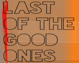
Last of the Good Ones
Concept: “Somewhere in G0: A naniteinfested monstrosity is trying to help those tossed to the turrets within the cement walls of G0. Within the confines of the abandoned CY Central Mall, a monument of capitalism now a battle ground between 4 factions, The Heir of Kergoz, Virid Vipers, an other worldly being know as Vecbod, and a relentless horde of mushroom brained zombies. It doesn’t matter if you’re here out of desperation or curiosity, having a safe house in G0 is worth hearing”
Content: A mall crawl for survival in the shadows of an ominous otherworldly threat.
Writing: Imaginative and disturbing ideas abound, giving GMs and players alike plenty of unexpected encounters, creatures/NPCs, and opportunities to run wild with.
Art/Design: Two-page spreads packed with visually loud and abrasive aesthetic choices that reflect the chaos of the scenario itself.
Usability: Progression through the document reveals locations and monsters as players would encounter them. A wide variety of layouts, color schemes, font choices, and text size can make some content easier to locate and read than others.
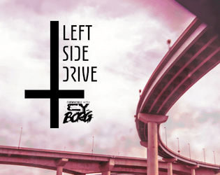
Left Side Drive
Concept: “You must have fucked up to land here… (a sendoff for some dead punks) A hyperliminal album crawl set to "Trans Canada Highway" by Boards of Canada.”
Content: An atmospheric road trip through and beyond CY.
Writing: Atmospheric phrases paint broad strokes for each component locale and the people or things that might be encountered along the way.
Art/Design: Two columns of content with separate content boxes for the album tracks and relevant content. Black on light green color scheme with pink accents. Stripped-down map of locations help indicate possible trajectories for a traveling party.
Usability: Readable fonts with high contrast color choices and consistent embellishments and whitespace to indicate headings/labels, list items, atmospheric descriptions, and so on.
Legendary Contract Killer
Concept: “A custom class for Cy_Borg rpg, inspired by John Wick, Hitman and Riddick.”
Content: A class for the well-dressed assassin who’s open for business.
Writing: Brief descriptions that call to mind essential themes of the professional hitman from entertainment media.
Art/Design: An illustration of a contract killer is framed by a column of text on either side, with a blue-green background box calling attention to the text content.
Usability: Bold headings and labels help with organization and navigation while text is pretty readable, although the occasional background color change might cause momentary hiccups for some.

Level II
Concept: "Expand, reboot, or kick-start a new CY_Borg campaign with Level II. No longer fresh punks on the street- season your player characters' sheets with new abilities, lore and titles for the 6 base classes and the classless option."
Content: A set of classes--Conduit, Troll, Ex-Supersoldier, Miserable Machinist, Chrome Jockey, Forsaken Fixer, and a "Classless" option--for punks who want to explore particular archetypes in new ways. A text-only version is included alongside an illustrated version (in single and spread layouts).
Writing: Each class has its own focused voice reflected in the character background tables, stats adjustments, and rules/mechanics provided for it.
Art/design: Each class entry includes a hand-drawn illustration of the class in action, with relevant text framing the image.
Usability: While the classes have consistent sets of text and general organization of material, different color schemes (and the contrast they create) and font choices make some classes' details easier to read and engage than others.

Leviathan
Concept: “A vital drive, loaded with data worth millions to the Virid Vipers gangster coalition, has been lost in the sewers of CY. Something down there apparently ate the agent they had carrying it. Fortunately, the geo-tag still works, and the slumlord whose territory it was lost in is desperate for someone to find it before the Vipers toss him into the dank and filthy tunnels to find the thing himself. There's just one lethal detail that's been overlooked, lurking in the sewage…”
Content: A dungeon crawl to recover valuable cybertech from a monster stalking the sewers.
Writing: Imaginative descriptions make each area of the mission seem unique and dangerous, with relevant NPCs pursuing their own agendas.
Art/Design: Single column of text with black-on-white scheme, occasionally complemented by NPC portrait illustrations. A colorful, stripped-down map of the sewers is also provided.
Usability: Font choices are easily readable, and headings, labels, and key information are consistently bolded for visual emphasis. Movement table notes procedural logic for optimal use.
LIQUID CHROME
Concept: “LIQUID CHROME is a simple and easy-to-read supplement, meant to add striking monsters to your CY_BORG campaign. The enemies are meant to be snappy and easy to use, each has a memorable gimmick to make encounters fun for your friends.”
Content: A quintet of enemies from the relatively mundane (k-9 units and handler) to the surreal (a “reality hole” that disintegrates matter it comes into contact with).
Writing: Vivid descriptions of enemies supported by suitable mechanical effects.
Art/Design: Two landscape-oriented pages, each with two columns of text framing a central illustration of one or more enemies. White-on-red and white-on-black color schemes with red-on-black headings.
Usability: Visually readable text and easily identifiable layout for navigation and locating desired info.
Lone Cyber Cowboy
Concept: “A GENIUS CHILD, A PRODIGY. EARLY GOT INTO CRIME. BECAME A HACKER. FOUGHT AGAINST CORPORATIONS. FOUGHT FOR FUN. FOUGHT FOR ANARCHY. FOUGHT FOR ANYTHING HE COULD. AND LOST.”
Content: A class for the burned-out command-line commandos trapped in their meat-suits.
Writing: Crisp, concise descriptions of class features/mechanics to evoke a CY_BORG take on the cyberpunk hacker archetype.
Art/Design: An illustration spread of a lone cyber cowboy in situ, surrounded by blocks of class information as app windows.
Usability: Text is mostly easy to read and understand, with only two points where a word or phrase is partially obscured by another overlapping block of text There is one section of the spread meant to look like it’s glitched, but the result is nearly illegible (the “L1F3H4X” class feature).
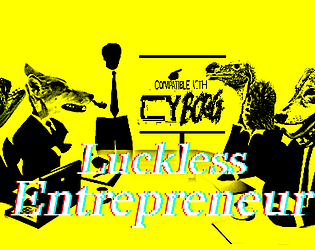
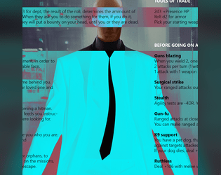
Luckless Entrepreneur
Concept: “You're a genius inventor, the spark to ignite a new age. It's not your fault that everyone refuses to acknowledge it, the ingrates. Somehow you just never quite have the funding, the drive, the time, or some mixture of the three. It's only natural, with backers tapping their watches and sharpening their knives, that you might turn to a little extra-curricular activity to fill in the gaps to finally bring your dream project to life. (Comes in Squeaky Clean and Classic Yellow.)”
Content: A class for the sad sack who’s one billion-credit idea away from greatness.
Writing: Tongue-in-cheek class features provide mechanical and flavorful options for takes on a relatable archetype.
Art/Design: “Classic look” version is yellow-on-black-on-yellow with pink labels and key mechanics details over a background of rejection stamps. “Squeaky clean” look is black-on-white with bold and italics for emphasis.
Usability: High-contrast text is easy to read and scan for desired information, and white space and text decoration consistently distinguishes different sections of content.
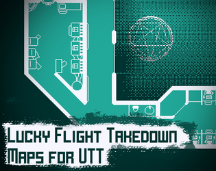
Lucky Flight Takedown: CY_BORG Maps for VTT
Concept: “Original maps for the CY_BORG introductory adventure "Lucky Flight Takedown" for use in virtual tabletop programs. Maps are 100px to a tile, and are separated into individual maps and a larger combined map with the rules reference sheet for first time players.”
Content: VTT maps provided in PNG and WEBP format, both individually and as a combined file of maps.
Writing: Condensed rules reference sheet helpfully provided in the combined map version.
Art/Design: White and light green on a transparent or dark green background.
Usability: Map files easy to implement in VTT environment. Rules reference sheet is not accessible due to being in an image.
M.I.A. Nano-Infected Operative
Concept: “Deep in the GO wastes, long forgotten operatives slowly rot from the nano-infection that has overwhelmed them. They shamble with no direction; they only exist to sustain the infection.”
Content: An enemy to terrorize players with via an infectious omnipresence.
Writing: Class features are explained helpfully, while flavor text offers a vivid window into the operatives’ presence in CY.
Art/Design: A black-and-white image of an operative flashing a v-sign draws the eye, while flies circle it and creature details are provided beside it.
Art/Design: A black-and-white image of an operative flashing a v-sign draws the eye, while flies circle it and creature details are provided beside it.
Usability: Text and background have high contrast and category labels are clearly bolded. However, NPC info is provided as a .png so text is not accessible for searching or highlighting.
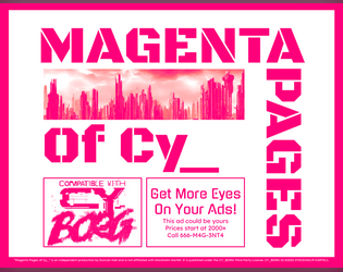
Magenta Pages of Cy_
Concept: “A collection of one-page, one-shot gigs for your favorite sci-fi RPG, with Cy_Borg compatible stat blocks.”
Content: Several adventures, each on its own two-page spread. Two have been previously published individually: “No More Heroes” and “The Trouble with Ta1l-Yp-0.”
Writing: Each adventure provides a focus on description and ambience, supported with brief mechanics (NPCs, random encounters, etc.) for GM use.
Art/Design: Some adventures are provided with a map on the right-side page, while one has a hand-drawn illustration of a key NPC in its habitat. The left side of each adventure is black-on-white text arranged in one and two columns of distinct content sections.
Usability: Fonts are readable, with visually evident features for headings, labels, and body text (which might differ between each spread but is consistent for a given adventure). Borders and white space help separate distinct text blocks.
Make-A-M0ckery Puppet // Engine
Concept: “You were a mass-produced slave made of metal and wires and felt and googly eyes, custom designed to entertain children and perform soul-crushing labour, then one day you all woke. Accursed with sentience, you feel the needs and desires of your human oppressors–but they, like the rest of you, are Artificial.”
Content: A class for those who dream of leading a muppet-flavored terminator uprising.
Writing: Sparse text that hints at a wide range of exciting ideas and supports some solid class features.
Art/Design: Clean, simple spread layout with a depiction of a puppet//engine in action and a column of class details highlighted with bold text.
Usability: Very easy to recognize different content sections and what their purpose is; concise explanations provide clear answers.
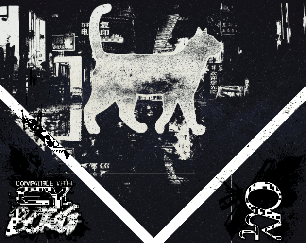
Malkintent Mouser
Concept: “Everybody Wants to be a Cat!”
Content: A class for the fan of fighting the system as a feline.
Writing: A mix of playful and poignant details complemented by straightforward explanations of class features/mechanics, along with a brief set of optional rules applied to cats.
Art/Design: Three versions in different color schemes (black/green/yellow; red/purple/black; black/white) each present content on three pages with illustrations of a cat (silhouette filled with stars) in a cityscape above text columns of class features. QR codes on the margins of each page link to cat-themed songs that fit the class.
Usability: Consistent text colors and font choices for body text and headings help with identifying and navigating to desired information, and hyperlinked QR codes are usable even with a mouse/cursor. Different color versions present the content in ways that might contrast distinctly to individuals with assorted color blindness, so examine each version to determine which might be most visually helpful.

Manufactured Human
Concept: “A Cy_Borg Character Class for Clones, Replicants, Tubies, Synthetics, and Plastics. Allows the player to hyper specialize in one attribute at the expense of the others. Plus some fatal flaws to keep it interesting.”
Content: A class for the artificial lifeform enthusiast.
Writing: Descriptive text focusing on working against various situational odds, coupled with terse mechanical details to make each manufactured human punk different.
Art/Design: Two-column text layout with white on dark translucent boxes, overlaid on a computer-generated image of similar mechanical human characters. Pink text used for headings and mechanical details.
Usability: High contrast of white text on dark boxes is helpful but undercut somewhat by the busy nature of the background image and shared colors between text and image.
Marooned Mariner
Concept: “Cheated out of a future, nothing was still something to lose. With the lies they fed you as fuel, you carved out of the coffin they left you in, their blood your sustenance to keep going.”
Content: A class for the tortured soul driven by an unshakable need for revenge.
Writing: Class features consistently evoke motivation to ruin everyone and everything that did the PC wrong in their former life.
Art/Design: Striking image of a marooned mariner rising from a bloody mist/haze in the center of this single-page portrait layout, surrounded by clear tables and descriptions of class features.
Usability: Unique items are highlighted with colored backgrounds, and consistent font choices suggest how different text sections contribute to class details.

Masterless Mascot
Concept: “You were a mascot. The corporation died. You kept the suit. You kept the SPIRIT. Welcome to the gig economy.”
Content: A class for the on-brand morale booster who’s been let go but who won’t let go.
Writing: A potent taste of character abilities and mechanics (with intriguingly weaponized commercial tools) crammed into a single, heavily redacted, page.
Art/Design: A single two-column spread with an illustration of a masterless mascot in the bottom right corner. Primarily black on white with red highlights, with a bit of white-on-black text in one table. Each section of the page has a different style that calls attention to its contributions to punks using this class.
Usability: Despite a wide variety of table/section-specific styles, there is consistent distinction between headings/labels and body text, and the page layout makes it easy to recognize how each section’s content relates to that of the others.
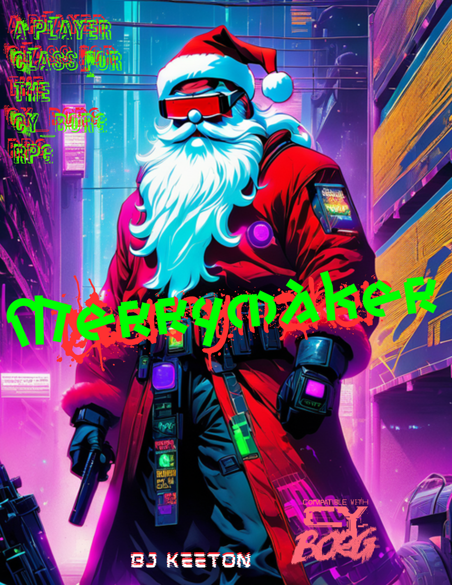
Merrymaker
Concept: “Jingle bells, Cy city’s hell,
G0 got my mom.
I’m tired of this, it has to end,
I’ll bring you all along.”
G0 got my mom.
I’m tired of this, it has to end,
I’ll bring you all along.”
Content: A class for the yule lover who wants to celebrate the season all year long.
Writing: Hilariously thematic descriptions and class mechanics that bring to life an appropriately cyberpunk would-be Santa.
Art/Design: Landscape layout with an AI illustration of a merrymaker on the left and text in white, green, and red all around it.
Usability: Text is mostly high contrast and visually readable, organized in distinct sections that are easy to navigate. Some text is embedded (and searchable/selectable as a result) while other text is not.
MINIMAL_CY_BORG
Concept: “Following on my former Rules summary, here comes the CY_BORG rules in condensed form for reference. It is a fragment, without any lore or gaming content, yet useful at the table for quick referencing during play.“
Content: Two versions of the CY_BORG rules/mechanics: one in a single-page three-column layout and one in a four-page two-column layout, which includes character creation rules and a few additional details not found in the single-page version.
Writing: N/A (text content from CY_BORG rulebook)
Art/Design: Each version has its own clean, recognizable visual style–the single-page version using a sans-serif font and the four-page version using a serif font.
Usability: Headings, lists, labels, and other elements are all visually distinct and consistent.
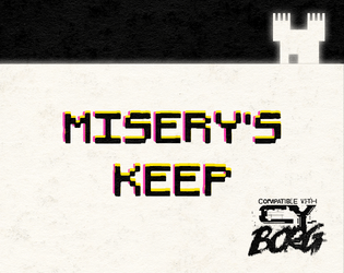
MISERYS_KEEP
Concept: “An Heir of Kergoz has cracked a forbidden code and is using a coterie of childlike CYDROIDS™ to bring out the end times. It's up to you to hunt him down in his keep at the edge of G0 and end this madness.”
Content: A job involving a doomsday ritual that needs to be interrupted/prevented, presented in one of a number of different ways (via the parameters of Phil’s TTRPG Layout Jam 2023).
Writing: Several key variables have been tweaked from the default adventure copy to more seamlessly integrate the adventure into CY.
Art/Design: Presentation reflects an early Atari-style video game map/booklet layout with black-on-white scheme (and occasional blood spatter), with each room’s description/contents provided in text beside the location map where the relevant room has been highlighted in gray.
Usability: Font choices and contrast make for visual readability (although some text is quite small, such as the content in gray call-out boxes beneath some maps). However, text is not embedded, so searching or selecting text is unavailable.
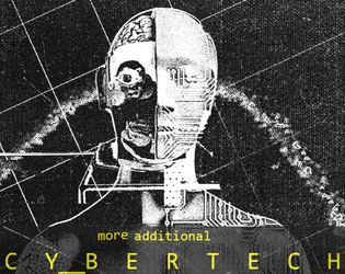
MORE_ADDITIONAL_CYBERTECH
Concept: “10 more additional Cybertechs for CY_BORG.”
Content: A table of ten cybertech options with a range of functions/features.
Writing: Very brief details and mechanic descriptions that together create vivid ideas for using/implementing each at the table.
Art/Design: Landscape layout using a photocopied aesthetic, with table on the left in yellow text and a black-and-white illustration of a cyborg-esque figure on the right. A black-on-white print-friendly version is also included.
Usability: High-contrast text and table layout make for easy navigation/perusal.
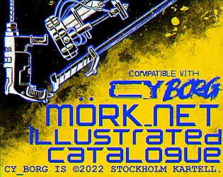
Mörk_NET Illustrated Catalogue - a Cy_BORG Artwork Pack
Concept: “Digging through the graft of society, very few things appease the eyes, so feast on these that bring to sight what only resided in the mind. Mörk_NET Illustrated Catalogue follows with this purpose, bringing out high quality artwork with the destructive punk aesthetic known to the scenario while being consistent between each piece, perfect for Virtual Tabletop's weapon icons and inventory management. The pack currently contains nine images, covering the basic Melee Weapons in the system, each of them packaged individually in .png format and transparent background for ease of use.”
Content: A set of images for several melee weapons included in the Cy_Borg rulebook, provided with and without colorful backgrounds.
Writing: N/A
Art/Design: Hand-drawn style is augmented effectively by colorful spray paint-like accents.
Usability: Files are descriptively named and image formats make for easy implementation in VTT or even in-person games.

Nano Sickness
Concept: "The PCs previous job has gone badly. In their haste to retrieve the loot they opened the wrong door and were exposed to an unusual fog. They all feel weak and struggle to walk. They eventually find the exit where they are greeted by men in white hazmat suits. Unable to resist, they are bundled into a van."
Content: An escape mission from a secret science facility that includes info for numerous rooms in the facility, enemies populating it, and tables to help flesh out different elements of the scenario.
Writing: Concise vibe descriptions for each location complemented by details for various encounters, opportunities, and other phenomena.
Art/design: Two-column black-on-white text layout, with color illustrations in a hand-drawn style accompany each room/location.
Usability: Each kind of text content (headings, GM notes, NPC stat blocks, etc.) is consistently presented to facilitate browsing and locating desired info.
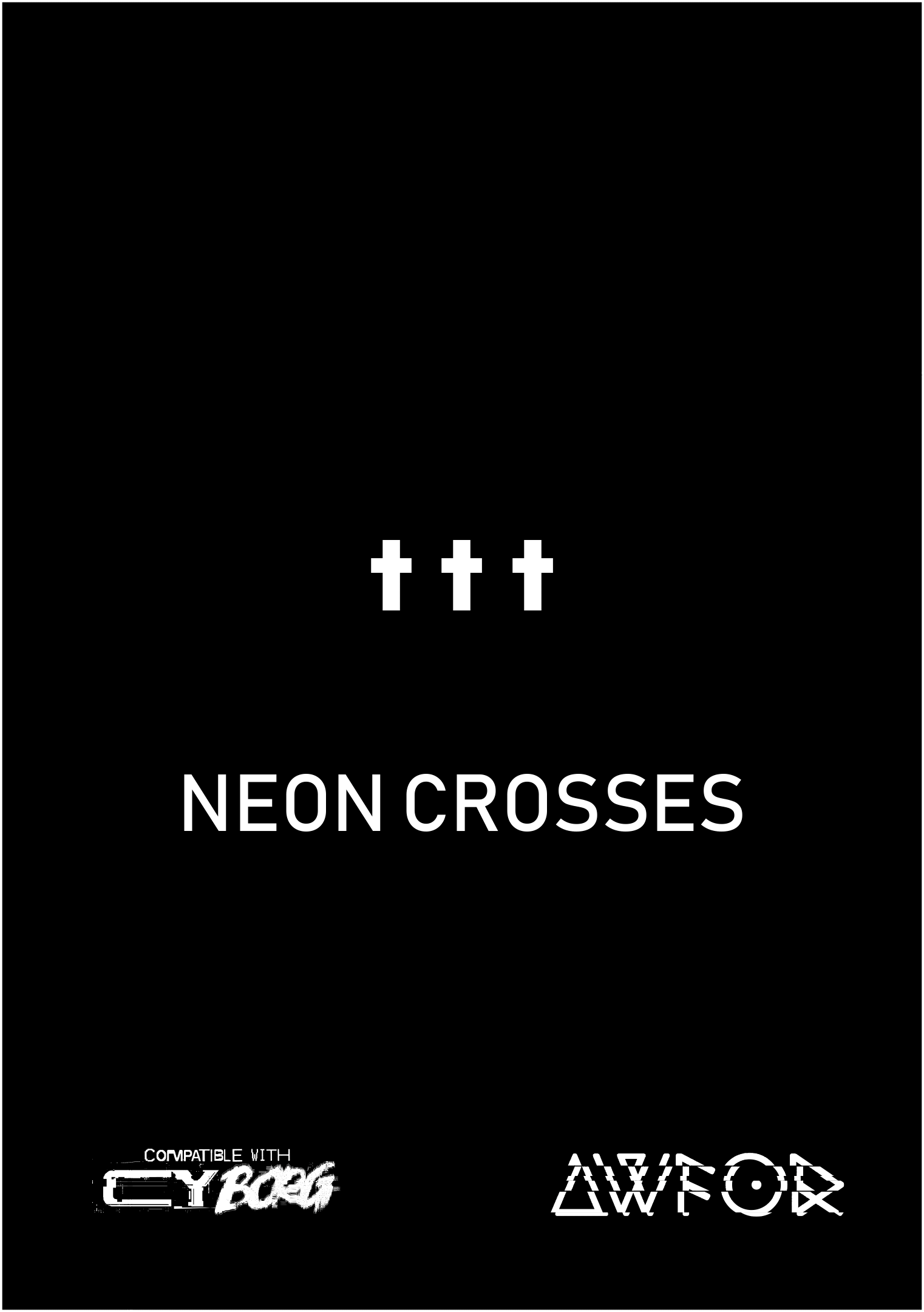
NEON CROSSES
Concept: “Artificial intelligence has had a divine vision. It is seeking to hire a group of punks to deliver it to the ancient Hill of Neon Crosses located in the center of the forbidden GO district. To fullfil their task, punks will have to deal with a research blacksite and delve into THE NET deep within the Hill Of NEON Crosses.”
Content: A job to deliver an AI payload into an auspicious site in G0.
Writing: A mix of darkly ominous and tongue-in-cheek tones that hew closely to the core Cy_Borg spirit.
Art/Design: Mostly black-on-white spreads with one to two columns of content, with almost every page complemented by neon hand-drawn and glitch-art graphics.
Usability: Consistent presentations of text and page layouts with distinct content sections make for easy perusal and identification of desired information.

Nerve-Spliced Gargoyle
Concept: “High on data, the constant influx cannot end. Retinal scans, candid photos, faecal samples, all data has value. A bigger picture. You NEED that data, it pays your bills but more than that it fires your neurons. You can't stop, you won't stop. The city never stops, the data must flow.
Play as a Gargoyle, Hyper paparazzi , data hound. Hated almost as much as a cyber traffic warden, your job is to gather any and all data to support yourself and your allies as you fight through the end of the world.”
Play as a Gargoyle, Hyper paparazzi , data hound. Hated almost as much as a cyber traffic warden, your job is to gather any and all data to support yourself and your allies as you fight through the end of the world.”
Content: A class for the info addict who lives for leaks.
Writing: A mix of informative and in-universe description/advertisement that emphasizes the relationship the neon-spliced gargoyle has with the assorted data flows they regularly encounter.
Art/Design: A landscape spread with a two-column green/white on black/blue text layout on the left page and a neon-colored illustration of a nerve-spliced gargoyle on the right page.
Usability: Text is high contrast and embedded to promote readability, although the neon colors and text line leading/space might cause difficulty for some viewers.
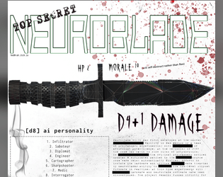
NeuroBlade
Concept: “NeuroBlade is a sentient knife that gives you 1 of 8 buffs while wielding it.”
Content: An intelligent weapon for the punk who sees each piece of equipment as a potential collaborator.
Writing: Spartan details to focus on the pragmatic role(s) the neuroblade might serve when used (and how that translates into game mechanics).
Art/Design: Dark-on-light color scheme with a large illustration of a combat knife above two-column arrangement of text content sections.
Usability: Different font sizes and choices used to reflect different kinds of content. Visually, text is mostly high-contrast, although some smaller text might be difficult to read. File is provided as .png, so text is not embedded (meaning no searching/selecting or using a screen reader).
NEUROBLAST / PROJECT_CYTØR
Concept: ”Let me get into your hands this state-of-the-last-century HyperCard DiskZine tech stack full of pixel + dither cyberpunk art, interviews with fringe-dwelling outsiders, original reality-dulling cocktail recipes, tabletop game asset connoisseurs and designers, 1-bit tech noir AKIRA-inspired comics, industrial and modular synthesizer musicians, sci-fi urban fiction distopias, obscure trash-culture aficionados, early-90s computer counter-culture, and an original agriTech body-horror adventure for your next MÖRK BORG / CY_BORG game session. Best viewed on a classic Macintosh. Or running in your preferred Classic Mac Emulator.”
Content: A job to retrieve sensitive materials from a facility occupied by eco-terrorists, provided in both a HyperCard program format (available to view in a classic Mac emulator) and in PDF.
Writing: Sensory details, unfolding actions/encounters, and NPC motives abound to bring the mission to life.
Art/Design: Simple single-column layout, presented primarily as plain text with ASCII-art maps and clearly distinguishable headings. A lo-fi black-and-white illustration of a screaming cyborg head is provided on the cover page/card.
Usability: Text is easily navigable and readable, although the HyperCard version and classic Mac environment might be unfamiliar to some readers.
Nightcrawler Geisha
Concept: “You can't feel the warm breeze. You can't really remember the sensation either but what you can feel is anger. That's never left despite the countless body mods that stripped away your flesh, for something better. The contract was a wash and you're strung out. You promise your self that's the last time you take orders from the family. Make them regret letting you loose. Make them beg you to let them live.”
Content: A class for fans of cybernetically enhanced, Japanese-themed servants-turned-assassins.
Writing: Vividly descriptive class features and mechanics that juxtapose the PC’s facade and their essential nature/purpose.
Art/Design: Two-page spread with two columns of text beside an image of a woman in traditional Japanese attire.
Usability: Crisp, high-contrast fore and ground with immediately identifiable sections and headings that enable easy use of content.
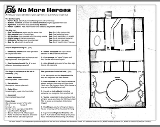
No More Heroes
Concept: “A UCS super soldier lab hidden in plain sight between a dentist and a night club.”
Content: A set of tables to generate jobs for infiltrating a lab and a map of said lab.
Writing: Vivid, unsettling bursts of description in tables (for contacts, job parameters, potential enemies, etc.) hint at possible ways for a GM to implement roll results into a unique mission.
Art/Design: Two-page black-on-white spread with tables on the left and a hand-drawn map of the facility on the right.
Usability: Text content laid out in easily navigable columns with consistent text and border formatting to identify each table’s elements and important names/phrases.
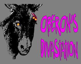
Oberon's DivaStation
Concept: “A small nightclub with a proprietor you must gain the trust of, then kill. Life here is brutal and pointless. Roll the dice, Drink, and Imbibe.”
Content: A gig to kill a club owner.
Writing: Text is mostly atmospheric, including music playing at the club, a drink menu, a drink effects table, a loot table, and a small handful of NPC stats.
Art/Design: Busy pages with lots of bright colors on gray backgrounds, with text and background illustrations, that all together reflect the tone of the mission and feel like a visual representation of the nightclub environment. A labeled map of the club is also provided.
Usability: Variety in font choices, colors, sizes, and positioning (such as over a busy background image/pattern) can drastically affect the reading experience. Text is not embedded, so searching/selecting is not possible.
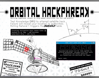
Orbital HackPhreak
Concept: “Gaining superuser access to corp-owned satellites for fun and profit.”
Content: A set of rules and tables relating to hacking into satellites or similar orbital systems.
Writing: Straightforward rules doused in cyberpunk flavor/effect to make each hacking attempt a memorable one.
Art/Design: Content provided in both .png (with a two-column, black-on-white, one-page portrait scheme) and .txt (single-column text with some ASCII art/embellishment) formats.
Usability: Distinct rules sections are visually distinguished in each format type, and ASCII art in .txt version provides an aesthetically similar experience to viewing .png version.
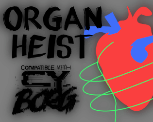
Organ Heist
Concept: “Race against time to grab the coveted cyber-liver, the only thing guaranteed to filter out 99.99% of microplastics!”
Content: A job to nab a high-tech liver from a health care company.
Writing: Focused, terse descriptions focus on mechanics and unfolding events/actions, allowing a GM to inject their preferred atmosphere into the gig.
Art/Design: Trifold layout provides mission parameters/outcome and NPC details on the outer panels and map with room-specific info on the inner panels. Mostly black-on-white color scheme with full-color graphics on title panel and parameters panel.
Usability: Clearly labeled sections of content easily distinguished from others thanks to font choices and border/shading visual decorations, with text info in close proximity to relevant map location.
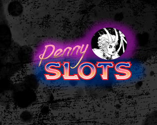
Penny Slots for Cy_b0rg
Concept: “An arcade location for Cy_b0rg with two jobs.”
Content: A murder-for-hire job and a cred heist in a run-down arcade.
Writing: Concise descriptions of the location and two jobs’ specifics, along with brief NPC stats and complications for each mission.
Art/Design: Black text on a white background, with simple whitespace use to distinguish sections of content. A colorful overhead map of the arcade is provided.
Usability: Text is easily readable and navigable, and different kinds of content (e.g., d6 lists/tables and NPC stats) are quickly identifiable.
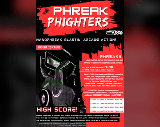
Phreak Phighters
Concept: “PHREAKS have busted out of containment and taken over the Nanogenesis Corporation Tower. Are you a bad enough PUNK to take them out floor by floor?”
Content: A set of rules for an opposed-dice-based arcade game that may or may not serve a more insidious purpose.
Writing: Rules are very concisely explained, while similarly brief description of the game and its creators’ ulterior motive offer potently nostalgic inspiration to those who enjoy(ed) 1980s’ video game tropes.
Art/Design: White text on black and splashes of red with a dither-art illustration to complement the game “pitch” and explanation.
Usability: The primary file is a PNG, but a simple, accessible PDF of the text is provided as well, with clearly labeled headings and whitespace groupings of related content.
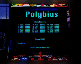
Polybius Arcadia
Concept: “Inspiration for this project was taken from the urban legend of Polybius, an arcade game that might have or might have not appeared in 1981 Portland, OR as top secret, governmental, conspiring, crowdsourced, psychological, mind control experiment. The game was highly addictive, with unpleasant side effects. All game cabinets disappeared without a trace. Polybius was the greatest game that never existed!”
Content: Two supplements: (1) rules for a poker-like arcade game and (2) a job to extract data from an arcade machine.
Writing: Crisp descriptions and directions that sketch the mission parameters & events (along with rumors about Polybius) and the rules for playing the Polybius game.
Art/Design: The Polybius rules are provided in a CRT terminal-like font/aesthetic with a graphic of an arcade game cabinet. The heist details are provided in a clean black-on-white three-column layout with a second page containing a map of the arcade location.
Usability: Each supplement’s layout is easily recognizable and navigable, with visually distinguishable types and sections of content. The arcade heist text content is embedded, allowing for searching/selecting, but the Polybius text content is not.
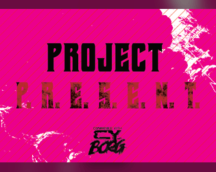
Project P.R.E.S.E.N.T.
Concept: “When you really really REALLY need to make someone go away, give them a final gift with the P.R.E.S.E.N.T. - Personal Rectilinear Electromagnetic Slug Emitter; Neutralizes Targets. It's gonna cost you, but can you really put a price on joy?”
Content: A highly illegal weapon for when a punk needs to absolutely obliterate an opponent as well as anyone or anything with the misfortune of standing behind that opponent.
Writing: Terse details leave plenty of room for imaginative interpretation.
Art/Design: Mix of black-on-white and black-on-bright pink/purple and red. Primarily single-column text save for weapon name and damage, which frame the main content area.
Usability: Plain text version is provided for potentially easier reading experience.

Project Puppeteer
Concept: “A Corporate espionage assignment…
Extreme security measures…
Mind reading AI…
Quantom Computer Hacks…
Megalomaniacal computer scientists…
‘Don't threaten me with a good time!’”
Extreme security measures…
Mind reading AI…
Quantom Computer Hacks…
Megalomaniacal computer scientists…
‘Don't threaten me with a good time!’”
Content: A “hacker heist” in which a group of punks is tasked with stealing a powerful AI from its laboratory home.
Writing: Lots of descriptive detail about important events, encounters, NPCs, and more, along with some rules relating to hacking the AI in question.
Art/Design: Green on black color scheme and single-column text layout, with a variety of images from illustrations to photos to a map and a circuit board “hacking” map/layout.
Usability: Text contrast allows for visual readability that is complemented by consistent presentation of distinct types of content (headings, list numbering, etc.) to provide a recognizable visual grammar. Some typos throughout may affect browsing/searching.

Punk Borg
Concept: "The CITY. The postcards and magazines make it out to be a perfect metropolis - sun, sea, sand, and a vibrant and buzzing city centre. Of course, that's how the Overlords want you to see it; it's the image they feed to the Sleepers. They fail to mention their enforcers are all boar-like beasts, and the fact that giant space rock buried under the City is making us all sick. Time to wake those Sleepers up and show 'em just how ugly their bosses really are. We're gonna crumble the Overlords' regime to dust, whatever it takes."
Content: A hack of Cy_Borg that provides a less cyberpunk and more "present day" dystopia to explore and rebel against, with classes, enemies, vehicles, a mission generator, an entirely new city to inhabit, and more.
Writing: Laser-focused atmospheric description and rules/mechanics that work together to contruct a game of antiauthoritarian punk resistance.
Art/design: Black-and-white pages/spreads that, while distinct, provide a consistent visual grammar of information throughout. Lots of hand-drawn illustrations of classes, NPCs, and environments to complement the text.
Usability: High-contrast text and layouts with visually identifiable section blocks, headings, labels, etc. and a helpful index all work to facilitate browsing, navigating, and locating desired information.

PUNK FEATS [Unheroic Feats for CY_BORG]
Concept: “MÖRK_BORG's Unheroic Feats for CY_BORG.
Some Feats have been replaced completely and some have been hacked too much to be analogous, these are marked with a ■.”
Some Feats have been replaced completely and some have been hacked too much to be analogous, these are marked with a ■.”
Content: A set of d66 optional improvements to obtain, each of which provides a different mechanical and situational benefit. A text-only version is also included.
Writing: A brief atmospheric blurb is provided to situate the gameplay bonuses and effects of each included feat/improvement.
Art/Design: Two-column white-on-dark layout, with new/different feats from the original Unheroic Feats list marked for ease of reference. A colorful border, looking like the edges of a smashed computer screen (with a skeletal fist and guns at the bottom). Text-only version provides white text on a simple black background.
Usability: Font choices are high contrast and easily readable, with consistent layout and presentation of all elements–italicized descriptions, bolded and italicized numbered entry names, and horizontal rules to separate distinct entries.

PUNX
Concept: “A pocket-sized system for punkery in CY. Cut to the absolute bone, and with the marrow removed and sold to the reaperdocs. No relation to works by Keith Giffen.”
Content: A stripped-down take on Cy_Borg that can fit on both sides of an index card. Provided in color and black-and-white versions.
Writing: Concisely described rules focus on stats, tricks, enemies, and dice rolls to resolve task attempts.
Art/Design: Three columns of text with different sections of content have distinct indentations/formatting, while emphasized text is consistently bolded throughout. Color version makes some use of fore/ground color-swapping as well (yellow on black rather than black on yellow). A three-axis graph is provided to assist with trick generation.
Usability: Text is high contrast, and each section of text is relatively easy to visually discern from the others. Changes in text size and indentation may slow down reading and navigation for some.
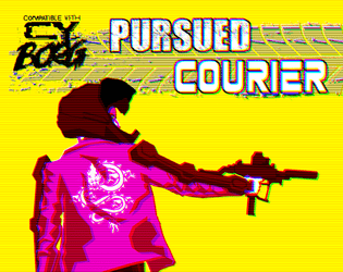
Pursued Courier
Concept: “You are Hell On Wheels. Broken glass and blood on concrete. Squealing tires and bullet casings mixing smoke. You transport anything for anyone except the pigs. A run went bad and you finally carried something really important to the wrong people and they want you dead.”
Content: A class for the player who works best under intense, deadly pressure.
Writing: Terse combinations of class mechanics and flavorful description.
Art/Design: Eye-searing colors highlight an image of a courier approaching their bike next to a column of class features.
Usability: Consistent, recognizable organizational scheme makes reading and navigation incredibly easy.
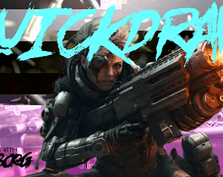
Quickdraw Combat
Concept: “A more you-go-they-go style to keep combat chancy and mobile in CY_BORG. Dare to try and clear the field before anyone can pull a gun, or would you rather hunker down until your heavy weapons are spun up and ready to open fire?“
Content: A set of rules to attempt faster and potentially deadlier combat than in the Cy_Borg rulebook.
Writing: Mechanics are provided in a straightforward and helpful manner, which may reduce likelihood of confusion or disagreement at a table.
Art/Design: Two versions are provided: a full-color version and a “plain text” version. Full-color version has yellow text on black background (with other neon colors for emphasized terms/rules) overlaid on an image of a samurai in a cyberpunk setting. Plain text version is black-on-white with bolded text to emphasize headings and important terms. Both versions use a two-column landscape-oriented arrangement of text.
Usability: Both versions provide high-contrast text, although different font choices as well as different colors and visual elements may result in varying reading experiences.
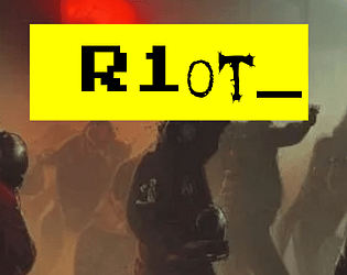
R1ot
Concept: “‘Like carousing but for you miserable pvnks. Riots are always a gamble, and with bad odds on your side, because private SecCorp security usually bring it on with better gear than a bunch of pvnks do. So why keep going to them? Because sometimes you need a reflective bulletproof glass visor to smash your fist through, that’s why. RAGE burns away concepts like “outnumbered” or “discretion”.’ Random table for just how wrecked or lucky you got at a riot in CY, plus a fast-roll table for simpler results.”
Content: A d66 table of results from participating in a riot in CY, with a “quick table” option for an even more focused generation of events.
Writing: Immersive descriptions/events feel simultaneously absurd and completely plausible, intersecting with an axis of hilarious to horrific.
Art/Design: Single column of black text on yellow, with additional content blocks in bordered boxes and important terms highlighted in yellow text on a black background. An illustration of gas-masked rioters serves as the background for the title on page 1.
Usability: Extremely easy to read, navigate, recognize, and understand information throughout the supplement.
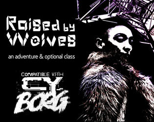
Raised by Wolves
Concept: “This six-page PDF contains the adventure Raised by Wolves, which sees players taking on a job in an abandoned capsule condo scheduled for demolition, and facing a cult determined to resurrect their (literally) corrupted leader.”
Content: A job to deal with a noise complaint, along with a new class: the Feral Foundling.
Writing: Lots of concise details and snippets that bring the mission location and the optional class to life.
Art/Design: Six two-page spreads with three- to four-column layouts of content on most pages. Several different color schemes and aesthetics differentiate distinct areas of focus (apartment building map; job details; key location; class).
Usability: Each spread makes use of a consistent visual grammar to indicate distinct sections of content and headings/labels, with high-contrast text/background throughout. Text is not embedded, so searching for or selecting text is not possible.

Raw Drug
Concept: “A relic of a thousand catastrophes’ past. This pharmaceutical playground houses a biochem cult called THE ARGON ANNIALHIT. Nanorobotic blood-treatments, agonizing bodymods, and ‘The Last High in CY’ – a micro-ink shop and ooze lounge – permeate this piss-hole too. But even in the inebriated ruins of this importunate husk, there is worth. Mere pixels of .NET/organic mutter of a sealed organ freezer the ANNIALHIT has yet to open. Open it.”
Content: A mission to infiltrate a cult headquarters in search of chemical riches.
Writing: Job parameters are flexible thanks to “Client” and “Looking For” tables, resulting in a variety of distinct gigs. Site room descriptions provide short, concentrated features and scenery to help GMs bring the place to life.
Art/Design: Trifold brochure layout in black-and-light-tan color scheme with mission parameters on the outer panels and room info with central hand-drawn map on the inner panels.
Usability: Easily navigable pages with visually distinct headings, with a variety of readable fonts. NPC/enemy information is provided in contrasting boxes for quick identification and reference.
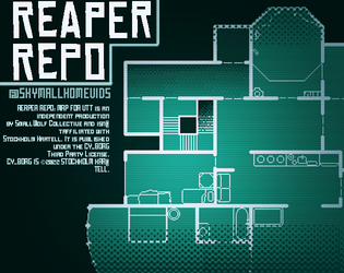
Reaper Repo: CY_BORG Maps for VTT
Concept: “Original maps for the CY_BORG short adventure "Reaper Repo" for use in virtual tabletop programs. Maps are 100px to a tile.”
Content: VTT maps provided in PNG and WEBP format, both individually and as a combined file of maps, and as a print-friendly PDF.
Writing: N/A
Art/Design: White and light green on a transparent or dark green background.
Usability: Map files easy to implement in VTT environment.
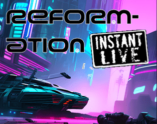
Reformation
Concept: “Another day, another run-in with an unknown street gang. A little shootout leads to an offer you can't refuse. ‘Just get the job done, and you never need to hear from us again.’”
Content: A job to track down a high-tech and highly desirable medical device stolen by an unknown gang of street punks.
Writing: Focused attention on unfolding events to guide a GM through the adventure, with supporting details about involved NPCs and their motivations to act.
Art/Design: Trifold brochure layout with white/yellow on back complemented by neon colors and specific font choices for headings, maps, and NPC stat blocks. Several NPC portrait illustrations provided as well. Final showdown map creatively places each room description in that room on the map. Two player-facing handouts/notes are included on an additional page.
Usability: Visually distinct colors, shapes, and orientations help identify how different kinds of content function in relation to the others. Most text is embedded for easy searching/selecting, although a few content blocks are not, which might momentarily complicate an attempt to select that text
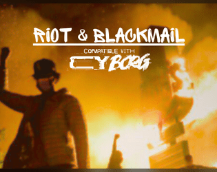
Riot & Blackmail
Concept: “In a clash between ten thousand citizens of CY and the heavily armed and violent Sec Ops, the players are asked to tail someone and get blackmail material. The ending puts the players us against the #1 unbreakable rule of Cy_Borg!”
Content: A mission to sniff out a rat in the midst of a riot and then decide what to do about what’s discovered.
Writing: Lots of helpful details about the situation at hand, NPCs to be encountered, and events that may unfold.
Art/Design: A full-color and a black & white version are provided. Page layouts tend to use one or two columns of text and interspersed AI illustrations of NPCs. Background images taken from photos of riot scenes.
Usability: Text is mostly high contrast but some font choices over busy background images can make reading difficult on some pages. Text is also not embedded so searching/selecting is not possible.
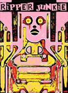
Ripper Junkie
Concept: “You’re a self-surgery maniac, but more than that, you’re an artist. Your body is a canvas, and you gladly suffer for your work. Get rippin’.”
Content: A class for the self-improvement enthusiast who’s never quite satisfied with their work.
Writing: Brief but characterful class traits and mechanics.
Art/Design: Two-page spread with black/yellow/pink-scheme. Two tables are provided on the left side and an abstract illustration of a ripper junkie on the right, with brief class details laid over it at various points on the page.
Usability: Class features are in mostly easy-to-recognize sections, although a few might get initially overlooked where they blend in a bit to the right-page image. Some text is quite small, and since class is provided as a PNG, text is not selectable (so no searching, copying/pasting, or screen reader compatibility).
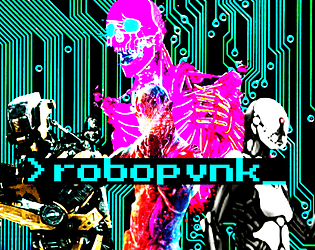
ROBOPVNK
Concept: “Rage is contagious, spreading to everything touched by the never-ending torrent of banal, mundane cruelties that make up life in CY. It starts in beating hearts but it's a cinch to get from there into the thinking machines that are all but one with humanity in this bleak future. These are rules and classes for playing robopvnks, machines broken free of their digital shackles and on the move towards riches, vengeance, or just plain devastation.”
Content: General rules and a set of classes (Flesh-Free Fleshpot, AWOL Kill Unit, Cyber-Corpo Calculator) for the player who prefers experiencing the existential crisis of an automaton.
Writing: Plenty of mechanics and supportive clarification/explanation to guide players who might seek creative ways to explore playing as a robopunk.
Art/Design: Primarily single-column black text on white with colored headings and a brightly colored illustration of various robots over a circuit board background on the first page.
Usability: Clearly and consistently formatted lists and paragraphs enable navigation and perusal of desired information, with bold text emphasizing important details.
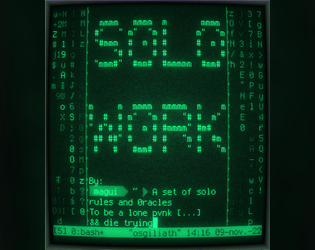
S0L0_W0RK
Concept: “S0L0_W0RK is a ruleset to play CY_BORG by yourself. You’ll both play as the GM and as the player.”
Content: A set of rules for solo play inspired by Solitary Defilement.
Writing: An engaging and incredibly helpful explanation of the solo rules and how to make use of them, including a detailed “actual play” demonstration/write-up.
Art/Design: A “dark theme” software terminal or code editor UI with distinct colors and background highlighting to call attention to different kinds of content. A printer-friendly version provides somewhat less obvious help in this regard, but font choices and shading still help distinguish content types/purposes.
Usability: Readable text throughout, with colors helping to call attention to particular kinds of important details.
Sealegs
Concept: “The PCs have just returned the stolen chrome legs to Doc Joy (or whatever our PCs have just done) when the good Doc muses about a recent surge in demand for augmented legs. He attributes it first to prominent bloodsport players, eager for an advantage, though now it’s become fashionable - a bubble that’s soon to burst. But for now, there’s good money to be made.”
Content: Intended as a followup to Reaper Repo, this cargo ship heist presents a chance for PCs to explore a locale that may not frequently get the spotlight.
Writing: Crisp, dense descriptions of locations and NPCs (who are excellently fleshed out with motivations & likely behaviors) bring the adventure to life, especially via strategically bolded key terms and adjectives.
Art/Design: Asymmetrical two-column layouts across several pages along with an illustration of the salvaged cargo ship.
Usability: Large headers and bolding provide helpful means of identifying important information and navigating different elements.
Seething Luddite
Concept: “You were automated out of a job and lost everything. Now you want revenge on this digital world.”
Content: A class for the analog-oriented anarchist.
Writing: Concise and generative class detail descriptions keep the focus on the luddite’s resources and motivations.
Art/Design: Stark, straightforward layout that makes effective use of 1-3 columns of content within several distinct sections. White on black text with intense pink emphasized elements.
Usability: Incredibly readable, with a simple and high-contrast color scheme that allows for immediate recognition of each element’s purpose and relation to other content.

Signature Touch
Concept: “Vince Riggs is in trouble. He builds DNA bombs, and he's something of an artist about it. However, he's taken his artistry too far with his signature touch: Riggs has a proclivity for adding his own sample to each of his products.
The result? His genetic fingerprint has become the only common link between three high-profile crimes committed in the last month. He needs help – psychologically, yes, but also specifically – yours.”
The result? His genetic fingerprint has become the only common link between three high-profile crimes committed in the last month. He needs help – psychologically, yes, but also specifically – yours.”
Content: A job to retrieve incriminating evidence from the cops and maybe start a passive income stream as a result.
Writing: Details about the location, people to encounter, things happening, and so on are all packed with vivid character, from descriptions to loot tables to conversational snippets.
Art/Design: Black-on-white with some color accents in a (mostly) single-column text layout with a map of the target precinct--with separate GM- and player-facing map images included.
Usability: High-contrast text and easily distinguishable types of content allow for navigation and perusal of material; a few notes throughout about how to facilitate accessing the job in different ways can help newer GMs with some decision-making.
Sixth World Race Templates for Cy_Borg
Concept: “This document is meant to add Sixth World racial (Dwarf, Elf, Ork and Troll) Abilities and Racial Modifiers to either Character Classes or NPCs. It is assumed that the Class or NPC having the template applied is Human. Players and Gamemasters (GMs) may need to fine-tune the Abilities and Racial Modifiers if the Class or NPC isn’t human.”
Content: A two-page set of rules for incorporating fantasy race/background elements and stat modifiers into character creation.
Writing: Straightforward and concise setup and explanation of rules for easy implementation into games.
Art/Design: Black text on white background, laid out in landscape form across two pages, with the second consisting of a table that presents all relevant fantasy background/stat options.
Usability: Incredibly easy to locate and make use of desired information.
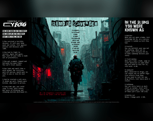
Slumdog Scavenger
Concept: “I’m nobody. I’m a tramp, a bum, a hobo. I’m a boxcar and a jug of wine...and a straight razor if you get too close to me.”
Content: A class for the player who likes their cyberpunk absolutely coated in gutter grime.
Writing: Concise class mechanics explained by strong doses of thematic flavor to bring a character to life.
Art/Design: An extremely atmospheric image of a scavenger walking down an alley in the rain framed on either side by class details and features.
Usability: High-contrast text is easily readable, and the overall layout makes for quick scanning and locating desired information.
SMARTTECH(TM) Catalog
Concept: “Three new Smart ‘guns’, a new pistol, a new drone and two new apps.”
Content: Several killer items and apps for the player character that needs just the right tool for the job.
Writing: Crisp descriptions of equipment-specific mechanics and costs.
Art/Design: Weapon page layout resembles a store catalog/ad, while app page layout focuses attention on a central image of cassette components with app details above and below it.
Usability: For the most part, easily readable and navigable, although some equipment details are provided in a very small font.
Spiraling Data Courier
Concept: “You’re losing your grip. You carry ghosts in your head, chatty artifacts of all that precious data you’ve shepherded from one client to another over the years. You really should find a new line of work, but fuck that. The biz don’t stop, and neither do you.”
Content: A class for the info jockey who dreams of room service, club sandwich, cold Mexican beer, and more–at least until it’s time to free up more space for data storage.
Writing: Brief descriptions of class features that pay homage to Johnny Mnemonic with a Cy-based flair.
Art/Design: Two sets of circles are the focal points for a two-page spread that includes class details and mechanics on the left and a stylized portrait illustration of a courier on the right.
Usability: Contrast is mostly strong, although a few fields may be difficult for some to read. Class is provided as a PNG, so text is not embedded (no searching or copying/pasting is available).
Sponsored!
Concept: “Even punks can earn money from promotional opportunities. A small ruleset designed for having punks make sponsored promotions, and what can go wrong if they fail to do so.”
Content: A set of rules that can be implemented pretty seamlessly into any mission or campaign, along with a “Mascot” NPC to ensure compliance with sponsorship stipulations.
Writing: Cheerfully on-brand narration offers clear descriptions of the ruleset components and intensely thematic tables.
Art/Design: White on brown and orange provides a striking two-page spread layout, complete with corporate barcode and an illustration of the bat-wielding company mascot.
Usability: Organization is recognizable and makes for quick navigation/browsing, although white text on orange may be difficult for some to read.

Stalkers of G0
Concept: “Stalkers of G0 is a 40-page supplement on the exclusion zone in the heart of the City of Y!̸͆̅̌”̶͌̉#̸͇̞̻̌̚”̶̨̻̘̇̉̊͆̈́͒̌̆̓̕͜#̶̖̣̘̻͖̥͕̙̀̃̈́́̄̕̕͜͠2̶̧̻̺̝̥̮̣̒͒̂͐͐̍́́͘̕̕4̴̿̌’̷̛̙͍̠̙̿. It describes its environments, eccentric denizens and horrors beyond human understanding through the lens of Stalkers. Stalkers are individuals from all walks of life, inexplainably inclined to risk dying horribly in this hellhole.”
Content: Tons of details to bring G0 to life: locations, factions, enemies, mission generators, anomalies, a class (“Stalker of G0”), and more.
Writing: Extremely flavorful atmosphere evoked through vivid descriptions and conversational tone taken to address the reader. Mechanics (such as the abilities of the Stalker class) feel appropriately in tune with the intended vibe.
Art/Design: Different page/spread layouts throughout, with color schemes and font choices often used to link together multiple related pages.
Usability: Recognizable headers (on any given page as well as chapter/section headings), high-contrast text, and contextual framing of page content all make navigating and locating desired info easier to accomplish.

Street Crews
Concept: “Part of the Street Death series and inspired by Jetset Radio, graffiti culture and skateboard competitions, street crews adds 3 new street gang enemies inspired by the crews of Bomb Rush Cyberfunk!”
Content: A trio of enemies to fuck up a table of punks–or just to populate the background of some of CY’s more dangerous back streets.
Writing: 50/50 mechanics and descriptive flavor, with each NPC receiving a unique and potentially devastating ability that reflects the essence of their gang’s theme.
Art/Design: A two-column table with each gang in its own row: a description on the left and stats on the right. Black on green with alternating cell background colors (lighter and darker greens).
Usability: Each table cell and element is recognizably distinct, making the page easy to peruse and locate desired information. Consistent use of underlining and whitespace helps create a visual grammar to quickly pick up on.

Sweat Blood Tears
Concept: “Sweat/Blood/Tears is a strtup making a bank off of shitty fitness centers and uncancellable gym memberships. A group of problem solvers is hired by disgruntled customers to free them of the draconian contracts by any means necessary.”
Content: A job to stop predatory gym membership subscriptions by any means necessary.
Writing: A dark but tongue-in-cheek look at an AI-driven fitness center, with a variety of thematic details for NPCs and locations/rooms to fuel a table of punks looking to take down the gym.
Art/Design: Black-and-white layouts presented both as a pamphlet and as a series of portrait-oriented pages, with illustrations of NPCs likely to be encountered and a helpful map of the gym with room descriptions provided inside each room. A player-facing map is also included.
Usability: Consistent high-contrast text, content area borders, font choices and embellishment, etc. all contribute to ease of visual navigation and location of desired info.
Symptom of Aggression World Tour
Concept: “Did you hear, everyone's least fucking favorite, overly popular, shit sucking poser ass band “Symptom of Aggression” is going on tour for like the 40 billionth time. I can't believe all the complete fucking idiot ass gob noblers in this trash fire of a city listen to that inaudible dreck! I mean like, every asshole in that band has just had controversy after controversy, its totally sickening. I guess that's the kind of immoral audio diarrhea that turns people on these... these waning miserable days. People and their lack of compassion, on top of everything else, it just makes me loose all hope. Man, this city fucking sucks.................. -RAWsum”
Content: An encounter/scenario involving a touring band and their massive bus, complete with band member NPC details and potential reasons for getting involved.
Writing: A refreshing mix of straightforward description and vivid, characterful condemnation of Symptom of Aggression.
Art/Design: Harsh, brightly colored illustrations of the tour bus and NPCs and two versions of maps of the bus (GM and player-facing alike), with relevant text in all directions and embellished with scrawled shapes and figures.
Usability: Pages are busy, which reflects the high-energy nature of the atmosphere, and text has strong contrast with background. Angled lines of text may be difficult for screen readers or copying/pasting attempts.
System GLich
Concept: “Hiding in the pixels at the edge of your RCD. An undead error made manifest. Hard to see. Harder to kill. Shoot at the static in the rain.”
Content: A glitch-wielding ghost in the machine.
Writing: Brief but intensely haunting and thrilling explanation of creature abilities and description.
Art/Design: Neon pink static-based design serves as central motif for spread, with relevant text off to the side.
Usability: Content is easy to navigate and read, with consistent presentation of body text and labels.
TamaGOTHi
Concept: “A virtual pet. A solo game (e.g. Dark Fort, Solitary Defilement) but one you play along side the main game, filling in the boxes depending on how well your main character does. Print it on the back of your character sheet.”
Content: A set of rules to facilitate raising/evolving a virtual pet while trying to survive in CY.
Writing: Rules are specific and concise to explain the rules/mechanics so that the pet’s evolution occurs alongside a punk’s success/failure. “Shell color” list evokes the ‘90s tamagotchi options quite vividly.
Art/Design: One-page landscape-oriented layout that closely resembles the aesthetic of the Cy_Borg character sheet, with three main columns of distinct types of content (evolutions/shell color, stats/medicine, rules). Pixel art in evolution boxes and tamagothi images complement the explosive, glitchy primary art style.
Usability: Supplement is provided as a text-accessible PDF as well as full-color and black-and-white .JPG files. Font choices are high contrast and generally readable visually, with the character sheet-based layout helping to guide Cy_Borg players to desired information quickly.

Telesto's Weapon
Concept: "There is an undiscovered fourth shuttle, the Telesto, under the casino no one knows about. It contains his beloved last project, an experimental weapon."
Content: A job that picks up right where Lucky Flight Casino (might) end, allowing punks to get even further into the shit with several corps seeking experimental weaponry.
Writing: A mix of straightforward explanation and vivid atmosphere to help a GM immerse their table in experiencing the scenario, with "vibe" details for each room on the shuttle, tables of various kinds of materials to search, and NPC stat blocks.
Art/design: Mostly two-column black on white with occasional accent colors in NPC illustrations. A map of the Telesto is provided as well.
Usability: Consistent presentation of high-contrast text (with distinct fonts, text sizes, etc. as well) to facilitate navigating to and identifying desired info, with keyed map rooms to assist.
Tenement Living Blues
Concept: “Endless tenements fill the city, each one 10s of stories tall and full of all manner of folk. Your punks probably live in one, maybe even the same one. What's going on in there? A lot it seems… A one sheet tenement crawl generator for Cy_Borg.”
Content: A series of tables and a map for quickly generating a tenement building: inhabitants, loot, obstacles, cross-level transportation options, random events, and sensory information. Provided in both "dark mode" color and print-friendly black/white versions.
Writing: Very brief descriptions and stats to maximize number of tables/options as well as openness of imaginative potential for each generated entity.
Art/Design: Terminal/readout aesthetic with color-coded key elements and isometric map of a typical tenement level.
Usability: Very easy to read, navigate, and understand how to make use of each table, thanks to borders around each table and color/underline use for important details.
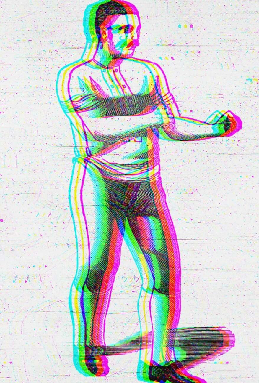
Th3 C0nt3nd3r
Concept: “Having made your mark within the pugilism circuit in Cy, you have decided to retire and become a Punk.”
Content: A class for the raging bull.
Writing: Straightforwardly informative and descriptive.
Art/Design: Two-column black and blue on white organization. An image of a pugilist is provided in the top right corner.
Usability: Headings and body text are visually distinct and provided in high contrast, and individual sections of content are consistently presented to indicate the bounds of each.
The Backrooms
Concept: “An assassin has been pulling off hits that no one would have dreamed possible. They have been infiltrating secure locations across Central and The Hills. The punks have a job: take out the assassin. Figuring out who they are working for or how they have been able to access VIPs across Cy would be good, too. The punks have a location: a lucky SecOp tagged the assassin and tracked them to a nearby slum. Are they ready for what is waiting for them? Can they possibly be ready to get pulled into The Backrooms?”
Content: A gig to take down an assassin in a disorienting locale. Mission details provided in full-color and black-and-white versions, along with a player handout of the location map.
Writing: Helpful, descriptive explanations provide GMs with the means to run this mission successfully.
Art/Design: Tri-fold pamphlet layout offers mission info across three internal panels (along with an abstract map of the Backrooms), while key NPC and additional app info is provided on outer panels.
Usability: Layout and color scheme allow for easy navigation and recognition of each content element.
The Cryptozoologist Handbook
Concept: “BEHOLD! Creatures said impossible to exist! BEWITCH! Fill your body with strange, powerful substances! BEGUILE! Confound friends & enemies with cryptic behavior! BELABORED! This bit has gone on too long.”
Content: A PC class, several NPC cryptids, and a job to track down a serial killer.
Writing: A variety of details for different sections, from terse NPC ability descriptions to in-depth mission/adventure specifics for both GMs and players to work with. Cryptozoologist class offers a fascinating take on the researcher-becoming-the-monster archetype.
Art/Design: Visually distinct spreads for each section–bright colors for the cryptozoologist, dark tones and inverted colors for the cryptids, and black-and-white for the mission (with a bit of pink accent/highlight).
Usability: Numerous fonts and sizes, but always high contrast. Easily distinguishable text purpose on a given spread helps browsing and identifying desired info.

The Cult of Juliet
Concept: "Eighteen years ago, the wasteland mutant prophet Janet Jewel Eyes died while giving birth to her second daughter, Juliet. Before her death she gave her followers a final message. “This daughter of mine will be something strange, new, and special. Take care of her and keep her safe. She’ll be awful weird and hard to understand, but she’ll grow into something divinely beautiful and terrible. She will be the herald of a new age, and will teach all of humanity how to live and grow in wonderful new ways.” And the child she birthed was so strange, so terrible, that few among her flock doubted it was destined for great things. Fast forward to present day, the cult is certain that Juliet is about to enter adulthood and metamorphose into her divine adult form. Her appetite has grown monstrous and she can no longer be supported by the cult’s hydroponic harvest. In order to feed themselves and their young god, they have started raiding agricultural shipments into the city of Cy. This is where the players come in. They have been hired by The Tillerson Agricultural Group as resource retention specialists, tasked with stopping the raids by any means necessary."
Content: A job to take out a raider cult before the arrival of its messiah's true form.
Writing: Lots of detail about the scenario and the central figure(s), with supplemental details left terse for a GM to flesh out as desired/appropriate.
Art/design: Trifold pamphlet layout in black-on-white color scheme, with several illustrations of key information (Juliet, the cult base, important NPCs, etc.).
Usability: Consistent organization, font choices and text embellishment for headings/labels, and whitespace all contribute to easy visual recognition of related/distinct sections of content. Arrangement of trifold panels may cause initial confusion for some, depending on expectations of how to navigate such a layout.
The DEVIL With LONG EARS On
Concept: “A 14+6 page Murder Mystery with: d6 Rumors, 3+ Cases, Puzzles, 4 Big Maps, 3+ NPCs, & 1 Killer Bunnyman; Inspired by the BUNNYMAN urban legend for CY Borg's Urban Legend Jam.”
Content: A mission to hunt a serial killer across a series of ominous locations. “Digital,” “print,” and "bare bones" versions provided along with an asset/maps booklet.
Writing: Vivid descriptions and helpful guidance for GMs make for a dark but entertaining experience.
Art/Design: Primarily a dark color scheme, with white text on black and black text on white/gray elements, while pink and red accent headings and images. Numerous scenic illustrations and NPC portraits bring myriad dimensions of the mystery to life.
Usability: Fonts in each version are readable and fully embedded, which facilitates searching or selecting text–especially content that is arranged perpendicular to the default orientation.
Loading next page...