All Entries
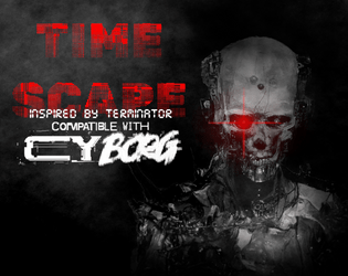
Time Scape
Concept: “In the not so distant future… Out of the unholy marriage of Super A.I. and alchemy of flesh, a new type of being came into existence. In the year 20X9, the machines rule every aspect of daily life, forever looking to further optimize culling the ‘dregs’ of society, ensuring any threat to its existence is either exterminated with the extreme prejudice of nu-capitalism, or by force. But the final battle for humanity will not be fought in the future. It will be fought here, it present day CY. Tonight…”
Content: A mission to save the future by terminating a CEO. Additional classes ("Time Target," "Veteran of the Future War," and "Reprogrammed Hunter Killer"), supplemental glitch rules, and a murderous NPC are also included.
Writing: Creativity permeates every page/spread, offering plenty of details to flesh out each encounter with a clear sense of in-game urgency for the stakes involved.
Art/Design: Distinct full-color layouts for each page/spread that manage to share a dark-themed aesthetic for a sense of consistency throughout. Numerous illustrations provide visuals for the landscape, significant NPCs, and maps.
Usability: Visually, most pages provide high-contrast text/background for easy reading, with immediately apparent headings/labels and distinct content sections (whether via whitespace, borders, etc.). However, the text is not embedded, so no searching or selecting is possible. A ToC is provided at the end of the supplement.
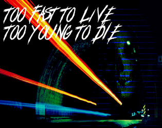
Too Fast to Live, Too Young to Die
26 contributors
Astrolich
Calen Heydt
industrialnation
Gnoll
Flintwyrm
Patch Adam Perryman
thefatherofcats
Johan Nohr
Prince “PROFANEKNOWLEDGE” Maxi
Leonard B
cyotee doge
Amaranth M
Brendan Carlson
Kevin Cantello
Patrick Möën
Gaffy
Michael T. Baker
Mal R
Ryan
Casanova Funkenstein
psyop.fyc
Torg_OR
KMSH
Daniel Scott
Olav
Jason “Anabasis” Brook
Concept: “Too Fast to Live, Too Young to Die is a rules expansion for CY_BORG giving you the chance to drive fast and wreak carnage hanging out the passenger side window (or just crash headlong into it, your mileage may vary). These rules are light-weight, but robust, and will add a ton of flavor to your chase scenes as you bolt down narrow streets in attempt to escape the piggies or track down a corpo shit-bag. Hell, you don't even need to catch 'em, just have a firefight between vehicles - we got rules for that!”
Content: An impressive cornucopia of content: rules for vehicle chases/races and driving hazards, classes for the “Got-Away Driver” and “High Speed Vigilante," stats for vehicles that are purchaseable (or not), enemies to encounter on the streets of CY, and an entire revenge-themed mission.
Writing: A focus on thematic details/voices to breathe life into included elements that are supported by succinct, direct rules and guidance for GMs to implement assorted features into a game.
Art/Design: A mix of layouts and aesthetics throughout the supplement. Some pages are laid out landscape-wise, and at least one two-page spread has text broken across its pages. Number and variety of illustrations and themes, along with their execution, are inspiring.
Usability: Body text font is pretty consistent throughout, and despite the range of page/spread layouts it’s easy to identify headings/labels and how they relate to nearby content. However, the text is not embedded, so searching/selecting and screen reader use is not possible.

Train Through the Pain
Concept: “A self-improvement cult headed by a mad NET influencer has kidnapped a brilliant biochemist. Independent entrepreneurs all over CY are scrambling to break him out and use his talents in their shady business ventures.”
Content: A job to “liberate” a scientist from one sketchy situation so they can serve a different one.
Writing: Terse, conversational descriptions of important NPCs and location details are complemented by even briefer relevant stats/mechanics.
Art/Design: Black-and-white text and images presented in both a pamphlet format and as standard portrait-oriented pages. A map of the target location and illustrations of some NPCs accompany the text (along with a cover image of a hairy or veiny individual being assaulted from all sides). A player-facing map is also included.
Usability: High-contrast text and consistent use of specific fonts/embellishment for headings, body text, emphasized info, etc. helps with easy visual navigation and identification of desired details. Room descriptions in each relevant map room similarly allow for quick reference/atmosphere notes.

Tranquility
Concept: "During one of the earliest lunar prospecting missions, the commander of Chrysus 14, Alan Shepard, famously played a game of golf on the moon’s dusty-white surface. Two golf balls were lost and left behind that day. An anonymous CEO wants one (or better both) for their private collection. One golf ball = 2,500¤! The trip to the moon is already paid for, basic space suits included. What are you still standing around for? Off to the spaceport with your sorry wetware!"
Content: A simple job to travel to the surface of the moon and retrieve golf balls.
Writing: Concise descriptions and rules, encounters, and similar GM-facing info for each location that might be visited on the trip.
Art/design: Mission details are provided in a trifold brochure/pamphlet format, in both full-color version (with high-res background graphics of the moon's surface) and a black-on-white printer-friendly version. Distinct boxes separate out each scenario location, with one pamphlet panel dedicated to distinct NPC stat blocks and another to mission-related overview info for the GM.
Usability: Each separate content block is recognizably distinct, with a consistent aesthetic for recognizing similar kinds of content (block borders and, for the full-color version, block accent colors). Fonts are readable with visually distinct decorations for headings, labels, etc.
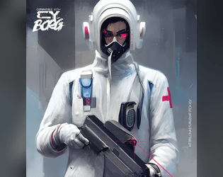
Trauma Team Specialist
Concept: “Become a trauma team member today.”
Content: A class for the broke med student who wants to chase endorphins via battlefield surgery.
Writing: Brief descriptions and explanations of class features/mechanics that feel appropriately “clinical” and at home in CY.
Art/Design: Two-page spread, with a left-side column of text (reddish pink on white) and a right-side digital illustration of a gun-toting medical specialist.
Usability: Class details are easy to read and navigate, with distinct headings that indicate the scope of each section.

Tribute
Concept: “Tribute — a 48-page triple-threat zine with content for Mörk Borg, CY_BORG, Death in Space. Whatever sick or sad ideas came to my mind, I banished into this cursed little booklet. [...] CY_BORG. Go dumpster diving (in CY), visit the REAKTOR, die in horrible car accidents, and play as a revolutionist chemist!
By day, you mix and cook in the corps’ polluted factories; the ¤ ¤ ¤ are much needed. Reaction kinetics are on your mind. By night, you burn the palaces. You poison the organism that feeds you. Your concoctions are august.”
By day, you mix and cook in the corps’ polluted factories; the ¤ ¤ ¤ are much needed. Reaction kinetics are on your mind. By night, you burn the palaces. You poison the organism that feeds you. Your concoctions are august.”
Content: A zine whose focus is partially on several Cy_Borg-related supplements: a class (Revolutionist Chemist); a mini-game (Dumpster-diving) with random encounters and loot tables; and a club location (Reaktor) with related tables for drinks, NPCs, trouble, and music genres.
Writing: An overall balance of general and atmospheric description, in-universe text (such as instant messages/social media posts), and mechanical/rules-based explanation.
Art/Design: Distinct spreads/pages for each entry, with a variety of aesthetics and graphics (photo collage, hand-drawn illustration, simple icons, etc.).
Usability: While spreads do vary aesthetically, each has an identifiable organization and layout that consistently presents information throughout for ease of navigation and use.
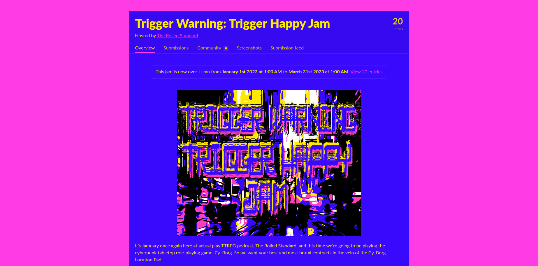
Trigger Warning: Trigger Happy Jam
Concept: “It's Jamuary once again here at actual play TTRPG podcast, The Rolled Standard, and this time we're going to be playing the cyberpunk tabletop role-playing game, Cy_Borg. So we want your best and most brutal contracts in the vein of the Cy_Borg Location Pad.”
Content: A collection of jobs/gigs to send parties of punks out on to fuck shit up, get rich, or die trying to do either.

Triune
Concept: "TRIUNE dominates screens, frequencies and can be found in every corner of the NET.
Their music is everywhere, their brand is inescapable, and their message is carefully crafted to keep you coming back for more, addicted, and consumed by desire.
MindE. Bodi. Spyrr. The perfect pop-idol machine, multiplied threefold. Identical triplets, the epitome of stardom: impossible bodies, voices tuned to unfathomable harmonies. They don’t just make music—they code emotions."
MindE. Bodi. Spyrr. The perfect pop-idol machine, multiplied threefold. Identical triplets, the epitome of stardom: impossible bodies, voices tuned to unfathomable harmonies. They don’t just make music—they code emotions."
Content: A three-in-one enemy with which to personify the essence of CY and also to make punks' lives miserable through the NPCs' popularity.
Writing: Disturbingly on-point mechanics for the NPCs, wrapped in equally (and appropriately) dystopian description of Triune and their reach/impact.
Art/design: Several spreads of slick marketing-aesthetic presentation (a mix of light-on-dark and synthwave neon color schemes) that uses a mix of illustration and glitchy accents to sell the in-universe nature of the document.
Usability: High-contrast text and recognizable distinctions between types and sections of content--along with concise and direct explanations of ruling-related abilities--allow for easy navigation, location, and use of desired info.
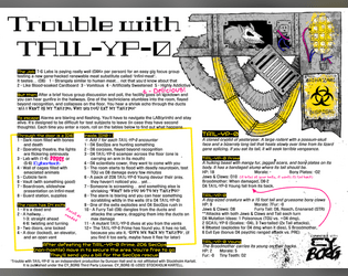
Trouble with TA1L-YP-0
Concept: “It's a real easy gig... Just taste test T-G Labs new Infini-meat and participate in a quick focus group! You'll soon be on your way with a fistful of kreds. Where's the meat come from you ask? I'm afraid we can't share that proprietary information.”
Content: A mission to survive a marketing research meeting.
Writing: Brief bursts of flavor and mechanics (including an intriguing set of maze/escape tables) directed to both GM and player.
Art/Design: Landscape-oriented black-on-white spread (with yellow, pink, and blue highlights) includes a hand-drawn illustration of a cryptid in the top right corner, and two main columns of text content (the left of which has two columns of tables within it).
Usability: Consistent presentation of content, with visually identifiable headings, labels, and marginal notes. Layout makes referring to specific info easy, especially stats for NPCs appearing in maze room encounters.
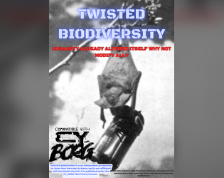
TWISTED BIODIVERSITY
Concept: “This zine contains a table for Animals and plants altered genetically, mechanically or both, some stat blocks and body modifications.”
Content: A collection of biological and technological creatures, parts, and modifications to bring more animalistic variety to a game.
Writing: Descriptions make use of a casual and conversational voice that makes even the more mundane entries engaging and humorous.
Art/Design: Three pages of red and blue text on a light gray hex-pattern background. Two pages use single-column text layouts, while the page of stat blocks has different NPCs’ info scattered around the page.
Usability: Each page provides a consistent visual grammar to indicate how to navigate its content. Center-aligned lists of creatures and modifications may slow down some reading of entries that span multiple lines of text.
Ultraviolent Entertainment
Concept: “A small collection of optional rules for Cy_Borg. Includes variations on Experience, Dice-few Combat (with revisions to how armor, weapons and initiative work), a biological alternative to Cybertech and doing away with Cy-Rage.”
Content: A set of rule proposals to affect characters in assorted ways that can provide some intriguing variety to a game of Cy_Borg.
Writing: Text is direct and focused on explaining the mechanical differences between these rules and those in the official rulebook. No fluff, all function.
Art/Design: Single-column text with a simple heading organization. Black-and-white with one heading level provided in red/pink. Background is a light noise/speckle pattern.
Usability: Font choices are easily readable, and the page background pattern shouldn’t cause much disruption of engagement with text. A few key terms and phrases are bolded and italicized for quick identification.
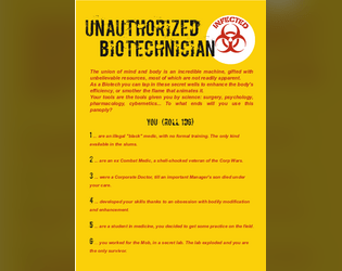
Unauthorized Biotechnician
Concept: “The union of mind and body is an incredible machine, gifted with unbelievable resources, most of which are not readily apparent. As a Biotech you can tap in these secret wells to enhance the body's efficiency, or smother the flame that animates it. Your tools are the tools given you by science: surgery, psychology, pharmacology, cybernetics... To what ends will you use this panoply?”
Content: A class for street docs, freelance paramedics, and back-alley barber-surgeons.
Writing: Terse descriptions that distill the essence of class features and mechanics.
Art/Design: Two pages of stark red and black on yellow with white highlights that keep class details as the focus, with a biohazard symbol and a silhouette image of a figure in a hazmat suit underscoring the work entailed by the class.
Usability: Easy to navigate and recognize different elements providing distinct purposes via specific color and font choices.
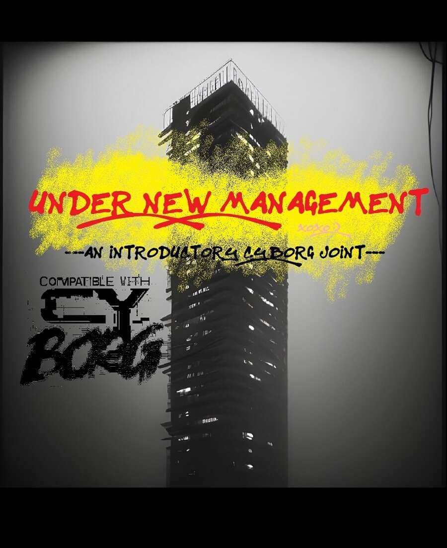
Under New Management
Concept: “UNDER NEW MANAGEMENT is an introductory three-part CY_BORG adventure inspired by classic movies like Running Man and Judge Dredd (2012), wherein the player characters must ascend a crumbling apartment tower and take out its self-appointed gang-goon leader, Jinghai Soan. It's nonstop action and weirdness that's perfect for introducing new players into the setting and system!”
Content: A scenario for PCs to get intimately familiar with life in a high-rise habitat on lockdown in order to bring down the crime lord at its apex.
Writing: Tons of details about apartment residents, the building’s aesthetic, recent rumors, NPC stats, a map, and more.
Art/Design: White-on-black monospace text with red and yellow graffiti/handwritten headings and embellishments. Occasional borders help indicate the extent of a particular sidebar or table. Black-and-white map and portrait of Jinghai Soan are included.
Usability: Text is provided mostly in one- and two-column formats with occasional exceptions. While text contrast makes for easy reading, the text is not embedded, so no searching or copying/pasting is available.
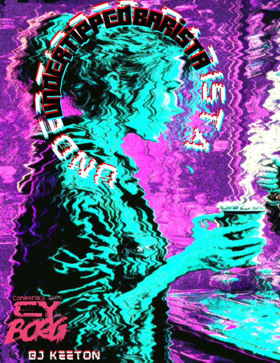
Undertipped Barista
Concept: “people suck. you knew it before you took the job. now it's your religion. you draw hearts with foam. you take their inane and complex orders. you try to laugh at their banal jokes. it's a good day if they say thank you. it's a miracle if they leave you a single credit. you hate them.”
Content: A class for the food service worker who’s been all but ground into dust and is ready to burn everything to the ground in retaliation.
Writing: An overflowing venti’s worth of cynical flavor that brings the class to life. Class details are mostly terse (if appropriate!), but the “breaking point” table offers surprising depth in contrast.
Art/Design: An illustration of a barista serving a customer is surrounded by class features, all with a neon palette on a dark background.
Usability: Each section of content is easily distinguishable from the rest, with font color, type, and size choices indicating each heading/label.
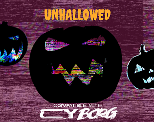
Unhallowed
Concept: “An eerie chill sweeps the streets of CY, and the shadows between the neon lights seem ever darker this time of year. Within creep seven frightful ghouls to haunt the sewers, stalking any pvnk so foolish as to roam the dreadful night.“
Content: A collection of high-tech terrors, from the data spectre to the flesh debtor, with which to haunt a table of punks as they try to survive life in Cy.
Writing: A colorful set of descriptions and mechanical abilities that paint vivid possibilities for each NPC’s uses in a game.
Art/Design: Two versions available: one black-on-white printer-friendly version and one orange-on-maroon version with occasional illustrations to complement the ambience of the writing. Both use single-column text layout.
Usability: Consistent page organization, font usage, and presentation of NPC mechanics to make reading and navigating through the document easy and helpful.

UNMARKETABLE EXTRACURRICULARS
Concept: "D66 Adaptions, reflavours or substitutions of Unheroic Feats for CY_Borg
BONUS:
D66 Never seen before advantages for undiscerning scum"
Content: A set of tables providing new options for improvement (some with downsides!) that can help a punk feel like a more exceptional character.
Writing: Balanced mix of thematic description and mechanics explanation to help a player understand what a given feat does rule-wise and how to interpret that within the game and character headspace.
Art/design: Light-on-black two-column text organization, with some pages including a small hand-drawn illustration in a bottom corner.
Usability: Text is consistently color-coded to indicate the aim of each text block, and each table entry is distinguished from the others with consistent numbering and horizontal rule usage.
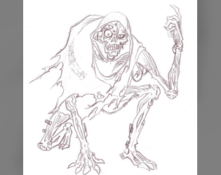
Upcycled Cyber-Undead
Concept: “You died. Through means fair or foul, you departed this plane of existence, of that you are mightily certain. Then? Your cyber-attachments brought you back online. Or maybe it was some sort of nanoplague or something. In any case, you’re back. Except no one wants you back. You smell bad. You sound bad. You look very, very bad indeed. You’re way too deep into the Uncanny Valley to pass as one of the living. Sorry.”
Content: A class for those inhabiting the venn diagram overlap of “zombie lover,” “cyborg-curious,” and “body horror fanatic.”
Writing: Class detail descriptions are not for the faint of heart but are a must-read for anyone vaguely interested in the idea, with dark humor balancing the gore with levity. Mechanics are concise and complement the descriptions well.
Art/Design: Eye-searing colors faithfully reflect the unsettling nature of the class concept, and a sketch of an upcycled cyber-undead further brings the idea to (un)life. Text is sectioned into boxes set askew with distinct color and font choices that indicate different purposes.
Usability: Askew text angles support recognition of distinct purposes for each text box, inviting closer examination of enticing class possibilities. However, text is non-selectable and inaccessible to a screen reader.
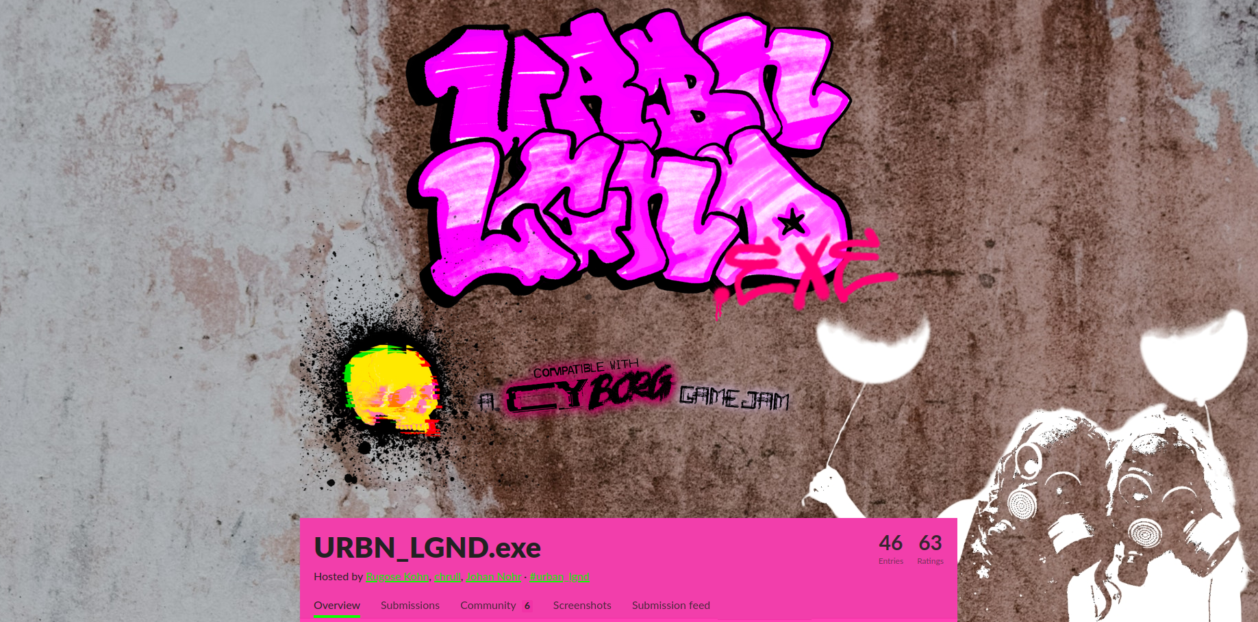
URBN_LGND.exe
Concept: “Urban Legends, the undercurrent of our cultures and personal narratives, a shared imagination that shapes our worldview. From Florida Man to Area 51, the illuminati to cryo-frozen billionaires; these are the stories and whispered secrets we tell to amuse and frighten ourselves. But what happens if our world's lore collides with the desperate city of CY? What new conspiracies are born, what new abominations draw breath? URBN_LGND.exe is a third party compatible game jam that asks YOU to CY_BORGify your favorite urban legend.“
Content: A variety of supplements–gigs, creatures, classes, optional rules, and beyond–reflecting various urban legends that might be (un)known to the punks that try to survive in CY.
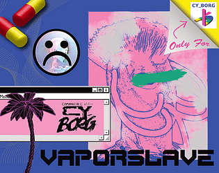
Vaporslave
Concept: “You are constantly jacked into your Vapestim-Pack, emitting vapor clouds. You have to stay sedated! Drugs for everyone! Down with the luxury elite!”
Content: A class for the languid lotus-eater and sedate spice fiend who wants, or needs, to constantly moderate their mood–and who wants everyone else to, too.
Writing: Class detail descriptions and mechanics explanations support one another well to present a cohesive concept through the document.
Art/Design: Two-page pink-heavy spread layout highlights a vaporslave illustration, a rendering of capsules, and an early GUI in addition to distinct sections of text framed as a cassette track list.
Usability: Class details are organized for quick identification of desired information, and different aesthetic components invite further exploration and engagement.
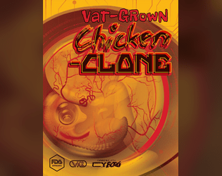
Vat-Grown Chicken Clone
Concept: “Are you more human than chicken or more chicken than human? Engineered to be tastier, juicier, more finger-licking good. Implanted with a brain that was not your own, and GMOd to decay at a slower rate — so when the skies fall, only you and the cockroaches will be left ruling the roost.”
Content: A class for the egghead who enjoys fowl play, whether it’s original or extra crispy.
Writing: Since this class is an homage to the creator’s “Vat-grown Repli-clone” class, chicken-themed references and puns abound that provide the class with intriguing and unique options/mechanics.
Art/Design: Wide spread in a yellow/orange color scheme with a graphic of a chicken embryo (much like the repli-clone class’s graphic) toward the left, while three columns of content take up the bulk of the page.
Usability: Each column of text content has its own visual design, but each provides a consistent presentation to distinguish headings, labels, emphasized text, and so on. Searching/selecting text may cause some issues due to unexpected spacing between and clustering of characters.
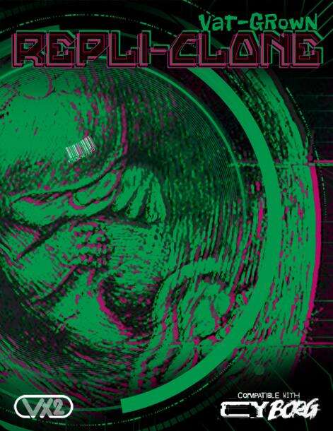
Vat-grown Repli-clone
Concept: “Engineered to be better, stronger, faster; implanted with memories that are not your own; and genetically encoded to degrade at an accelerated rate. Live fast, die young embodied. And your time is almost up.”
Content: A class for the discarded or obsolete duplicant who wants their maker to pay for their profane hubris.
Writing: Drawing on iconic literature and film for its inspiration, class features are concisely packed with ideas to spur introspective and destructive roleplay.
Art/Design: Sleek spread layout of class details complemented amazingly with green/pink color scheme to highlight page elements, with a large background illustration of a vat-grown fetus to underscore the character’s origins.
Usability: While there’s a lot happening on the page, it’s eminently readable, with high contrast and bordered framing of text guiding visual navigation through the document.

Vat-Grown Runaway
Concept: “You are an artificially designed human being, grown in a lab, who ends up finding themselves roaming in the alleyways of CY, lost and confused.”
Content: A class for the not-quite-a-person who’s trying to figure out what they are and why.
Writing: Brief and vivid character details for background and motivation complemented with terse mechanical effects/features.
Art/Design: An illustration of a runaway on the right side of a landscape-oriented spread, with white text on black (with yellow and pink highlights & headings).
Usability: Distinct typefaces and groupings of text allow for quick navigation between different content areas.
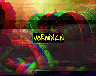
Verminkin
Concept: “In CY, it's easy to feel like there's nobody to trust. Everyone wants creds or drugs or alcohol or fame or whatever, and most people are willing to backstab each other for it. But you- you're secure. Your friends would never betray you, and you make friends very easily, at least, with some people. The kind of people who have greasy black feathers and pick at trash dumps, or gnawing teeth and skitter under floorboards, or slimy skin and creep through the gutters. Your friends have your back. Anyone who wants to get to you will have to go through them.”
Content: A class for the rat bastard who works best with partners, the nastier the better.
Writing: Inspired class features that bring a feral animal-loving misfit to life, complete with mechanics for one or more vermin companions.
Art/Design: Full-color version is yellow-on-black with rat photographs with color treatments as backgrounds, while print-friendly version is black-on-white text. Both versions use single-column text content layout.
Usability: Distinct sections are immediately recognizable in both versions thanks to consistent heading/label presentation and white space. Full-color version employs an additional handwritten-aesthetic font for labels and emphasized terms/phrases.
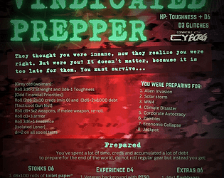
Vindicated Prepper
Concept: “‘They thought you were insane, now they realize you were right. But were you? It doesn't matter, because it is too late for them. You must survive…’ An old man or woman who have spent their lives preparing for the apocalypse who now finds themselves in a perpetual never ending one. Will they survive? Even thrive?”
Content: A class for the punk who’s well-stocked for nearly any apocalyptic occasion.
Writing: Brief, extremely flavorful tables and mechanics that round out assorted approaches to playing a vindicated prepper, provided in a mix of straightforward and tongue-in-cheek tones.
Art/Design: Bright green on a red cloudy pattern background, organized mainly in a three-column format.
Usability: Consistent presentation of content sections via organization, headings, emphasized info, etc. all make for easy navigation and identification of desired details.
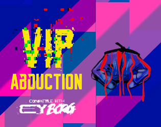
VIP Abduction
Concept: “The punks have a mission. Kidnap Lukas Tosk. He's traveling with just his driver today. It'll be a quick 10k¤. Or so they think. VIP Abduction is a pamphlet-sized module for CY_BORG. It includes a map of a Virid Viper safe house and everything you need to put inside to set up the abduction mission. The module includes stat blocks for new characters and page numbers for referencing the CY_BORG rule book for other stat blocks and tables.”
Content: A kidnapping mission with a bonus automotive theft component.
Writing: Job setup and preparation/site location info is provided first, followed by sections on the mission execution and target/enemy NPCs.
Art/Design: Two versions: full-color and black-and-white. Trifold brochure layout with full color outer panels (in full color version), while inner panels are black and white in both versions. An overhead map of the mission locale is also included as a separate file.
Usability: Bolded headers and key labels/descriptors help call attention to important information, and consistent spacing makes it easy to identify individual sections of content. Overall arrangement of info reduces need to jump around between panels to locate immediately useful specifics. Full-color gradient pattern background on outer panels provides decent contrast to maintain text readability.
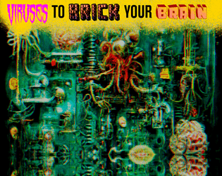
Viruses to Brick Your Brain
Concept: “Embedded in ads, lurking in the top search result, loaded as a hacker’s dead hand, coursing through a derelict net node. Viruses are everywhere, infecting everyone, stealing a portion of everything. Most of them are unnoticeable, lurking in your RCD, implants, accounts, everything. These? Less so. Bisecting your consciousness. Hijacking your implants. This is the result of someone else’s malice or misconduct. It will break you down until you get rid of it.”
Content: A set of tables to make a player’s life living hell through the power of compromised technology.
Writing: Concise and powerfully thematic explanations of relevant variables, including how the virus spreads, how it affects a player mechanically, who developed it, how to get rid of it.
Art/Design: A visual overload of colors, fonts, graphics, and stylistic clashes that feels entirely appropriate given the rules’ purpose.
Usability: While overall consistency is out the window, it is possible to understand and navigate each table/element while focusing on that section.
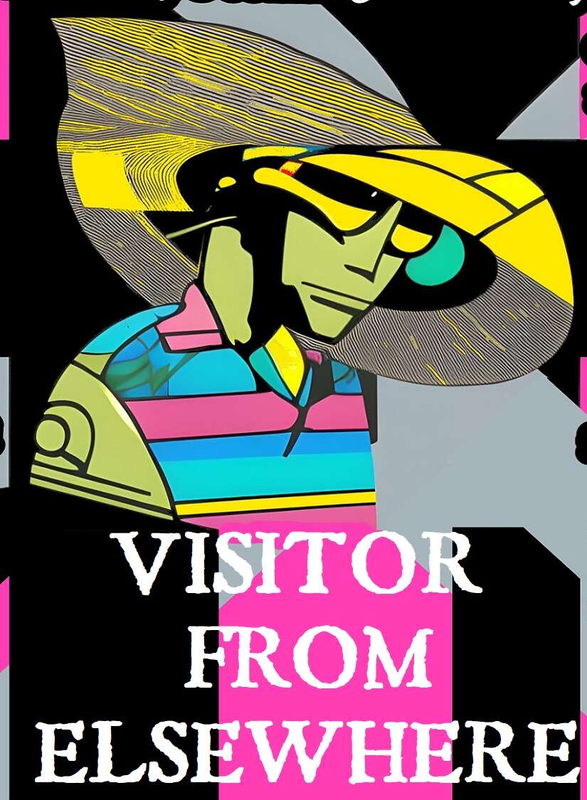
Visitor from Elsewhere
Concept: “You hail from a world unknown to humanity, far beyond the outer bounds of the Terran solar system. All data projections point to planet Earth as the site of some great future calamity, one that will resonate throughout the entire universe—but what could it be, and why here? You’ve been stranded on Earth (what’s left of it, anyway) for a few months now, and so far, only one thing’s been made abundantly clear: this place is a shithole, and nobody’s coming to rescue you.”
Content: A class for the stranger in a strange land with no way to leave it.
Writing: Class details mix levity and bizarre sci-fi tropes for a unique class experience in a cyberpunk milieu.
Art/Design: Black-edged white text on black, pink, and gray with some green text accents. Class features are arranged around a central illustration of a visitor over a background pattern of criss-crossing X shapes.
Usability: Visually, this is a busy spread, which may make reading/scanning difficult for some, augmented by the lack of embedded text (so no searching or copying/pasting). Bold text for important info and labels consistently helps distinguish individual list items and content sections.
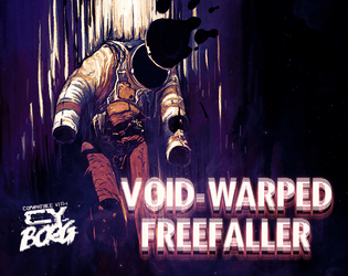
Void-Warped Freefaller
Concept: “It was nothing like they advertised; there were no off-world colonies, no bold unknown, no strange new worlds–only more cramped corridors and self-devouring consumerism in the name of the tourist industry. And then one night SOMETHING shocked the shuttle systems, and you began floating in a most peculiar way…”
Content: A class for those who were changed in irrevocable, horrifying ways when they walked among the stars–and who are now shackled to the earth once again.
Writing: Vivid, evocative descriptions of features and mechanics are both illuminating and unsettling in the best way.
Art/Design: Two two-page spreads with class details and a set of alien infestations, with white text on dark background throughout. An image of a void-warped freefaller emphasizes the cosmic horror at the core of this class and the effect it has on the character.
Usability: Easy to navigate, read, and comprehend, with key components visually embellished for identification of their significance and purpose.
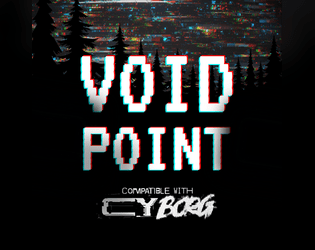
Voidpoint
Concept: “Meatspace decays. AR sputters. VR goes black. There are perilous chambers for those descending too deep in the THE NET. Nothing in them but shimmering entropy. Fractal pits. Voidpoints.”
Content: A set of rules for when a player fumbles an app roll while in the net, along with a set of locations to explore when doing so.
Writing: Brief, evocative descriptions of sensory experiences that can cause a punk to question their reality, even as digital dangers risk their annihilation.
Art/Design: Organized as a trifold pamphlet basic rules and title/credit info are provided on outer panels (in white-on-black color scheme), while voidpoint locations and a map are provided across the inner panels (in black-on-white color scheme).
Usability: Headings and labels are visually distinct from body text and consistent in appearance. Map locations are numbered and correspond to descriptions surrounding the map image. Text is not embedded, so searching/selecting is not possible.

WAR MACHINE
Concept: “War makes money, at the end of the day, and the corps of CY are interested in anything that makes money, no matter how many cadavers will be piled up alongside those heaps of cash. “
Content: An arsenal of material–enemies, squad makeups, potential job seeds, environmental tables, and more–with which to make corps even more terrifying, overwhelming, omnipresent, and all-around dangerous.
Writing: A mix of informative mechanics and in-universe flavorful commentary on each entry that balances black humor on the edge of bleakness.
Art/Design: Simple black-on-white single-column layout over fourteen pages.
Usability: Visually distinct and consistent font and text decoration choices, along with helpful whitespace use, result in an easily navigable document.

Wasteland Degenerates
Concept: “‘Tomorrow is nothing, today is too late; the good lived yesterday.’ - Marcus Aurelius
Welcome to the gas-guzzling, high octane post-apocalyptic hack of Cy_Borg, about miserable, radiated scum struggling to survive in tomorrow's unforgiving carcass!”
Welcome to the gas-guzzling, high octane post-apocalyptic hack of Cy_Borg, about miserable, radiated scum struggling to survive in tomorrow's unforgiving carcass!”
Content: A Mad Max-style take on Cy_Borg rules, with some new and different systems while others very closely resemble those of the base game. (Note: At the time of writing, the "Jumper Cable Edition" version of the game has been released. A fuller version of the game is set to be published in the future.)
Writing: A balanced amount of thematic description and mechanical explanation of effects/features that situate players and GMs to the game’s focus (especially in comparison to that of Cy_Borg).
Art/Design: Aesthetics of the core rulebook with some occasional pages/spreads and illustrations that break out in a different direction (such as in the more comic book-like “The world has ended” spread early in the book, or the Vast Grimm-style “lagunasuga” monster spread created by VG creator Brian Colin).
Usability: The fore/ground contrast varies significantly from page to page, as do fonts/typefaces, either of which can make some text quite difficult to read.
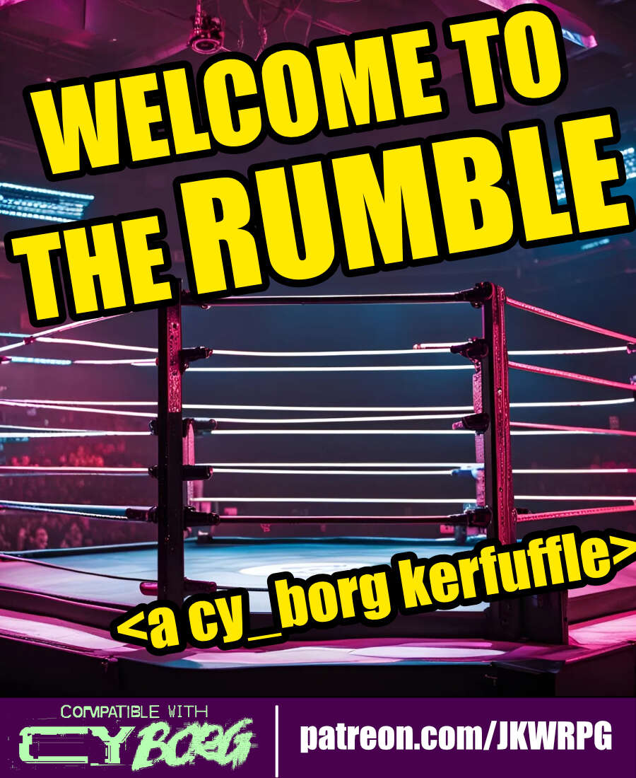
WELCOME TO THE RUMBLE
Concept: “Tonight, we are going to witness the most anticipated match in the history of professional wrestling---for the CY Wrestling Federation Championship Belt! Are you ready? Wrestling fans, ARE YOU READY?! For the thousands in attendance, and the millions watching from around the world, from the capital city of CY...ladies and gentleman...LLLLEEEET'S GET RRRREAADY TO RRRRRRUUUUMMMMBBBBBLLLLLEEEEE!”
Content: An opportunity for punks to up their side-hustle game by making some bank as a wrestling champion–assuming they win, of course.
Writing: Primarily informative details about the mechanics of the encounter, accented by some headings to reflect the tenor of the wrestling scene.
Art/Design: Wide three-column layout of content with a bloody wrestling mat map in the center of the document. White text on black with yellow headings, while a bit of pink highlights the mat image and the license info.
Usability: High-contrast text and easily readable fonts facilitate reading and navigation. Skewed text may occasionally pose issues for screen readers.
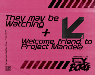
Welcome, Friend, to Project Mandela
Concept: “
[recruiter77@mandela ~]$ sudo project-mandela --help
#################—BEGIN TRANSMISSION—#################
<<<<<<< Project Mandela is a collaborative effort, a beacon of hope in the ever changing face of uncertainty. Our mission is to unveil the truth behind and expose the Doppels, who silently infiltrate our lives. With your assistance, we can protect ourselves and our loved ones from the horrors of being ‘replaced’. Join now.
########################—END—########################
[recruiter77@mandela ~]$ _
“
Content: A set of rules for a secret organization that tracks down “doppels” and its secret/coded message system.
Writing: “In-world” content speaks directly to PCks while also providing GMs and players with the details needed to work the Project Mandela organization into a given game.
Art/Design: Pages are laid out as “in-world” printed flyers (complete with tear-off tags at the bottom of one page). Three versions are provided: one spread layout and two single-page layouts, with one of these optimized for printer-friendliness.
Usability: Text is mostly quite readable, with distinct sections of content clearly identifiable visually, with consistent font choices to indicate relationships between different text blocks.
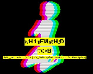
Wh1tewashed T0mb
Concept: “Megapastor Apollo Imra is in the crosshairs- his wife's, to be specific. One of his twenty-odd wives. You've been hired to take out this lecherous philanderer, right in his own temple vestry, where he's taking tonight's dose of infidelity. But beware: there's more going on here than you might think…”
Content: A mission to serve divorce papers, of a sort.
Writing: Extensive information provided about the job, the site, NPCs the punks might encounter, and more.
Art/Design: Primarily black-on-white single-column text layout complemented by illustrations of key NPC portraits and neon-colored maps.
Usability: Font choices promote readability, and heading/label bolding, italics, and highlighting are applied consistently throughout to facilitate quick navigation toward desired details.
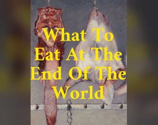
What to Eat at the End of the World
Concept: “The world is ending, but not fast enough. Poison drizzles from the skies and mats in the gutters. Reality flickers and stutters, but doesn't go out. And the people of this spliced and plated rainsick hell can't afford to starve like ascetics, awaiting purification by the end. It could be days from now that judgement comes. Or it could be never. Their bellies still grumble in discontent. So the people of CY eat. They eat for nourishment and for distraction and to be seen in the act of specific consumptions. They eat scraps and banquets, packaged rations and homecooked platters. They eat, and they look out glitching windows, and they hope the apocalypse holds off for another day.”
Content: Myriad options for restaurants/eateries in CY, with business descriptions, menu lists, and costs for dishes.
Writing: Each establishment is given its own flavor/style, and descriptions reflect in-universe perceptions of the place and its fare as much as they provide helpful worldbuilding notes for GMs.
Art/Design: While each page includes the same essential components, different font, color, and graphic selections contribute to unique identities for the restaurants included in the supplement.
Usability: Text is consistently readable and navigable even across a wide range of fonts, and only occasionally are there color changes (e.g., from background patterns) that might momentarily disrupt reading. Hyperlinked ToC makes for an even quicker navigating/locating experience.
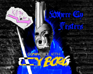
Where CY Festers Vol1 The Blood of Aliens
Concept: “Made for The Rolled Standards Trigger Warning: Trigger Happy Jam, this adventure is a simple assassination mission in a rundown church in the heart of G0. Risk nano infestations while trying to kill off the cult leader Farther Barnos, return his head and a requested item for a fat pay out.”
Content: A job to unseat the head of a local church.
Writing: Intense descriptions of the mission’s most important locations and events/encounters.
Art/Design: A mix of analog hand-drawn and digital illustrations accompany a mostly single-column layout of white, green, and pink on black backgrounds.
Usability: Text is mostly readable and searchable (except for Barnos’ stat block, which is handwritten text) with clear visual distinctions–color, typeface, white space–between sections of content.

Wiggly Dorpher
Concept: "Wiggly Dorpher introduces new game options for CYBORG hyperlinked to DRUGS.
'Getting high and playing holos is fun; but have you ever zeroed someone while trippin' balls? It's exhilarating!'"
Content: Sets of equipment, nano powers, a class (Wiggly Dorpher), a location, an enemy, and more--all relating to drugs in some way.
Writing: Potently and concisely atmospheric, with rules/mechanics explanations complementing the descriptive aims.
Art/design: A mix of page/spread aesthetics and organizations that reflects the core Cy_Borg design variety.
Usability: While most pages have significant text/background contrast to facilitate reading, much of the text content is not embedded and thus cannot be searched or selected.
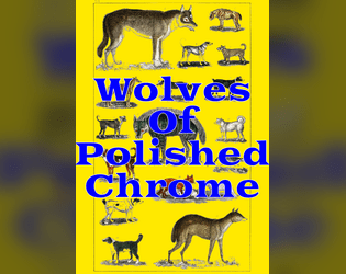
Wolves of Polished Chrome
Concept: “There's a sickness in the streets of CY. Rain drips like a broken IV. Dying adverts flicker in sallow shades. They say the world is ending. Has ended. Will end. They say the howls at night are Cy-Ragers. NanoPhreaks. Nothing to worry about. Nothing abnormal. The water is poison, but it always has been. The air is poison, but how bad can it be? It churns through your lungs all day and hasn't killed you yet. There's nanites in the trash, nanites growing like mold on the walls, nanites in the blood and bones of regular citizens, but all of this is familiar misery. Last night you stared blearily at your face in the bathroom mirror, watching it change. Watching it become something new. As you did, your cybernetics clicked like beetle legs, like teeth shuffling in the mouth of a cannibal. They squirmed and contorted to match your new flesh. You vomited your whole stomach lining into the sink, then washed it out with a swig of cheap ethanol. But the disinfectant didn't purify you. It just made you worse. Tonight, the glitching moon hangs low over the skyline and your body is wrong. Wrong for the city. Wrong for the life that clings to it. Wrong for the alien gods that have touched its streets. You hate them all, and that hate pours out of you in a howl.”
Content: A set of rules to incorporate werewolves into CY.
Writing: Matter-of-fact explanations and descriptions of a variety of factors pertinent to affected characters (transformation rules, clothing options that survive transformation, a “Festering Wolfborg” class, etc.) as well as several lycanthropic foes and their stats.
Art/Design: A mix of black-and-white splash images with brightly colored sections of content, each with its own bold color scheme.
Usability: Single-page, single-column layouts make for quick perusal and identification of desired content, assisted by a hyperlinked table of contents.
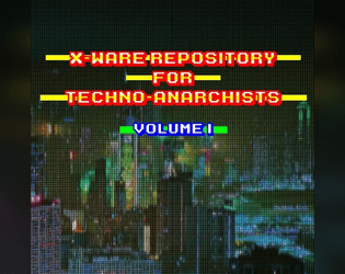
X-Ware Repository for Techno-Anarchists, Volume I
Concept: “Hello Operator! The X-Ware Repository for Techno-Anarchists is a collection of random tables that offers some extra 'ware to spice up your game.”
Content: A set of ten apps, ten cybertech, and ten nano options that offer intriguing variety to GMs and players looking to expand their gear.
Writing: Brief descriptions of fascinating and creative mechanics, often with references to material found in the official rulebook.
Art/Design: Two pages dedicated to each category, and each pair of pages has a distinct color scheme, with a high-contrast color choice and set of fonts for the single column of text laid over the background image/pattern.
Usability: Headings/labels are provided as a distinct font from the main body content in each section to help readability. Background image in the ‘Apps’ section might slow down reading for some (there’s just a bit of noise working against contrast), but text is easily searchable/selectable.
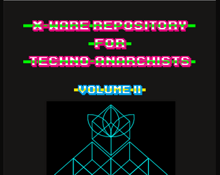
X-Ware Repository for Techno-Anarchists, Volume II
Concept: “Hello Operator! This second volume of the XWare Repository for TechnoAnarchistsis brings more random tables of new content for your game.”
Content: A set of six weapons, six booster mods, six drugs, six gangs, and six nano-phreaks to bring even more variety and danger to a Cy_Borg table.
Writing: Bite-sized bullet points and descriptions indicate mechanical effects, flavorful qualities, and other quirks that might spur a GM or player to innovative integration of a subject into their game.
Art/Design: Single-column organization of text, with distinct layout features and color scheme for each category’s page(s), complemented by thematically appropriate illustrations and background images.
Usability: Despite a variety of headings/labels across category layouts, text throughout is easy to read thanks to high contrast on background and size/color choices to assist with recognizing characters and kinds of content.

You Died, Dumbass
Concept: “You Died, Dumbass is a profile for another shitty subscription company, some rules for near death organ transplant (inspired by https://zordvil.itch.io/horrible-wounds) and related headlines made for the new-times-dumbass game jam.”
Content: A set of rules to complicate life when a punk at the table comes back from near death with a biosynthetic organ–complete with 4d4 additional relevant headlines to roll when a miserable headline is rolled.
Writing: A focus on the bleakly absurd atmosphere of a world where biosynthetic organs (and the late capitalist approach to their supply) is common, with brief mechanical features/effects supporting that focus.
Art/Design: Mix of black-on-white and white-on-black spreads/pages, using different layouts and aesthetics, with consistent appearance of red accents and highlights throughout. Several illustrations of NPCs and a location appear along with a silhouette to underscore our equally bleakly absurd reality
Usability: High-contrast text is consistently provided and page/spread layouts offer visually recognizable organizations of similarly presented and distinctly marked content.

You Got Mail
Concept: "Have you ever found yourself in need of some holo messages to bombard your players with? Random mails while they are investigating a datafortress? Disturbing radio chatter when caught in a nano-storm? Maybe you are just looking for some inspiration to spark an adventure?
Look no further! YOU GOT MAIL is here for you!"
Content: A set of tables of different kinds of messages for GMs to incorporate into their games--some with options for referencing/implicating the punks directly.
Writing: Tongue-in-cheek flavor pervades the messages' content, from advertisements to conversation threads to corrupted fragments.
Art/design: Black-on-green aesthetic reminiscent of computer terminal displays in two-page spread layouts.
Usability: Visually readable fonts with solid contrast of text on ground, complemented with outside-margin section headings (for the current table), allow for easy "lift and use" in a given game.
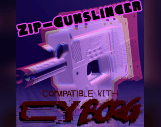
Zip-Gunslinger
Concept: “Zip guns are sold everwhere, as multipacks in bodegas and as singles in vending machines. These mass-produced deadly toys are made of the cheapest materials in the cheapest way possible and designed to break after a single shot, but that's all you need, right?”
Content: A class for the venn diagram intersection of firearms fanatic and gashapon addict.
Writing: Concise, approachable descriptions of class features and mechanics with a dash of thematic flavor to glue the concepts to the setting.
Art/Design: Plain text format with whitespace between paragraphs and lists.
Usability: The file format allows for incredibly easy resizing/formatting content in one’s preferred text editor or word processing program.
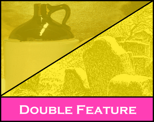
Zwyntar Pass / Moonshine - A Borg Dovble Featvre
Concept: “This is a double feature, 2 one shots for 2 different Borg Systems. One is "Moonshine" for the Cy_Borg system. It features players robbing a rich senator's house to steal his supply of crypto-moonshine. The other is called Zwyntar Pass for the MorkBorg system. It features players trying to hunt a troll at a pass at Graven-Tosk. Both scenarios were inspired by a Ukrainian band called Zwyntar.”
Content: A job to steal a bunch of crypto-moonshine from a senator’s home.
Writing: Concise details that cover important elements for the score and how different approaches might lead to different results.
Art/Design: Eye-blistering neon purple, pink, and yellow (with a bit of green-on-black) across two pages: one text-heavy GM-focused page and one player-facing page with a map of the job location.
Usability: Headings and different blocks of content are visually distinct from one another thanks to font size choices and whitespace use.
Previous page
Page 7 of 7