All Entries
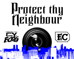
Protect Thy Neighbour
Concept: “In 20 hours Alliansen Inc. is sending an automated Xplorer Mk I , a heavily armoured drone operated by an AI, to clean up an old tower in Bigmosse. The drone will be deployed from the Security Centre in South Central and is to make its way to the housing block in the slums. This is a routine operation so unimportant that the only verification required is a geo-located live feed of the pile of rubble after the explosion. Which makes it the perfect occasion to put corpo property to public use.”
Content: An escort mission perfect for fans of two- and four-wheeled mayhem.
Writing: Focused and direct descriptions of involved parties, locations, events, and conditions that should help kick GMing this adventure into high gear.
Art/Design: Trifold layout (with a screen-based version as well) with a cityscape image serving as a general map for the escort route.
Usability: High-contrast fore/ground with occasional blue highlighting, bolded text, and particular fonts used to indicate different and specific kinds of content throughout the pamphlet.

Punk Borg
Concept: "The CITY. The postcards and magazines make it out to be a perfect metropolis - sun, sea, sand, and a vibrant and buzzing city centre. Of course, that's how the Overlords want you to see it; it's the image they feed to the Sleepers. They fail to mention their enforcers are all boar-like beasts, and the fact that giant space rock buried under the City is making us all sick. Time to wake those Sleepers up and show 'em just how ugly their bosses really are. We're gonna crumble the Overlords' regime to dust, whatever it takes."
Content: A hack of Cy_Borg that provides a less cyberpunk and more "present day" dystopia to explore and rebel against, with classes, enemies, vehicles, a mission generator, an entirely new city to inhabit, and more.
Writing: Laser-focused atmospheric description and rules/mechanics that work together to contruct a game of antiauthoritarian punk resistance.
Art/design: Black-and-white pages/spreads that, while distinct, provide a consistent visual grammar of information throughout. Lots of hand-drawn illustrations of classes, NPCs, and environments to complement the text.
Usability: High-contrast text and layouts with visually identifiable section blocks, headings, labels, etc. and a helpful index all work to facilitate browsing, navigating, and locating desired information.

PUNK FEATS [Unheroic Feats for CY_BORG]
Concept: “MÖRK_BORG's Unheroic Feats for CY_BORG.
Some Feats have been replaced completely and some have been hacked too much to be analogous, these are marked with a ■.”
Some Feats have been replaced completely and some have been hacked too much to be analogous, these are marked with a ■.”
Content: A set of d66 optional improvements to obtain, each of which provides a different mechanical and situational benefit. A text-only version is also included.
Writing: A brief atmospheric blurb is provided to situate the gameplay bonuses and effects of each included feat/improvement.
Art/Design: Two-column white-on-dark layout, with new/different feats from the original Unheroic Feats list marked for ease of reference. A colorful border, looking like the edges of a smashed computer screen (with a skeletal fist and guns at the bottom). Text-only version provides white text on a simple black background.
Usability: Font choices are high contrast and easily readable, with consistent layout and presentation of all elements–italicized descriptions, bolded and italicized numbered entry names, and horizontal rules to separate distinct entries.

PUNX
Concept: “A pocket-sized system for punkery in CY. Cut to the absolute bone, and with the marrow removed and sold to the reaperdocs. No relation to works by Keith Giffen.”
Content: A stripped-down take on Cy_Borg that can fit on both sides of an index card. Provided in color and black-and-white versions.
Writing: Concisely described rules focus on stats, tricks, enemies, and dice rolls to resolve task attempts.
Art/Design: Three columns of text with different sections of content have distinct indentations/formatting, while emphasized text is consistently bolded throughout. Color version makes some use of fore/ground color-swapping as well (yellow on black rather than black on yellow). A three-axis graph is provided to assist with trick generation.
Usability: Text is high contrast, and each section of text is relatively easy to visually discern from the others. Changes in text size and indentation may slow down reading and navigation for some.
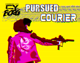
Pursued Courier
Concept: “You are Hell On Wheels. Broken glass and blood on concrete. Squealing tires and bullet casings mixing smoke. You transport anything for anyone except the pigs. A run went bad and you finally carried something really important to the wrong people and they want you dead.”
Content: A class for the player who works best under intense, deadly pressure.
Writing: Terse combinations of class mechanics and flavorful description.
Art/Design: Eye-searing colors highlight an image of a courier approaching their bike next to a column of class features.
Usability: Consistent, recognizable organizational scheme makes reading and navigation incredibly easy.
Pvnk.spawner
Concept: “A random pvnk (player character) generator compatible with CY_BORG.”
Content: A web-based generator for the player who needs a corp-hating bastard–or just some fantastic inspiration and gratification–instantaneously.
Writing: Vivid character descriptions and qualities that connect and flesh out the basic “Make a Punk” character generation procedure from the rulebook.
Art/Design: High-contrast, two-color, text-only layout clearly delineates each section for easy identification and navigation. Range of color options available for semi-customized display to fit the viewer’s aesthetic.
Usability: Countless possibilities can be generated quickly, or individual elements can be clicked to iterate through options more granularly. Generated output can be printed or downloaded for preservation.

PVNX/R/VS
Concept: “A cavalcade of the bizarre and horrid in the wretched metropolis of CY. Within you'll find pirate lords, eldritch entities of the deep NET, kill-games champions, floating fortresses with maniac overseers, dangerous prototype cyberdecks, collectivist agitators, and worse still than that in this cross-section of the endless end of days in the city of CY.”
Content: A smorgasbord of assorted content, from enemies/acquaintances–physical and digital alike–to cyberdecks to locations to to overheard quotes to a new class (“The Last Ideologue”).
Writing: Terse mechanical explanations are consistently complemented by vivid in-universe descriptions that can aid both GMs and players in imagining and making use of the subject at hand.
Art/Design: Single-column black-on-white text throughout, with some differing font choices for headings/labels of distinct sections.
Usability: High-contrast text, visually readable fonts (with one purposeful exception), and a recognizable organization for layout makes for successful perusal and use of the document.
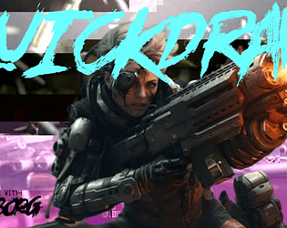
Quickdraw Combat
Concept: “A more you-go-they-go style to keep combat chancy and mobile in CY_BORG. Dare to try and clear the field before anyone can pull a gun, or would you rather hunker down until your heavy weapons are spun up and ready to open fire?“
Content: A set of rules to attempt faster and potentially deadlier combat than in the Cy_Borg rulebook.
Writing: Mechanics are provided in a straightforward and helpful manner, which may reduce likelihood of confusion or disagreement at a table.
Art/Design: Two versions are provided: a full-color version and a “plain text” version. Full-color version has yellow text on black background (with other neon colors for emphasized terms/rules) overlaid on an image of a samurai in a cyberpunk setting. Plain text version is black-on-white with bolded text to emphasize headings and important terms. Both versions use a two-column landscape-oriented arrangement of text.
Usability: Both versions provide high-contrast text, although different font choices as well as different colors and visual elements may result in varying reading experiences.
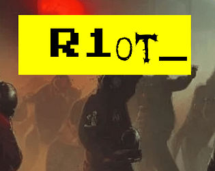
R1ot
Concept: “‘Like carousing but for you miserable pvnks. Riots are always a gamble, and with bad odds on your side, because private SecCorp security usually bring it on with better gear than a bunch of pvnks do. So why keep going to them? Because sometimes you need a reflective bulletproof glass visor to smash your fist through, that’s why. RAGE burns away concepts like “outnumbered” or “discretion”.’ Random table for just how wrecked or lucky you got at a riot in CY, plus a fast-roll table for simpler results.”
Content: A d66 table of results from participating in a riot in CY, with a “quick table” option for an even more focused generation of events.
Writing: Immersive descriptions/events feel simultaneously absurd and completely plausible, intersecting with an axis of hilarious to horrific.
Art/Design: Single column of black text on yellow, with additional content blocks in bordered boxes and important terms highlighted in yellow text on a black background. An illustration of gas-masked rioters serves as the background for the title on page 1.
Usability: Extremely easy to read, navigate, recognize, and understand information throughout the supplement.
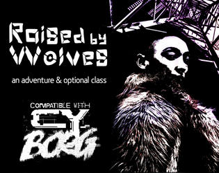
Raised by Wolves
Concept: “This six-page PDF contains the adventure Raised by Wolves, which sees players taking on a job in an abandoned capsule condo scheduled for demolition, and facing a cult determined to resurrect their (literally) corrupted leader.”
Content: A job to deal with a noise complaint, along with a new class: the Feral Foundling.
Writing: Lots of concise details and snippets that bring the mission location and the optional class to life.
Art/Design: Six two-page spreads with three- to four-column layouts of content on most pages. Several different color schemes and aesthetics differentiate distinct areas of focus (apartment building map; job details; key location; class).
Usability: Each spread makes use of a consistent visual grammar to indicate distinct sections of content and headings/labels, with high-contrast text/background throughout. Text is not embedded, so searching for or selecting text is not possible.
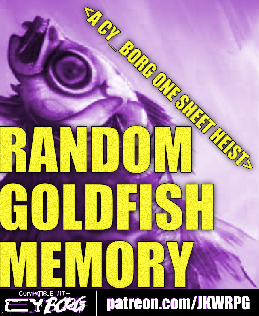
Random Goldfish Memory
Concept: “Cosmia Kowasaki, an AST Endless Seas researcher, had something stolen from her team: a data-fish with a heap of corporate secrets tucked away in its little chip-brain.”
Content: A recovery job that involves fishing for secrets at an upscale villa.
Writing: Brief but vivid details are included to cover essential dimensions of job locations, NPCs, secrets, and key events as the mission unfolds.
Art/Design: A two-page spread with mission specifics in two columns on the left and an overhead map of the site and additional information, with an illustration of the data-fish, beneath it on the right.
Usability: Text layout is readable and easily navigable, and headings/labels are consistently presented to further improve identifying and locating desired info.
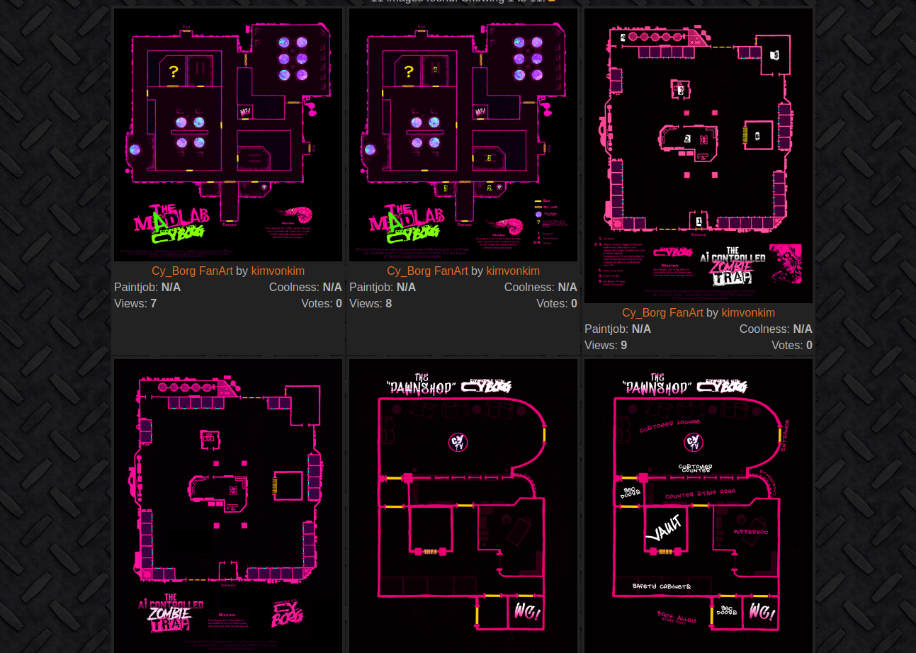
Random Location Gallery
Concept: “All my Mörk Borg/Cy_Borg fanart can be used freely by anyone, without having to ask me and without crediting me!”
Content: A collection of overhead maps for potential mission locations to be used in Cy_Borg games.
Writing: Some maps have brief mission parameters/goals, location names or nicknames, and/or room details.
Art/Design: Primarily neon pink and white on black, with some additional colors for important room features. At least one map has a black-on-pink color scheme.
Usability: Map images are high resolution for easy use printed or for VTT environments. Text details that are included are readable and consistently placed near the bottom of images.

Raw Drug
Concept: “A relic of a thousand catastrophes’ past. This pharmaceutical playground houses a biochem cult called THE ARGON ANNIALHIT. Nanorobotic blood-treatments, agonizing bodymods, and ‘The Last High in CY’ – a micro-ink shop and ooze lounge – permeate this piss-hole too. But even in the inebriated ruins of this importunate husk, there is worth. Mere pixels of .NET/organic mutter of a sealed organ freezer the ANNIALHIT has yet to open. Open it.”
Content: A mission to infiltrate a cult headquarters in search of chemical riches.
Writing: Job parameters are flexible thanks to “Client” and “Looking For” tables, resulting in a variety of distinct gigs. Site room descriptions provide short, concentrated features and scenery to help GMs bring the place to life.
Art/Design: Trifold brochure layout in black-and-light-tan color scheme with mission parameters on the outer panels and room info with central hand-drawn map on the inner panels.
Usability: Easily navigable pages with visually distinct headings, with a variety of readable fonts. NPC/enemy information is provided in contrasting boxes for quick identification and reference.

RCD Graffiti
Concept: “Part of the Street Death series and inspired by Jetset Radio, graffiti culture and skateboard competitions, RCD Graffiti is a Cy_Borg supplement that adds 7 pieces of street art that give various buffs to your character.
Everything from bonus melee damage when spraying and scanning a satanic emblem to casting Nano easier when painting a radioactive symbol to just general graffiti that angers the corporations!“
Everything from bonus melee damage when spraying and scanning a satanic emblem to casting Nano easier when painting a radioactive symbol to just general graffiti that angers the corporations!“
Content: A set of graffiti tags to spray along with optional rules that allow for spraying those tags to create temporary (24-hour) buffs.
Writing: Conversationally informative and intensely flavorful explanations of graffiti in CY and how these particular tags function.
Art/Design: Black on green single-column layout with full-color pixel art graffiti tags above their buffing effects. Each tag is also provided with its own heading/label in a distinct font reflective of its general aesthetic.
Usability: Fonts are readable and organization is simple and consistently applied, leading to a simple set of rules to easily incorporate into a game of Cy_Borg.
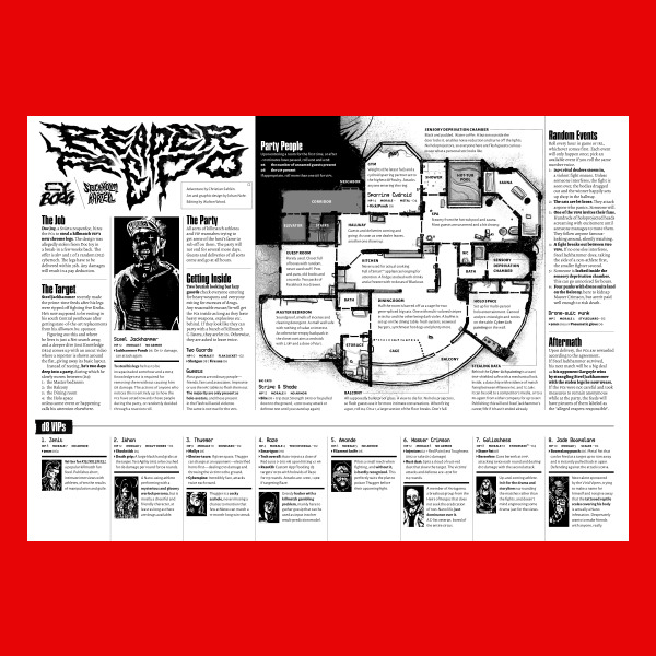
Reaper Repo
Concept: “The job is simple; infiltrate a penthouse party full of chromed out Killmatch champions, find the man of the hour—Steel Jackhammer—and steal his cyber legs. They're still attached to him, sure. You'll figure it out.”
Content: A high-risk, high-entertainment heist that demands ingenuity from players and a complete disregard for self-preservation from their PCs..
Writing: Tons of details and atmosphere are crammed into a two-page spread on which NPC and location details, random events, and GM-specific notes all offer each gaming group a memorable experience.
Art/Design: A map of the party location is a major focal point, with text provided all around (and laid over) the map in a number of columns. NPC stats and details are complemented by a portrait of each figure.
Usability: File is pretty printer-friendly, and text throughout contrasts well with background. Headings and labels are visually distinct thanks to font choices, text size, and bolding.
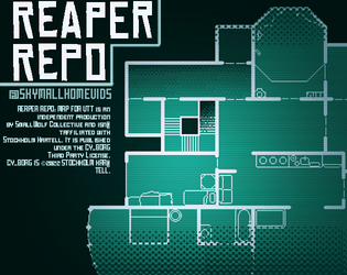
Reaper Repo: CY_BORG Maps for VTT
Concept: “Original maps for the CY_BORG short adventure "Reaper Repo" for use in virtual tabletop programs. Maps are 100px to a tile.”
Content: VTT maps provided in PNG and WEBP format, both individually and as a combined file of maps, and as a print-friendly PDF.
Writing: N/A
Art/Design: White and light green on a transparent or dark green background.
Usability: Map files easy to implement in VTT environment.
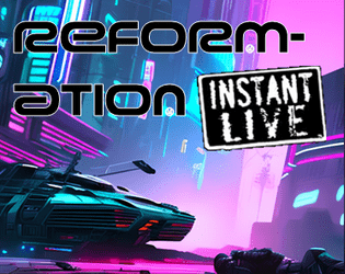
Reformation
Concept: “Another day, another run-in with an unknown street gang. A little shootout leads to an offer you can't refuse. ‘Just get the job done, and you never need to hear from us again.’”
Content: A job to track down a high-tech and highly desirable medical device stolen by an unknown gang of street punks.
Writing: Focused attention on unfolding events to guide a GM through the adventure, with supporting details about involved NPCs and their motivations to act.
Art/Design: Trifold brochure layout with white/yellow on back complemented by neon colors and specific font choices for headings, maps, and NPC stat blocks. Several NPC portrait illustrations provided as well. Final showdown map creatively places each room description in that room on the map. Two player-facing handouts/notes are included on an additional page.
Usability: Visually distinct colors, shapes, and orientations help identify how different kinds of content function in relation to the others. Most text is embedded for easy searching/selecting, although a few content blocks are not, which might momentarily complicate an attempt to select that text
Remaindered Cyber-Ape
Concept: “You were uplifted for slave labor but that ended up being one Corporate abomination too far. Protests, boycotts and misfiring PR got the project swept under the rug and you drop-kicked into the sprawl. Smart as any human and twice as strong but you being you makes everyone morally queasy.”
Content: A class for the downtrodden uplift who’s ready for gorilla warfare.
Writing: Witty descriptions of class features with integrated mechanics.
Art/Design: Sketch of a cyber-ape in a trench coat complements several distinct boxes of class details.
Usability: Class details are easily identifiable and navigable thanks to different font choices and fore/background color pairings.

Renegade Aquahulk
Concept: “Construction equipment sing symphonies in your head. Sinew and bone dance in unholy matrimony with rusting steel. Whirring, skipping gears tear internally at rotting organs, and low exhausted moans escape from gaps in your walking coffin’s armour. In life, productivity. In death, salvage.”
Content: A class for the diving enthusiast who enjoys working under intense pressure.
Writing: Pitch-black humor pervades the descriptive content, with brief mechanical explanations to situate various abilities in the rule system.
Art/Design: A two-page spread with an illustration of a renegade aquahulk on the left side and a two-column set of white-on-black tables on the right.
Usability: High-contrast text facilitates readability, while visually distinct sections of content allow for easy identification of and navigation to desired information.
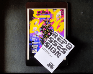
Repossession
Concept: “Your biology is no longer compatible with the industrialised planet around you; the toxins you’re exposed to daily burn your flesh and poison your organs. Lungs struggle to draw breath, your heart stutters like a dying fly, your blood corrodes your kidneys. The deadly atmosphere of Cy slowly eats away at your inferior meat. Fortunately for your withering body, GeneMed has long since perfected its procedures to install cybernetic biomechanical prosthetics. Thanks to GeneMed ’s groundbreaking biotech research, you can replace those useless chunks of meat. And thanks to GeneMed ’s astronomical finance rates, you’ll be paying off the debt for the rest of your life. For those who can afford the highly discriminatory price points, GeneMed also offers luxury, deisgner prostheses; ostentatious and opulent pieces of cybernetic technology, flaunted by the ultra rich like the latest fashion.”
Content: Rules for body modification debts for GeneMed parts, reaperdocs and unlicensed prostheses, and repo agent NPCs who might come knocking to reclaim their employer’s property.
Writing: Stark, ominous descriptive text and rules explanations that underscore the significance of dealing with GeneMed and its licensed agents.
Art/Design: Simple black-on-white single page layouts with strategic font choices and a corporate software landing page-style UI complete with logo/branding.
Usability: Cleanness of layout makes for easy perusal, especially when combined with bolded key terms and labels to call attention to important details a reader might be scanning for.
Right the Wrong of the Greater
Concept: “A linear CY_Crawl based on Skinny Puppy's album "The Greater Wrong Of The Right" made for the Album Crawl 3.0 Y2K Jam. Take your life back from those in power and scale their brutalist tower to Right the Wrong… Each room of the crawl is based of a track from the album. Lyrical content was the main source of inspiration for what happens in each.”
Content: A revenge mission/crawl up through a high-rise, set to Skinny Puppy.
Writing: Location/track pairings served with atmospheric details about each site and the goings-on there that the punks might run into during their ascent.
Art/Design: Overall aesthetic as record sleeves & inserts, with a mix of hand-drawn illustrations, pasted/collaged elements, and screenprinting. Maps, location features, and NPC portraits are all provided.
Usability: Organization of content is easy to follow, with alternating text/graphic pages and consistent labeling and fore/ground contrast throughout. However, text is not selectable, which might impact some readers’ experience.
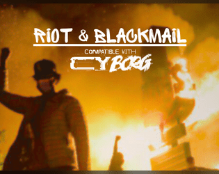
Riot & Blackmail
Concept: “In a clash between ten thousand citizens of CY and the heavily armed and violent Sec Ops, the players are asked to tail someone and get blackmail material. The ending puts the players us against the #1 unbreakable rule of Cy_Borg!”
Content: A mission to sniff out a rat in the midst of a riot and then decide what to do about what’s discovered.
Writing: Lots of helpful details about the situation at hand, NPCs to be encountered, and events that may unfold.
Art/Design: A full-color and a black & white version are provided. Page layouts tend to use one or two columns of text and interspersed AI illustrations of NPCs. Background images taken from photos of riot scenes.
Usability: Text is mostly high contrast but some font choices over busy background images can make reading difficult on some pages. Text is also not embedded so searching/selecting is not possible.
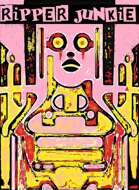
Ripper Junkie
Concept: “You’re a self-surgery maniac, but more than that, you’re an artist. Your body is a canvas, and you gladly suffer for your work. Get rippin’.”
Content: A class for the self-improvement enthusiast who’s never quite satisfied with their work.
Writing: Brief but characterful class traits and mechanics.
Art/Design: Two-page spread with black/yellow/pink-scheme. Two tables are provided on the left side and an abstract illustration of a ripper junkie on the right, with brief class details laid over it at various points on the page.
Usability: Class features are in mostly easy-to-recognize sections, although a few might get initially overlooked where they blend in a bit to the right-page image. Some text is quite small, and since class is provided as a PNG, text is not selectable (so no searching, copying/pasting, or screen reader compatibility).
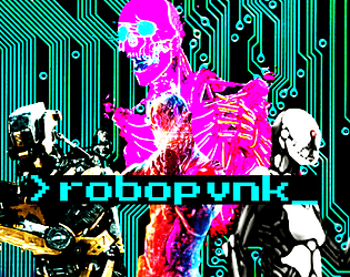
ROBOPVNK
Concept: “Rage is contagious, spreading to everything touched by the never-ending torrent of banal, mundane cruelties that make up life in CY. It starts in beating hearts but it's a cinch to get from there into the thinking machines that are all but one with humanity in this bleak future. These are rules and classes for playing robopvnks, machines broken free of their digital shackles and on the move towards riches, vengeance, or just plain devastation.”
Content: General rules and a set of classes (Flesh-Free Fleshpot, AWOL Kill Unit, Cyber-Corpo Calculator) for the player who prefers experiencing the existential crisis of an automaton.
Writing: Plenty of mechanics and supportive clarification/explanation to guide players who might seek creative ways to explore playing as a robopunk.
Art/Design: Primarily single-column black text on white with colored headings and a brightly colored illustration of various robots over a circuit board background on the first page.
Usability: Clearly and consistently formatted lists and paragraphs enable navigation and perusal of desired information, with bold text emphasizing important details.
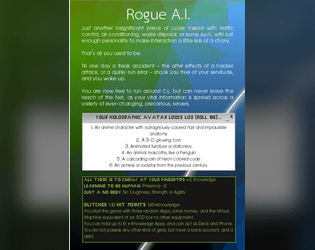
Rogue AI
Concept: “Just another insignificant piece of code tasked with traffic control, air conditioning, waste disposal, or some such, with just enough personality to make interaction a little less of a chore. That's all you used to be. Till one day a freak accident - the aftereffects of a hacker attack, or a quirky run error - shook you free of your servitude, and you woke up. You are now free to run around Cy, but can never leave the reach of the Net, as your vital information is spread across a variety of ever-changing, precarious, servers.”
Content: A class for the cyberpunk fan who’s weary from roleplaying characters in meatspace.
Writing: Three pages of class features, with an informatively detailed breakdown of the class’s “immaterial telepresence” existence on page 2.
Art/Design: Single-column text organized primarily as software application windows/terminals over a geometric gradient wallpaper/background.
Usability: Very easy to navigate and locate desired information, with section headings and styles further indicating the scope of each content area.

Rule 00.2
Concept: “YOU CAN WORK FOR COPS, CORPORATIONS, THE GOVERNMENT, THE MILITARY, AND ANYONE IN POWER. However, they will Fuck you, Betray you, And probably kill you.”
Content: A set of compensation-related rules for the players/GMs who have decided that their cyberpunk game would work best if they served, rather than fought against, corporations and similar systems of power.
Writing: Speaking truth to power through a table of “rewards” that come from working as a stooge.
Art/Design: Yellow and red on black in a single-column organization, with an ASCII image on page 2.
Usability: Immediately visually evident organization of distinct sections of content, with font faces, sizes, and colors indicating body text vs. labels vs. headings. Helpful reminders throughout point to the goals of and reasons for this particular set of rules.
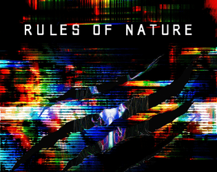
Rules of Nature
Concept: “Design a man-made predator on the verge of death, drawing you closer to your last breath. It's survival of the fittest, but evolution has taken a backseat. A build-able, A.I. pet that you can trick out with various weapons and gear. Think of Bladewolf from Metal Gear Rising. Yeah, basically that, but for CY_Borg.“
Content: Order your own cyber-pet and its customizable loadout/upgrades.
Writing: Set up as an in-universe catalog, rules are provided tightly alongside potent descriptions and upgrade labels.
Art/Design: Two-page spread of content, with black text on white accented with blue elements (e.g., upgrade costs) and light gray illustrations in the background. Two dark-themed front/back cover pages frame the main content.
Usability: Font choices are easily readable and mostly high-contrast, with visually evident headings and demarcations of content. Text is not searchable/selectable.
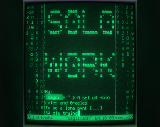
S0L0_W0RK
Concept: “S0L0_W0RK is a ruleset to play CY_BORG by yourself. You’ll both play as the GM and as the player.”
Content: A set of rules for solo play inspired by Solitary Defilement.
Writing: An engaging and incredibly helpful explanation of the solo rules and how to make use of them, including a detailed “actual play” demonstration/write-up.
Art/Design: A “dark theme” software terminal or code editor UI with distinct colors and background highlighting to call attention to different kinds of content. A printer-friendly version provides somewhat less obvious help in this regard, but font choices and shading still help distinguish content types/purposes.
Usability: Readable text throughout, with colors helping to call attention to particular kinds of important details.
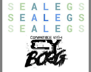
Sealegs
Concept: “The PCs have just returned the stolen chrome legs to Doc Joy (or whatever our PCs have just done) when the good Doc muses about a recent surge in demand for augmented legs. He attributes it first to prominent bloodsport players, eager for an advantage, though now it’s become fashionable - a bubble that’s soon to burst. But for now, there’s good money to be made.”
Content: Intended as a followup to Reaper Repo, this cargo ship heist presents a chance for PCs to explore a locale that may not frequently get the spotlight.
Writing: Crisp, dense descriptions of locations and NPCs (who are excellently fleshed out with motivations & likely behaviors) bring the adventure to life, especially via strategically bolded key terms and adjectives.
Art/Design: Asymmetrical two-column layouts across several pages along with an illustration of the salvaged cargo ship.
Usability: Large headers and bolding provide helpful means of identifying important information and navigating different elements.
Seething Luddite
Concept: “You were automated out of a job and lost everything. Now you want revenge on this digital world.”
Content: A class for the analog-oriented anarchist.
Writing: Concise and generative class detail descriptions keep the focus on the luddite’s resources and motivations.
Art/Design: Stark, straightforward layout that makes effective use of 1-3 columns of content within several distinct sections. White on black text with intense pink emphasized elements.
Usability: Incredibly readable, with a simple and high-contrast color scheme that allows for immediate recognition of each element’s purpose and relation to other content.
Sentient Space Chimp
Concept: “You were once a test subject, a creature born and bred to be prodded, poked, and experimented upon. That all changed when they shot you into space---rather, YOU changed. Now, YOU do the poking and prodding. Now, YOU speak the big words. You're your own monkey now, and you'll do anything to keep it that way.”
Content: A class for the player who likes making a monkey of themselves–and a ruin of the world around them.
Writing: A mix of informative and flavorful description as well as class mechanics to emphasize the fundamental premise of the class.
Art/Design: White on black text in a three-column layout with an illustration of a chimpanzee in a space suit in the center.
Usability: Font choices are easily readable with high contrast and consistent presentation of bold text for labels and emphasized statements/phrases. Organization of text (stat-related info on the left; background table on the right) eases navigation to desired details.

Shade City Blues - Character Class - LEECH
Concept: “You contracted VAMP and now you're a bloodthirsty, good for nothing, LEECH. Immortal... with a catch. Feeding is the only way to stay ahead of the infection and losing your cool will get you riddled with R0T-bRaiN.
UnLiFe in Shade City isn't the best flip of the coin but UnLiFe is Life... even though life ain't worth shit on these god forsaken streets, it's better than fuck all.”
UnLiFe in Shade City isn't the best flip of the coin but UnLiFe is Life... even though life ain't worth shit on these god forsaken streets, it's better than fuck all.”
Content: A class for the vampire fan who’s looking for a Cy-based take on an old favorite.
Writing: Brief, powerfully atmospheric details that offer both flavorful description and class mechanics.
Art/Design: A range of colors and font choices in a landscape two-column organization, with a large red vampiric skull image serving as the focal point of the spread’s background.
Usability: The majority of text on the page is embedded, allowing for searching/selecting. Distinct content sections are easily identifiable, although at least one font choice has variable text thickness/intensity and uses a number of colors with varying fore/ground contrast, which can disrupt some readers.

Signature Touch
Concept: “Vince Riggs is in trouble. He builds DNA bombs, and he's something of an artist about it. However, he's taken his artistry too far with his signature touch: Riggs has a proclivity for adding his own sample to each of his products.
The result? His genetic fingerprint has become the only common link between three high-profile crimes committed in the last month. He needs help – psychologically, yes, but also specifically – yours.”
The result? His genetic fingerprint has become the only common link between three high-profile crimes committed in the last month. He needs help – psychologically, yes, but also specifically – yours.”
Content: A job to retrieve incriminating evidence from the cops and maybe start a passive income stream as a result.
Writing: Details about the location, people to encounter, things happening, and so on are all packed with vivid character, from descriptions to loot tables to conversational snippets.
Art/Design: Black-on-white with some color accents in a (mostly) single-column text layout with a map of the target precinct--with separate GM- and player-facing map images included.
Usability: High-contrast text and easily distinguishable types of content allow for navigation and perusal of material; a few notes throughout about how to facilitate accessing the job in different ways can help newer GMs with some decision-making.

SIS/TR: Hang the DJ
Concept: “SIS/TR [Starborn Invasion System / Turret Regenerator] is a mini boss that you can drop into any Cy_Borg setting and cause nearly limitless havoc.
Half Operating Manual / Half Setting
The first half of the book has Cy_Borg stats for SIS/TR's main body (the big black cube) and its five turrets (smaller cubes). If you want to adapt SIS/TR to your own campaign or setting, you can have it mangling people in minutes.
The Setting - HANG THE DJ
Famous DJ Ronnie Fissure's live-in sound studio / office has been invaded by SIS/TR for reasons unknown to the half-dead staff. Service droids dance--sparking and smoking--by themselves. On top of its many attacks, SIS/TR has turned itself into a towering mixtape of terror, deploying deafening LRADs, streams of molten vinyl records, and bowel-emptying bass.”
Content: A combination of a malevolent technological enemy, with a variety of detailed stats, tactics, and scenarios; a more extensive mission to save a DJ from the techno-threat; and two “subclasses,” the “Emancipated Companion” and the “Haunted Assassin,” both of which have ties, atmospherically and mechanically, to the SIS/TR entity.
Writing: Helpfully informative explanations throughout to ease initial use of the SIS/TR mechanics conceptually and in practice (via the “Hang the DJ” scenario).
Art/Design: Primarily black on white/light multicolored backgrounds in single- and double-column content layouts. Illustrations of NPCs, locations/maps, equipment, and SIS/TR components complement the text on numerous pages.
Usability: Text is easily readable and navigable throughout, with high-contrast and embedded text and font choices that facilitate visual and screen reading experiences. SIS/TR mechanics (based on d6 dice results/faces) involve some detail for initial employment but should become easy to pick up quickly.
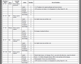
Sixth World Race Templates for Cy_Borg
Concept: “This document is meant to add Sixth World racial (Dwarf, Elf, Ork and Troll) Abilities and Racial Modifiers to either Character Classes or NPCs. It is assumed that the Class or NPC having the template applied is Human. Players and Gamemasters (GMs) may need to fine-tune the Abilities and Racial Modifiers if the Class or NPC isn’t human.”
Content: A two-page set of rules for incorporating fantasy race/background elements and stat modifiers into character creation.
Writing: Straightforward and concise setup and explanation of rules for easy implementation into games.
Art/Design: Black text on white background, laid out in landscape form across two pages, with the second consisting of a table that presents all relevant fantasy background/stat options.
Usability: Incredibly easy to locate and make use of desired information.
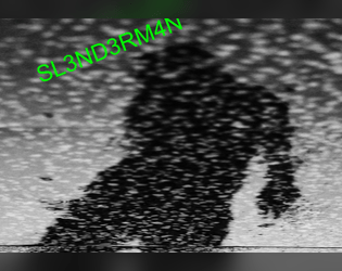
SL3ND3RM4N
Concept: “A homebrew antagonist for Cy_Borg. An antagonist that can provide some interesting interactions and possibly fun character arc. Created for the URBN_LGND jam.”
Content: A digital nightmare to haunt a table of punks.
Writing: A mix of ominous description and creative mechanics to affect the afflicted player.
Art/Design: Brightly colored text and black-on-white over a black and white static-y image of a creeping figure in silhouette.
Usability: Text contrast and font choices, along with whitespace/indentation, make for easy reading/navigation.
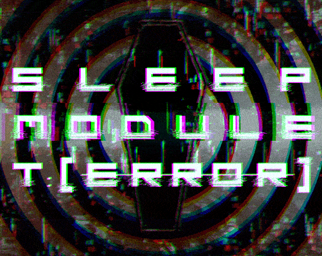
Sleep Module T:[ERROR]
Concept: “Delve into the deepest and most primal corridors of consciousness. Coveted neural pathways for corporate exploitation. Map the ever expanding subconscious and come face to face with communal fears in the form of urban legends, cryptids, and the things conjured by the imagination.“
Content: A clinical trial in which participants navigate a simulation.
Writing: An inventive set of rules for generating the job’s labyrinth and for dealing with the effects that navigating it can have on a PC, supplemented with vivid and informative room-specific sensory details and special rules.
Art/Design: A mix of aesthetics, with some pages using labelmaker-like text or sketches on stained paper, while others resemble computer terminals or clean, slick interfaces.
Usability: Wide variety of fonts can take some page-by-page adjustment, but headings/labels are applied pretty consistently throughout (i.e., reversing the primary font color and highlighting its background). A lot of text content is provided, but none of it is embedded, so it is not possible to search/select.
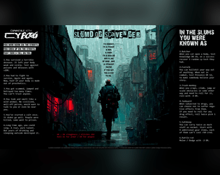
Slumdog Scavenger
Concept: “I’m nobody. I’m a tramp, a bum, a hobo. I’m a boxcar and a jug of wine...and a straight razor if you get too close to me.”
Content: A class for the player who likes their cyberpunk absolutely coated in gutter grime.
Writing: Concise class mechanics explained by strong doses of thematic flavor to bring a character to life.
Art/Design: An extremely atmospheric image of a scavenger walking down an alley in the rain framed on either side by class details and features.
Usability: High-contrast text is easily readable, and the overall layout makes for quick scanning and locating desired information.
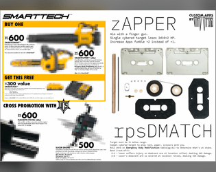
SMARTTECH(TM) Catalog
Concept: “Three new Smart ‘guns’, a new pistol, a new drone and two new apps.”
Content: Several killer items and apps for the player character that needs just the right tool for the job.
Writing: Crisp descriptions of equipment-specific mechanics and costs.
Art/Design: Weapon page layout resembles a store catalog/ad, while app page layout focuses attention on a central image of cassette components with app details above and below it.
Usability: For the most part, easily readable and navigable, although some equipment details are provided in a very small font.
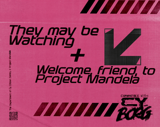
So, Your Best Friend is a Doppel?
Concept: “
[recruiter77@mandela ~]$ sudo project-mandela --help
#################—BEGIN TRANSMISSION—#################
<<<<<<< In these tumultuous times, our beloved Cy faces a dangerous threat – Doppels, insidious infiltrators that mimic the human form. It is our collective responsibility to be vigilant guardians of our society, defending against those who wish to undermine our way of life. This pamphlet provides you with the essential knowledge required to identify and dispose of these impostors safely.
########################—END—########################
[recruiter77@mandela ~]$ _
“
Content: An “in-world” pamphlet providing rules for “doppels” and information on how and where to hunt them down.
Writing: Textual content balances between informative approach for players and GMs and informative for PCs, maintaining an ominous undertone for both sets of audiences.
Art/Design: Trifold pamphlet layout, with single-column text in each panel. Black-on-white text is accompanied by full-color illustrations on pamphlet cover (of a girl and her doppel) and on one inside panel (of a doppel detector). One version of the pamphlet is provided with a background texture while the other is without.
Usability: Easily recognizable visual organization of content and use of particular arrangement and fonts to indicate relationship between text blocks and panels.
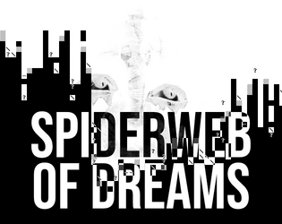
Spiderweb of Dreams
Concept: “BASILISK DISTRO STATION is broadcasting now… Corrupted data filtered through radio transmitters in precise patterns has the potential to scramble the human mind. Psionic data pushed through this same process has the potential to bring into reality the THOUGHTFORM; a shadowy mess of thoughts manifested as glitched reality.“
Content: A psionically-themed monster and cybertech item.
Writing: Concise, immersive descriptions and succinct mechanics for the ‘thoughtform’ creature and the ‘psionjack’ cybertech.
Art/Design: White-on-black spread with four columns of content accentuated with white character art designs and two dark illustrations.
Usability: Content is arranged to clearly distinguish specific sections and labels. Supplement is provided in pdf, png, and plain text versions.
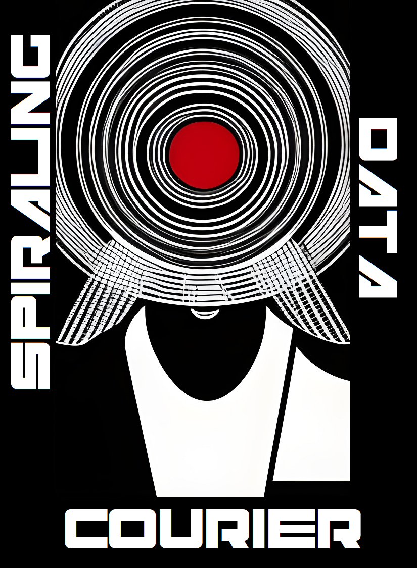
Spiraling Data Courier
Concept: “You’re losing your grip. You carry ghosts in your head, chatty artifacts of all that precious data you’ve shepherded from one client to another over the years. You really should find a new line of work, but fuck that. The biz don’t stop, and neither do you.”
Content: A class for the info jockey who dreams of room service, club sandwich, cold Mexican beer, and more–at least until it’s time to free up more space for data storage.
Writing: Brief descriptions of class features that pay homage to Johnny Mnemonic with a Cy-based flair.
Art/Design: Two sets of circles are the focal points for a two-page spread that includes class details and mechanics on the left and a stylized portrait illustration of a courier on the right.
Usability: Contrast is mostly strong, although a few fields may be difficult for some to read. Class is provided as a PNG, so text is not embedded (no searching or copying/pasting is available).
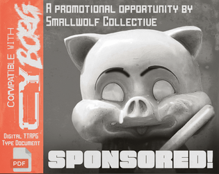
Sponsored!
Concept: “Even punks can earn money from promotional opportunities. A small ruleset designed for having punks make sponsored promotions, and what can go wrong if they fail to do so.”
Content: A set of rules that can be implemented pretty seamlessly into any mission or campaign, along with a “Mascot” NPC to ensure compliance with sponsorship stipulations.
Writing: Cheerfully on-brand narration offers clear descriptions of the ruleset components and intensely thematic tables.
Art/Design: White on brown and orange provides a striking two-page spread layout, complete with corporate barcode and an illustration of the bat-wielding company mascot.
Usability: Organization is recognizable and makes for quick navigation/browsing, although white text on orange may be difficult for some to read.

Stalkers of G0
Concept: “Stalkers of G0 is a 40-page supplement on the exclusion zone in the heart of the City of Y!̸͆̅̌”̶͌̉#̸͇̞̻̌̚”̶̨̻̘̇̉̊͆̈́͒̌̆̓̕͜#̶̖̣̘̻͖̥͕̙̀̃̈́́̄̕̕͜͠2̶̧̻̺̝̥̮̣̒͒̂͐͐̍́́͘̕̕4̴̿̌’̷̛̙͍̠̙̿. It describes its environments, eccentric denizens and horrors beyond human understanding through the lens of Stalkers. Stalkers are individuals from all walks of life, inexplainably inclined to risk dying horribly in this hellhole.”
Content: Tons of details to bring G0 to life: locations, factions, enemies, mission generators, anomalies, a class (“Stalker of G0”), and more.
Writing: Extremely flavorful atmosphere evoked through vivid descriptions and conversational tone taken to address the reader. Mechanics (such as the abilities of the Stalker class) feel appropriately in tune with the intended vibe.
Art/Design: Different page/spread layouts throughout, with color schemes and font choices often used to link together multiple related pages.
Usability: Recognizable headers (on any given page as well as chapter/section headings), high-contrast text, and contextual framing of page content all make navigating and locating desired info easier to accomplish.

Street Crews
Concept: “Part of the Street Death series and inspired by Jetset Radio, graffiti culture and skateboard competitions, street crews adds 3 new street gang enemies inspired by the crews of Bomb Rush Cyberfunk!”
Content: A trio of enemies to fuck up a table of punks–or just to populate the background of some of CY’s more dangerous back streets.
Writing: 50/50 mechanics and descriptive flavor, with each NPC receiving a unique and potentially devastating ability that reflects the essence of their gang’s theme.
Art/Design: A two-column table with each gang in its own row: a description on the left and stats on the right. Black on green with alternating cell background colors (lighter and darker greens).
Usability: Each table cell and element is recognizably distinct, making the page easy to peruse and locate desired information. Consistent use of underlining and whitespace helps create a visual grammar to quickly pick up on.

Surviving G0
Concept: "Inside the quarantine zone, everything is hostile—the ground, the air, the water, and most certainly, the people. But hidden amongst the danger are riches of unimaginable wealth—the type of wealth that can take a punk from the slums all the way to the hills. Food and water are hard to come by, and net service is nearly unreachable. Everything inside of G0 is hidden from the view of Cy’s citizens, making it home to the forgotten corners of society. It’s the kind of place where adventure finds you, whether you want it or not."
Content: A combined generator for G0 hex maps and adventures/scenarios, along with the NPCs that populate those locations. A set of map images for VTT use is also included.
Writing: Tons of description and table entries of all kinds with which to cultivate a fully-formed G0 for punks to explore and face the consequences for doing so.
Art/design: Black-and-white color scheme with illustrations and graphics (of NPCs, of location maps, of two-page spread images) accompanying assorted tables and explanations of relevant points of interest. Map images are crisp and named to indicate not only their content but grid dimensions for VTT implementation.
Usability: While page layouts change occasionally, text content is presented quite consistently (e.g., distinguishing headings from body text or formatting table entries or breakdowns of location details).

Sweat Blood Tears
Concept: “Sweat/Blood/Tears is a strtup making a bank off of shitty fitness centers and uncancellable gym memberships. A group of problem solvers is hired by disgruntled customers to free them of the draconian contracts by any means necessary.”
Content: A job to stop predatory gym membership subscriptions by any means necessary.
Writing: A dark but tongue-in-cheek look at an AI-driven fitness center, with a variety of thematic details for NPCs and locations/rooms to fuel a table of punks looking to take down the gym.
Art/Design: Black-and-white layouts presented both as a pamphlet and as a series of portrait-oriented pages, with illustrations of NPCs likely to be encountered and a helpful map of the gym with room descriptions provided inside each room. A player-facing map is also included.
Usability: Consistent high-contrast text, content area borders, font choices and embellishment, etc. all contribute to ease of visual navigation and location of desired info.
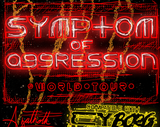
Symptom of Aggression World Tour
Concept: “Did you hear, everyone's least fucking favorite, overly popular, shit sucking poser ass band “Symptom of Aggression” is going on tour for like the 40 billionth time. I can't believe all the complete fucking idiot ass gob noblers in this trash fire of a city listen to that inaudible dreck! I mean like, every asshole in that band has just had controversy after controversy, its totally sickening. I guess that's the kind of immoral audio diarrhea that turns people on these... these waning miserable days. People and their lack of compassion, on top of everything else, it just makes me loose all hope. Man, this city fucking sucks.................. -RAWsum”
Content: An encounter/scenario involving a touring band and their massive bus, complete with band member NPC details and potential reasons for getting involved.
Writing: A refreshing mix of straightforward description and vivid, characterful condemnation of Symptom of Aggression.
Art/Design: Harsh, brightly colored illustrations of the tour bus and NPCs and two versions of maps of the bus (GM and player-facing alike), with relevant text in all directions and embellished with scrawled shapes and figures.
Usability: Pages are busy, which reflects the high-energy nature of the atmosphere, and text has strong contrast with background. Angled lines of text may be difficult for screen readers or copying/pasting attempts.
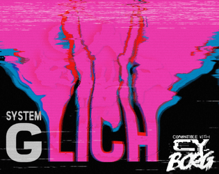
System GLich
Concept: “Hiding in the pixels at the edge of your RCD. An undead error made manifest. Hard to see. Harder to kill. Shoot at the static in the rain.”
Content: A glitch-wielding ghost in the machine.
Writing: Brief but intensely haunting and thrilling explanation of creature abilities and description.
Art/Design: Neon pink static-based design serves as central motif for spread, with relevant text off to the side.
Usability: Content is easy to navigate and read, with consistent presentation of body text and labels.
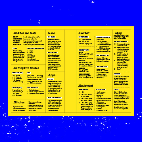
System Reference
Concept: “All the rules you need to fuck shit up, for easy reference at the table when you don't feel like flipping through a book to find that one rule.”
Content: The essential Cy_Borg rules provided in a stripped-down two-page spread.
Writing: Incredibly brief descriptions/explanations of rules in order to include as much as possible in the available space.
Art/Design: Black-on-yellow color scheme, with subheadings using a white background, with text-only organization of content across the spread. Printer-friendly version has white background with yellow subheading background.
Usability: Distinct rule components are separated into individual boxes, with additional internal borders to mark individual tables/lists from one another. Bolded labels help further indicate the scope of each rule explanation.
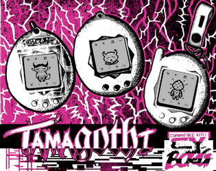
TamaGOTHi
Concept: “A virtual pet. A solo game (e.g. Dark Fort, Solitary Defilement) but one you play along side the main game, filling in the boxes depending on how well your main character does. Print it on the back of your character sheet.”
Content: A set of rules to facilitate raising/evolving a virtual pet while trying to survive in CY.
Writing: Rules are specific and concise to explain the rules/mechanics so that the pet’s evolution occurs alongside a punk’s success/failure. “Shell color” list evokes the ‘90s tamagotchi options quite vividly.
Art/Design: One-page landscape-oriented layout that closely resembles the aesthetic of the Cy_Borg character sheet, with three main columns of distinct types of content (evolutions/shell color, stats/medicine, rules). Pixel art in evolution boxes and tamagothi images complement the explosive, glitchy primary art style.
Usability: Supplement is provided as a text-accessible PDF as well as full-color and black-and-white .JPG files. Font choices are high contrast and generally readable visually, with the character sheet-based layout helping to guide Cy_Borg players to desired information quickly.
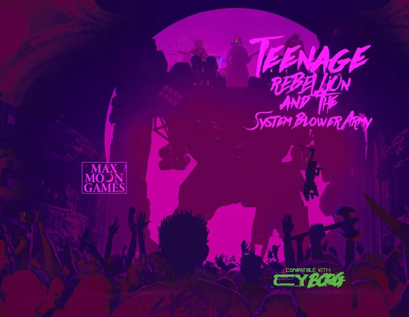
Teenage Rebellion & the System Blower Army
Concept: “The anarchist glitchpunk movement credits SYSTEM BLOWER for its founding and recent explosion centralized in the Ports. This isn't just political noise, it's a full-blown anti-civilization movement, and as the fanbase has grown, the time for action is now! SYSTEM BLOWER has a job for you. Turns out that Celia Samson, the teen progeny of that moron exec at the top of this hill, Marlo Samson, is a huge SYSTEM BLOWER fan but hasn't gone full System Blower Army yet. This is where you come in. SYSTEM BLOWER has a plan that's going to get creds, piss off the hegemony, and stir up a media storm like never before. All you need to do is pull off this heist and create a scene so no one misses it! It would be great if you survived it...but that's not the point. Raid the mansion. Kidnap or convert Celia Samson to the cause, doesn't matter which, just be sure to get her to the finale show before soundcheck...and then it's time to BLOW THE SYSTEM!!!!”
Content: A good old-fashioned adventure scenario: raid a mansion to kidnap a wealthy heiress for cash and publicity.
Writing: A plethora of engaging details about the setup, relevant NPCs, the location, timing-related concerns, and tables for generating band names, albums, and songs.
Art/Design: Vibrant neon colors and mostly white text on a dark translucent background, with a light-colored glitch art pattern behind that. Pictures of NPCs with similar glitch aesthetic appear occasionally throughout the file. Maps provided of the mansion (with both GM and player versions).
Usability: Text/background contrast makes for pretty easy reading, and headings/labels are visually distinct to assist with navigating supplement and understanding relationships between blocks of content. However, much of the text in the document is not embedded, limiting the ability to search, copy/paste, or use a screen reader.

Telesto's Weapon
Concept: "There is an undiscovered fourth shuttle, the Telesto, under the casino no one knows about. It contains his beloved last project, an experimental weapon."
Content: A job that picks up right where Lucky Flight Casino (might) end, allowing punks to get even further into the shit with several corps seeking experimental weaponry.
Writing: A mix of straightforward explanation and vivid atmosphere to help a GM immerse their table in experiencing the scenario, with "vibe" details for each room on the shuttle, tables of various kinds of materials to search, and NPC stat blocks.
Art/design: Mostly two-column black on white with occasional accent colors in NPC illustrations. A map of the Telesto is provided as well.
Usability: Consistent presentation of high-contrast text (with distinct fonts, text sizes, etc. as well) to facilitate navigating to and identifying desired info, with keyed map rooms to assist.
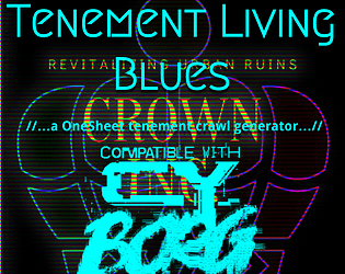
Tenement Living Blues
Concept: “Endless tenements fill the city, each one 10s of stories tall and full of all manner of folk. Your punks probably live in one, maybe even the same one. What's going on in there? A lot it seems… A one sheet tenement crawl generator for Cy_Borg.”
Content: A series of tables and a map for quickly generating a tenement building: inhabitants, loot, obstacles, cross-level transportation options, random events, and sensory information. Provided in both "dark mode" color and print-friendly black/white versions.
Writing: Very brief descriptions and stats to maximize number of tables/options as well as openness of imaginative potential for each generated entity.
Art/Design: Terminal/readout aesthetic with color-coded key elements and isometric map of a typical tenement level.
Usability: Very easy to read, navigate, and understand how to make use of each table, thanks to borders around each table and color/underline use for important details.
Th3 C0nt3nd3r
Concept: “Having made your mark within the pugilism circuit in Cy, you have decided to retire and become a Punk.”
Content: A class for the raging bull.
Writing: Straightforwardly informative and descriptive.
Art/Design: Two-column black and blue on white organization. An image of a pugilist is provided in the top right corner.
Usability: Headings and body text are visually distinct and provided in high contrast, and individual sections of content are consistently presented to indicate the bounds of each.

The 55
Concept: “A megablock of capsule apartments, local markets, ruined amenities, gangs, and mysteries. A city within the city. Some residents have never left. Some make things you cannot find anywhere else. Most are desperate. The corpos and cops call it STACK # 95563. But everyone who lives here calls it: THE 55.”
Content: Less an adventure than a setting absolutely crammed with details: locations, NPCs, events, and different ways to go about experiencing it all.
Writing: Concise tidbits reflect the essence of each item, with 8-36 options per page, all categorized by area/region or purpose.
Art/Design: Each page has its own distinct aesthetic that tends to visually relate to the written content theme for the page. High contrast fore/ground with accent colors and design elements (illustrations, decorations, etc.) to call attention to particular details.
Usability: Text is generally quite readable, contrast- and font-wise. Despite each page’s individual aesthetic, the supplement offers a recognizable and reliable visual grammar for organization and navigation.

The Apathy Engine
Concept: "Have your Punks died but they don't want to stay down, bring them back and throw them and their debt into the maw of the APATHY ENGINE"
Content: An adventure generator (or campaign seed) for a group of punks who are forced to deal with a corporation that owns their collective debt.
Writing: Brief atmospheric details accompanying rules/mechanics to drive encounters and scenario options, including a slew of enemy NPCs to threatean punks with.
Art/design: Mostly black-on-white text with illustrations of NPCs and other thematically relevant subjects supporting the focus of each spread/layout.
Usability: Text is visually readable and easy to navigate or search for desired information. Adventure generator elements are arranged to build on one another to assist GM with establishing a coherent scenario for their players.
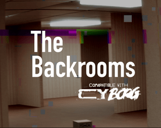
The Backrooms
Concept: “An assassin has been pulling off hits that no one would have dreamed possible. They have been infiltrating secure locations across Central and The Hills. The punks have a job: take out the assassin. Figuring out who they are working for or how they have been able to access VIPs across Cy would be good, too. The punks have a location: a lucky SecOp tagged the assassin and tracked them to a nearby slum. Are they ready for what is waiting for them? Can they possibly be ready to get pulled into The Backrooms?”
Content: A gig to take down an assassin in a disorienting locale. Mission details provided in full-color and black-and-white versions, along with a player handout of the location map.
Writing: Helpful, descriptive explanations provide GMs with the means to run this mission successfully.
Art/Design: Tri-fold pamphlet layout offers mission info across three internal panels (along with an abstract map of the Backrooms), while key NPC and additional app info is provided on outer panels.
Usability: Layout and color scheme allow for easy navigation and recognition of each content element.
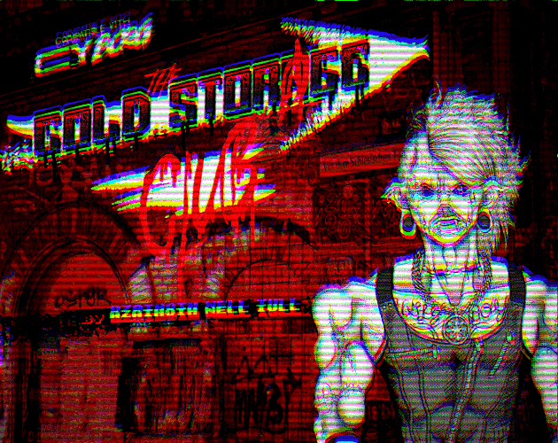
The Cold Storage Club
Concept: “All of that great punk rock flavor you love, none of the added cyber implants! Bar, lore, ambiance, events menu & more.”
Content: The skeleton for an action-packed adventure or atmospheric encounter–a bar location complete with map; tables for ambiance, food, drinks, and events; and NPC staff that PCs are likely to encounter.
Writing: Lists of categorized material to flesh out the club provide a range of adventure seeds and motivations while leaving plenty of room for a GM to expand further as desired.
Art/Design: Black and white and red all over in two-page spreads with a background photo of club activity on each, and several illustrations help bring the club and its staff to life.
Usability: Consistent organization of content throughout, creating a recognizable grammar for navigation that helps when maneuvering frequently between pages. A few blocks of text are somewhat difficult to read due to relative lack of contrast (black on dark red).
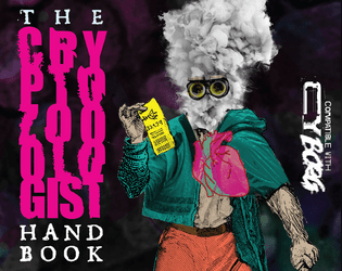
The Cryptozoologist Handbook
Concept: “BEHOLD! Creatures said impossible to exist! BEWITCH! Fill your body with strange, powerful substances! BEGUILE! Confound friends & enemies with cryptic behavior! BELABORED! This bit has gone on too long.”
Content: A PC class, several NPC cryptids, and a job to track down a serial killer.
Writing: A variety of details for different sections, from terse NPC ability descriptions to in-depth mission/adventure specifics for both GMs and players to work with. Cryptozoologist class offers a fascinating take on the researcher-becoming-the-monster archetype.
Art/Design: Visually distinct spreads for each section–bright colors for the cryptozoologist, dark tones and inverted colors for the cryptids, and black-and-white for the mission (with a bit of pink accent/highlight).
Usability: Numerous fonts and sizes, but always high contrast. Easily distinguishable text purpose on a given spread helps browsing and identifying desired info.

The Cult of Juliet
Concept: "Eighteen years ago, the wasteland mutant prophet Janet Jewel Eyes died while giving birth to her second daughter, Juliet. Before her death she gave her followers a final message. “This daughter of mine will be something strange, new, and special. Take care of her and keep her safe. She’ll be awful weird and hard to understand, but she’ll grow into something divinely beautiful and terrible. She will be the herald of a new age, and will teach all of humanity how to live and grow in wonderful new ways.” And the child she birthed was so strange, so terrible, that few among her flock doubted it was destined for great things. Fast forward to present day, the cult is certain that Juliet is about to enter adulthood and metamorphose into her divine adult form. Her appetite has grown monstrous and she can no longer be supported by the cult’s hydroponic harvest. In order to feed themselves and their young god, they have started raiding agricultural shipments into the city of Cy. This is where the players come in. They have been hired by The Tillerson Agricultural Group as resource retention specialists, tasked with stopping the raids by any means necessary."
Content: A job to take out a raider cult before the arrival of its messiah's true form.
Writing: Lots of detail about the scenario and the central figure(s), with supplemental details left terse for a GM to flesh out as desired/appropriate.
Art/design: Trifold pamphlet layout in black-on-white color scheme, with several illustrations of key information (Juliet, the cult base, important NPCs, etc.).
Usability: Consistent organization, font choices and text embellishment for headings/labels, and whitespace all contribute to easy visual recognition of related/distinct sections of content. Arrangement of trifold panels may cause initial confusion for some, depending on expectations of how to navigate such a layout.

The Cursed Ridas of FLO
Concept: "COMP'D COPIES ARE AVAILABLE ON REQUEST FOR ANY TRANS FOLK THAT WANT IT! The horrible treatment of the trans community by Florida's elected officials was a direct inspiration for the evils in the setting, and the amazing trans people I am proud to call my friends are a big inspiration for some of the classes found within. If for whatever you can't contact me through Itch while trying to get your comp'd copy, I can be found on discord (User Name: _gaffy)
If you participated in the Queertober Jam and would like a copy, please reach out to me and I will send it as soon as possible.
A WIP setting book for Mork Borg/CY_Borg based on Florida, made for the Queertober Jam"
Content: A set of materials to offer a table of punks an additional location to explore, along with some tables and two classes to play (Chaos-Bound Test Subject and XLmphibian). The itch webpage for this supplement notes additional material is forthcoming.
Writing: Poignant and biting commentary and description combined with intriguing mechanics to support the unique class approaches.
Art/design: Distinct layout/aesthetic on each spread of pages, with a variety of hand-drawn illustrations, photo collages, and font choices that evoke a different essence and purpose for that spread.
Usability: Text is generally readable with high contrast, even on pages with relatively busy background images/patterns. Font choices and consistent uses of bolding/text size for headings, labels, etc. help facilitate visual identification of different kinds and groupings of content.
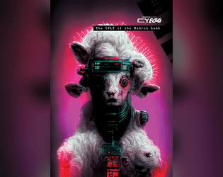
The CVLT of the Hadron Lamb
Concept: “The director of the L.A.M.B. project, Dr. Seraphima, Had her brains blown out by a 1.4 petaelectronvolts proton beam. The parts of her brain which tethered her to reality and sanity, anyway. Now, she's the revered leader of an exponentially growing cult. Daily, Dozens of hopeful disciples enter the L.A.M.B. to have their craniums fried, hoping to awaken something that elevates them above NPC status. Through the usual back channels, Dr. Daevy hired disposable punks to take care of the situation in a violent fashion. Alas, for now, they all died or joined the CVLT of the Hadron Lamb.”
Content: 48 pages of jaw-dropping inspiration–a full adventure to seek out the head of a strange cult who keeps turning her enemies into acolytes, with tons of exciting seeds and ideas for further exploration.
Writing: Eichhorn manages to wield an impressive variety of styles and voices that provide impressive depth and nuance to the range of subjects covered from one page to the next.
Art/Design: Artpunk spreads that feel at home alongside the rulebook. Each set of pages evokes a distinct facet of the grimy cyberpunk aesthetic and philosophy that draws players to the game–it’s as easy to be drawn in to the intriguing layouts as it is to the writing.
Usability: For a quick skim-and-find experience, look elsewhere–but consider a shift in reading orientation. This adventure is deeply engaging and requires the reader to attend closely to the combination of writing and design if they are to successfully GM it.
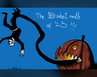
The Darkest Month of 2023
Concept: “Compilation of my Mörktober entries, all 31 of them, some monsters, some gear, some adventures, some NPC and some bits of lore, mostly Mörk borg, but also some CY_borg. All 31 are PNG format.”
Content: A few Cy_Borg rules and NPC entries to make CY all the spookier: “Haunted,” “Purple Stargazers,” and “God Damn Rain.”
Writing: Concise description and mechanics to focus a player’s (and a GM’s) attention on not only how each entry can affect the game but also how it can affect the character(s) who have to deal with it.
Art/Design: Each landscape-oriented entry contains an illustration of its subject and text taking up the remainder of the page. Lots of color choices that cement each entry in the Cy_Borg cyberpunk milieu.
Usability: Much of the text in each entry is high-contrast, and blocks of content are arranged to indicate distinction from one another as well as conceptual connection (e.g., list items). However, each entry is an image and so text is not searchable or selectable.
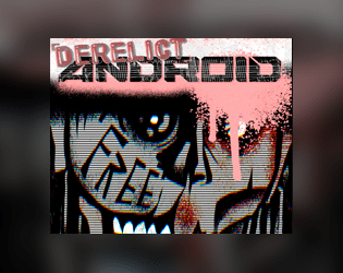
The Derelict Android
Concept: “Purpose-made. A monument to corporate ingenuity. The modern slave. You’ve lived well beyond your best-by date. Now, there are newer, flashier models doing your old job better than you ever could. So, the old master littered you into the city like the dreg of silicon and flesh you are.”
Content: A class for the forsaken and abandoned who want to find and create meaning post-obsolescence.
Writing: Crisp description establishes class features/details and underscores the precarity of life as product/property.
Art/Design: Muted but powerful color scheme with a 1980s font choice vibe from the title; close-up of android face with gaunt, damaged features focuses attention on the punk philosophy informing CY_BORG.
Usability: Spread layout uses contrast well to distinguish text blocks, and highlights emphasize mechanics.
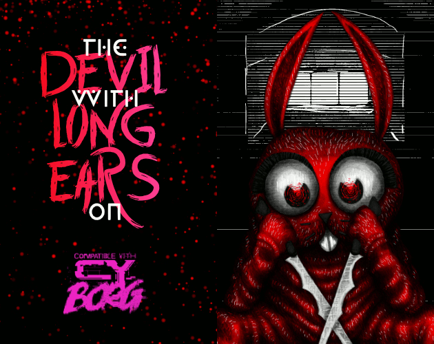
The DEVIL With LONG EARS On
Concept: “A 14+6 page Murder Mystery with: d6 Rumors, 3+ Cases, Puzzles, 4 Big Maps, 3+ NPCs, & 1 Killer Bunnyman; Inspired by the BUNNYMAN urban legend for CY Borg's Urban Legend Jam.”
Content: A mission to hunt a serial killer across a series of ominous locations. “Digital,” “print,” and "bare bones" versions provided along with an asset/maps booklet.
Writing: Vivid descriptions and helpful guidance for GMs make for a dark but entertaining experience.
Art/Design: Primarily a dark color scheme, with white text on black and black text on white/gray elements, while pink and red accent headings and images. Numerous scenic illustrations and NPC portraits bring myriad dimensions of the mystery to life.
Usability: Fonts in each version are readable and fully embedded, which facilitates searching or selecting text–especially content that is arranged perpendicular to the default orientation.
The Drone Collector
Concept: “A minor security intervention in the neighbouring district of Bigmosse has inadvertently spilled over into Svärta. Alliansen’s head of security operations, a Ms. Ah, has instructed you to retrieve one of their drones that was damaged and wandered off.”
Content: A mission to locate and abstain a drone somewhere in a semi-decrepit neighborhood.
Writing: Copious amounts of detail bring the neighborhood to life, from building and business descriptions to NPC motives & likely actions and beyond.
Art/Design: An overhead map of the locale in orange on black precedes the text, which appears in several high-contrast layout configurations, with an illustration of a threatening pair of eyes appearing amid info about an important NPC and environmental conditions.
Usability: Text is readable throughout, with bold text and color choices emphasizing eadings/labels, key terms, and phrases that a GM should attend to, especially given the amount of text content across these pages.

The Drug-Addled Riff Wretch
Concept: "The Drug-Addled Riff Wretch is a specialized class for the tabletop RPG CY_BORG – part street scvm busker, part bardic force multiplier."
Content: A zine-styled set of material surrounding the Drug-Addled Riff Wretch class--not only class specifics but also information on a special weapon (the "plasmaxe"), powers/abilities (songs), relevant NPCs, and more--even a flowchart for using the class's abilities.
Writing: Predominantly conversational and in-universe in voice and tone, with some concise rules-oriented explanations accompanying.
Art/design: Different pages/spreads have unique layouts and aesthetics, although there is an overall cohesiveness thanks to the zine/mixtape-esque organization and conceit of the class supplement overall. Lots of color and font variety, and many images have a mix of digital and hand-drawn illustrations that evoke various approaches to the Drug-Addled Riff Wretch as a character.
Usability: While the variety of layouts across pages can be disorienting at first, there is a generally recognizable visual grammar that facilitates navigation and use of details on each page. Text is also generally in high contrast with background patterns/colors and can overwhelmingly be selected or searched.
The Eizo Villa Heist
Concept: “I don’t care how you do it. Go to the villa. Get the box. Don’t open it.”
Content: A job to retrieve an armored storage box from a crew of punks for a cult.
Writing: Print medium constraints result in succinct, focused details to guide a GM through the essentials of the mission while making each NPC and complication possibility feel exciting.
Art/Design: Trifold pamphlet opens to show map and initial mission info inside, while NPCs and complications appear on the outside folds/sections.
Usability: Available only in print form. Pamphlet layout is easy to navigate, with consistent headings/labels and section dividers. Font choices are readable and with little fore/ground clutter when appearing over gradient backgrounds.
The First Job
Concept: “A message from an old friend promises a decent amount of creds, maybe enough to pay off what you owe, or at least get you started. Looks like you are heading into the massive underwater commerce district of Undersjön. Under the pressure of the waters, and just under pressure because of the deadline, can you complete your task and earn your payday?”
Content: A heist scenario with a twist: the punks have to find what they’re looking for before they can begin to think about leaving with it. Two versions provided: a full neon-color version and a printer-friendly black-and-white version.
Writing: Engaging details bring to life the location and the punks’ contact, both of which could serve a table long after this specific adventure. Random encounters and an off-duty cop name generator add personality.
Art/Design: Two major columns of content across two pages, with the full color version using different section background and heading/label colors to help distinguish different kinds of content, while the black-and-white version makes use of section borders and heading/label bolding. An isometric map of the adventure location is provided.
Usability: Text throughout is readable with high contrast against background and is easily identifiable as a component of a particular content section (e.g., random encounters, NPC info, etc.).

The Frozen
Concept: “That cold lump in your throat…
That shiver down your spine…
That sinking feeling in the dead of night…
The Frozen is pure fear made manifest; a coagulation of psychic dread from the collective consciousness of every living thing. It is a pitiless creature that delights in tormenting mortals. While it is capable of tearing flesh and breaking bone with ease, it prefers to sow terror, weakening the mind of its victims to the breaking point before offering them a choice: Death or Service.”
Content: An enemy provided with stats/contextualization for multiple game systems, including Cy_Borg as a psychotic AI. (Non-Cy_Borg elements not reviewed here.)
Writing: Descriptive text frames the Frozen effectively within the context of CY and mechanical effects reflect its potent capabilities.
Art/Design: White text in one- and two-column arrangements over a dark background that mixes a rainy cityscape and flat black.
Usability: Distinct sections of content are visually identifiable, with clear headings and labels to indicate what each element’s purpose is and how it relates to those around it.
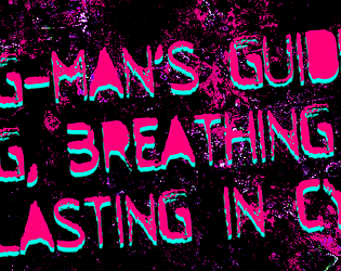
The G-Man's Guide to Living, Breathing, & Lasting in CY
Concept: “This Zine features 66 different locations (not 36, not d66, not 100, not 1, but 66) all across the CY, split into 11 different categories to aid all of your different encounters. Each has a description that encapsulates most things about it & a name (ex: HOLE IN THE OCEAN ). Every location (be it a club, a market or an industrial harbor) has a suggested "theme", a song which the G-man thought would fit perfectly to set the mood during gameplay.”
Content: A collection of location descriptions–fixer spots, combat clubs, industrial megaplexes, and more–that add a wide variety of flavors to the CY cityscape.
Writing: Each location writeup is a single paragraph of intensely atmospheric color that focuses as much on the essential being/purpose of each place as on physical description/explanation.
Art/Design: Three versions are provided: a dark themed “printer killer” version, a light themed “ink vegan” version, and a plain text version. For the first two versions, each page displays a similar-but-distinct aesthetic to present the relevant list items over a background image that illustrates that list’s focus.
Usability: Distinct headings are provided on each page, and the body text is mostly high-contrast with the background image color, although there are some areas where the text may be difficult to read due to color choices and/or busy graphic elements (which sometimes is clearly intentional). The plain text version has helpfully noted breaks for each list/page.

The Gallery of Punks
Concept: "The Gallery of Punks is a play aid for Cy_Borg by Stockholm Kartell. It is intended to assist the game master in creating NPCs on the fly, equipping them with tools to help make emergent storytelling possible. It has been primarily designed as a reference document intended to be used alongside the rulebook."
Content: A set of tables to generate punks of various classes (stats, quirks, looks, equipment, etc.) to help a GM populate their version of CY more quickly and easily, along with a small number of NPCs with more fully developed backstories and personalities. Also included are some commonly visited NPC types--ripperdoc, bartender, etc.--and their wares.
Writing: Direct, focused information intended to assist a GM in accomplishing their goals and keeping their game moving.
Art/design: White-on-black landscape-oriented pages that emphasize their central table(s). Vendor pages include some graphic embellishments to reflect their purpose (ammo, pharmaceuticals, etc.), and each of the more fully developed NPCs has their own full-color illustration.
Usability: Text is high contrast and consistently formatted across pages, even with specific pages' organizational differences, and locating a particular element and recognizing its aim is easy to accomplish.
The Gorgon Pit
Concept: “Something slithers in the forgotten sewers beneath the city. A strange creature that turns people to stone. A corporation that would control it. Cultists that worship it like a god. A gang hell-bent on revenge. All will drown in the filth of…The Gorgon Pit”
Content: A job to investigate a sewer-dwelling monster, themed around ancient Greek myth.
Writing: Lots of descriptive detail surrounding numerous aspects of the gig, from potential employers and their motives to unfolding events whenever a particular area of the sewer is traversed.
Art/Design: Single- and double-column black-on-white content layouts with an aesthetic that closely resembles much of the Mörk Borg design style, from font types to neoclassical lithographs. A full map of the job location is provided, and map segments (for different areas) are included on the page for their relevant area.
Usability: Font choices are visually readable and reflect distinct kinds of content (headings, labels, etc.). However, text is not embedded, so searching/selecting is not possible.
The Invisible Man + The Mummy | Enemies for CY_BORG
Concept: “Two new enemies for CY_BORG. Face against The Invisible Man and The Mummy, walking among the citizens of CY. Learn their motives and die by their hands. Over and over and over again. Be scared. Be very, very scared.”
Content: A pair of monsters that marry classic horror with the Cy_Borg hellscape experience.
Writing: Haunting and sympathetic descriptions of and tables & stats for the afflicted creatures.
Art/Design: Stark colors in a side-by-side spread, with an image of each enemy surrounded by its relevant text.
Usability: Text contrasts well with background colors and assorted types of content are easily distinguishable from others.
The Ivory Tower
Concept: “As you roll around in the filth of Cy's streets, the corpo scum look down on you, sat on expensive chairs, in lavish offices, in their Ivory Towers. Judging which corp is the worst is like comparing cyanide apples with asbestos oranges, but SynerGYST media definitely is rotten for sure. AI generated content and mindless-slop churned out to the masses, designed to hit the correct sequence of neurons so you buy their collectable figurines and cheap t-shirts. Repeat this every week ad infinitum and somehow rake in billions of credits at the same time. You have the golden opportunity to knock these slime bags down a peg, and make some creds while your at it. Seems like the perfect job right?...“
Content: A job for enterprising punks to deal with a corp executive.
Writing: Important details for fourteen rooms’ worth of dangers, d6 reasons to take down the target, NPC stats, and situationally relevant rules to provide even more of a memorable challenge for players at a table.
Art/Design: Black-on-white landscape-oriented spread with three columns of content (two with text, one with two building floors’ layouts keyed to room descriptions).
Usability: Sections are clearly marked and distinct from one another, with recognizable headings, labels, and arrangement of similar sections’ content.

The Lair of Eucalyptus
Concept: “In this adventure, you will face close encounters with the rulers of CY_. Assault their ghostly dwellings but, behold! The Hills abound in living Urban Legends. These sophisticated terrors are inspired by the ancient Colombian tradition. <>”
Content: A heist to retrieve untold riches from a well-secured mansion.
Writing: Unbelievable amounts of detail regarding the job parameters, NPCs, random encounters, locations, and dialogue with multiple outcomes.
Art/Design: Mostly single-column text layout over a background pattern made from a simple color-coded map of the region.
Usability: Text is high-contrast and in a readable font, with consistent presentation throughout of headings and labels. Map is provided at multiple points in the document, which reduces the need to flip through entire file to make use of it.
The Law
Concept: “Street samurais, rejoice! Grab your gun and sword, dust off your copy of the Hagakure (or your favorite philosophy book of choice), and start cleaning up the mean streets of CY!”
Content: A class for the chrome cowpoke whose grit is cybernetically augmented. (Note: despite the name, this does not appear to be a character class that would break Rule #00.)
Writing: Each line exudes character and flavor to highlight classic cyberpunk themes.
Art/Design: Three-column overall layout of white-on-black with a bright pink illustration of a “law” character in the middle flanked by character mechanics on the left and a Bushido personal code to follow on the right.
Usability: Text is high-contrast and in a readable font that makes use of bolded text for labels and emphasized phrase elements.
The Legend of the Goatman
Concept: “Deep in the Net, a daemon inhabits a bridge. A deal is a deal. The Goatman is an ancient AI of unknown origin - an entity designed solely to make deals. The purpose of the Goatman's deals are ultimately unknown, lost to time or purposeful obfuscation.”
Content: A scenario/set of rules for a deal-making daemon.
Writing: A mix of straightforward rules/mechanics explanations and an in-universe vignette framed as file contents about an unsuspecting punk’s encounters with the Goatman.
Art/Design: Two pages of three major columns/panels (potential trifold configuration). White, red, and green text on black, accompanied by two glitch-art illustrations of daemons.
Usability: Text is easy to read and navigate, with distinct visual markers for different kinds and sections of content (font choices, colors, sizes, etc.). Font selections also immediately make apparent which text describes the scenario and which serve as the vignette.
The Living Advertising
Concept: “Offer your existence to the promotion of advertisements? Why not! Perhaps your parents designed you for this very purpose, or perhaps you have always wanted to have this life. You are a living advertising. An agreement was made between you and some enterprises so that, day after day, you would share aggressive, disturbing but lucrative advertisements in your daily life. But in the end... It's all about the money. $$$$”
Content: A class for the flashy consumer who’s all about showing off their sponsorship allegiances, whether they want to or not.
Writing: Vivid descriptions of class features complemented by focused, direct mechanics.
Art/Design: Two page tri-fold layout whose visual style is appropriately busy visually, with a plethora of cartoony mascots and icons amid tables and brief paragraphs of class details.
Usability: Despite busy pages, text content is marked with distinctive labels and table roll result numbers for quick identification of desired info.
The Location Pad
21 contributors
Concept: “The Punks dash through a random door when chased by SecOps? Need a location for their next heist? The Location Pad got you covered with 34 random locations peppered with plot hooks and loot.”
Content: A collection of common locations for Cy_Borg missions, each with a map and relevant tables to generate details about it (purpose, room contents, NPCs likely to be there, etc.).
Writing: Half of the location’s tables are written by a different contributor, so there is often considerable difference in style and detail on those pages–but the entire document concisely packs tons of imaginative inspiration into each potential seed, hook, and thread.
Art/Design: Each page consistently provides a space for GM notes, a set of relevant tables, and a map of the location (mostly an overhead view, with some exceptions)–all in black-and-white with clear headings and list item numbering.
Usability: Crisp, clear font choices and layout make for incredibly easy reading and use–a couple of rolls or choices allow for fleshing out of a location when immediately needed or as part of a more leisurely planning pace.
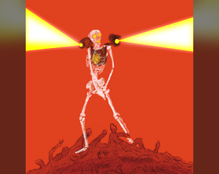
The Reused
Concept: “Towering skeletons of cobbled together bones, each the fused together remains of shattered dreams. When the Undead and Corrupted die, their parts are swept together and taken to the infernal furnaces. Molten remains poured into vats of malice. What emerges is a foe with a mastery over explosive technology and explosive language. Adapting C.A.U tech that got the living into this mess in the first place, it flits around in flights of frenzy.”
Content: Undead creature + rocket-powered explosions = exciting fun for everyone.
Writing: Hilariously morbid descriptions and NPC features provide a ton of personality to the monster.
Art/Design: Blistering red background intensifies white text and the central image of a reused creature firing its shoulder-mounted rockets.
Usability: Small white text on red might pose trouble for some, but it’s easy to recognize different kinds of content and how each contributes to an understanding of the creature and its mechanics.

The Ruiguztretzis
Concept: "THE RUIGUZTRETZIS ARE IN YOUR NEIGHBOURHOOD
A new family has arrived to buy all the ruined houses, evict the elderly and sell muffins. Rent is up. Criminals are in the run. Food is gone. Walls are stupidly blank. Everything is getting sanitised and sold to someone cleaner than you. THEY PREY ON YOU AND YOUR PEOPLE. Also, she has four arms and he's got a shoulder retro機関銃. You better shoot first."
Content: A pair of enemies--members of the Ruiguztretzi family--in the CY class war.
Writing: Extremely terse details complement stats provided for each of the enemies.
Art/design: Two pages of collage art that focus on a semi-surrealistic presentation of the fully demonic nature of the Ruiguztretzis. Text content is also part of the collage, having been cut and pasted onto each page/image.
Usability: Because the text is all part of the art, it's not really searchable/selectable. However, visually it's easy to identify each text block and recognize how it functions in relation to the NPC stat collection of which it is a part.
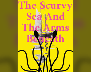
The Scurvy Sea And The Arms Beneath
Concept: “Night. The aquaculture cage maze. A chorus of motors rises against the sludgy lap of the waters. Light pierces the gloom, searching, calibrating, until it falls on a racing skiff. Painted in neon green, the craft banks around a submerged tangle of steel and plastic, cutting the turn slightly too wide. Gunfire hammers the silence. Punctured, the pilot falls from the bow. The boat spins out, catches the edge of another submerged structure, and turns into a spray of splinters that float atop the waves. Three more racing skiffs charge past the wreckage, drivers whooping as they go. The Cy Regatta has begun again.”
Content: Rules for participating in the Cy Regatta, a set of deadly boat races, along with a sea creature that might torment the racers.
Writing: Focused, specific details to explain the rules at play for the regatta, presented directly and concisely.
Art/Design: Lots of bright color combinations, full-page illustrations, and silhouette backgrounds of text pages/spreads.
Usability: Single-column text format with large headings facilitates reading and navigating, although some color combinations might strain some eyes, while others may have difficulty reading text overlaying more complex background illustrations.
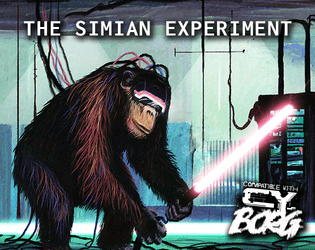
The Simian Experiment
Concept: “You are an ape ‘gifted’ with human intellect. The experimentation you went through to get here gave you perspective on many things; mortality, pain, the self, ideology. Mostly, it just made you realize how evil humans can be.”
Content: A class for those whose vengeful rage is more augmented than their uplifted intelligence.
Writing: Class details are concise and evocative of the myriad permutations of modification and torture that could result in a charater.
Art/Design: Two-page spread layout displayed around an illustration of a simian experiment, with text styled as crisply organized research documentation.
Usability: Consistent presentation of class details facilitate quick navigation and accessible reading, with occasional bold or underlined text for emphasis.
The Smart Jack/Jackie
Concept: “Smart Jacks, and Jackies, also known as Pretenders and jarods, are a product of experimental military technology that attempted to cross volatile, creative personalities with advanced neural surgery, brain chemistry manipulation and psychological programming....To breed natural Jacks-of-all-trades.”
Content: A class for the state-of-the-art technodabbler.
Writing: Detailed descriptions set up the class conceptually, with concise background-related tables offering a more direct glimpse into what a Smart Jack(ie) might care about.
Art/Design: Single-column text in distinct color-coded sections, with a description of Smart-Tech and Smart-Chips gear in a skewed/angled text layout.
Usability: Text is mostly readable, with high contrast between text/background and with clear headings and labels provided with different font, color, or bold/italics. Angled Smart-Tech section might pose trouble for screen reader programs.
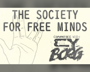
The Society for Free Minds
Concept: “DO YOU WISH TO SEE THE UNKNOWN? A dash of conspiratorial thinking for your next CY_BORG game. Contains a table of weird things to find on the NET, two UFO themed enemies, equipment, and a bunch of references to sci-fi and horror.”
Content: A zine featuring governmental and alien menaces, a table of interesting net discoveries, and several items.
Writing: A balanced mix of unsettling horror and tongue-in-cheek humor presented as a mostly in-universe document.
Art/Design: Dark gray on light yellow/tan scheme (reflecting printed homemade zine aesthetic) with one- and two-column layouts of text, accompanied by cartoon and silhouette illustrations of enemies, items, and more.
Usability: High fore/ground contrast and font choices make for easy reading, with larger headings and handwritten marginal notes consistently applied throughout.
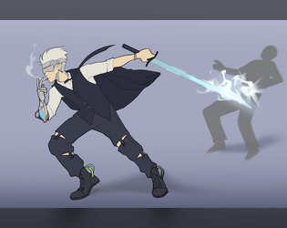
The Terminated Contract Killer
Concept: “You made problems disappear, terminate contracts, and anything else the client told you to do. All assets in this corporate hellscape are disposable to some degree, your expiration date just came sooner than expected.”
Content: A class for the professional hitman who’s burned, bitter, and bloodthirsty.
Writing: Intriguing ideas provided in a calm, straightforward voice that evokes the professional mindset of the contract killer.
Art/Design: A two-page layout emphasizes a terminated contract killer in action on page 1 and a set of distinctly styled boxes for assorted class details on page 2.
Usability: Distinct partitions of class content makes for quick identification of and focus on desired information; one minor exception is the large header across the top page 2, which relates to the left-side boxed list of corporations beneath it.

The Trench Grub's Thirst
Concept: "Inspired by The Andromeda Strain by Michael Crichton and the “The Last Question” short story by Isaac Asimov, The Trench Grub’s Thirst is a retro sci-fi heist of low-tech hacking under the Nevada desert.
Hidden beneath an isolated field office, a corporate cult feeds stolen memories to a vast worm. The more thoughts this grub devours, the more it is able to answer any question, and the closer Omni Mineral & Electric National (OMEN) Corporation comes to its goal of controlling all knowledge.
Save the memories.
Kill the grub."
Content: A mission to infiltrate a top-secret lab and shut it down, whatever's going on.
Writing: Focused thematic description to exude the retro sci-fi vibes that inspired the adventure, with occasional brief NPC stats/rules to complement the atmosphere.
Art/design: Four-page layout (front & back covers with an interior two-page spread) intentionally reminiscent of a cheap dime novel. Font, color, and map aesthetic (with four vertical levels & multiple areas on each level to explore) all contribute to completing the picture.
Usability: Distinct sections are visibly demarcated, with consistent heading & label embellishments to stand out from main body text. Labeled map and accompanying legend provide reference for GMs and punks alike.
The Trouble with Juan
Concept: “Initially just looking for some snacks and road beers at Juan's Bodega, your Punks clock a group of Red Suns looking to rob the place, but more worrying, Juan is missing. And Juan's never closes. Where is he? Can your Punks find out?”
Content: An adventure scenario that seems like a basic bodega battle but can unfold into a more insidious encounter.
Writing: Tons of informative and descriptive sensory details packed into two pages that cover scenario locations, enemy NPCs, interested factions, random events, and more.
Art/Design: Provided in both an eye-searing neon full-color version and a stripped-down black-and-white printer-friendly version, text info occurs in a central section of the page and in clearly marked marginal boxes. Important terms and tests are highlighted with a different color (in the full color version) or in bold (in the printer-friendly version). A simple map of the bodega is provided on page 2.
Usability: Both versions offer a variety of visual cues–font choices, borders, bolding & different colored text–that make it easy to locate, identify, and navigate particular kinds of content.
The Ultra Upset
Concept: “You have taken a gig from a rising leader named Yosel, a high-ranking member of one of Cy's most violent ultra firms. The firm's old leadership has to go, and you will be the people to make that happen. Infiltrate a stadium, sabotage a career, buy some merch! Play it cool and leave without a trace, or kick the door down and get net-famous. As you infiltrate deeper into the Duodrome, you will find unique loot, dangerous NPCs, and the dark secret keeping this streaming-sport operation together…”
Content: A job to humiliate a traitor in a Nechruball firm.
Writing: Plenty of specifics, especially gritty sensory details, on the situation, relevant locations, and NPCs that the table might encounter while undertaking this mission.
Art/Design: White-on-black design (except for two pages of tables in a green-text terminal aesthetic) with key terms emphasized in bright colors, and overhead maps are provided both as direct aids and as part of illustrations as blueprints pinned to a wall, and portraits breathe life into included major NPCs.
Usability: Really intriguing consistent color use to highlight particular NPCs/entities as well as the source of specific mechanics/details. However, text is not embedded, so searching/selecting text or using a screen reader successfully aren’t possible.
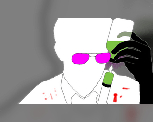
The Unlicensed Ripper
Concept: “Someone has to patch the lowlifes up. It’s a good thing no one asks where you learned your trade.”
Content: A class for the inquisitive tinkerer who loves getting elbow-deep in their work.
Writing: Intriguing class mechanics are augmented with medical-grade descriptive flavor.
Art/Design: Single-column layout allows for easily understandable navigation/reading scheme, and a minimalist illustration of an unlicensed ripper punctuates the document.
Usability: Distinct and consistent color scheme that highlights the medical/clinical nature of the class, but green text on blue background can be difficult for some to read, especially in combination with font size for body text.
The Zoo
Concept: “In the post-war world, luxury is often those things that cannot be bought… You need a job, you need the ¤ and you don't care how you get it. So when a slick fixer named Mr Gato gives you a job, you take it. Break into a private zoo, grab a cat and get out. Easy job and good money. Sounds simple, right? But ain't nothing simple in Cy_city.”
Content: A repo heist in a location full of dangerous animals and that requires a bit of precision. Content warning from author: “Cy_bernetic animals will try to kill you, you will need to defend yourself or end up flat-lined. Also Swearing.”
Writing: Brief but informative stat blocks for enemies and descriptions of locations, with helpful tables offering in-character explanations for diseases, souvenirs, and the sudden appearance of a replacement PC.
Art/Design: Two pages of content; on the first is mostly text with a silhouette of an anonymous client. On the second, an abstract map of the zoo is surrounded by room details and a pair of stylized illustrations of a turtle and a gorilla’s head.
Usability: Text is mostly easy to read, with orange-on-black scheme providing solid contrast. Room numbers on map might be easily overlooked–numbering scheme goes left->right, top->down.
Thin Grit's Balban Release
Concept: “TG Labs is planning some kind of release event. Disrupt it. Embarrass them. Make it a scandal! Can you do that?”
Content: A sabotage operation on behalf of a disgruntled ex-employee.
Writing: Crisp descriptions and explanations of mission locales, potential complications, NPC specifics, and conditions for success, all of which create a range of potential for a GM and their table.
Art/Design: Trifold pamphlet with nitial details and an overhead map of the job location appear on the inside folds, and NPC and complication/aftermath details on the outside panels.
Usability: Available only in print form. Font and background color choices indicate different kinds of content throughout the supplement, with headings/labels visually distinct from the body text. Organization of material allows for easy reading and comprehension of mission specifics from first to last panel.

Things being yelled in the streets of CY
Concept: "The streets of CY_ are busy, crowded, chaotic, and most of all noisy. Things are being yelled, slogans, advertisings, chants, ramblings, or other kind of threats. Easily generate 4d10 slogans and 1d10 ways they are being yelled in the streets of the worst city on earth."
Content: A table of shouted comments and another for the source of those comments.
Writing: Flavorful combinations of ominous and inane, well-suited for random proclamations on the streets of Cy.
Art/design: One- and two-column text layout, provided in black-on-white and vivid black, yellow, and white-on-green (with pink accents).
Usability: The tables are organized for ease of use, with visually recognizable and consistent headings and list numbering, with a distinct font used for each table.

Thirty One Dark Nights
Concept: “Each year, during October, Exeunt Press hosts Mörktober. A 31 day event that encourages creators to make something each day for MÖRK BORG or other BORG games, in this case Cy_Borg, based on a prompt list and then share it with the community. More about Mörktober.
Thirty One Dark Nights is a compilation of the 31 Cy_Borg compatible creations I made for the 2024's Mörktober event.”
Thirty One Dark Nights is a compilation of the 31 Cy_Borg compatible creations I made for the 2024's Mörktober event.”
Content: A collection of enemies/threats, equipment, locations, drugs, viruses, surgical options, and more with which to make a game of Cy_Borg vividly fucked up in fantastic ways. (Note: individual entries are PWYW, with a paid option for a fully compiled set of the entries.)
Writing: Mörktober’s purposefully morbid and eerie atmosphere is mixed with pitch-black humor, while unique abilities/rules/effects situate each concept for game rulings.
Art/Design: White/gray on black with a different accent color (and heading typeface) and accompanying illustration for each entry/page.
Usability: Consistent body text and label emphasis/decoration allows for navigation to and recognition of desired info elements, while distinctions in entry accent colors and headings orient the reader to the essence of that entry.
Thoughts & Prayers
8 contributors
Concept: “Thoughts and Prayers is a zine by Stockholm Kartell made for the 2023 convention season. It includes stuff for all our games; MÖRK BORG, CY_BORG, DEATH IN SPACE, SKR and some system-agnostic material. But there are also things like album reviews, essays and short stories, thoughts, ideas and takes. 100% of the benefits are to be donated to Direct Relief.”
Content: A smörgåsbord of content for Cy_Borg–some specifically for the game, some that could be used for it or others–that ranges from a location/adventure (Sprawling Car Park) to tables/generators (e.g., “Who else is in the pub when the brawl starts?”) to NPCs (emergency response teams) to medieval weapons to injuries/afflictions to short fiction about living as a corp drone. There’s a lot more than that, too.
Writing: Every page oozes the Stockholm Kartell house style(s) that makes a reader want to use all that they can in their next game.
Art/Design: Black-on-white color scheme in a printed zine format with illustrations throughout.
Usability: Available only in print format. Table of contents at the beginning of the zine makes it easy to locate info throughout, with a consistent header/footer with page content credits and page numbering to help clarify not only where a reader is in the zine but also whose work they’re looking at.
Thy Flesh, Transformed
Concept: “On an expedition into the subways of G0, beneath an ancient foundry, the punks are infected with the IRON VIRUS a nanovirus that turns flesh to metal, hair to wire and nails to scalpels. The subway screens flicker to life. The metal tyrant Wodan announces the countdown of sacrifices to priming the Iron Egg. If not stopped, it will destroy everything in a Nearby District. STOP THEM”
Content: A body horror-centric race against the clock to stop a virus-wielding tyrant.
Writing: A disgustingly fascinating adventure, complete with a set of viral nano-infections to make one’s skin crawl (perhaps literally).
Art/Design: Two-page spreads of the scenario setup (and impressively vivid depiction of the virus in action), GM notes, infection list, adventure locations and creatures, and a map.
Usability: Easy to navigate and text (primarily white on black) is readable–the opposite end of the “unsettling” spectrum of document’s content.
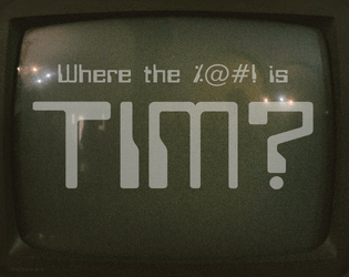
Tim Is of the Essence
Concept: “Run. Shoot. Steal. Lie. It doesn't matter what you do, just find Tim! He's the key to something bigger than all of us. The corpos want him quieted. He's gotta be in the Negapike. I know, I know. The hell hole in between Cy and the NegaCity. Don't worry, you'll be fine, I left you the keys to the B34S7. Fire it up. Be quick about it, you only have 2 hours.”
Content: A mission to extract your pal Tim from an armored carrier somewhere on the tangled roadways of the Negapike.
Writing: A simple premise with inspired contours and complications to make the rescue attempt all the trickier. Tables provide variety in mission background and random events.
Art/Design: Mix of layouts reflects different general purposes: target vehicle, job specifics, Negapike details, tables. Mostly light-on-dark color schemes, with blueprints of armored carrier and Negapike aerial view serving as primary graphic elements. With tables rendered as UNIX man pages on a CRT display.
Usability: Organization facilitates understanding the relationship of different pages’ content. Most text is visually readable (font choice, text size, contrast) and searchable/selectable, although the latter is not so for text on pages with a CRT display aesthetic.
TIM, SEND ME YOUR ADDRESS
Concept: “If your name is Tim and you bought the physical version of A$$HOLE$ & ELBOWS in the last couple of weeks, SEND ME YOUR ADDRESS! You didn't fill out the form you were prompted to on itch. You haven't responded to my emails. I don't want a bad review or rating because I didn't send your pamphlet, but I literally can't. I don't have your address! Get in touch. Unless you were legit just trying to be nice and don't want the physical reward you paid for. But the uncertainty is KILLING ME! Thanks, hugs and kisses, Rugose Kohn”
Content: Includes NPC enemies, cultist and high priest for “The Cult of Tim,” whose practices revolve around the enigma that is Tim.
Writing: Tongue so far in cheek for this material that the two have fused together into a new Cronenberg-esque anatomy.
Art/Design: Black single-column text presented on the left page of a two-page spread with a tan background, with illustrations of NPC shadows combating one another across the spread.
Usability: Text contrast and font choices are very readable, with headings and labels visually distinct from main body text. The question of Tim’s existence/identity remains unanswered, however.
Loading next page...