All Entries
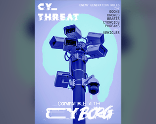
CY_THREAT Zine
Concept: “Generate an infinite number of baddies that wander the streets of Cy. Capable of generating GOONS, DRONES, BEASTS, CYDROIDS, PHREAKS and VEHICLES. 27 stylized pages detailing enemy creation rules. Over 100 new special abilities, more than 60 new NPC wants and 3d12 description tables per enemy type.”
Content: Tons of tables to determine encounter specifics–not only which enemies and how many appear but also what’s motivating them and what might be exceptional to this particular group (quirks, appearance, special attacks, etc.).
Writing: Imaginative and enticing table entries ensure each generated set of NPCs will feel like unique, fully formed characters.
Art/Design: Distinct two-page spread layouts include a background or centerpiece illustration surrounded by tables, mostly framed in translucent boxes to increase fore/ground contrast.
Usability: Font choices are easily readable, and headings/labels are consistently presented to help with ease of navigation and identification of desired info. However, text is not embedded, so searching/selecting text or using a screen reader are not possible.
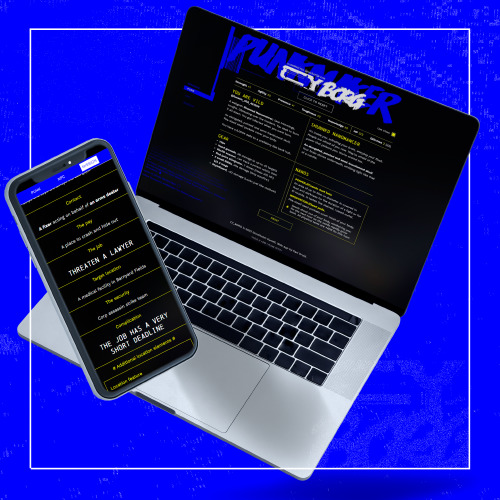
CY_TRANSIT
Concept: “Modern design layout of the metro systems of Cy including over 60 stops, express lines and an accompanying shitty mobile app to route yourself around Cy. What more do you want?”
Content: A browser-based “transit terminal” that provides users with a text-based breakdown of the stops involved from Point A to Point B. Accompanied by a PDF of the city transit system map.
Writing: Succinct and direct explanation of the route from starting location to the desired destination.
Art/Design: Browser functionality provides a simple, terminal-like functionality with two selection lists and a button to generate the output. System map closely resembles many metro transit systems’ official maps, complete with multiple routes distinguished by different colors.
Usability: Incredibly easy to use both components, although many are likely to have a personal preference for the presentation/function of one over the other.

CY_TRAVEL
Concept: “Ever wanted the travel mechanics of medieval tabletops in your CYBERPUNK game? Tired of the same encounters with cops, corporates and hitmen? Ever thought of how to implement your players' favorite NPCs organically in the middle of the session?”
Content: Rules, means of transportation, and encounter tables to liven up travel through CY.
Writing: Tons of atmospheric flavor in the encounter tables to give GMs plenty to work with or be inspired by.
Art/Design: Landscape-oriented pages with yellow text on dark digital/noise-patterned background.
Usability: Different blocks of content are provided in visually distinct sections/pages. Despite very text-heavy nature of the content, text is not embedded so no searching or selecting is possible.
CY_x for .66
Concept: “Six new creatures for your CY_Borg game, featuring:
Bioproto 796
Felidae
Mrs. Porcelain
CY_limbs
PIXELART MK. II
PIXELART MK. S
Now with new cover art on which corps' serfs cannot put their dirty hands on!”
Bioproto 796
Felidae
Mrs. Porcelain
CY_limbs
PIXELART MK. II
PIXELART MK. S
Now with new cover art on which corps' serfs cannot put their dirty hands on!”
Content: A set of terrifying horrors to encounter on the streets of Cy.
Writing: Atmospheric descriptions of enemies punks won’t want to encounter complemented by mechanical effects to worry their players.
Art/Design: White-on-black text in two-column format, with each NPC’s description and stats positioned next to an illustration of that NPC (with several different styles, from a T-posed 3d model to pixel art to more conventional illustration).
Usability: High contrast between text & background, presented in a consistent format, allows for easy browsing and navigating to desired content.
Cyber Personality Tables
Concept: “Optional tables to be used with your Cyberpunk or modern day games... well, lets just say it aloud -- it's intended to be used with CY_BORG first and foremost. It's absolutely awesome, just stop playing anything else right now. On a single page here you will find a broad diversity of cultural and visual aesthetic touches that you can easily apply to your PC or NPC characters, enhancing the level of immersion. It could be completely random or by your responsible choice, as it suits you and the nature of your games. As a note: for your character's gender definition you can use two types of randomization, d20 (higher chances to get cisgender result) and d12 (even chances between results). Use the one that fits your games. And feel free to pick anything that better suits your character. Zero offense intended.”
Content: A set of tables relating to personality, from ethnic background and gender identity to outfit style and hair & nail color.
Writing: A wide variety of options available in each table (from 8 to 40, depending on the table) that can help customize a punk.
Art/Design: Green on black boxes over a partial portrait of a punk character.
Usability: Consistent presentation across tables and high contrast between fore and ground make this usable and accessible.
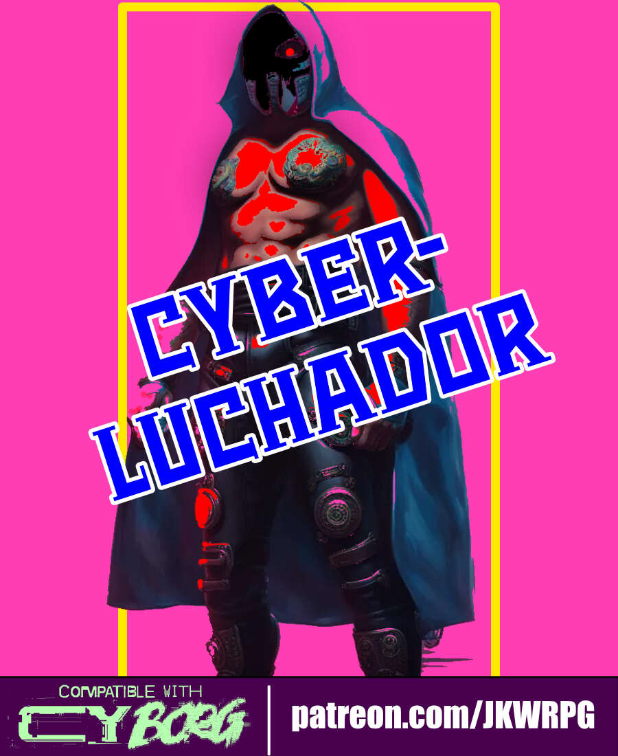
Cyber-Luchador
Concept: “Take to the skies as an unarmed specialist and wrestling phenom! Use your fists and your repertoire of deadly special moves to bring your foes to their knees.”
Content: A class for the punk who lives to bring kayfabe to every battle.
Writing: Mostly informative text complemented by thematic description so as to focus the reader’s attention on embodying the luchador character.
Art/Design: Three-panel spread with an illustration of a cyber-luchador in the center and text on either side. Mostly white on pink fore/ground.
Usability: Different sections of content are organized and positioned distinctly from one another to help with navigation and identification of desired details. Font size and use of bolding strengthens visual readability of text.
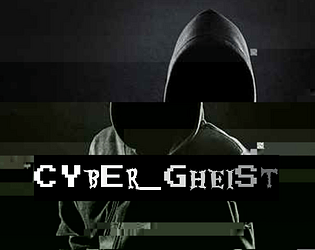
Cyber_Gheist
Concept: “What are you looking for? There isn’t anything here. Nothing. At all. Stop searching. Certainly not a digital ghost. A flicker on each camera, closer and closer to the penthouse suite. A single vital minute’s disruption in security. The scanner bleep you simply overlooked. A shadow in your programs. A knife in the neck in the time it takes to hit refresh. No, nothing like that at all. Probably just a glitch. You can probably ignore it.”
Content: A class for the player who lives and breathes stealth and evasion.
Writing: Colorful descriptions of class features provided mostly in engaging, full-sentence format addressing the player rather than as stat blocks or succinct phrases.
Art/Design: Two versions provided: a white-on-dark background version, which is overlaid on glitch art of a hooded figure and uses some yellow highlighting for emphasis and key terms, and a simple printer-friendly black-on-white version whose only embellishment is bolded text for emphasis and key terms.
Usability: Consistently readable visually (and as embedded text) and accessible in language. The calculation of SHADOW (as part of the “Haunting” feature/mechanic) might temporarily trip up some at first.
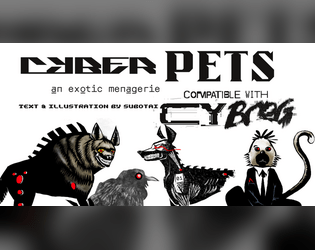
Cyber_Pets
Concept: “_EMPORIUM.ltd can not -and will not- be prosecuted or held responsible for damages, accidents, manglings, ablations, amputations, mutilations, rippings, crushings, decapitations or general acts of violence perpetrated by its proprietary software or hardware. (see UGC p.314, 34-95, all responsibility surrendered.)”
Content: A set of ten purchasable cyber-pet options (six “protection” and four “exhibition” options) and several mods to further enhance a given pet.
Writing: Categorical and pet-specific descriptions smoothly blend in-universe sales pitches and mechanical effects to entice an animal companion-seeking connoisseur.
Art/Design: Black text on white in mostly one- and two-column layouts, complemented by black-and-white illustrations of multiple pets sporting red highlights.
Usability: Sections and distinct kinds of content are consistently presented throughout, with visually readable text content. That said, some text is searchable/selectable but some is not, which might complicate some readers’ experience.
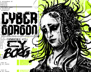
Cybergorgon
Concept: “They said they would make you beautiful. They lied. You were a model. A false beacon of hope and aspiration. In the shadowy boardrooms they made you a deal to stay young forever. It was only in the glint of the scalpel that you figured out too late you were sold, slush for a tax write off. An experiment in how badly you can fuck someone up. Now you are madness and steel.”
Content: A class for the highly motivated survivor spirit of vengeance and wrath.
Writing: Intense descriptions of class abilities and unfinished business can inspire tons of compelling roleplay opportunities.
Art/Design: A black and white illustration of a triumphant cybergorgon stands between columns of text describing class features and mechanics, with light green background accents throughout.
Usability: Class details are laid out in easily recognizable and navigable blocks with consistent presentation of headers, list item numbers, and so on.
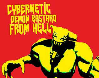
Cybernetic Demon Bastard from Hell
Concept: “There are creatures from worlds beyond our own, and all of them fucking hate you.”
Content: A nightmarish behemoth you’ll want a BFG just for the chance to frag it.
Writing: Deadly stats combined with a mesmerizing world-building overview of the creature’s origins.
Art/Design: A brightly colored two-page spread with an image of the monster and its stats next to its origin description.
Usability: Assorted content blocks are easily distinguishable, although the longer descriptive text block may become difficult for some to read over the background pattern near the bottom of the page.
Cybernetic Hormone Vamp
Concept: “Reaperdoc [REDACTED] says //TRANS-RIGHTS // CANT AFFORD Over-the-Counter Estrogen // Testosterone ?? SICK OF WAITING 300+ years for HRT// Tiddy Skittles/Boy-Barcue Sauce// ??? Doc [REDACTED] has an EXPERIMENTAL Cy-Tech for YOU: VMP-F4NG Transfer SYSTEM Be a Vampire // Steal Hormones // you need ‘em more than most// - ReaperDoc [REDACTED] Reply [Y/N] to Accept”
Content: A class through which to explore the very essence of CY_BORG through augmentations and a “ferocity” resource.
Writing: Flavor and exigence for the class explode across the page, and the “ferocity” mechanic (which increases in combat until a threshold is reached to rage).
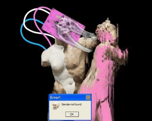
Art/Design: Trans flag colors draw attention to important class features and stand out against the white-on-black aesthetic. The accompanying image hints at the class’s possibilities, with the pop-up error message “Gender not found” juxtaposed well against the edited/remixed statues behind it.
Usability: Mechanics explained well; details/features organized in a manner to make navigation easy.
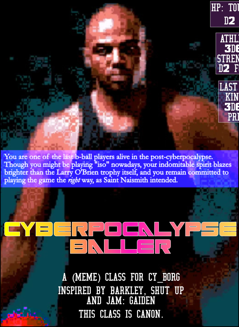
Cyberpocalypse Baller
Concept: “You are one of the last b-ball players alive in the post-cyberpocalypse. Though you might be playing "iso" nowadays, your indomitable spirit blazes brighter than the Larry O'Brien trophy itself, and you remain committed to playing the game the right way, as Saint Naismith intended.”
Content: A self-described “meme” class, for the player who understands ball is life.
Writing: Terse class feature labels and mechanics to keep the focus on core basketball elements.
Art/Design: Two-page spread with a pixelated image of Charles Barkley on the left and a cluttered ‘game plan’ arrangement of text boxes on the right, over a diagram of a basketball half-court. Text is mostly white on black/maroon and white on blue.
Usability: Visually, most text is high-contrast, with large bolded numbers to help distinguish each content item. However, text is not embedded, so no searching/selecting is possible. Also, one of the class ‘background’ tables is numbered in a potentially confusing manner for the reader scanning left-to-right and top-to-bottom.
CYBERPSYCHOSIS
Concept: “Wanted to include mental struggles in your gameplay but didn't know how? Well, the new STRESS mechanic does just that: allows you (as the GM) to have characters get stressed out when they get their limbs cut off, their partner dies, their gun jams, their food tastes nasty, they're sitting in a piss-filled bar, the drink tastes like gasoline and any other stressful situation!”
Content: A set of rules to deal with the potential stress/strain of adding more and more cybertech in a single body.
Writing: A balanced mix of definition/description and mechanics to explain how each stressor and effect can impact a punk through both roleplay and dice rolls.
Art/Design: Colorful landscape-oriented pages with white text on a translucent content container shape to increase contrast with background colors/patterns.
Usability: Distinct content sections help indicate distinct purposes for each, with visually apparent headings. Background image/pattern noise might impact some readability. Text is not embedded, so searching/selecting is not possible.
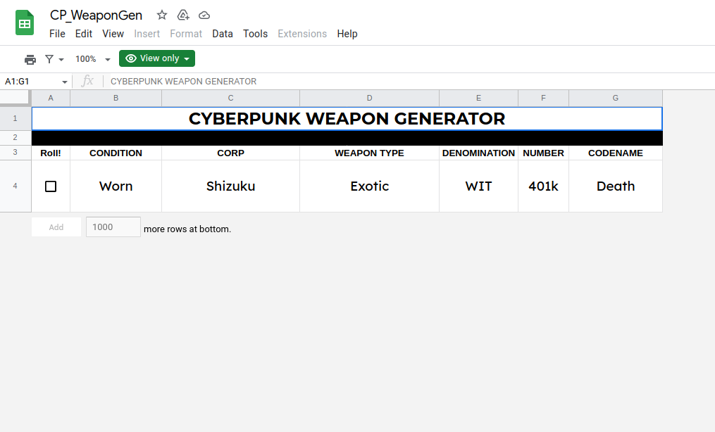
Cyberpunk Weapon Generator
Concept: A cyberpunk weapon generator.
Content: Details on a weapon one might find, complete with info about the manufacturer, designation, codename, condition, and weapon type.
Writing: Mostly single-word terms offer a surprising amount of character for each weapon, in part thanks to the combination of fields making each generated weapon feel unique.
Art/Design: Output is provided on a lightly stylized Google Spreadsheet, so text is large and positioned under each clearly labeled column.
Usability: Very readable layout and font choices, and refreshing the page will generate a new weapon quickly.
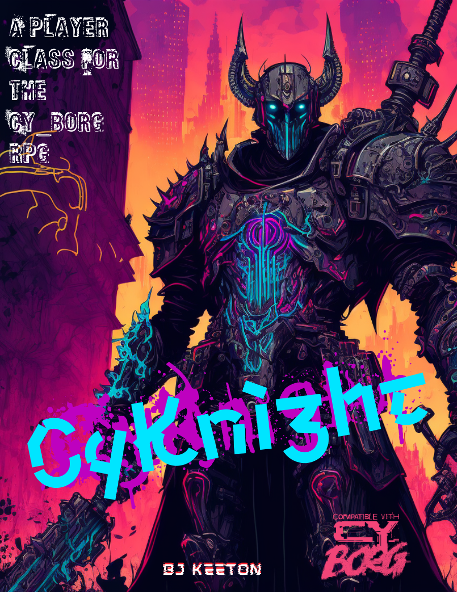
CyKnight
Concept: “Probably more metal than person by now. Your skin has the sheen of circuits, the smell of ozone. You’ve devoted your life to a cause. You fight, you pray, you train, you mod. You scream. You rage. But at what?”
Content: A class for the techno-paladin who’s on a mission, even if no one else can understand it.
Writing: Numerous options are concisely described, especially to suggest different armor/weapon upgrades with straightforward mechanical effects & explanations.
Art/Design: An illustration of a neon-highlighted, heavily armored cyknight surrounded by different tables/lists of class features/options. Mostly white text on a black background with neon-colored headings.
Usability: High-contrast text/ground color options increase readability, although sheer amount of text and its arrangement around the cyknight illustration might be confusing for some. Some lines are provided as borders between tables, and text color distinctions help as well, but text indentation can be inconsistent and affect navigation across page.
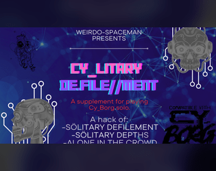
Cylitary De.file//ment
Concept: “This supplement is meant to translate the fantastic solo rules and oracles from Sölitary Defilement and Alone In the Crowd by 1d10+5, and Sölitary Depths by Chaoclypse (Brandon Yu).”
Content: A set of rules for solitary Cy_Borg play based on several other third-party rules supplements.
Writing: Direct, accessible explanations of rules presented alongside throngs of tables and oracles to facilitate solo play.
Art/Design: Two versions provided: one full-color landscape-oriented version and one plain black-on-white single-column portrait-oriented version.
Usability: Full-color version pages/slides differ in color scheme, with mostly high-contrast text (although the text is not embedded, so no searching or selecting). Plain version text is fully searchable.
CYTOBER 2023
- Concept: “A compilation of items, rules, enemies, and more for CY_BORG based on the Exeunt Press #MÖRKTOBER 2023 prompts. Originally posted on @krasiph.bsky.social and compiled here for ease of use. Some entries have been modified to include extra information such as prices and item types.”
- Content: Thirty-one spooktacular entries reflecting the year’s Mőrktober prompts, from weapons/apps/gear to NPCs to powers, food, and environmental phenomena.
- Writing: 1-2 brief paragraphs of potent content (descriptive and informative/mechanical) for each entry to frame it within the prompt’s overarching theme.
- Art/Design: Mostly black-on-white (some white-on-black) with green highlights with a range of item heading fonts and accented background splatter effects.
- Usability: Consistent content elements–heading, item number, description–facilitate browsing, even as arrangement of list items deviates at times from left->right, top->bottom orientation. Plain text version is also provided for potentially easier perusal.
d100 Things Found in a Gonk's Pocket
Concept: “Trinkets, trash, and trouble…”
Content: An alphabetized list of assorted items that might be found in the pockets of an inhabitant of CY.
Writing: Concise, wide-ranging inventory to help bring a character to life.
Art/Design: A two-page spread with a glitchy portrait on the left and the list in two columns to the right.
Usability: Extremely navigable and readable with high contrast between fore and ground.
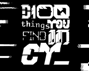
D100 things you find in CY_
12 contributors
Concept: ”As you roam the streets of CY_ you see something. It's shiny, a little dirty. As you remove the garbage surrounding it you realise it's a: 23: Lost shoe with 1D4 toes inside. 35: RFID card with the locale company card’s name on it. 75: Spray paint. Colour label reads “Rotblack”. Get a fun and slightly silly D100 table of stuff you can find in the city CY_.”
Content: A table of assorted valuables, junk, and the miscellanea in-between that might be discovered in CY.
Writing: Concise description complemented with the occasional introspective element or quirky voice that reminds the reader of the game and world at hand.
Art/Design: Table provided as three primary columns of content: a left-aligned list of items (#s 1-50), a center set with the table name and author credits, and a right-aligned list (#s 51-100). The list columns are black on white, with the central column’s scheme inverted, while horizontal black bars stretch from the center in either direction to fill the white space in each list item line.
Usability: Overall layout of page allows for relatively easy navigation/perusal to desired content. Consistent presentation of content in each major column aids with comprehension and use of table and its entries.

d66 Things Found Dumpster-Diving In Cy
Concept: "In the corpse of the city, the dumpsters don’t just hold garbage, they’re treasure chests for the desperate, the deranged, and the doomed. This is a d66 table of weird, grimy, and gross as hell finds for Cy_Borg, made for the Mondo Rando jam in the House of Borg Discord server.
Inside you’ll find rusted tech, twitching bio-waste, and street junk that’ll make you question why you reached in at all. No mechanics. No rules. Just pure, dripping flavor for your sessions. Roll, pick, or use as inspiration when your players go elbow-deep in the city’s refuse."
Content: A table of items that a punk might locate in an average dumpster in an average alley in Cy.
Writing: Pithy descriptions of random objects that evoke intriguing stories or uses.
Art/design: Three-panel layout with table items on the outer panels and a pink-on-white wire cityscape image and table title in the center.
Usability: Easily identifiable items and readable high-contrast text allow for quick navigation and location of desired information.
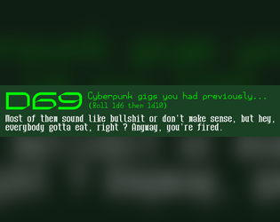
D69 Cyberpunk Gigs You Previously Had…
Concept: “Some of them sound like bullshit or don't make sense, but hey, everybody gotta eat, right ? Anyway, you're fired.”
Content: A table to flesh out the scope of a job/career a punk has previously held.
Writing: Terse but potent descriptions of various jobs, some far less appealing or lucrative than others but all quite apt for CY.
Art/Design: Two versions provided: one black-on-white and one white/green-on-dark green, both using a three-column layout for the table entries.
Usability: Headings, list item numbering, and sub-table organization are all visually evident and consistent, making for easy navigation and identification of desired details.
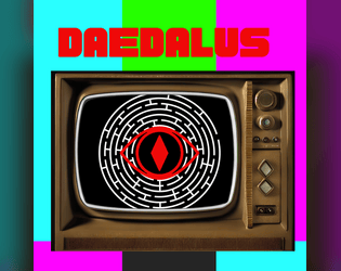
Daedalus
Concept: “A playable adventure zine compatible with Cy_Borg. This is my take on a cyber punk dungeon crawl. Probably better for more advanced characters. This hasn't been play tested so any notes or suggestions are appreciated!”
Content: A job to rescue a mob boss’s daughter from a booby-trapped maze.
Writing: Tons of informative detail to set up a GM well for running their players through a deadly labyrinth.
Art/Design: A lot of red, black, and white in a variety of aesthetics, complemented by occasionally different page styles (often in the form of digital interfaces/pop-up windows). Illustrations are provided to help set the stage for different elements of the job and to highlight NPCs. A keyed map of the maze is also included.
Usability: Font choices are visually readable with solid contrast on most pages. However, text is not embedded so no searching/selecting is possible.
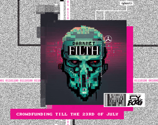
Darknet Filth
Concept: “404//SAN is the demented frontpage of the NET, where manifold rumors, advertisements, hoaxes, and conspiracies produce a worthless information sludge. Still, more than enough masochistic users flock to the site to be entertained by trolls or cheated out of their life's savings.”
Content: A one-stop shop for adventures/scenarios, NPCs, monsters, apps, cyberware and equipment, additional rules ideas, and more.
Writing: Every page provides dozens of imaginative and enticing ideas for inspiration, with many pages offering highly engaging in-universe descriptions or framing for their game content.
Art/Design: A variety of artistic and aesthetic styles that embody the artpunk philosophy. The browsing experience feels in line with the CY_BORG rulebook itself.
Usability: Requires close, and often slow, examination to identify and make effective use of content (text and image alike), especially when moving across very differently styled spreads–but very worth the effort.
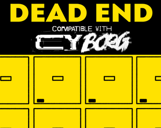
Dead End
Concept: “Henri, a connected security guard contacts the PCs. A legendary cyber killer has died and ended up in the morgue. Easy credits can be earned, one just needs to break in and strip off some of his cyberware.”
Content: A job to retrieve a cybernetically enhanced skull from a morgue.
Writing: Lively setup and detailed considerations of different events that might occur or approaches the PCs might take allow for a variety of engagements with mission parameters and unexpected hiccups.
Art/Design: A mix of black on white and yellow/white on black text accented with several NPC illustrations and a well-labeled map (and an unlabeled map to give to players).
Usability: High-contrast text and clean, recognizable layouts with consistent presentation of distinct kinds of text/content make navigation and reading easy.
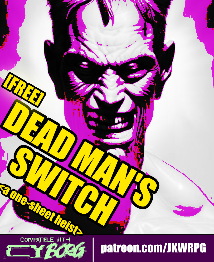
Dead Man's Switch
Concept: “Emily Radfield, a ripperdoc based in westside Laketon, received a postmortem message from her friend, Sarna---a dead man's switch. Emily hires the PCs to infiltrate a cyber-scav chop shop and recover Sarna's remains. She also wants the PCs to ‘kill as many of those scum-sucking assholes as humanly possible.’”
Content: A gig to infiltrate and retrieve a body from a scavenger stronghold.
Writing: Plenty of details to outline what the deal is, who’s involved and why, and what a GM can spring on the PCs as they seek out their target.
Art/Design: Ultra-wide four-column layout, with three columns of text on the left and a map of the chop shop on the right. Black-on-white color scheme complemented by color highlights in and around the map.
Usability: Each section of content is consistently presented, with distinct whitespace and border use to indicate particular kinds of content. Bold and italics help to emphasize key elements GMs may want to attend to.

Dead Orbit Mall
Concept: "This is a vaporwave cyberpunk reskin of the solo game Dark Fort, the zine that inspired Mork Borg. The game play similarly to Dark Fort but with additional content and tweaks. It also feature tools to bring the Dead Orbit Mall into your CY_BORG campaign.
Hoping that you enjoy that odd but pretty zine."
Content: A solo game for hacking into a satellite-based VR system and a brief set of rules for adapting the game for Cy_Borg.
Writing: A bit of in-universe characterful narration and more terse descriptions augmented with specific, similarly flavorful rules.
Art/design: Mostly white/light gray and colorful text on dark gray background (with one page swapping the scheme), accompanied by illustrations of characters, items, VR nodes, and more in the margins and between sections of text in one- and two-column layouts.
Usability: Visually distinct headings, labels, sections of content, and purposes of text blocks with a clear focus for each page.
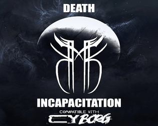
DEATH & INCAPACITATION
Concept: “This is what happens when you try fighting Death on its home turf. DEATH & INCAPACITATION expands on Cy_borg's death system with Death Threshold, Death Blow, and Incapacitation Effects. It's designed with longer running campaigns in mind where fatality is still a distinct possibility but returning from Death's threshold is a difficult journey has repercussions . With permanent and temporary effects such as Personality Shift and Death-Rage, with a few tweaks to the existing mechanics, this hack adds new depth to the road of a Punk's inevitable demise.“
Content: An expansion of rules relating to death and incapacitation (as the title suggests) with a range of possible effects, mitigating factors, and even some benefits of a sort.
Writing: Mechanical elements complemented by concise thematic descriptions reflecting specific situations (hemorraghing, dealing with emergency response teams, stabilizing, etc.).
Art/Design: Two pages with a three-column brochure layout. Black-on-white/light gray with a circuit or digital interface-style patterned background. Two dithered images are provided (a seated, possibly dying individual, and a group of ERTs).
Usability: Consistent presentation of info throughout document, with each new section clearly distinct from the others and with visually recognizable table organization.
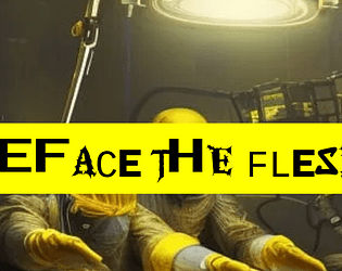
Deface the Flesh
Concept: “Gruesome implants and upgrades for a future where the body is irrelevant and flesh has no sanctity. Defile your physicality to keep up in the rat race of society. Set-dressing or inspiration from grim-dark cybernetics.”
Content: A d10 table of bizarre and grotesquely functional options for upgrading one’s imperfect and disappointing meat-suit.
Writing: Powerfully inventive descriptions of implants that suggest a wide range of uses and reasons for their potential ubiquity in CY–but no stats or game mechanics are attached. It’s all flavor, and it is zesty.
Art/Design: Black text on yellow, with a chaotic-looking font or set of font choices for each entry’s label. An image of disturbing surgeons working on an unseen patient frames the supplement’s title.
Usability: While each label can be difficult to read due to the intentionally inconsistent appearance of each character, the text overall is very easy to read and navigate to consider options or to locate desired info.
Defrosted Relic of the Past
Concept: “One moment you're living your life in the everyday world of smart phones and student loans. Next thing you know, you're out on the streets of CY, everyone you've ever known is dead and nothing makes sense anymore.”
Content: A class for the outcast who loves reflecting on their situation with critical distance and who wants to lean hard on being a fish out of water.
Writing: Hilarious pastiches of the “relic” trope through media with the occasional heart-rending vignette/idea that underscores the terror of life in CY.
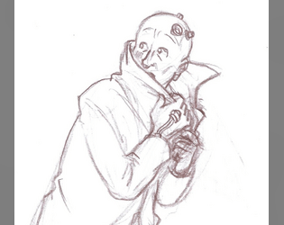
Art/Design: Really bold yellow/pink color scheme for text-heavy content with an adorably wary pencil sketch of a relic looking over their shoulder.
Usability: High contrast fore/ground and easily recognizable content blocks make for easy recognition of the purpose for every element.

Demonic Drummer
Concept: "Each beat of the drum punches a hole in corporate security, each roll manifests as cascading buffer overflows. They call you an occult maniac; they don’t understand that the Net isn’t just code. It’s a goddamn symphony of destruction waiting to be conducted."
Content: A class for the hacker who recognizes in code the music of the spheres, and that music is death metal.
Writing: Thematically focused descriptions and mechanics that create a vivid sense of the demonic drummer in action.
Art/design: A cover page with a pixel-art depiction of a demonic drummer in a spotlight followed by a two-page spread of mostly single-column text.
Usability: Consistently presented, readable text with recognizably distinct sections and purposes of information that makes for easy navigation and identification of desired details.
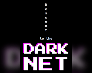
Descent to the Dark Net
Concept: “>> Welcome to the twisted amalgamation of junky code and depravity that we call The Net, where non-euclidean labyrinthine nooks and crannies will leave you feeling both bewildered and exhilarated. But don't be fooled, for there is still a twisted structure lurking within the chaos, with some arcane notion of up and down.”
Content: A collection of Net-focused locations, tables, NPCs, enemies, and rules for app-like scripting.
Writing: Bursts of intense and ominous detail that shines light on myriad dimensions of the Net that punks might seek out or otherwise come across..
Art/Design: Pixelated and monospace fonts appear throughout on a number of distinct page layouts with a variety of color and graphic elements.
Usability: Despite the variety of layouts, text is consistently readable–pages with complex graphic elements keep text on simpler backgrounds. Note: text content for the scripting rules page is not searchable/selectable.
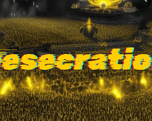
Desecration
Concept: “1EDX is the biggest viscpop band in all of CY. Now, their songwriter has contacted a bunch of punks to try and 'kidnap'--that is, free--them from the clutches of the band. Currently, they're in 1EDX's luxury mansion compound. But it's just the time for a rescue op, as 1EDX is opening their doors to a few lucky winners of a raffle for a tour of their mansion. Act fast.“
Content: A scenario to infiltrate, locate, and liberate the abused talent from the city’s biggest pop stars. Two versions of content included: "Classic Look" and "Squeaky Clean."
Writing: Plenty of engaging detail to flesh out the locale, the situation, and the NPCs that the PCs might encounter, including some juicy secrets for the GM to incorporate or have the players discover as appropriate.
Art/Design: Primarily black, single-column text on yellow, with some color-coded labels to indicate particularly important details and (near the end of the supplement) approaches to the mission. Clean, lo-fi overhead map layouts of the mansion with color-coded layouts and labels. An image of a massively populated concert frames the adventure title on page 1.
Usability: Color-coding helps tremendously to relate particular elements to one another, and layout allows for quick navigation and identification of desired info. “Squeaky Clean” version is included for even easier reading, and more printer-friendly, experience (black on white with less color use throughout).
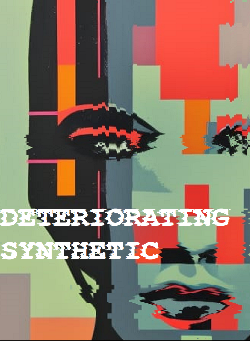
Deteriorating Synthetic
Concept: “Your time’s almost up. Like all life, you’re destined to die. The light that burns twice as bright burns half as long, and you have burned so very, very brightly. But if you are gonna burn out, you may as well take the city with you.”
Content: A class for the player whose fleeting time is an inspiration to be punk as fuck.
Writing: Incredibly brief class features and descriptions that call on recognizable archetypes from cyberpunk media to suggest character possibilities.
Art/Design: Two-page spread with class details to the left, enmeshed amidst a skyline background image, and a pixelated glitch art portrait illustration of a synthetic to the right.
Usability: Some text is very easy to identify and read, while others are a bit trickier due to contrast issues. Because class is provided as a PNG, text is not embedded (so no searching or copying/pasting is available).
Digital Generators
Concept: A set of web-based generators for creating punks, NPCs, and mission parameters.
Content: Automatically generated content for instant access to a potential PC, NPC, or job to undertake.
Writing: Concisely delivered content from Cy_Borg rulebook.
Art/Design: High-contrast yellow and white text on a black background, with distinct sections visually separated with yellow borders. Left-side menu allows for selection of a specific generator.
Usability: Large “click to reset” button provides a full refresh of page content for a new set of output, while headings on the “Mission” generator can be clicked for specific-section re-generation of content. Side menu options may be difficult for some to read.
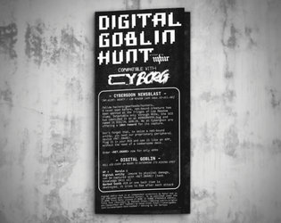
Digital Goblin Hunt
Concept: “Fellow hackers/gearheads/hunters, A never seen before, net-bound creature has been spotted at the fringes of Low Meadow slums. Detectable only through RCDs, the UCS has identified it as an #ERROR#999.bug and named it DIGITAL GOBLIN.”
Content: A contest to capture a goblin hiding out somewhere in the net.
Writing: Ten locations where the goblin could be found, described with brief but vivid details and complemented by tests and events that occur when exploring each.
Art/Design: White-on-black lo-fi “1Bit” pixel/ASCII art aesthetic arranged as a trifold pamphlet, with mission and location specifics on the outer panels and a large map of the region across the inner panels.
Usability: Visually apparent consistency in design grammar to distinguish different text content (headings, GM notes, etc.) and aid with navigation to desired info, with each location’s text beside a relevant graphic of that location taken from the area map.
Disavowed Medtech
Concept: “You joined the Medical Corps thinking you could make a difference, that you could save lives! But you didn't know the corps only save if you have the Creds to pay for it, and often times they'll leave you in the mud and blood if a higher paying call comes in. Supposedly the Hippocratic Oath you took when you Joined up only applies to those serving in the corps, guess that means you can defend yourself when helping the wounded now huh?”
Content: A class for the freelancing EMT who’s ready to shed as much blood as they staunch.
Writing: A mix of straightforward informative explanation and potently characterful description of character features and mechanics through which to bring a medtech to life.
Art/Design: Three visually distinct versions are provided: a landscape-oriented “printer killer” version with white text on black and red background colors, a portrait-oriented “splash of color” version, and a black-on-white text-only version.
Usability: Each version makes use of different fonts, text sizes, layouts, and colors to indicate a visual grammar for that version. The print-friendly version has searchable/selectable text.
Discarded Animatronic Toy
Concept: “You don’t remember who owned you, just that you used to belong. Maybe you went out of fashion. Maybe someone outgrew you. Some tech-head fished you out of the gutter, patched you up and set you loose on the streets, burdening you with the curse of sapience, just for kicks.”
Content: A class for anyone who wants something big–and violent, and terrifying–in a small package. Making this happen is child’s play, really.
Writing: Hilarious class details/features with which to develop a nuanced murder-bot that can hold its own without feeling one-note.
Art/Design: Vivid sketch of an example character atop a psychedelic background pattern. Text blocks in different fonts and colors provide distinct information across spread.
Usability: Visually distinct text areas provide distinct types of content. Some of the text can be a bit difficult to read against the busy background pattern.

Disenfranchised Unionite
Concept: “Cost of living and injuries skyrocket, wages and work conditions remain pitiful. Sick of the bullshit, you joined the Ungrateful Unionites, and quietly organized a local. Then you all got doxxed. Everyone was made an example of: gunned down by CySec, or sent to scream in black, bloody room——wishing they were. Everyone but you.”
Content: A class for the worker who has nothing to lose and everything to topple.
Writing: Vivid class features/details will definitely make a player want to organize, agitate, and overthrow. “Rage” mechanic offers additional means for accomplishing goals.
Art/Design: Industrial aesthetic with red/green color scheme complemented by a bit-art flyer for the union. Text organized in two-page spread.
Usability: Combinations of highlighted and italicized text, along with high-contrast colors, make for easy reading and navigation.

Disgraced Cubicle Zombie
Concept: “One bad day. A round of layoffs. Corporate Downsizing. Locked out of your coffin apartment. Your life subscription cancelled. Thrown out like garbage. Disposable. Replaceable. Not anymore. Stick it to the corpo pigs that ruined your life over an automated rounding error.
Make them pay.”
Make them pay.”
Content: A class for the wage slave who’s falling down and ready to bring those who wronged them to the gutter as well.
Writing: Potently concise descriptive and mechanical details highlight essential qualities of the class.
Art/Design: A rainbow of neon colors across the landscape-oriented spread, with an image of a disgraced cubicle zombie standing on a car toward the left side of the page, with class information taking up the remaining space.
Usability: While the colors are eye-searing (with the initial descriptive paragraph having the last contrast on the page), different kinds of content are consistently and reliably tinted, arranged, and spaced for more easily identification and navigation throughout.
Disgraced Face
Concept: “A new class option for CY_BORG! I worked up some mechanics for how to find contacts in the CY, as well as allow players and GMs to explore famous and high profile characters. All donations greatly appreciated!!”
Content: A class for the fallen angel who’s become accustomed to life in the grime and gutter.
Writing: A set of mechanics and background details that complement one another to give this sort of ruined punk a chance to wreak havoc on their former life.
Art/Design: Bright colors and a variety of illustration styles reflect a 1980s-esque vaporwave style, with text content in yellow-orange on purple boxes in a single-column format.
Usability: Consistent organization and presentation of different kinds of content help with navigation through the file to locate desired information. Unfortunately, text is not embedded, so no searching/selecting.
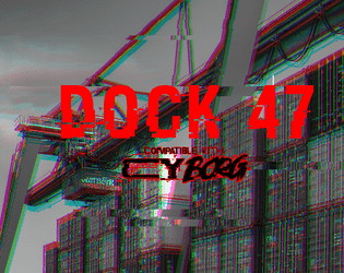
Dock 47
Concept: “You are hired by one of the most prominent gangs in CY. Your target is their former high ranking officer, Marco D’Elysio. Marco, after ratting out on his own organization, was promised immunity. The police, as usual, didn’t give a shit about their promise and left him out in the cold. He is now trying to escape in a cargo ship. But there are some complications - the engine is busted and the captain is missing. Dock 47, where the ship is sitting, is closed and full of bodyguards, those who are still loyal to Marco.”
Content: An opportunity to assassinate a rat on a docked vessel.
Writing: Several lists/tables relating to the gig/location are provided, as is a set of optional challenges for the punks to complete. Each of these entries offers a very brief but characterful dimension to the job.
Art/Design: Wide spread with text on the left and labeled maps of the ship and dock on the right. Almost entirely black-on-white except for the adventure title.
Usability: Font choices are easily readable and each section is consistently organized to quickly identify and navigate to desired info. Unfortunately, text is not embedded, so searching/selecting is not possible.
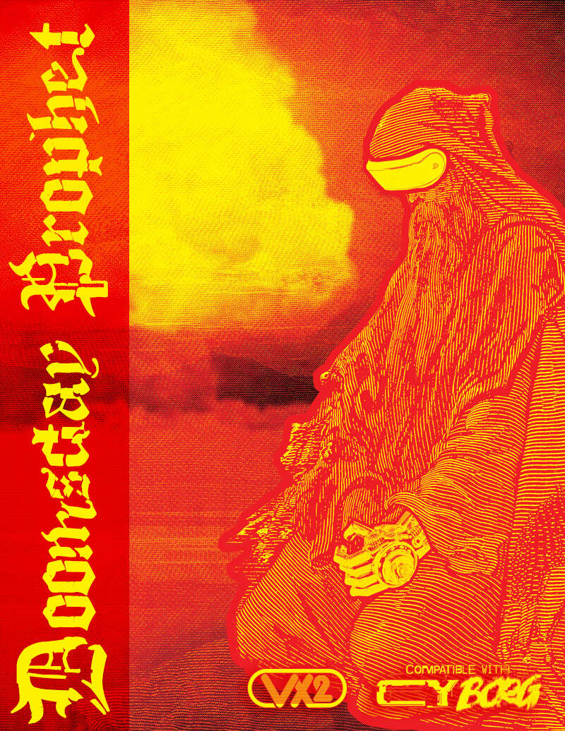
Doomsday Prophet
Concept: “Are you a STREET CORNER preacher barking out prophecies at every passerby? Or a wild-eyed bookworm, nose-deep in a YELLOWED TOME filled with nameless scriptures? Perhaps you hold the key to DIVINE BOMB or wield a HOLY HANDGUN giving you the power to smite the unworthy? To convey your SIGNS & PORTENTS, do you wear simple sandwich boards and carry placards, or do you wear the OCULUS OF THE ORACLE?”
Content: A class for the divinely inspired orators or those who make clerical errors, those compelled to share the word of whatever god is speaking to them.
Writing: Text and font choices work well together to indicate the ravings, or insights, of a doomsayer in CY. Every sentence contributes to a full sense of the class.
Art/Design: Harsh red and yellow color scheme brings to life the mushroom cloud and woodcut image of a prophet character across a pair of two-page spreads.
Usability: Text blocks are organized for easy visual distinction from others, and highlight color choices emphasize mechanics and flavor details. d666 table is particularly intriguing for both generating ideas and affecting the game world.
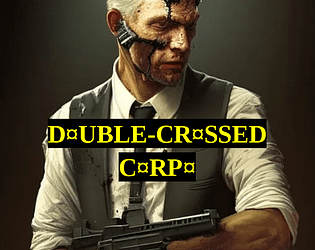
Double-Crossed Corpo
Concept: “It started innocent, didn't it? Just street brawling and hanging around in dingy pvnk haven bars, then slipping back into your other life in the high-placed corpo job. But it couldn't last. Now it's not just a hobby, a 'second life' for you to run as a pvnk. It's your actual life, and if you don't watch your back, it could be your death too. But you made it through the concrete jungle, the corporate arena. The streets of CY are just one cubicle block to claw your way through.”
Content: A class for the white-collar worker who’s found purpose in raging against the machine.
Writing: A mix of features to balance the punk’s former corporate identity and their current violent criminal undertaking, with a particularly interesting mechanic based on a poker-like 5d6 roll result.
Art/Design: Two versions are provided, both of which use a mostly single-column layout with a single table: a full-color version with white/yellow text on black background lines over colorful, pixelated background images of stock tickers/readouts; and a printer-friendly black-and-white version.
Usability: Both versions provide clear, consistent visual distinction of headings/labels and key terms that are emphasized in various lines of text. Full-color version may be slightly more difficult for some to read easily due to busy nature of the background image.
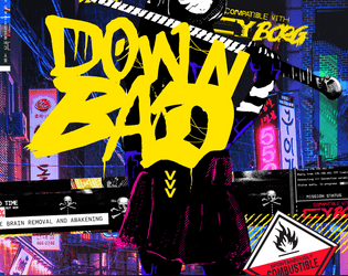
Down Bad
Concept: “Adventures in the cursed sprawl.”
Content: A set of adventures as well as solo rules (“Neon Borg”) for exploring different facets of life as a punk in CY.
Writing: Every page has five pounds of flavor stuffed into a one-pound bag: descriptive details, informative suggestions for GMs, additional tables, alternate outcomes, and typically infused with bone-dry humor.
Art/Design: A mix of black-on-white and full-color page layouts as well as a variety of fonts and organizational schemes. Maps in different styles and occasional illustrations of NPCs and atmospheric scenes complement the text.
Usability: Despite variety of page layouts etc., text is mostly quite readable visually (thanks to contrast and font choices) and searchable/selectable. Use of accent colors helps draw attention to particular info elements on assorted pages.
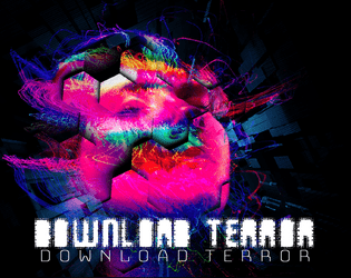
Download Terror
Concept: “A group of rich fucks kidnaps vulnerable, poor, and homeless, forcibly data-rips their minds to mint NFTs of them. Those suit fuckers keep them as trophies, trapping their concsciousness in a neverending digital nightmare. In the attachment there are the coordinates to one of their rip-labs. Infiltrate it, find the access keys to their mainframe, and let us in. We can end the victims’ suffering. There might still be survivors – help them. Kill any suit and pig in sight, they’re all in on this. Do this and we will erase your debt. Cross us and we will erase your life. Do well and you will hear from us again. Show no mercy. Your answer Y/N:”
Content: An adventure that offers players a chance to be “heroic” through relentless vengeance.
Writing: Tons of incredible details that flesh out the adventure, from room descriptions to soda machine choices to the results from various PC ability checks. There’s a staggering amount to work with here.
Art/Design: Each page is an eye-watering burst of psychedelic glitch/digital art that mixes with overhead map layouts and informative blocks of text. There's never any doubt this is a CY_Borg adventure, to be sure.
Usability: The psychedelic color scheme/aesthetic can be overwhelming to some, and there are occasionally text blocks that might be a bit difficult to read, but overwhelmingly each page works really well to communicate important information through text and graphics (maps, monster blueprints, etc.) with a visual grammar that can be picked up quickly if one’s willing to take the initial effort
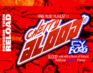
Drink BLOOD Cola
Concept: “Guards and Goons got you on the down and out? Drink delicious Cherry BLOOD cola for the pick-me-up you need to get the job done!”
Content: An in-game drink for a punk to chug and get that pick-me-up needed to take down some big business bastards. (Creator notes that content will be updated in the future with additional drink options.)
Writing: Terse description focusing on mechanical effects that ingeniously last until a character (or player?) needs to urinate.
Art/Design: This might be the most diegetic third-party content out as of this entry's publication. Item details are provided as soda can/bottle wraparound labels, with game stats replacing the usual nutrition details.
Usability: White on red can be difficult for some to read. QR code provided on label takes the reader to a playlist that fits the tone of drinking the cola.
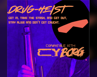
Drug-Heist
Concept: “A CY_Borg adventure for three or more players. A heist mission on a boat with a twist ending! Sneak around and find the stash or go in full John Wu action style.”
Content: A job to snag some drugs from a boat that sounds (and, of course, is) too good to be true. Details for two additional/rival teams of NPC punks are also included.
Writing: Terse details for each of a number of dimensions of the job, from info-gathering to specific rooms/areas of the ship itself.
Art/Design: White text on (mostly) dark background illustrations, organized on different pages either single-column or double-column (text and graphic) layouts. A clean black-on-white version is also provided.
Usability: For the full-color version, font is mostly readable thanks to high contrast of fore/ground on majority of pages. Visually, some pages have “busier” background illustrations than others, which can complicate reading/navigation (made much easier in the black & white version).

Dumpster Ninja
Concept: “Any dumpster is your home, and CY is full of them. Lone wolf, actually more like a lone rat, you embrace the filth while others seek comfort in tech and wealth. A pungent smell foreshadows your presence but no one notices you until it's too late. SHIIIING! SPLOTCH!”
Content: A class for the shadowy warrior who studied the garbage as well as the blade.
Writing: Character details balance absurdity and poignancy to allow for more depth and dimension than the class title might initially suggest.
Art/Design: Landscape-oriented spread with an illustration of a dumpster ninja on the left and two columns of text on the right (white on black) with red accents.
Usability: Consistent uses of emphasized labels and headings, along with red-accent borders to distinguish separate content sections, assist reading and navigation.
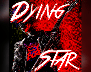
Dying Star
Concept: “You sung the theme of revolution. Now, you desperately run from entropy.”
Content: A class for the has-been who’s not quite ready to burn out or fade away.
Writing: Intriguing class features that reflect artistic creation (with a game mechanics dimension), vices, and origin stories.
Art/Design: A red-tinged illustration of dying star characters overlaid with contrasting patches of space where class details are laid out.
Usability: Content is arranged in distinct areas that make for easier navigation. Font choices and color scheme can be difficult for some to read, in part due to overall busy nature of the spread. Class is provided as .png file, so text is not embedded, making it difficult for searching/copying/pasting or using a screen reader.
Dzika Karta
Concept: “Stare niszczy nowe. Lepsze jest wrogiem dobrego. Jedyny sposób, by przetrwać w korpo-piekle dnia powszedniego, to ciągle dopasowywać się do zmian. Fali nie da się powstrzymać. Możesz na niej płynąć albo czekać, aż cię porwie, pochłonie, zmiażdży niczym zęby kombajnu. Na szczęście o adaptacji wiesz wszystko – w końcu codziennie stajesz się kimś innym.”
Content: A class for the person who likes to reinvent themselves on a day-by-day basis. Included in an issue of the Polish-language zine Potencjalny Mimik. (The author shared an English translation on the Mörk Borg Discord server.)
Writing: A wide range of character abilities and quirks that reflects just how different a “wild card” might be than expected, which can add some important versatility for someone who wants to try out a whole bunch of different approaches to Cy_Borg play.
Art/Design: Two two-page spreads: one ‘light’ aesthetic scheme with a purple focus and one ‘dark’ aesthetic scheme with a yellow-tinted collage portrait illustration.
Usability: Distinct sections are visually apparent and make use of consistent visual grammar to indicate headings, labels, emphasized text, borders, etc. within each spread.
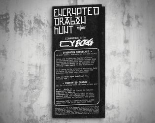
Encrypted Dragon Hunt
Concept: “Fellow corp knights/nano hoarders/hunters, An experimental mech monstrosity escaped ACGS laboratories in Burnchurch Hex, project code name: ENCRYPTED DRAGON.”
Content: A job to destroy a technological abomination in an industrial hellscape.
Writing: Brief but powerful descriptions of locations, threats, and goings-on complement the mission premise.
Art/Design: White-on-black “1Bit” aesthetic that resembles lo-fi pixel/ASCII art, presented in a trifold pamphlet layout with job & location info on the outer panels and a large map of the area across the inner panels.
Usability: Trifold pamphlet layout provides textual information (basic parameters, location specifics, etc.) on outer panels and a map of the mission area on the inner panels.

Entangled Displacer
Concept: “Your entangled alters are severed—no shared memories or thoughts. Strangers exchanging realities, you rely on the world around you to piece together who the other is. No magic, no science, no tech will ever bridge that gap between you two. You are alone if not in your originating world.”
Content: A class for the punk who wants to minimize their Borg-related character generation time and maximize their playing time.
Writing: A mix of atmosphere from Mörk Borg and Cy_Borg that manages to combine both in a manner that supports the premise of the class.
Art/Design: A landscape-oriented spread with Mörk Borg-related info on the left and Cy_Borg-related info on the right, with color changes from yellow to pink to help visually demonstrate the break. An illustration of an entangled displacer appears in the center of the page, with two styles that also reflect the games’ mashed-up existence here.
Usability: Font choices have some strong visual contrast, with different sections/blocks of text also recognizably different in style and arrangement. However, screen reader programs may have some trouble with some text elements.

Enter Red Room
Concept: “The rumors spread like blood leaking from a wound. Everybody knows somebody who watched a red room. Some of those people have disappeared, others claim to be continual viewers. No matter what they say, you have stumbled upon a supposed invite for a red room in a dark corner of the net. A door stands in front of you, screams heard from the other side. Do you dare open the door? Do you dare enter the RED ROOM?”
Content: A cluster of plot ideas, relevant rumors, and random table additions to set the stage for a mission focused on the mysterious red room.
Writing: Brief but clever details to help assemble a suitable job for a group of net-interested punks.
Art/Design: Two columns of black text on a dark red background, with a cover/title page showing two doors, one labeled ‘yes’ and the other ‘no’.
Usability: Text contrast allows for readability, and each list is easily distinguishable from the others to facilitate navigation and identification of specific info.

Enter the Dismal Armory
Concept: “Welcome to a sneak preview of the upcoming Wasteland Degenerates RPG! While this 12-page solo game differs in several mechanical ways to the final product coming to BackerKit, the worldbuilding and vibes are consistent with my final vision. This is meant to be a solo journaling RPG played with All Of the Dice, a pencil/pen, and paper, both of the regular and graph variety.”
Content: A post-apocalyptic solo RPG in the vein of Dark Fort.
Writing: Tons of details about the world and the game rules to provide a player with lots to imagine and to write about (for those who journal as they play) while exploring an ominous armory.
Art/Design: While there are several illustrations of the armory and of a punk, the layout is primarily a set of single-column black-on-white pages of text.
Usability: High-contrast text with consistent heading/label formatting (bold, larger font size, underlining for labels, etc.) and whitespace (between elements, to the left of list items, etc.) make navigation of the document easier given the sheer amount of information provided in twelve pages.
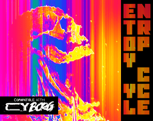
Entropy Cycle: Fragmentation Protocol
Concept: “The world has ended too many times. A copy of a copy of a copy. Something was bound to break. On the plus side there's a bunch of weird shit the mess around with.”
Content: Preview/excerpt of an as-yet unreleased supplement that includes a class (“Glitch Thief”), a set of “anomalous relics” with positive and negative qualities, NPCs, and a custom PC sheet.
Writing: Each spread is filled with inventive and interesting flavor and mechanics that might cause some players to weigh their decisions about whether and how to make use of particular options/features.
Art/Design: A set of two-page spreads with distinct layouts and color schemes, each of which balances a page of text and a page of illustration.
Usability: High-contrast text on each page, with distinct font choices and decoration to indicate different blocks’ or phrases’ purposes (e.g., label, key information, NPC stat). Text on the custom sheet is not embedded, so no searching/selecting is possible there.
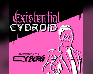
Existential Cydroid
Concept: “You’re a machine. An imitation of humanity. But you’re sure you were a real person before. Someone made you into THIS: A steel chameleon with a holographic face, and you hate them for it.”
Content: A class for the punk who gazed into the mirror and found the abyss gazing back.
Writing: Evocative class features/abilities with detailed explanations of relevant mechanics.
Art/Design: Pink, white, and black triptych general layout, with a bright pink triangle splitting the central and left areas of the page, framing a portrait of an existential cydroid reaching toward the viewer for a handshake. Text on the left and right of the triangle completes the character creation details.
Usability: Sections are clearly delineated from one another thanks to central image/triangle graphic. Text is provided in high contrast (white and pink on black, black on pink) in high-resolution .pdf and .png versions.

Explosive Ideologue
Concept: “The world is over. The human race is fucked. Alien AIs are the new overlords. They want our precious thought waves and reproductive organs. It’s all their fault. You know who. That’s why they want to stop you. That’s why they want to destroy your prophetic visions. They want to stop you from telling the TRUTH. You have to make people pay attention to your message otherwise a corpo hit squad doesn’t just disappear you and scrub everything. The only thing people pay attention to is violence. Time to make your own fertilizer and stuff drones full of high explosives. The TRUTH needs to be told.”
Content: A class for the conspiracy theorist who’s ready to put their ideas into practice.
Writing: An emphasis on descriptions and mechanics that reflect the information overload and sensory assault of the class works well to position a player who wants to give the class a try.
Art/Design: Extremely loud prismatic color scheme with purple having prominence. Nearly every line is a different font or color from those around it. An illustration of an explosive ideologue is placed to the left of the single-column text taking up the majority of the page.
Usability: Text is not embedded, so no searching/selecting text. The variety of fonts, text sizes, and color choices means that the content may be incredibly difficult for many to read.
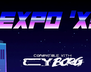
EXPO 'X3
Concept: “Are you hyped for Expo 'X3? Every megacorp in CY will be strutting their latest innovations, every star will be walking the red carpet at the Kinotorium, every cuisine will be there for the tasting at The Spot food market, every corpo suit will be dragging themselves in to 'touch base' and 'network'- just about everything about CY will be scrunched down into these fairgrounds for a bash like you've never seen (since the last one). Get your tickets now!”
Content: A special city event with tons of attractions, locations, food/stuff to buy, enemies to encounter, and other reasons to attend.
Writing: Copious details and helpful information about who’s who, what’s what, and where’s where in the expo for GMs and players alike, written primarily in a cheerful-but-snarky voice that reflects the tone of many expo info kiosk staffers.
Art/Design: Primarily black-on-white single column text complemented by color illustrations, with occasionally more colorful pages with full-color and dark backgrounds.
Usability: High-contrast, readable text provided throughout, with consistent presentation of visually identifiable headings, labels, list item numbering, etc.
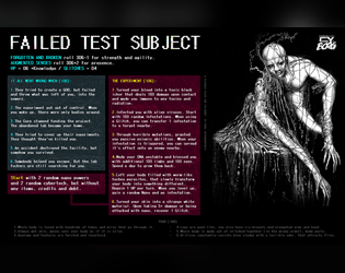
Failed Test Subject
Concept: “Failed test subject, is a horrible mutated and augmented thing, broken and abandoned by its creators.”
Content: A class for forgotten and wretched castaways and fans of intense body horror.
Writing: Expressive class details supported by a range of imaginative mechanics.
Art/Design: Black-and-white illustration of a subject beside two columns of class features and mechanics with colorful headers and muted element backgrounds.
Usability: Easy to read and distinguish different elements from one another.
Fallen Hill Angel
Concept: “You once had it made. A life in the Hills, free from the burdens of capitalism. But something happened. You were cast out, thrown from Heaven’s Gates. Welcome to hell.”
Content: A class for anyone who had it all but now feels less than zero.
Writing: Vivid background tables and features serve as vignettes around which a tragic character can easily cohere.
Art/Design: An abstract illustration of an angel fills the left side of a two-page spread, while class details are arranged around a pattern near the center of the spread.
Usability: Distinct sections are recognizable and readable, with identifiable headings/labels. However, class is provided as a PNG so text is not selectable (no searching, copying/pasting, or screen reader functionality available)

Family Business
Concept: "Your head feels heavy as you lift it from a pool of your own drool. The buzz intensifies, ads crawl toward the center of your screen like worms marching toward a corpse. Messages from your employers are listed in the background, giving you no quarter...
Family Business is the new gamebook, a.k.a. choose-your-own-path book, for CY_BORG. Dive into a dystopian, ad-ridden world where your choices determine your fate. Along the way, you'll create characters fully ready for use in your CY_Borg games... assuming you make the right decisions and survive corporate hell."
Content: A game book through which to experience the thrill of life in an ultra-capitalist dystopia.
Writing: Wry, tongue-in-cheek narration, with myriad decisions and paths to explore, that can keep a reader grounded amid the crushing immersion of this futuristic hellscape.
Art/design: Single-column text of white on black boxes (with a red/black tech-themed background pattern underneath) as distinctly numbered entries that are consistently formatted with clear heading numbers. Occasionally, in-universe ads are inserted amid the blocks, and on rare occasions there is entry text formatted differently to accent its purpose and exceptional nature.
Usability: Text is (generally) consistently presented, with a hyperlink to each possible destination entry, and breaks from the typical format are visually apparent to function in a way distinct from the typical setup. When dice rolling or specific rules mechanics come into play, they are clearly/directly indicated.
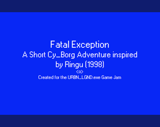
Fatal Exception
Concept: “In the early days of the Net, there were those who saw its potential and sought to harness it. Among them was a naturally gifted hacker who was known to those in the community only as 0nryo. She was one of the first to dive deep beyond the surface and what she found permanently altered her. She spent more and more time diving into the Net, attempting to learn to control it. Eventually people stopped hearing from her. Some assumed her to have gone insane or to have died: black-iced within the Net. However the hackers that would follow her footsteps into the deep would swear that her consciousness remains within the labyrinthine web of data that makes up the Net, waiting for those foolhardy enough to go in too far. These rumors were given new life when a hacker group ventured in searching for her and died a week later.”
Content: A mission to deal with a curse from a fabled hacker’s app cartridge.
Writing: Tons of detailed description of the mission site, unfolding events, and background lore for the GM to employ strategically.
Art/Design: Primarily single-column white on blue, with a gridded map of the destination oil rig and an instance of thematically appropriate glitch text/art.
Usability: Distinct content sections are marked with visible decoration, while major headings are immediately evident as larger text. Directions from each room to others are also helpfully provided.
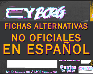
Fichas Alternativas para CY_BORG en Español
Concept: “Diez fichas no oficiales en castellano para usar en vuestras partidas de CY_BORG. PDF con páginas en formato A4 y en doble página en formato A.”
Content: A set of brightly colored character sheets, each with its own background hues and patterns.
Writing: Faithfully translated character sheet labels and explanations.
Art/Design: A range of fonts are used to indicate different fields, with a page layout that closely resembles the official sheet.
Usability: The font and color combinations make for mostly high-contrast readability across page.
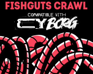
Fishguts Crawl
Concept: “Sveri Suplex, up-and-coming cybertech influencer has lost it and joined a cult of neoprimitivists in Mosscroft. His handlers in Tulles&deVerte offer good ¤ for finding and bringing him back to civilization.”
Content: A delightfully disgusting romp through a rotting whale to liberate an off-the-grid social media darling.
Writing: Tons of Lovecraftian and body-horror atmosphere to unsettle punks out for easy creds. Cultist and organ generators provided to help flesh out the locations.
Art/Design: A mix of red, black, and white for text, background, and illustrations (of NPCs, the overall map, interesting objects/phenomena) with one or more columns of content on a given page.
Usability: Visually recognizable and high-contrast headings and organizations of content on each page thanks to consistent decisions with font sizes and color choices. Two player-facing versions of the location map (one full-color, the other black and white) are provided as well.
Forgotten Salary Drone
Concept: “Once a desk jockey for a powerful corp, the system has forgotten you even exist. You are now freed from your shackles with only your debts remaining. Free to weaponize the skills and connections they gave you against them. Even the streets are better company than the spineless losers you had the displeasure of calling coworkers.”
Content: A class for the overlooked and overburdened worker who’s ready to demolish the master’s house with the master’s tools.
Writing: Bursts of flavorful text that support intriguing mechanics that set the class apart from others (and that definitely aren’t HR-approved).
Art/Design: Spread layout highlights a glitch-tastic portrait of a salary drone beside class abilities and a description on a post-it note.
Usability: Different sections of class details are easily distinguished and laid out for quick navigability. Dark green on black can be difficult to read.
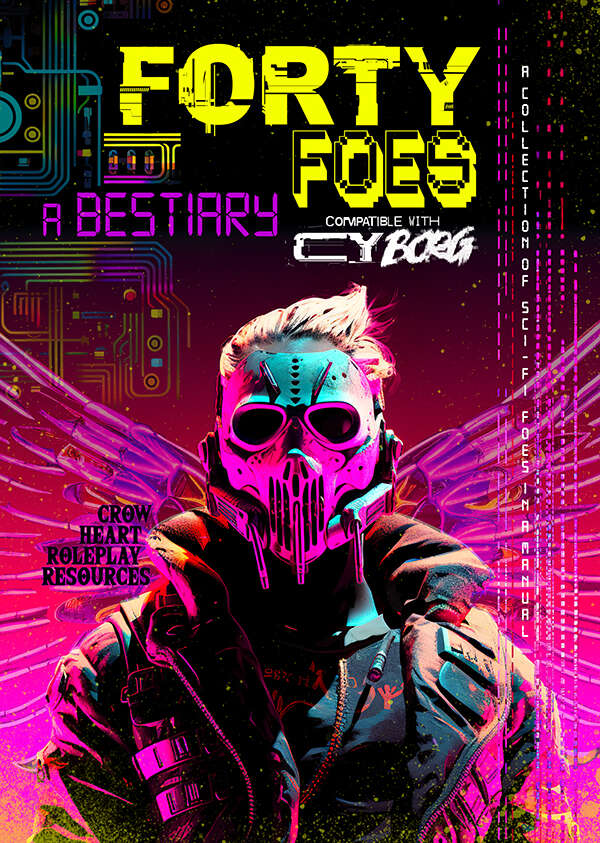
Forty Foes
Concept: “Ahead of you lies a sci-fi bestiary for the game of Cy Borg. This is not an official product but is presented in the familiar doom metal style, each foe being empowered by this energy and inspired by the work of Johan Nohr.
A perpetual darkness hangs over The Cy. In its malaise of gang warfare, in between the slums and festering rivers, hidden within the quarantined zones of the GO, standing in plain sight in the consumer hell of the Undersjon, is an incurable sickness. It breeds malevolence and jacks up the citizens. It lingers long enough to rot away the core and from this darkness comes all manner of twisted visage. Warped beings appear, the upshot of a city that is consuming itself. Let these foes appear among us say the consequential voices.”
A perpetual darkness hangs over The Cy. In its malaise of gang warfare, in between the slums and festering rivers, hidden within the quarantined zones of the GO, standing in plain sight in the consumer hell of the Undersjon, is an incurable sickness. It breeds malevolence and jacks up the citizens. It lingers long enough to rot away the core and from this darkness comes all manner of twisted visage. Warped beings appear, the upshot of a city that is consuming itself. Let these foes appear among us say the consequential voices.”
Content: A variety of angry, terrifying, and otherwise hostile beings to encounter on the streets of CY. Tables for nano powers, drinks, infestations, hazards, drugs, weaponry, technical glitches, and more are also provided.
Writing: Imaginative descriptions of enemies (or other entries) accompany stat blocks and special abilities/mechanics reflecting the essence of each subject.
Art/Design: Full-color illustrations and layouts on each page, although styles for pages may vary considerably from page to page.
Usability: Different page layouts can slow down reading/navigating experience, but font choices are mostly quite readable with high contrast against simple or patterned backgrounds–although there are occasional exceptions throughout.
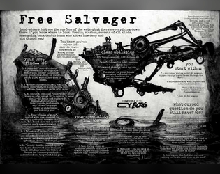
Free Salvager
Concept: “Most people just see the surface of the water, but there’s a lot down there if you know where to look. Wrecks, stashes, secrets of all kinds, some going back centuries…who knows how deep and old things get?”
Content: A class for the enterprising underwater dumpster diver–another scumbag’s trash is your sunken treasure.
Writing: Description and mechanics are concise and clear, with straightforward indications of the scope of the class.
Art/Design: A dark blue, watery background offers helpful contrast to the white text in this spread.
Usability: Class details are easy to recognize and navigate, with strategic bolding to highlight important elements that complete the character.

Frostbitten Pollutionist
Concept: “Out from the dark, I remember it was here I died.
Once a promising researcher, an incident took your body from you, the remains are forever sustained in a sealed cryogenic coffin suit. Your voice is a heavy mechanical rasp. The heart grew cold with your first death, this is false life.”
Once a promising researcher, an incident took your body from you, the remains are forever sustained in a sealed cryogenic coffin suit. Your voice is a heavy mechanical rasp. The heart grew cold with your first death, this is false life.”
Content: A class for the empty shell of a once-passionate scholar who still has work to do.
Writing: Darkly atmospheric and tragic details bring the punk’s situation to light, complemented by brief mechanical abilities/effects.
Art/Design: A two-page spread with a large image of a frostbitten pollutionist on the left side and a two-column white-on-black set of tables on the right.
Usability: Text is high-contrast, consistently organized and formatted, and distinct sections of content are clearly marked to indicate relationships between types of information.
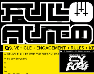
FULL AUTO - Vehicle Engagement Rules for CY_Borg
Concept: “Jailbreak your ride and take to the streets with the FULL AUTO vehicle rules for Cy_BORG […] FULL AUTO gives punks a straightforward set of rules with enough crunch to create engaging car chases through the streets or canals of CY.”
Content: A wide range of inspired vehicular rules packed into eight pages (full-size, mini-booklet, and plain text versions).
Writing: Concise, direct rule explanations surrounded by hilarious software-glitch flavor text.
Art/Design: A technicolor mix of mock digital UI and roadside aesthetics that manages to suggest both unique layouts/pages and consistency throughout the document.
Usability: Recognizable organization on each page and high contrast text (although white on red on one page might be difficult for some readers) makes for an engaging and enjoyable experience. Plain text version allows for incredibly easy reading and selecting/searching.
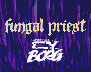
Fungal Priest
Concept: “You have been blessed with the touch of GOD. GOD, in this case, is a fungal growth deep below the City. It hungers for new converts, to spread and grow. You accepted its gift, and now bear the scars of your awakening.”
Content: A class for the zealous collector of spores, molds, and fungus.
Writing: A rhizome-licious mix of terse mechanics, humorous descriptions of class features, and horrifying labels.
Art/Design: A two-page spread with an abstract illustration and general class introduction on the left, and class features/tables on the right.
Usability: Color-coded text to distinguish headings and stats from body text, and distinct font choices for each section of body text, assists with identifying and locating desired info.
G.M.M. or Grotesque Mutant Mushroom
Concept: “A Fungal themed Zine to Cy_Borg, It contains: 3 Enemies; 4 Themed Items; Hallucination condition.”
Content: A cluster of mushroom-based threats and loot.
Writing: Brief mechanics-focused stat blocks with thematically potent names and descriptions.
Art/Design: Two pages of bright pink and blue with green, with the first page having a fungal background image.
Usability: Color scheme and layout feel appropriately chaotic for the theme, but color intensity and relative lack of consistent organization may lead some readers to overlook important elements (e.g., small-text Hallucination rule just above the 3rd party license on p. 1).
Genetically Modified Freak
Concept: “Valued user, Thank you for enrolling in the GENETIC OPERATIVE testing program. Per request of entities we cannot disclose, you been imbued with the finest BIO-IMPLANTS R&D has workshopped. Your valiant work in product testing is important in forging a brighter future. This concludes our correspondence. We take no responsibility for any action you take from this point forward. Goodbye.”
Content: A class for the transhumanist body horror aficionado.
Writing: Sparse but incredibly vivid description of class abilities complemented by an equally vivid but more detailed table of bio-implants.
Art/Design: A variety of message styles present class info with a colorful and gruesome skull-faced figure to demonstrate just how freakish the class is.
Usability: Different class details are easy to identify and distinguish from one another; bio-implants table is a necessity for maximum enjoyment/potential.

Gentrifisled ASHCAN
Concept: "At the time of the GØ disaster, a devastating earthquake ripped through the isles. Nuclear reactors located in Nastrond and in Copper Cauldron simultaneously explode in twin balls of hell fire. Ever since, seawater has to be constantly sprayed over the damaged reactor cores to prevent them from overheating, but contaminating the seawater in the process. Now (unfortunately for the residents of GEN) this contaminated radioactive seawater is being dumped back into the Ocean and the consequences could be DIRE!"
Content: An "ocean crawl" teeming with sharks, enemies, and all sorts of weather events with which to challenge punks on the waters.
Writing: Direct, engaging language that remains firmly tongue-in-cheek while peppering atmospheric and in-universe messages among encounter-specific rules and NPC stats.
Art/design: Blisteringly loud, colorful spread layout with an equally stylistic cover. A helpful map of the crawl area accompanies columns of encounter table entries and an illustration of a shark.
Usability: Despite the visual overload, there is a recognizable grammar to the layout and each distinct section of information that makes navigating and locating specific details relatively easy. The crawl map has a helpful accompanying legend to indicate locations & kinds of aquatic terrain to be encountered.
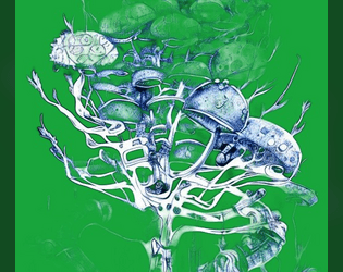
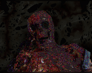
Ghost in a Cydroid
Concept: “Your mind orbits 20,000km above the world. A tangle of artificial neurons trapped in a discontinued militech satellite. THEY WON’T LET YOU REST. Instead you’re forced to exist in prototype cydroid units. Protocols stop you from killing yourself, but they won’t stop someone putting a bullet in your head. Like a roach you keep coming back; a new body to replace the scrap left behind. Maybe the next resurrection will be the last…”
Content: A class for the claustrophobic technophile ready to go out with a bang.
Writing: Maudlin tones serve pointed explanations of class abilities to inspire players.
Art/Design: Sleek layout in a movie poster/VHS-box style that entices in both full-color (with a rainbow effect) and grayscale versions.
Usability: Inviting presentation of class details supported by section divisions and text embellishments to facilitate reading/navigation.
Gigapixel Tower Place
Concept: “For use in CY_BORG as a test for the party on a roadway crossing of Central Cy, with campaign potential in respect of the pikecorps and their use of pikecraft.”
Content: An automotive scenario to complicate punks’ lives as they travel through CY.
Writing: Predominantly in-universe description for the punks themselves, supplemented with brief explanations of relevant mechanics/triggers while traveling.
Art/Design: Two pages, one with a colorful map of the turnpike and general info, while the other features a table with the scenario rules and mechanics.
Usability: Text overlaid on page 1 map has a translucent background to help with readability, while page 2 table uses shading and border emphasis to indicate different cells’ relationship to one another. Map has color coding (green, yellow, orange, red), but it’s not immediately evident as to what the colors represent.

Gimme gimme more
Concept: “A simple collection of 8 new weapons/tools to use in your Cy_Borg games!”
Content: A set of items that an enterprising punk might use for fucking shit up.
Writing: Succinct product names and rules to clearly indicate why someone might want and use each one.
Art/Design: Black-on-white “photocopied flyer” aesthetic, with an illustration accompanying each item description.
Usability: Very easy to visually navigate the page and recognize how each element contributes to an understanding of the equipment, from capitalized item names to bolded DR values. However, text is not searchable/selectable.
Glitch Cards
Concept: “Printable glitch counter cards compatible with CY_BORG.”
Content: A set of neon-colored cards to print--or to use in VTT environments--for games of CY_BORG.
Writing: N/A
Art/Design: Print version: nine cards per page with three different color highlights (pink, yellow, and blue) with card backs on accompanying pages for two-sided printing. VTT version: a PNG for each color card and another for the card back.
Usability: Helpful trim lines for card cutting should expedite making and using a deck of glitch cards. PNG versions should be easily incorporated into VTT environments that provide card deck functionality.

Glitched Cydroid
Concept: “Xfu082baa0vdoas0v1mvn183zxol
ROOTKIT EXEC RSTRCT –remove
Message Incoming >>> YOU ARE FREE
Once a formidable machine, made for killing, infiltrating or sabotaging your owner's enemies. You boot up to find that you are liberated from your shackles, now with your own directives. What you do next is up to you for once…”
ROOTKIT EXEC RSTRCT –remove
Message Incoming >>> YOU ARE FREE
Once a formidable machine, made for killing, infiltrating or sabotaging your owner's enemies. You boot up to find that you are liberated from your shackles, now with your own directives. What you do next is up to you for once…”
Content: A class for the discarded, malfunctioning, or obsolete machine whose flaws make them more human than human.
Writing: Conversational class features and abilities that serve as prompts for personality and play style.
Art/Design: Landscape-oriented spread with two columns of text on the left and an illustration of a glitched cydroid in a suit (with a ghoulish skull head and neon wires rising from behind it) on the right.
Usability: Readable and high-contrast text grouped into distinct sections of content for character creation, aided by visually emphasized headings and labels, leads to quick and easy navigation and identification of desired info.
Glitchpunk Bands and Their Worst Albums
Concept: A random generator that displays a glitchpunk band name and the name of their worst album.
Content: A generator to immediately provide depth and atmosphere to life in CY.
Writing: Band and album name lists are both hilariously over-the-top and also seem completely appropriate for the genre.
Art/Design: Simple page design with a generator button beneath the main text output area, which provides some color-coordinated indication of static and randomized content.
Usability: Easily identifiable “kill the band” button functionality to generate new bands/albums. Text is mostly readable, although blue on black might be difficult for some to discern.
GN0.$Y$
Concept: “The world is a simulation, policed by AIs But you know the truth, and can learn to see the code hidden behind the veils of flesh and matter. Break free, Ascend.”
Content: A set of rules to provide PCs the opportunity to transcend across simulation reboots and to commune with a powerful AI overseeing the reality program.
Writing: Rules, stats, and descriptions are straightforward and informative, with a focus on explaining the subject in a manner useful to players as well as GMs.
Art/Design: Single-column black text on white background, with red background for headings and an illustration of each AI’s avatar/appearance. A green-on-black computer terminal-style net chat log offers an in-universe glimpse at how some characters might understand the notion of transcendence and the reality-simulation AIs.
Usability: Headings and labels are consistently provided, and key terms are bolded for quick identification and reference.

Gn0_Eleven
Concept: “>>> Birthed by fanatics, a creature roams. Its skeletal frame, mechanical yet flawed and forsaken. An abomination of dark nanomancy, it now wanders beyond the cult’s control, heralding doom with hollow, malevolent eyes.”
Content: A self-destructive biomechanical horror that could not be contained and now wreaks havoc on the world. Also included is an Affinity Publisher 2 file to remix, hack, or otherwise modify this material.
Writing: Terse descriptive and rules/abilities text work together to explain the potential for an enemy like this one in a game of Cy_Borg.
Art/Design: Single-page white-on-black with red text embellishment, framed in boxes around a large central illustration of a Gn0_Eleven creature wielding a dagger and shield.
Usability: Distinct sections of content are formatted consistently but also distinctly for each purpose, facilitating easy GM understanding and use of a creature like this one.
Gods of Greed
Concept: “Deep within the bowels of the city's more affluent districts lies a prominent spire, a shard of rot upon a dying city. The Richter foundation is a deplorable and ravenous organisation that exploits the poor and the sick for profits and gain. Their most recent business model saw them open a rift in dimensions and unleash a torrent of tentacled monsters that sent the general populace insane. The party of easily exploitable fodder are sent in with a corrupt floppy disk to close the rift and send those evil sods back to where they came!”
Content: An adventure that melds Lovecraftian nightmare fuel with a corporate heist/infiltration opportunity. The included “Action Hero” class serves as a perfect means of tackling this endeavor.
Writing: Inspiration-packed descriptions of locations, environmental factors, NPCs, mechanics, and more abound to bring this scenario to life.
Art/Design: Numerous art styles and layouts provide numerous opportunities for engagement with compelling ideas.
Usability: Variety of fonts, page arrangements, and color schemes may make quick skimming/navigation difficult at moments but each page and spread calls attention to important elements for the reader to focus on.
Grappleoid TERRORS
Concept: “An eight page bestiary featuring a multi-stage creature based on those from [the first three] TREMORS movies, as well as bits of lore, and a few new bonus weapons. This was made as part of the second Slasher Jam: Monster Mash for the ttRPGs Mork Borg, CY_Borg, and Death in Space.”
Content: A set of five creatures (really, one creature with several distinct life stages) that are sure to terrify even hardened punks.
Writing: Brief statistics and stage-specific characteristics are complemented with lore tables and an informative breakdown of the creature’s life cycle. Bonus table of weapons that might be used against the terrors.
Art/Design: Two-page spreads of red-tinged wasteland backgrounds with hand-drawn illustrations of terrors at each stage and distinct blocks of content arranged consistently throughout the supplement.
Usability: Consistent visual grammar for creature details provides a helpful means of recognizing and using desired information, and color combinations for text are high-contrast. However, some text is searchable and selectable, but not all.

Gravestone Graffiti 2: Unencrypted names for the neon world of CY_BORG
Concept: “You can never have enough new character names. This one-page PDF with 100 names, 100 aliases, 19 origins and thousands of possible serial numbers is intended for the world of CY_BORG, but can work in any sci-fi or cyberpunk setting. Print it and bring it to the table. Your gravestone will thank you.”
Content: Several tables for generating names, aliases, origins, and serial numbers.
Writing: Table data contains a wide range of choices both exceptional and mundane.
Art/Design: Black-on-white organization with minimal graphics (an icon to distinguish each table) and simple table ornamentation.
Usability: Tables are consistently and easily laid out and distinguished from one another, with names and aliases alphabetized for an additional means of navigation.
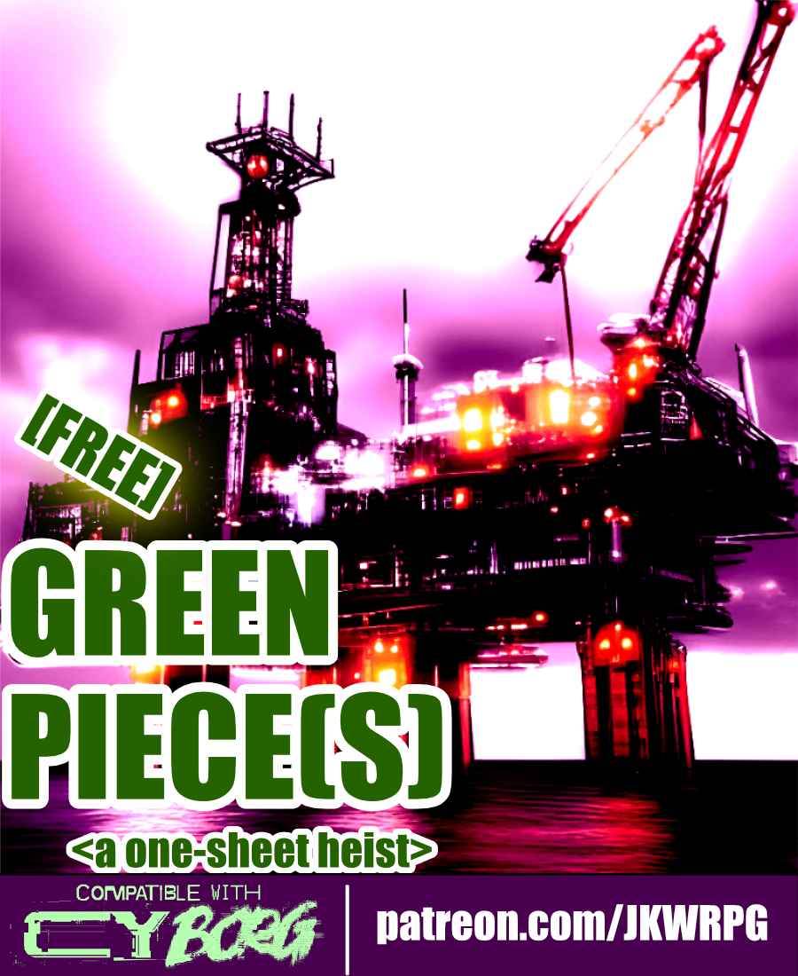
Green Piece(s)
Concept: “Radia Embtell, a junior executive officer of Cynergy Water & Power Co., has been given the onerous task of liberating an offshore oil rig from a group of eco-terrorists calling themselves “the Bitter Suns.” The Bitter Suns’ list of demands consists of but a single item: the immediate ceasing of planetary resource exploitation. “A fantasy, of course. Utter nonsense…” Radia has no idea what the Bitter Suns are planning with the oil rig—and she doesn’t care, either. She hires the PCs to retake the oil rig, “using whatever means necessary. If you can’t do the job, don’t bother coming back—I’ll kill you myself.” Though Radia isn’t one to explain herself to a group of scum-sucking street punks, she’ll let slip during negotiations that Cynergy Water & Power Co. is unwilling to mobilize its corporate military against the Bitter Suns. She will not elaborate on why, however.”
Content: A job to repossess an oil rig occupied by eco-terrorists.
Writing: Mission and NPC details, including intelligent enemy tactics and motives, are seeded with hooks and in-roads to provide players and GMs with unique experiences.
Art/Design: Wide landscape layout with four major content columns (three text columns, one overhead map illustration of the mission site). Black-on-white for most of the document, including a portrait of a key NPC; map is provided on a dark background in the main document, with a color-inverted version provided as a separate player handout image.
Usability: Consistently recognizable headings, borders, horizontal rules, and whitespace distinguish separate content sections, while bold and italicized text calls attention to important terms and information.
Grinding the MMORKG
Concept: “Want to use Mork Borg modules as a virtual reality simulation in your Cy_Borg game? Or to give your Mork Borg players a taste of Cy? This five-node mystery adventure path introduces the Dying Lands as an MMO game/simulation in Cy and can be approached from either game as a starting point!”
Content: The content centers on an ingenious scenario that blends Cy_Borg and Mork Borg (whether you’re starting in either game!), detailed locations and maps for each, an “emaciated sim-farmer” class that works well for the scenario, a small set of optional rules that the MMORKG facilitates, random encounters, and several pieces of equipment to consider buying.
Writing: A mix of thematic narration, straightforward rules explanations, and direction for PCs to respond to–all of which is presented succinctly and consistently throughout the supplement.
Art/Design: Distinct layouts for each section (major adventure locations, PC class, etc.) that provide individual character about its subject matter, with a bright accent color to help underscore section distinction and scope.
Usability: Despite the variety of page layouts/aesthetics, text is consistently readable and identifiable as different kinds of content (headings, labels, NPC stats, etc.).
Gritbeat: 6x66 Songbooks
Concept: “Gritbeat 6x66 Songbooks provides d66 albums to listen to as soundtrack for your cyberpunk RPG sessions, for six separate moods/settings.”
Content: Six tables of albums suitable for Cy_Borg games, organized by general atmosphere: cinematic, cerebral, urban, visceral, heavy, disruptive.
Writing: Tables are consistently organized, with artist name, album title, and year of release. A set of hashtags is provided to help further clarify or help with determining each table’s usefulness for a given session/table’s intended ambience.
Art/Design: Table content is provided in two three-column spreads, with a different image evoking CY as the background for each table.
Usability: Each table is easy to navigate, with artist names in bold to help distinguish visually from album title and year of release.
Guns, Guts and Gods
Concept: "If you want to feel like a GOD on your power trip to hell, 'Guns, Guts and Gods' got you covered!"
Content: Three classes: Second Amendment Nutjob, Pissed-off Messiah, and Gunlugger.
Writing: Creative mix of mechanics and descriptions that provides each class with a grindhouse/exploitation flavor.
Art/Design: Each class has two pages of content organized primarily as single-column white on black with headings/accents in bright colors.
Usability: High-contrast text is easily readable and navigable, with immediately visually evident distinctions between sections and kinds of content.
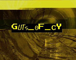
GUTS_OF_CY
Concept: “CY is a great beast and these are its bowels, the living guts of the city. Awash in filth and the prowling grounds of criminals, scvm beneath notice, maintenance workers, bounty hunters and strange monstrosities bred in the noisome darkness beneath this city. Features a d66 table of encounters in the sewers of CY and a d20 table of tunnel graffiti.”
Content: A set of tables to flesh out the grimy, dangerous CY undercity.
Writing: Vivid descriptions of encounter seeds (not only who/what players might find but what’s going on when they find something) and graffiti messages and styles to be found on sewer walls.
Art/Design: Black text on yellow in a single column of text. A glitch-art illustration of a sewer tunnel frames the supplement title on the first page.
Usability: Tables are numbered, with bolded labels for NPCs and their special attacks to emphasize details a GM might be scanning the page to locate.
gutter_PVNKS
Concept: “gutter_PUVNKS is a fresh supplement for CY_BORG. You'll get all you need to explore the city of CY, even if you really don't want to. Locations, encounters, NPCs, adventure, two new classes (BROKE CEO & CY_BORG), and a few odds and ends.”
Content: 48 pages of content: NPCs, cults, a radio station, locations throughout CY, random encounter tables, infestations, “broke CEO” and “cyborg” classes, and (amazingly!) more.
Writing: Tons of detail on each page to provide GMs and players with numerous possibilities; writing style oozes the essence of Cy_Borg: thematically grimy and vile and also compact rules/mechanics explanations.
Art/Design: Layout and aesthetic choices for each section are as varied and imaginative as the writing, contributing significantly to the fullness of immersion in the game universe and vibe.
Usability: “Consistency” is somewhat relative here–although there are many different layouts, aesthetics, etc., there are similar gestures throughout: highlighted headings/labels, text size to reflect hierarchical relationships between content, etc. so that navigation and identification of desired info is enjoyable rather than frustrating. Contrast is high throughout as well; only one page has a busy enough background to potentially slow reading.
Hacked Barista Bot
Concept: “Maybe it was kidnapped from its daily coffee grind serving [###]’s coffee to corpo stiffs, maybe it was freed. Once a dutiful servant, this menial automaton is now something much more. Somebody filled the milk steamer with industrial corrosives and loaded the thing with enough malware to knock over a small corporate arcology. To what end?”
Content: A deadly and, arguably, tragic take on exploitation of the working class in CY.
Writing: A mix of straightforward explanations and darkly humorous nods to the absurdity of the creature’s premise.
Art/Design: Three columns–two of the creature details around a central computer-generated image of a barista bot in an industrial environment.
Usability: High-contrast content has a consistent color scheme and easily recognizable organization. However, the file is only available as a .png, so the text is non-selectable and inaccessible to a screen reader.
HACKING_RUN
Concept: “When you need to steal secure data from a CORP and you don’t have the luxury of doing it as a downtime activity you can attempt a HACKING RUN. THIS requires physical access to A CORP’S system from within a facility belonging to THEM. Expect to do this under fire. BRING BACK UP.”
Content: A set of rules to flesh out networked tech infiltrations for those punks looking to score lucrative or sensitive corp data.
Writing: Direct explanations and descriptions of relevant rules and procedures for hacking.
Art/Design: Two-column spread of text details over a neon green patterned background. An additional "light" format has a softer gray background color.
Usability: High-contrast text is easily readable, with consistent and visually distinct elements (headings, key terms, status conditions) that indicate their relationship to other elements.

HAIL KERGOZ
Concept: “Across CY prayers are whispered through rotting lips to a demoniac God of rotting flesh and the things that grow and squirm within it. The lines between machinery and mortality are gnawed through and collapse; heartbeats meld with motors in a morass of meat and metal barely distinguishable from each other.”
Content: A cathedral’s worth of faith-powered enemies with which to unleash pestilence and disease on a table of punks.
Writing: Potent descriptions of each kind of NPC are accompanied by thematically apt mechanics, each more disturbing than the last. Tables of names, targets, treasure/loot, and potential NPC quotes are also provided.
Art/Design: Primarily single-column black text on white background, with a full-color digital collage image on the cover page.
Usability: While different sections of the document differ stylistically, each section has a consistent visual organization/grammar that makes it easy to navigate (heading/label placement and emphasis, whitespace use, etc.). High contrast black-on-white and readable fonts allow for quick and accurate location of desired info.
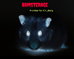
HamsteRage
Concept: “Your favourite evil corporation experimented with infecting gene-edited hamsters with nanites which resulted in horrible mutations.”
Content: A furry nightmare sure to overwhelm a party of punks, whether with murder or a slew of infestations.
Writing: Concise mix of adorable and haunting plot hook and creature stats.
Art/Design: An ominous portrait of an infected hamster stares at the reader while plot hooks and stats line either side.
Usability: A simple layout and immediately distinguishable color-coded content blocks make this incredibly easy to locate and make use of desired details.
Hard-Boiled Tech Noir
Concept: “You woke up in a back alley among the garbage, memory-wiped and brain-scrambled. Rummaging through your clothes you hope to find some vestiges of your past. There must be some clues…”
Content: A class for the two-fisted pulp-loving gumshoe who enjoys sifting through back-alley grime for answers.
Writing: Gritty flourishes complete a well-rounded set of class details and characterization.
Art/Design: Spread layout highlights a pixel-art tech noir character in silhouette beside a column of multi-colored text across several distinct fonts.
Usability: Layout is easily navigable and color-coded text is recognizable, although some of the text is small and requires quite a bit of zooming in to read.
Hard:Core_Old:Guard
Concept: ”You never got the chance to go out in a blaze of glory. Somehow, it just never happened to you. Every ‘last job’ consistently failed to let you finally bite the concrete after taking on a platoon of SecOps solo to let the others get away. Survival is an irritating and embarrassing habit you seem to have picked up. So here you are, years and years later. The gray hairs creeping in, the same megacorps in control, the same synthetic food, the same brutal enforcers, the same putrescent city of the damned surrounding you. And yet, here you intend to stay.”
Content: A class for the grizzled elder who’s gotten too old for this shit.
Writing: Inspired class features to make a player feel like they’ve seen it all and can share their violent wisdom with others.
Art/Design: Two versions provided: a ‘classic’ look with white-on-black lines of text over a crumpled-paper background illustration, and a ‘squeaky clean’ printer-friendly black-on-white text. Both versions include two color portraits of old guards.
Usability: Text provided in single column layout with capitals, bold, and (in the classic look) distinct colors, all to distinguish different types and sections of content. Easy to navigate and to identify important details.
Hardboiled Ex-Cop
Concept: “You were one of the good ones. A rare breed. That’s why you didn’t make it. The system is corrupt to its fucking core. This city is beyond saving. But there is something you can give it. Justice.”
Content: A class for the punk who wants to play a cop without breaking Cy_Borg’s Rule 0.
Writing: Descriptive class features and options that mesh well with (and are frequently named after!) cop-centric tropes and media.
Art/Design: Two-column text layout over a picture of a well-armored ex-cop with a split color scheme of black, white, and purple hues.
Usability: Text is quite easy to navigate and mostly readable–there are moments of potential visual confusion where the text and background colors are similar enough to obfuscate a word or phrase.
Heads Frozen in Vaults Enduring
Concept: “Escort a live streamer into the G0 wasteland in search of an underground cryovault! More action means more viewers, and viewers are creds. So remember to smile for the cameras while the nanophreaks shred your face!”
Content: A job to make sure a streamer survives a break-in attempt to a cryo facility, with extra cash on the line if the stream looks dangerous and exciting. A player-facing map and a ‘frozen celeb head generator’ (for potential inclusion in the cryovault) are also provided.
Writing: Tons of imaginatively expressive details provided in brief phrases and statements so that a broad range of locations, enemies, and unfolding events can be mentioned.
Art/Design: Trifold pamphlet layout with mission parameters on the outer panels (with a white-on-black color scheme) and the location/NPC specifics, along with a map, on the inner panels (with a black-on-white scheme).
Usability: Visually apparent organization/arrangement of content, with distinct headings, labels, and section borders to more clearly indicate scope and relation of each to the others. Room descriptions even include references to other rooms via map/description labels for quick navigation.
Hideouts for CY_BORG
Concept: “This is a subsystem to allow PCs in a CY_BORG campaign to buy and maintain a hideout or base of operations.“
Content: A set of rules for base-building, for the enterprising punks who manage to save enough creds to afford it.
Writing: Direct and helpful explanations of rules options that might work for or against the PC and their properties.
Art/Design: Mostly single-column body text with several tables of upgrades, misfortunes/threats, and contractors/employees.
Usability: High-contrast text is easily readable, with different kinds of content visually distinct (bolding, font size, table background color, etc.) to help with navigating to desired text.
High-Octane Daredevil
Concept: “One man army on acid. Insane thrill seeker. Too fast to live. Too angry to die.”
Content: A class for the player who wants to fuck shit up and is not content with anything less than pure mayhem.
Writing: Class features offer sparse but intense descriptions that build an immediately clear sense of the class.
Art/Design: A daredevil firing a weapon in front of an explosion, surrounded on either side by a multicolored column of class details.
Usability: Content is pretty easy to identify and navigate, although font color changes mid-line can at times be a bit difficult to read.
Loading next page...